Tuesday, July 31, 2012

The S&P500 Vs. The Shanghai Stock Exchange Composite Index – July 31, 2012


Starting on May 3, 2010 I have written posts concerning the notable divergence that has occurred between the S&P500 and Chinese (Shanghai Composite) stock markets.

The chart below illustrates this divergence; it shows the S&P500 vs. the Shanghai Composite on a daily basis, since 2006:

(click on chart to enlarge image)(chart courtesy of StockCharts.com; chart creation and annotation by the author)


-

It is notable that the Shanghai Composite led the SPX (S&P500) significantly in late ’08 – early ’09, yet it has been (gradually) declining since that time.

I continue to find this divergence between the S&P500 and  Shanghai Composite to be notable and disconcerting, on an “all things considered” basis.
_____

The Special Note summarizes my overall thoughts about our economic situation

SPX at 1385.61 as this post is written

Sunday, July 29, 2012

The Velocity Of Money – Charts Updated Through July 27, 2012


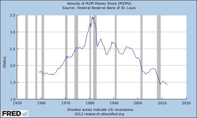
Here are three charts from the St. Louis Fed depicting the velocity of money in terms of the MZM, M1 and M2 money supply measures.

All charts reflect quarterly data through the second quarter of 2012, and were last updated as of July 27, 2012.  As one can see, two of the three measures are at all-time lows:

Velocity of MZM Money Stock, current value = 1.428 :


-

Velocity of M1 Money Stock, current value = 6.924 :


-

Velocity of M2 Money Stock, current value = 1.575 :


_____

The Special Note summarizes my overall thoughts about our economic situation

SPX at 1385.97 as this post is written

Saturday, July 28, 2012

Long-Term Charts Of The ECRI WLI & ECRI WLI, Gr. – July 27, 2012 Update


As I stated in my July 12, 2010 post ("ECRI WLI Growth History"):
For a variety of reasons, I am not as enamored with ECRI’s WLI and WLI Growth measures as many are.
However, I do think the measures are important and deserve close monitoring and scrutiny.
The movement of the ECRI WLI and WLI, Gr. is particularly notable at this time, as ECRI publicly announced on September 30, 2011 that the U.S. was “tipping into recession,” and ECRI has reaffirmed that view since, most recently in a Bloomberg interview of July 10 titled “Recession Here” in which Lakshman Achuthan argues that the U.S. is now in a recession.

Other past notable reaffirmations of the September 30, 2011 recession call by ECRI were seen (in chronological order)  on March 15 (“Why Our Recession Call Stands”) as well as various interviews and statements the week of May 6, including:


Wall Street Journal video, May 9: “Free Market Economies Have Business Cycles


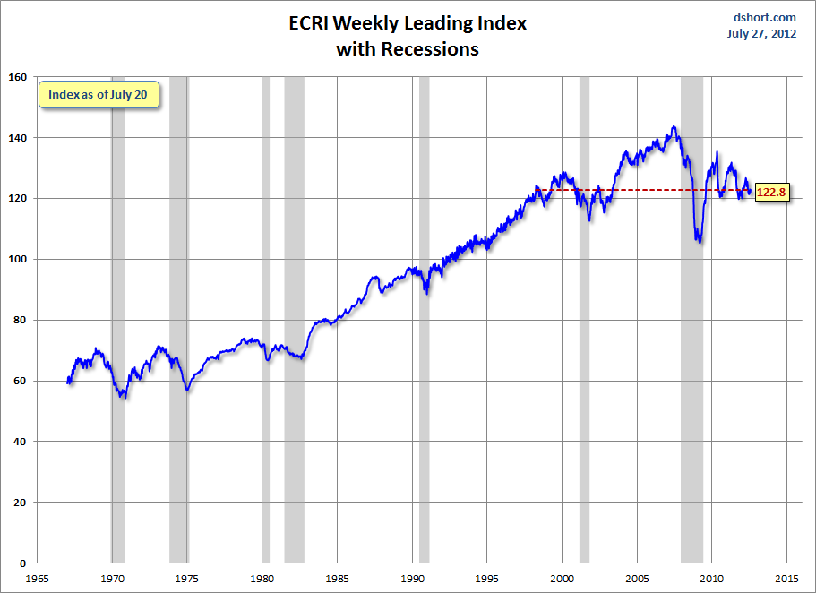
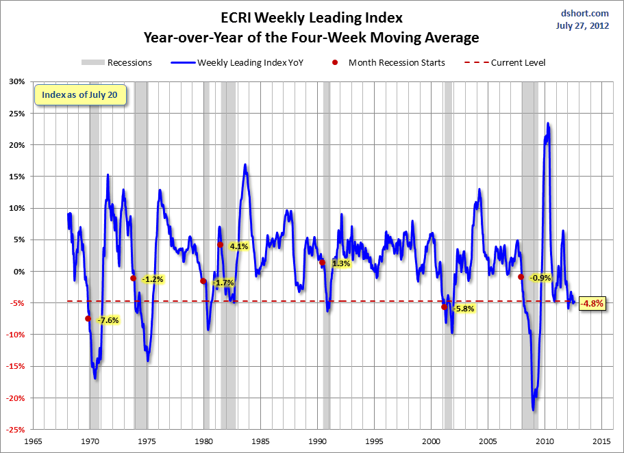
Below are three long-term charts, from Doug Short’s blog post of July 27 titled "ECRI Recession Call: Weekly Leading Index Improves."  These charts are on a weekly basis through the July 27 release, indicating data through July 20.

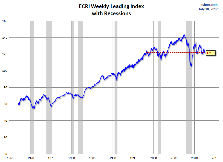
Here is the ECRI WLI (defined at ECRI’s glossary):

(click on charts to enlarge images)


-

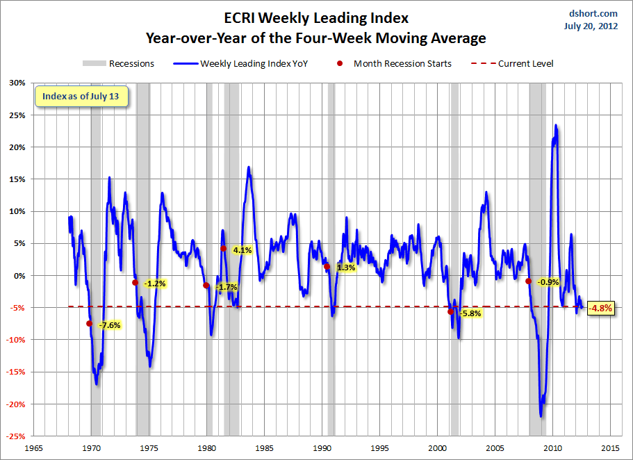
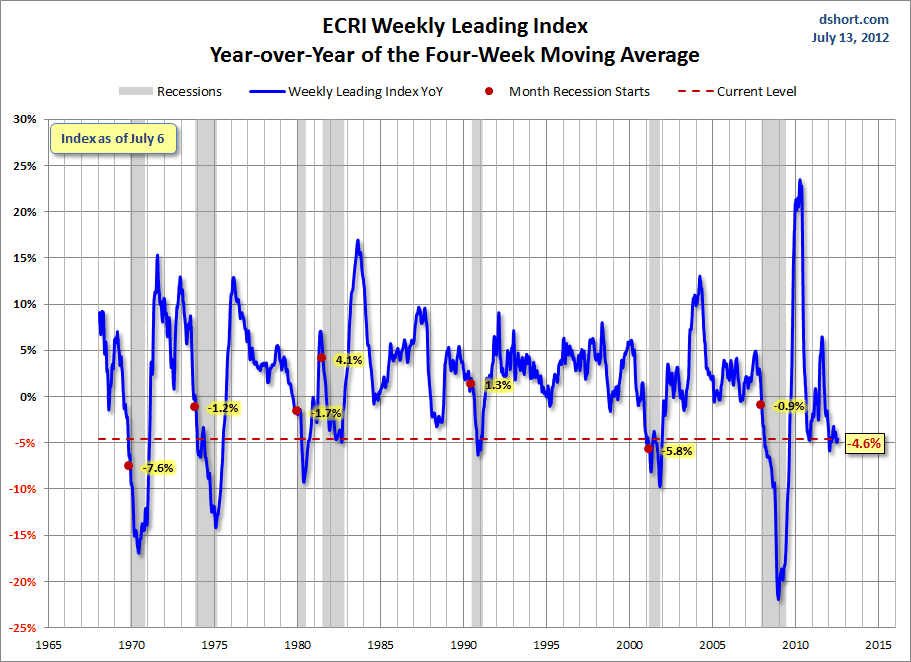
This next chart depicts, on a long-term basis, the Year-over-Year change in the 4-week moving average of the WLI:


-

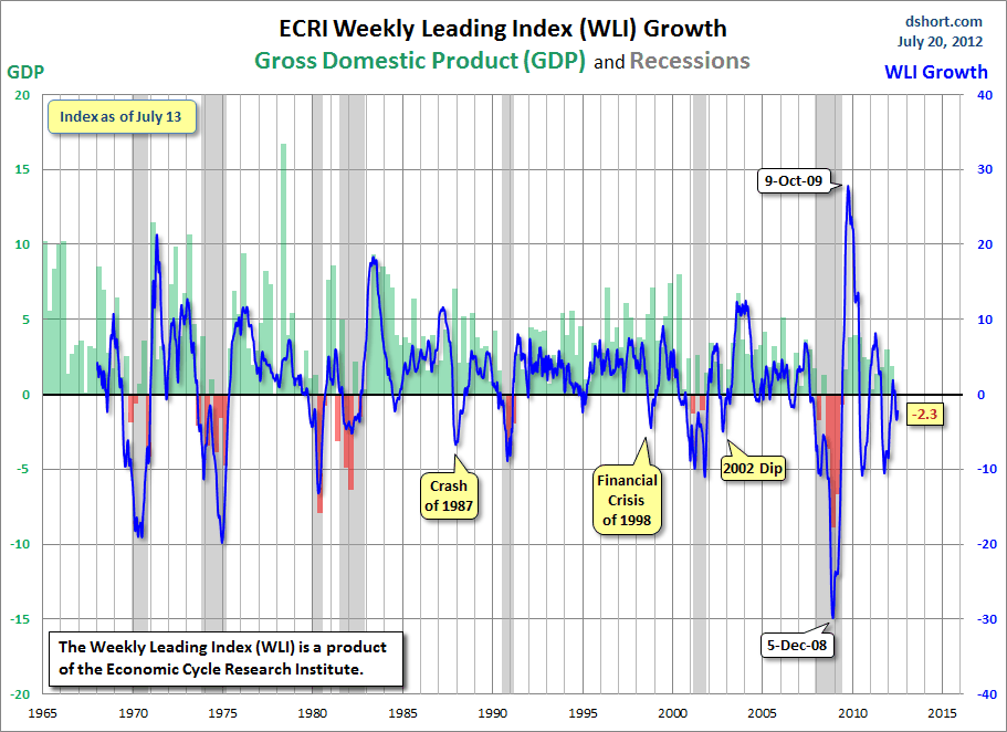
This last chart depicts, on a long-term basis, the WLI, Gr.:


_________

I post various economic indicators and indices because I believe they should be carefully monitored.  However, as those familiar with this blog are aware, I do not necessarily agree with what they depict or imply.
_____

The Special Note summarizes my overall thoughts about our economic situation

SPX at 1385.97 as this post is written

Friday, July 27, 2012

St. Louis Financial Stress Index – July 26, 2012 Update


On March 28, 2011 I wrote a post ("The STLFSI") about the  STLFSI (St. Louis Fed’s Financial Stress Index) which is supposed to measure stress in the financial system.  For reference purposes, the most recent chart is seen below.  This chart was last updated on July 26, incorporating data from December 31,1993 to July 20, 2012 on a weekly basis.  The July 20, 2012 value is .237 :

(click on chart to enlarge image)


_________

I post various indicators and indices because I believe they should be carefully monitored.  However, as those familiar with this blog are aware, I do not necessarily agree with what they depict or imply.
_____

The Special Note summarizes my overall thoughts about our economic situation

SPX at 1360.02 as this post is written

Durable Goods New Orders – Long-Term Charts Through June 2012


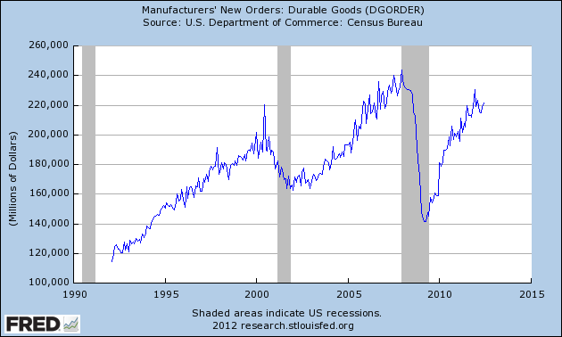
Many people place emphasis on Durable Goods New Orders as a prominent economic indicator and/or leading economic indicator.

For reference, here are a few charts depicting this measure.

First, from the St. Louis Fed site (FRED), a chart through June, last updated on July 26.  This value is 221,626 ($ Millions) :

(click on charts to enlarge images)


-

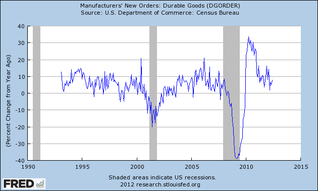
Here is the chart depicting this measure on a Percentage Change from a Year Ago basis:


-

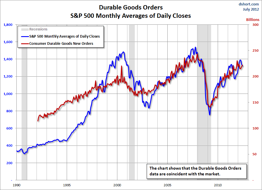
Lastly, a chart from Doug Short’s post of July 26 titled “Durable Goods Orders Up 1.6%, Above Expectations; But ex Transportation and Defense, Down 4.6%” showing the Durable Goods New Orders vs. the S&P500′s monthly average of daily closes:


_____

The Special Note summarizes my overall thoughts about our economic situation

SPX at 1360.02 as this post is written

Wednesday, July 25, 2012

The Bond Bubble – July 2012 Update


In previous posts I have discussed the Bond Bubble and its many facets.

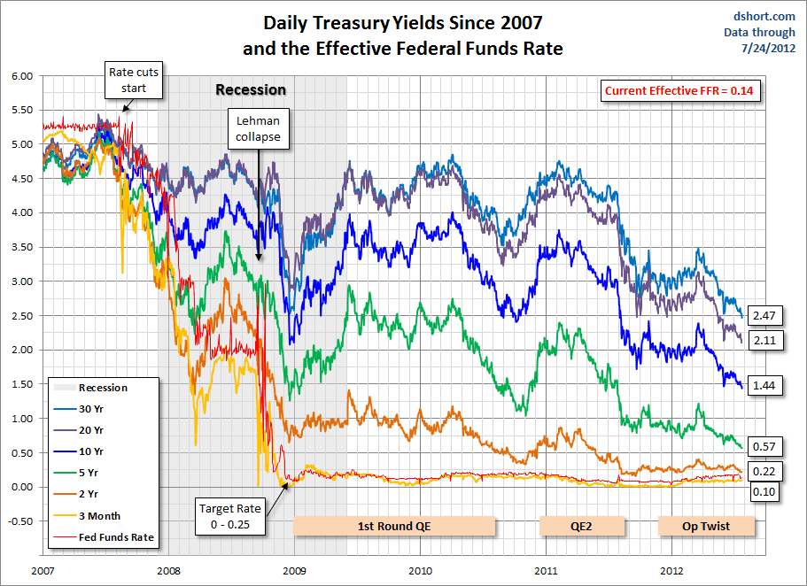
Since my last post on the Bond Bubble (the February 21 post titled "The Bond Bubble - February 2012 Update") yields of various Treasury maturities have continued to decline and many have been establishing all-time lows in the last few days.

Here is a chart depicting various Treasury yields from 2007 as seen in Doug Short's blog post of  July 24 titled "Treasuries Update:  More Historic Low Yields" :


-

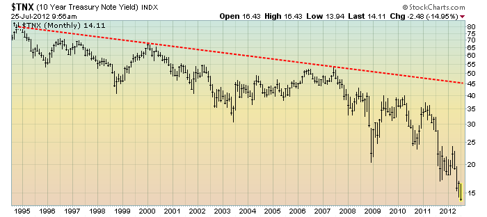
It should be noted that current rates on 10-Year Treasury Yields are, from a long-term historical view, extremely depressed.  This can be seen in a monthly chart of 10-Year Treasury Yields dating back to 1994, on a LOG-basis, with a red trendline shown:

(click on chart to enlarge image)(chart courtesy of StockCharts.com; chart creation and annotation by the author)


-

Many investors, including those very prominent, currently believe that the biggest threat to the future value of bonds is inflation.  While I believe that the threat of inflation is a concern, there are various other factors that pose immense threats as well.

As I wrote in the August 15, 2011 post ("The Bond Bubble - Update") :
While this Bond Bubble may have a little more “upside” left to it, I am of the belief that attempting to derive gains from bonds at this point is akin to “picking up pennies in front of a steamroller” – i.e. there is little to be gained, and much to be lost.
While the Bond Bubble continues, its risks to investors, financial markets and the economy in general has in no way diminished.
The perils of this bond bubble and its future “bursting” can hardly be overstated.  As I mentioned in the April 6, 2010 post ("The Threat Of Rising Interest Rates") :
Falling interest rates over the last 20 years have been an “enabler” of much of our current day economy.
_____

The Special Note summarizes my overall thoughts about our economic situation

SPX at 1337.88 as this post is written

Monday, July 23, 2012

Updates On Economic Indicators July 2012


Here is an update on various indicators that are supposed to predict and/or depict economic activity.  These indicators have been discussed in previous blog posts:

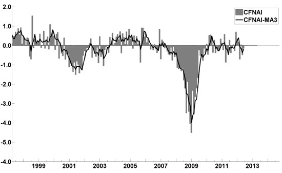
The July Chicago Fed National Activity Index (CFNAI)(pdf) updated as of July 23, 2012:


-

An excerpt from the July 19 update titled “Index forecasts weaker growth” :
The July update of the USA TODAY/IHS Global Insight Economic Outlook Index shows real GDP growth, at a six-month annualized growth rate, slowing to 1.6% in July and then increasing to 2% by year end. While employment, housing (mostly the multifamily sector) and consumer spending are slowly recovering, concerns about the Eurozone and world growth continue.
-


As of 7/20/12 (incorporating data through 7/13/12) the WLI was at 121.9 and the WLI, Gr. was at -2.3%.

A chart of the WLI, Gr. since 2000, from Doug Short’s blog of July 20 titled “ECRI Recession Call:  Weekly Leading Index Declines” :


-


Here is the latest chart, depicting 7-14-10 to 7-14-12:


-


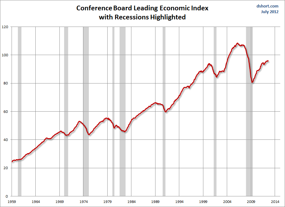
As per the July 19 release, the LEI was at 95.6 and the CEI was at 104.5 in June.

An excerpt from the July 19 release:
Says Ken Goldstein, economist at The Conference Board: “The U.S. economy is growing very slowly. The CEI basically reflects this steady but soft pace of overall economic activity. The LEI is pointing to no strengthening over the next few months, as the economy continues to sail through strong headwinds domestically and internationally.”
Here is a chart of the LEI from Doug Short’s blog post of July 19, titled “Conference Board Leading Economic Index: 'Sustained Weak Growth Through The Fall'” :


_________

I post various indicators and indices because I believe they should be carefully monitored.  However, as those familiar with this blog are aware, I do not necessarily agree with what they depict or imply.
_____

The Special Note summarizes my overall thoughts about our economic situation

SPX at 1339.98 as this post is written

Saturday, July 21, 2012

Long-Term Charts Of The ECRI WLI & ECRI WLI, Gr. – July 20, 2012 Update


As I stated in my July 12, 2010 post ("ECRI WLI Growth History"):
For a variety of reasons, I am not as enamored with ECRI’s WLI and WLI Growth measures as many are.
However, I do think the measures are important and deserve close monitoring and scrutiny.
The movement of the ECRI WLI and WLI, Gr. is particularly notable at this time, as ECRI publicly announced on September 30, 2011 that the U.S. was “tipping into recession,” and ECRI has reaffirmed that view since, most recently in a Bloomberg interview of July 10 titled “Recession Here” in which Lakshman Achuthan argues that the U.S. is now in a recession.

Past notable reaffirmations of the September 30, 2011 recession call by ECRI were seen (in chronological order)  on March 15 (“Why Our Recession Call Stands”) as well as various interviews and statements the week of May 6, including:


Wall Street Journal video, May 9: “Free Market Economies Have Business Cycles


Below are three long-term charts, from Doug Short’s blog post of July 20 titled “ECRI Recession Call: Weekly Leading Index Declines.”  These charts are on a weekly basis through the July 20 release, indicating data through July 13.

Here is the ECRI WLI (defined at ECRI’s glossary):

(click on charts to enlarge images)


-

This next chart depicts, on a long-term basis, the Year-over-Year change in the 4-week moving average of the WLI:


-

This last chart depicts, on a long-term basis, the WLI, Gr.:


_________

I post various economic indicators and indices because I believe they should be carefully monitored.  However, as those familiar with this blog are aware, I do not necessarily agree with what they depict or imply.
_____

The Special Note summarizes my overall thoughts about our economic situation

SPX at 1362.66 as this post is written

Friday, July 20, 2012

St. Louis Financial Stress Index – July 19, 2012 Update


On March 28, 2011 I wrote a post ("The STLFSI") about the  STLFSI (St. Louis Fed’s Financial Stress Index) which is supposed to measure stress in the financial system.  For reference purposes, the most recent chart is seen below.  This chart was last updated on July 19, incorporating data from December 31,1993 to July 13, 2012 on a weekly basis.  The July 13, 2012 value is .299 :

(click on chart to enlarge image)


_________

I post various indicators and indices because I believe they should be carefully monitored.  However, as those familiar with this blog are aware, I do not necessarily agree with what they depict or imply.
_____

The Special Note summarizes my overall thoughts about our economic situation

SPX at 1376.51 as this post is written

Wednesday, July 18, 2012

Charts of Equities’ Performance Since March 9, 2009 And January 1, 1980 - July 18, 2012 Update


In the March 9, 2012 post ("Charts of Equities' Performance Since March 9, 2009 And January 1, 1980") I highlighted two charts for reference purposes.

Below are those two charts, updated through yesterday's close:

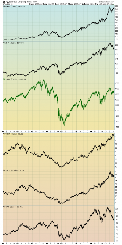
The first is a daily chart of the S&P500 (shown in green), as well as five (AAPL, IBM, WFM, SBUX, CAT) individual stocks, since 2005.  There is a blue vertical line that is very close to the March 6, 2009 low.  As one can see, both the S&P500 performance, as well as many stocks including the five shown, have been strong since the March 6, 2009 low:

(click on chart to enlarge image)(chart courtesy of StockCharts.com; chart creation and annotation by the author)


-

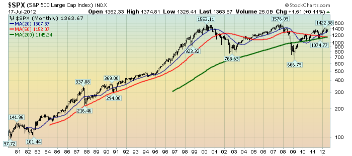
This next chart shows, on a monthly LOG basis, the S&P500 since 1980.  I find this chart notable as it provides an interesting long-term perspective on the S&P500′s performance.  The 20, 50, and 200-month moving averages are shown in blue, red, and green lines, respectively:

(click on chart to enlarge image)(chart courtesy of StockCharts.com; chart creation and annotation by the author)


_____

The Special Note summarizes my overall thoughts about our economic situation

SPX at 1366.82 as this post is written

Monday, July 16, 2012

Consumer Confidence Surveys – As Of July 16, 2012


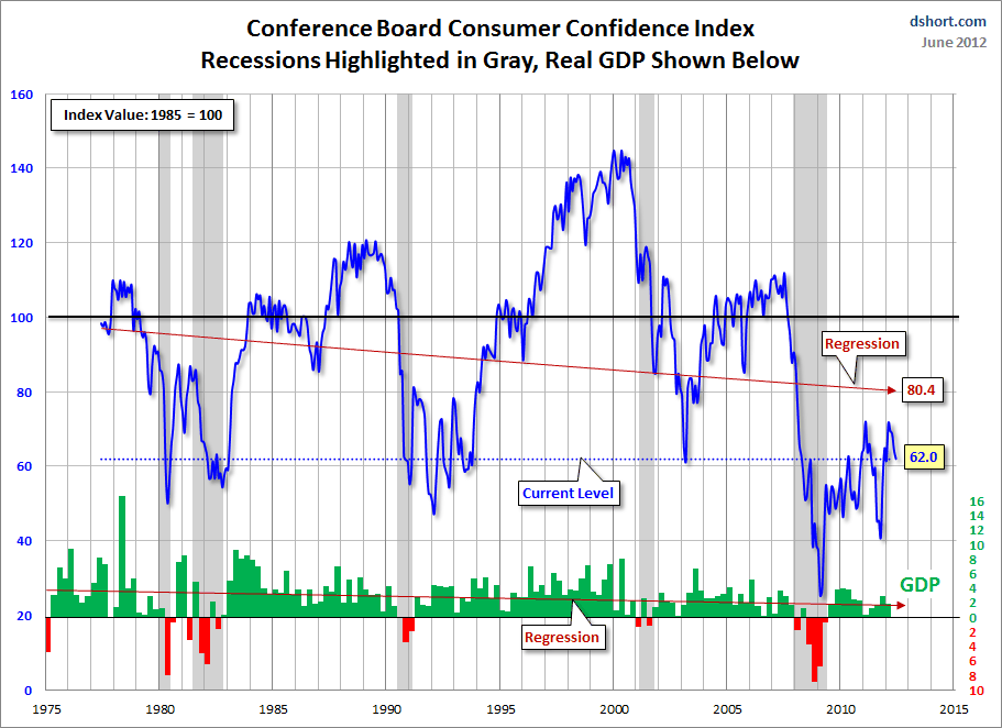
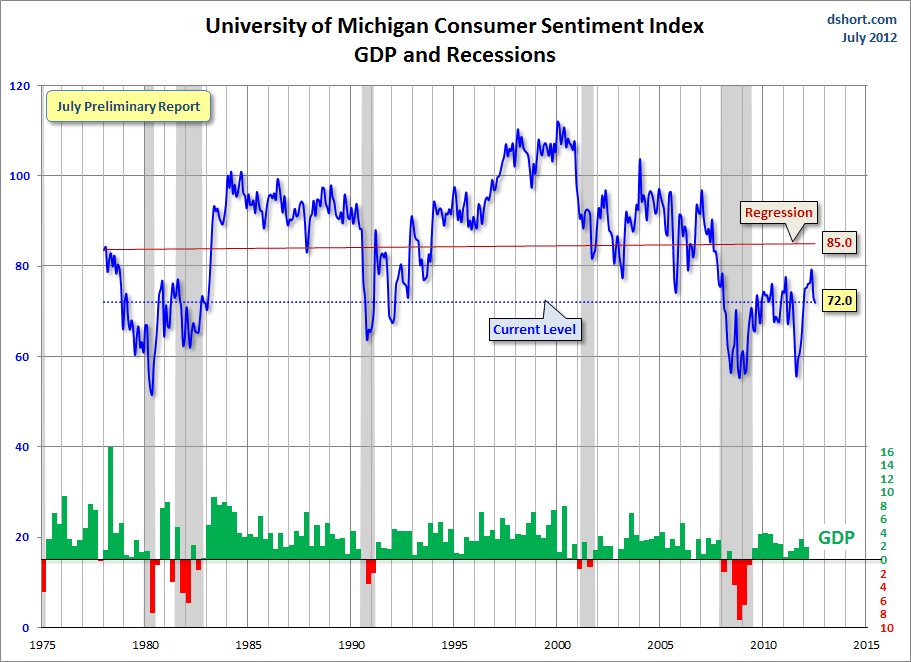
Doug Short had a blog post of July 13 ("Michigan Consumer Sentiment:  A Case Of The Summer Blues") in which he presents the Conference Board Consumer Confidence and Thomson/Reuters University of Michigan Consumer Sentiment Index charts.  They are presented below:

(click on charts to enlarge images)


-


-

There are a few aspects of the above charts that I find highly noteworthy.  Of course, the continuing subdued absolute levels of these two surveys is disconcerting.

Also, I find the “behavior” of these readings to be quite disparate as compared to the other post-recession periods, as shown in the charts between the gray shaded areas (the gray areas denote recessions as defined by the NBER.)

While I don’t believe that confidence surveys should be overemphasized, I find these readings to be very problematical, especially in light of a variety of other highly disconcerting measures highlighted throughout this blog.
_____

The Special Note summarizes my overall thoughts about our economic situation

SPX at 1353.97 as this post is written
Saturday, July 14, 2012

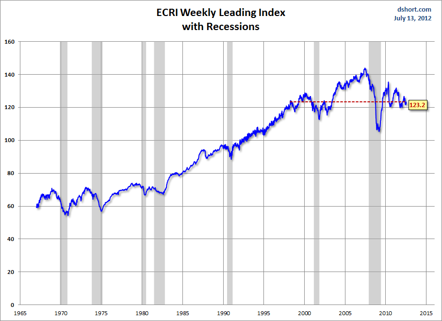
Long-Term Charts Of The ECRI WLI & ECRI WLI, Gr. – July 13, 2012 Update


As I stated in my July 12, 2010 post ("ECRI WLI Growth History"):
For a variety of reasons, I am not as enamored with ECRI’s WLI and WLI Growth measures as many are.
However, I do think the measures are important and deserve close monitoring and scrutiny.
The movement of the ECRI WLI and WLI, Gr. is particularly notable at this time, as ECRI publicly announced on September 30, 2011 that the U.S. was “tipping into recession,” and ECRI has reaffirmed that view since, most recently in a Bloomberg interview this week (July 10) titled "Recession Here" in which Lakshman Achuthan argues that the U.S. is now in a recession.

Past notable reaffirmations of the September 30, 2011 recession call by ECRI were seen (in chronological order)  on March 15 (“Why Our Recession Call Stands”) as well as various interviews and statements the week of May 6, including:


Wall Street Journal video, May 9: “Free Market Economies Have Business Cycles


Below are three long-term charts, from Doug Short’s blog post of July 13 titled “ECRI Recession Call: Weekly Leading Index Improves Yet Again.”  These charts are on a weekly basis through the July 13 release, indicating data through July 6.

Here is the ECRI WLI (defined at ECRI’s glossary):

(click on charts to enlarge images)


-

This next chart depicts, on a long-term basis, the Year-over-Year change in the 4-week moving average of the WLI:


-

This last chart depicts, on a long-term basis, the WLI, Gr.:


_________

I post various economic indicators and indices because I believe they should be carefully monitored.  However, as those familiar with this blog are aware, I do not necessarily agree with what they depict or imply.
_____

The Special Note summarizes my overall thoughts about our economic situation

SPX at 1356.78 as this post is written
Friday, July 13, 2012

St. Louis Financial Stress Index – July 12, 2012 Update


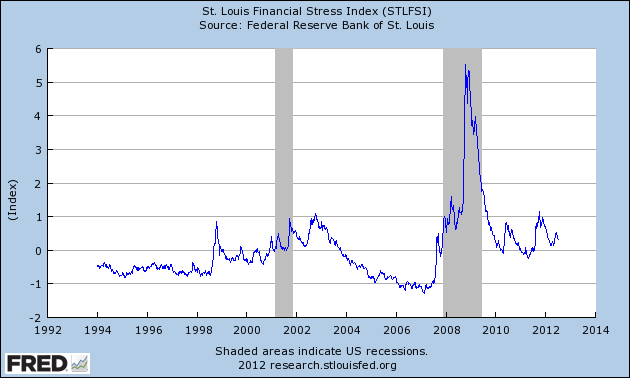
On March 28, 2011 I wrote a post ("The STLFSI") about the  STLFSI (St. Louis Fed’s Financial Stress Index) which is supposed to measure stress in the financial system.  For reference purposes, the most recent chart is seen below.  This chart was last updated on July 12, incorporating data from December 31,1993 to July 6, 2012 on a weekly basis.  The July 6, 2012 value is .314 :


_________

I post various indicators and indices because I believe they should be carefully monitored.  However, as those familiar with this blog are aware, I do not necessarily agree with what they depict or imply.
_____

The Special Note summarizes my overall thoughts about our economic situation

SPX at 1347.71 as this post is written