On Wednesday, March 19, 2014 Janet Yellen gave her scheduled
press conference. (video)
From Janet Yellen’s opening comments
Inflation has continued to run below the Committee’s 2 percent objective. Given that longer-term inflation expectations appear to be well-anchored, and in light of the ongoing recovery in the United States and in many economies around the world, the FOMC continues to expect inflation to move gradually back toward its objective. The Committee is mindful that inflation running persistently below its objective could pose risks to economic performance. The Committee also recognizes, however, that policy actions tend to exert pressure on inflation that is manifest only gradually over time. The FOMC will continue assessing incoming data carefully to ensure that policy is consistent with attaining the FOMC’s longer-run objectives of maximum employment and inflation of 2 percent.
also:
Let me now return to our decision to make another measured reduction in the pace of asset purchases. Starting next month, we will be purchasing $55 billion of securities per month, down $10 billion per month from our current rate. Even after today’s action takes effect, we will continue to significantly expand our holdings of longer-term securities, and we will also continue to roll over maturing Treasury securities and reinvest principal payments from the FOMC’s holdings of agency debt and agency mortgage-backed securities in agency mortgage-backed securities. These sizable and still-increasing holdings will continue to put downward pressure on longer-term interest rates, support mortgage markets, and make financial conditions more accommodative, helping to support job creation and a return of inflation to the Committee’s objective.
Janet Yellen’s responses as indicated to the various questions:
YLAN MUI. Hi, Ylan from the Washington Post. You mentioned in your testimony on Capitol Hill recently that the Fed was trying to assess the balance of weather effects versus more fundamental weakness in the economy as the reason for the slowdown in growth in the first quarter, and you guys mentioned in the statement weather specifically. Does that mean that the Fed’s analysis has come down on the side weather, or are you still concerned that there could be something else going that can be contributing in slower growth, and you guys also lowered your forecast for GDP growth this year?
CHAIR YELLEN. So I'd say certainly the analysis that we've done, and we did spent a lot of time discussing weather and how it’s affected businesses and households in various parts of the country. Certainly weather has played an important role in weakening economic activity in Q1. It's not the only factor that is at work, and most projections for growth in the first quarter are reasonably weak. It's an important factor. It's not the only factor. But I would say it's likely in the view of most of the Committee to begin to wash out in the second quarter, and we can even see some rebound.
Now, I would say I know what we've said about weather is a little bit complicated and confusing. So, you know, let me just say between December and January, the Committee saw a data that led it to be quite a bit more optimistic about the economic outlook. So I would say incoming data since January, when our statement sounded quite an optimistic tone, partly down due to weather and partly down because we probably overdid the optimism in January. So in some sense, our views have moved around here a little bit, but if we take December to March, Committee's views are largely unchanged.
also:
ANN SAPHIR. To be clear. I just wanted to be clear about that. Then once you do wind down the bond buying program, could you tell us how long of a gap we might expect before the rate hikes do begin?
CHAIR YELLEN. So, the language that we use in the statement is “considerable period.” So, I, you know, this is the kind of term it's hard to define. But, you know, probably means something on the order of around six months or that type of thing. But, you know, it depends what the statement is saying as it depends what conditions you like. We need to see where the labor market is, how close are we to our full employment goal--that will be a complicated assessment not just based on a single statistic--and how rapidly as we moving toward it. Are we really close and moving fast? Or are we getting closer but moving very slowly? And then, what the statement emphasizes and this is the same language we used in December and January, we used the language especially if inflation is running below our 2 percent objective. Inflation matters here, too, and our general principle tries to capture that notion. If we have a substantial short fall in inflation, if inflation is persistently running below our 2 percent objective, that is a very good reason to hold the funds rate at its present range for longer.
also:
JEFF KERNS. Jeff Kerns from Bloomberg News. You’ve spoken in the past about, thinking about back to March of last year, of how you supplement your view of the labor market beyond unemployment with other gauges like quick rates and layouts and things like that. How was your--how's your dashboard evolved in the past few months in terms both of the--which indicators you like to watch most, and also in terms of the quality of data that you think, whether it's positive, negative, that you're getting from these indicators. Thank you.
CHAIR YELLEN. So, I have talked in the past about indicators I like to watch or I think that are relevant in assessing the labor market. In addition to the standard unemployment rate, certainly look at boarder measures of unemployment. I mentioned U6 in my statement. It--five percent of the labor force working part time on an involuntary basis, that's an exceptionally high number relative to the measured unemployment rate, and so, to my mind, is a form of slack that is, adds to what we see in the normal unemployment rate and is unusually large. However, it is coming down as well as U3. It's moving in the right direction and it's moved even more recently than U3. Of course, I watch discouraged and marginally attached workers. The share of longterm unemployment has been immensely high and can be very stubborn in bringing down, that’s something that I watch closely again, that remains exceptionally high but it has come down from something like 45 percent, high 30s, but that's certainly in my dashboard. Labor force participation, I do think most research suggests that due to demographic factors, labor force participation will be coming down and there has been a downward trend now for a number of years. But I think there is also a cyclical component in the fact that labor force participation is depressed. And so, it may be that as the economy begins to strengthen, we could see labor force participation flattened out for a time as discouraged workers start moving back into the labor market. And so that's something I'm watching closely. In the Committee, we'll have to watch-- there are different views on this within the Committee and it's hard to know definitively what part of labor force participation is structural versus cyclical. So, it's something to watch closely. I've also mentioned in the past measures of labor market turnover. You mentioned quits. A remarkably large share of workers quit their jobs every month, usually going directly into another job. And I take the quit rate in many ways as a sign of the health of the economy. When workers are scared they won't be able to get other jobs they show a reduced willingness to quit their jobs. Now, quit rates now are below normal pre-recession levels, but on the other hand, they have come up over time and so we have seen improvement. The job opening rate has also come up. The hires rate, however, remains extremely depressed and I take that as a sign of a weaker labor market. But most of these measures, although they don't paint the identical extent of improvement, if you ask about my dashboard, the dial on virtually all of those things is moving in a direction of improvement. The final thing I've mentioned is wages and wage growth has really been very low. I know there is perhaps one isolated measure of wage growth that suggests some uptick, but most measures of wage increase are running at very low levels. In fact, with productivity growth, we have, and two percent inflation, one would probably expect to see on an ongoing basis something between perhaps three and four percent wage inflation would be normal. Wage inflation has been running at two percent. So not only is it depressed, signaling weakness in the labor market, but it is certainly not flashing and increase it, and it might signal some tightening or meaningful pressures on inflation, at least over time. And I would say we're not seeing that.
also:
WYATT ANDREWS. Madam Chair, Wyatt Andrews from CBS. For tens of millions of Americans, the recovery is an awful long time coming. May we know your thoughts on why the recovery is so slow and why the economy is not creating more jobs?
CHAIR YELLEN. Well, I think the short answer is that we have lived through a devastating financial crisis that has taken an exceptional toll on the economy in many different ways, from housing to leaving a huge number of home owners with mortgages, living in homes with mortgages that are underwater, has had a highly negative effect on their credit readings and their ability to access credit, has left businesses with very cautious attitudes that we see in business investment spending that is very restrained. On top of that, we've had weakness in the global economy and we've had a very tight fiscal policy at home after stimulus, if the onset of the recession, we've had a good deal of fiscal consolidation in the United States and, at a time when fiscal policy normally in the past would have been serving to create jobs, fiscal policy from that standpoint has served as a headwind to the recovery. And if the federal--especially at the federal level--but also with state and local levels as well. And so, we have had a disappointing recovery. And monetary policy has tried to do what we can to offset that. But, you know, the linkages aren't as strong and aren't as quick as we might ideally like them to be.
also:
KATE DAVIDSON. Hi, Kate Davidson from Politico. Much has been made about the fact that you and your predecessor agreed on many policies. You shared a lot of the same policy views. Can you tell us one way in which your chairmanship will be different than Ben Bernanke's?
CHAIR YELLEN. Well, I think we are committed to exactly the same set of goals. And, you know, as I indicated I--my goal, and I will, you know, throw myself into this as whole heartedly as I can, is to make rapid progress, as rapid progress as we possibly can in getting this recovery back on track and putting Americans back to work and into jobs, and in moving inflation back up to levels that--at the Committee's target of 2 percent. My predecessor was also devoted to that. Strengthening the financial system is a work in progress. And he made large inroads in strengthening the financial system. I just say there is more work to be done, have a long to-do list. I would absolutely, it's high priority for me to see further work done in addressing too big to fail. We have a to-do list of things we want to accomplish, and then assessing threats to financial stability because neither one of us, and no one wants to live through a financial crisis like the last one. And we want to be extremely cognizant of emerging threats to the financial system. So, I haven't answered your question by saying that I will be different, but I think he had a very good agenda and it's one I shared. It's why I came to Washington to be vice chair and it's the agenda I expect to continue pursuing.
also:
VICTORIA MCGRANE. Victoria McGrane from Dow Jones Newswires. You've spoken about how unemployment is more than just statistics to you. And I wanted to ask when you've made that statement, who do you have in mind or--and what do you do if anything to keep in touch with that kind of human side of the impact of the economic crisis and slow recovery that we've had?
CHAIR YELLEN. Well, I'd be surprised if anyone in this room doesn't know someone who has been touched by the crisis, by unemployment, by difficulties in getting jobs, and that’s-is true of me and my family and friends, I think as it is probably for many of you. I talked to a broad range of business contacts and try to stay in touch with what's happening with real people in the economy. We have--do a lot of work in community development in the Fed and have groups come to talk to us and explain to us how their communities have been affected by the economic situation and by the housing crisis. When I was in San Francisco, we worked--you know, we had programs there, we worked very closely particularly in low-income communities that have been very badly affected, to design programs that could potentially be helpful. We tried to study what kinds of programs can be most effective and to try to understand what kinds of advice we could give to those in the community development lending field to help. So, I do try to listen to people that represent communities that are experiencing the worst of the crisis and stay in touch with it that way.
_____
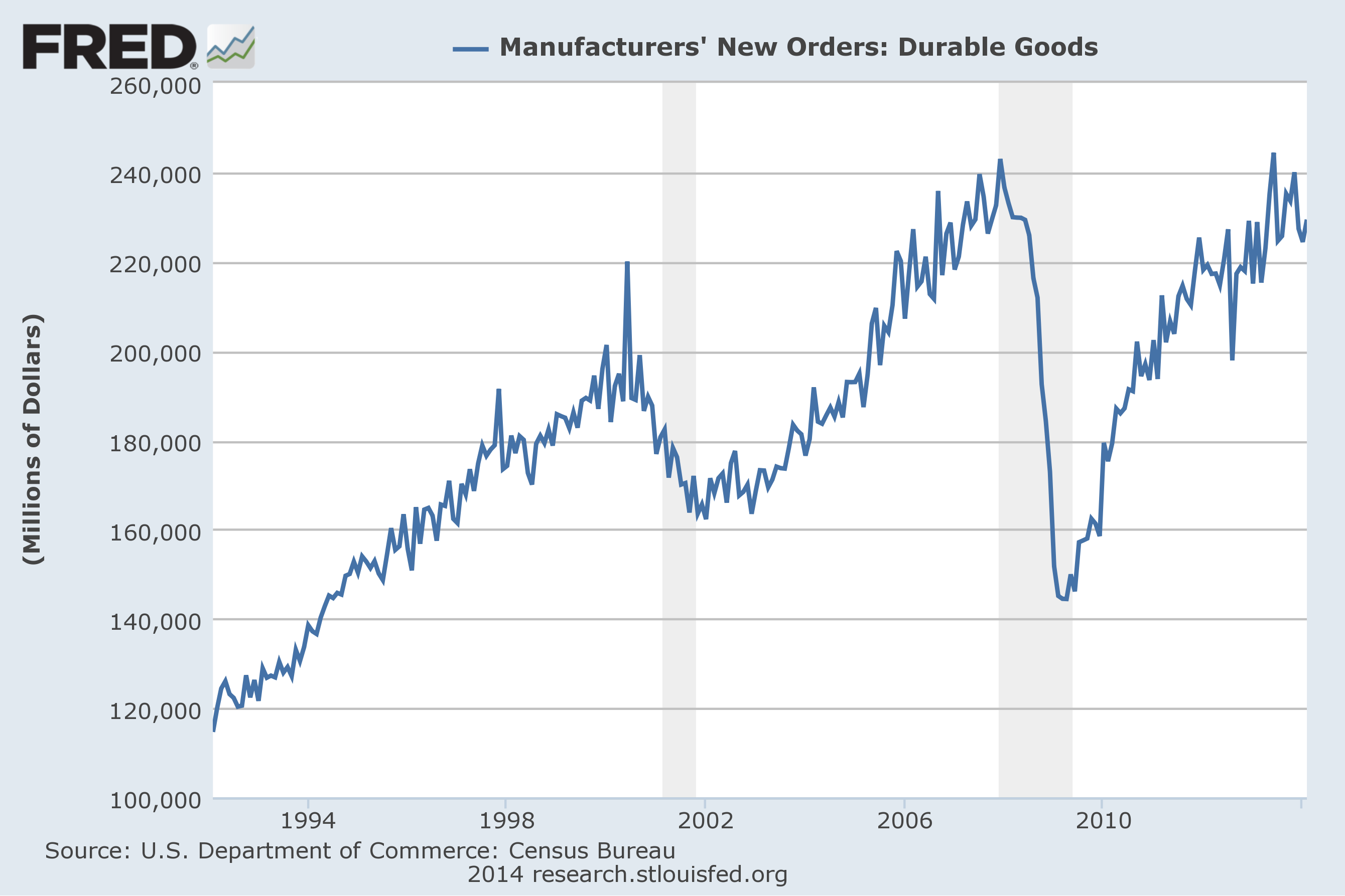
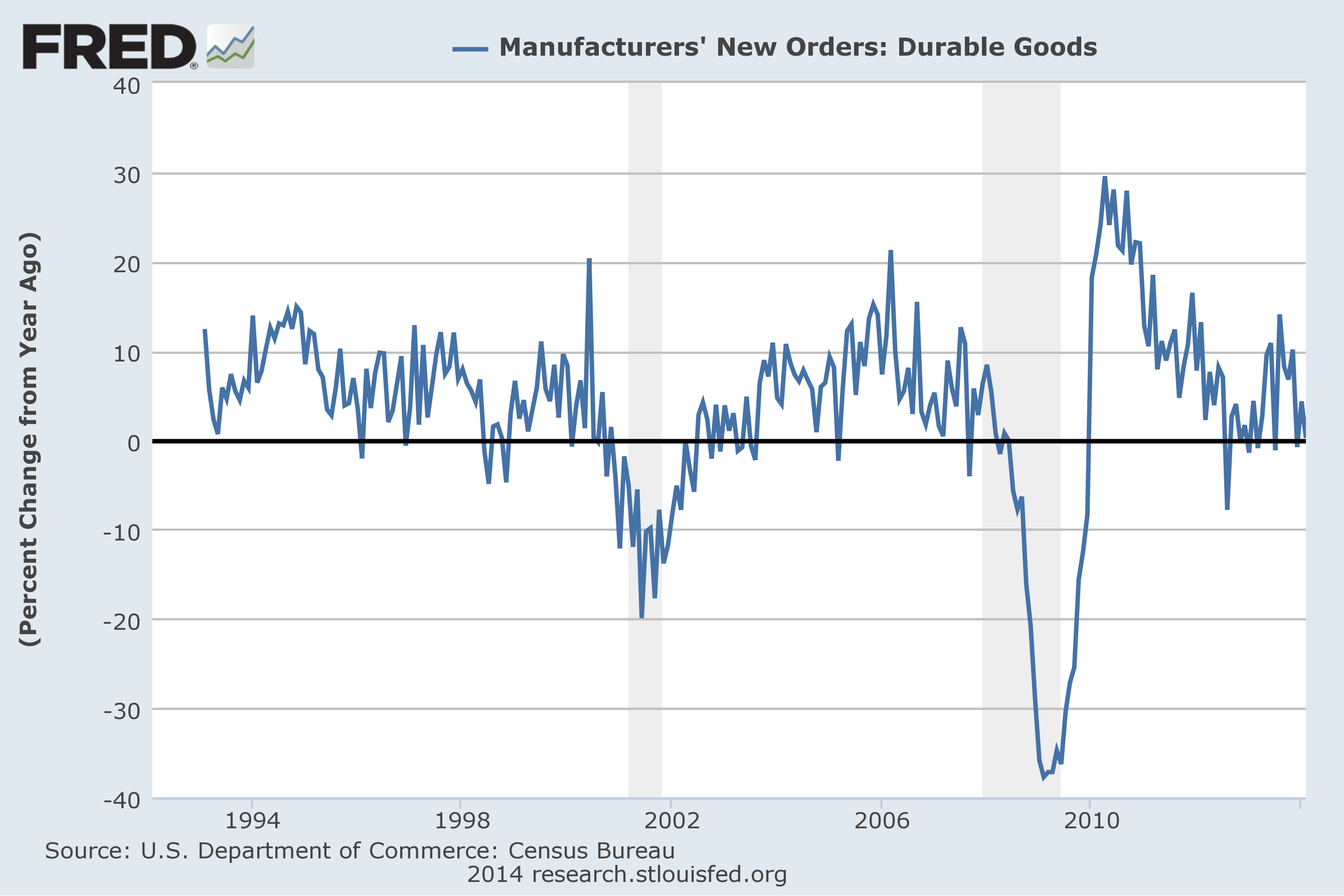
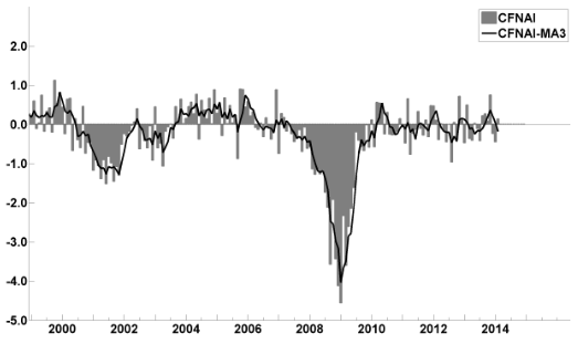
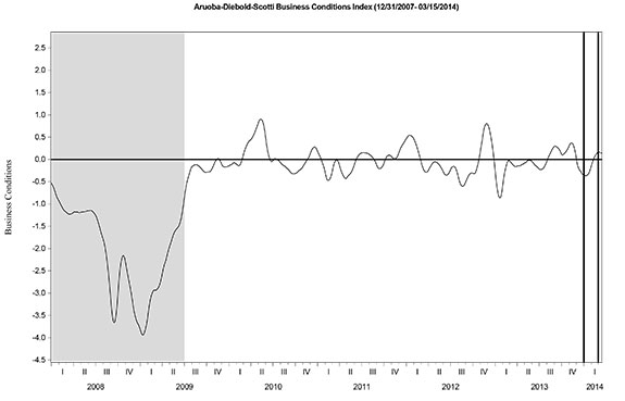
The Special Note summarizes my overall thoughts about our economic situation
SPX at 1881.01 as this post is written