Friday, February 27, 2015

Consumer Confidence Surveys – As Of February 27, 2015

Doug Short had a blog post of February 27, 2015 (“Michigan Consumer Sentiment Remains off Its January Peak“) in which he presents the latest Conference Board Consumer Confidence and Thomson/Reuters University of Michigan Consumer Sentiment Index charts.  They are presented below:
(click on charts to enlarge images)
Conference Board Consumer Confidence
Michigan Consumer Sentiment
There are a few aspects of the above charts that I find highly noteworthy.  Of course, until the recent sudden upswing, the continued subdued absolute levels of these two surveys was disconcerting.
Also, I find the “behavior” of these readings to be quite disparate as compared to the other post-recession periods, as shown in the charts between the gray shaded areas (the gray areas denote recessions as defined by the NBER.)
While I don’t believe that confidence surveys should be overemphasized, I find these readings to be very problematical, especially in light of a variety of other highly disconcerting measures highlighted throughout this site.
_____
The Special Note summarizes my overall thoughts about our economic situation
SPX at 2110.84 as this post is written

Thursday, February 26, 2015

Money Supply Charts Through January 2015

For reference purposes, below are two sets of charts depicting growth in the money supply.
The first shows the MZM (Money Zero Maturity), defined in FRED as the following:
M2 less small-denomination time deposits plus institutional money funds.
Money Zero Maturity is calculated by the Federal Reserve Bank of St. Louis.
Here is the “MZM Money Stock” (seasonally adjusted) chart, updated on February 20, 2015 depicting data through January 2015, with value $12,977.8 Billion:
MZM seasonally adjusted
Here is the “MZM Money Stock” chart on a “Percent Change From Year Ago” basis:
MZM seasonally adjusted percent change from year ago
Data Source: FRED, Federal Reserve Economic Data, Federal Reserve Bank of St. Louis; accessed February 26, 2015:
The second set shows M2, defined in FRED as the following:
M2 includes a broader set of financial assets held principally by households. M2 consists of M1 plus: (1) savings deposits (which include money market deposit accounts, or MMDAs); (2) small-denomination time deposits (time deposits in amounts of less than $100,000); and (3) balances in retail money market mutual funds (MMMFs). Seasonally adjusted M2 is computed by summing savings deposits, small-denomination time deposits, and retail MMMFs, each seasonally adjusted separately, and adding this result to seasonally adjusted M1.
Here is the “M2 Money Stock” (seasonally adjusted) chart, updated on February 19, 2015, depicting data through January 2015, with value $11,700.9 Billion:
M2 seasonally adjusted
Here is the “M2 Money Stock” chart on a “Percent Change From Year Ago” basis:
M2 seasonally adjusted percent change from year ago
Data Source: FRED, Federal Reserve Economic Data, Federal Reserve Bank of St. Louis; accessed February 26, 2015:
_____
The Special Note summarizes my overall thoughts about our economic situation
SPX at 2110.96 as this post is written

Durable Goods New Orders – Long-Term Charts Through January 2015

Many people place emphasis on Durable Goods New Orders as a prominent economic indicator and/or leading economic indicator.
For reference, below are charts depicting this measure.
First, from the St. Louis Fed site (FRED), a chart through January, updated on February 26, 2015.  This value is 236,147 ($ Millions) :
(click on charts to enlarge images)
Durable Goods New Orders
Here is the chart depicting this measure on a “Percentage Change from a Year Ago” basis:
durable goods new orders percent change from year ago
Data Source: FRED, Federal Reserve Economic Data, Federal Reserve Bank of St. Louis: Manufacturers’ New Orders:  Durable Goods [DGORDER]; U.S. Department of Commerce: Census Bureau; accessed February 26, 2015;
_________
I post various indicators and indices because I believe they should be carefully monitored.  However, as those familiar with this blog are aware, I do not necessarily agree with what they depict or imply.
_____
The Special Note summarizes my overall thoughts about our economic situation
SPX at 2111.24 as this post is written

Wednesday, February 25, 2015

Chicago Fed National Financial Conditions Index (NFCI)

The St. Louis Fed’s Financial Stress Index (STLFSI) is one index that is supposed to measure stress in the financial system.  Its reading as of the February 19, 2015 update (reflecting data through February 13) is -.928.
Of course, there are a variety of other measures and indices that are supposed to measure financial stress and other related issues, both from the Federal Reserve as well as from private sources.
Two other indices that I regularly monitor include the Chicago Fed National Financial Conditions Index (NFCI) as well as the Chicago Fed Adjusted National Financial Conditions Index (ANFCI).
Here are summary descriptions of each, as seen in FRED:
The National Financial Conditions Index (NFCI) measures risk, liquidity and leverage in money markets and debt and equity markets as well as in the traditional and “shadow” banking systems. Positive values of the NFCI indicate financial conditions that are tighter than average, while negative values indicate financial conditions that are looser than average.
The adjusted NFCI (ANFCI). This index isolates a component of financial conditions uncorrelated with economic conditions to provide an update on how financial conditions compare with current economic conditions.
For further information, please visit the Federal Reserve Bank of Chicago’s web site:
Below are the most recently updated charts of the NFCI and ANFCI, respectively.
The NFCI chart below was last updated on February 25, 2015 incorporating data from January 5,1973 to February 20, 2015, on a weekly basis.  The February 20, 2015 value is -.70:
(click on chart to enlarge image)
NFCI 2-25-15 -.70
Data Source: FRED, Federal Reserve Economic Data, Federal Reserve Bank of St. Louis; accessed February 25, 2015:
The ANFCI chart below was last updated on February 25, 2015 incorporating data from January 5,1973 to February 20, 2015, on a weekly basis.  The February 20 value is .08:
ANFCI 2-25-15 .08
Data Source: FRED, Federal Reserve Economic Data, Federal Reserve Bank of St. Louis; accessed February 25, 2015:
_________
I post various indicators and indices because I believe they should be carefully monitored.  However, as those familiar with this blog are aware, I do not necessarily agree with what they depict or imply.
_____
The Special Note summarizes my overall thoughts about our economic situation
SPX at 2114.81 as this post is written

Tuesday, February 24, 2015

Trends Of S&P500 Earnings Forecasts

S&P500 earnings trends and estimates are a notably important topic, for a variety of reasons, at this point in time.
FactSet publishes a report titled “Earnings Insight” that contains a variety of information including the trends and expectations of S&P500 earnings.
For reference purposes, here are two charts as seen in the “Earnings Insight” (pdf) report of February 20, 2015:
from page 24:
(click on charts to enlarge images)
S&P500 2015 and 2016 earnings estimates
from page 25:
S&P500 earnings 2005-2016
_____
I post various economic forecasts because I believe they should be carefully monitored.  However, as those familiar with this blog are aware, I do not agree with many of the consensus estimates and much of the commentary in these forecast surveys.
_____
The Special Note summarizes my overall thoughts about our economic situation
SPX at 2115.97 as this post is written

S&P500 Earnings Estimates – Years 2014 Through 2016

As many are aware, Thomson Reuters publishes earnings estimates for the S&P500.  (My other posts concerning S&P earnings estimates can be found under the S&P500 Earnings label)
The following estimates are from Exhibit 12 of “The Director’s Report” (pdf) of February 23, 2015, and represent an aggregation of individual S&P500 component “bottom up” analyst forecasts.  For reference, the Year 2013 value is $109.68/share:
Year 2014 estimate:
$117.73/share
Year 2015 estimate:
$120.31/share
Year 2016 estimate:
$136.15/share
_____
I post various economic forecasts because I believe they should be carefully monitored.  However, as those familiar with this blog are aware, I do not agree with many of the consensus estimates and much of the commentary in these forecast surveys.
_____
The Special Note summarizes my overall thoughts about our economic situation
SPX at 2112.53 as this post is written

Monday, February 23, 2015

Standard & Poor’s S&P500 Earnings Estimates For 2015 & 2016 – As Of February 19, 2015

As many are aware, Standard & Poor’s publishes earnings estimates for the S&P500.  (My posts concerning their estimates can be found under the S&P500 Earnings label)
For reference purposes, the most current estimates are reflected below, and are as of February 19, 2015:
Year 2015 estimates add to the following:
-From a “bottom up” perspective, operating earnings of $118.32/share
-From a “top down” perspective, operating earnings of N/A
-From a “bottom up” perspective, “as reported” earnings of $111.76
Year 2016 estimates add to the following:
-From a “bottom up” perspective, operating earnings of $136.52/share
-From a “top down” perspective, operating earnings of N/A
-From a “bottom up” perspective, “as reported” earnings of N/A
_____
I post various economic forecasts because I believe they should be carefully monitored.  However, as those familiar with this blog are aware, I do not agree with many of the consensus estimates and much of the commentary in these forecast surveys.
_____
The Special Note summarizes my overall thoughts about our economic situation
SPX at 2108.10 as this post is written

Updates Of Economic Indicators February 2015

Here is an update of various indicators that are supposed to predict and/or depict economic activity. These indicators have been discussed in previous blog posts:
The February 2015 Chicago Fed National Activity Index (CFNAI) updated as of February 23, 2015:
cfnai-monthly-ma3-
As of February 20, 2015 (incorporating data through February 13, 2015) the WLI was at 130.3 and the WLI, Gr. was at -4.3%.
A chart of the WLI,Gr., from Doug Short’s post of February 20, 2015, titled “ECRI Recession Watch:  Update“:
ECRI WLI,Gr.
Here is the latest chart, depicting the ADS Index from December 31, 2007 through February 14, 2015:
ads index
As per the February 19, 2015 press release, titled “The Conference Board Leading Economic Index (LEI) for the U.S. Increased,” the LEI was at 121.1 and the CEI was at 111.6 in January.
An excerpt from the February 19 release:
“The U.S. Leading Economic Index increased again in January, but its pace of growth has moderated in recent months,” said Ataman Ozyildirim, Economist at The Conference Board. “While the LEI suggests a positive short-term outlook in 2015, the lack of strong momentum in residential construction, along with a weak outlook for new orders in manufacturing, poses a downside risk for the U.S. economy.”
Here is a chart of the LEI from Doug Short’s blog post of February 19 titled “Conference Board Leading Economic Index:  Growth Moderates“:
Conference Board LEI
 
_________
I post various indicators and indices because I believe they should be carefully monitored.  However, as those familiar with this blog are aware, I do not necessarily agree with what they depict or imply.
_____
The Special Note summarizes my overall thoughts about our economic situation
SPX at 2103.47 as this post is written

The U.S. Economic Situation – February 23, 2015 Update

Perhaps the main reason that I write of our economic situation is that I continue to believe, based upon various analyses, that our economic situation is in many ways misunderstood.  While no one likes to contemplate a future rife with economic adversity, current and future economic problems must be properly recognized and rectified if high-quality, sustainable long-term economic vitality is to be realized.
There are an array of indications and other “warning signs” – many readily apparent – that current economic activity and financial market performance is accompanied by exceedingly perilous dynamics.
I have written extensively about this peril, including in the following:
Building Financial Danger” (ongoing updates)
My analyses continues to indicate that the growing level of financial danger will lead to the next stock market crash that will also involve (as seen in 2008) various other markets as well.  Key attributes of this next crash is its outsized magnitude (when viewed from an ultra-long term historical perspective) and the resulting economic impact.  This next financial crash is of tremendous concern, as my analyses indicate it will lead to a Super Depression – i.e. an economy characterized by deeply embedded, highly complex, and difficult-to-solve problems.
For long-term reference purposes, here is a chart of the Dow Jones Industrial Average since 1900, depicted on a monthly basis using a LOG scale (updated through February 20, 2015, with a last value of 18140.44):
(click on chart to enlarge image)(chart courtesy of StockCharts.com)
DJIA 1900-present
_____
The Special Note summarizes my overall thoughts about our economic situation
SPX at 2110.30 as this post is written

Friday, February 20, 2015

Long-Term Charts Of The ECRI WLI & ECRI WLI, Gr. – February 20, 2015 Update

As I stated in my July 12, 2010 post (“ECRI WLI Growth History“):
For a variety of reasons, I am not as enamored with ECRI’s WLI and WLI Growth measures as many are.
However, I do think the measures are important and deserve close monitoring and scrutiny.
Below are three long-term charts, from Doug Short’s blog post of February 20, 2015 titled “ECRI Recession Watch:  Weekly Update.”  These charts are on a weekly basis through the February 20 release, indicating data through February 13, 2015.
Here is the ECRI WLI (defined at ECRI’s glossary):
ECRI WLI
This next chart depicts, on a long-term basis, the Year-over-Year change in the 4-week moving average of the WLI:
Dshort 2-20-15 - ECRI-WLI-YoY -1.6 percent
This last chart depicts, on a long-term basis, the WLI, Gr.:
ECRI WLI,Gr.
_________
I post various economic indicators and indices because I believe they should be carefully monitored.  However, as those familiar with this blog are aware, I do not necessarily agree with what they depict or imply.
_____
The Special Note summarizes my overall thoughts about our economic situation
SPX at 2109.05 as this post is written

Trends Of U.S. Treasury Yields – February 20, 2015 Update

For references purposes, below are two charts that show the trend in interest rates for various Treasuries, including the 3-Month, 2-Year, 5-Year, 7-Year, and 10-Year.
A chart showing the interest rate trends of the last 20 years, on a monthly basis:
(click on chart to enlarge image)(chart courtesy of StockCharts.com; chart creation and annotation by the author)
U.S. Treasury Yields
A chart showing the interest rate trends of the last year, on a daily basis:
(click on chart to enlarge image)(chart courtesy of StockCharts.com; chart creation and annotation by the author)
U.S. Treasury Yields
_____
The Special Note summarizes my overall thoughts about our economic situation
SPX at 2097.45 as this post is written

Thursday, February 19, 2015

Chicago Fed National Financial Conditions Index (NFCI)

The St. Louis Fed’s Financial Stress Index (STLFSI) is one index that is supposed to measure stress in the financial system.  Its reading as of the February 19, 2015 update (reflecting data through February 13) is -.928.
Of course, there are a variety of other measures and indices that are supposed to measure financial stress and other related issues, both from the Federal Reserve as well as from private sources.
Two other indices that I regularly monitor include the Chicago Fed National Financial Conditions Index (NFCI) as well as the Chicago Fed Adjusted National Financial Conditions Index (ANFCI).
Here are summary descriptions of each, as seen in FRED:
The National Financial Conditions Index (NFCI) measures risk, liquidity and leverage in money markets and debt and equity markets as well as in the traditional and “shadow” banking systems. Positive values of the NFCI indicate financial conditions that are tighter than average, while negative values indicate financial conditions that are looser than average.
The adjusted NFCI (ANFCI). This index isolates a component of financial conditions uncorrelated with economic conditions to provide an update on how financial conditions compare with current economic conditions.
For further information, please visit the Federal Reserve Bank of Chicago’s web site:
Below are the most recently updated charts of the NFCI and ANFCI, respectively.
The NFCI chart below was last updated on February 19, 2015 incorporating data from January 5,1973 to February 13, 2015, on a weekly basis.  The February 13, 2015 value is -.64:
(click on chart to enlarge image)
NFCI 2-19-15 -.64
Data Source: FRED, Federal Reserve Economic Data, Federal Reserve Bank of St. Louis; accessed February 19, 2015:
The ANFCI chart below was last updated on February 19, 2015 incorporating data from January 5,1973 to February 13, 2015, on a weekly basis.  The February 13 value is .11:
ANFCI 2-19-15 .11
Data Source: FRED, Federal Reserve Economic Data, Federal Reserve Bank of St. Louis; accessed February 19, 2015:
_________
I post various indicators and indices because I believe they should be carefully monitored.  However, as those familiar with this blog are aware, I do not necessarily agree with what they depict or imply.
_____
The Special Note summarizes my overall thoughts about our economic situation
SPX at 2099.78 as this post is written

Walmart’s Q4 2015 Results – Comments

I found various notable items in Walmart’s Q4 2015 management call transcript (pdf) dated February 19, 2015.  (as well, there is Walmart’s press release of the Q4 results)
I view Walmart’s results and comments as particularly noteworthy given their retail prominence and focus on low prices.  I have previously commented on their quarterly management call comments; these previous posts are found under the “paycheck to paycheck” label.
Here are various excerpts that I find most notable:
comments from Doug McMillon, President and CEO, page 4:
Now clearly, our sales benefitted from customers having more spending power due to lower gas prices in most of our large markets. In addition, product inflation and more favorable weather were a tailwind to U.S. comp sales.
comments from Doug McMillon, President and CEO, page 7:
Value matters to everyone, regardless of household income level, and digital access creates even more price transparency. Being the low price leader has been a part of our customer proposition; and it will continue to be a priority in the future.
also:
Walmart U.S. improved its sales and operating income trends each consecutive quarter during fiscal 2015. Fourth quarter comp sales were the strongest in more than 2 years, with positive traffic for the first time in 9 quarters. Our Neighborhood Markets have continued to deliver strong comps. Our emphasis remains on the quality of the stores that we open, not the quantity.
comments from Greg Foran, president and CEO of Walmart U.S., page 13:
First, we believe associates equally value their hourly rate and hours worked. We’re happy to announce improvements to both aspects of associates’ earning opportunity. Current and future associates will benefit from this initiative, which ensures that Walmart hourly associates earn at least $1.75 above today’s federal minimum wage, or $9.00 per hour in April. And current associates will earn $10.00 per hour or higher by next February.
comments from Greg Foran, president and CEO of Walmart U.S., page 16:
And finally, we saw strong performance from our Neighborhood Market format. While all formats experienced positive sales comps, our traditional Neighborhood Markets continue to outperform Walmart supercenters and discount stores, providing customers with the products and services they desire at locations that are convenient to them. Our traditional Neighborhood Markets delivered approximately a 7.7 percent comp for the quarter.
comments from Greg Foran, president and CEO of Walmart U.S., page 17:
Now let me cover our full-year financial performance. For the year, net sales increased 3.1 percent, or $8.6 billion, to $288 billion. Comp sales improved 0.5 percent for the 52-week period ended January 30, while operating income declined 2.1 percent to $21.3 billion. Gross profit improved 2.6 percent for the year, with a 12 basis point decline in gross profit rate. This was primarily driven by price investments in meat and preferred Medicare prescription plans.
comments from Greg Foran, president and CEO of Walmart U.S., page 18:
In FY16, we expect to open approximately 60 to 70 supercenters, including relocations and expansions. Additionally, we’ll open an estimated 180 to 200 Neighborhood Markets, including 10-15 smaller-format locations, as we complete our openings of this test program. We’ll continue to monitor the progress of these test locations before making any further commitments to this format. We expect to add approximately 15 to 16 million retail square feet this year.
 
_____
The Special Note summarizes my overall thoughts about our economic situation
SPX at 2098.19 as this post is written

Tuesday, February 17, 2015

The Stock Market Bubble - February 2015 Update

This post is an update to various past posts concerning the stock market bubble, most recently that of November 21, 2013 titled "Is The Stock Market Experiencing A Bubble?"
Many people don't believe that we are currently experiencing a stock market bubble because their primary reference regarding stock market bubbles is that of the mid- to late-1990s, in which there was a stock market bubble with immense speculative activity, wildly resplendent "price action" in the technology and internet sectors, and many exceedingly high (in some cases stratospheric) company valuations.  It was an amazingly notable period for many reasons.
Today's overall stock market bubble is not as "overt" and "flamboyant" in nature and many "bubble" aspects aren't necessarily (widely) recognized or necessarily understood.  However, just because the obvious signs aren't glaringly obvious doesn't mean that the bubble's magnitude is smaller.
One of the problems in identifying an asset bubble is that there is no standard definition of one, and many - if not most - bubbles are identified "after the fact."  As there is no standard definition of an asset bubble, there is no definitive measures to "prove" or "disprove" of one's existence.
However, there are many underlying financial conditions that historically have led to asset bubbles.  While the list is extensive, among the more notable conditions are (ultra) easy monetary policy and the accompanying ultra-low interest rate environment, both of which have been extant for a number of years now.
My posts concerning the existence of the stock market as being in an asset bubble date back to 2011.  While I base this view both on technical analysis and fundamental analysis factors, in this post I will primarily focus on fundamental measures.  While a full discussion of these factors would be exceedingly lengthy and, at times, very complex, below is discussion of some of the more notable factors, including earnings and valuations.
Earnings
Perhaps the most common equity valuation metric in use today is the P/E ratio.  By this measure, stocks don't necessarily appear exceedingly expensive.  One way to look at it is the from the FactSet Earnings Insight of February 13, 2015 (pdf), which says:
The current 12-month forward P/E ratio is 17.1. This P/E ratio is well above the 5-year (13.6) average and the 10-year (14.1) average.
However, my analyses indicate that earnings are being impacted by a variety of special factors that likely will prove transitory in nature.  Among these factors - which are further discussed in the November 21, 2013 post mentioned above - are ultra-low interest rates and share buybacks.  As well, the decline in corporate taxes has played a role, as discussed in the June 3, 2014 ProfitabilityIssues.com post titled "Long-Term Trends And Sources Of Corporate Profitability Growth."
Other factors that have increased profitability is cost-cutting, subdued hiring, and continually-low increases in (nominal) labor costs.
As a result of myriad factors, the S&P500 net profit margin is notably high from a historical perspective.  According to the Wall Street Journal article of February 1, S&P500 net profit margins "averaged 8.4% between 1999 and 2013," and are now 10.1%  (Historical and projected S&P500 net profit margins are seen in the February 5, 2015 ProfitabilityIssues.com post titled "S&P500 Net Profit Margins - 2 Charts.")
Of note, this occurred during a recent period of low revenue growth.  Additionally, as one can see from both the net profit margins chart mentioned above as well as in the Wall Street Journal article, consensus analyst expectations are for a further rise of net profit margins to over 11% by 2016.
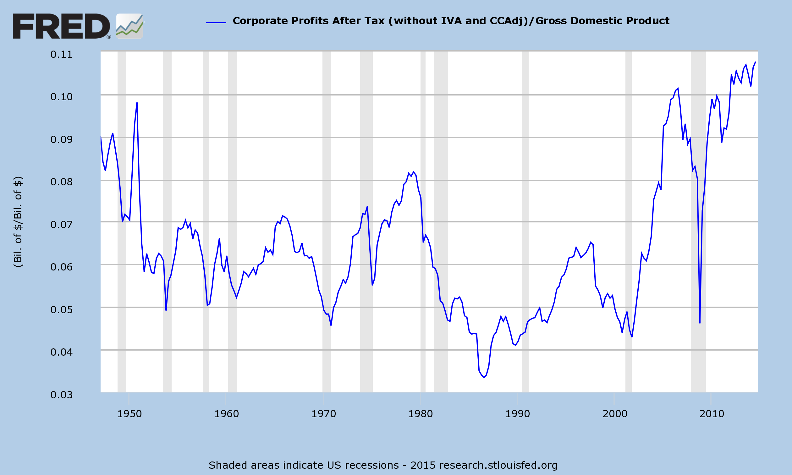
Other metrics illustrate how distended the aggregate level of profitability is from a long-term historical perspective.  One measure that can be used is (After-Tax) Corporate Profits as a Percent of GDP.  This chart is seen below.  From 1947 through the 3rd quarter of 2014, the average is 6.5% and the median is 6.2%.  The Q3 2014 value is 10.8%:
After-Tax Corporate Profits As A Percent Of GDP
US. Bureau of Economic Analysis, Corporate Profits After Tax (without IVA and CCAdj) [CP], retrieved from FRED, Federal Reserve Bank of St. Louis https://research.stlouisfed.org/fred2/series/CP/, February 13, 2015.
US. Bureau of Economic Analysis, Gross Domestic Product [GDP], retrieved from FRED, Federal Reserve Bank of St. Louis:
Stock Market "Price Action" And Valuations
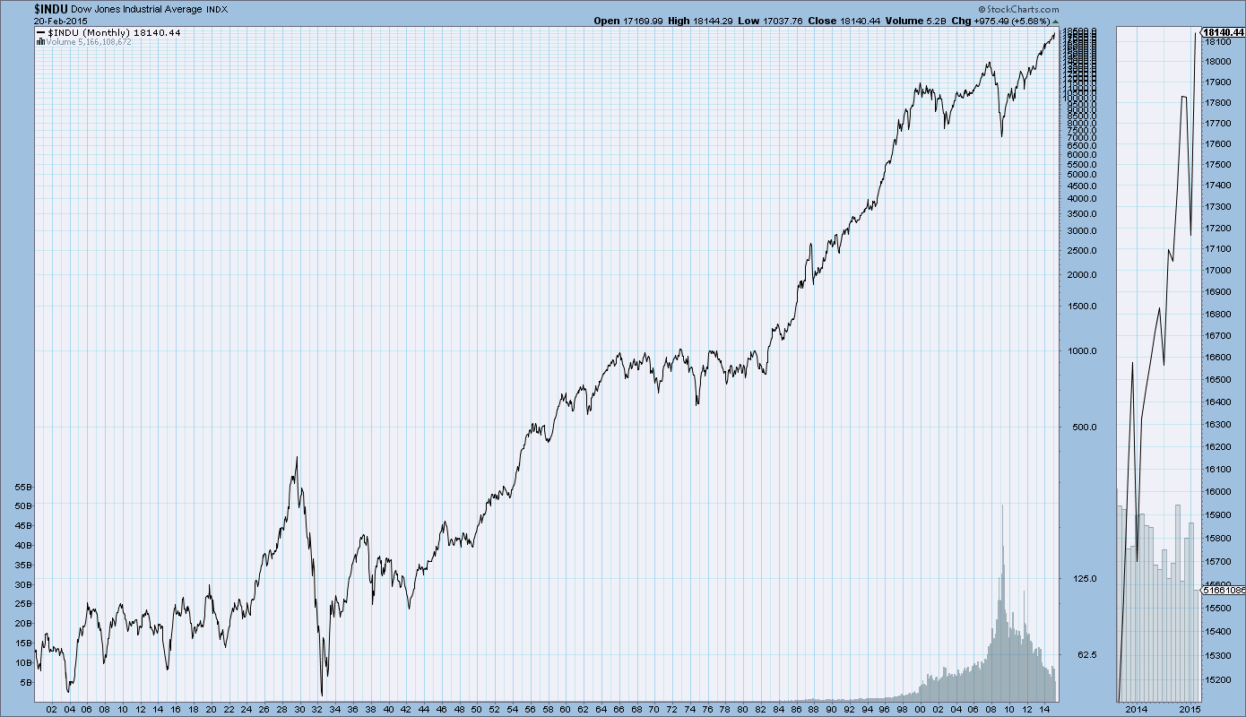
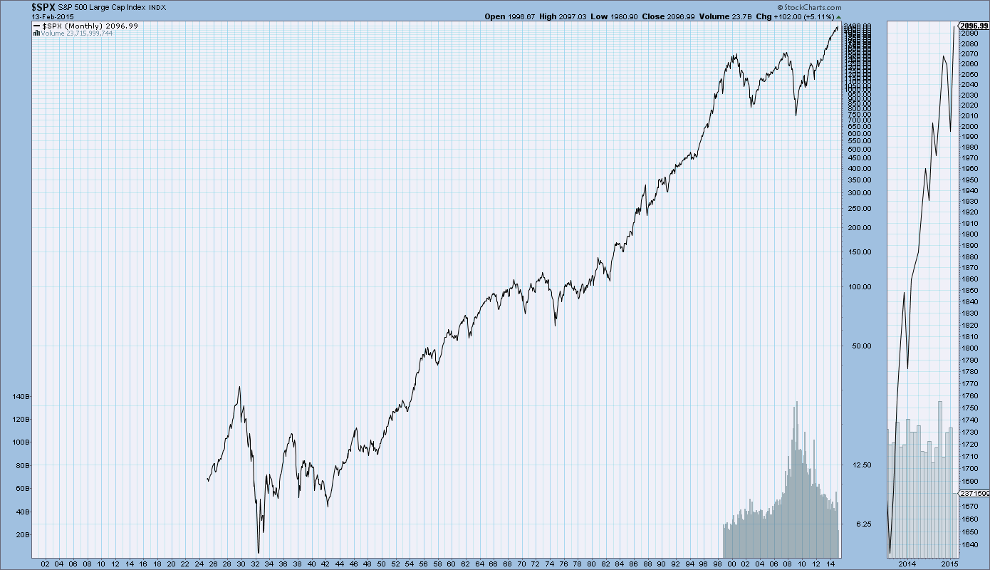
Stock market "price action" and valuations are other notable aspects of today's stock market bubble.  For reference, here is a long-term chart of the S&P500 since 1925 (depicted on a LOG scale through February 13, 2015):
(click on charts to enlarge image)(chart courtesy of StockCharts.com)
S&P500 since 1925
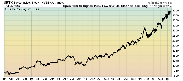
While, admittedly, the recent overall stock "price action" isn't as "frenzied" as it was in the late 1990s, there are many pockets of extreme stock valuations and/or continuously sharply rising stock prices.  With regard to the former, there are many large-cap stocks that appear highly overvalued based upon measures including (continual) lack of profitability.  With regard to the latter, there are many stocks - including those in the biotech sector - that exhibit "frothy" stock "price action."  This can be seen in the parabolic advance seen in various biotech indices, including the BTK Biotechnology Index seen below:
(click on charts to enlarge image)(chart courtesy of StockCharts.com)
BTK since 2009
As well, there are many valuation measures that would indicate that stocks are expensive, if not very much so.  When one uses stock market valuation measures other than the P/E ratio, one often sees the stock market as either being (very) expensive or in “bubble” territory.  These other valuation measures include the Q-Ratio and CAPE (“Shiller PE”), etc.  (note:  these factors are discussed in Doug Short’s “Market Valuation Overview.”)
As well, there is the stock market capitalization to GDP measure,  which is seen in Doug Short's post of January 7, 2015 ("Market Cap to GDP:  The Buffett Valuation Indicator"):
market capitalization to GDP
In addition to these many instances of notably rich public stock valuations, there is also the tangential issue of notably high private company valuations.  This issue has been recently discussed in the January 22, 2015 Fortune article titled "The Age of Unicorns," subtitled "The billion-dollar tech startup was supposed to be the stuff of myth.  Now they seem to be … everywhere," as well as the Barron's article of December 8, 2014 titled "This Time It's Different."
Size Of The Stock Market Bubble
While the above discussion indicates a stock market that is overvalued, if not very much so, there are many reasons why the stock market bubble is far larger than any before it.  One of the reasons is the current distension - and forthcoming mean reversion - of many of the measures discussed above.
While a detailed mean reversion discussion would be very lengthy and complicated - and as such isn't suitably discussed in a brief manner - it is highly relevant with regard to the potential downside and associated financial and economic dynamics that will come into play.  As well, the consequences of mean reversion will determine the magnitude of the ultimate stock market price decline, which will be the main measure as to this bubble's magnitude.
While projections are difficult to make due to a number of factors and the uncertainty that would accompany such a rapidly changing environment, changes in overall stock market valuations will certainly be far greater than most would assume.  It appears that this issue of mean-reversion and the resulting revaluation greatly lacks recognition.
_____
The Special Note summarizes my overall thoughts about our economic situation
SPX at 2096.99 as this post is written