Friday, May 29, 2015

Long-Term Charts Of The ECRI WLI & ECRI WLI, Gr. – May 29, 2015 Update

As I stated in my July 12, 2010 post (“ECRI WLI Growth History“):
For a variety of reasons, I am not as enamored with ECRI’s WLI and WLI Growth measures as many are.
However, I do think the measures are important and deserve close monitoring and scrutiny.
Below are three long-term charts, from Doug Short’s blog post of May 29, 2015 titled “ECRI:  Index Slightly Down from Last Week.”  These charts are on a weekly basis through the May 29 release, indicating data through May 22, 2015.
Here is the ECRI WLI (defined at ECRI’s glossary):
ECRI WLI
This next chart depicts, on a long-term basis, the Year-over-Year change in the 4-week moving average of the WLI:
Dshort 5-29-15 - ECRI-WLI-YoY -1.0 percent
This last chart depicts, on a long-term basis, the WLI, Gr.:
ECRI WLI,Gr.
_________
I post various economic indicators and indices because I believe they should be carefully monitored.  However, as those familiar with this blog are aware, I do not necessarily agree with what they depict or imply.
_____
The Special Note summarizes my overall thoughts about our economic situation
SPX at 2111.48 as this post is written

Consumer Confidence Surveys – As Of May 29, 2015

Doug Short had a blog post of May 29, 2015 (“Michigan Consumer Up from Preliminary , but still Below April Final“) in which he presents the latest Conference Board Consumer Confidence and Thomson/Reuters University of Michigan Consumer Sentiment Index charts.  They are presented below:
(click on charts to enlarge images)
Conference Board Consumer Confidence
Michigan Consumer Sentiment
There are a few aspects of the above charts that I find highly noteworthy.  Of course, until the recent sudden upswing, the continued subdued absolute levels of these two surveys was disconcerting.
Also, I find the “behavior” of these readings to be quite disparate as compared to the other post-recession periods, as shown in the charts between the gray shaded areas (the gray areas denote recessions as defined by the NBER.)
While I don’t believe that confidence surveys should be overemphasized, I find these readings to be very problematical, especially in light of a variety of other highly disconcerting measures highlighted throughout this site.
_____
The Special Note summarizes my overall thoughts about our economic situation
SPX at 2109.91 as this post is written

Corporate Profits As A Percentage Of GDP

In the last post (“1st Quarter 2015 Corporate Profits“) I displayed, for reference purposes, a long-term chart depicting Corporate Profits After Tax.
There are many ways to view this measure, both on an absolute as well as relative basis.
One relative measure is viewing Corporate Profits as a Percentage of GDP.  I feel that this metric is important for a variety of reasons.  As well, the measure is important to a variety of parties, including investors, businesses, and government policy makers.
As one can see from the long-term chart below (updated through the first quarter), (After Tax) Corporate Profits as a Percentage of GDP is at levels that can be seen as historically (very) high.  While there are many reasons as to why this is so, from a going-forward standpoint I think it is important to recognize both that such a notable condition exists, as well as contemplate and/or plan for such factors and conditions that would come about if (and in my opinion “when”) a more historically “normal” ratio of Corporate Profits as a Percentage of GDP occurs.  This topic can be very complex in nature, and depends upon myriad factors.  In my opinion it deserves far greater recognition.
(click on chart to enlarge image)
corporate profits as a percentage of GDP
Data Source: FRED, Federal Reserve Economic Data, Federal Reserve Bank of St. Louis; accessed May 29, 2015
_____
The Special Note summarizes my overall thoughts about our economic situation
SPX at 2114.96 as this post is written

1st Quarter 2015 Corporate Profits

Today’s GDP release (Q1, 2nd Estimate)(pdf) was accompanied by the BLS Corporate Profits report for the 1st Quarter.
Of course, there are many ways to adjust and depict overall Corporate Profits.  For reference purposes, here is a chart from the St. Louis Federal Reserve (FRED) showing the Corporate Profits After Tax (last updated May 29, 2015, with a value of $1893.8 Billion):
corporate profits after tax
Here is the Corporate Profits After Tax measure shown on a Percentage Change from a Year Ago perspective:
corporate profits after tax
Data Source: FRED, Federal Reserve Economic Data, Federal Reserve Bank of St. Louis: Corporate Profits After Tax [CP]; U.S. Department of Commerce: Bureau of Economic Analysis; accessed May 29, 2015; https://research.stlouisfed.org/fred2/series/CP
_____
The Special Note summarizes my overall thoughts about our economic situation
SPX at 2108.20 as this post is written

Thursday, May 28, 2015

Chicago Fed National Financial Conditions Index (NFCI)

The St. Louis Fed’s Financial Stress Index (STLFSI) is one index that is supposed to measure stress in the financial system.  Its reading as of the May 28, 2015 update (reflecting data through May 22) is -1.09.
Of course, there are a variety of other measures and indices that are supposed to measure financial stress and other related issues, both from the Federal Reserve as well as from private sources.
Two other indices that I regularly monitor include the Chicago Fed National Financial Conditions Index (NFCI) as well as the Chicago Fed Adjusted National Financial Conditions Index (ANFCI).
Here are summary descriptions of each, as seen in FRED:
The National Financial Conditions Index (NFCI) measures risk, liquidity and leverage in money markets and debt and equity markets as well as in the traditional and “shadow” banking systems. Positive values of the NFCI indicate financial conditions that are tighter than average, while negative values indicate financial conditions that are looser than average.
The adjusted NFCI (ANFCI). This index isolates a component of financial conditions uncorrelated with economic conditions to provide an update on how financial conditions compare with current economic conditions.
For further information, please visit the Federal Reserve Bank of Chicago’s web site:
Below are the most recently updated charts of the NFCI and ANFCI, respectively.
The NFCI chart below was last updated on May 28, 2015 incorporating data from January 5,1973 to May 22, 2015, on a weekly basis.  The May 22, 2015 value is -.75:
(click on chart to enlarge image)
NFCI
Data Source: FRED, Federal Reserve Economic Data, Federal Reserve Bank of St. Louis; accessed May 28, 2015:
The ANFCI chart below was last updated on May 28, 2015 incorporating data from January 5,1973 to May 22, 2015, on a weekly basis.  The May 22 value is .68:
ANFCI
Data Source: FRED, Federal Reserve Economic Data, Federal Reserve Bank of St. Louis; accessed May 28, 2015:
_________
I post various indicators and indices because I believe they should be carefully monitored.  However, as those familiar with this blog are aware, I do not necessarily agree with what they depict or imply.
_____
The Special Note summarizes my overall thoughts about our economic situation
SPX at 2120.79 as this post is written

Wednesday, May 27, 2015

House Prices Reference Chart

As a reference for long-term house price index trends, below is a chart, updated with the most current data (through March) from the CalculatedRisk blog post of May 26, 2015 titled “Real Prices and Price-to-Rent Ratio in March”:
(click on chart to enlarge image)
Nominal House Prices
_____
The Special Note summarizes my overall thoughts about our economic situation
SPX at 2116.25 as this post is written

Tuesday, May 26, 2015

Money Supply Charts Through April 2015

For reference purposes, below are two sets of charts depicting growth in the money supply.
The first shows the MZM (Money Zero Maturity), defined in FRED as the following:
M2 less small-denomination time deposits plus institutional money funds.
Money Zero Maturity is calculated by the Federal Reserve Bank of St. Louis.
Here is the “MZM Money Stock” (seasonally adjusted) chart, updated on May 22, 2015 depicting data through April 2015, with value $13,199.5 Billion:
MZMSL
Here is the “MZM Money Stock” chart on a “Percent Change From Year Ago” basis:
MZMSL percent change from year ago
Data Source: FRED, Federal Reserve Economic Data, Federal Reserve Bank of St. Louis; accessed May 26, 2015:
The second set shows M2, defined in FRED as the following:
M2 includes a broader set of financial assets held principally by households. M2 consists of M1 plus: (1) savings deposits (which include money market deposit accounts, or MMDAs); (2) small-denomination time deposits (time deposits in amounts of less than $100,000); and (3) balances in retail money market mutual funds (MMMFs). Seasonally adjusted M2 is computed by summing savings deposits, small-denomination time deposits, and retail MMMFs, each seasonally adjusted separately, and adding this result to seasonally adjusted M1.
Here is the “M2 Money Stock” (seasonally adjusted) chart, updated on May 21, 2015, depicting data through April 2015, with value $11,895.10 Billion:
M2SL
Here is the “M2 Money Stock” chart on a “Percent Change From Year Ago” basis:
M2SL percent change from year ago
Data Source: FRED, Federal Reserve Economic Data, Federal Reserve Bank of St. Louis; accessed May 26, 2015:
_____
The Special Note summarizes my overall thoughts about our economic situation
SPX at 2102.65 as this post is written

Durable Goods New Orders – Long-Term Charts Through April 2015

Many people place emphasis on Durable Goods New Orders as a prominent economic indicator and/or leading economic indicator.
For reference, below are charts depicting this measure.
First, from the St. Louis Fed site (FRED), a chart through April, updated on May 26, 2015. This value is $235,527 ($ Millions):
(click on charts to enlarge images)
Durable Goods New Orders
Here is the chart depicting this measure on a “Percentage Change from a Year Ago” basis:
durable goods new orders percent change from year ago
Data Source: FRED, Federal Reserve Economic Data, Federal Reserve Bank of St. Louis: Manufacturers’ New Orders:  Durable Goods [DGORDER]; U.S. Department of Commerce: Census Bureau; accessed May 26, 2015;
_________
I post various indicators and indices because I believe they should be carefully monitored.  However, as those familiar with this blog are aware, I do not necessarily agree with what they depict or imply.
_____
The Special Note summarizes my overall thoughts about our economic situation
SPX at 2103.29 as this post is written

Friday, May 22, 2015

Updates Of Economic Indicators May 2015

Here is an update of various indicators that are supposed to predict and/or depict economic activity. These indicators have been discussed in previous blog posts:
The May 2015 Chicago Fed National Activity Index (CFNAI) updated as of May 21, 2015:
CFNAI
As of May 22, 2015 (incorporating data through May 15, 2015) the WLI was at 133.9 and the WLI, Gr. was at 1.5%.
A chart of the WLI,Gr., from Doug Short’s post of May 22, 2015, titled “ECRI:  Fed Rate Hike May Be Delayed Due to Inclement Data“:
ECRI WLI,Gr.
Here is the latest chart, depicting the ADS Index from December 31, 2007 through May 16, 2015:
ADS Index
As per the May 21, 2015 press release, titled “The Conference Board Leading Economic Index (LEI) for the U.S. Increased Again,” the LEI was at 122.3 and the CEI was at 112.0 in April.
An excerpt from the May 21 release:
“April’s sharp increase in the LEI seems to have helped stabilize its slowing trend, suggesting the paltry economic growth in the first quarter may be temporary,” said Ataman Ozyildirim, Economist at The Conference Board. “However, the growth of the LEI does not support a significant strengthening in the economic outlook at this time. The improvement in building permits helped to drive the index up this month, but gains in other components, in particular the financial indicators, have been somewhat more muted.”
Here is a chart of the LEI from Doug Short’s blog post of May 21 titled “Conference Board Leading Economic Index Increased Again in April“:
Conference Board LEI

_________
I post various indicators and indices because I believe they should be carefully monitored.  However, as those familiar with this blog are aware, I do not necessarily agree with what they depict or imply.
_____
The Special Note summarizes my overall thoughts about our economic situation
SPX at 2126.06 as this post is written

The U.S. Economic Situation – May 22, 2015 Update

Perhaps the main reason that I write of our economic situation is that I continue to believe, based upon various analyses, that our economic situation is in many ways misunderstood.  While no one likes to contemplate a future rife with economic adversity, current and future economic problems must be properly recognized and rectified if high-quality, sustainable long-term economic vitality is to be realized.
There are an array of indications and other “warning signs” – many readily apparent – that current economic activity and financial market performance is accompanied by exceedingly perilous dynamics.
I have written extensively about this peril, including in the following:
Building Financial Danger” (ongoing updates)
My analyses continues to indicate that the growing level of financial danger will lead to the next stock market crash that will also involve (as seen in 2008) various other markets as well.  Key attributes of this next crash is its outsized magnitude (when viewed from an ultra-long term historical perspective) and the resulting economic impact.  This next financial crash is of tremendous concern, as my analyses indicate it will lead to a Super Depression – i.e. an economy characterized by deeply embedded, highly complex, and difficult-to-solve problems.
For long-term reference purposes, here is a chart of the Dow Jones Industrial Average since 1900, depicted on a monthly basis using a LOG scale (updated through May 15, 2015, with a last value of 18272.56):
(click on chart to enlarge image)(chart courtesy of StockCharts.com)
DJIA 1900-May 15 2015
_____
The Special Note summarizes my overall thoughts about our economic situation
SPX at 2131.15 as this post is written

Thursday, May 21, 2015

Trends Of S&P500 Earnings Forecasts

S&P500 earnings trends and estimates are a notably important topic, for a variety of reasons, at this point in time.
FactSet publishes a report titled “Earnings Insight” that contains a variety of information including the trends and expectations of S&P500 earnings.
For reference purposes, here are two charts as seen in the “Earnings Insight” (pdf) report of May  8, 2015:
from page 23:
(click on charts to enlarge images)
S&P500 earnings forecast trends
from page 24:
S&P500 earnings

_____
I post various economic forecasts because I believe they should be carefully monitored.  However, as those familiar with this blog are aware, I do not agree with many of the consensus estimates and much of the commentary in these forecast surveys.
_____
The Special Note summarizes my overall thoughts about our economic situation
SPX at 2132.37 as this post is written

S&P500 Earnings – Estimates For Years 2015 Through 2017

As many are aware, Thomson Reuters publishes earnings estimates for the S&P500.  (My other posts concerning S&P earnings estimates can be found under the S&P500 Earnings tag)
The following estimates are from Exhibit 12 of “The Director’s Report” (pdf) of May 20, 2015, and represent an aggregation of individual S&P500 component “bottom up” analyst forecasts.  For reference, the Year 2013 value is $109.68/share:
Year 2014 estimate:
$118.78/share
Year 2015 estimate:
$119.27/share
Year 2016 estimate:
$133.96/share
Year 2017 estimate:
$149.44/share
_____
I post various economic forecasts because I believe they should be carefully monitored.  However, as those familiar with this blog are aware, I do not agree with many of the consensus estimates and much of the commentary in these forecast surveys.
_____
The Special Note summarizes my overall thoughts about our economic situation
SPX at 2132.05 as this post is written

Standard & Poor’s S&P500 Earnings Estimates For 2015 & 2016 – As Of May 12, 2015

As many are aware, Standard & Poor’s publishes earnings estimates for the S&P500.  (My posts concerning their estimates can be found under the S&P500 Earnings label)
For reference purposes, the most current estimates are reflected below, and are as of May 12, 2015:
Year 2015 estimates add to the following:
-From a “bottom up” perspective, operating earnings of $116.16/share
-From a “top down” perspective, operating earnings of N/A
-From a “bottom up” perspective, “as reported” earnings of $106.54
Year 2016 estimates add to the following:
-From a “bottom up” perspective, operating earnings of $133.28/share
-From a “top down” perspective, operating earnings of N/A
-From a “bottom up” perspective, “as reported” earnings of $124.77/share
_____
I post various economic forecasts because I believe they should be carefully monitored.  However, as those familiar with this blog are aware, I do not agree with many of the consensus estimates and much of the commentary in these forecast surveys.
_____
The Special Note summarizes my overall thoughts about our economic situation
SPX at 2132.10 as this post is written

Wednesday, May 20, 2015

Walmart’s Q1 2016 Results – Comments

I found various notable items in Walmart’s Q1 2016 management call transcript (pdf) dated May 19, 2015.  (as well, there is Walmart’s press release of the Q1 results(pdf))
I view Walmart’s results and comments as particularly noteworthy given their retail prominence and focus on low prices.  I have previously commented on their quarterly management call comments; these previous posts are found under the “paycheck to paycheck” tag.
Here are various excerpts that I find most notable:
comments from Doug McMillon, President and CEO, page 5:
Walmart U.S. again delivered positive comp sales, and I’m encouraged by the customer traffic trends. I’m particularly pleased by the customer response to our Neighborhood Markets, driving strong comps again this quarter. Based on recent surveys, we know that many of our U.S. customers are using their tax refunds and the extra money from lower gas prices to pay down debt or put it into savings. They’re also using these funds for everyday expenses like utilities and groceries. That’s where we can be their destination of choice. We’re not where we want to be in every store, but I’m pleased with the progress that I’m seeing.
comments from Claire Babineaux-Fontenot, EVP and treasurer, page 8:
The last item I’ll leave you with today is share repurchases. The company repurchased approximately 3.5 million shares for $280 million during the quarter. Market conditions, general business trends and a focus on maintaining our AA credit rating, among other factors, influenced our share repurchase activity. We have approximately $10 billion remaining on our existing share repurchase authorization.
comments from Greg Foran, president and CEO of Walmart U.S., page 9:
This quarter we began executing this plan. We took the initial steps in April towards a stronger investment in our associates by raising the minimum starting wage for all hourly associates to $9.00 per hour. As a part of our $1 billion investment in our associates we also raised the floor and ceiling on pay bands in our stores creating raises for many full and part-time hourly associates at every level. More than 500,000 associates benefited from this change. We’re also restructuring the management teams in the stores adding back almost 8,000 department managers. These department managers will have responsibility for a smaller area of the store ensuring that they have the knowledge and the time to engage with both the customers and store associates driving an overall better experience. The $1 billion investment in our associates this year includes training programs as well.
comments from Greg Foran, president and CEO of Walmart U.S., page 10:
With these steps in mind, let’s move on to our first quarter results. Net sales grew $2.4 billion, or 3.5 percent, versus last year. For the 13-week period ended May 1, comparable stores were up 1.1 percent, which was within our guidance. Comp sales were driven by solid growth in traffic, which was up 1 percent. Customers continue to see the benefit of lower gas prices versus last year and are responding favorably to some of our new assortments for the spring and summer selling seasons.
All formats had positive comps for the quarter, including our traditionalformat Neighborhood Markets, which posted approximately a 7.9 percent comp. A focus on customer service and in-stock position drove strong traffic in this format. Customers continue to see the benefit of Neighborhood Markets to meet their everyday needs, including convenient access to services such as drive-thru pharmacies and fuel stations.
comments from Greg Foran, president and CEO of Walmart U.S., page 11:
Moving on to the remainder of our financial results…In the first quarter, gross profit rate declined 13 basis points driven primarily by a headwind from shrink, half of which was in food. We are addressing this increase immediately, bringing a high level of focus and visibility to this concern by adding it as a key urgent agenda item this year. In addition to shrink, the ongoing mix shift in pharmacy, incremental expenses related to the west coast port congestion, and cost inflation in consumables contributed to the decline. Somewhat offsetting this was a continued focus on the urgent agenda items laid out last year, including managing throwaways in fresh and reducing inventory that is no longer active in the stores.

_____
The Special Note summarizes my overall thoughts about our economic situation
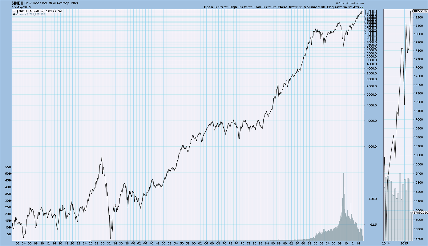
SPX at 2125.85 as this post is written

Chicago Fed National Financial Conditions Index (NFCI)

The St. Louis Fed’s Financial Stress Index (STLFSI) is one index that is supposed to measure stress in the financial system.  Its reading as of the May 14, 2015 update (reflecting data through May 8) is -1.099
Of course, there are a variety of other measures and indices that are supposed to measure financial stress and other related issues, both from the Federal Reserve as well as from private sources.
Two other indices that I regularly monitor include the Chicago Fed National Financial Conditions Index (NFCI) as well as the Chicago Fed Adjusted National Financial Conditions Index (ANFCI).
Here are summary descriptions of each, as seen in FRED:
The National Financial Conditions Index (NFCI) measures risk, liquidity and leverage in money markets and debt and equity markets as well as in the traditional and “shadow” banking systems. Positive values of the NFCI indicate financial conditions that are tighter than average, while negative values indicate financial conditions that are looser than average.
The adjusted NFCI (ANFCI). This index isolates a component of financial conditions uncorrelated with economic conditions to provide an update on how financial conditions compare with current economic conditions.
For further information, please visit the Federal Reserve Bank of Chicago’s web site:
Below are the most recently updated charts of the NFCI and ANFCI, respectively.
The NFCI chart below was last updated on May 20, 2015 incorporating data from January 5,1973 to May 15, 2015, on a weekly basis.  The May 15, 2015 value is -.77:
(click on chart to enlarge image)
NFCI
Data Source: FRED, Federal Reserve Economic Data, Federal Reserve Bank of St. Louis; accessed May 20, 2015:
The ANFCI chart below was last updated on May 20, 2015 incorporating data from January 5,1973 to May 15, 2015, on a weekly basis.  The May 15 value is .75:
ANFCI
Data Source: FRED, Federal Reserve Economic Data, Federal Reserve Bank of St. Louis; accessed May 20, 2015:
_________
I post various indicators and indices because I believe they should be carefully monitored.  However, as those familiar with this blog are aware, I do not necessarily agree with what they depict or imply.
_____
The Special Note summarizes my overall thoughts about our economic situation
SPX at 2127.03 as this post is written

Tuesday, May 19, 2015

Markets During Periods Of Federal Reserve Intervention – May 19, 2015 Update

In the August 9, 2011 post (“QE3 – Various Thoughts“) I posted a chart that depicted the movements of the S&P500, 10-Year Treasury Yield and the Fed Funds rate spanning the periods of various Federal Reserve interventions since 2007.
For reference purposes, here is an updated chart (through May 15, 2015) from Doug Short’s blog post of May 18  (“Treasury Snapshot: ...“):
markets during intervention
_____
The Special Note summarizes my overall thoughts about our economic situation
SPX at 2129.17 as this post is written

Monday, May 18, 2015

Philadelphia Fed – 2nd Quarter 2015 Survey Of Professional Forecasters

The Philadelphia Fed 2nd Quarter 2015 Survey of Professional Forecasters was released on May 15, 2015.  This survey is somewhat unique in various regards, such as it incorporates a longer time frame for various measures.
The survey shows, among many measures, the following median expectations:
Real GDP: (annual average level)
full-year 2015:  2.4%
full-year 2016:  2.8%
full-year 2017:  2.8%
full-year 2018:  2.5%
Unemployment Rate: (annual average level)
for 2015: 5.4%
for 2016: 5.0%
for 2017: 4.8%
for 2018: 4.8%
Regarding the risk of a negative quarter in real GDP in any of the next few quarters, mean estimates are 11.2%, 11.0%, 12.0%, 14.8% and 15.2% for each of the quarters from Q2 2015 through Q2 2016, respectively.
As well, there are also a variety of time frames shown (present quarter through the year 2024) with the median expected inflation (annualized) of each.  Inflation is measured in Headline and Core CPI and Headline and Core PCE.  Over all time frames expectations are shown to be in the .7% to 2.3% range.
_____
I post various economic forecasts because I believe they should be carefully monitored.  However, as those familiar with this blog are aware, I do not agree with many of the consensus estimates and much of the commentary in these forecast surveys.
_____
The Special Note summarizes my overall thoughts about our economic situation
SPX at 2130.10 as this post is written