Pages

Monday, April 30, 2012

Recession Measures – Updated


This post is the latest update to a series of blog posts seen on the CalculatedRisk.com blog.  The original blog post of April 12, 2010, is titled “Recession Measures.” In it, Bill discussed key measures that the NBER uses to determine recoveries, and posted four charts.

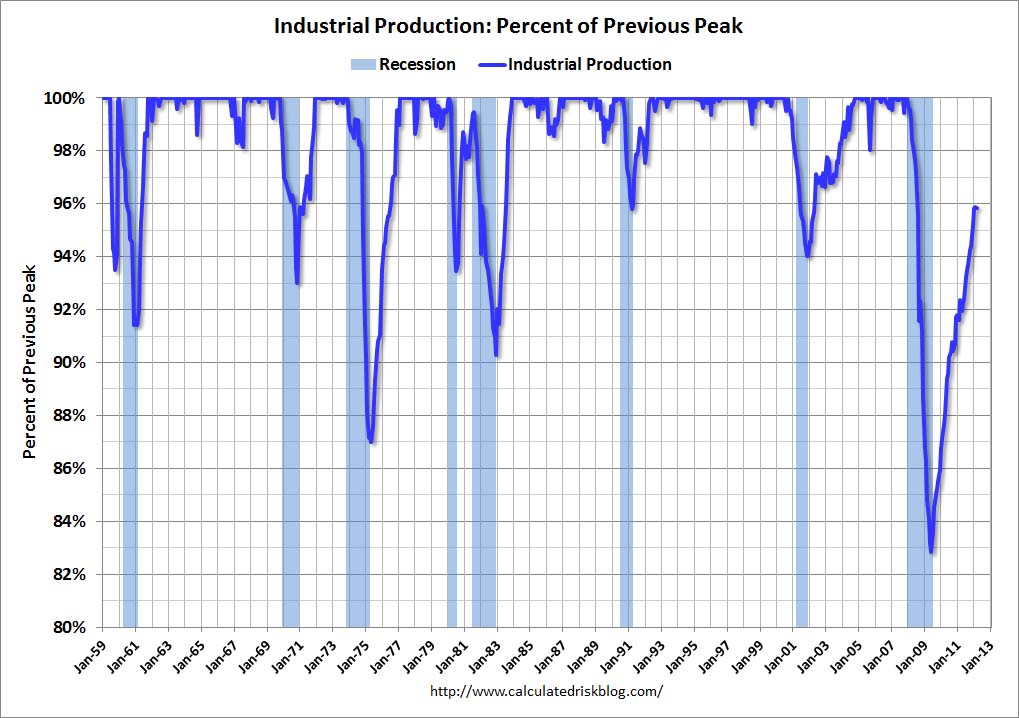
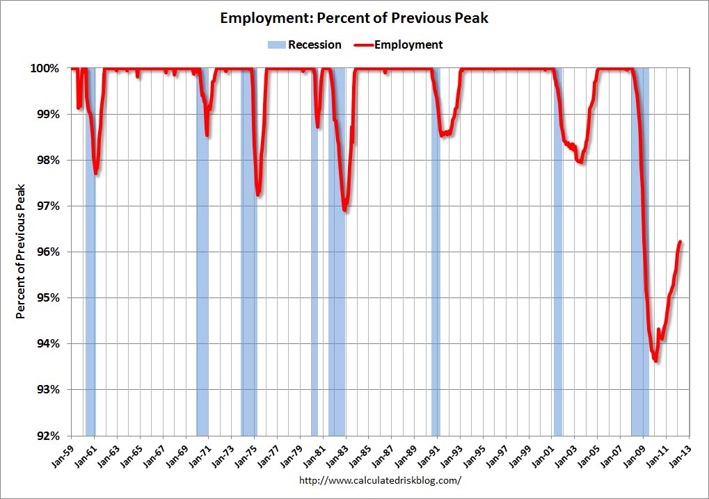
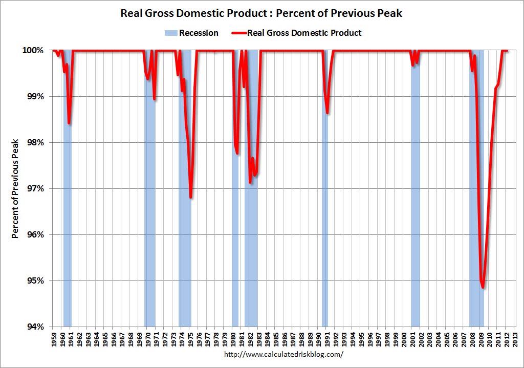
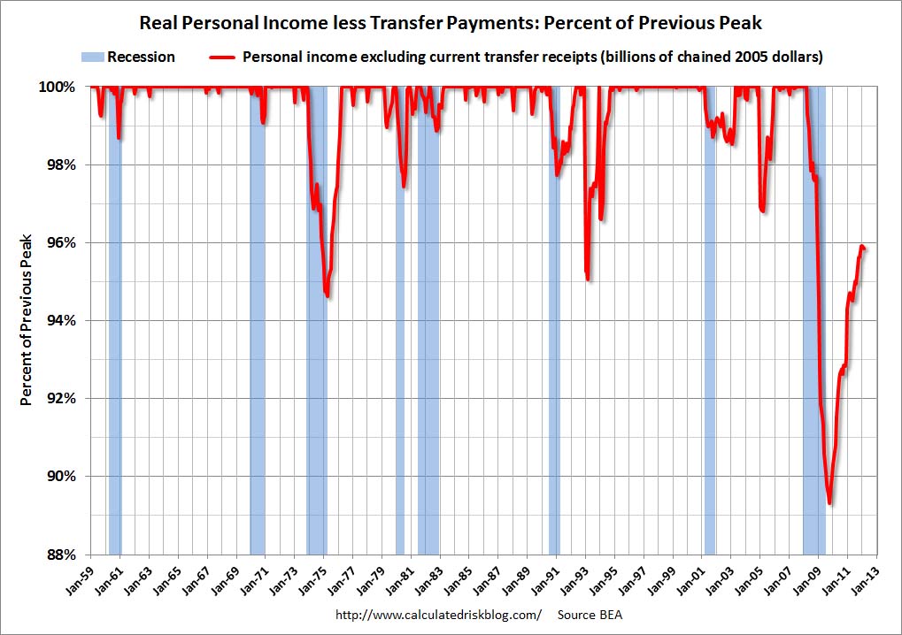
Here are those charts, updated in his April 29, 2012 post titled “Recovery Measures.”  The charts are constructed in a fashion different than most – in a “percent of peak” fashion.  As defined, “The following graphs are all constructed as a percent of the peak in each indicator.  This shows when the indicator has bottomed – and when the indicator has returned to the level of the previous peak.  If the indicator is at a new peak, the value is 100%.”  Periods of recession, as defined by the NBER, are shown as blue bars.

Here are the four charts, updated through the dates shown:

(click on images to enlarge)

Real Gross Domestic Product, above its pre-recession peak:


-

Real Personal Income Less Transfer Payments, still 4.2% below the pre-recession peak:


-

Industrial Production, still 4.1% below the pre-recession peak:


-

Payroll Employment, still 3.8% below the pre-recession peak:


_____

The Special Note summarizes my overall thoughts about our economic situation

SPX at 1403.36 as this post is written

Sunday, April 29, 2012

The Velocity Of Money – Charts Updated Through April 27, 2012


Here are three charts from the St. Louis Fed depicting the velocity of money in terms of the MZM, M1 and M2 money supply measures.

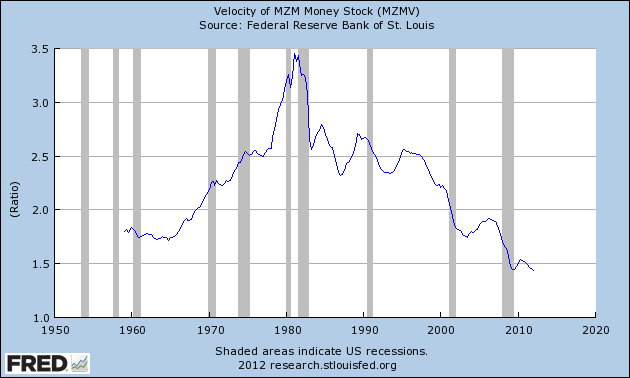
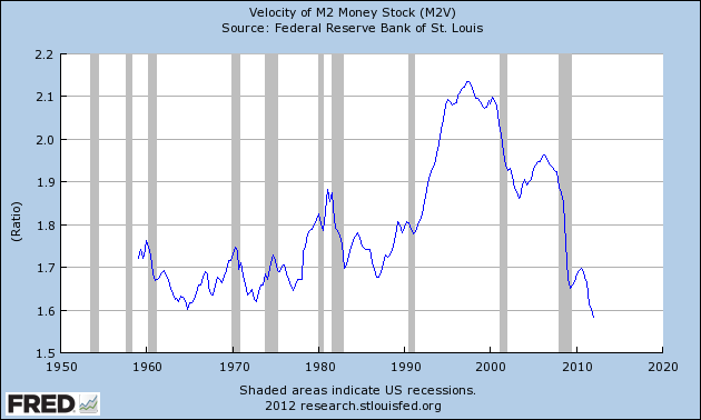
All charts reflect quarterly data through the first quarter of 2012, and were last updated as of April 27, 2012.  As one can see, two of the three are at all-time lows:

Velocity of MZM Money Stock, current value = 1.434 :


-

Velocity of M1 Money Stock, current value = 6.966 :


-

Velocity of M2 Money Stock, current value = 1.582 :


_____

The Special Note summarizes my overall thoughts about our economic situation

SPX at 1403.36 as this post is written

Saturday, April 28, 2012

Long-Term Charts Of The ECRI WLI & ECRI WLI, Gr. – April 27, 2012 Update


As I stated in my July 12, 2010 post ("ECRI WLI Growth History"):
For a variety of reasons, I am not as enamored with ECRI’s WLI and WLI Growth measures as many are.
However, I do think the measures are important and deserve close monitoring and scrutiny.
The movement of the ECRI WLI and WLI, Gr. is particularly notable at this time, as ECRI publicly announced on September 30, 2011 that the U.S. was “tipping into recession,” and ECRI has reaffirmed that view since, with the most recent statement on March 15 (“Why Our Recession Call Stands.”)

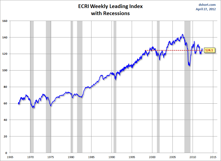
Below is a long-term chart, on a weekly basis through the April 27 release (data through April 20 with current value of 124.1), of the ECRI WLI (defined at ECRI’s glossary) from Doug Short’s blog post of April 27 titled "ECRI Weekly Leading Indicator:  The Growth Index Slips Again" :

(click on charts to enlarge images)


-

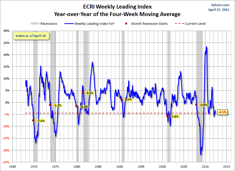
This next chart depicts, on a long-term basis, the Year-over-Year change in the 4-week moving average of the WLI through the April 27 release (data through April 20):


-

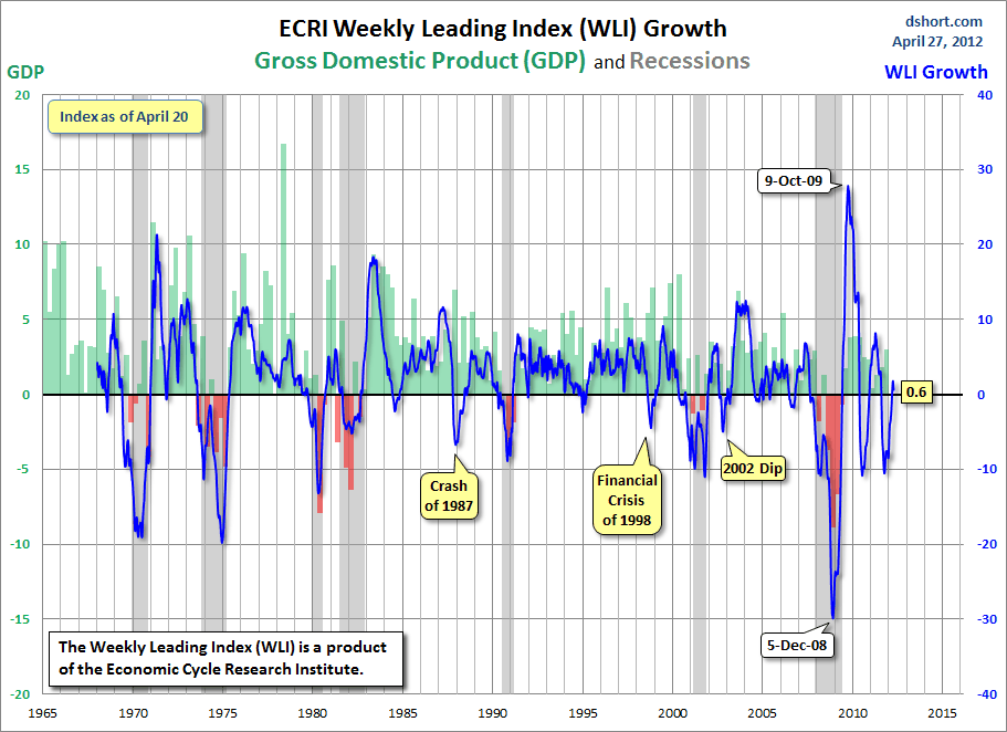
This last chart depicts, on a long-term basis, the WLI, Gr. through the April 27 release (data through April 20):


_________

I post various economic indicators and indices because I believe they should be carefully monitored.  However, as those familiar with this blog are aware, I do not necessarily agree with what they depict or imply.
_____

The Special Note summarizes my overall thoughts about our economic situation

SPX at 1403.36 as this post is written

Friday, April 27, 2012

St. Louis Financial Stress Index – April 26, 2012 Update


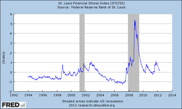
On March 28, 2011 I wrote a post (“The STLFSI") about the  STLFSI (St. Louis Fed’s Financial Stress Index) which is supposed to measure stress in the financial system.  For reference purposes, the most recent chart is seen below.  This chart was last updated on April 26, incorporating data from 12-31-93 to 4-20-12 on a weekly basis.  The 4-20-12 value is .244 :

(click on chart to enlarge image)


_________

I post various indicators and indices because I believe they should be carefully monitored.  However, as those familiar with this blog are aware, I do not necessarily agree with what they depict or imply.
_____

The Special Note summarizes my overall thoughts about our economic situation

SPX at 1399.98 as this post is written

Ben Bernanke’s April 25, 2012 Press Conference – Notable Aspects


On Wednesday, April 25, Ben Bernanke gave his scheduled press conference.

Here are Ben Bernanke’s comments I found most notable, in the order they appear in the transcript, although I don’t necessarily agree with them.  These comments are excerpted from the "Transcript of Chairman Bernanke’s Press Conference"(preliminary)(pdf) of April 25, 2012, with accompanying economic projections (pdf).

Bernanke’s responses as indicated to the various questions:
Thank you Mr. Chairman, Darren Gersh, Nightly Business Report: Some of your critics, I'm sure you're not going to be surprised think that you're still being too cautious that unemployment is still high, the economy may be slowing, inflation is subdued, but I know you just talked about the balance sheet. But given that, is the Committee now any closer to QE3 than it was at its last meeting?
Chairman Bernanke: Well first, the Committee has certainly been bold and aggressive in terms of easing monetary policy. We've maintained the Federal Funds Rate close to zero since late 2008. We've had two rounds of so-called quantitative easing. We've had a Maturity Extension Program which is ongoing. We have offered a guidance about the Federal Funds Rate that goes into at least late 2014. So we had been very accommodative and we remained prepared to do more as needed to make sure that this recovery continues and that inflation stays close to target. So in particular, we will continue to assess, you know, looking at the economic outlook, looking at the risk, whether or not unemployment is making sufficient progress towards this longer run, normal level, and whether inflation is remaining close to target.  And if appropriate and depending also on assessment of the costs and risks of additional policy actions, we are--remained entirely prepared to take additional balance sheet actions if necessary to achieve our objectives. So those tools remain very much on the table and we will not hesitate to use them should the economy require that additional support.

Updates On Economic Indicators April 2012


Here is an update on various indicators that are supposed to predict and/or depict economic activity.  These indicators have been discussed in previous blog posts:

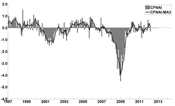
The April Chicago Fed National Activity Index (CFNAI)(pdf) updated as of April 26, 2012:


-


An excerpt from the March 22 update titled “Index forecasts weaker growth” :
The February update of the USA TODAY/IHS Global Insight Economic Outlook Index shows real GDP growth, at a six-month annualized growth rate, increasing to 2.5% in March and April and then slowing to 2.1% in July. While employment, housing (mostly the multifamily sector) and consumer spending are slowly recovering, concerns about the Eurozone and world growth continue.
-


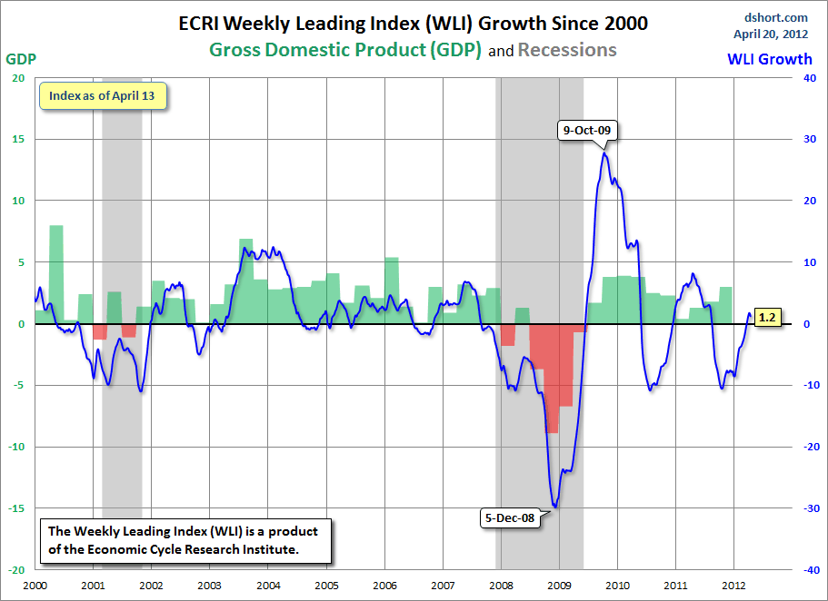
As of 4/20/12 the WLI was at 123.9 and the WLI, Gr. was at 1.2%.

A chart of the WLI, Gr. since 2000, from Doug Short’s blog of April 20 titled “ECRI Weekly Leading Indicator:  The Growth Index Slips” :


-


no current value available

-


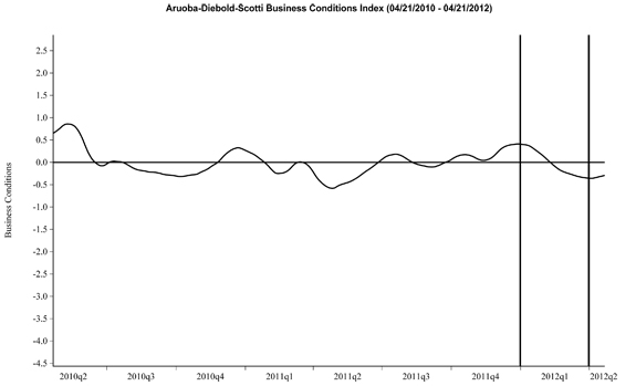
Here is the latest chart, depicting 4-21-10 to 4-21-12:


-


As per the April 19 release, the LEI was at 95.7 and the CEI was at 104.2 in March.

An excerpt from the April 19 release:
Says Ken Goldstein, economist at The Conference Board: “Despite relatively weak data on jobs, home building and output in the past month or two, the indicators signal continued economic momentum. We expect a gradual improvement in growth past the summer months.”
_________

I post various indicators and indices because I believe they should be carefully monitored.  However, as those familiar with this blog are aware, I do not necessarily agree with what they depict or imply.
_____

The Special Note summarizes my overall thoughts about our economic situation

SPX at 1399.98 as this post is written

Thursday, April 26, 2012

Durable Goods New Orders – Long-Term Charts Through March 2012


Many people place emphasis on Durable Goods New Orders as a prominent economic indicator and/or leading economic indicator.

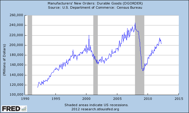
For reference, here are a few charts depicting this measure.

First, from the St. Louis Fed site (FRED), a chart through March, last updated on April 25.  This March value is 202,568 ($ Millions) :

(click on charts to enlarge images)


-

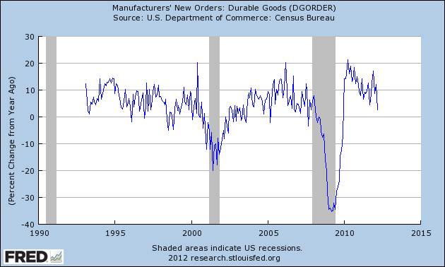
Here is the chart depicting this measure on a Percentage Change from a Year Ago basis:


-

Lastly, a chart from Doug Short’s post of April 25 titled “Durable Goods Orders Fell 4.2 Percent: Far Below Expectations ” showing the Durable Goods New Orders vs. the S&P500′s monthly average of daily closes:


_____

The Special Note summarizes my overall thoughts about our economic situation

SPX at 1390.69 as this post is written

Tuesday, April 24, 2012

The Unemployment Situation Facing The United States


Part I: Introduction

This post, in five parts, will discuss the unemployment situation in the United States.

As a prelude, I am of the strong belief that the unemployment situation - and its underlying drivers has, and will, impact the entire U.S. population, not just those unemployed.  This impact will be experienced through an adverse combination of individual-specific factors including reduced employment prospects, reduced career advancement probabilities, and reduced compensation and benefits - not to mention an array of adverse macroeconomic factors that have, and will, impact the country's economic situation as a whole.

A few disclaimers with regard to this post:

First, this unemployment aspect of our current economic situation is very complex.  This series of posts will present a summary discussion of the topic, as to avoid excessive complexity and length.

Second, the current and future unemployment situation varies widely among demographics, industries, and professions.  As such, while every employment situation is unique, there is enough commonality as to be able to generalize to some extent.

Third, the overall employment situation is, of course, dependent upon the overall economic environment.

Fourth, a precursor to this series of blog posts is the July 2009 series of five blog posts titled “Why Aren’t Companies Hiring?”, which discusses various aspects of the topic, many of which lack recognition.

Part 2:  What Is The Actual Unemployment Rate?


As this post is written, the official Unemployment Rate (U-3) is at 8.2%.

Some believe that the U-6 rate, currently at 14.5%, is a (closer) proxy of the actual unemployment rate.

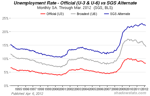
Of course, there are other interpretations of the actual unemployment rate.  One is seen on the ShadowStats.com site's Alternate Unemployment Charts page.  On this page, there is an interesting chart of what John Williams refers to as the "Alternate Unemployment Rate," which he defines as:
The seasonally-adjusted SGS Alternate Unemployment Rate reflects current unemployment reporting methodology adjusted for SGS-estimated long-term discouraged workers, who were defined out of official existence in 1994. That estimate is added to the BLS estimate of U-6 unemployment, which includes short-term discouraged workers.
The U-3 unemployment rate is the monthly headline number. The U-6 unemployment rate is the Bureau of Labor Statistics’ (BLS) broadest unemployment measure, including short-term discouraged and other marginally-attached workers as well as those forced to work part-time because they cannot find full-time employment.
Here is the accompanying chart, indicating the U-3, U-6 and his "SGS Alternate Unemployment Rate."  One sees that there is a different trajectory for the SGS Alternate rate, currently at 22.2%,  vs. the official U-3 and U-6 rates:


I like to use these three unemployment rates - the U3, U6, and SGS Alternate Unemployment Rate -  as benchmarks;  they also  serve to (disconcertingly) illustrate how one concept, that of the unemployment rate, can have three vastly different values.

As to my belief of the actual unemployment rate, I think that the answer is conditional on many different factors, including - most importantly - how one chooses to define an "unemployed person."  As well, I don't believe that the framework and methodologies currently used to calculate the official unemployment rate are optimal.

Given my misgivings with the framework and methodologies currently utilized, I find it nebulous as to what exactly the actual unemployment rate may be.  However, from an "all things considered" standpoint, taking into account my definition of an "unemployed person", the official unemployment statistics, an array of arguments supporting and refuting the validity of the official unemployment statistics, empirical data, etc.,  I surmise that the "actual" unemployment rate may well be above 20%, as suggested by the SGS Alternate Unemployment Rate.  Of course, if this is actually the case, it would be highly worrisome on a variety of fronts, and have vast implications.
Monday, April 23, 2012

Money Manager Forecasts - Notable Excerpts From Barron's


The April 23 edition of Barron’s has a cover story titled “Reason To Cheer.”

The story contains the results of the "Spring 2012 Big Money Poll" and related commentary.

As described in the story:
THE BIG MONEY POLL is published twice yearly by Barron's, in the spring and fall. The latest survey, prepared with the help of Beta Research in Syosset, N.Y., reflects the responses of 125 money managers nationwide. Some run small or mid-size investment firms, while others manage billions of dollars for banks, mutual-fund companies, endowments, and other institutions. The latest poll was mailed to participants in mid-March.
Included in the story are a variety of forecasts regarding the markets and economy.

I found a few of the statistics to be especially notable, including:
Only 14% of Big Money men and women identify themselves as bears these days, down from 17% last fall. The fence-sitters, or the neutral cohort, are holding steady at 31% of respondents. The bears' mean prediction puts the Dow at 12,185 by December's end and 11,738 by next June, the latter down 10% from current levels. In the skeptics' view, the S&P 500 could revisit 1301 before falling to 1243, while the Nasdaq could tumble to 2693 by mid-2013 from 3000 now.
As well, in response to the question "Which is most likely to occur in the U.S. in the next 12 months?" , the most popular response from all of the respondents was "inflation" at 52%, followed by "None will occur" at 26%, "Stagflation" at 18% and "Deflation" at 4%.

As to the question "Will analysts raise, lower, or maintain their current 2012 consensus estimates for S&P500 profits?" 49% replied "lower", 34% replied "raise", and 17% said "maintain."
_____

I post various economic forecasts because I believe they should be carefully monitored.  However, as those familiar with this blog are aware, I do not agree with many of the consensus estimates and much of the commentary in these forecast surveys.
_____

The Special Note summarizes my overall thoughts about our economic situation

SPX at 1364.77 as this post is written

Sunday, April 22, 2012

Long-Term Charts Of The ECRI WLI & ECRI WLI, Gr. – April 20, 2012 Update


As I stated in my July 12, 2010 post ("ECRI WLI Growth History"):
For a variety of reasons, I am not as enamored with ECRI’s WLI and WLI Growth measures as many are.
However, I do think the measures are important and deserve close monitoring and scrutiny.
The movement of the ECRI WLI and WLI, Gr. is particularly notable at this time, as ECRI publicly announced on September 30, 2011 that the U.S. was “tipping into recession,” and ECRI has reaffirmed that view since, with the most recent statement on March 15 (“Why Our Recession Call Stands.”)

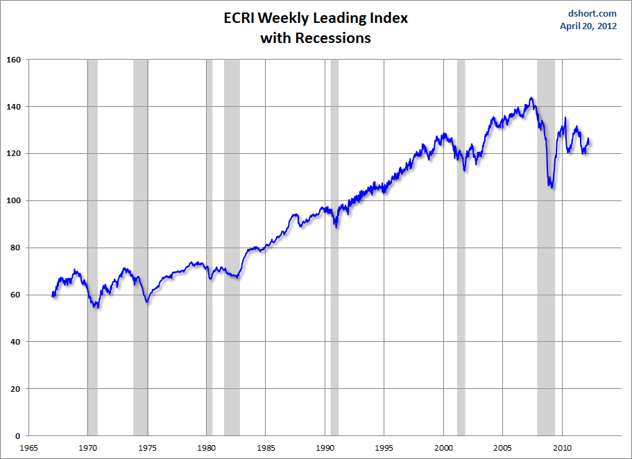
Below is a long-term chart, on a weekly basis through the April 20 release (data through April 13 with current value of 123.9), of the ECRI WLI (defined at ECRI’s glossary) from Doug Short’s blog post of April 20 titled "ECRI Weekly Leading Indicator:  The Growth Index Slips" :

(click on charts to enlarge images)


-

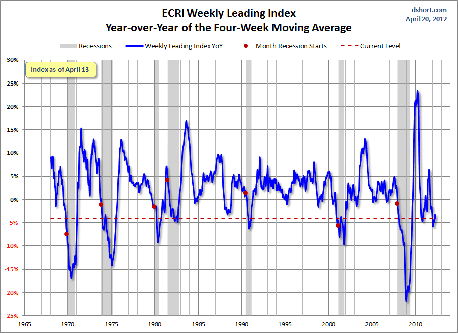
This next chart depicts, on a long-term basis, the Year-over-Year change in the 4-week moving average of the WLI through the April 20 release (data through April 13):


-

This last chart depicts, on a long-term basis, the WLI, Gr. through the April 20 release (data through April 13):


_________

I post various economic indicators and indices because I believe they should be carefully monitored.  However, as those familiar with this blog are aware, I do not necessarily agree with what they depict or imply.
_____

The Special Note summarizes my overall thoughts about our economic situation

SPX at 1378.53 as this post is written

Friday, April 20, 2012

St. Louis Financial Stress Index – April 19, 2012 Update


On March 28, 2011 I wrote a post ("The STLFSI") about the  STLFSI (St. Louis Fed’s Financial Stress Index) which is supposed to measure stress in the financial system.  For reference purposes, the most recent chart is seen below.  This chart was last updated on April 19, incorporating data from 12-31-93 to 4-13-12 on a weekly basis.  The 4-13-12 value is .277 :

(click on chart to enlarge image)


_________

I post various indicators and indices because I believe they should be carefully monitored.  However, as those familiar with this blog are aware, I do not necessarily agree with what they depict or imply.
_____

The Special Note summarizes my overall thoughts about our economic situation

SPX at 1376.92 as this post is written

Thursday, April 19, 2012

Building Financial Danger – April 19, 2012 Update


On October 17, 2011 I wrote a post titled “Danger Signs In The Stock Market, Financial System And Economy.”  This post is a brief tenth update to that post.

My overall analysis indicates a continuing elevated and growing level of danger which contains  many worldwide and U.S.-specific “stresses” of a very complex nature.

I have written numerous posts of some of what I consider both ongoing and recent “negative developments.”  These developments, as well as other highly problematic conditions, have presented a highly perilous economic environment that endangers the overall financial system.

My analysis continues to indicate that there are many reasons for tremendous concern, as seen in almost innumerable fundamental economic, financial-market, and proprietary measures.   Many prominent parties seem to be fixated on the European financial problems.  While I believe that the European debt problems are gravely serious and have broader implications (as explained in the November 17, 2011 post "Europe And Contagion – Broader Implications"), an array of U.S. economic problems also exist.

Predicting the timing and extent of a stock market crash is always difficult, and the immense complexity of today’s economic situation makes such a prediction even more challenging. With that being said, my analyses indicate that the danger inherent in the financial system has reached a level at which a stock market crash – that would also involve (as seen in 2008) various other markets as well – has reached a level at which a near-term crash is a substantial concern.

(note: the “next crash” has outsized significance and implications, as discussed in the post of January 6, "The Next Crash And Its Significance")

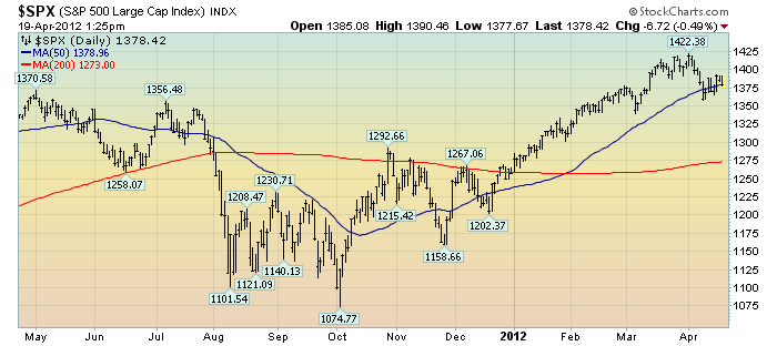
As reference, below is a one-year daily chart of the S&P500, indicating both the 50dma and 200dma as well as price labels.  The current price is 1378.42:

(click on chart to enlarge image)(chart courtesy of StockCharts.com; chart creation and annotation by the author)


_____

The Special Note summarizes my overall thoughts about our economic situation

SPX at 1378.42 as this post is written

Wednesday, April 18, 2012

Financial Stocks – April 18, 2012 Update Concerning Poor “Price Action”


On June 29, 2011 I wrote a blog post titled “Financial Stocks – Notable Price Action.”

Although financial stocks have increased in price in 2012, I continue to believe that the longer-term “price action” of various financial stocks is disconcerting.  I view the poor performance of these financial and brokerage stocks to be one indicator among (very) many that serves as a “red flag” as to the financial markets and economy as a whole.

Here is an updated chart to that shown in the June 29 post.  It shows the XLF (the financial ETF) on a daily basis since 2007.  As well, the S&P500 is plotted above it, with GS and JPM shown below it.  The blue line on each indicates the 200dma:

(click on chart image to enlarge)(chart courtesy of StockCharts.com; chart created by and annotated by author)


_____

The Special Note summarizes my overall thoughts about our economic situation

SPX at 1385.85 as this post is written

Financial Stocks – Relative Price To Overall Stock Market – April 18, 2012 Update


In the June 29, 2011 post (“Financial Stocks – Notable Price Action”) I wrote the following:
I think that the relatively poor “price action” of various financial stocks is notable.  It is one of many current indications that overall stock market health is not as strong as a casual glance at the major indices would indicate.
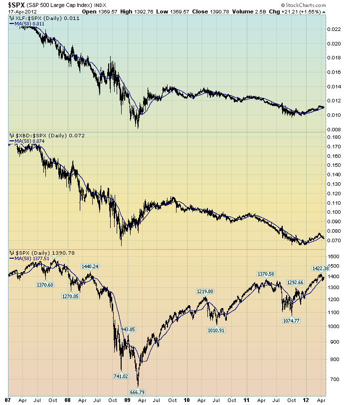
I continue to believe that the lagging / “sagging” price of various financial stocks is highly notable.  Here is a chart that I created a while ago that provides another view of the poor “price action” of the financial stocks vs. that of the entire stock market, as depicted by the S&P500:

(click on chart to enlarge image)(chart courtesy of StockCharts.com; chart created by and annotated by author)


-

The above chart is depicted on a daily basis, LOG scale, since 2007.   On each of the three plots, a blue line depicts the 50dma for perspective.

As one can see, there has been an interesting progression of the relative price of the XLF (Financial SPDR) vs. the S&P500, as seen in the top of the chart.  In the middle of the chart, the same can be seen in the $XBD (Broker/Dealer Index).  Generally, since mid-2009, the price of both the XLF and $XBD have been on a slow downward trajectory relative to the price of the S&P500.  The S&P500 is plotted on the bottom of the chart.

In my experience, any time the financials lag the general stock market for a considerable period, it is generally a “red flag” that should be closely monitored.
_____

The Special Note summarizes my overall thoughts about our economic situation

SPX at 1390.78 as this post is written

Tuesday, April 17, 2012

CEO Confidence Surveys 1Q 2012 – Notable Excerpts


On April 5, The Conference Board released its 1st Quarter CEO Confidence Survey.   The overall measure of CEO Confidence was at 63, up from 49 in the fourth quarter.

Notable excerpts from this April 5 Press Release include:
Says Lynn Franco, Director of The Conference Board Consumer Research Center: “CEOs’ confidence has rebounded from rather dismal readings in the latter half of 2011. Looking ahead, chief executives are optimistic about growth prospects, with about the same percentage as last year expecting to hire new workers.”
also:
CEOs’ appraisal of current economic conditions has grown very positive. Now, 67 percent say conditions have improved compared to six months ago, up from just 17 percent last quarter. A similar improvement is reflected in the assessment of their own industries. Forty-two percent of business leaders claim conditions have improved, compared with only 16 percent in the fourth quarter of 2011.
The Business Roundtable also recently released their CEO Economic Outlook Survey for the 1st Quarter of 2012.   Notable excerpts from the March 28 release, titled "America's CEOs See Increased Momentum for U.S. Economy" include the following:
The Business Roundtable CEO Economic Outlook Survey Index – a composite index of CEO expectations for the next six months of sales, capital spending and employment – increased notably to 96.9 in the first quarter of 2012, from 77.9 in the fourth quarter of 2011.
also:
The results of Business Roundtable’s (BRT) first quarter CEO Economic Outlook Survey for 2012 show an upturn in expectations for sales, capital spending and hiring for the next six months.
also:
In terms of the overall U.S. economy, Business Roundtable members estimate real GDP will grow by 2.3 percent in 2012, up from last quarter’s estimate of 2.0.
_____

I post various economic forecasts because I believe they should be carefully monitored.  However, as those familiar with this blog are aware, I do not necessarily agree with many of the consensus estimates and much of the commentary in these forecast surveys.
_____

The Special Note summarizes my overall thoughts about our economic situation

SPX at 1369.57 as this post is written