Pages

Thursday, May 31, 2012

Consumer Confidence Surveys – As Of May 31, 2012


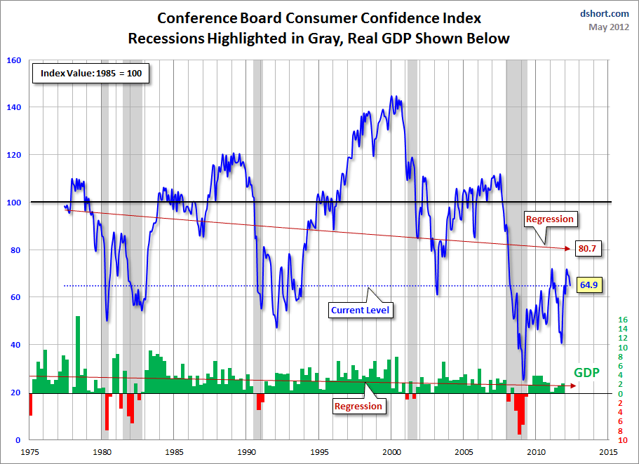
Doug Short had a blog post of May 29 (“May Consumer Confidence:  The Third Month of Shrinkage") in which he presents the Conference Board Consumer Confidence and Thomson/Reuters University of Michigan Consumer Sentiment Index charts.  They are presented below:

(click on charts to enlarge images)


-


-

There are a few aspects of the above charts that I find highly noteworthy.  Of course, the continuing subdued absolute levels of these two surveys is disconcerting.

Also, I find the “behavior” of these readings to be quite disparate as compared to the other post-recession periods, as shown in the charts between the gray shaded areas (the gray areas denote recessions as defined by the NBER.)

While I don’t believe that confidence surveys should be overemphasized, I find these readings to be very problematical, especially in light of a variety of other highly disconcerting measures highlighted throughout this blog.
_____

The Special Note summarizes my overall thoughts about our economic situation

SPX at 1313.32 as this post is written

Wednesday, May 30, 2012

Trends In Real Personal Income Growth


In various posts I have commented about the troubling long- and short-term trends in income growth.  (Many of these past posts are seen under the "household income" label)

While there are many ways to measure these income trends, regardless of the measurement or time period used, the trends appear worrisome.

As I highlighted in the May 14 post ("ECRI Statements From The Week Of May 7, 2012"), ECRI commented upon Real Personal Income growth in their May 9 release titled "Revoking Recession:  48th Time's The Charm?"

Here is an excerpt from that release:
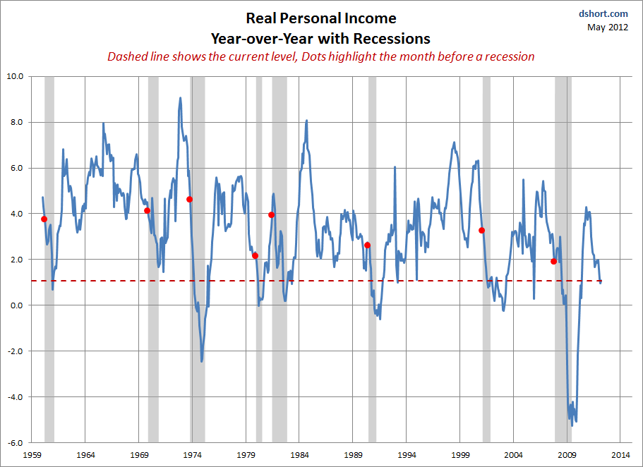
For the last three months, year-over-year growth in real personal income has stayed lower than it was at the beginning of each of the last ten recessions. In other words, this is what personal income growth typically looks like early in a recession.
Has personal income growth ever remained this low for three months without the economy going into recession? The answer is no.
The release also contains a chart of U.S. Real Personal Income, presented on a Year-over-Year Growth (%) basis from 1952.

In his May 26 post titled "ECRI Recession Call Update:  Weekly Leading Index Declines Again," Doug Short features a chart depicting Real Personal Income on a Year-over-Year basis.  Here is the chart for reference:

(click on chart to enlarge image)


_____

The Special Note summarizes my overall thoughts about our economic situation

SPX at 1332.42 as this post is written

Saturday, May 26, 2012

Long-Term Charts Of The ECRI WLI & ECRI WLI, Gr. – May 25, 2012 Update


As I stated in my July 12, 2010 post ("ECRI WLI Growth History"):
For a variety of reasons, I am not as enamored with ECRI’s WLI and WLI Growth measures as many are.
However, I do think the measures are important and deserve close monitoring and scrutiny.
The movement of the ECRI WLI and WLI, Gr. is particularly notable at this time, as ECRI publicly announced on September 30, 2011 that the U.S. was “tipping into recession,” and ECRI has reaffirmed that view since, including a notable statement on March 15 (“Why Our Recession Call Stands”) as well as various interviews and statements the week of May 6, including:


Wall Street Journal video, May 9: “Free Market Economies Have Business Cycles


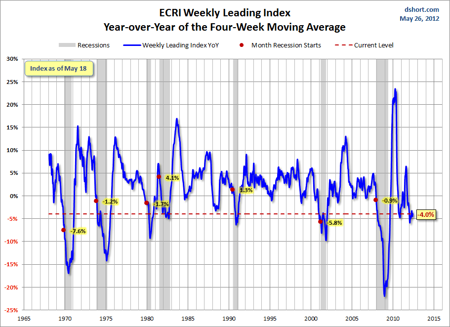
Below are three long-term charts, from Doug Short’s blog post of May 26 titled “ECRI Recession Call Update:  Weekly Leading Index Declines Again.”  These charts are on a weekly basis through the May 25 release, indicating data through May 18.

Here is the ECRI WLI (defined at ECRI’s glossary):

(click on charts to enlarge images)


-

This next chart depicts, on a long-term basis, the Year-over-Year change in the 4-week moving average of the WLI:


-

This last chart depicts, on a long-term basis, the WLI, Gr.:


_________

I post various economic indicators and indices because I believe they should be carefully monitored.  However, as those familiar with this blog are aware, I do not necessarily agree with what they depict or imply.
_____

The Special Note summarizes my overall thoughts about our economic situation

SPX at 1317.82 as this post is written

Friday, May 25, 2012

St. Louis Financial Stress Index – May 24, 2012 Update


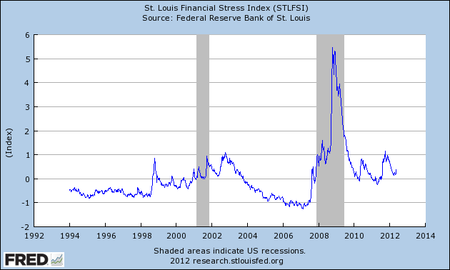
On March 28, 2011 I wrote a post ("The STLFSI") about the  STLFSI (St. Louis Fed’s Financial Stress Index) which is supposed to measure stress in the financial system.  For reference purposes, the most recent chart is seen below.  This chart was last updated on May 24, incorporating data from 12-31-93 to 5-18-12 on a weekly basis.  The 5-18-12 value is .368 :


_________

I post various indicators and indices because I believe they should be carefully monitored.  However, as those familiar with this blog are aware, I do not necessarily agree with what they depict or imply.
_____


The Special Note summarizes my overall thoughts about our economic situation

SPX at 1320.68 as this post is written

Durable Goods New Orders – Long-Term Charts Through April 2012


Many people place emphasis on Durable Goods New Orders as a prominent economic indicator and/or leading economic indicator.

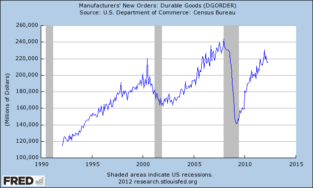
For reference, here are a few charts depicting this measure.

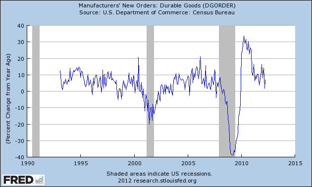
First, from the St. Louis Fed site (FRED), a chart through April, last updated on May 24.  This value is 215,527 ($ Millions) :

(click on charts to enlarge images)


-

Here is the chart depicting this measure on a Percentage Change from a Year Ago basis:


-

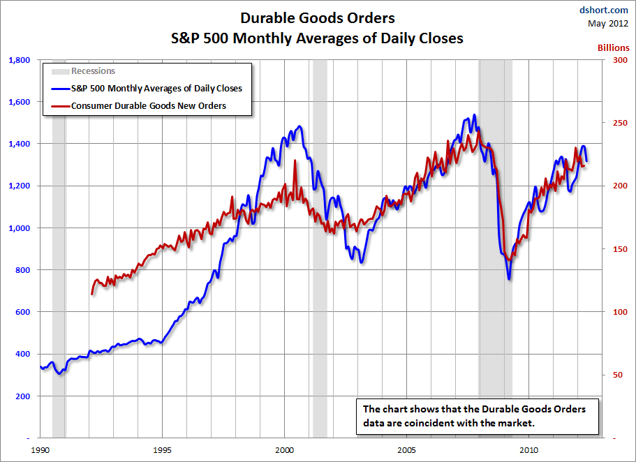
Lastly, a chart from Doug Short’s post of May 24 titled “Durable Goods Orders Up .2%, But Below Expectations” showing the Durable Goods New Orders vs. the S&P500′s monthly average of daily closes:


_____

The Special Note summarizes my overall thoughts about our economic situation

SPX at 1320.68 as this post is written

Thursday, May 24, 2012

The Importance Of Revenue Growth To Hiring


Last Thursday, the Philadelphia Federal Reserve released the May 2012 Business Outlook Survey.

One aspect I found particularly notable was a chart indicating responses to "Factors Restraining Hiring."  As indicated, the foremost response was "Expected growth of sales is low."

In various blog posts - including the April 24 post titled "The Unemployment Situation Facing The United States" - I have commented upon the lagging nature of corporate revenue growth, and how corporate revenue growth appears to be a notable driver of hiring, or lack thereof.

The responses from the May 2012 Business Outlook Survey is yet another confirmation that (expected) revenue growth is a major factor for hiring.  This relationship appears to lack widespread recognition.
_____

The Special Note summarizes my overall thoughts about our economic situation

SPX at 1318.86 as this post is written

Tuesday, May 22, 2012

Updates On Economic Indicators May 2012


Here is an update on various indicators that are supposed to predict and/or depict economic activity.  These indicators have been discussed in previous blog posts:

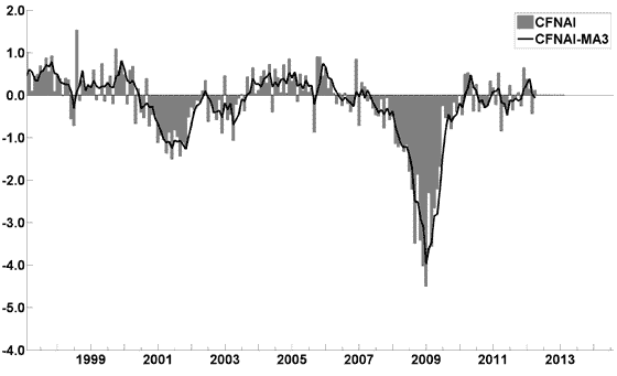
The May Chicago Fed National Activity Index (CFNAI)(pdf) updated as of May 21, 2012:


-


An excerpt from the April 26 update titled “Index forecasts weaker growth” :
The April update of the USA TODAY/IHS Global Insight Economic Outlook Index shows real GDP growth, at a six-month annualized growth rate, increasing to 2.5% in February and March and then slowing to 2.0% during the summer months. While employment, housing (mostly the multifamily sector) and consumer spending are slowly recovering, concerns about the Eurozone and world growth continue.
-


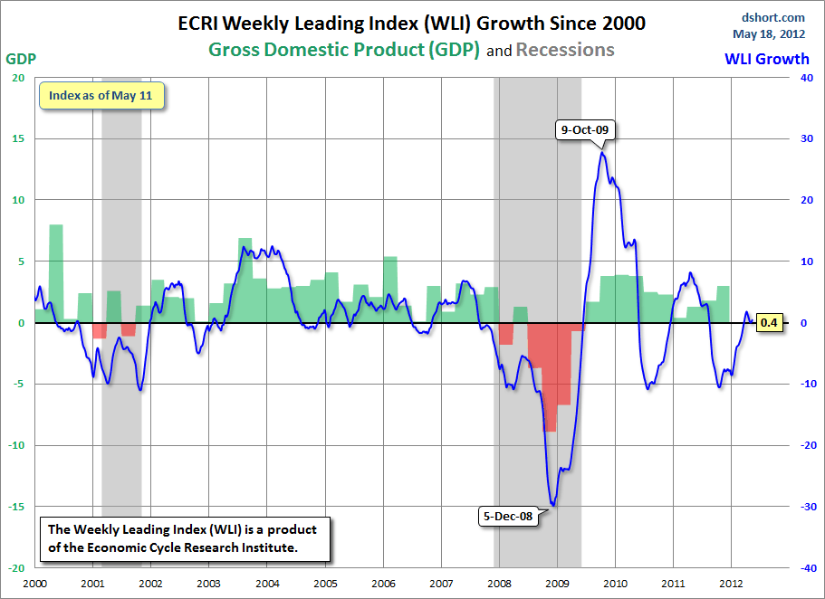
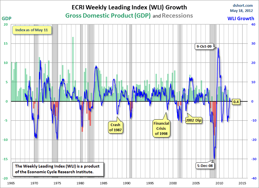
As of 5/18/12 (incorporating data through 5/11/12) the WLI was at 124.5 and the WLI, Gr. was at .4%.

A chart of the WLI, Gr. since 2000, from Doug Short’s blog of May 18 titled “ECRI Recession Call Update:  WLI Declines, But Growth Improves Slightly” :


-


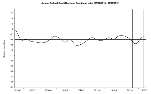
Here is the latest chart, depicting 5-12-10 to 5-12-12:


-


As per the May 17 release, the LEI was at 95.5 and the CEI was at 104.3 in April.

An excerpt from the May 17 release:

Says Ataman Ozyildirim, economist at The Conference Board: “The LEI declined slightly in April. Falling housing permits, rising initial claims for unemployment insurance and subdued consumer expectations offset small gains in the remaining components. The LEI’s six-month growth rate fell slightly, but remains in expansionary territory and well above its growth at the end of 2011. The CEI, a measure of current economic conditions, has also increased for five consecutive months.”
_________

I post various indicators and indices because I believe they should be carefully monitored.  However, as those familiar with this blog are aware, I do not necessarily agree with what they depict or imply.
_____

The Special Note summarizes my overall thoughts about our economic situation

SPX at 1317.73 as this post is written

Monday, May 21, 2012

Walmart’s Q1 2013 Results – Comments


I found various notable items in Walmart’s Q1 2013 earnings call transcript (pdf) dated May 17, 2012.  I view Walmart’s results and comments as particularly noteworthy given their retail prominence and focus on low prices.  I have previously commented on their quarterly conference call comments; these previous posts are found under the “paycheck to paycheck” label.

Here are various excerpts that I find most notable:

comments from Mike Duke, page 7:
I’m pleased that Walmart U.S. grew comp sales 2.6 percent. It was our best quarterly comp performance in three years and was well above the top end of our guidance range. Walmart U.S. not only delivered top line, they also delivered impressive profitability, with operating income growing faster than sales.
comments from Bill Simon, page 14:
Price was the focus of our first quarter marketing, and this will continue to be a key message this year.
comments from Bill Simon, page 14:
Let’s review the financial details for the first quarter. Net sales were up 5.9 percent to $66.3 billion for the quarter. Gross profit was up 4.9 percent to $18 billion. Gross profit rate was down 24 basis points versus last year as we continue strategic price investment. We expect this trend to continue during the year.
comments from Bill Simon, page 16:
While grocery inflation moderated slightly to approximately 3 percent for the quarter, customers are still trading down to lower price points and smaller pack sizes. Trade down and other initiatives reduced the net inflation impact on our customers to between 50 and 150 basis points.
comments from Bill Simon, page 18:
The overall economy is still our customers’ main concern. In particular, they remain concerned about job security or the availability of jobs, followed by gas and energy prices, and rising food costs. Food is consistently the top monthly expense outside of housing and vehicle payments.
comments from Bill Simon, page 19:
Our price investment strategy will gradually reduce what our customers pay, and thus our gross margin rate as well.  We will focus on productivity initiatives and expense management, which will continue to drive results to the bottom line.
_____

The Special Note summarizes my overall thoughts about our economic situation

SPX at 1309.18 as this post is written

Sunday, May 20, 2012

Long-Term Charts Of The ECRI WLI & ECRI WLI, Gr. – May 18, 2012 Update


As I stated in my July 12, 2010 post ("ECRI WLI Growth History"):
For a variety of reasons, I am not as enamored with ECRI’s WLI and WLI Growth measures as many are.
However, I do think the measures are important and deserve close monitoring and scrutiny.
The movement of the ECRI WLI and WLI, Gr. is particularly notable at this time, as ECRI publicly announced on September 30, 2011 that the U.S. was “tipping into recession,” and ECRI has reaffirmed that view since, including a notable statement on March 15 (“Why Our Recession Call Stands”) as well as various interviews and statements last week, including:


Wall Street Journal video, May 9: "Free Market Economies Have Business Cycles"


Below are three long-term charts, from Doug Short’s blog post of May 18 titled “ECRI Recession Call Update:  WLI Declines, But Growth Improves Slightly.”  These charts are on a weekly basis through the May 18 release, indicating data through May 11.

Here is the ECRI WLI (defined at ECRI’s glossary):

(click on charts to enlarge images)


-

This next chart depicts, on a long-term basis, the Year-over-Year change in the 4-week moving average of the WLI:


-

This last chart depicts, on a long-term basis, the WLI, Gr.:


_________

I post various economic indicators and indices because I believe they should be carefully monitored.  However, as those familiar with this blog are aware, I do not necessarily agree with what they depict or imply.
_____

The Special Note summarizes my overall thoughts about our economic situation

SPX at 1295.22 as this post is written

Friday, May 18, 2012

St. Louis Financial Stress Index – May 17, 2012 Update


On March 28, 2011 I wrote a post ("The STLFSI") about the  STLFSI (St. Louis Fed’s Financial Stress Index) which is supposed to measure stress in the financial system.  For reference purposes, the most recent chart is seen below.  This chart was last updated on May 17, incorporating data from 12-31-93 to 5-11-12 on a weekly basis.  The 5-11-12 value is .204 :


_________

I post various indicators and indices because I believe they should be carefully monitored.  However, as those familiar with this blog are aware, I do not necessarily agree with what they depict or imply.


_____

The Special Note summarizes my overall thoughts about our economic situation

SPX at 1304.86 as this post is written
Building Financial Danger – May 18, 2012 Update


On October 17, 2011 I wrote a post titled “Danger Signs In The Stock Market, Financial System And Economy.”  This post is a brief 12th update to that post.

My overall analysis indicates a continuing elevated and growing level of danger which contains  many worldwide and U.S.-specific “stresses” of a very complex nature.

I have written numerous posts of some of what I consider both ongoing and recent “negative developments.”  These developments, as well as other highly problematic conditions, have presented a highly perilous economic environment that endangers the overall financial system.

My analysis continues to indicate that there are many reasons for tremendous concern, as seen in almost innumerable fundamental economic, financial-market, and proprietary measures.   Many prominent parties seem to be fixated on the European financial problems.  While I continue to believe that these European problems are gravely serious and disconcertingly intractable, and have broader implications (as explained in the November 17, 2011 post "Europe And Contagion – Broader Implications"), exceedingly problematical U.S. economic problems also exist.  While many would refute this view - as seen in a variety of recent economic and market forecasts that continue to indicate low probabilities of any type of serious adversity - my analyses indicate this optimism is misplaced, unfortunately.

Among the greatest threats to a quality, sustainable U.S. economic recovery (or expansion) is the existence - and future resolution of - a variety of asset bubbles.  While the collective belief appears to be that either such bubbles don't exist - or if they do exist, they are not something to be unduly concerned about - I continue to find these asset bubbles alarming, and have written extensively about them.

Predicting the timing and extent of a stock market crash is always difficult, and the immense complexity of today’s economic situation makes such a prediction even more challenging. With that being said, my analyses indicate that the danger inherent in the financial system has reached a level at which a stock market crash – that would also involve (as seen in 2008) various other markets as well – has reached a level at which a near-term crash is of tremendous concern.

(note: the “next crash” has outsized significance and implications, as discussed in the post of January 6, "The Next Crash And Its Significance")

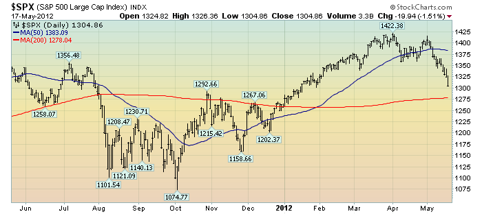
As reference, below is a one-year daily chart of the S&P500, indicating both the 50dma and 200dma as well as price labels.  The current price is 1304.86:

(click on chart to enlarge image)(chart courtesy of StockCharts.com; chart creation and annotation by the author)


_____

The Special Note summarizes my overall thoughts about our economic situation

SPX at 1304.86 as this post is written

Thursday, May 17, 2012

The Federal Reserve's "Dual Mandate"


Recently, there has been increasing mention of the Federal Reserve's "Dual Mandate."

While my thoughts on the topic are complex, and I am not necessarily in agreement with it, I think highlighting some reference material on the the "Dual Mandate" is apropos as I expect there to be much more mention of this in the future.

One of the most thorough discussions of the "Dual Mandate" - especially in the context of our current economic situation - can be found in a February 13, 2012 speech by FRBSF President and CEO John C. Williams titled "The Federal Reserve's Mandate and Best Practice Monetary Policy."

An excerpt from the speech:
Let me start with the Fed’s mission. It’s often said that Congress assigned the Federal Reserve a dual mandate: maximum employment and stable prices. But, that’s not quite accurate. In fact, the Fed has a triple mandate. Section 2A of the Federal Reserve Act calls on the Fed to maintain growth of money and credit consistent—and I quote—“with the economy’s long-run potential to increase production, so as to promote effectively the goals of maximum employment, stable prices, and moderate long-term interest rates.”
The above paragraph contains a footnote referencing the following, as seen in the Federal Reserve Act, Section 2A (Monetary Policy Objectives):
The Board of Governors of the Federal Reserve System and the Federal Open Market Committee shall maintain long run growth of the monetary and credit aggregates commensurate with the economy's long run potential to increase production, so as to promote effectively the goals of maximum employment, stable prices, and moderate long-term interest rates.
[12 USC 225a. As added by act of November 16, 1977 (91 Stat. 1387) and amended by acts of October 27, 1978 (92 Stat. 1897); Aug. 23, 1988 (102 Stat. 1375); and Dec. 27, 2000 (114 Stat. 3028).]
The speech also contains a variety of other notable material, including some long-term charts illustrating various pertinent metrics concerning the "Dual Mandate," as well as the first endnote, an excerpt of which is seen below:
It is interesting to note that the Federal Reserve’s legal mandate has evolved over time in response to economic events and advances in understanding of how monetary policy and the economy function. For example, in the original Federal Reserve Act of 1913, the Fed had no mandate for macroeconomic stabilization and was only charged with providing an “elastic currency” and to act as a lender of last resort for banks. The quote here originates in the Federal Reserve Reform Act of 1977 and remains in place today. See Judd and Rudebusch (1999) for some discussion and more details.
The Federal Reserve Bank of Chicago also maintains a page on the "Dual Mandate" with charts updated as of May 9, 2012.
_____

The Special Note summarizes my overall thoughts about our economic situation

SPX at 1320.06 as this post is written

Wednesday, May 16, 2012

Financial Stocks – May 16, 2012 Update Concerning Poor “Price Action”


On June 29, 2011 I wrote a blog post titled “Financial Stocks – Notable Price Action.”

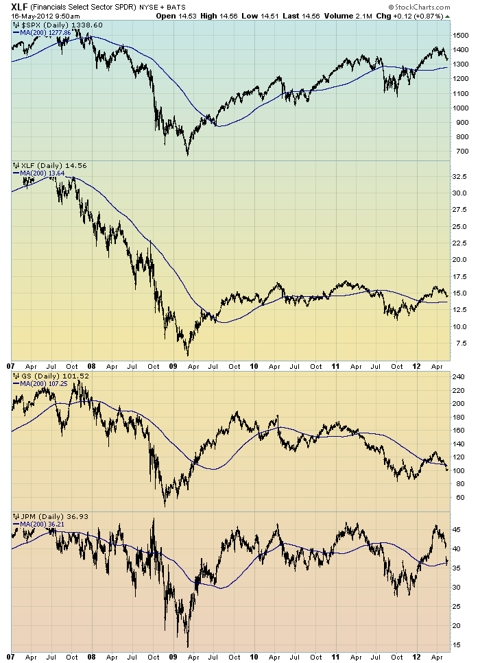
Although financial stocks have increased in price in 2012, I continue to believe that the longer-term “price action” of various financial stocks is disconcerting.  I view the poor performance of these financial and brokerage stocks to be one indicator among (very) many that serves as a “red flag” as to the financial markets and economy as a whole.

Here is an updated chart to that shown in the aforementioned June 29, 2011 post.  It shows the XLF (the financial ETF) on a daily basis since 2007.  As well, the S&P500 is plotted above it, with GS and JPM shown below it.  The blue line on each indicates the 200dma:

(click on chart image to enlarge)(chart courtesy of StockCharts.com; chart created by and annotated by author)


_____

The Special Note summarizes my overall thoughts about our economic situation

SPX at 1340.28 as this post is written
Financial Stocks – Relative Price To Overall Stock Market – May 16, 2012 Update


In the June 29, 2011 post (“Financial Stocks – Notable Price Action”) I wrote the following:
I think that the relatively poor “price action” of various financial stocks is notable.  It is one of many current indications that overall stock market health is not as strong as a casual glance at the major indices would indicate.
I continue to believe that the lagging / “sagging” price of various financial stocks is highly notable.  Here is a chart that I created a while ago that provides another view of the poor “price action” of the financial stocks vs. that of the entire stock market, as depicted by the S&P500:

(click on chart to enlarge image)(chart courtesy of StockCharts.com; chart created by and annotated by author)


-

The above chart is depicted on a daily basis, LOG scale, since 2007.   On each of the three plots, a blue line depicts the 50dma for perspective.

As one can see, there has been an interesting progression of the relative price of the XLF (Financial SPDR) vs. the S&P500, as seen in the top of the chart.  In the middle of the chart, the same can be seen in the $XBD (Broker/Dealer Index).  Generally, since mid-2009, the price of both the XLF and $XBD have been on a slow downward trajectory relative to the price of the S&P500.  The S&P500 is plotted on the bottom of the chart.

In my experience, any time the financials lag the general stock market for a considerable period, it is generally a “red flag” that should be closely monitored.
_____

The Special Note summarizes my overall thoughts about our economic situation

SPX at 1336.93 as this post is written

Tuesday, May 15, 2012

The May 2012 Wall Street Journal Economic Forecast Survey


The May Wall Street Journal Economic Forecast Survey was published on May 14, 2012.  The headline is “Economists Forecast Subdued Growth in 2012.”

I found the following excerpts to be notable:
The economy is expected to add about 185,000 jobs a month over the next year. That rate of growth hasn't been seen since 2006, but it remains too slow to bring down the unemployment rate quickly.
also:
Meanwhile, the prospect of another recession over the next 12 months remains remote. On average, economists put just a 16% chance of another downturn.
also:
But contagion from Europe was the biggest potential pitfall cited by more than half the respondents.
Also, as seen in the Q&A section (in the spreadsheet), the percentage of  economists who see the Federal Reserve starting "another round of large-scale bond buying in 2012" is at 24%.  Also, as to whether the risk to their 2012 economic forecasts are to the upside or downside, 70% said to the downside.


The current average forecasts among economists polled include the following:

GDP:
full-year 2012:  2.5%
full-year 2013:  2.6%
full-year 2014:  3.0%

Unemployment Rate:
December 2012: 7.9%
December 2013: 7.4%
December 2014:  6.8%

10-Year Treasury Yield:
December 2012: 2.47%
December 2013: 3.10%
December 2014:  3.67%

CPI:
December 2012:  2.3%
December 2013:  2.3%
December 2014:  2.6%

Crude Oil  ($ per bbl):
for 12/31/2012: $100.76

(note: I highlight this WSJ Economic Forecast survey each month; commentary on past surveys can be found under the “Economic Forecasts” label)
_____

I post various economic forecasts because I believe they should be carefully monitored.  However, as those familiar with this blog are aware, I do not necessarily agree with many of the consensus estimates and much of the commentary in these forecast surveys.
_____

The Special Note summarizes my overall thoughts about our economic situation

SPX at 1338.35 as this post is written
Monday, May 14, 2012

ECRI Statements From The Week Of May 7, 2012


Last week, ECRI issued a variety of statements and interviews that I found notable.  The full list is found at ECRI's website.

Each of these interviews and articles is in some way a reaffirmation of ECRI's recession call of September 30, 2011 that the U.S. was “tipping into recession,” and ECRI has reaffirmed that view since, including a notable statement on March 15 (“Why Our Recession Call Stands.”)

While I don't necessarily agree with ECRI's analyses and conclusions -my overall thoughts on ECRI’s measures and methodologies are complex and lengthy - below are various of last week's comments that I find notable:


Here, ECRI discusses a variety of issues - including whether recessions can be avoided - and highlights the YoY Growth in Real Personal Income, especially for the last 3 months.  An excerpt:
For the last three months, year-over-year growth in real personal income has stayed lower than it was at the beginning of each of the last ten recessions. In other words, this is what personal income growth typically looks like early in a recession.
Wall Street Journal video, May 9: “Free Market Economies Have Business Cycles


An excerpt:
What most people don’t understand is that recessions often begin when gross domestic product is still showing positive growth.
Four of the past six recessions started during a quarter when GDP was growing, as did 72% of all recessions in the past 94 years[1].
also:
One reason we believe the economy is heading for recession now is weak job growth. Since February, job growth has turned down, as have other key indicators.
also:
In fact, our research shows a new recession is likely to start by mid-2012. Under the circumstances, complacency about U.S. recession risk is likely to prove badly misplaced.
_____

The Special Note summarizes my overall thoughts about our economic situation


SPX at 1353.39 as this post is written