Pages

Saturday, December 29, 2012

Broad-Based Indicators Of Economic Activity


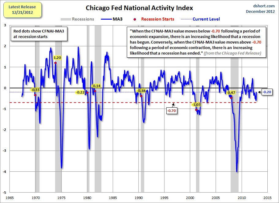
The Chicago Fed National Activity Index (CFNAI) and the Aruoba-Diebold-Scotti Business Conditions Index (ADS Index) are two broad-based economic indicators that I regularly feature in this site.

The current levels of each are notable, as they are flagging from a short-term perspective and their long-term trends continue to sink.

Doug Short, in his blog post of December 27, titled “The Philly Fed Business Conditions Index” displays both the CFNAI MA-3 (3 month Moving Average) and ADS Index (91-Day Moving Average) from a couple of perspectives.

Of particular note, two of the charts, shown below, denote where the current levels of each reading is relative to the beginning of past recessionary periods, as depicted by the red dots.

The CFNAI MA-3:

(click on charts to enlarge images)

Dshort 12-27-12 Chicago-Fed-CFNAI-recession-indicator

-

The ADS Index, 91-Day MA:

Dshort 12-27-12 ADS-index-91-day-MA

-

Also shown in the Doug Short’s aforementioned post is a chart of each with a long-term trendline (linear regression.)

_________

I post various indicators and indices because I believe they should be carefully monitored.  However, as those familiar with this blog are aware, I do not necessarily agree with what they depict or imply.
_____

The Special Note summarizes my overall thoughts about our economic situation

SPX at 1402.43 as this post is written
Friday, December 28, 2012

Long-Term Charts Of The ECRI WLI & ECRI WLI, Gr. – December 28, 2012 Update


As I stated in my July 12, 2010 post ("ECRI WLI Growth History"):
For a variety of reasons, I am not as enamored with ECRI’s WLI and WLI Growth measures as many are.
However, I do think the measures are important and deserve close monitoring and scrutiny.
The movement of the ECRI WLI and WLI, Gr. is particularly notable at this time, as ECRI publicly announced on September 30, 2011 that the U.S. was “tipping into recession,” and ECRI has reaffirmed that view since, seen most recently in these two media sources of December 7:
“Reviewing the indicators used to officially decide U.S. recession dates, it looks like the recession began around July 2012.”
Other past notable 2012 reaffirmations of the September 30, 2011 recession call by ECRI were seen (in chronological order)  on March 15 (“Why Our Recession Call Stands”) as well as various interviews and statements the week of May 6, including:
Also, subsequent to May 2012:
-

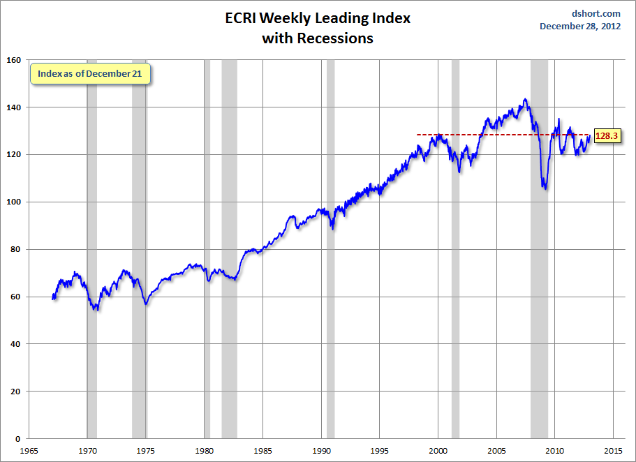
Below are three long-term charts, from Doug Short’s blog post of December 28 titled “ECRI Update:  Flunking Recession 101.”  These charts are on a weekly basis through the December 28 release, indicating data through December 21, 2012.

Here is the ECRI WLI (defined at ECRI’s glossary):

Dshort 12-28-12 ECRI-WLI 128.3

-

This next chart depicts, on a long-term basis, the Year-over-Year change in the 4-week moving average of the WLI:

Dshort 12-28-12 ECRI-WLI-YoY 4.8 percent

-

This last chart depicts, on a long-term basis, the WLI, Gr.:

Dshort 12-28-12 ECRI-WLI-growth-since-1965 5.4

_________

I post various economic indicators and indices because I believe they should be carefully monitored.  However, as those familiar with this blog are aware, I do not necessarily agree with what they depict or imply.
_____

The Special Note summarizes my overall thoughts about our economic situation

SPX at 1409.97 as this post is written

St. Louis Financial Stress Index – December 27, 2012 Update


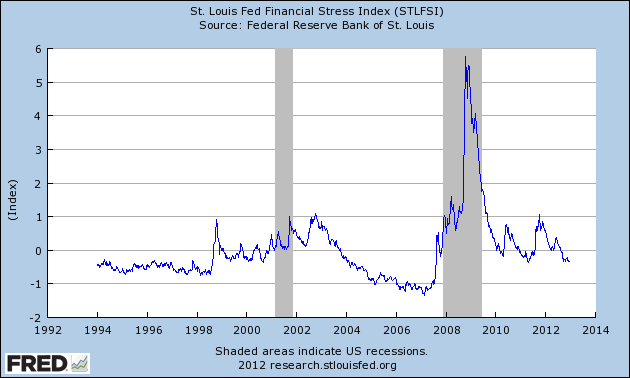
On March 28, 2011 I wrote a post ("The STLFSI") about the  STLFSI (St. Louis Fed’s Financial Stress Index) which is supposed to measure stress in the financial system.  For reference purposes, the most recent chart is seen below.  This chart was last updated on December 27, incorporating data from December 31,1993 to December 21, 2012 on a weekly basis.  The December 27, 2012 value is -.333 :

(click on chart to enlarge image)

STLFSI_12-27-12 -.333

_________

I post various indicators and indices because I believe they should be carefully monitored.  However, as those familiar with this blog are aware, I do not necessarily agree with what they depict or imply.
_____

The Special Note summarizes my overall thoughts about our economic situation

SPX at 1418.10 as this post is written

Consumer Confidence Surveys – As Of December 28, 2012


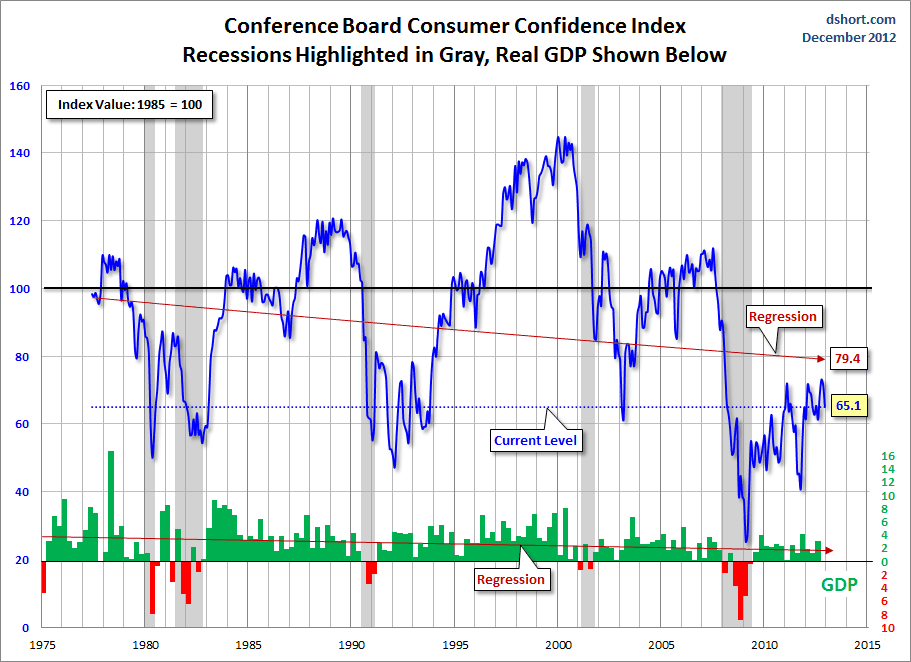
Doug Short had a blog post of December 27 ("Consumer Confidence Takes a Plunge") in which he presents the latest Conference Board Consumer Confidence and Thomson/Reuters University of Michigan Consumer Sentiment Index charts.  They are presented below:

(click on charts to enlarge images)

Dshort 12-27-12 Conference-Board-consumer-confidence-index

-

Dshort 12-27-12 Michigan-consumer-sentiment-index

-

There are a few aspects of the above charts that I find highly noteworthy.  Of course, the continuing subdued absolute levels of these two surveys is disconcerting.

Also, I find the “behavior” of these readings to be quite disparate as compared to the other post-recession periods, as shown in the charts between the gray shaded areas (the gray areas denote recessions as defined by the NBER.)

While I don’t believe that confidence surveys should be overemphasized, I find these readings to be very problematical, especially in light of a variety of other highly disconcerting measures highlighted throughout this blog.
_____

The Special Note summarizes my overall thoughts about our economic situation

SPX at 1418.10 as this post is written

Thursday, December 27, 2012

House Prices Reference Chart


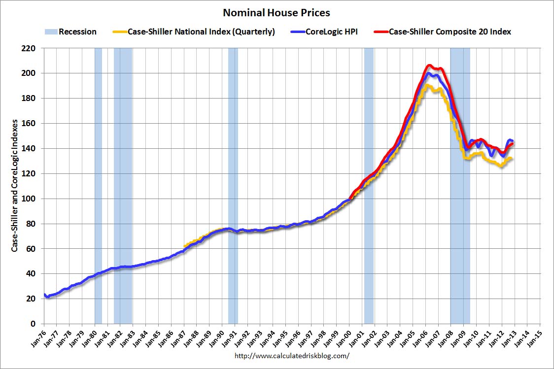
As a reference for long-term house price index trends, below is a chart, updated with the most current data (through October), from the CalculatedRisk blog post of December 26 titled “Comment on House Prices, Real House Prices, Price-to-Rent Ratio” :

(click on chart to enlarge image)

CR 12-26-12 NominalHousePricesOct2012

_____

The Special Note summarizes my overall thoughts about our economic situation

SPX at 1403.59 as this post is written

Zillow December 2012 Home Price Expectations Survey – Summary & Comments


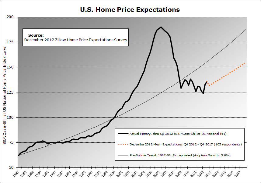
On December 26, the Zillow December 2012 Home Price Expectations Survey (pdf) results were released.  This survey is done on a quarterly basis.

An image from the December 2012 Survey results is seen below:

(click on chart image to enlarge)

Zillow Dec2012 HPE Projections Chart

As one can see from the above chart, the average expectation is that the residential real estate market, as depicted by the Case-Shiller US National Home Price Index (NSA), will continually climb after 2012.

The detail of the December 2012 Home Price Expectations Survey (pdf) is interesting.  Of the 105 survey respondents, 4 (of the displayed responses) forecast a cumulative price decrease through 2017; and of those 4, only 2, William Hummer and Gary Shilling, foresee a double-digit percentage cumulative price drop, at 13.13% and 11.87%, respectively.

The Median Cumulative Home Price Appreciation for years 2012-2017 is seen as 4.60%, 8.12%, 11.94%, 15.86%, 19.42%, and 23.67%, respectively.

For a variety of reasons, I continue to believe that even the most “bearish” of these forecasts (as seen in William Hummer’s above-referenced forecast)  will prove too optimistic in hindsight.  Although a 13.13% cumulative decline is substantial, from a longer-term historical perspective such a decline is rather tame in light of the wild excesses that occurred over the “bubble” years.

I have written extensively about the residential real estate situation.  For a variety of reasons, it is exceedingly complex.  While many people continue to have an optimistic view regarding future residential real estate prices, in my opinion such a view is unsupported on an “all things considered” basis.  Furthermore, (even) from these price levels there exists outsized potential for a price decline of severe magnitude, unfortunately.  I discussed this downside, based upon historical price activity, in the October 24, 2010 post titled “What’s Ahead For The Housing Market – A Look At The Charts.”
_____

The Special Note summarizes my overall thoughts about our economic situation

SPX at 1419.83 as this post is written
December 2012 Duke/CFO Magazine Global Business Outlook Survey – Notable Excerpts


On December 12 the December Duke/CFO Magazine Global Business Outlook Survey (pdf) was released.  It contains a variety of statistics regarding how CFOs view business and economic conditions.

In this CFO Survey, I found the following to be the most notable excerpt:
The fiscal cliff is among the greatest concerns affecting the corporate sector, trailing only weak consumer demand among external concerns. Worries about governmental policies, intense price pressure and the federal budget deficit round out top external concerns of CFOs.
The difficulty in maintaining profit margins is the top concern of internal U.S. firms. Other worries include the cost of health care, attracting and retaining skilled workers, and employee morale.
“These concerns have led to a continued erosion of optimism about the U.S. economy,” said Kate O’Sullivan, editorial director at CFO Magazine. ”Optimism has fallen to 51 out of 100, down from 60 last spring, and even slightly below Europe. This is worrisome because historically reduced optimism foretells slower economic activity over the next year.”
The CFO survey contains the Optimism Index chart, showing U.S. Optimism (with regard to the economy) at 51, as seen below:

Duke CFO Optimism 12-12-12
-

It should be interesting to see how well the CFOs predict business and economic conditions going forward.   I discussed various aspects of this, and the importance of these predictions, in the July 9 2010 post titled “The Business Environment”.

(past posts on CEO and CFO Surveys can be found under the “CFO and CEO Confidence” tag)
_____

I post various economic forecasts because I believe they should be carefully monitored.  However, as those familiar with this blog are aware, I do not necessarily agree with many of the consensus estimates and much of the commentary in these forecast surveys.
_____

The Special Note summarizes my overall thoughts about our economic situation

SPX at 1419.83 as this post is written
Saturday, December 22, 2012

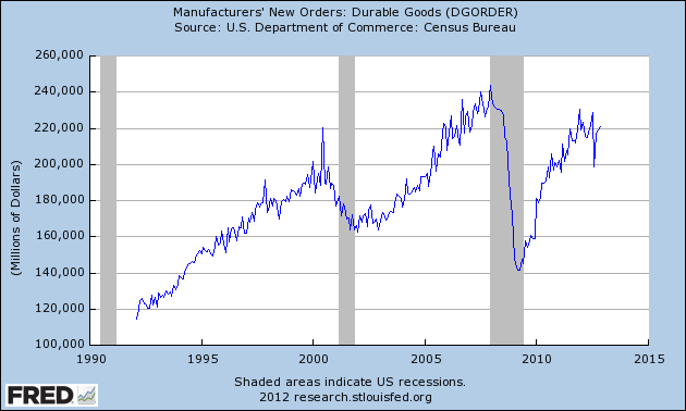
Durable Goods New Orders – Long-Term Charts Through November 2012


Many people place emphasis on Durable Goods New Orders as a prominent economic indicator and/or leading economic indicator.

For reference, below are charts depicting this measure.

First, from the St. Louis Fed site (FRED), a chart through November, last updated on December 21.  This value is 220,941 ($ Millions) :

(click on charts to enlarge images)

DGORDER_12-21-12 220941

-

Here is the chart depicting this measure on a “Percentage Change from a Year Ago” basis:

DGORDER_12-21-12 Percent Change From Year Ago

_________

I post various indicators and indices because I believe they should be carefully monitored.  However, as those familiar with this blog are aware, I do not necessarily agree with what they depict or imply.
_____

The Special Note summarizes my overall thoughts about our economic situation

SPX at 1430.15 as this post is written
Updates On Economic Indicators December 2012


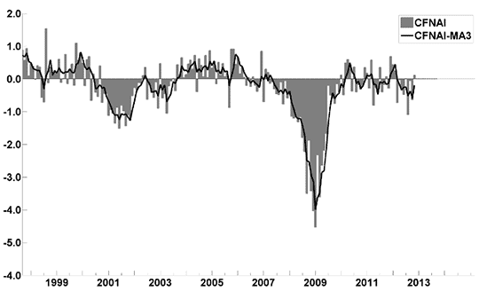
Here is an update on various indicators that are supposed to predict and/or depict economic activity.  These indicators have been discussed in previous blog posts:

The December Chicago Fed National Activity Index (CFNAI)(pdf) updated as of December 21, 2012:

cfnai_monthly_MA3 12-21-12

-

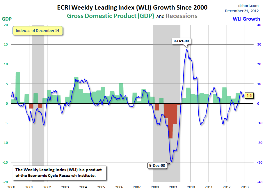
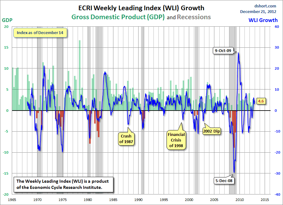
As of 12/21/12 (incorporating data through 12/14/12) the WLI was at 127.2 and the WLI, Gr. was at 4.6%.

A chart of the WLI, Gr. since 2000, from Doug Short’s blog of December 21 titled “ECRI Weekly Leading Index:  The Recession Call Is Further Undermined” :

Dshort 12-21-12 ECRI-WLI-growth-since-2000 4.6

-


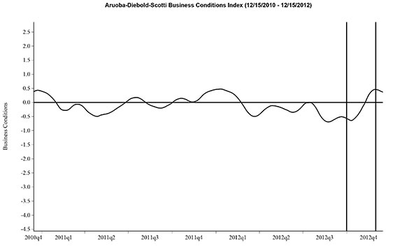
Here is the latest chart, depicting 12-15-10 to 12-15-12:

ads_2yrs_12-15-10 - 12-15-12

-


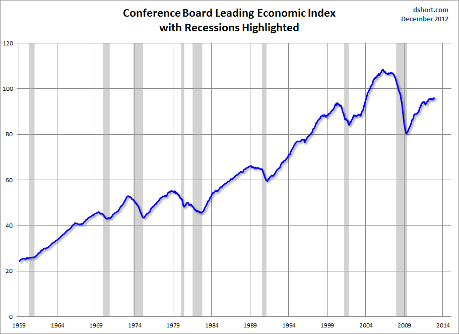
As per the December 20 press release, the LEI was at 95.8 and the CEI was at 104.9 in November.
An excerpt from the December 20 release:
Says Ken Goldstein, economist at The Conference Board: “The indicators reflect an economy that remains weak in the face of strong domestic and international headwinds, as it faces a looming fiscal cliff. Growth will likely be slow through the early months of 2013.”
Here is a chart of the LEI from Doug Short’s blog post of December 20 titled “Conference Board Leading Economic Index:  Six-Month Growth at Zero” :

Dshort 12-20-12 CB-LEI

_________

I post various indicators and indices because I believe they should be carefully monitored.  However, as those familiar with this blog are aware, I do not necessarily agree with what they depict or imply.
_____

The Special Note summarizes my overall thoughts about our economic situation

SPX at 1430.15 as this post is written

Friday, December 21, 2012

Long-Term Charts Of The ECRI WLI & ECRI WLI, Gr. – December 21, 2012 Update


As I stated in my July 12, 2010 post ("ECRI WLI Growth History"):
For a variety of reasons, I am not as enamored with ECRI’s WLI and WLI Growth measures as many are.
However, I do think the measures are important and deserve close monitoring and scrutiny.
The movement of the ECRI WLI and WLI, Gr. is particularly notable at this time, as ECRI publicly announced on September 30, 2011 that the U.S. was “tipping into recession,” and ECRI has reaffirmed that view since, seen most recently in these two media sources of December 7:
“Reviewing the indicators used to officially decide U.S. recession dates, it looks like the recession began around July 2012.”
Other past notable 2012 reaffirmations of the September 30, 2011 recession call by ECRI were seen (in chronological order)  on March 15 (“Why Our Recession Call Stands”) as well as various interviews and statements the week of May 6, including:
Also, subsequent to May 2012:
-
Below are three long-term charts, from Doug Short’s blog post of December 21 titled “ECRI Update:  The Recession Call Is Further Undermined.”  These charts are on a weekly basis through the December 21 release, indicating data through December 14, 2012.

Here is the ECRI WLI (defined at ECRI’s glossary):

(click on charts to enlarge images)

Dshort 12-21-12 ECRI-WLI 127.2

-

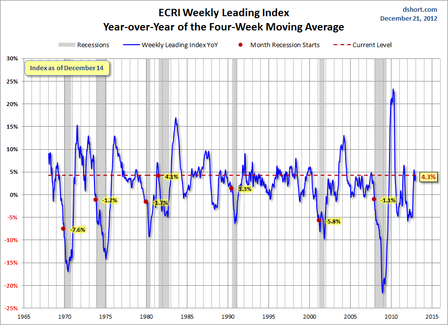
This next chart depicts, on a long-term basis, the Year-over-Year change in the 4-week moving average of the WLI:

Dshort 12-21-12 ECRI-WLI-YoY 4.3 percent

-

This last chart depicts, on a long-term basis, the WLI, Gr.:

Dshort 12-21-12 ECRI-WLI-growth-since-1965 4.6

_________

I post various economic indicators and indices because I believe they should be carefully monitored.  However, as those familiar with this blog are aware, I do not necessarily agree with what they depict or imply.
_____

The Special Note summarizes my overall thoughts about our economic situation

SPX at 1428.44 as this post is written
St. Louis Financial Stress Index – December 20, 2012 Update


On March 28, 2011 I wrote a post ("The STLFSI") about the  STLFSI (St. Louis Fed’s Financial Stress Index) which is supposed to measure stress in the financial system.  For reference purposes, the most recent chart is seen below.  This chart was last updated on December 20, incorporating data from December 31,1993 to December 14, 2012 on a weekly basis.  The December 20, 2012 value is -.338 :

(click on chart to enlarge image)

STLFSI_12-20-12 -.338

_________

I post various indicators and indices because I believe they should be carefully monitored.  However, as those familiar with this blog are aware, I do not necessarily agree with what they depict or imply.
_____

The Special Note summarizes my overall thoughts about our economic situation

SPX at 1428.38 as this post is written
Thursday, December 20, 2012

Current Economic Situation


With regard to our current economic situation,  my thoughts can best be described/summarized by the posts found under the 19 “Building Financial Danger” posts.

My thoughts concerning our ongoing economic situation – with future implications – can be seen on the page titled “A Special Note On Our Economic Situation,” which has been found near the bottom of every blog post since August 15, 2010.
_____

The Special Note summarizes my overall thoughts about our economic situation

SPX at 1435.81 as this post is written

Wednesday, December 19, 2012

Markets During Periods Of Federal Reserve Intervention – December 18, 2012 Update


In the August 9, 2011 post ("QE3 – Various Thoughts") I posted a chart that depicted the movements of the S&P500, 10-Year Treasury Yield and the Fed Funds rate spanning the periods of various Federal Reserve interventions since 2007.

For reference purposes, here is an updated chart from Doug Short’s blog post of December 19 ("Treasury Yield Snapshot") :

(click on chart to enlarge image)

Dshort 12-19-12 SPX-10-yr-yield-and-fed-intervention

_____

The Special Note summarizes my overall thoughts about our economic situation

SPX at 1438.94 as this post is written

Standard & Poor’s S&P500 Earnings Estimates For 2012 & 2013 – As Of December 13, 2012


As many are aware, Standard & Poor’s publishes earnings estimates for the S&P500.  (My posts concerning their estimates can be found under the S&P500 Earnings tag)

For reference purposes, the most current estimates are reflected below, and are as of December 13, 2012:

Year 2012 estimates add to the following:
-From a “bottom up” perspective, operating earnings of $99.46/share
-From a “top down” perspective, operating earnings of N/A
-From a “top down” perspective, “as reported” earnings of $87.78/share

Year 2013 estimates add to the following:
-From a “bottom up” perspective, operating earnings of $113.00/share
-From a “top down” perspective, operating earnings of $107.73/share
-From a “top down” perspective, “as reported” earnings of $101.65/share
_____

I post various economic forecasts because I believe they should be carefully monitored.  However, as those familiar with this blog are aware, I do not agree with many of the consensus estimates and much of the commentary in these forecast surveys.
_____

The Special Note summarizes my overall thoughts about our economic situation

SPX at 1446.79 as this post is written

Tuesday, December 18, 2012

2013 Estimates For S&P500 Earnings & Price Levels


In the December 15 edition of Barron’s, the cover story is titled “Outlook 2013.”

Included in the story, 10 stock-market strategists give various forecasts for 2013 including S&P500 profits, S&P500 year-end price targets, GDP growth, and 10-Year Treasury Note Yields.

A couple of excerpts:
The 10 strategists recently surveyed by Barron's see more gains ahead next year. Their mean S&P prediction for 2013 -- 1562 -- implies a 10% price gain from current levels.
also:
Ironically, a stronger conviction about stocks comes despite the strategists' predictions of ho-hum growth next year in corporate earnings. Their mean forecast for S&P 500 profits is $108 a share, up 5% from this year's estimated $102.
The article also mentions that a separate group of industry analysts  has a 2013 earnings forecast of $113.  This "bottom up" figure of $113 seems to be a widely-held consensus level.

_____

I post various economic forecasts because I believe they should be carefully monitored.  However, as those familiar with this blog are aware, I do not agree with many of the consensus estimates and much of the commentary in these forecast surveys.
_____

The Special Note summarizes my overall thoughts about our economic situation

SPX at 1431.91 as this post is written