Pages

Monday, March 31, 2014

Deloitte “CFO Signals” Report Q1 2014 – Notable Aspects

Recently Deloitte released their “CFO Signals” “High-Level Summary” report for the 1st Quarter of 2014.
As seen in page 2 of the report, "One hundred and nine CFOs responded during the two-week period ending February 21. Sixty-nine percent of the respondents are from public companies, and 81% are from companies with more than $1B in annual revenue. For more information, please see the “About the Survey” section of this report."
Here are some of the excerpts that I found notable:
from page 3:
How do you regard the current and future status of the North American,Chinese, and European economies? Views of North America improved, with 42% describing conditions as good (26% last quarter), and 62% expecting better conditions in a year (55% in 4Q13). Thirty-seven percent regard China’s economy as good (32% in 4Q13), and 33% expect improvement (38% in 4Q13). Nearly one third now see Europe improving in a year– a major sentiment shift. 
What is your company’s business focus for the next year? CFOs still indicate a bias toward “pursuing opportunity” over “limiting risk,” but there is a stronger risk focus this quarter. Growth is again biased toward new offerings and existing geographies.
Compared to the past 12 months, how do you expect your key operating metrics to change over the next 12 months?* Sales growth expectations rose slightly from last quarter’s survey low of 4.1% to 4.6% this quarter. Earnings expectations declined from 8.6% to a survey-low 7.9%. Capital spending held steady at 6.5%, but are below the survey average of 8%. Domestic hiring expectations declined to just 1.0% from last quarter’s 1.4%.
How does your optimism regarding your company’s prospects compare to last quarter? Coming off the first entire calendar year in which net optimism stayed positive, net optimism remained strong this quarter at +27 (down from +33 last quarter). But sentiment normally peaks early in the calendar year, and this quarter’s net optimism is the lowest for any first quarter on record.
Overall, what external or internal risk worries you the most?  Worries returned around the health and trajectory of both mature and developing economies. CFOs expressed worries that economies will falter due to weak growth and external shocks, and also about effects of slow job growth on consumer demand.
from page 13:
Domestic hiring expectations declined to just 1.0%, below last quarter’s 1.4% and among the lowest in the history of the survey. The median is again 0.0%, and variability of responses is very high. Forty-two percent of CFOs expect year-over-year gains (comparatively low), and 18% expect cuts (comparatively low).
Among the various charts and graphics in the report are graphics depicting trends in “Own Company Optimism” and “Economy Optimism” found on page 6.
_____
I post various business and economic surveys because I believe they should be carefully monitored.  However, as those familiar with this blog are aware, I do not necessarily agree with many of the consensus estimates and much of the commentary in these surveys.
_____
The Special Note summarizes my overall thoughts about our economic situation
SPX at 1857.62 as this post is written

Saturday, March 29, 2014

Corporate Profits As A Percentage Of GDP

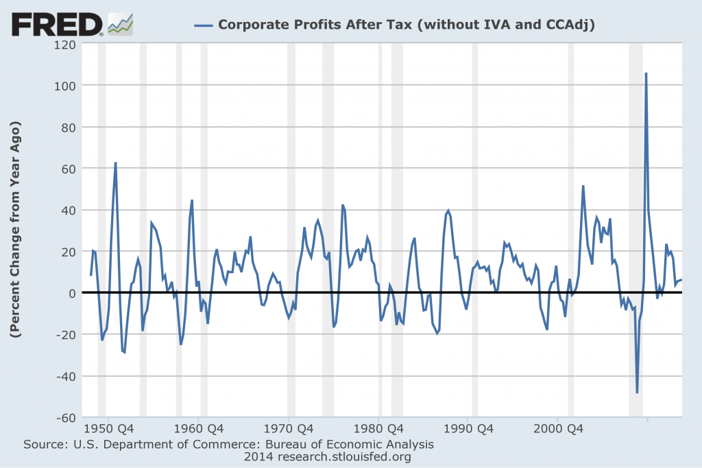
In the last post (“4th Quarter 2013 Corporate Profits“) I displayed, for reference purposes, a long-term chart depicting Corporate Profits After Tax.
There are many ways to view this measure, both on an absolute as well as relative basis.
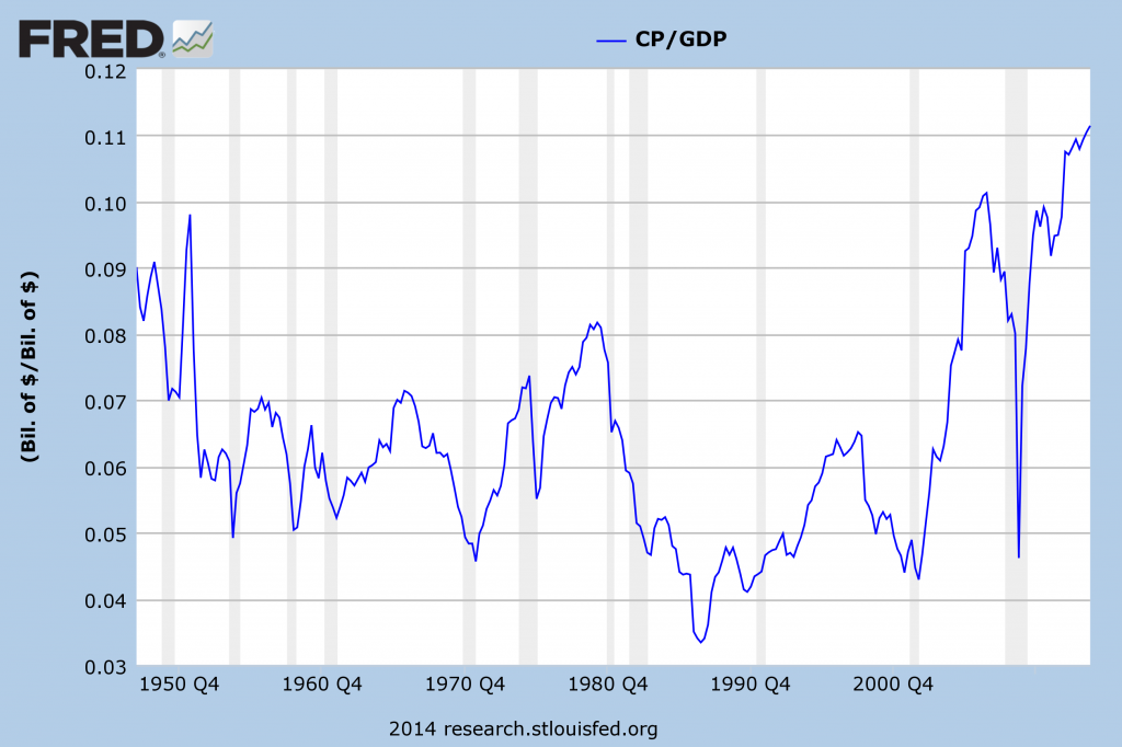
One relative measure is viewing Corporate Profits as a Percentage of GDP.  I feel that this metric is important for a variety of reasons.  As well, the measure is important to a variety of parties, including investors, businesses, and government policy makers.
As one can see from the long-term chart below (updated through the fourth quarter), (After Tax) Corporate Profits as a Percentage of GDP is at levels that can be seen as historically (very) high.  While there are many reasons as to why this is so, from a going-forward standpoint I think it is important to recognize both that such a notable condition exists, as well as contemplate and/or plan for such factors and conditions that would come about if (and in my opinion “when”) a more historically “normal” ratio of Corporate Profits as a Percentage of GDP occurs.  This topic can be very complex in nature, and depends upon myriad factors.  In my opinion it deserves far greater recognition.
(click on chart to enlarge image)
corporate profits as a percent of GDP
Data Source: FRED, Federal Reserve Economic Data, Federal Reserve Bank of St. Louis; accessed March 29, 2014
_____
The Special Note summarizes my overall thoughts about our economic situation
SPX at 1857.62 as this post is written

4th Quarter 2013 Corporate Profits

Thursday's GDP release (Q4, 2nd Estimate) was accompanied by the BLS Corporate Profits report for the 4th Quarter.
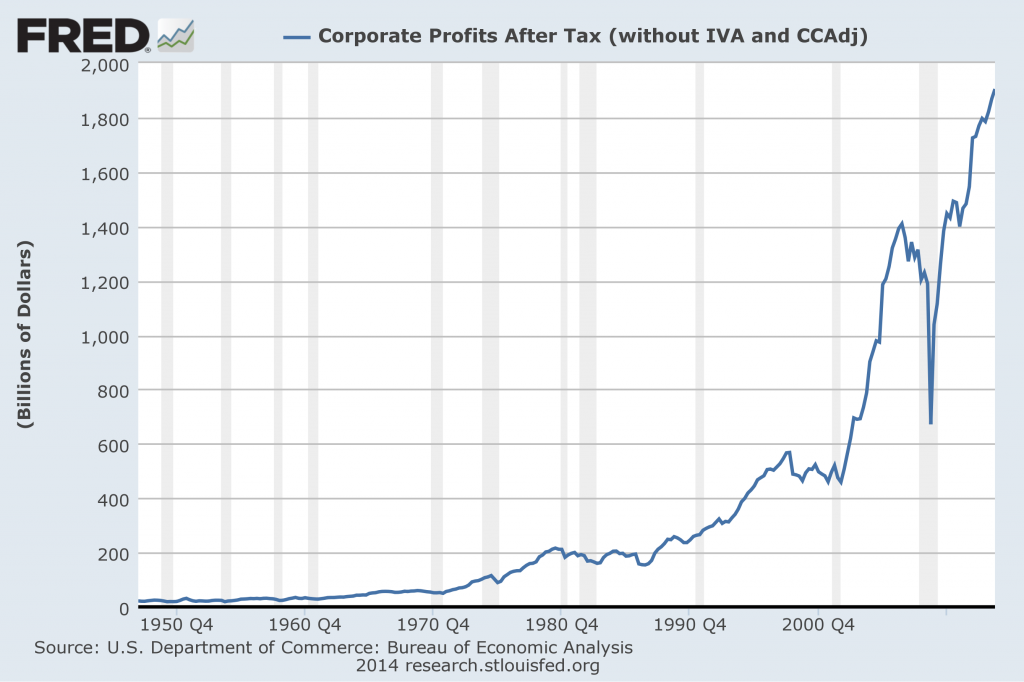
Of course, there are many ways to adjust and depict overall Corporate Profits.  For reference purposes, here is a chart from the St. Louis Federal Reserve (FRED) showing the Corporate Profits After Tax (last updated March 27, 2014, with a value of $1904.50 Billion) :
Corporate Profits After Tax
-
Here is the Corporate Profits After Tax measure shown on a Percentage Change from a Year Ago perspective:
Corporate Profits After Tax Percent Change From Year Ago
Data Source: FRED, Federal Reserve Economic Data, Federal Reserve Bank of St. Louis: Corporate Profits After Tax [CP]; U.S. Department of Commerce: Bureau of Economic Analysis; accessed March 29, 2014; https://research.stlouisfed.org/fred2/series/CP
_____
The Special Note summarizes my overall thoughts about our economic situation
SPX at 1857.62 as this post is written

Friday, March 28, 2014

Consumer Confidence Surveys – As Of March 28, 2014

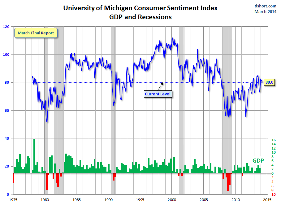
Doug Short had a blog post of March 28, 2014 (“Michigan Consumer Sentiment...“) in which he presents the latest Conference Board Consumer Confidence and Thomson/Reuters University of Michigan Consumer Sentiment Index charts.  They are presented below:
(click on charts to enlarge images)
Conference Board Consumer Confidence
-
University of Michigan Consumer Sentiment
-
There are a few aspects of the above charts that I find highly noteworthy.  Of course, the continuing subdued absolute levels of these two surveys is disconcerting.
Also, I find the “behavior” of these readings to be quite disparate as compared to the other post-recession periods, as shown in the charts between the gray shaded areas (the gray areas denote recessions as defined by the NBER.)
While I don’t believe that confidence surveys should be overemphasized, I find these readings to be very problematical, especially in light of a variety of other highly disconcerting measures highlighted throughout this blog.
_____
The Special Note summarizes my overall thoughts about our economic situation
SPX at 1856.06 as this post is written

Durable Goods New Orders – Long-Term Charts Through February 2014

Many people place emphasis on Durable Goods New Orders as a prominent economic indicator and/or leading economic indicator.
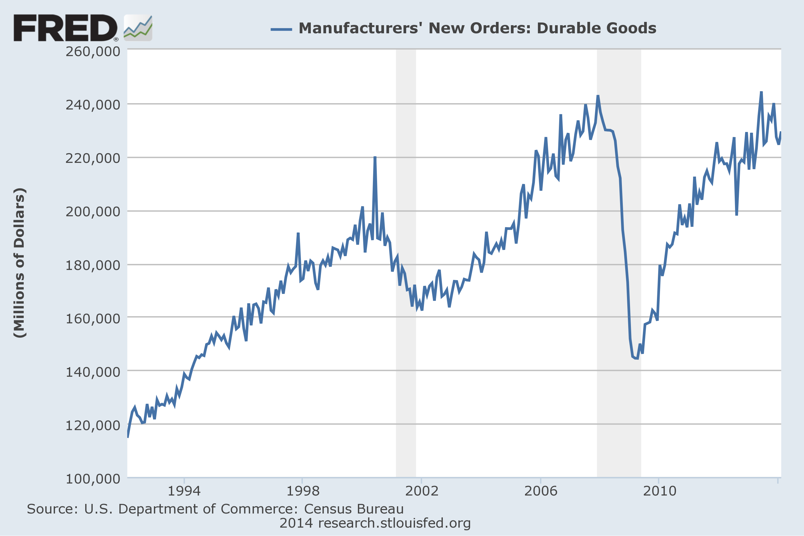
For reference, below are charts depicting this measure.
First, from the St. Louis Fed site (FRED), a chart through February, last updated on March 26, 2014.  This value is 229,379 ($ Millions) :
(click on charts to enlarge images)
Durable Goods New Orders
-
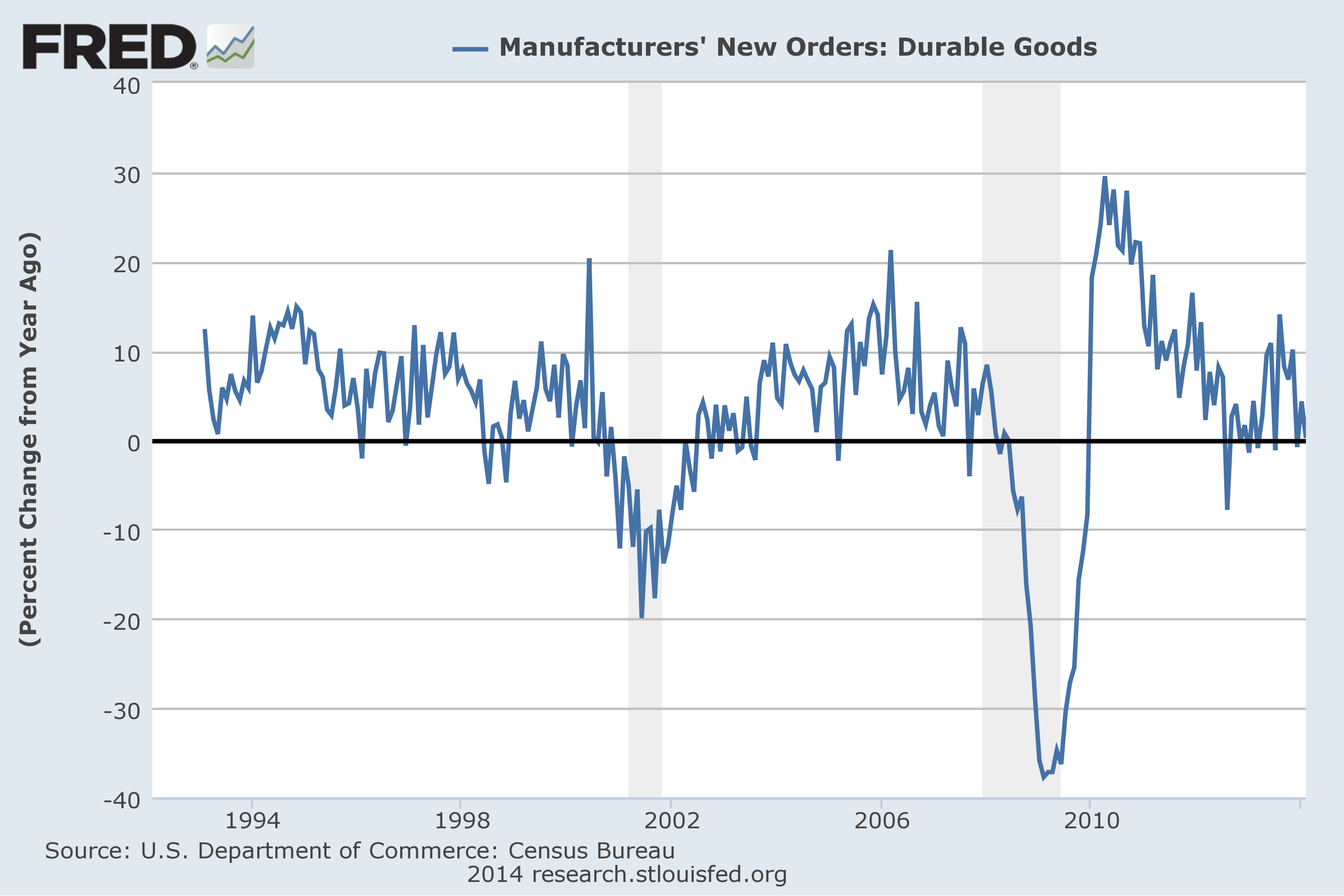
Here is the chart depicting this measure on a “Percentage Change from a Year Ago” basis:
DGORDER_3-26-14 229379 Percent Change From Year Ago
Data Source: FRED, Federal Reserve Economic Data, Federal Reserve Bank of St. Louis: Manufacturers’ New Orders:  Durable Goods [DGORDER] ; U.S. Department of Commerce: Census Bureau ; accessed March 28, 2014;
_________
I post various indicators and indices because I believe they should be carefully monitored.  However, as those familiar with this blog are aware, I do not necessarily agree with what they depict or imply.
_____
The Special Note summarizes my overall thoughts about our economic situation
SPX at 1855.50 as this post is written

Monday, March 24, 2014

Updates Of Economic Indicators March 2014

Here is an update of various indicators that are supposed to predict and/or depict economic activity. These indicators have been discussed in previous blog posts:
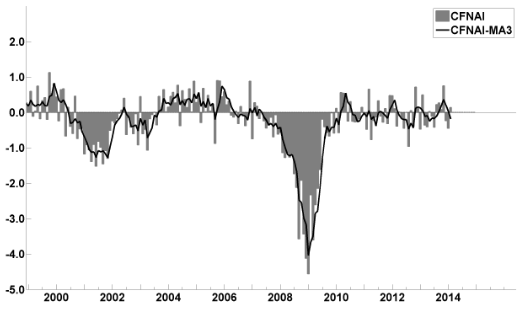
The March 2014 Chicago Fed National Activity Index (CFNAI)(pdf) updated as of March 24, 2014:
CFNAI-MA3
-
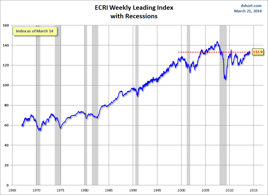
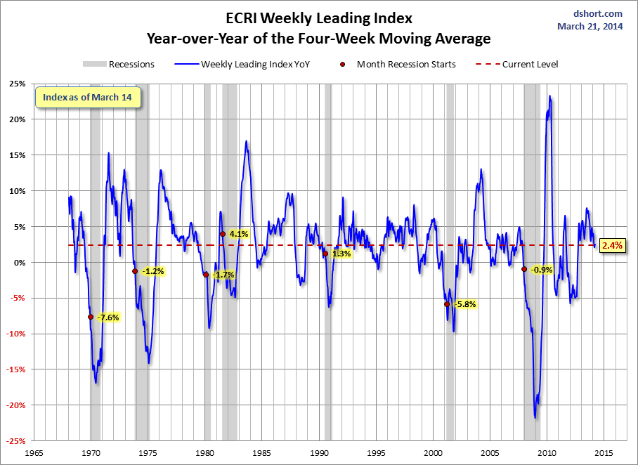
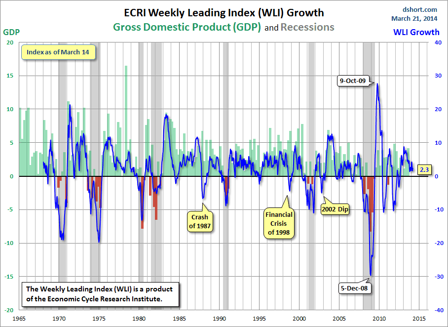
As of March 21, 2014 (incorporating data through March 14, 2014) the WLI was at 132.9 and the WLI, Gr. was at 2.3%.
Here is a chart of the ECRI WLI,Gr., from Doug Short’s March 21, 2014 post titled “ECRI Recession Watch:  Weekly Update” :
ECRI WLI,Gr.
-
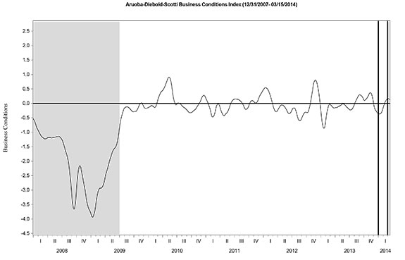
Here is the latest chart, depicting the ADS Index from December 31, 2007 through March 15, 2014:
ads_12-31-07 to 3-15-14
-
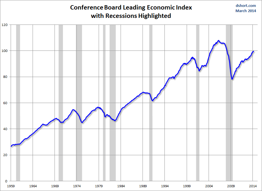
As per the March 20, 2014 press release, the LEI was at 99.8 and the CEI was at 108.2 in February.
An excerpt from the March 20 release:
“While the CEI shows the pace of economic activity remained slow at the start of 2014, the trend in the LEI remains quite positive,” said Ken Goldstein, Economist at The Conference Board. “The biggest challenge continues to be weak consumer demand, pinned down by weak wage growth. These conditions were still in evidence the first two months of the year, but will likely improve as spring arrives.”
Here is a chart of the LEI from Doug Short’s blog post of March 20 titled “Conference Board Leading Economic Index Increased in February“ :
Conference Board LEI

_________
I post various indicators and indices because I believe they should be carefully monitored.  However, as those familiar with this blog are aware, I do not necessarily agree with what they depict or imply.
_____
The Special Note summarizes my overall thoughts about our economic situation
SPX at 1866.26 as this post is written

Current Economic Situation

With regard to our current economic situation, my thoughts can best be described/summarized by the posts found under the 34 “Building Financial Danger” posts.
My thoughts concerning our ongoing economic situation – with future implications – can be seen on the page titled “A Special Note On Our Economic Situation,” which has been found near the bottom of every blog post since August 15, 2010.
_____
The Special Note summarizes my overall thoughts about our economic situation
SPX at 1866.52 as this post is written

Friday, March 21, 2014

Long-Term Charts Of The ECRI WLI & ECRI WLI, Gr. – March 21, 2014 Update

As I stated in my July 12, 2010 post (“ECRI WLI Growth History“):
For a variety of reasons, I am not as enamored with ECRI’s WLI and WLI Growth measures as many are.
However, I do think the measures are important and deserve close monitoring and scrutiny.
The movement of the ECRI WLI and WLI, Gr. is particularly notable at this time, as ECRI publicly announced on September 30, 2011 that the U.S. was “tipping into recession,” and ECRI has reiterated the view that the U.S. economy is currently in a recession, seen most recently in these twelve sources :
Other past notable year 2012 reaffirmations of the September 30, 2011 recession call by ECRI were seen (in chronological order) on March 15 (“Why Our Recession Call Stands”) as well as various interviews and statements the week of May 6, including:
Also, subsequent to May 2012:
__
Below are three long-term charts, from Doug Short’s blog post of March 21, 2014 titled “ECRI Recession Watch:  Weekly Update.”  These charts are on a weekly basis through the March 21 release, indicating data through March 14, 2014.
Here is the ECRI WLI (defined at ECRI’s glossary):
ECRI WLI
-
This next chart depicts, on a long-term basis, the Year-over-Year change in the 4-week moving average of the WLI:
Dshort 3-21-14 - ECRI-WLI-YoY 2.4 percent
-
This last chart depicts, on a long-term basis, the WLI, Gr.:
ECRI WLI,Gr.

_________
I post various economic indicators and indices because I believe they should be carefully monitored.  However, as those familiar with this blog are aware, I do not necessarily agree with what they depict or imply.
_____
The Special Note summarizes my overall thoughts about our economic situation
SPX at 1866.52 as this post is written

Janet Yellen’s March 19, 2014 Press Conference – Notable Aspects

On Wednesday, March 19, 2014 Janet Yellen gave her scheduled press conference. (video)
Below are Janet Yellen's comments I found most notable – although I don’t necessarily agree with them – in the order they appear in the transcript.  These comments are excerpted from the “Transcript of Chairman Yellen’s Press Conference“(preliminary)(pdf) of March 19, 2014, with the accompanying “FOMC Statement” and “Economic Projections of Federal Reserve Board Members and Federal Reserve Bank Presidents, March 2014“ (pdf).
From Janet Yellen’s opening comments
Inflation has continued to run below the Committee’s 2 percent objective.  Given that longer-term inflation expectations appear to be well-anchored, and in light of the ongoing recovery in the United States and in many economies around the world, the FOMC continues to expect inflation to move gradually back toward its objective.  The Committee is mindful that inflation running persistently below its objective could pose risks to economic performance.  The Committee also recognizes, however, that policy actions tend to exert pressure on inflation that is manifest only gradually over time. The FOMC will continue assessing incoming data carefully to ensure that policy is consistent with attaining the FOMC’s longer-run objectives of maximum employment and inflation of 2 percent.
also:
Let me now return to our decision to make another measured reduction in the pace of asset purchases.  Starting next month, we will be purchasing $55 billion of securities per month, down $10 billion per month from our current rate.  Even after today’s action takes effect, we will continue to significantly expand our holdings of longer-term securities, and we will also continue to roll over maturing Treasury securities and reinvest principal payments from the FOMC’s holdings of agency debt and agency mortgage-backed securities in agency mortgage-backed securities.  These sizable and still-increasing holdings will continue to put downward pressure on longer-term interest rates, support mortgage markets, and make financial conditions more accommodative, helping to support job creation and a return of inflation to the Committee’s objective.
Janet Yellen’s responses as indicated to the various questions:
YLAN MUI. Hi, Ylan from the Washington Post. You mentioned in your testimony on Capitol Hill recently that the Fed was trying to assess the balance of weather effects versus more fundamental weakness in the economy as the reason for the slowdown in growth in the first quarter, and you guys mentioned in the statement weather specifically. Does that mean that the Fed’s analysis has come down on the side weather, or are you still concerned that there could be something else going that can be contributing in slower growth, and you guys also lowered your forecast for GDP growth this year?
CHAIR YELLEN. So I'd say certainly the analysis that we've done, and we did spent a lot of time discussing weather and how it’s affected businesses and households in various parts of the country. Certainly weather has played an important role in weakening economic activity in Q1. It's not the only factor that is at work, and most projections for growth in the first quarter are reasonably weak. It's an important factor. It's not the only factor. But I would say it's likely in the view of most of the Committee to begin to wash out in the second quarter, and we can even see some rebound.
Now, I would say I know what we've said about weather is a little bit complicated and confusing. So, you know, let me just say between December and January, the Committee saw a data that led it to be quite a bit more optimistic about the economic outlook. So I would say incoming data since January, when our statement sounded quite an optimistic tone, partly down due to weather and partly down because we probably overdid the optimism in January. So in some sense, our views have moved around here a little bit, but if we take December to March, Committee's views are largely unchanged.
also:
ANN SAPHIR. To be clear. I just wanted to be clear about that. Then once you do wind down the bond buying program, could you tell us how long of a gap we might expect before the rate hikes do begin?
CHAIR YELLEN. So, the language that we use in the statement is “considerable period.” So, I, you know, this is the kind of term it's hard to define. But, you know, probably means something on the order of around six months or that type of thing. But, you know, it depends what the statement is saying as it depends what conditions you like. We need to see where the labor market is, how close are we to our full employment goal--that will be a complicated assessment not just based on a single statistic--and how rapidly as we moving toward it. Are we really close and moving fast? Or are we getting closer but moving very slowly? And then, what the statement emphasizes and this is the same language we used in December and January, we used the language especially if inflation is running below our 2 percent objective. Inflation matters here, too, and our general principle tries to capture that notion. If we have a substantial short fall in inflation, if inflation is persistently running below our 2 percent objective, that is a very good reason to hold the funds rate at its present range for longer.
also:
JEFF KERNS. Jeff Kerns from Bloomberg News. You’ve spoken in the past about, thinking about back to March of last year, of how you supplement your view of the labor market beyond unemployment with other gauges like quick rates and layouts and things like that. How was your--how's your dashboard evolved in the past few months in terms both of the--which indicators you like to watch most, and also in terms of the quality of data that you think, whether it's positive, negative, that you're getting from these indicators. Thank you.
CHAIR YELLEN. So, I have talked in the past about indicators I like to watch or I think that are relevant in assessing the labor market. In addition to the standard unemployment rate, certainly look at boarder measures of unemployment. I mentioned U6 in my statement. It--five percent of the labor force working part time on an involuntary basis, that's an exceptionally high number relative to the measured unemployment rate, and so, to my mind, is a form of slack that is, adds to what we see in the normal unemployment rate and is unusually large. However, it is coming down as well as U3. It's moving in the right direction and it's moved even more recently than U3. Of course, I watch discouraged and marginally attached workers. The share of longterm unemployment has been immensely high and can be very stubborn in bringing down, that’s something that I watch closely again, that remains exceptionally high but it has come down from something like 45 percent, high 30s, but that's certainly in my dashboard. Labor force participation, I do think most research suggests that due to demographic factors, labor force participation will be coming down and there has been a downward trend now for a number of years. But I think there is also a cyclical component in the fact that labor force participation is depressed. And so, it may be that as the economy begins to strengthen, we could see labor force participation flattened out for a time as discouraged workers start moving back into the labor market. And so that's something I'm watching closely. In the Committee, we'll have to watch-- there are different views on this within the Committee and it's hard to know definitively what part of labor force participation is structural versus cyclical. So, it's something to watch closely. I've also mentioned in the past measures of labor market turnover. You mentioned quits. A remarkably large share of workers quit their jobs every month, usually going directly into another job. And I take the quit rate in many ways as a sign of the health of the economy. When workers are scared they won't be able to get other jobs they show a reduced willingness to quit their jobs. Now, quit rates now are below normal pre-recession levels, but on the other hand, they have come up over time and so we have seen improvement. The job opening rate has also come up. The hires rate, however, remains extremely depressed and I take that as a sign of a weaker labor market. But most of these measures, although they don't paint the identical extent of improvement, if you ask about my dashboard, the dial on virtually all of those things is moving in a direction of improvement. The final thing I've mentioned is wages and wage growth has really been very low. I know there is perhaps one isolated measure of wage growth that suggests some uptick, but most measures of wage increase are running at very low levels. In fact, with productivity growth, we have, and two percent inflation, one would probably expect to see on an ongoing basis something between perhaps three and four percent wage inflation would be normal. Wage inflation has been running at two percent. So not only is it depressed, signaling weakness in the labor market, but it is certainly not flashing and increase it, and it might signal some tightening or meaningful pressures on inflation, at least over time. And I would say we're not seeing that.
also:
WYATT ANDREWS. Madam Chair, Wyatt Andrews from CBS. For tens of millions of Americans, the recovery is an awful long time coming. May we know your thoughts on why the recovery is so slow and why the economy is not creating more jobs?
CHAIR YELLEN. Well, I think the short answer is that we have lived through a devastating financial crisis that has taken an exceptional toll on the economy in many different ways, from housing to leaving a huge number of home owners with mortgages, living in homes with mortgages that are underwater, has had a highly negative effect on their credit readings and their ability to access credit, has left businesses with very cautious attitudes that we see in business investment spending that is very restrained. On top of that, we've had weakness in the global economy and we've had a very tight fiscal policy at home after stimulus, if the onset of the recession, we've had a good deal of fiscal consolidation in the United States and, at a time when fiscal policy normally in the past would have been serving to create jobs, fiscal policy from that standpoint has served as a headwind to the recovery. And if the federal--especially at the federal level--but also with state and local levels as well. And so, we have had a disappointing recovery. And monetary policy has tried to do what we can to offset that. But, you know, the linkages aren't as strong and aren't as quick as we might ideally like them to be.
also:
KATE DAVIDSON. Hi, Kate Davidson from Politico. Much has been made about the fact that you and your predecessor agreed on many policies. You shared a lot of the same policy views. Can you tell us one way in which your chairmanship will be different than Ben Bernanke's?
CHAIR YELLEN. Well, I think we are committed to exactly the same set of goals. And, you know, as I indicated I--my goal, and I will, you know, throw myself into this as whole heartedly as I can, is to make rapid progress, as rapid progress as we possibly can in getting this recovery back on track and putting Americans back to work and into jobs, and in moving inflation back up to levels that--at the Committee's target of 2 percent. My predecessor was also devoted to that. Strengthening the financial system is a work in progress. And he made large inroads in strengthening the financial system. I just say there is more work to be done, have a long to-do list. I would absolutely, it's high priority for me to see further work done in addressing too big to fail. We have a to-do list of things we want to accomplish, and then assessing threats to financial stability because neither one of us, and no one wants to live through a financial crisis like the last one. And we want to be extremely cognizant of emerging threats to the financial system. So, I haven't answered your question by saying that I will be different, but I think he had a very good agenda and it's one I shared. It's why I came to Washington to be vice chair and it's the agenda I expect to continue pursuing.
also:
VICTORIA MCGRANE. Victoria McGrane from Dow Jones Newswires. You've spoken about how unemployment is more than just statistics to you. And I wanted to ask when you've made that statement, who do you have in mind or--and what do you do if anything to keep in touch with that kind of human side of the impact of the economic crisis and slow recovery that we've had?
CHAIR YELLEN. Well, I'd be surprised if anyone in this room doesn't know someone who has been touched by the crisis, by unemployment, by difficulties in getting jobs, and that’s-is true of me and my family and friends, I think as it is probably for many of you. I talked to a broad range of business contacts and try to stay in touch with what's happening with real people in the economy. We have--do a lot of work in community development in the Fed and have groups come to talk to us and explain to us how their communities have been affected by the economic situation and by the housing crisis. When I was in San Francisco, we worked--you know, we had programs there, we worked very closely particularly in low-income communities that have been very badly affected, to design programs that could potentially be helpful. We tried to study what kinds of programs can be most effective and to try to understand what kinds of advice we could give to those in the community development lending field to help. So, I do try to listen to people that represent communities that are experiencing the worst of the crisis and stay in touch with it that way.

_____
The Special Note summarizes my overall thoughts about our economic situation
SPX at 1881.01 as this post is written
Median Household Income Chart

I have written many blog posts concerning the worrisome trends in income and earnings.
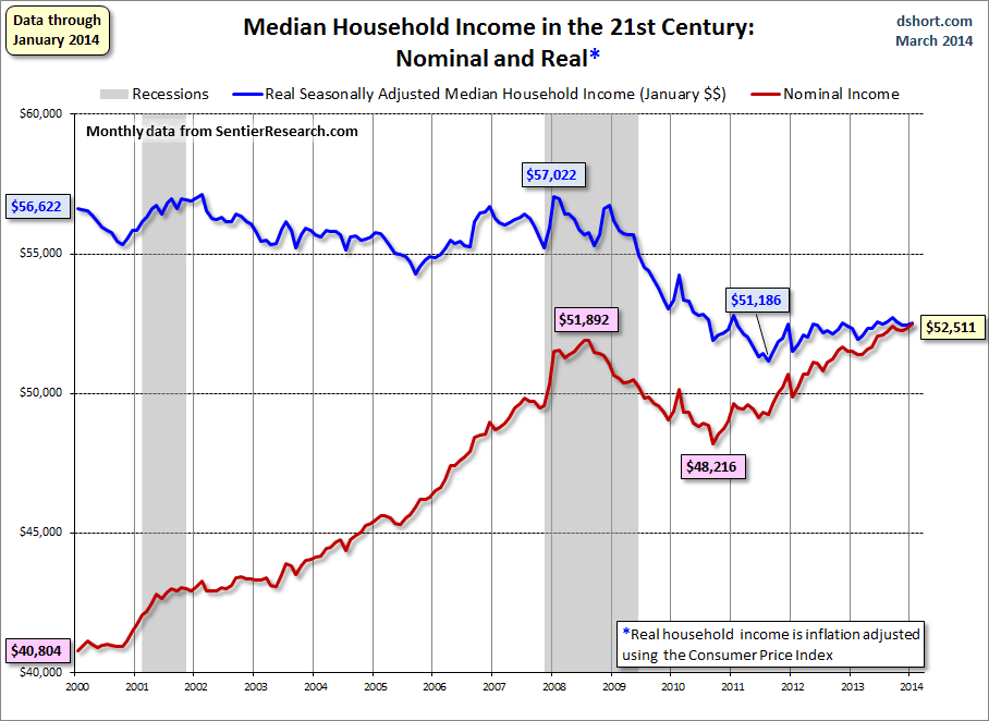
Doug Short, in his March 20, 2014 post titled “Real Median Household Income Is About $4500 Off Its 2008 High” produced the chart below.  It is based upon data from Sentier Research, and it shows both nominal and real median household incomes since 2000, as depicted.  As one can see, post-recession real median household income (seen in the blue line since 2009) is especially worrisome.
(click on chart to enlarge image)
median household income
-
As Doug mentions in his aforementioned blog post:
As the excellent data from Sentier Research makes clear, the mainstream U.S. household was struggling before the Great Recession. At this point, real household incomes are in worse shape than they were four years ago when the recession ended.
Among other items seen in his blog post is a chart depicting each of the two (nominal and real household incomes) data series’ percent change over time since 2000.
_____
The Special Note summarizes my overall thoughts about our economic situation
SPX at 1872.01 as this post is written
Thursday, March 20, 2014

St. Louis Financial Stress Index – March 20, 2014 Update

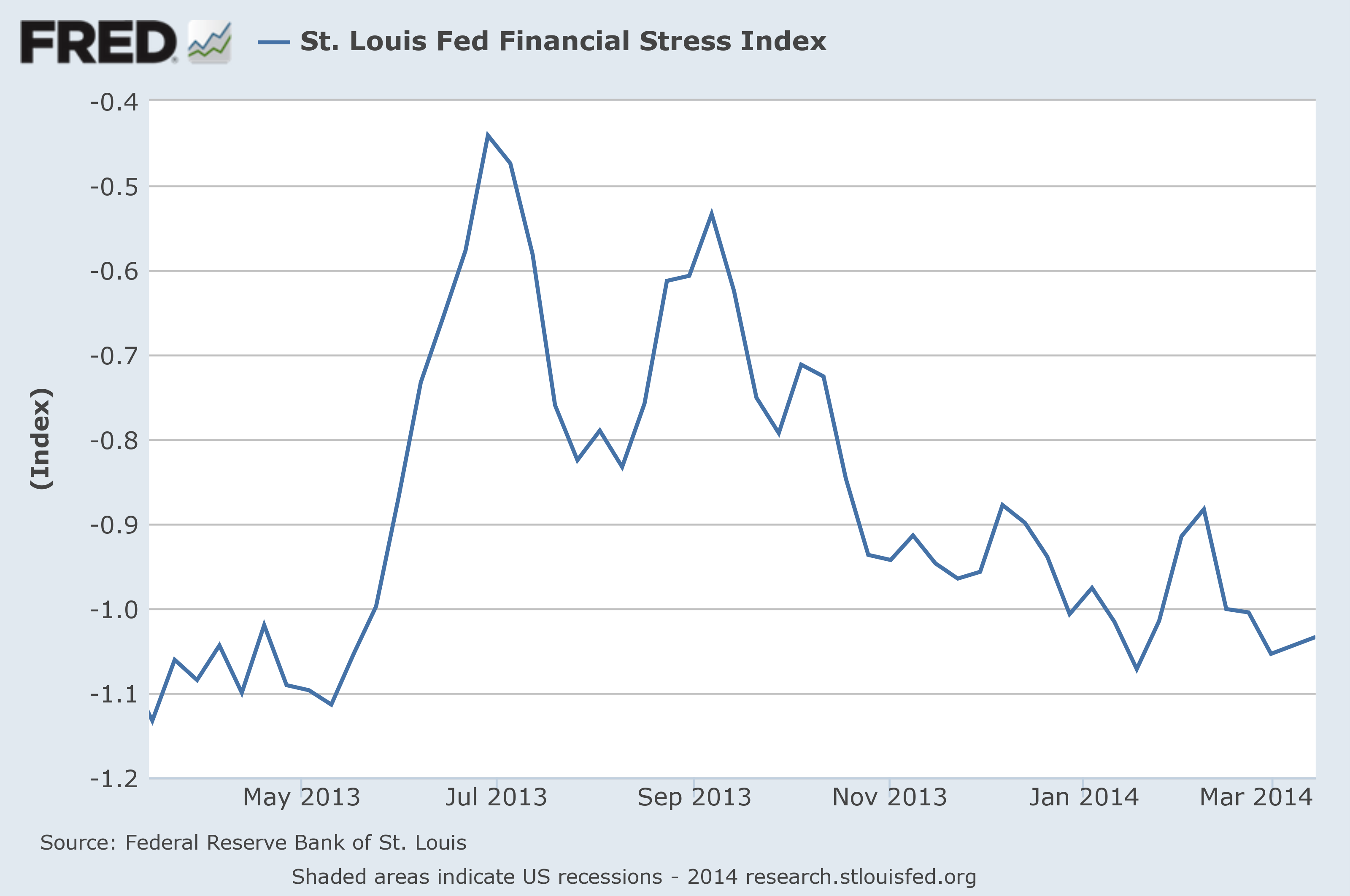
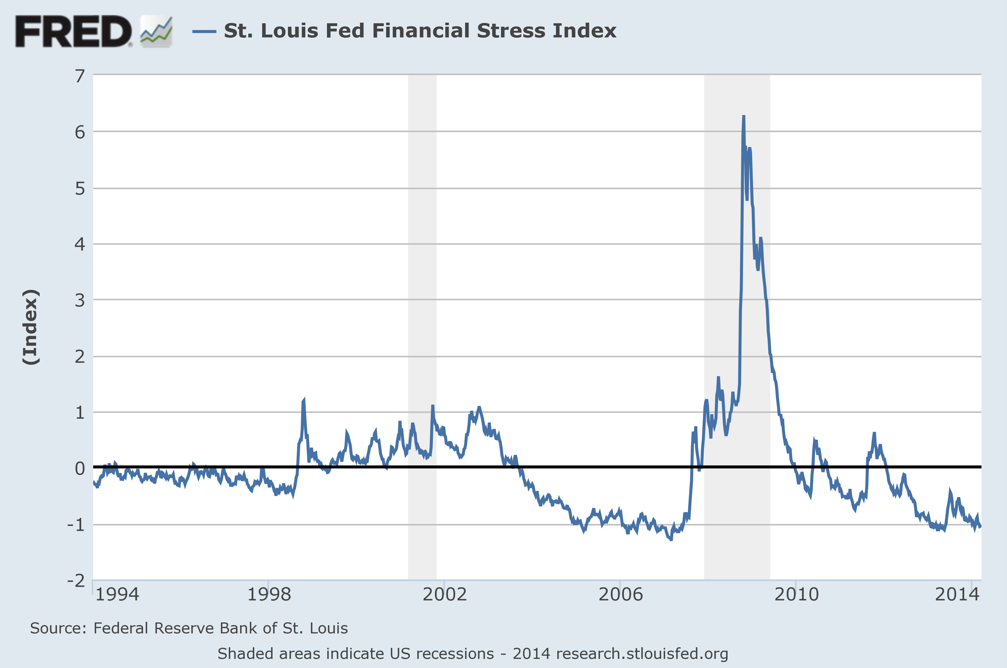
On March 28, 2011 I wrote a post (“The STLFSI“) about the St. Louis Fed’s Financial Stress Index (STLFSI) which is supposed to measure stress in the financial system.  For reference purposes, the most recent chart is seen below.  This chart was last updated on March 20, incorporating data from December 31,1993 to March 14, 2014, on a weekly basis.  The March 14, 2014 value is -1.034:
(click on chart to enlarge image)
STLFSI chart
-
Here is the STLFSI chart from a 1-year perspective:
STLFSI chart 1-year
Data Source: FRED, Federal Reserve Economic Data, Federal Reserve Bank of St. Louis; accessed March 20, 2014:
_________
I post various indicators and indices because I believe they should be carefully monitored.  However, as those familiar with this blog are aware, I do not necessarily agree with what they depict or imply.
_____
The Special Note summarizes my overall thoughts about our economic situation
SPX at 1872.01 as this post is written
Chicago Fed National Financial Conditions Index (NFCI)

Each week I have been posting two charts of the St. Louis Fed’s Financial Stress Index (STLFSI), which is supposed to measure stress in the financial system.
Of course, there are a variety of other measures and indices that are supposed to measure financial stress and other related issues, both from the Federal Reserve as well as from private sources.
Two other indices that I regularly monitor include the Chicago Fed National Financial Conditions Index (NFCI) as well as the Chicago Fed Adjusted National Financial Conditions Index (ANFCI).
Here are summary descriptions of each, as seen in FRED:
The National Financial Conditions Index (NFCI) measures risk, liquidity and leverage in money markets and debt and equity markets as well as in the traditional and “shadow” banking systems. Positive values of the NFCI indicate financial conditions that are tighter than average, while negative values indicate financial conditions that are looser than average.
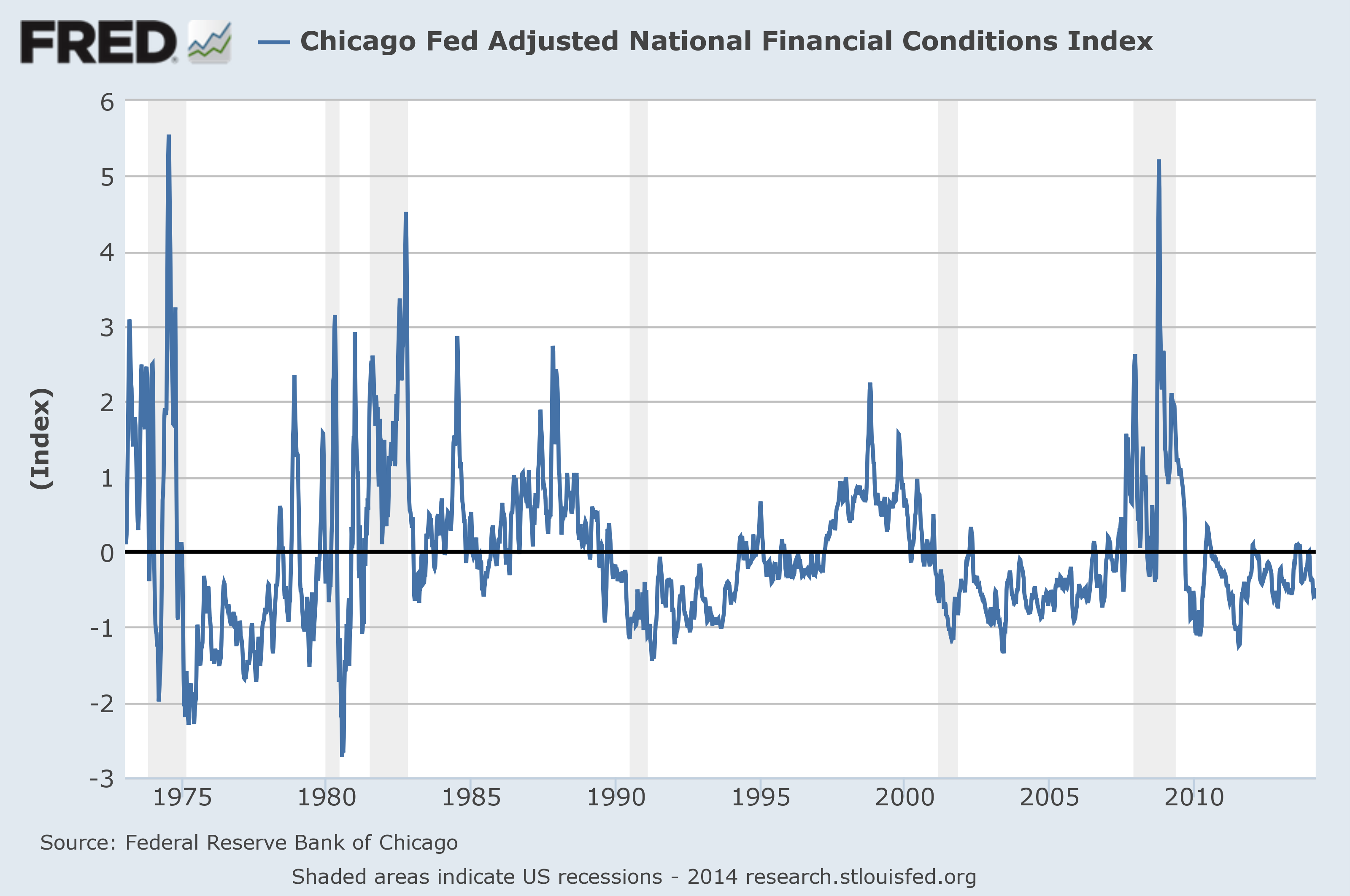
The adjusted NFCI (ANFCI). This index isolates a component of financial conditions uncorrelated with economic conditions to provide an update on how financial conditions compare with current economic conditions.
For further information, please visit the Federal Reserve Bank of Chicago’s web site:
Here are the most recently updated charts of the NFCI and ANFCI, respectively.
The NFCI chart below was last updated on March 19, incorporating data from January 5,1973 to March 14, 2014, on a weekly basis.  The March 14, 2014 value is -.95:
(click on chart to enlarge image)
NFCI
Data Source: FRED, Federal Reserve Economic Data, Federal Reserve Bank of St. Louis; accessed March 20, 2014:
-
The ANFCI chart below was last updated on March 19, incorporating data from January 5,1973 to March 14, 2014, on a weekly basis.  The March 14, 2014 value is -.48:
(click on chart to enlarge image)
ANFCI
Data Source: FRED, Federal Reserve Economic Data, Federal Reserve Bank of St. Louis; accessed March 20, 2014:
_________
I post various indicators and indices because I believe they should be carefully monitored.  However, as those familiar with this blog are aware, I do not necessarily agree with what they depict or imply.
_____
The Special Note summarizes my overall thoughts about our economic situation
SPX at 1866.16 as this post is written
Trends Of S&P500 Earnings Forecasts

S&P500 earnings trends and estimates are a notably important topic, for a variety of reasons, at this point in time.
FactSet publishes a report titled “Earnings Insight” that contains a variety of information including the trends and expectations of S&P500 earnings.
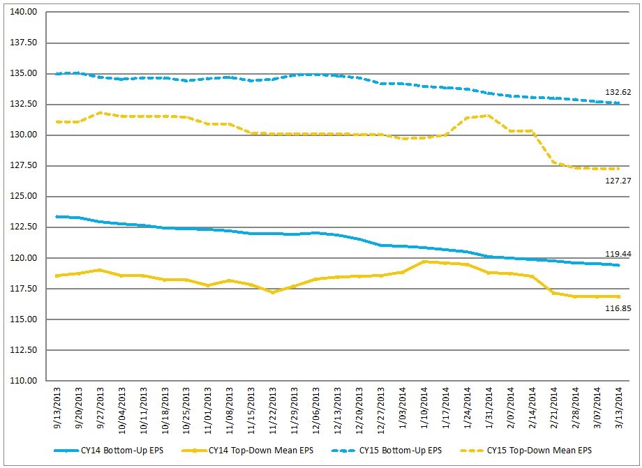
For reference purposes, here are two charts as seen in the “Earnings Insight” (pdf) report of March 14, 2014:
from page 19:
(click on charts to enlarge images)
CY Bottom-Up EPS vs. Top-Down Mean EPS (Trailing 26-Weeks) 
S&P500 earnings forecasts
-
from page 20:
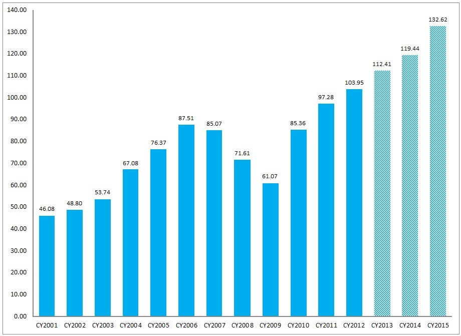
Calendar Year Bottom-Up EPS Actuals & Estimates
S&P500 annual earnings

_____
I post various economic forecasts because I believe they should be carefully monitored.  However, as those familiar with this blog are aware, I do not agree with many of the consensus estimates and much of the commentary in these forecast surveys.
_____
The Special Note summarizes my overall thoughts about our economic situation
SPX at 1867.11 as this post is written