Pages

Thursday, March 29, 2018

Consumer Confidence Surveys – As Of March 29, 2018

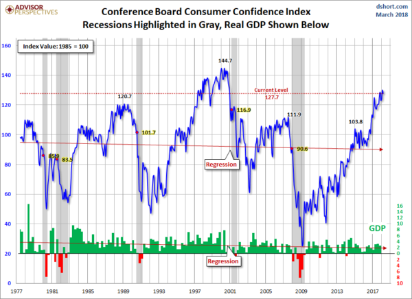
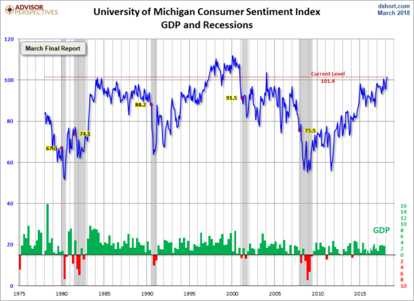
Doug Short’s site had a post of March 29, 2018 (“Michigan Consumer Sentiment:  March Final Highest Since 2004“) that displays the latest Conference Board Consumer Confidence and Thomson/Reuters University of Michigan Consumer Sentiment Index charts.  They are presented below:
(click on charts to enlarge images)
Conference Board Consumer Confidence
Michigan Consumer Sentiment
There are a few aspects of the above charts that I find highly noteworthy.  Of course, until the sudden upswing in 2014, the continued subdued absolute levels of these two surveys was disconcerting.
Also, I find the “behavior” of these readings to be quite disparate as compared to the other post-recession periods, as shown in the charts between the gray shaded areas (the gray areas denote recessions as defined by the NBER.)
While I don’t believe that confidence surveys should be overemphasized, I find these readings to be very problematical, especially in light of a variety of other highly disconcerting measures highlighted throughout this site.
_____
The Special Note summarizes my overall thoughts about our economic situation
SPX at 2641.53 as this post is written

Deloitte “CFO Signals” Report Q1 2018 – Notable Aspects

Recently Deloitte released their “CFO Signals” “High-Level Summary” report for the 1st Quarter of 2018.
As seen in page 2 of the report, there were 155 survey respondents.  As stated:
“Each quarter (since 2Q10), CFO Signals has tracked the thinking and actions of CFOs representing many of North America’s largest and most influential companies.
All respondents are CFOs from the US, Canada, and Mexico, and the vast majority are from companies with more than $1 billion in annual revenue. For a summary of this quarter’s response demographics, please see the sidebars and charts on this page. For other information about participation and methodology, please contact nacfosurvey@deloitte.com.”
Here are some of the excerpts that I found notable:
from page 3:

Perceptions

How do you regard the current/future status of the North American, European, and Chinese economies? Perceptions of North America improved, with 90% of CFOs rating current conditions as good (up sharply from 74% last quarter and a new survey high), and 59% expecting better conditions in a year (up from 56%). Perceptions of Europe rose to 55% and 51%, respectively (both new highs), and China rose sharply to 50% (new high) and 37%. Page 6.
What is your perception of the capital markets? Seventy-seven percent of CFOs say debt financing is attractive (down from 85%). Attractiveness of equity financing decreased for public company CFOs (from 46% to 43%) and also for private company CFOs (from 47% to 35%). Seventy-six percent of CFOs now say US equities are overvalued—down from last quarter’s survey-high 84%. Page 7.

Sentiment

Overall, what risks worry you the most? Anticipating higher post-tax-reform investment, CFOs voice very strong internal concerns about securing the talent they need. They again cite external worries about politics and policy (especially trade policy) and also new concerns about rising government debt. Page 8.
Compared to three months ago, how do you feel about the financial prospects for your company? The net optimism index rose from last quarter’s +47 to +54 this quarter—a new survey high. Nearly 60% of CFOs express rising optimism (up from 52%), and just 6% express declining optimism. Page 9.

Expectations

What is your company’s business focus for the next year? CFOs indicate a strong bias toward revenue growth over cost reduction (64% vs. 18%) and investing cash over returning it (57% vs. 14%). The bias toward current offerings over new ones held steady this quarter (40% vs. 37%), and the bias toward current geographies over new ones declined slightly (61% vs. 20%). Page 10.
Compared to the past 12 months, how do you expect your key operating metrics to change over the next 12 months? Revenue growth expectations rose from 4.7% to 5.9% (a two-year high). Earnings growth rose from 8.4% to 9.8% (the highest level in nearly three years). Capital investment rose sharply from 6.5% to 11.0% (a five-year high). Domestic hiring rose from 2.0% to 3.1% (a new high). Manufacturing and Retail/Wholesale led for most metrics. Page 11.

Special topic: Companies’ response to US tax law changes

What will be the impact of new US corporate tax laws on your company? Many CFOs expect tax reform to raise their domestic investment, hiring, and wages; many also expect accelerated earnings repatriation and challenges for their tax function. Page 12.
What will you do with your repatriated cash? Investment (in both core and new businesses and also in R&D) is far and away CFOs’ top expected use for repatriated cash. Many expect some use for hiring and pay, but more extensive use appears focused on debt repayment, buybacks, and dividends. Page 13.
from page 9:

Sentiment

Optimism regarding own-companies’ prospects

After bouncing back last quarter to the high levels we saw early in 2017, net optimism rose again to another survey high this quarter—on strength in all three geographies and most industries.
Net optimism hit a survey-high +50% in 1Q17. Then, after declining in the second and third quarters, it bounced back in the fourth to a very strong +47. This quarter’s net optimism continued the positive trend, reaching another survey high at +54. Nearly 60% of CFOs expressed rising optimism (up from 52%), and just 6% cited declining optimism (near the historic low).
Net optimism for the US rose from last quarter’s already-high +50 to +55 this quarter. Canada rose slightly from +46 to +47, while optimism in Mexico rose sharply from zero to +38.
Sentiment was particularly strong in Services, Manufacturing, Technology, and Retail/ Wholesale—all of which came in above +62. Financial Services and T/M/E* were lowest at +25.
Please see the appendix for charts specific to individual industries and countries.
* Please note the very small sample size for T/M/E.
from page 11:

Expectations

Growth in key metrics, year-over-year

All key metrics rose to multi-year highs— largely on skyrocketing optimism in the US, but also on strength in Canada and Mexico. The Manufacturing and Retail/Wholesale sectors powered much of the improvement.
Revenue growth rose from 4.7% to 5.9% and sits at its two-year high. The US rose to its twoyear high. Canada rose substantially, but is still below its two-year average; Mexico rose above its two-year average. Retail/Wholesale and Technology lead; T/M/E* trails.
Earnings growth rose from 8.4% to 9.8% and sits at its highest level in nearly three years. The US rose sharply to its three-year high. Canada rose, but remains below its two-year average; Mexico rose above its two-year average. Manufacturing and Retail/Wholesale lead; T/M/E* and Healthcare/Pharma trail.
Capital investment rose sharply from 6.5% to 11% (a five-year high). The US rose to its five- year high. Canada rose sharply, but remains below its two-year average. Mexico rose sharply to its fourth-highest-ever level. Manufacturing and Retail/Wholesale are highest; T/M/E* and Technology are lowest.
Domestic personnel growth rose from 2.0% to 3.1%, a new survey high. The US and Canada both rose sharply—the US to its new survey high, and Canada to its second-highest level in nearly five years. Mexico rose, but sits below its two-year average. Services and Technology lead; T/M/E* and Energy/Resources trail.
Please see the appendix for charts specific to individual industries and countries.
* Please note the very small sample size for T/M/E.
Among the various charts and graphics in the report are graphics depicting trends in “Own Company Optimism” on page 9 and “Economic Optimism” found on page 6.
_____
I post various business and economic surveys because I believe they should be carefully monitored.  However, as those familiar with this site are aware, I do not necessarily agree with many of the consensus estimates and much of the commentary in these surveys.
_____
The Special Note summarizes my overall thoughts about our economic situation
SPX at 2605.00 as this post is written

Wednesday, March 28, 2018

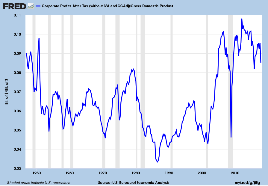
Corporate Profits As A Percentage Of GDP

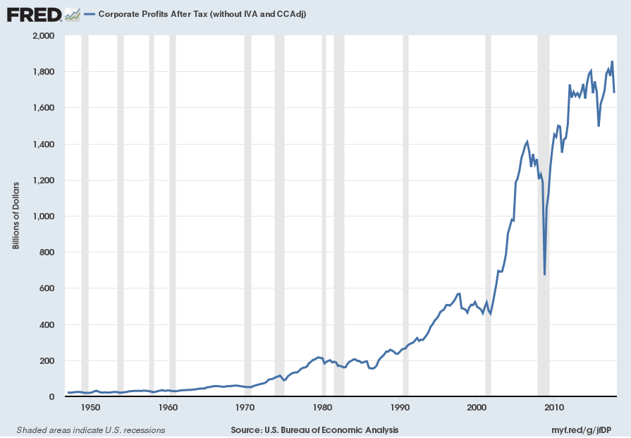
In the last post (“4th Quarter 2017 Corporate Profits“) I displayed, for reference purposes, a long-term chart depicting Corporate Profits After Tax.
There are many ways to view this measure, both on an absolute as well as relative basis.
One relative measure is viewing Corporate Profits as a Percentage of GDP.  I feel that this metric is important for a variety of reasons.  As well, the measure is important to a variety of parties, including investors, businesses, and government policy makers.
As one can see from the long-term chart below (updated through the fourth quarter), (After Tax) Corporate Profits as a Percentage of GDP is at levels that can be seen as historically (very) high.  While there are many reasons as to why this is so, from a going-forward standpoint I think it is important to recognize both that such a notable condition exists, as well as contemplate and/or plan for such factors and conditions that would come about if (and in my opinion “when”) a more historically “normal” ratio of Corporate Profits as a Percentage of GDP occurs.  This topic can be very complex in nature, and depends upon myriad factors.  In my opinion it deserves far greater recognition.
(click on chart to enlarge image)
Corporate Profits As A Percentage Of GDP
Data Source: FRED, Federal Reserve Economic Data, Federal Reserve Bank of St. Louis; accessed March 28, 2018
_____
The Special Note summarizes my overall thoughts about our economic situation
SPX at 2618.66 as this post is written
4th Quarter 2017 Corporate Profits

Today’s (March 28, 2018) GDP release (Q4, 3rd Estimate)(pdf) was accompanied by the BLS Corporate Profits report for the 4th Quarter.
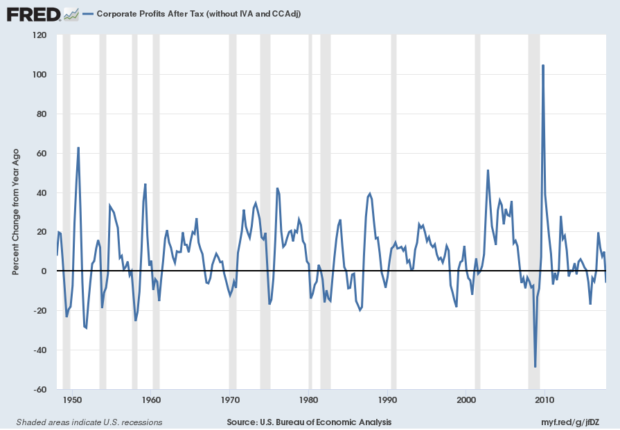
Of course, there are many ways to adjust and depict overall Corporate Profits.  For reference purposes, here is a chart from the St. Louis Federal Reserve (FRED) showing the Corporate Profits After Tax (without IVA and CCAdj) (last updated March 28, 2018, with a value of $1680.25 Billion SAAR):
CP
Here is the Corporate Profits After Tax measure shown on a Percentage Change from a Year Ago perspective:
Corporate Profits After Tax Percent Change From Year Ago
Data Source: FRED, Federal Reserve Economic Data, Federal Reserve Bank of St. Louis: Corporate Profits After Tax [CP]; U.S. Department of Commerce: Bureau of Economic Analysis; accessed March 28, 2018; https://research.stlouisfed.org/fred2/series/CP
_________
I post various indicators and indices because I believe they should be carefully monitored.  However, as those familiar with this site are aware, I do not necessarily agree with what they depict or imply.
_____
The Special Note summarizes my overall thoughts about our economic situation
SPX at 2615.85 as this post is written
Chicago Fed National Financial Conditions Index (NFCI)

The St. Louis Fed’s Financial Stress Index (STLFSI) is one index that is supposed to measure stress in the financial system.  Its reading as of the March 22, 2018 update (reflecting data through March 16, 2018) is -1.116.
Of course, there are a variety of other measures and indices that are supposed to measure financial stress and other related issues, both from the Federal Reserve as well as from private sources.
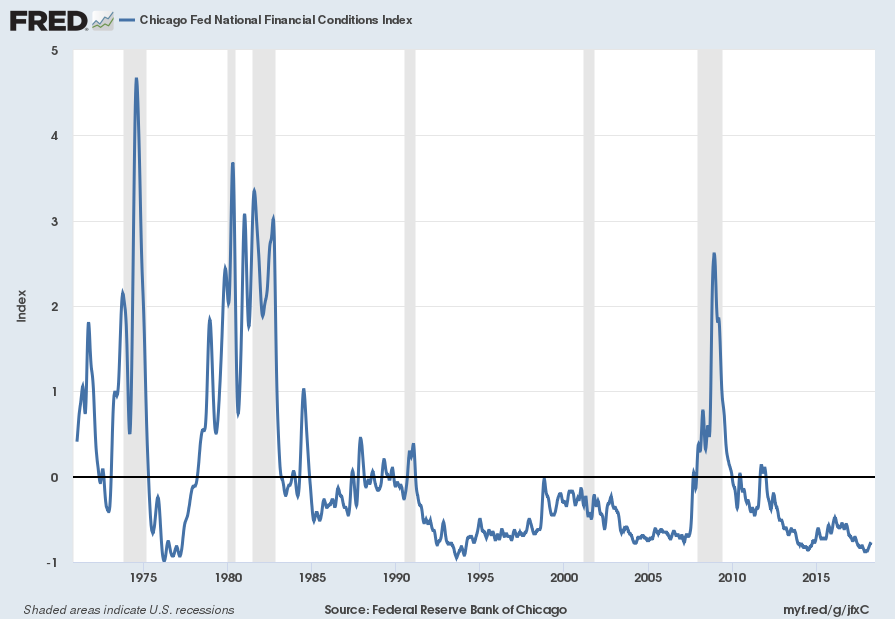
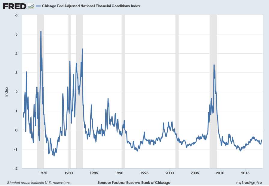
Two other indices that I regularly monitor include the Chicago Fed National Financial Conditions Index (NFCI) as well as the Chicago Fed Adjusted National Financial Conditions Index (ANFCI).
Here are summary descriptions of each, as seen in FRED:
The National Financial Conditions Index (NFCI) measures risk, liquidity and leverage in money markets and debt and equity markets as well as in the traditional and “shadow” banking systems. Positive values of the NFCI indicate financial conditions that are tighter than average, while negative values indicate financial conditions that are looser than average.
The adjusted NFCI (ANFCI). This index isolates a component of financial conditions uncorrelated with economic conditions to provide an update on how financial conditions compare with current economic conditions.
For further information, please visit the Federal Reserve Bank of Chicago’s web site:
Below are the most recently updated charts of the NFCI and ANFCI, respectively.
The NFCI chart below was last updated on March 28, 2018 incorporating data from January 8, 1971 through March 23, 2018, on a weekly basis.  The March 23, 2018 value is -.77:
NFCI
Data Source: FRED, Federal Reserve Economic Data, Federal Reserve Bank of St. Louis; accessed March 28, 2018:
The ANFCI chart below was last updated on March 28, 2018 incorporating data from January 8,1971 through March 23, 2018, on a weekly basis.  The March 23 value is -.50:
ANFCI
Data Source: FRED, Federal Reserve Economic Data, Federal Reserve Bank of St. Louis; accessed March 28, 2018:
_________
I post various indicators and indices because I believe they should be carefully monitored.  However, as those familiar with this site are aware, I do not necessarily agree with what they depict or imply.
_____
The Special Note summarizes my overall thoughts about our economic situation
SPX at 2612.62 as this post is written
Money Supply Charts Through February 2018

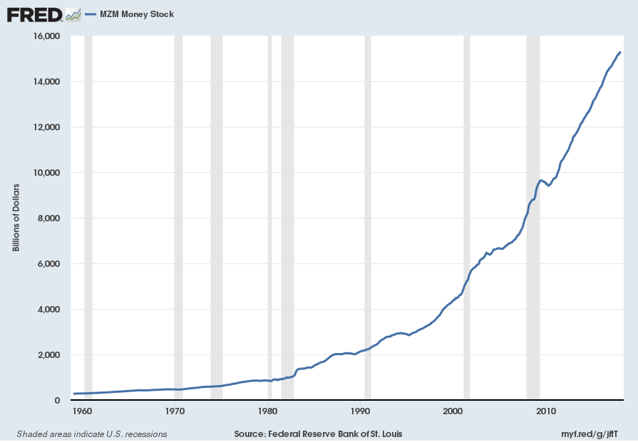
For reference purposes, below are two sets of charts depicting growth in the money supply.
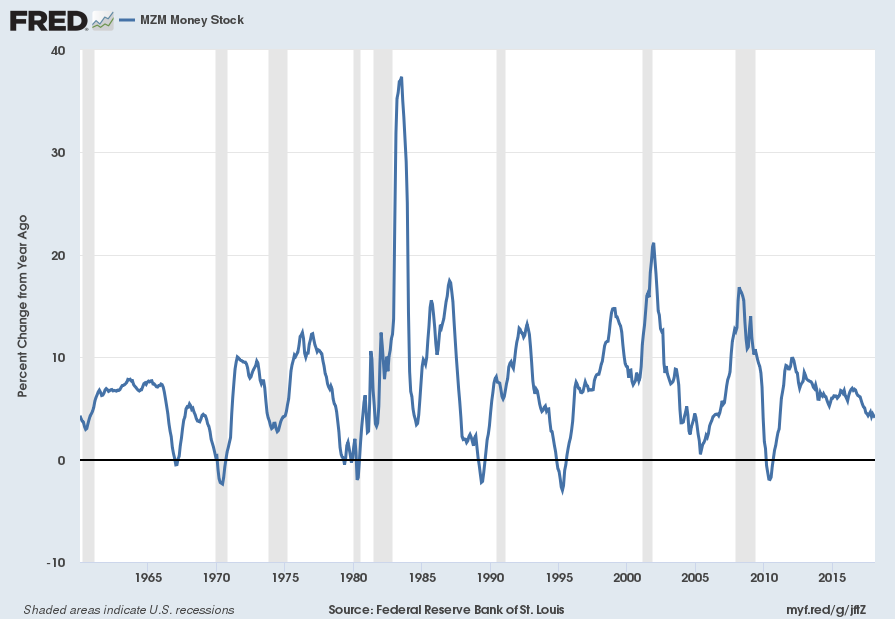
The first shows the MZM (Money Zero Maturity), defined in FRED as the following:
M2 less small-denomination time deposits plus institutional money funds.
Money Zero Maturity is calculated by the Federal Reserve Bank of St. Louis.
Here is the “MZM Money Stock” (seasonally adjusted) chart, updated on March 23, 2018 depicting data through February 2018, with a value of $15,277.1 Billion:
MZMSL
Here is the “MZM Money Stock” chart on a “Percent Change From Year Ago” basis, with a current value of 4.1%:
MZMSL Percent Change From Year Ago
Data Source: FRED, Federal Reserve Economic Data, Federal Reserve Bank of St. Louis; accessed March 28, 2018:
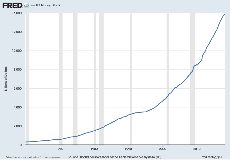
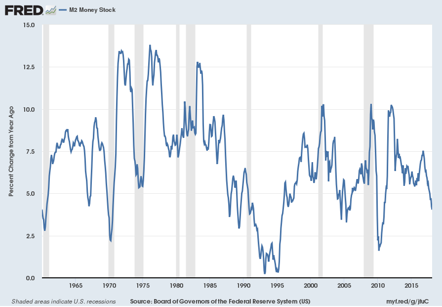
The second set shows M2, defined in FRED as the following:
M2 includes a broader set of financial assets held principally by households. M2 consists of M1 plus: (1) savings deposits (which include money market deposit accounts, or MMDAs); (2) small-denomination time deposits (time deposits in amounts of less than $100,000); and (3) balances in retail money market mutual funds (MMMFs). Seasonally adjusted M2 is computed by summing savings deposits, small-denomination time deposits, and retail MMMFs, each seasonally adjusted separately, and adding this result to seasonally adjusted M1.
Here is the “M2 Money Stock” (seasonally adjusted) chart, updated on March 22, 2018, depicting data through February 2018, with a value of $13,858.2 Billion:
M2SL
Here is the “M2 Money Stock” chart on a “Percent Change From Year Ago” basis, with a current value of 4.0%:
M2SL Percent Change From Year Ago
Data Source: FRED, Federal Reserve Economic Data, Federal Reserve Bank of St. Louis; accessed March 28, 2018:
_____
The Special Note summarizes my overall thoughts about our economic situation
SPX at 2612.62 as this post is written
Monday, March 26, 2018

Updates Of Economic Indicators March 2018

Here is an update of various indicators that are supposed to predict and/or depict economic activity. These indicators have been discussed in previous blog posts:
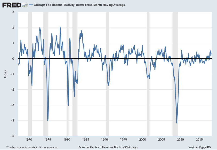
The March 2018 Chicago Fed National Activity Index (CFNAI) updated as of March 26, 2018:
The CFNAI, with current reading of .88:
CFNAI_3-26-18 .88
Federal Reserve Bank of Chicago, Chicago Fed National Activity Index [CFNAI], retrieved from FRED, Federal Reserve Bank of St. Louis, March 26, 2018;
The CFNAI-MA3, with current reading of .37:
CFNAIMA3_3-26-18 .37
Federal Reserve Bank of Chicago, Chicago Fed National Activity Index: Three Month Moving Average [CFNAIMA3], retrieved from FRED, Federal Reserve Bank of St. Louis, March 26, 2018;
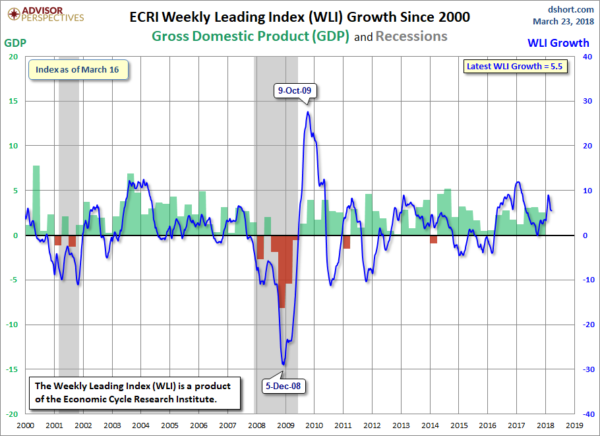
As of March 23, 2018 (incorporating data through March 16, 2018) the WLI was at 149.5 and the WLI, Gr. was at 5.5%.
A chart of the WLI,Gr., from Doug Short’s ECRI update post of March 26, 2018:
ECRI WLI,Gr.
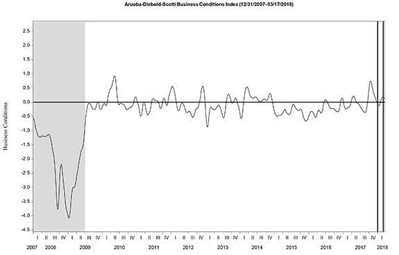
Here is the latest chart, depicting the ADS Index from December 31, 2007 through March 17, 2018:
ADS Index
The Conference Board Leading (LEI), Coincident (CEI) Economic Indexes, and Lagging Economic Indicator (LAG):
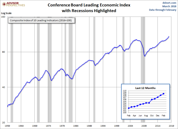
As per the March 22, 2018 press release, titled “The Conference Board Leading Economic Index (LEI) for the U.S. Increased in February” (pdf) the LEI was at 108.7, the CEI was at 103.3, and the LAG was 104.3 in February.
An excerpt from the release:
“The U.S. LEI rose again, despite a sharp downturn in stock markets and weakness in housing construction in February,” said Ataman Ozyildirim, Director of Business Cycles and Growth Research at The Conference Board. “The LEI points to robust economic growth throughout 2018. Its six-month growth rate has not been this high since the first quarter of 2011. While the Federal Reserve is on track to continue raising its benchmark rate for the rest of the year, the recent weakness in residential construction and stock prices – important leading indicators – should be monitored closely.”
Here is a chart of the LEI from Doug Short’s Conference Board Leading Economic Index update of March 22, 2018:
Conference Board LEI
_________
I post various indicators and indices because I believe they should be carefully monitored.  However, as those familiar with this site are aware, I do not necessarily agree with what they depict or imply.
_____
The Special Note summarizes my overall thoughts about our economic situation
SPX at 2641.88 as this post is written
Friday, March 23, 2018

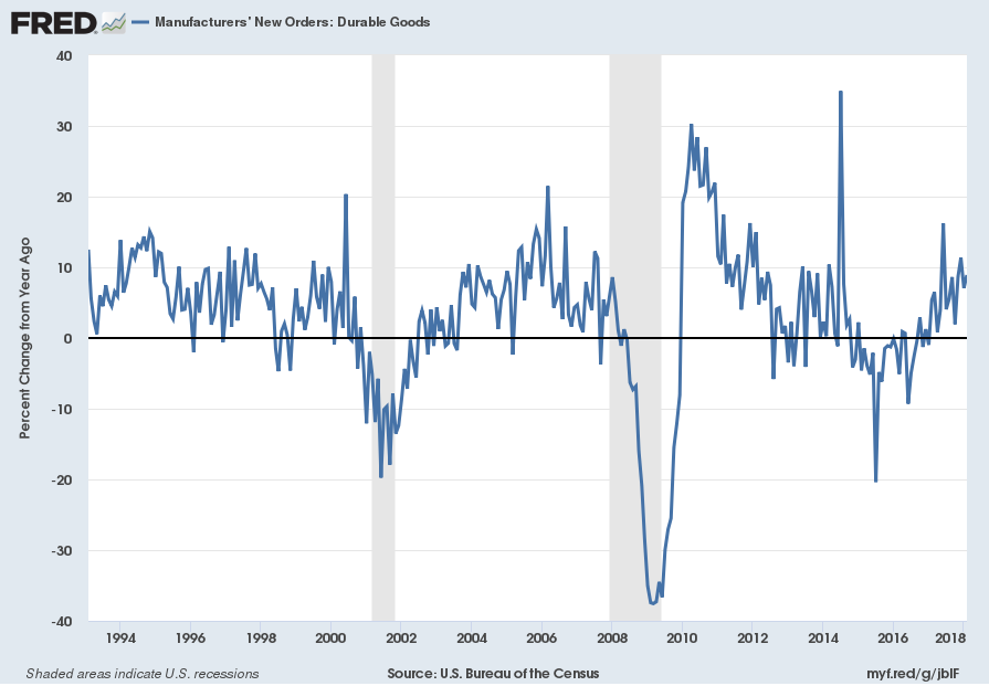
Durable Goods New Orders – Long-Term Charts Through February 2018

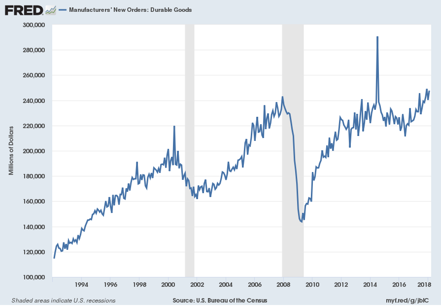
Many people place emphasis on Durable Goods New Orders as a prominent economic indicator and/or leading economic indicator.
For reference, below are two charts depicting this measure.
First, from the St. Louis Fed site (FRED), a chart through February 2018, updated on March 23, 2018. This value is $247,718 ($ Millions):
(click on charts to enlarge images)
Durable Goods New Orders
Second, here is the chart depicting this measure on a “Percentage Change from a Year Ago” basis:
DGORDER Percent Change From Year Ago
Data Source: FRED, Federal Reserve Economic Data, Federal Reserve Bank of St. Louis: Manufacturers’ New Orders:  Durable Goods [DGORDER]; U.S. Department of Commerce: Census Bureau; accessed March 23, 2018;
_________
I post various indicators and indices because I believe they should be carefully monitored.  However, as those familiar with this site are aware, I do not necessarily agree with what they depict or imply.
_____
The Special Note summarizes my overall thoughts about our economic situation
SPX at 2638.64 as this post is written

The U.S. Economic Situation – March 23, 2018 Update

Perhaps the main reason that I write of our economic situation is that I continue to believe, based upon various analyses, that our economic situation is in many ways misunderstood.  While no one likes to contemplate a future rife with economic adversity, current and future economic problems must be properly recognized and rectified if high-quality, sustainable long-term economic vitality is to be realized.
There are an array of indications and other “warning signs” – many readily apparent – that current economic activity and financial market performance is accompanied by exceedingly perilous dynamics.
I have written extensively about this peril, including in the following:
Building Financial Danger” (ongoing updates)
My analyses continues to indicate that the growing level of financial danger will lead to the next stock market crash that will also involve (as seen in 2008) various other markets as well.  Key attributes of this next crash is its outsized magnitude (when viewed from an ultra-long term historical perspective) and the resulting economic impact.  This next financial crash is of tremendous concern, as my analyses indicate it will lead to a Super Depression – i.e. an economy characterized by deeply embedded, highly complex, and difficult-to-solve problems.
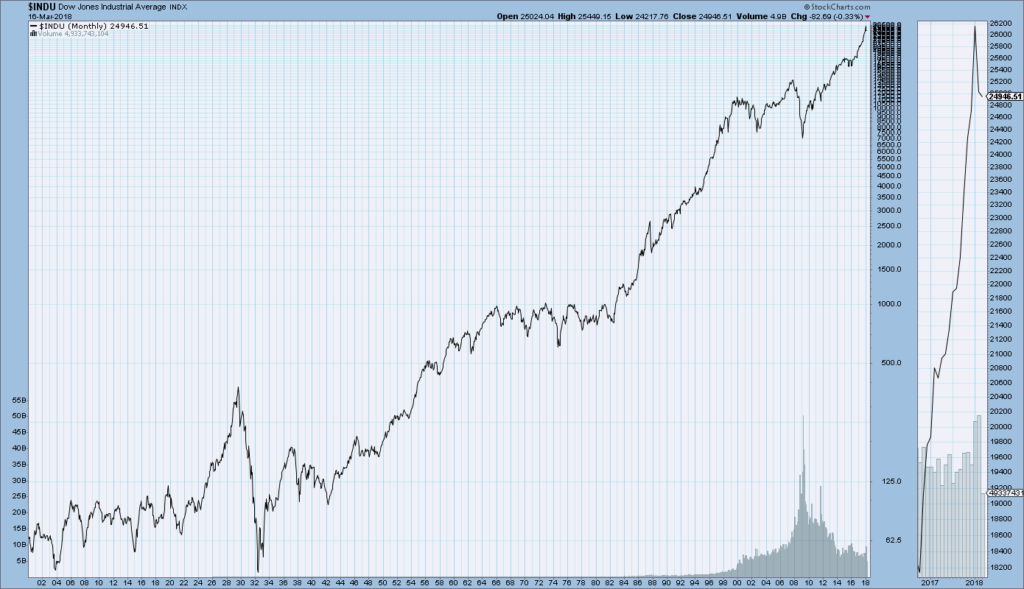
For long-term reference purposes, here is a chart of the Dow Jones Industrial Average since 1900, depicted on a monthly basis using a LOG scale (updated through March 16, 2018, with a last value of 24946.51):
(click on chart to enlarge image)(chart courtesy of StockCharts.com)
DJIA chart since 1900
_____
The Special Note summarizes my overall thoughts about our economic situation
SPX at 2643.63 as this post is written

Thursday, March 22, 2018

Jerome Powell’s March 21, 2018 Press Conference – Notable Aspects

On Wednesday, March 21, 2018 Jerome Powell gave his scheduled March 2018 FOMC Press Conference. (link of video and related materials)
Below are Jerome Powell’s comments I found most notable – although I don’t necessarily agree with them – in the order they appear in the transcript.  These comments are excerpted from the “Transcript of Chairman Powell’s Press Conference“ (preliminary)(pdf) of March 21, 2018, with the accompanying “FOMC Statement” and “Economic Projections of Federal Reserve Board Members and Federal Reserve Bank Presidents, March 2018“ (pdf).
From Jerome Powell’s opening comments:
Job gains averaged 240,000 per month over the past three months, well above the pace needed in the longer run to absorb new entrants into the labor force.  The unemployment rate remained low in February at 4.1 percent, while the labor force participation rate moved higher.  Over the past four years, the participation rate has remained roughly unchanged.  That’s a sign of improvement, given that the aging of our population is putting downward pressure on the participation rate, and we expect that the job market will remain strong.
Although the growth rates of household spending and business investment appear to have moderated early this year, gains in the fourth quarter were strong and the fundamentals underpinning demand remain solid.  Indeed, the economic outlook has strengthened in recent months.  Several factors are supporting the outlook: fiscal policy has become more stimulative, ongoing job gains are boosting incomes and confidence, foreign growth is on a firm trajectory, and overall financial conditions remain accommodative.
Jerome Powell’s responses as indicated to the various questions:
MICHAEL DERBY. I’m Mike Derby from Dow Jones Newswires. I have a question about the future of the mechanics of monetary policy. I wanted to know whether you favor sticking with the system that you have now of keeping interest on excess reserves and reverse repo–the reverse repo rate to control interest rates, or do you want to shift back to the old way of doing things at some point of targeting the fed funds market? And, do you have any concern that if you do stick with the current system that as rates rise that you might see issues where the Fed is under–is being criticized for paying out ever larger shares of money to banks, you know, to control interest rates that some might perceive as a subsidy to the banks that are getting this money?
CHAIRMAN POWELL. Sure. Our current framework for implementing monetary policy is working very well. We have excellent control over rates, and it’s working. And it’s–you described it accurately. We haven’t made a decision to keep that as our longer-run framework. We haven’t really addressed that question. We’ve had meetings where we’ve talked about it, and we’ve agreed that it’s working well. But it’s–and it’s not something I see us as needing to urgently address. I think we’re continuing to learn about this framework. For example, one, in the longrun, the size of the balance sheet’s going to depend on the public’s demand for our liabilities, including currency and reserves. So, we don’t know what the demand is for reserves in a world where you have, you know, you have regulations that require banks to hold lots of high quality liquid assets, and reserves are one of those. So, it’s not something we’re looking at resolving in the near-term.
You mentioned the question of interest on excess reserves, and I think it’s a little bit of a misnomer to think that there’s a subsidy there. We pay interest on excess reserves. We can’t pay interest in excess reserves that is above the general level of short-term interest rates. So, we’re paying rates that banks can get from other interest rates from any other investment in the shortterm money markets. In addition, remember that those liabilities–those are our liabilities. The assets that we have on the other side are treasury securities and mortgage-backed securities, which we yield much higher than interest on reserves. So, in fact, it’s not a subsidy, and it’s not a cost to the taxpayer.
also:
GREG ROBB. Over here. Thank you, Chairman. Thank you very much. Greg Robb from MarketWatch. Several of your colleagues recently have been speaking and expressing concern about financial imbalances and rising signs of financial imbalances. I was wondering if you could give us your view on the asset markets. Are–do you see any bubbles? And do you have the tools you need, you think, to combat those? Thank you very much.
CHAIRMAN POWELL. Since the financial crisis, we’ve been monitoring financial conditions and financial stability issues very carefully, and the FOMC receives regular briefings about the staff framework and sort of measures of various aspects of financial stability risks, and the current view of the Committee is that financial stability vulnerabilities are moderate, let’s say, and I’ll go through a couple of pieces of that.
So, if you look at the banking system, particularly the large financial institutions, you see higher capital. You see much higher liquidity. You see them more aware of their risks and better able to manage them with stress testing. And if one–if something does go wrong, you’ve got better ability to deal with the failure of those institutions. So, therefore, you don’t see high leverage. You don’t see excess risk-taking in great quantity the way you see before the crisis. If you look at households, household balance sheets are in much better condition. If you look at nonfinancial corporations, you see–you do see relatively elevated levels of borrowing, but nothing that suggests, you know, serious risks. And, of course, default rates are very low. So, those readings look okay. I should mention also that for large financial institutions, they’re no longer funded by a lot of short-term wholesale funding, which can disappear very quickly. So, they’re far less vulnerable to liquidity issues. Overall, those aspects, I think, suggest low levels of vulnerability.
You identified the, really, one area where, which is an area of focus, which is asset prices. So, in some areas, asset prices are elevated relative to their longer-run historical norms. You can think of some equity prices. You can think of commercial real estate prices in certain markets. But we don’t see it in housing, which is key. And so, overall, if you put all of that into a pie, what you have is moderate vulnerabilities in our view. In terms of whether we have the tools, you know, we have some tools, and I think we certainly will use them. We have–I think the stress test is a really important tool that we have for the largest financial institutions and for the smaller financial institutions. We regularly use that to–as a way to test against various, you know, market shocks, certainly for the larger institutions.
also:
NANCY MARSHALL-GENZER. Nancy Marshall-Genzer with Marketplace. Does the interest rate hike today suggest that Americans are being paid enough? Are you satisfied with the rate of wage growth right now?
CHAIRMAN POWELL. As I mentioned, you know, we’ve had unemployment decline sharply since, I guess, 2010, when it peaked at 10 percent and down to 4.1 percent now, and we’ve seen only modest increases in wages. So, on the one hand, what wages should in theory represent is inflation plus productivity increases. You should get paid for your productivity plus inflation, and productivity’s been very low. Inflation’s been low. So, these low wage increases, in a sense, they do make sense in that–from that perspective.
On the other hand, as the market is tightened, as labor markets have tightened, and we hear reports of labor shortages that we see that, you know, groups of unemployed are diminishing, and the unemployment rate is going down, we haven’t seen, you know, higher wages, wages going up more. And I would–I think I’ve been surprised by that, and I think others have as well. In terms of what’s the right level, I don’t think I have a view on what the right level of wages is, but I think we will know that the labor market is getting tight when we do see a more meaningful upward move in wages.
also:
MYLES UDLAND. Thanks. Myles Udland, Yahoo Finance. Chair Powell, I’m curious if the Fed would be willing to tolerate an inverted yield curve. We continue to see these spread between the two-year and the 10-year tighten, even with longer-term yields coming up since the beginning of the year. This is a dynamic that has typically preceded recessions, and we’re likely to see shorter-term rates come up as the Fed continues to increase rates. So, I’m just curious if you guys have discussed that, if you’d be willing to push back against that, or if that’s a dynamic you’d be comfortable with?
CHAIRMAN POWELL. You know, it’s an interesting question, and there are a range of views there. I think it’s true that yield curves have tended to predict recessions if you look back over many cycles, but a lot of that was just situations in which inflation was allowed to get out of control, and the Fed had to tighten, and that put the economy into a recession. That’s really not the situation we’re in now, so I don’t know that that’s–I don’t know that–I don’t think that recession probabilities are particularly high at the moment, any higher than they normally are. But, having said that, I think it’s–there are good questions about what a flat yield curve or inverted yield curve does to intermediation. It’s hard to find in the research data, but nonetheless, I think those are issues that we’ll be watching carefully.

_____
The Special Note summarizes my overall thoughts about our economic situation
SPX at 2686.76 as this post is written