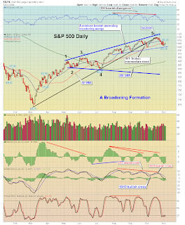
chart provided by http://thechartpatterntrader.com
Chart Courtesy of StockCharts.com
Here is a weekly chart of the S&P500. Notable here is the downtrend line (in black) from the October 2007 highs that seems to be serving as resistance. Also, the MACD and Full Stochastics seem to be reflecting weakness.

chart provided by http://thechartpatterntrader.com
Chart Courtesy of StockCharts.com
Next is a weekly chart of the QQQQ. Again, as with the S&P500 chart above, the downtrend line (in black) from the October 2007 highs that seems to be serving as resistance. Also, the MACD and Full Stochastics seem to be reflecting weakness. As well, the RSI is declining:

chart provided by http://thechartpatterntrader.com
Chart Courtesy of StockCharts.com
Now onto Part V...
SPX at 1046.50 as this post is written
No comments:
Post a Comment