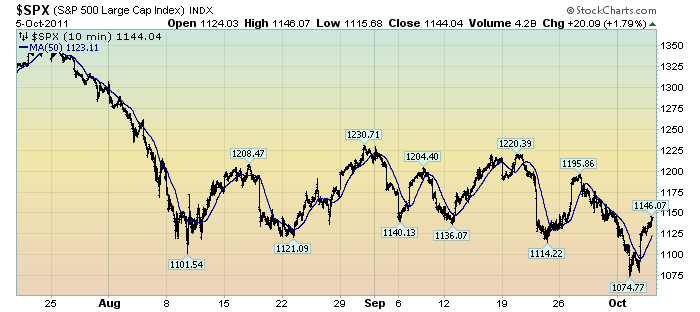
The following chart depicts the S&P500 in 10 minute intervals from July 20 through yesterday's close. As such, it encompasses the progression of the stock market since its July 25 daily high of 1344.32:
(click on chart to enlarge image)(chart courtesy of StockCharts.com)

The blue line is a 50-period moving average.
What I find notable is the frequency and extent of the price volatility. As one can see, there have been several episodes of advances and declines of roughly 80-100+ points in rapid fashion - some even happening over the course of a few days.
While there are various ways to interpret such volatility, my overall belief is that such is (yet another) cautionary sign.
_____
The Special Note summarizes my overall thoughts about our economic situation
SPX at 1144.04 as this post is written
No comments:
Post a Comment