Pages

Wednesday, October 31, 2012

House Prices Reference Chart


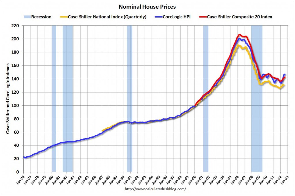
As a reference for long-term house price index trends, below is a chart, updated through the August data, from the CalculatedRisk blog post of October 30 titled “House Price Comments, Real House Prices, Price-to-Rent Ratio” :

(click on chart to enlarge image)


_____

The Special Note summarizes my overall thoughts about our economic situation

SPX at 1411.94 as this post is written

Monday, October 29, 2012

Velocity Of Money – Charts Updated Through October 26, 2012


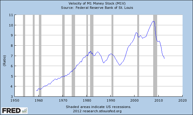
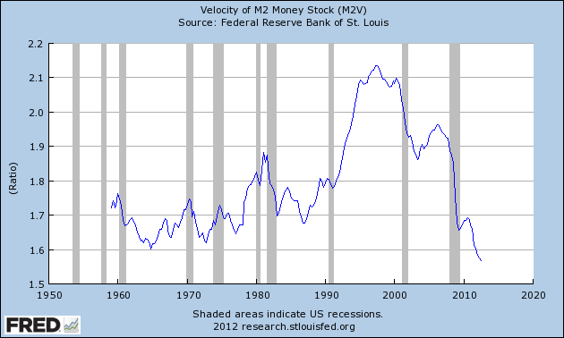
Here are three charts from the St. Louis Fed depicting the velocity of money in terms of the MZM, M1 and M2 money supply measures.

All charts reflect quarterly data through the third quarter of 2012, and were last updated as of October 26, 2012.  As one can see, two of the three measures are at all-time lows:

Velocity of MZM Money Stock, current value = 1.418 :


-

Velocity of M1 Money Stock, current value = 6.732 :


-

Velocity of M2 Money Stock, current value = 1.568 :


_____

The Special Note summarizes my overall thoughts about our economic situation

SPX at 1411.94 as this post is written

Friday, October 26, 2012

Long-Term Charts Of The ECRI WLI & ECRI WLI, Gr. – October 26, 2012 Update


As I stated in my July 12, 2010 post ("ECRI WLI Growth History"):
For a variety of reasons, I am not as enamored with ECRI’s WLI and WLI Growth measures as many are.
However, I do think the measures are important and deserve close monitoring and scrutiny.
The movement of the ECRI WLI and WLI, Gr. is particularly notable at this time, as ECRI publicly announced on September 30, 2011 that the U.S. was “tipping into recession,” and ECRI has reaffirmed that view since, most recently in a September 13 release titled “The 2012 Recession:  Are We There Yet?” and September 13 Bloomberg video titled “Recession Update.”

Other past notable 2012 reaffirmations of the September 30, 2011 recession call by ECRI were seen (in chronological order)  on March 15 (“Why Our Recession Call Stands”) as well as various interviews and statements the week of May 6, including:
Also, subsequent to May 2012:

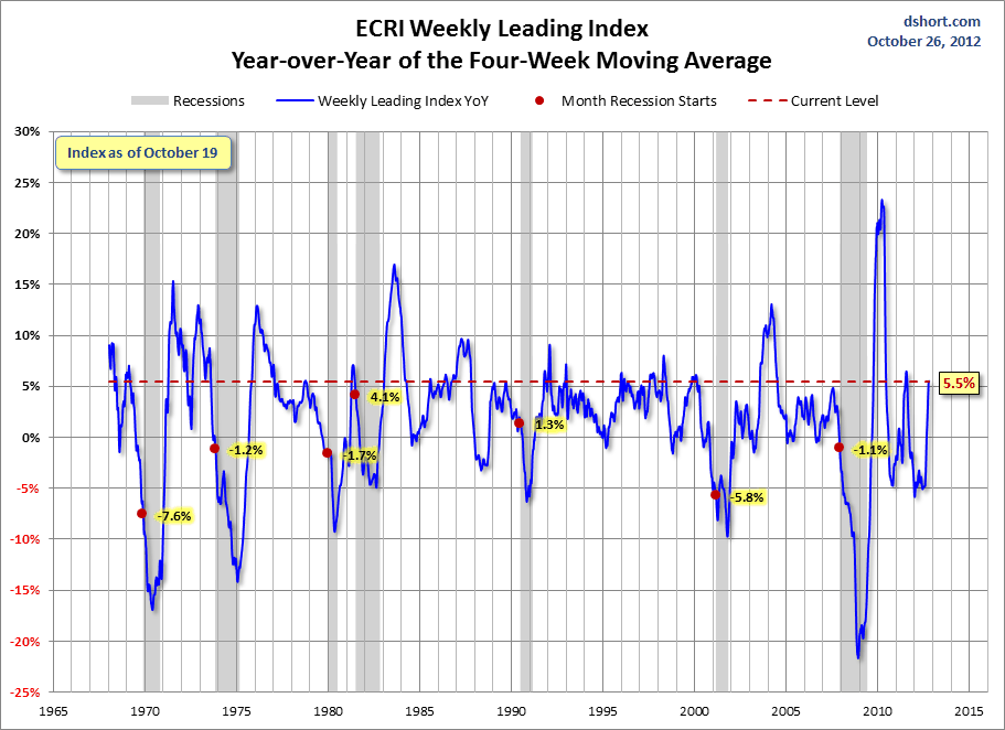
Below are three long-term charts, from Doug Short’s blog post of October 26 titled “ECRI Weekly Leading Index:  Running in Place.”  These charts are on a weekly basis through the October 26 release, indicating data through October 19, 2012.

Here is the ECRI WLI (defined at ECRI’s glossary):


-

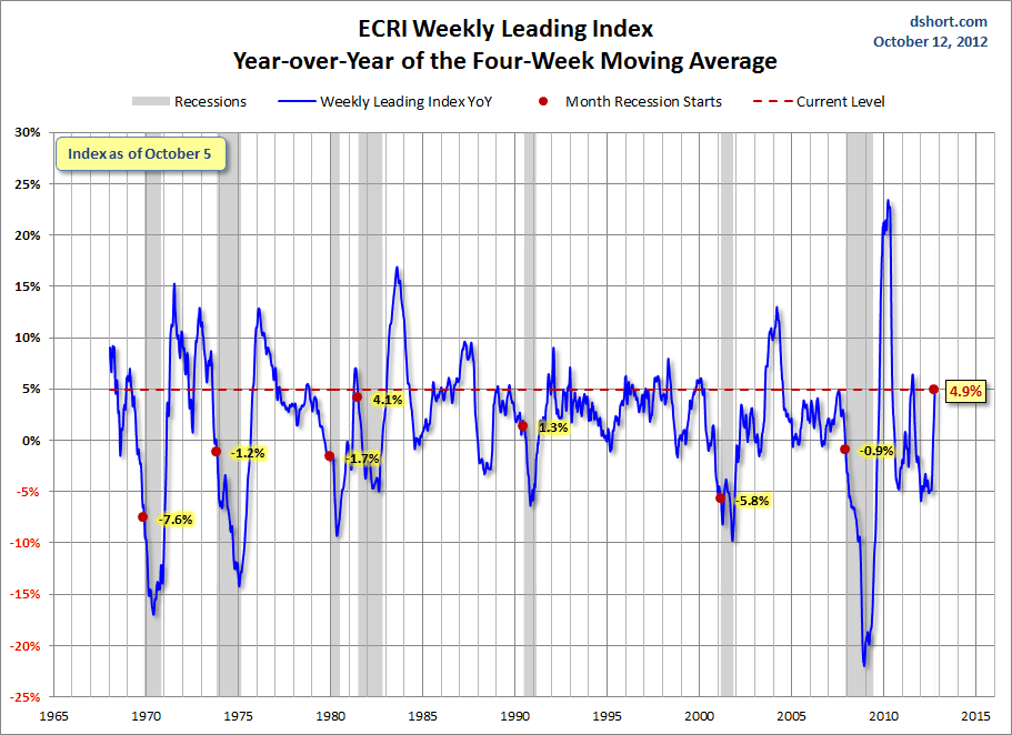
This next chart depicts, on a long-term basis, the Year-over-Year change in the 4-week moving average of the WLI:


-

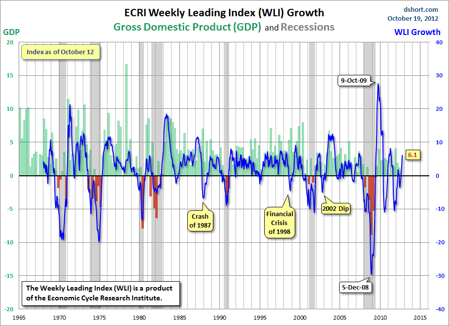
This last chart depicts, on a long-term basis, the WLI, Gr.:


_________

I post various economic indicators and indices because I believe they should be carefully monitored.  However, as those familiar with this blog are aware, I do not necessarily agree with what they depict or imply.
_____

The Special Note summarizes my overall thoughts about our economic situation

SPX at 1414.62 as this post is written

St. Louis Financial Stress Index – October 25, 2012 Update


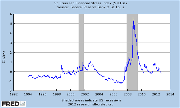
On March 28, 2011 I wrote a post ("The STLFSI") about the  STLFSI (St. Louis Fed’s Financial Stress Index) which is supposed to measure stress in the financial system.  For reference purposes, the most recent chart is seen below.  This chart was last updated on October 25, incorporating data from December 31,1993 to October 19, 2012 on a weekly basis.  The October 19, 2012 value is -.247 :

(click on chart to enlarge image)


_________

I post various indicators and indices because I believe they should be carefully monitored.  However, as those familiar with this blog are aware, I do not necessarily agree with what they depict or imply.
_____

The Special Note summarizes my overall thoughts about our economic situation

SPX at 1412.97 as this post is written

Durable Goods New Orders – Long-Term Charts Through September 2012


Many people place emphasis on Durable Goods New Orders as a prominent economic indicator and/or leading economic indicator.

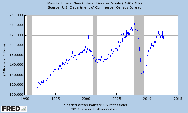
For reference, here are a few charts depicting this measure.

First, from the St. Louis Fed site (FRED), a chart through September, last updated on October 25.  This value is 218,238 ($ Millions) :

(click on charts to enlarge images)


-

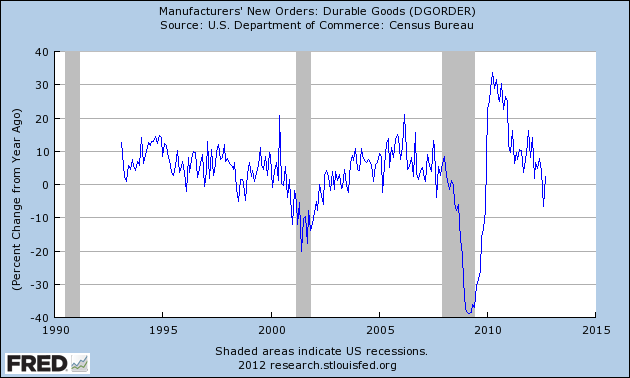
Here is the chart depicting this measure on a “Percentage Change from a Year Ago” basis:


-

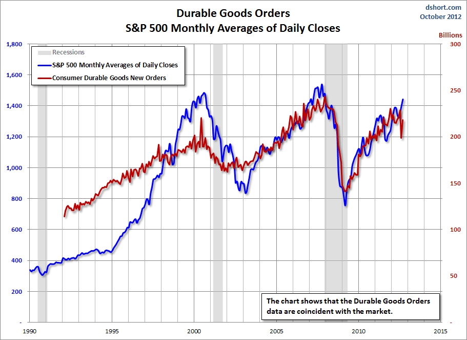
Lastly, a chart from Doug Short’s post of October 26 titled “Durable Goods Orders Partially Recover From Last Month's Major Dip” showing the Durable Goods New Orders vs. the S&P500′s monthly average of daily closes:


_____

The Special Note summarizes my overall thoughts about our economic situation

SPX at 1412.97 as this post is written

Thursday, October 25, 2012

Updates On Economic Indicators October 2012


Here is an update on various indicators that are supposed to predict and/or depict economic activity.  These indicators have been discussed in previous blog posts:

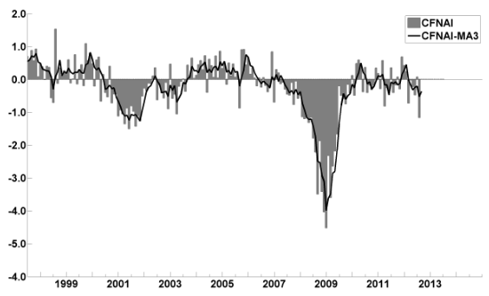
The October Chicago Fed National Activity Index (CFNAI)(pdf) updated as of October 25, 2012:


-


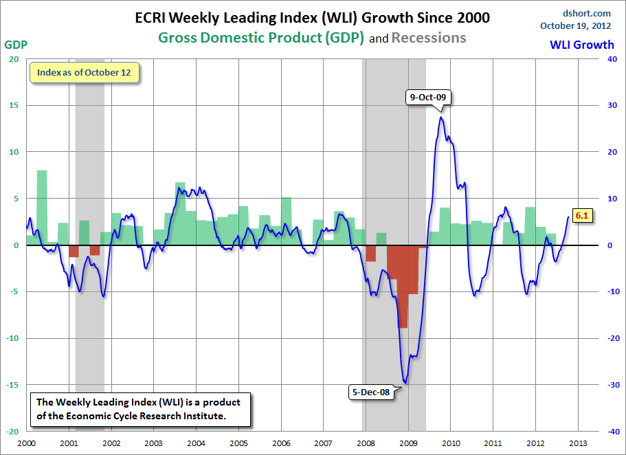
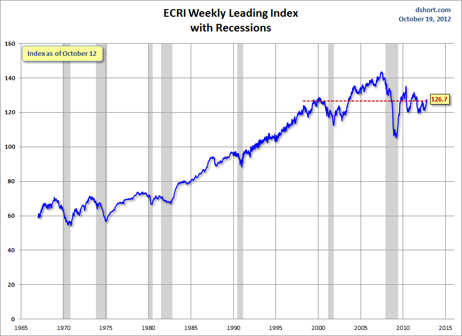
As of 10/19/12 (incorporating data through 10/12/12) the WLI was at 126.7 and the WLI, Gr. was at 6.1%.

A chart of the WLI, Gr. since 2000, from Doug Short’s blog of October 19 titled “ECRI Weekly Leading Index:  Index Slips But Growth Rises” :


-


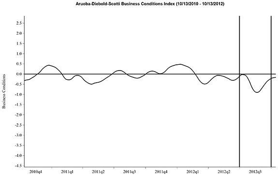
Here is the latest chart, depicting 10-13-10 to 10-13-12:


-


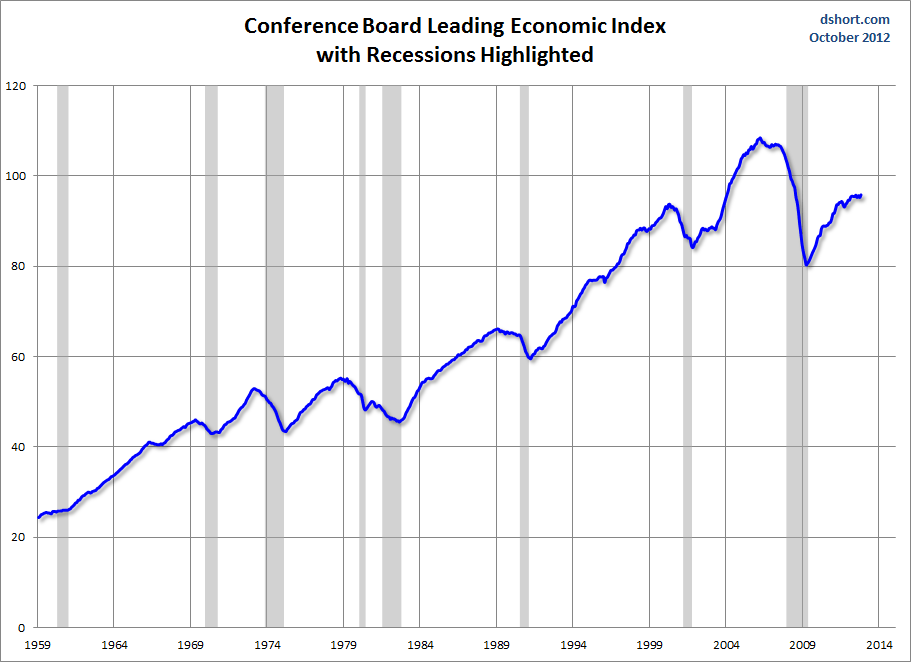
As per the October 18 release, the LEI was at 95.9 and the CEI was at 105.1 in September.

An excerpt from the October 18 release:
Says Ataman Ozyildirim, economist at The Conference Board: “The U.S. LEI increased in September, more than offsetting the decline in August. The LEI has been signaling an economy that is fluctuating around a slow growth trend. The six-month growth rate has slowed substantially, but still remains in growth territory due to positive contributions from the housing and financial components. Meanwhile, the coincident economic index also increased in September.”
Here is a chart of the LEI from Doug Short’s blog post of October 18 titled “Conference Board Leading Economic Index:  Fluctuating Around a Slow-Growth Trend” :


_________

I post various indicators and indices because I believe they should be carefully monitored.  However, as those familiar with this blog are aware, I do not necessarily agree with what they depict or imply.
_____

The Special Note summarizes my overall thoughts about our economic situation

SPX at 1417.94 as this post is written

Wednesday, October 24, 2012

Current Economic Situation


With regard to our current economic situation,  my thoughts can best be described/summarized by the posts found under the 17 "Building Financial Danger" posts.

My thoughts concerning our ongoing economic situation - with future implications - can be seen on the page titled "A Special Note On Our Economic Situation," which has been listed on every blog post since August 15, 2010.
_____

The Special Note summarizes my overall thoughts about our economic situation

SPX at 1416.75 as this post is written

Monday, October 22, 2012

"Risk Appetite" Commentary And Chart


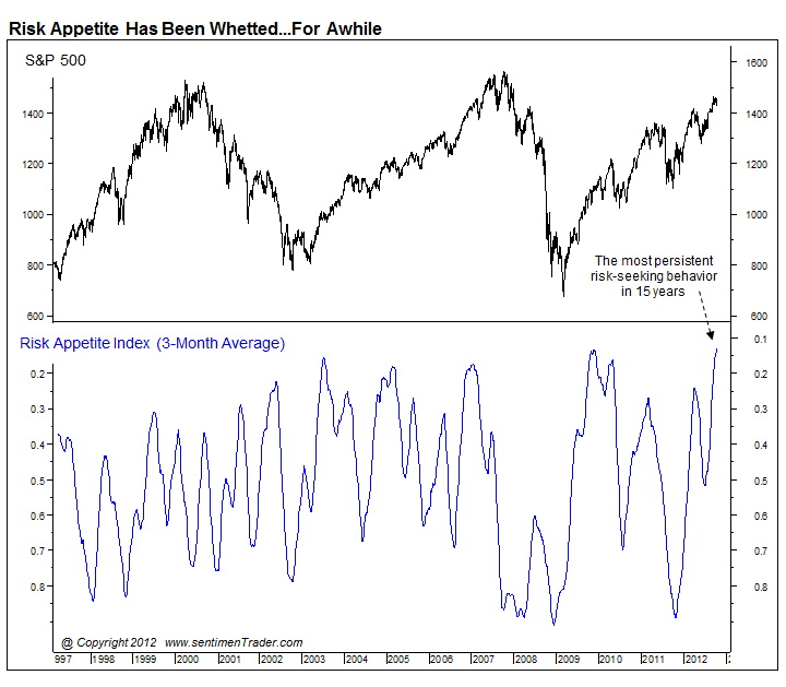
On Thursday, the SentimenTrader.com Daily Report had notable commentary and a chart with regard to the heightened level of "risk appetite" inherent in the financial markets.

Excerpts from the commentary:
The Risk Appetite Index aggregates several different indicators of risk-seeking behavior as compiled by institutional brokerage firms.
also:
As of now, it's at its most-extreme reading in at least 15 years.
The three measures used in the index are the Citigroup Macro Risk Index, Westpac Risk Aversion Index and UBS G10 Carry Risk Index Plus.

Here is the accompanying chart:
_________

I post various economic indicators and indices because I believe they should be carefully monitored.  However, as those familiar with this blog are aware, I do not necessarily agree with what they depict or imply.
_____

The Special Note summarizes my overall thoughts about our economic situation

SPX at 1433.19 as this post is written

Friday, October 19, 2012

Long-Term Charts Of The ECRI WLI & ECRI WLI, Gr. – October 19, 2012 Update


As I stated in my July 12, 2010 post ("ECRI WLI Growth History"):
For a variety of reasons, I am not as enamored with ECRI’s WLI and WLI Growth measures as many are.
However, I do think the measures are important and deserve close monitoring and scrutiny.
The movement of the ECRI WLI and WLI, Gr. is particularly notable at this time, as ECRI publicly announced on September 30, 2011 that the U.S. was “tipping into recession,” and ECRI has reaffirmed that view since, most recently in a September 13 release titled “The 2012 Recession:  Are We There Yet?” and September 13 Bloomberg video titled “Recession Update.”

Other past notable 2012 reaffirmations of the September 30, 2011 recession call by ECRI were seen (in chronological order)  on March 15 (“Why Our Recession Call Stands”) as well as various interviews and statements the week of May 6, including:
Also, subsequent to May 2012:
Below are three long-term charts, from Doug Short’s blog post of October 19 titled “ECRI Weekly Leading Index:  Index Slips, But Growth Rises.”  These charts are on a weekly basis through the October 19 release, indicating data through October 12, 2012.

Here is the ECRI WLI (defined at ECRI’s glossary):


-

This next chart depicts, on a long-term basis, the Year-over-Year change in the 4-week moving average of the WLI:


-

This last chart depicts, on a long-term basis, the WLI, Gr.:


_________

I post various economic indicators and indices because I believe they should be carefully monitored.  However, as those familiar with this blog are aware, I do not necessarily agree with what they depict or imply.
_____

The Special Note summarizes my overall thoughts about our economic situation

SPX at 1438.36 as this post is written

St. Louis Financial Stress Index – October 18, 2012 Update


On March 28, 2011 I wrote a post ("The STLFSI") about the  STLFSI (St. Louis Fed’s Financial Stress Index) which is supposed to measure stress in the financial system.  For reference purposes, the most recent chart is seen below.  This chart was last updated on October 18, incorporating data from December 31,1993 to October 12, 2012 on a weekly basis.  The October 12, 2012 value is -.199 :

(click on chart to enlarge image)


_________

I post various indicators and indices because I believe they should be carefully monitored.  However, as those familiar with this blog are aware, I do not necessarily agree with what they depict or imply.
_____

The Special Note summarizes my overall thoughts about our economic situation

SPX at 1448.67 as this post is written

Thursday, October 18, 2012

Food Stamps As Of September 28, 2012


This post is an update to previous posts concerning food stamps.  The program is officially called “Supplemental Nutrition Assistance Program,” or SNAP.  As stated on the SNAP website, “As of Oct. 1, 2008, Supplemental Nutrition Assistance Program (SNAP) is the new name for the federal Food Stamp Program.”

The data was last updated September 28, 2012, reflecting July 2012 levels.

Here is a table showing various monthly statistics with regard to national participation and costs going back to FY2009.  As seen in this table, the number of people participating as of July 2012 is 46,681,833 up 2.94% from year-ago (July 2011) levels.  As a reference point, the figure as of June 2009 (the official end of the recession as defined by the NBER) was 34,882,031.  Longer-term annual data is also available.

As I wrote in the April 12, 2010 post, “Of course, what is particularly disconcerting is not only the extent of participation in these programs, but the fact that this is yet another notable statistic that is getting worse well after the purported end of the recession.”
_____

The Special Note summarizes my overall thoughts about our economic situation

SPX at 1455.20 as this post is written

Wednesday, October 17, 2012

The S&P500 Vs. The Shanghai Stock Exchange Composite Index – October 17, 2012


Starting on May 3, 2010 I have written posts concerning the notable divergence that has occurred between the S&P500 and Chinese (Shanghai Composite) stock markets.

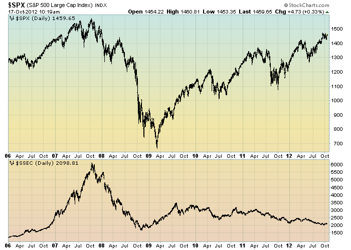
The chart below illustrates this divergence; it shows the S&P500 vs. the Shanghai Composite on a daily basis, since 2006:

(click on chart to enlarge image)(chart courtesy of StockCharts.com; chart creation and annotation by the author)


-

It is notable that the Shanghai Composite led the SPX (S&P500) significantly in late ’08 – early ’09, yet it has been (gradually) declining since that time.

I continue to find this divergence between the S&P500 and  Shanghai Composite to be notable and disconcerting, on an “all things considered” basis.
_____

The Special Note summarizes my overall thoughts about our economic situation

SPX at 1460.91 as this post is written

Sunday, October 14, 2012

The October 2012 Wall Street Journal Economic Forecast Survey


The October Wall Street Journal Economic Forecast Survey was published on October 12, 2012.  The headline is “Sluggish Growth Seen Into Next Year.”

An excerpt:
On average, the 48 respondents, not all of whom answer every question, expect the jobless rate will still be at 7.8% in June of next year—matching the September figure released last week. The reason for the stagnation in the job market is expectations for lackluster economic growth during the rest of 2012 and into 2013. Through the first half of next year, the average forecast is for growth in gross domestic product below 2% at a seasonally adjusted annual rate.
also:
To be sure, the economists don't see the U.S. falling into recession. They put just a 22% chance of another downturn hitting in the next 12 months. In fact, they put better odds—a 28% chance—that the economy will grow above 3% in 2013. But neither of those scenarios is seen as likely, and about two-thirds of the respondents say the risks remain more to the downside than upside.

The current average forecasts among economists polled include the following:

GDP:
full-year 2012:  1.7%
full-year 2013:  2.3%
full-year 2014:  2.9%

Unemployment Rate:
December 2012: 7.9%
December 2013: 7.6%
December 2014:  7.1%

10-Year Treasury Yield:
December 2012: 1.83%
December 2013: 2.46%
December 2014:  3.15%

CPI:
December 2012:  2.0%
December 2013:  2.1%
December 2014:  2.4%

Crude Oil  ($ per bbl):
for 12/31/2012: $91.31
for 12/31/2013: $93.84

(note: I highlight this WSJ Economic Forecast survey each month; commentary on past surveys can be found under the “Economic Forecasts” label)
_____

I post various economic forecasts because I believe they should be carefully monitored.  However, as those familiar with this blog are aware, I do not necessarily agree with many of the consensus estimates and much of the commentary in these forecast surveys.
_____

The Special Note summarizes my overall thoughts about our economic situation

SPX at 1428.59 as this post is written

Friday, October 12, 2012

Long-Term Charts Of The ECRI WLI & ECRI WLI, Gr. – October 12, 2012 Update


As I stated in my July 12, 2010 post ("ECRI WLI Growth History"):
For a variety of reasons, I am not as enamored with ECRI’s WLI and WLI Growth measures as many are.
However, I do think the measures are important and deserve close monitoring and scrutiny.
The movement of the ECRI WLI and WLI, Gr. is particularly notable at this time, as ECRI publicly announced on September 30, 2011 that the U.S. was “tipping into recession,” and ECRI has reaffirmed that view since, most recently in a September 13 release titled “The 2012 Recession:  Are We There Yet?” and September 13 Bloomberg video titled “Recession Update.”

Other past notable 2012 reaffirmations of the September 30, 2011 recession call by ECRI were seen (in chronological order)  on March 15 (“Why Our Recession Call Stands”) as well as various interviews and statements the week of May 6, including:
Also, subsequent to May 2012:

Below are three long-term charts, from Doug Short’s blog post of October 12 titled “ECRI Weekly Leading Indicators:  Time to Recant the Recession Call?”  These charts are on a weekly basis through the October 12 release, indicating data through October 5, 2012.

Here is the ECRI WLI (defined at ECRI’s glossary):

(click on charts to enlarge images)


-

This next chart depicts, on a long-term basis, the Year-over-Year change in the 4-week moving average of the WLI:


-

This last chart depicts, on a long-term basis, the WLI, Gr.:


_________

I post various economic indicators and indices because I believe they should be carefully monitored.  However, as those familiar with this blog are aware, I do not necessarily agree with what they depict or imply.
_____

The Special Note summarizes my overall thoughts about our economic situation

SPX at 1427.77 as this post is written
St. Louis Financial Stress Index – October 11, 2012 Update


On March 28, 2011 I wrote a post ("The STLFSI") about the  STLFSI (St. Louis Fed’s Financial Stress Index) which is supposed to measure stress in the financial system.  For reference purposes, the most recent chart is seen below.  This chart was last updated on October 11, incorporating data from December 31,1993 to October 5, 2012 on a weekly basis.  The October 5, 2012 value is -.172 :

(click on chart to enlarge image)


_________

I post various indicators and indices because I believe they should be carefully monitored.  However, as those familiar with this blog are aware, I do not necessarily agree with what they depict or imply.
_____

The Special Note summarizes my overall thoughts about our economic situation

SPX at 1432.84 as this post is written