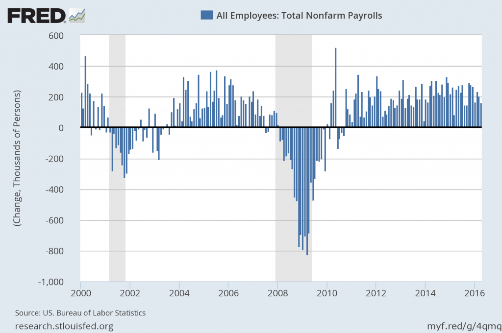
For reference purposes, below are five charts that display growth in payroll employment.
The first chart shows the monthly change in total nonfarm payrolls since the year 2000:
(click on charts to enlarge images)
(click on charts to enlarge images)
Data Source: FRED, Federal Reserve Economic Data, Federal Reserve Bank of St. Louis: All Employees: Total nonfarm [PAYEMS] ; U.S. Department of Labor: Bureau of Labor Statistics; accessed May 9, 2016;
The second chart shows a long-term chart of the same month-over-month change in total nonfarm payrolls (reports of February 1939 to the present report of April 2016):
The third chart shows the aggregate number of total nonfarm payrolls, from January 1939 – April 2016 (April 2016 value of 143.915 million):
The fourth chart shows this same aggregate number of total nonfarm payrolls measure as seen above but presented on a LOG scale:
Lastly, the fifth chart shows the total nonfarm payrolls number on a "percent change from year ago" basis from January 1940 – April 2016:
_________
I post various indicators and indices because I believe they should be carefully monitored. However, as those familiar with this blog are aware, I do not necessarily agree with what they depict or imply.
_____
The Special Note summarizes my overall thoughts about our economic situation
SPX at 2062.12 as this post is written


No comments:
Post a Comment