Throughout this site there are many charts of economic indicators. At this time, the readings of these various indicators are especially notable. While many are indicating economic growth, others depict (or imply) various degrees of economic weakness.
Below are a small sampling of charts that depict greater degrees of weakness and/or worrisome trends, and a brief comment for each. (note: additional economic commentary is seen throughout this EconomicGreenfield site)
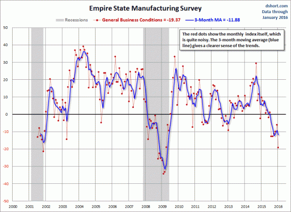
New York Federal Reserve Empire State Manufacturing Survey:
source: Doug Short's post of January 15, 2016, "Empire State Manufacturing Disappoints Forecast, Declined at Fastest Pace Since Recession."
comment:
Various manufacturing statistics have recently been showing weakness. This is seen in many metrics, including the various Federal Reserve regional manufacturing surveys, such as the New York Federal Reserve Empire State Manufacturing Survey depicted above.
-
The ratio of the Conference Board's Coincident Composite Index to the Lagging Composite Index:
source: Haver’s December 17, 2015 post ("U.S. Leading Indicators Continue To Rise")
comment:
As depicted by the above chart the ratio of the Coincident Composite Index to the Lagging Composite Index has been sinking for years, and is not far from the lows seen in the chart.
–
Labor Force Participation Rate (last updated 1-8-16; value of 62.6%):
source: US. Bureau of Labor Statistics, Civilian Labor Force Participation Rate [CIVPART], retrieved from FRED, Federal Reserve Bank of St. Louis https://research.stlouisfed.org/fred2/series/CIVPART/, January 13, 2016.
comment:
I have written extensively concerning unemployment, as the current and future unemployment issue is of tremendous importance. While the current unemployment rate is 5.0% - which would indicate unemployment is (very) low - closer examination indicates that this metric is, for a number of reasons, highly suboptimal.
The underlying dynamics of the unemployment situation, including that of the Labor Force Participation Rate shown above, remain exceedingly worrisome. These dynamics are numerous and complex, and greatly lack recognition and understanding, especially as how, from an "all-things-considered" standpoint they will progress in an economic and societal manner.
-
Inflation, as depicted by the PCE Price Index:
source: Doug Short's December 23, 2015 PCE Update
comment:
As depicted above, the shortfall between the Federal Reserve’s stated inflation target (2% on the PCE Price Index) and the actual inflation reading continues. The level of current inflation and the possibility of deflation is a vastly complex topic, and as such isn't suitably discussed in a brief manner; however, I continue to believe that outright sustained deflation will occur.
-
Inflation Expectations, as depicted by the “10-Year Breakeven Inflation Rate” (updated as of January 15, 2016, with a value of 1.43%)
source: Federal Reserve Bank of St. Louis, 10-Year Breakeven Inflation Rate [T10YIE], retrieved from FRED, Federal Reserve Bank of St. Louis, accessed January 18, 2016; https://research.stlouisfed.org/fred2/series/T10YIE/
comment:
There are many measures of inflation expectations, broadly categorized into two groups - “market-based” measures (such as that seen above) and surveys concerning expected inflation.
Current readings of the "market-based" and future inflation surveys range from steady to - as seen in the “10-Year Breakeven Inflation Rate” chart above - declining.
As I stated in the "U.S. Deflation - September 21, 2015" commentary:
While neither the inflation surveys or “market-based” measures depict a deflationary situation – or provide strong indications of impending deflation – is it correct to assume that they would? For many reasons I don’t believe that they will provide significant “advance” warning of impending deflation.
-
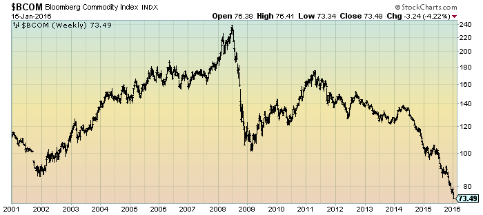
"Deflationary Pressures," as seen in the Bloomberg Commodity Index:
source: chart courtesy of StockCharts.com; chart creation and annotation by the author
comment:
I have discussed "deflationary pressures" extensively, in part because I continue to believe that the many continuing signs of “deflationary pressures” is a foreboding to actual U.S. deflation. The sudden, severe and unexpected decline in commodities, as depicted by the Bloomberg Commodity Index above, is one of an array of indicators that depict deflationary pressures.
-
For comparison, one can compare the above indicators to that of various broad-based measures of economic activity, such as the Chicago Fed National Activity Index (CFNAI) and the Aruoba-Diebold-Scotti Business Conditions Index (ADS Index). These were depicted in the January 15, 2016 post titled "Broad-Based Indicators Of Economic Activity." For further reference, below is the chart of GDP through the Third Estimate of 3rd Quarter GDP:
source: Doug Short's post of December 22, 2015, "Q3 GDP Third Estimate at 2.0% Little Changed from the Second Estimate."
As seen before and during the Financial Crisis, it should be noted that how economic weakness propagates in the current economic paradigm is complex and, to almost all involved, unpredictable in both timing and extent.
_____
The Special Note summarizes my overall thoughts about our economic situation
SPX at 1880.33 as this post is written


No comments:
Post a Comment