Pages

Friday, September 30, 2011

Our Current Economic "Man-Made Problems"


On September 8, President Obama gave the Address by the President to a Joint Session of Congress.  It concerned the economy and the American Jobs Act.  (I highlighted what I believed to be the most notable excerpts in a September 9 blog post titled "President Obama's Address of September 8 2011")

In the Address, President Obama said the following:
President Kennedy once said, “Our problems are man-made –- therefore they can be solved by man.  And man can be as big as he wants.”
This quote is from President Kennedy's American University Speech of June 10, 1963.  (another transcript is found here.)

I find this quote to be interesting in its logic.  From today's perspective, how applicable is it to our economic problems, the context in which President Obama was referring to?

I continue to believe that our current economic situation is of great complexity.  As I wrote in "A Special Note On Our Economic Situation" :
What separates this period of economic weakness from those that have preceded it is its complexity.
_____


The Special Note summarizes my overall thoughts about our economic situation


SPX at 1160.40 as this post is written
Thursday, September 29, 2011

Near-Term Direction Of Stock Market - Update


Since the S&P500 highs of early May and early July I have written a variety of posts warning of what I considered cautionary signs for the stock market.

One of those posts was on August 29, titled "The Near Term Direction Of The Stock Market."  In that post I commented:
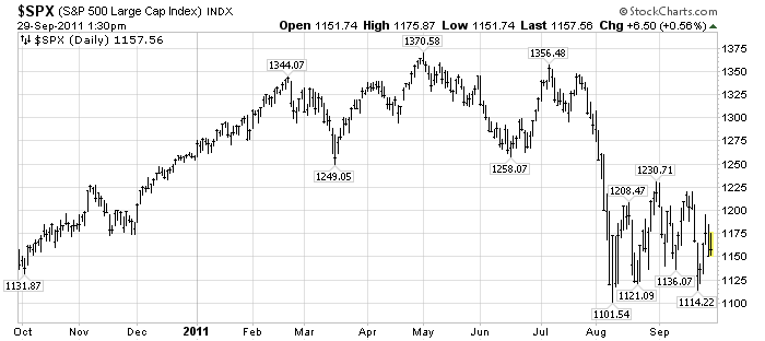
Was that August 9 low a “true bottom” – i.e. one that will not be breached, at least in the short-term?  I believe that the answer will be “no.”
I still believe that we will see a near-term low in the S&P500 below that August 9 low of 1101.54.

Additionally, the stock market "price action" feels very “unsettled” to me, and, as such,  I think the “danger” here is rather high.

My analysis indicates the main underlying driver of the peril continues to be “deflationary pressures” as I have mentioned recently, such as in the aforementioned August 29 post.

For reference, here is a 1-year daily chart of the S&P500, annotated with notable prices:


_____

The Special Note summarizes my overall thoughts about our economic situation


SPX at 1157.56 as this post is written

Wednesday, September 28, 2011

Gold's Uptrend Since 2009


In my August 25 post ("Gold And Deflationary Pressures") I spoke of the correction in Gold and its broader economic implications.  At that time Gold was at $1726/oz (December futures.)

Now, the December Gold futures are at $1645.1/oz.  If one views Gold's ascent from early 2009, one can see a rising trendline - one that seems very significant.  A daily chart of Gold since 2008 is shown below, with the rising trendline (which has served as support) in blue, as well as the 50 and 200dmas in dark blue and red, respectively:

(click on chart to enlarge image)(chart courtesy of StockCharts.com; annotations by the author)


I am continuing to monitor Gold's correction very closely, for many reasons including those indicated in the aforementioned August 25 post.
_____


The Special Note summarizes my overall thoughts about our economic situation


SPX at 1175.38 as this post is written

Tuesday, September 27, 2011

Updates On Economic Indicators September 2011


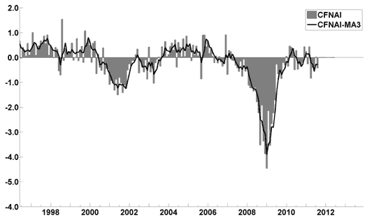
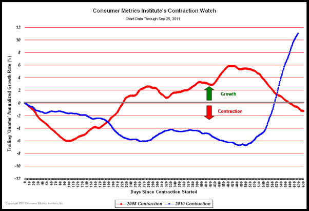
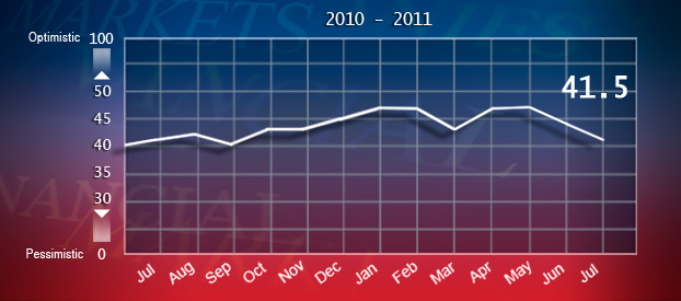
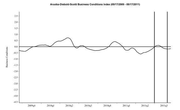
Here is an update on various indicators that are supposed to predict and/or depict economic activity.  These indicators have been discussed in previous blog posts:

The September Chicago Fed National Activity Index (CFNAI)(pdf) updated as of September 26, 2011:


-

The Consumer Metrics Institute Contraction Watch:


-

The USA TODAY/IHS Global Insight Economic Outlook Index:

An excerpt from the September 6 update titled "Index forecasts weak growth through year end" :
The August update of the USA TODAY/IHS Global Insight Economic Outlook Index shows real GDP growth, at a six-month annualized growth rate, remaining below 2% through the second half of the year. Persistent unemployment, elevated debt levels, high energy and food prices and low confidence have stalled consumer spending. Businesses are hesitant to expand amid uncertainty.
-

The ECRI WLI (Weekly Leading Index):

As of 9/16/11 the WLI was at 122.2 and the WLI, Gr. was at -6.7%.

-

The Dow Jones ESI (Economic Sentiment Indicator):

The Indicator as of August 31 was at 41.5, as seen below:


An excerpt from the August 31 Press Release, titled “Threat of a Recession Looms According to Dow Jones Economic Sentiment Indicator” :
In August, federal spending issues and a ratings downgrade took its toll on economic sentiment, according to the Dow Jones Economic Sentiment Indicator. The indicator fell for the third straight month to 41.4 from 41.5 in July.
“The warning lights are flashing but the index is not quite calling recession, merely a very subdued state of sentiment about the economy,” says Dow Jones Newswires “Money Talks” columnist Alen Mattich.
-

The Aruoba-Diebold-Scotti Business Conditions (ADS) Index:

Here is the latest chart, depicting 9-17-09 to 9-17-11:


-

The Conference Board Leading (LEI) and Coincident (CEI) Economic Indexes:

As per the September 22 release, the LEI was at 116.2 and the CEI was at 103.3 in August.

An excerpt from the September 22 release:
Says Ataman Ozyildirim, economist at The Conference Board: “The August increase in the U.S. LEI was driven by components measuring financial and monetary conditions which offset substantially weaker components measuring expectations. The growth trend in the LEI has moderated and positive and negative contributors to the index have been roughly balanced. The leading indicators point to rising risks and volatility, and increasing concerns about the health of the expansion.”
_________

I post various indicators and indices because I believe they should be carefully monitored.  However, as those familiar with this blog are aware, I do not necessarily agree with what they depict or imply.
_____

The Special Note summarizes my overall thoughts about our economic situation


SPX at 1162.95 as this post is written

Monday, September 26, 2011

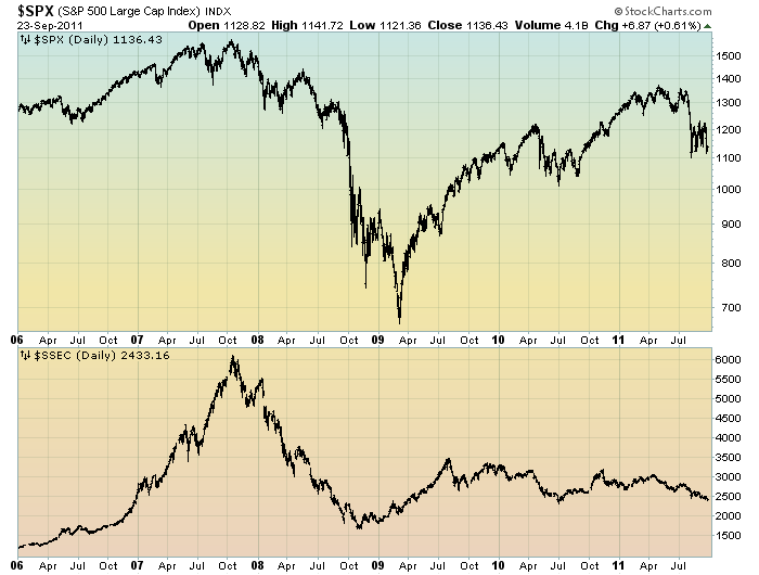
The S&P500 Vs. The Shanghai Stock Exchange Composite Index – September 2011


Starting on May 3, 2010 I have written posts concerning the notable divergence that has occurred between the S&P500 and Chinese (Shanghai Composite) stock markets.

The chart below illustrates this divergence; it shows the S&P500 vs. the Shanghai Composite on a daily basis, LOG scale, since 2006:

(click on chart to enlarge image)(chart courtesy of StockCharts.com)


-

It is notable that the Shanghai Composite led the SPX (S&P500) significantly in late ’08 – early ’09, yet it has been declining lately.

I continue to find this divergence between the S&P500 and  Shanghai Composite to be notable and disconcerting, on an “all things considered” basis.
_____


The Special Note summarizes my overall thoughts about our economic situation


SPX at 1136.43 as this post is written

Friday, September 23, 2011

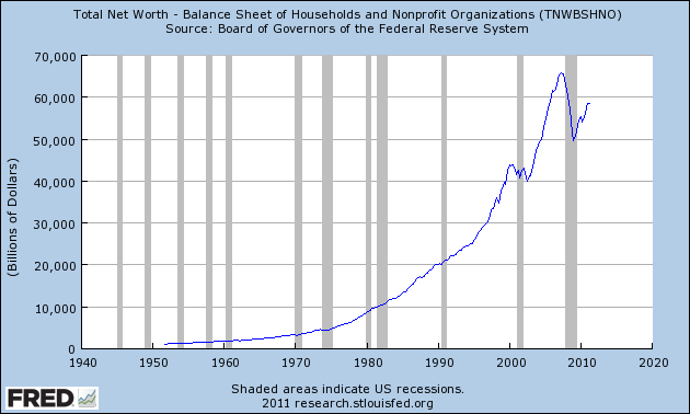
Total Household Net Worth As Of 2Q 2011 - A Long-Term Chart


In the September 18 post ("Total Household Net Worth As A Percent Of GDP 2Q 2011") I displayed a long-term chart depicting Total Household Net Worth as a percentage of GDP.

For reference purposes, here is Total Household Net Worth from a long-term perspective (from 1949:Q4 to 2011:Q2).  The last value is $58.463 Trillion:


The above chart was last updated as of September 16, 2011.
_____


The Special Note summarizes my overall thoughts about our economic situation


SPX at 1129.56 as this post is written

Thursday, September 22, 2011

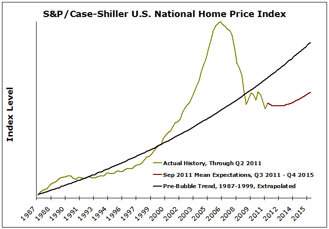
MacroMarkets September 2011 Home Price Expectations Survey


Yesterday (September 21) MacroMarkets released its September 2011 Home Price Expectations Survey (pdf) results.  This survey is now done on a quarterly basis.

The accompanying chart is seen below:

(click on chart image to enlarge)


As one can see from the above chart, the average expectation is that not only has the residential real estate market (nearly) hit a “bottom” as far as pricing; but that steady yet mild appreciation will occur through 2015.

The survey detail is interesting.  Of the 111 survey respondents, 20 (of the displayed responses) foresee a cumulative price decrease through 2015; and of those 20, only four foresee a double-digit percentage cumulative price drop.  Mark Hanson remains the most “bearish” of the survey participants with a forecast of a 22.03% cumulative price decline through 2015.

The Median Cumulative Home Price Appreciation for years 2011-2015 is seen as -2.53%, -2.62%, -.84%, 1.99%, and 5.44% respectively.

For a variety of reasons, I continue to believe that even the most “bearish” of these forecasts (as seen in Mark Hanson’s above-referenced forecast)  will prove too optimistic in hindsight.  Although a 22.03% decline is substantial, from a longer-term historical perspective such a decline is rather tame in light of the wild excesses that occurred over the “bubble” years.

I have written extensively about the residential real estate situation.  For a variety of reasons, it is exceedingly complex.  While many people continue to have an optimistic view regarding future residential real estate prices, in my opinion such a view is unsupported on an “all things considered” basis.  Furthermore, (even) from these price levels there exists outsized potential for a price decline of severe magnitude, unfortunately.  I discussed this downside, based upon historical price activity, in the October 24, 2010 post.
_____

The Special Note summarizes my overall thoughts about our economic situation

SPX at 1134.24 as this post is written

Hunger In The Chicago Area


Yesterday CBSChicago.com had a story titled "Study Finds 1 in 5 Chicagoans Are Hungry."

Although the entire article is worthwhile, I find the following excerpts to be most notable (and disconcerting):
The Greater Chicago Food Depository has, for the first time, done a neighborhood-by-neighborhood breakdown of hunger in the Chicago area.
As WBBM’s Mike Krauser reports, some of the numbers are staggering.
The numbers are growing—and about 20 percent of Chicagoans are hungry, a new analysis found.
also:
As CBS 2′s Derrick Blakley reports, the report found nearly 850,000 people in Cook County aren’t sure where their next meal is coming from.
also:
At St. Sylvester’s Pantry in Logan Square, the story’s much the same. Three years ago, they served 225 families. Now, they serve more than 800.
Deacon Fred Ortiz said, “We have people that have been in banking, people that have been in teaching, medical fields. We have seen a very, very big increase in that type of client coming in for service.”
Overall, the Chicago Food Depository says visits to food pantries are soaring, up 58 percent in the last three years.
Depository CEO Kate Maehr said, “That hunger is not restricted to one neighborhood. It’s in every community and every suburban community in our county and across our state in record numbers.”
_____


The Special Note summarizes my overall thoughts about our economic situation


SPX at 1126.84 as this post is written

Wednesday, September 21, 2011

Food Stamps As Of September 2011


This post is an update to previous posts concerning food stamps.  The program is officially called “Supplemental Nutrition Assistance Program,” or SNAP.  As stated on the SNAP website, “As of Oct. 1, 2008, Supplemental Nutrition Assistance Program (SNAP) is the new name for the federal Food Stamp Program.”


The data was last updated September 1, 2011, reflecting June 2011 levels.

Here is a table showing various monthly statistics with regard to National Level participation and costs going back to FY2008.  As seen in this table, the number of people participating as of June 2011 is 45,183,931, up 9.46% from year-ago (June 2010) levels.  As a reference point, the figure as of June 2009 (the official end of the recession as defined by the NBER) was 34,882,031.  Longer-term annual data is also available.

As I wrote in the April 12, 2010 post, “Of course, what is particularly disconcerting is not only the extent of participation in these programs, but the fact that this is yet another notable statistic that is getting worse well after the purported end of the recession.”
_____

The Special Note summarizes my overall thoughts about our economic situation


SPX at 1202.09 as this post is written

Tuesday, September 20, 2011

Year-End 2011 S&P500 Price & Earnings Forecasts


Yesterday (September 19) The Wall Street Journal had an article titled "Wall Street's Optimism Fades."

The article contains a variety of forecasts and commentary regarding the stock market and earnings.

Here are two excerpts of forecasts:
Goldman Sachs last Wednesday ratcheted down its end-of-year prediction for the S&P 500 to 1250, from its previous forecast of 1400. Last Monday, Wells Fargo dropped its forecast to 1250 from 1390. And on Friday, Citigroup lowered its target to 1325 from 1400.
The S&P 500 ended last week at 1216.01, which leaves most of the predictions still looking relatively bullish. Strategists on average expect the S&P 500 to end the year at 1309, according to Birinyi Associates—a rise of 7.6% from Friday's close through year end.
At the beginning of 2011, strategists were looking for an 8.5% gain for the entire year, predicting a year-end close of 1365.
also:
Consensus earnings estimates for the S&P 500 companies this year fell below $100 a share last week, according to S&P Capital IQ, down from $100.31 on Aug. 24. For the past few years, analysts have mostly been right to stay optimistic; strong company earnings have been a big driver of the S&P 500's 75% rise from March 2009.
To be sure, the consensus forecast for annual per-share earnings of $99.91 is still bullish, reflecting confidence that the economy can avoid a double-dip recession. In 2010, S&P 500 earnings were $84 a share, according to Barclays. But the falling forecasts indicate that even the most sanguine analysts are starting to worry about the burdens of a sagging economy and policy uncertainty.
_____

I post various economic forecasts because I believe they should be carefully monitored.  However, as those familiar with this blog are aware, I do not agree with many of the consensus estimates and much of the commentary in these forecast surveys.
_____


The Special Note summarizes my overall thoughts about our economic situation


SPX at 1219.79 as this post is written

Monday, September 19, 2011

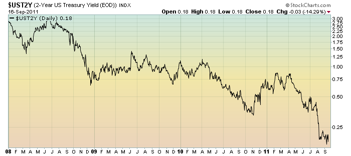
Short-term Treasury Yields - Significance


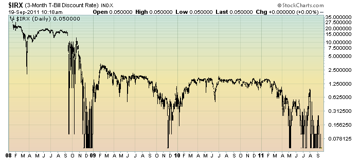
In at least two past posts on short-term Treasury yields, those of July 20, 2010 ("2-Year Treasury: Odd Occurrences") and November 23, 2009 ("Two Notable Developments") I have discussed the significance of the ultra-low yields seen on the 2-Year Treasury Note and the 3-Month Bill.

Here are updated charts of each, as of Friday's close.

First, the 2-Year Treasury Note yield, shown on a daily basis, LOG scale, since 2008:

(click on chart images to enlarge)(charts courtesy of StockCharts.com)


The second is a chart of the 3-Month Treasury Bill yield, also shown on a daily basis, LOG scale, since 2008:


For the various reasons I wrote about in the two aforementioned posts, I continue to find these ultra-low short-term Treasury yields to be disconcerting.
_____


The Special Note summarizes my overall thoughts about our economic situation


SPX at 1189.38 as this post is written

Sunday, September 18, 2011

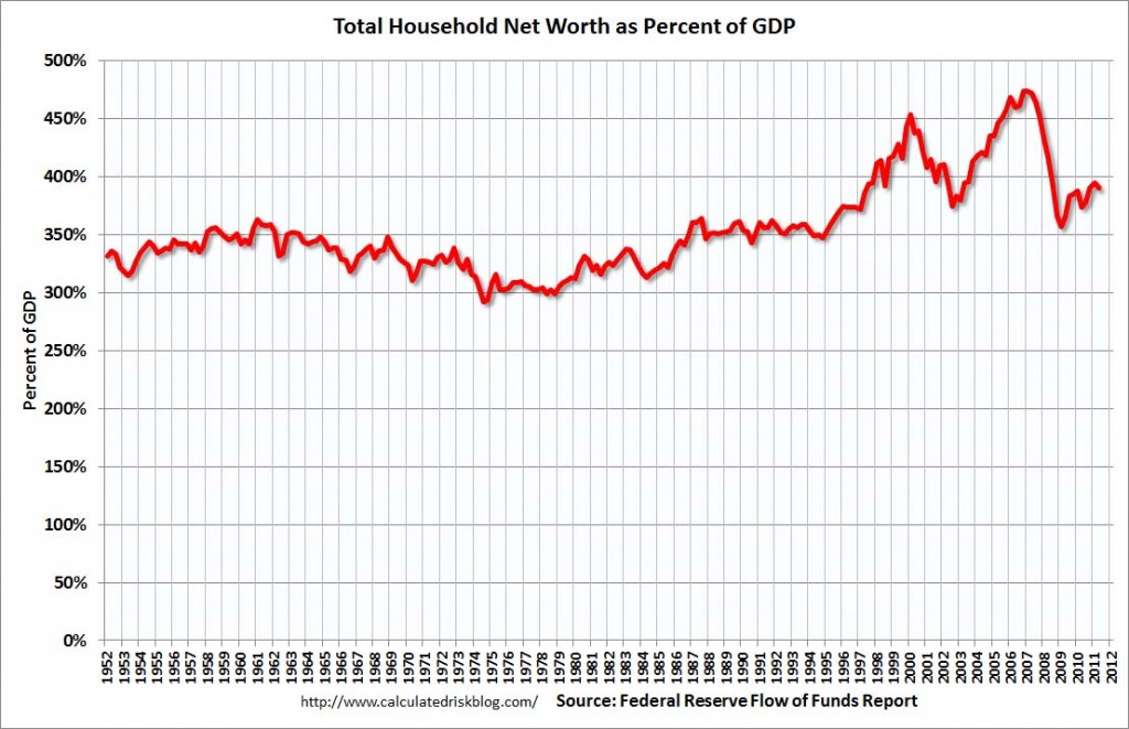
Total Household Net Worth As A Percent Of GDP 2Q 2011


The following chart is from the CalculatedRisk blog post of September 16, 2011 titled “Q2 Flow of Funds:  Household Real Estate assets off $6.6 trillion from peak.” It depicts Total Household Net Worth as a Percent of GDP.  The underlying data is from The Federal Reserve Flow of Funds 2Q 2011 report:

(click on chart to enlarge image)


As seen in the above-referenced CalculatedRisk blog post:
The Federal Reserve released the Q2 2011 Flow of Funds  report today.  The Fed estimated that the value of household real estate fell $65 billion to $16.18 trillion in Q2 2011, from $16.25 trillion in Q1 2011. The value of household real estate has fallen $6.6 trillion from the peak - and is still falling in 2011.
Household net worth peaked at $65.9 trillion in Q2 2007, and then net worth fell to $49.5 trillion in Q1 2009 (a loss of $16 trillion). Household net worth was at $58.5 trillion in Q2 2011 (up $8.9 trillion from the trough, but before the recent stock sell-off).
My comments:


As I have written in previous posts on this Household Net Worth (as a percent of GDP) topic:
As one can see, the first outsized peak was in 2000, and attained after the stock market bull market / stock market bubbles and economic strength.  The second outsized peak was in 2007, right near the peak of the housing bubble as well as near the stock market peak.
As seen on the chart, the Total Household Net Worth is making an upturn, but is significantly below the prior 2007 peak.
I could extensively write about various interpretations that can be made from this chart.  One way this chart can be interpreted is a gauge of “what’s in it for me?” as far as the aggregated wealth citizens are gleaning from economic activity, as measured compared to GDP.
_____


The Special Note summarizes my overall thoughts about our economic situation


SPX at 1216.01 as this post is written

Friday, September 16, 2011

The September 2011 Wall Street Journal Economic Forecast Survey


The September Wall Street Journal Economic Forecast Survey was published today, September 16, 2011.  The headline is “Economists Say That U.S. Recession Looks More Likely.”

I found various aspects of the survey to be interesting, including the following excerpts:
Economists see a one in three chance the U.S. will slip into recession over the next twelve months and doubt any steps the Federal Reserve might take at its meeting next week can change that.
also:
The majority of economists said all three steps—launching Operation Twist, altering interest on reserves or setting more explicit targets—would have little to no effect. Twenty-two of the 50 economists who responded to the question said more asset purchases would have somewhat or a significant impact on the economy, but 19 said the effect would be small and nine said it would be negative.
Also, a question in the detail (spreadsheet) asked “Please estimate on a scale of 0 to 100 the probability that the U.S. is in a recession already."  The average response was 15%.

Another question in the detail asked for the economists to grade President Obama's jobs proposal on a scale of 0-100.  The responses were the following:

A (90-100)         10%
B (80-89)             8%
C (70-79)            13%
D (60-69)             18%
F (Below 60)        51%

The current average forecasts among economists polled include the following:

GDP:
full-year 2011 : 1.5%
full-year 2012:  2.4%

Unemployment Rate:
December 2011: 9.1%
December 2012: 8.6%

10-Year Treasury Yield:
December 2011: 2.37%
December 2012: 3.17%

CPI:
December 2011:  3.1%
December 2012:  2.2%

Crude Oil  ($ per bbl):
for 12/31/2011: $88.95
for 12/31/2012: $92.82

(note: I comment upon this survey each month; commentary on past surveys can be found under the “Economic Forecasts” label)
_____

I post various economic forecasts because I believe they should be carefully monitored.  However, as those familiar with this blog are aware, I do not necessarily agree with many of the consensus estimates and much of the commentary in these forecast surveys.
_____

The Special Note summarizes my overall thoughts about our economic situation


SPX at 1213.89 as this post is written

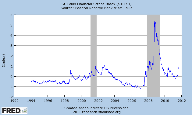
St. Louis Financial Stress Index – September 15 Update


On March 28 I wrote a post (“The STLFSI“) about the  STLFSI (St. Louis Fed’s Financial Stress Index) which is supposed to measure stress in the financial system.

Here is the most recent chart.  This chart was last updated on September 15, incorporating data from 12-31-93 to 9-9-11 on a weekly basis.  The present level is .846:


_________

I post various indicators and indices because I believe they should be carefully monitored.  However, as those familiar with this blog are aware, I do not necessarily agree with what they depict or imply.
_____

The Special Note summarizes my overall thoughts about our economic situation


SPX at 1214.86 as this post is written

Thursday, September 15, 2011

September 13 Gallup Poll On Upper-Income Americans' Economic Confidence – Notable Excerpts


On September 13, Gallup released a poll titled “Upper-Income Americans' Economic Confidence Shaken."

I find this poll interesting for a variety of reasons.  A few excerpts of note:
Upper-income Americans' economic confidence was badly shaken in August, with 80% saying the economy is "getting worse," up from 66% in July. This is the first month since the financial crisis of late 2008 and early 2009 that upper-income Americans are more pessimistic about the future direction of the U.S. economy than other Americans.
also:
Normally, upper-income Americans tend to be more optimistic about the future of the economy than those with lower incomes. Additionally, the percentage of upper-income Americans expressing concerns about the future direction of the economy is the highest it has been since February 2009.
also:
Fifty-four percent of upper-income Americans rate current economic conditions "poor" in August, up from 42% in July. This is the highest percentage providing this rating since March 2009.
_____


The Special Note summarizes my overall thoughts about our economic situation


SPX at 1188.68 as this post is written

Wednesday, September 14, 2011

U.S. Real Mean Household Income Growth Chart 1967-2010


In the September 20, 2010 post ("Real Median Household Income & Poverty Measures") I highlighted the lack of significant long-term growth in Real Median Household Income.

As I stated in that post:
…Real Median Household Income has experienced anemic growth for decades.
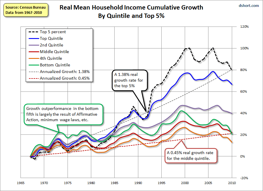
Doug Short, in his September 13 blog post titled “U.S. Household Incomes:  A 43-Year Perspective,” has a variety of charts and commentary on various facets of Household Income distributions and growth.

One chart, seen below, seems particularly interesting.  It is a depiction of Real Mean Household Income Cumulative Growth By Quintile and Top 5%, from 1967 to 2010:

(click on chart to enlarge image)


_____

The Special Note summarizes my overall thoughts about our economic situation

SPX at 1181.05 as this post is written

Median Household Income & Poverty Measures For 2010


Yesterday saw the release of  “Income, Poverty, and Health Insurance Coverage in the United States, 2010″ (pdf) from the U.S. Census Bureau.  Real Median Income was $49,445 in 2010, as seen on page 5.  On page 14, the Poverty Rate is seen at 15.1%, encompassing 46.2 million people.

As seen on the chart on page 8, Real Median Income has experienced anemic growth for decades.  In 1967 it was roughly $40,000 in real terms.

As stated in a Wall Street Journal article from today, titled "Income Slides to 1996 levels" :
The income of the typical American family—long the envy of much of the world—has dropped for the third year in a row and is now roughly where it was in 1996 when adjusted for inflation. 
The income of a household considered to be at the statistical middle fell 2.3% to an inflation-adjusted $49,445 in 2010, which is 7.1% below its 1999 peak, the Census Bureau said.
As for the Poverty figures, this measure has been widely criticized.  However, even if one uses the as-stated figures, it is obviously substantial.
_____

The Special Note summarizes my overall thoughts about our economic situation

SPX at 1177.00 as this post is written

Tuesday, September 13, 2011

The European Debt Crisis - Broader Implications


On January 10 I wrote an article on the Seeking Alpha site titled "10 'Front and Center' Problem Areas That Pose a Threat to the Economy."

From time to time I like to revisit this list as these threats remain very relevant to our current and future economic situation.

The European Debt Crisis was listed as #2 on the list.  How this crisis is evolving is very notable, and has broader implications.  Here is what I said in the aforementioned article:
European debt crisis: This situation appears to be unresolved in many respects. In fact, it almost appears to be a slow-spreading contagion. One interpretation of this overall situation is that it may signal a repudiation of (sovereign) debt. Should this interpretation prove accurate, it would not bode well for our highly-indebted global economy.
_____
The Special Note summarizes my overall thoughts about our economic situation


SPX at 1162.27 as this post is written
Friday, September 9, 2011

President Obama's Address Of September 8 2011 - Notable Excerpts


Last night President Obama made an address before the Joint Session of Congress, with regard to the American Jobs Act.   (also, for reference, a September 9 Bloomberg article titled "Obama Proposes $447 Billion Jobs Stimulus Plan.")

While I don't agree with various parts of the speech, I do find the following to be notable:
These men and women grew up with faith in an America where hard work and responsibility paid off.  They believed in a country where everyone gets a fair shake and does their fair share -- where if you stepped up, did your job, and were loyal to your company, that loyalty would be rewarded with a decent salary and good benefits; maybe a raise once in a while.  If you did the right thing, you could make it.  Anybody could make it in America.
For decades now, Americans have watched that compact erode.  They have seen the decks too often stacked against them.  And they know that Washington has not always put their interests first.
also:
I am sending this Congress a plan that you should pass right away.  It’s called the American Jobs Act.  There should be nothing controversial about this piece of legislation.  Everything in here is the kind of proposal that’s been supported by both Democrats and Republicans -- including many who sit here tonight.  And everything in this bill will be paid for.  Everything.  (Applause.)
also:
This is the American Jobs Act.  It will lead to new jobs for construction workers, for teachers, for veterans, for first responders, young people and the long-term unemployed.  It will provide tax credits to companies that hire new workers, tax relief to small business owners, and tax cuts for the middle class.  And here’s the other thing I want the American people to know:  The American Jobs Act will not add to the deficit.  It will be paid for.  And here’s how.  (Applause.)
The agreement we passed in July will cut government spending by about $1 trillion over the next 10 years.  It also charges this Congress to come up with an additional $1.5 trillion in savings by Christmas.  Tonight, I am asking you to increase that amount so that it covers the full cost of the American Jobs Act.  And a week from Monday, I’ll be releasing a more ambitious deficit plan -- a plan that will not only cover the cost of this jobs bill, but stabilize our debt in the long run.  (Applause.)
also:
Now, the American Jobs Act answers the urgent need to create jobs right away.  But we can’t stop there.  As I’ve argued since I ran for this office, we have to look beyond the immediate crisis and start building an economy that lasts into the future -- an economy that creates good, middle-class jobs that pay well and offer security.  We now live in a world where technology has made it possible for companies to take their business anywhere.  If we want them to start here and stay here and hire here, we have to be able to out-build and out-educate and out-innovate every other country on Earth.  (Applause.)
also:
I don’t pretend that this plan will solve all our problems. It should not be, nor will it be, the last plan of action we propose.  What’s guided us from the start of this crisis hasn’t been the search for a silver bullet.  It’s been a commitment to stay at it -- to be persistent -- to keep trying every new idea that works, and listen to every good proposal, no matter which party comes up with it.
also:
President Kennedy once said, “Our problems are man-made –- therefore they can be solved by man.  And man can be as big as he wants.”
_____

In December 2008 I wrote an article titled "President Obama's Greatest Challenge"
_____


The Special Note summarizes my overall thoughts about our economic situation


SPX at 1185.90 as this post is written
Thursday, September 8, 2011

U.S. Dollar Decline – September 2011 Update


U.S. Dollar weakness is a foremost concern of mine.  As such, I have extensively written about it.  I am very concerned that the actions being taken to “improve” our economic situation will dramatically weaken the Dollar.  Should the Dollar substantially decline from here, as I expect, the negative consequences will far outweigh any benefits.  The negative impact of a substantial Dollar decline can’t be overstated, in my opinion.

The following three charts illustrate various technical analysis aspects of the U.S. Dollar, as depicted by the U.S. Dollar Index.

First, a look at the monthly U.S. Dollar from 1983.  This clearly shows a long-term weakness, with the blue line showing technical support (until 2007):

(charts courtesy of StockCharts.com; annotations by the author)

(click on chart image to enlarge)


-

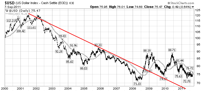
Next, another chart, this one focused on the daily U.S. Dollar since 2000 on a LOG scale.  The red line represents both a trendline as well as a relatively good visual “best-fit” line.  The gray dotted line is the 200-day M.A. (moving average).  As seen on this chart, the U.S. Dollar looks vulnerable to continuing its downward trend that has been interrupted since early 2008:


-

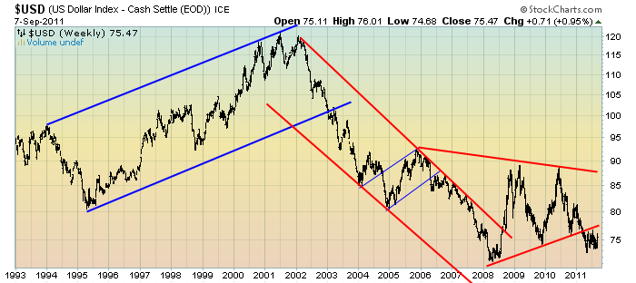
Lastly, a chart of the Dollar on a weekly LOG scale.  There are some clearly marked  channels here, with a large, prominent triangle featured.  Triangles are thought of as “continuation” patterns.  In this case, it would be a continuation of the Dollar downtrend since 2002:


-

I will be providing updates on this U.S. Dollar situation regularly as it deserves very close monitoring…

_____


The Special Note summarizes my overall thoughts about our economic situation


SPX at 1197.48 as this post is written
Wednesday, September 7, 2011

Standard & Poors S&P500 Earnings Estimates For 2011 & 2012


As many are aware, Standard & Poors publishes earnings estimates for the S&P500.  (My previous posts concerning their estimates can be found in the under the S&P500 Earnings tag)

Currently (as of September 2), their estimates for 2011 add to the following:

-From a “bottom up” perspective, operating earnings of $98.58/share
-From a “top down” perspective, operating earnings of N.A.
-From a “top down” perspective, “as reported” earnings of $88.64/share

Currently, their estimates for 2012 add to the following:

-From a “bottom up” perspective, operating earnings of $112.55/share
-From a “top down” perspective, operating earnings of $101.91/share
-From a “top down” perspective, “as reported” earnings of $95.67/share
_____


I post various economic forecasts because I believe they should be carefully monitored.  However, as those familiar with this blog are aware, I do not agree with many of the consensus estimates and much of the commentary in these forecast surveys.
_____


The Special Note summarizes my overall thoughts about our economic situation

SPX at 1180.31 as this post is written


Tuesday, September 6, 2011

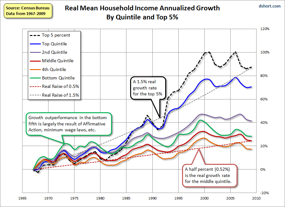
U.S. Real Household Income Growth Chart


In the September 20, 2010 post ("Real Median Household Income & Poverty Measures") I highlighted the lack of significant long-term growth in Real Median Household Income.

As I stated in that post:
...Real Median Household Income has experienced anemic growth for decades.
Doug Short, in his August 30 blog post titled "U.S. Household Incomes:  A 42-Year Perspective," has a variety of charts and commentary on various facets of Household Income distributions and growth.

One chart, seen below, seems particularly interesting.  It is a depiction of Real Mean Household Income Cumulative Growth By Quintile and Top 5%, from 1967 to 2009:

(click on chart to enlarge image)


_____

The Special Note summarizes my overall thoughts about our economic situation

SPX at 1145.50 as this post is written
Strategist 2011 & 2012 Estimates For S&P500 Earnings And Price Levels


In the September 5 edition of Barron's, the cover story was titled "Which Way Up?"

Included in the story, 15 "buy- and sell-side strategists" give various forecasts including 2011 and 2012 S&P500 EPS, S&P500 year-end price targets, GDP, and 10-Year Treasury Note Yields.

As seen on page 23, "The average of their expectations" for the S&P500 at year end "is about 1300."

Also, the consensus estimate for this year's (2011) S&P500 earnings is seen at "about $90" and for 2012 $102.
_____

I post various economic forecasts because I believe they should be carefully monitored.  However, as those familiar with this blog are aware, I do not agree with many of the consensus estimates and much of the commentary in these forecast surveys.
_____


The Special Note summarizes my overall thoughts about our economic situation


SPX at 1173.97 as this post is written

Sunday, September 4, 2011

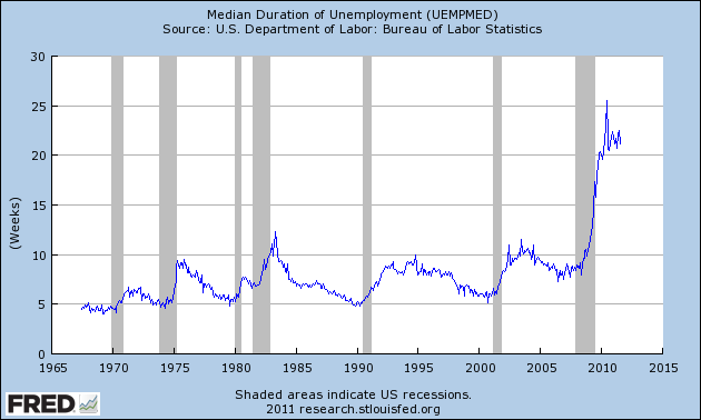
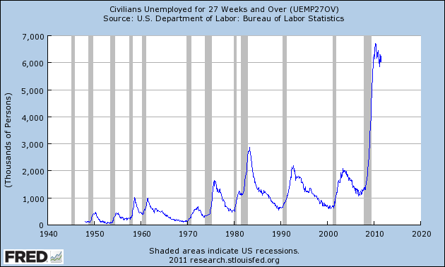
3 Critical Unemployment Charts – September 2011


As I have commented previously, as in the October 6, 2009 post ("A Note About Unemployment Statistics"), in my opinion the official methodologies used to measure the various job loss and unemployment statistics do not provide an accurate depiction; they serve to understate the severity of unemployment.

However, even if one chooses to look at the official statistics, the following charts provide an interesting (and disconcerting) long-term perspective of certain aspects of the officially-stated unemployment situation.

The first two charts are from the St. Louis Fed site.  Here is the Median Duration of Unemployment:

(click on charts to enlarge images)(charts updated as of 9-2-11)


-

Here is the chart for Unemployed 27 Weeks and Over:


-

Lastly, a chart from the CalculatedRisk.com site, from the September 2 post titled “August Unemployment Report...”  This shows the employment situation vs. that of previous recessions, as shown:


-
As depicted by these charts, our unemployment problem is severe.  Unfortunately, there do not appear to be any “easy” solutions.

In July 2009 I wrote a series of five blog posts titled “Why Aren’t Companies Hiring?”, which discusses various aspects of the topic, many of which lack recognition.
_____


The Special Note summarizes my overall thoughts about our economic situation


SPX at 1173.97 as this post is written
Thursday, September 1, 2011

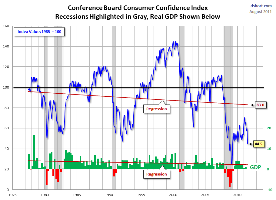
Confidence Surveys - Another View


In yesterday's post ("4 Confidence Charts - August 2011") I displayed four charts indicating various long-term consumer and small business confidence readings as compared to the S&P500.

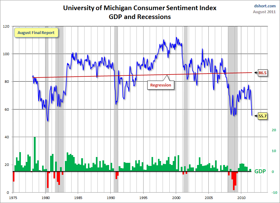
Doug Short had a blog post of August 30 ("Conference Board:  Consumer Confidence Does a Cliff Dive") in which he presents the Conference Board and University of Michigan charts in a different fashion.  They are presented below:

(click on charts to enlarge images)


-

There are a few aspects of the above charts that I find highly noteworthy.  Of course, the very subdued absolute levels of these two surveys is disconcerting.

Also, I find the "behavior" of these readings to be quite disparate as compared to the other post-recession periods, as shown in the charts between the gray shaded areas (the gray areas denote recessions as defined by the NBER.)

While I don’t believe that confidence surveys should be overemphasized, I find these readings to be very problematical, especially in light of a variety of other highly disconcerting measures highlighted in this blog.
_____


The Special Note summarizes my overall thoughts about our economic situation


SPX at 1209.91 as this post is written