Pages

Tuesday, January 31, 2012

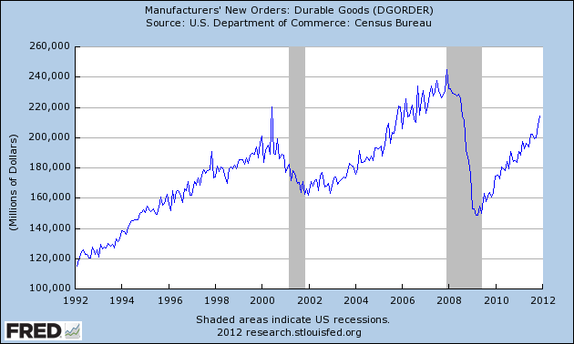
Durable Goods New Orders – Long-Term Charts Through December 2011


Many people place emphasis on Durable Goods New Orders as a prominent economic indicator and/or leading economic indicator.

For reference, here are a few charts depicting this measure.

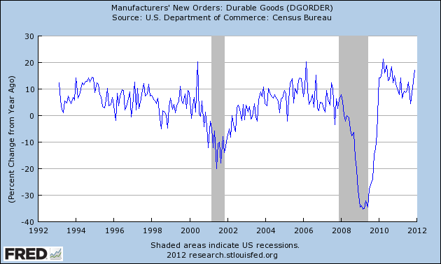
First, from the St. Louis Fed site (FRED), a chart through December, last updated on January 26.  This December value is 214,522 ($ Millions) :


-

Here is the chart depicting the measure on a Percentage Change from a Year Ago basis:


-
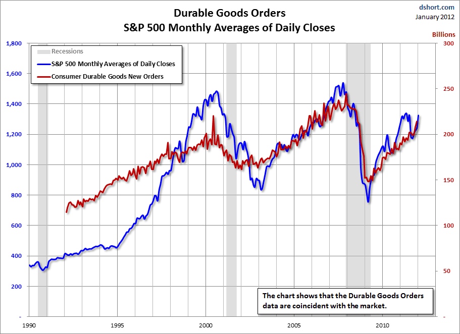
Lastly, a chart from Doug Short’s post of January 26 titled “Durable Goods Orders Up 3%, Beating Expectations” showing the Durable Goods New Orders vs. the S&P500:


_____

The Special Note summarizes my overall thoughts about our economic situation

SPX at 1313.01 as this post is written

Monday, January 30, 2012

A Note On Asset Bubbles


I would like to highlight the topic of asset bubbles and the numerous past posts I have written concerning them.  This topic is particularly apropos given that my analysis indicates that various asset bubbles are very "mature," i.e. very close to ending or "popping."   As well, I have been writing of my analysis concerning the building financial danger in the financial system, which also poses a grave danger to the sustenance of these asset bubbles. Among these mature asset bubbles are those in both the stock and bond markets.

There are two aspects of asset bubbles that are of great importance.  The first is the impact such bubbles have on investors.  The second is what impact these bubbles have on the overall economy.

It should be noted that asset bubbles are often widely seen as attractive and/or beneficial during their expansion phase.  For instance, during the housing bubble, few people were wary of the "bubble" trend; in fact, the vast majority - including professional economists and policy makers - thought such price appreciation was "great" (i.e. highly beneficial), and such appreciation was "natural" as opposed to constituting a "bubble."  The vast majority also believed such house price appreciation would last indefinitely, with few risks posed.  Exceedingly few (especially on a percentage basis) predicted the "top" of the bubble or the economic ramifications of its aftermath.

My analysis continues to indicate that the peril presented by the current asset bubbles can't be overstated.
_____

The Special Note summarizes my overall thoughts about our economic situation

SPX at 1314.53 as this post is written

Sunday, January 29, 2012

Ben Bernanke’s January 25, 2012 Press Conference – Notable Aspects


On Wednesday, January 25, Ben Bernanke gave his scheduled press conference.

Here are Ben Bernanke’s comments I found most notable, although I don’t necessarily agree with them.  These comments are excerpted from the "Transcript of Chairman Bernanke’s Press Conference"(preliminary)(pdf) of January 25, 2012, with accompanying economic projections (pdf).

Bernanke’s responses as indicated to the various questions:

Opening Remarks:

from page 5 :
The longer-run projections shown...represent participants' assessments of the rate to which each variable converge over time under appropriate monetary policy, and in the absence of further shocks to the economy.
from page 7 (with regard to the initial increase in Fed Funds target rate) : 
Six participants anticipate that policy firming is likely to commence in 2015 or 2016 while five others depict policy firming to commence in 2014. The remaining six participants judged that policy lift-off would be
appropriate in 2012 or 2013.
from page 8:
In particular, the Committee recognizes that hardships imposed by high and persistent unemployment in an underperforming economy and it is prepared to provide further monetary accommodation if employment is not making sufficient progress towards our assessment of its maximum level or if inflation show signs and moving further below its mandate consistent rate.
Q&A:

from page 8:
Steve Liesman: Thank you. Steve Liesman, CNBC. Mr. Chairman, we’ve had several months of economic data that's been stronger than most forecasters expected. Employment was over 200,000, unemployment rates come down 8 1/2 percent. But there seems to be very little mention of this recent strength in the statement. Do you and the Committee, Mr. Chairman, harbored doubts about the recent strength in the economy? And are you and the Committee baking in additional quantitative easing in order to achieve the growth rates that you've even forecast here? Thank you.
Chairman Bernanke: Steve, there have certainly been some encouraging news recently. We've seen slightly better performance in the labor market. Consumer sentiment has improved. Industrial production has been relatively strong. So there are some positive signs, no doubt. At the same time, we've had mixed results in some other areas, such as retail sales and we continue to see headwinds emanating from Europe coming from the slowing global economy and some other factors as well.  So, you know, we are obviously hoping that the strength we saw on the fourth quarter and in recent data will continue into 2012 but we're going to continue to monitor that situation. I don't think we are ready to declare that we've entered a new stronger phase at this point and we'll continue to look at the data. We will, as I've said in my statement, and as we have in fact in the FOMC statement, you know, we continued to review our holdings, our portfolio holdings, securities, and we are prepared to take further steps in that direction if we see that the recovery’s faltering or if inflation is not moving towards target. So, that's something as an option that's certainly on the table. I think it would be premature to say definitively one way or the other, but we continue to look at that option and if conditions warrant, we will certainly consider using it.
from page 24:
Darren Gersh: Darren Gersh, Nightly Business Report. Let me kind of follow up on Peter's question, why shouldn't somebody looking at these numbers from the outside say, “look, as aggressive as you say you've been, as aggressive as you have been, it doesn't look like you're meeting any of your goals the next three years on the economy, so, why isn't the Fed doing more now?”
Chairman Bernanke: Well, again, as I said earlier, the Fed has been doing a great deal. Just since August we have put a date on our expected period of low interest rates. We undertook the maturity extension program which is still continuing. Today, we announced a further extension of the expected period of low rates by issuing these expected policy rate information, we hope to convey to the market the extent to which there is support on the Committee for maintaining rates at a low level for a significant time. So, you know, I don't accept the premise that we've been passive, we've been actually quite active in our policy and in one respect, the low level inflation is a validation in the following sense that there were some who are very concerned that our balance sheet policies and the like would lead to high inflation. There is certainly no sign of that yet and it hasn't shown up either in financial markets or in outside forecasters’expectations. Now that being said, as I mentioned earlier, if the situation continues with inflation below target and unemployment declining at a rate which is very, very slow, then more, our framework, the logic of our framework says we should be looking for ways to do more, it's not completely straightforward because, of course, we're now dealing with a variety of nonstandard policy tools, we can't just lower the federal funds rate 25 basis points like in the good old days but your basic point is right that, you know, we need to adopt policies that will both achieve our inflation objectives and help the economy recover as quickly as is feasible and I would say that your question, actually and earlier question, shows a benefit of explaining this framework because the framework makes very clear that we need to be thinking about ways in which we can provide further stimulus if we don't get some improvement in the pace of recovery and normalization of inflation.
_____

The Special Note summarizes my overall thoughts about our economic situation

SPX at 1316.33 as this post is written

Friday, January 27, 2012

Updates On Economic Indicators January 2012


Here is an update on various indicators that are supposed to predict and/or depict economic activity.  These indicators have been discussed in previous blog posts:

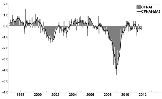
The January Chicago Fed National Activity Index (CFNAI)(pdf) updated as of January 26, 2012:


-

An excerpt from the January 3 update titled “Index forecasts weaker growth” :
The December update of the USA TODAY/IHS Global Insight Economic Outlook Index shows real GDP growth, at a six-month annualized growth rate, increasing to 2.5% in January and then slowing to 1.8% in May. While employment, housing (mostly the multifamily sector) and consumer spending are slowly recovering, concerns about the Eurozone and world growth continue.
-

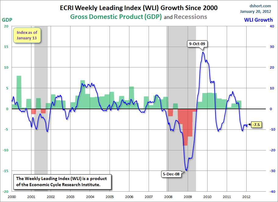
As of 1/13/12 the WLI was at 123.4 and the WLI, Gr. was at -7.5%.

A chart of the WLI Growth since 2000, from Doug Short’s blog of January 20 titled “ECRI Recession Call:  Growth Index Contraction Eases” :


-


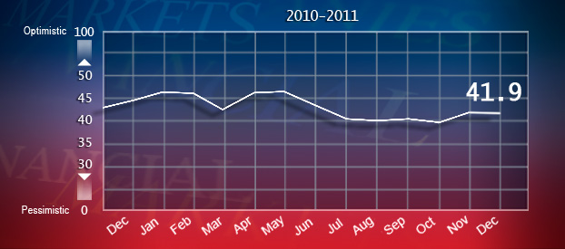
The Indicator as of January 9 was at 41.9, as seen below:


-


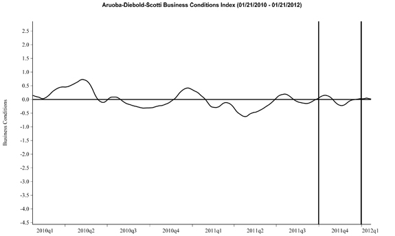
Here is the latest chart, depicting 1-21-10 to 1-21-12:


-


As per the January 26 release, the LEI was at 94.3 and the CEI was at 103.4 in December.

An excerpt from the January 26 release:
Added Ken Goldstein, economist at The Conference Board: “The CEI and other recent data reflect an economy that ended 2011 on a positive note and the LEI provides some reason for cautious optimism in the­ first half of 2012. This somewhat positive outlook for a strengthening domestic economy would seem to be at odds with a global economy that is losing some steam. Looking ahead, the big question remains whether cooling conditions elsewhere will limit domestic growth or, conversely, growth in the U.S. will lend some economic support to the rest of the globe.”
_________

I post various indicators and indices because I believe they should be carefully monitored.  However, as those familiar with this blog are aware, I do not necessarily agree with what they depict or imply.
_____

The Special Note summarizes my overall thoughts about our economic situation

SPX at 1318.43 as this post is written

Thursday, January 26, 2012

Conference Board CEO Confidence 4Q 2011 - Notable Excerpts

On January 10, The Conference Board released its 4th Quarter CEO Confidence Survey.   The overall measure of CEO Confidence was at 49, up from 42 in the third quarter.

Notable excerpts from this January 10 Press Release include:
Says Lynn Franco, Director of The Conference Board Consumer Research Center: “The bounce back in CEO Confidence in the final months of 2011 was due primarily to an improved short-term outlook. Overall, however, CEO confidence remains rather subdued. On the inflation front, CEOs anticipate price increases of about 1.8 percent for 2012, down from last year’s estimate of 3.3 percent.”
also:
CEOs’ assessment of current economic conditions was less pessimistic, with 17 percent saying conditions have improved compared to six months ago, up from just 11 percent last quarter.
Other recent surveys of business executives include the December 14 Business Roundtable’s CEO Economic Outlook Survey (pdf) and the December 15 Duke/CFO Magazine Global Business Outlook Survey (pdf).
_____

I post various economic forecasts because I believe they should be carefully monitored.  However, as those familiar with this blog are aware, I do not agree with many of the consensus estimates and much of the commentary in these forecast surveys.
_____


The Special Note summarizes my overall thoughts about our economic situation

SPX at 1326.06 as this post is written

Wednesday, January 25, 2012

The State of the Union Address – Notable Excerpts


I found President Obama's State of the Union Address last night to contain some noteworthy comments.  While I could comment extensively on many parts of the speech, for now I will indicate excerpts that I found most relevant, and may comment upon them at a future point.  I am highlighting these excerpts for many reasons; it should be noted that I do not necessarily agree with all of them.

Here are the excerpts I found most relevant, in the order they occurred in the speech:
Think about the America within our reach:  A country that leads the world in educating its people.  An America that attracts a new generation of high-tech manufacturing and high-paying jobs.  A future where we’re in control of our own energy, and our security and prosperity aren’t so tied to unstable parts of the world.  An economy built to last, where hard work pays off, and responsibility is rewarded.
We can do this.  I know we can, because we’ve done it before.
also:
...the basic American promise that if you worked hard, you could do well enough to raise a family, own a home, send your kids to college, and put a little away for retirement.
The defining issue of our time is how to keep that promise alive.  No challenge is more urgent.  No debate is more important.  We can either settle for a country where a shrinking number of people do really well while a growing number of Americans barely get by, or we can restore an economy where everyone gets a fair shot, and everyone does their fair share, and everyone plays by the same set of rules.  (Applause.)  What’s at stake aren’t Democratic values or Republican values, but American values.  And we have to reclaim them.
also:
Tonight, I want to speak about how we move forward, and lay out a blueprint for an economy that’s built to last -– an economy built on American manufacturing, American energy, skills for American workers, and a renewal of American values.
also:
On the day I took office, our auto industry was on the verge of collapse.  Some even said we should let it die.  With a million jobs at stake, I refused to let that happen.  In exchange for help, we demanded responsibility.  We got workers and automakers to settle their differences.  We got the industry to retool and restructure.  Today, General Motors is back on top as the world’s number-one automaker.  (Applause.)  Chrysler has grown faster in the U.S. than any major car company.  Ford is investing billions in U.S. plants and factories.  And together, the entire industry added nearly 160,000 jobs.
We bet on American workers.  We bet on American ingenuity.  And tonight, the American auto industry is back.
also:
Third, if you’re an American manufacturer, you should get a bigger tax cut.  If you’re a high-tech manufacturer, we should double the tax deduction you get for making your products here.  And if you want to relocate in a community that was hit hard when a factory left town, you should get help financing a new plant, equipment, or training for new workers.  (Applause.)
_____

The Special Note summarizes my overall thoughts about our economic situation

SPX at 1314.65 as this post is written

Tuesday, January 24, 2012

misc. note


Just a quick administrative note…

For those unaware, I maintain a separate site that mirrors all of the blog posts found on this site.   This second site can be accessed should there be problems accessing this site.

Here is the link to this second site:


PPI,CPI & Profit Margin Trends – January 2012 Update


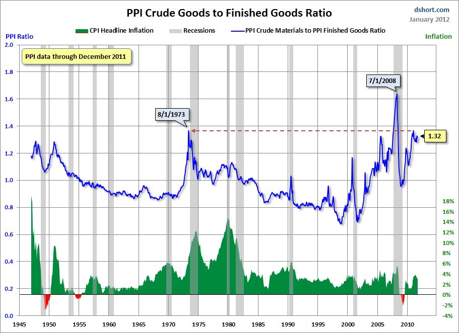
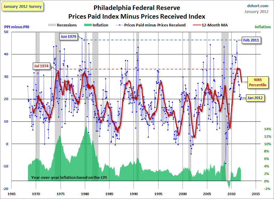
In various past posts I have written of the challenges businesses face in pricing, given today’s economic environment.  One aspect that I mentioned in the December 16, 2010 and April 25, 2011 posts was how the PPI (Producer Price Index) growth was significantly outpacing that of the CPI.

Since those posts, this PPI-CPI growth rate issue has remained notable.  Doug Short, on his blog, has posted a few interesting charts illustrating this concept from a long-term historical viewpoint.  Both of the charts shown below are from his January 20, 2012 post titled “Profit Margin Squeeze:  New Update.”

First, here is a chart that shows the ratio, in the PPI, of Crude Goods to Finished Goods. The CPI is plotted below, in green.  This situation, as depicted, is problematical for firms, and the overall economy, on a number of fronts:

(click on chart images to enlarge)


-

Second, a chart that shows data from the Philadelphia Federal Reserve regarding Prices Paid vs. Prices Received, with Inflation (CPI) and Recession periods also shown:


I believe that what this chart depicts is notable in a variety of ways.  As shown, we are experiencing a unique situation, and while the index level has recently subsided, we are near historical peaks for the 12-month moving average (MA) as shown.

I believe this data and its implications for businesses and the economy at large is of great concern.  Seeing how this situation resolves will be very interesting.  This is especially so given the vulnerability of the U.S. Dollar to a substantial decline, a topic that I have written extensively about.
_____

The Special Note summarizes my overall thoughts about our economic situation

SPX at 1316.00 as this post is written
Monday, January 23, 2012

Deloitte “CFO Signals” Report 4Q 2011 – Notable Aspects


Recently Deloitte released their “CFO Signals” report for 4th Quarter 2011.

As seen in page 2 of the full (pdf) report, “Eighty four CFOs responded during the two weeks ended November 29.  Over 70% are from public companies, and over 75% are from companies with more than $1B in annual revenue."

Here are some excerpts that I found notable:

from page 6:
CFOs now project average sales gains of about 6.3%* (down from last quarter’s 6.8%* and a new low for this survey), but 87% do expect year-over-year gains.  Earnings growth expectations rebounded from their 18-month low of 9.3%* last quarter to 10.1%* this quarter.  Projections for U.S. firms were above average at 10.9%* (10.5%* last quarter), with Canada lower at 7.4%* (8%* last quarter).
from page 6:
Despite their pessimistic sentiment, many CFOs appear to expect a brighter future. Few CFOs see economic conditions improving by the middle of 2012, but nearly 90% expect their home economies to be in better shape three years from now.
from page 8:
From late 2010 through the first part of 2011, CFOs’ concerns about global and domestic economies took a back seat to worries about internal missteps and detrimental government policy as barriers to growth. But two quarters ago, apparently sparked by rising sovereign debt issues in Europe, economic concerns began to climb back to the top of CFOs most worrisome risks. Recent escalation of the euro-zone financial crisis has only fueled the climb.
from page 12, regarding "Top Company Challenges" :
Revenue from existing markets again tops this quarter’s list with 54% of all CFOs and six of eight sectors naming it the top challenge (Energy/Resources and Healthcare/ Pharma are the exceptions). Revenue from new markets rebounded to 27%, up from 20% last quarter. It is a top concern for Technology, T/M/E, and Services.
_____

The Special Note summarizes my overall thoughts about our economic situation

SPX at 1315.38 as this post is written

Friday, January 20, 2012

St. Louis Financial Stress Index – January 19, 2012 Update


On March 28, 2011 I wrote a post ("The STLFSI") about the  STLFSI (St. Louis Fed’s Financial Stress Index) which is supposed to measure stress in the financial system.  Here is the most recent chart.  This chart was last updated on January 19, incorporating data from 12-31-93 to 1-13-12 on a weekly basis.  The present level is .64 :

_________

I post various indicators and indices because I believe they should be carefully monitored.  However, as those familiar with this blog are aware, I do not necessarily agree with what they depict or imply.
_____

The Special Note summarizes my overall thoughts about our economic situation

SPX at 1314.50 as this post is written
Thursday, January 19, 2012

January 18 Gallup Poll Results On Americans' Personal Financial Situation - Notable Excerpts


On January 18, Gallup published poll results titled "Half in U.S. Feel Worse Off Financially."

The poll asked various questions, including this one :
Would you say that you are financially better off now than you were a year ago, or are you financially worse off now?
An excerpt from the results, as discussed in the aforementioned January 18 release:
Nearly half of U.S. adults, 49%, say they are worse off financially today than a year ago, while 29% say they are better off and 21% volunteer that their finances haven't changed. The percentage rating their current finances negatively compared with a year ago is down from the high of 55% recorded twice in 2008, but is still among the highest in Gallup's four decades of measuring this attitude.
The chart shown in the poll results shows that the "% Worse off" results are notably elevated since latter-2008, relative to the other results going back to 1976.

While the question asked is somewhat subjective, these poll results seem to further support other information (much of which has been highlighted in previous blog posts) that despite an economic recovery/economic expansion (as officially designated by NBER) since June 2009 a large percentage of people in the United States are not seeing their personal financial condition improve.
_____

The Special Note summarizes my overall thoughts about our economic situation

SPX at 1310.79 as this post is written
Wednesday, January 18, 2012

The January 2012 Wall Street Journal Economic Forecast Survey


The January Wall Street Journal Economic Forecast Survey was published on January 13, 2012.  The headline is “Economists Split Over Additional Fed Action.”

The commentary largely focuses on when, and if, the Federal Reserve will do another round of "bond purchases."

An excerpt from the article:
Of the 22 economists who expect more bond buying from the central bank, 19 forecast that it would take place before June. On average, they expect a new program would total less than $500 billion, making it the smallest one yet. The first round of bond buying, initiated by the Fed in 2008 and ended in 2010, totaled $1.25 trillion in mortgage-backed securities, $300 billion in Treasury bonds and $175 billion in federal agency debt. The second round ended in June 2011 and consisted of $600 billion in purchases of U.S. Treasurys.
Also, as seen in the Q&A section (in the spreadsheet), the economists put the probability of a U.S. recession in the next 12 months at 19%.
The current average forecasts among economists polled include the following:

GDP:
full-year 2011 : 1.7%
full-year 2012:  2.4%
full-year 2013:  2.8%
full-year 2014:  3.1%

Unemployment Rate:
December 2012: 8.2%
December 2013: 7.7%
December 2014: 7.0%

10-Year Treasury Yield:
December 2012: 2.56%
December 2013: 3.21%
December 2014:  3.82%

CPI:
December 2012:  2.2%
December 2013:  2.4%
December 2014:  2.6%

Crude Oil  ($ per bbl):
for 12/31/2012: $99.41

(note: I comment upon this WSJ Economic Forecast survey each month; commentary on past surveys can be found under the “Economic Forecasts” label)
_____

I post various economic forecasts because I believe they should be carefully monitored.  However, as those familiar with this blog are aware, I do not necessarily agree with many of the consensus estimates and much of the commentary in these forecast surveys.
_____

The Special Note summarizes my overall thoughts about our economic situation

SPX at 1293.67 as this post is written
Tuesday, January 17, 2012

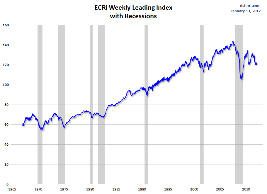
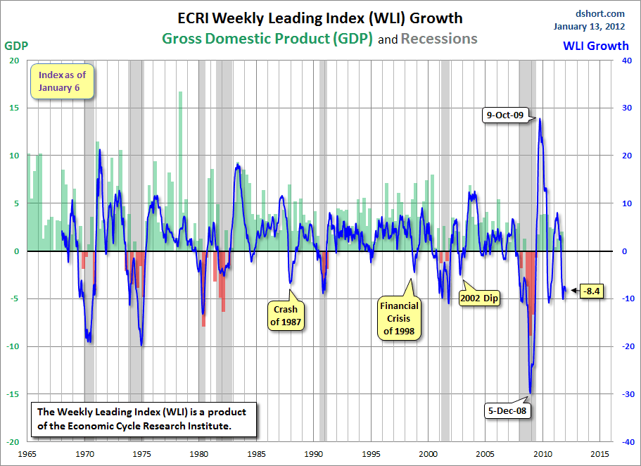
Long-Term Charts Of The ECRI WLI & ECRI WLI, Gr.


As I stated in my July 12, 2010 post ("ECRI WLI Growth History"):
For a variety of reasons, I am not as enamored with ECRI’s WLI and WLI Growth measures as many are.
However, I do think the measures are important and deserve close monitoring and scrutiny.
The movement of the ECRI WLI and WLI, Gr. is particularly notable at this time, as ECRI publicly announced on September 30 that the U.S. was "tipping into recession."  I featured excerpts from their statement in the October 3 post ("ECRI Recession Statement Of September 30 – Notable Excerpts")

Below is a long-term chart, on a weekly basis through January 13, of the ECRI WLI (defined at ECRI's glossary) from Doug Short’s blog post of January 13 titled “ECRI Recession Call: Growth Index Contracts Further” :

(click on charts to enlarge images)


-

This next chart depicts, on a long-term basis, the WLI, Gr. through January 13:


_____

The Special Note summarizes my overall thoughts about our economic situation

SPX at 1289.09 as this post is written
Thursday, January 12, 2012

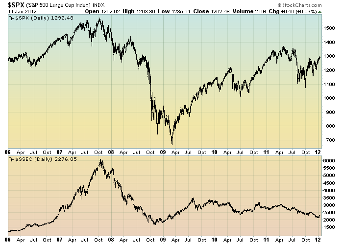
The S&P500 Vs. The Shanghai Stock Exchange Composite Index – January 12, 2012


Starting on May 3, 2010 I have written posts concerning the notable divergence that has occurred between the S&P500 and Chinese (Shanghai Composite) stock markets.

The chart below illustrates this divergence; it shows the S&P500 vs. the Shanghai Composite on a daily basis, since 2006:

(click on chart to enlarge image)(chart courtesy of StockCharts.com)


-

It is notable that the Shanghai Composite led the SPX (S&P500) significantly in late ’08 – early ’09, yet it has been declining lately.

I continue to find this divergence between the S&P500 and  Shanghai Composite to be notable and disconcerting, on an “all things considered” basis.
_____

The Special Note summarizes my overall thoughts about our economic situation

SPX at 1292.48 as this post is written

Wednesday, January 11, 2012

Building Financial Danger – January 11, 2012 Update


On October 17 I wrote a post titled “Danger Signs In The Stock Market, Financial System And Economy.”  This post is a brief fourth update to that post.

My overall analysis indicates a continuing elevated and growing level of danger.

I continue to believe the October 4 1074.77 low on the S&P500 will not be a “lasting bottom”, and the dynamics as described in the October 20 post (“Thoughts On The Next Stock Market Decline“) and the likelihood of longer-term substantial “downside” still apply.

Furthermore, as I mentioned in that October 17 post:
Of further concern is whether, and when, the above-mentioned problems might reach a point at which another (financial system) crash occurs.  I am particularly concerned about the prospects of the next crash for a number of reasons, of which I will elaborate upon shortly.
(The elaboration on this "next crash" was subsequently addressed in the post of January 6, 2012 titled "The Next Crash And Its Significance.")

Predicting the timing and extent of a stock market crash is always difficult, and the immense complexity of today's economic situation makes such a prediction even more challenging.  That being said, my analyses indicate that the danger inherent in the financial system has reached a level at which a stock market crash - that would also involve (as seen in 2008) various other markets as well - has reached a level at which a near-term crash is (at least) a significant concern.

As reference, below is a 1-year daily chart of the S&P500, indicating both the 50dma and 200dma:

(click on chart to enlarge image)(chart courtesy of StockCharts.com; chart creation and annotation by the author)

_____

The Special Note summarizes my overall thoughts about our economic situation

SPX at 1292.08 as this post is written

Monday, January 9, 2012

U-3 And U-6 Unemployment Rate Long-Term Reference Charts As Of January 6, 2012


Shortly after each monthly employment report I have been posting a continual series titled “3 Critical Unemployment Charts.”


Of course, there are many other employment charts that can be displayed as well.

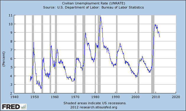
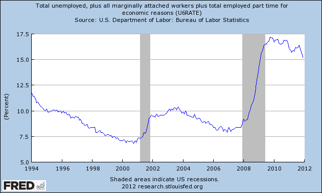
For reference purposes, below are the U-3 and U-6 Unemployment Rate charts from a long-term historical perspective.  Both charts are from the St. Louis Fed site.  The U-3 measure is what is commonly referred to as the official unemployment rate; whereas the U-6 rate is officially (per Bureau of Labor Statistics) defined as:
Total unemployed, plus all persons marginally attached to the labor force, plus total employed part time for economic reasons, as a percent of the civilian labor force plus all persons marginally attached to the labor force
Of note, many economic observers use the U-6 rate as a (closer) proxy of the actual unemployment rate rather than that depicted by the U-3 measure.

Here is the U-3 chart, currently showing a 8.5% unemployment rate:

(click on charts to enlarge images)(charts updated as of 1-6-12)


-

Here is the U-6 chart, currently showing a 15.2% unemployment rate:


_____

The Special Note summarizes my overall thoughts about our economic situation

SPX at 1277.81 as this post is written

3 Critical Unemployment Charts – January 2012


As I have commented previously, as in the October 6, 2009 post (“A Note About Unemployment Statistics”), in my opinion the official methodologies used to measure the various job loss and unemployment statistics do not provide an accurate depiction; they serve to understate the severity of unemployment.

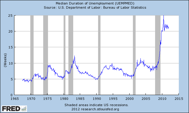
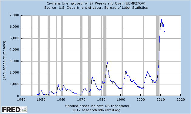
However, even if one chooses to look at the official statistics, the following charts provide an interesting (and disconcerting) long-term perspective of certain aspects of the officially-stated unemployment situation.

The first two charts are from the St. Louis Fed site.  Here is the Median Duration of Unemployment (current value = 21 weeks) :

(click on charts to enlarge images)(charts updated as of 1-6-12)


-

Here is the chart for Unemployed 27 Weeks and Over (current value =  5.588 million) :


-

Lastly, a chart from the CalculatedRisk.com site, from the January 6 post titled “December Unemployment Report…”  This shows the employment situation vs. that of previous recessions, as shown:


-

As depicted by these charts, our unemployment problem is severe.  Unfortunately, there do not appear to be any “easy” solutions.

In July 2009 I wrote a series of five blog posts titled “Why Aren’t Companies Hiring?”, which discusses various aspects of the topic, many of which lack recognition.

_____

The Special Note summarizes my overall thoughts about our economic situation

SPX at 1277.81 as this post is written