There are an array of indications and other “warning signs” – many readily apparent – that the current level of economic activity and financial market performance is accompanied by exceedingly perilous dynamics.
While some of these indications are plainly evident, others are less obvious, and many are unapparent. Many of these indications of deep-seated economic problems are featured and discussed throughout this site. However, many are not.
Many of these disparate indicators - of various levels of importance - do serve as readily apparent warnings. While these warnings do not, at least yet, signal the immense level of danger in the economic and financial system - which I have previously stated dwarfs that preceding and during the Great Depression - they do serve to indicate various problem areas and pernicious dynamics.
One area of concern is that of "
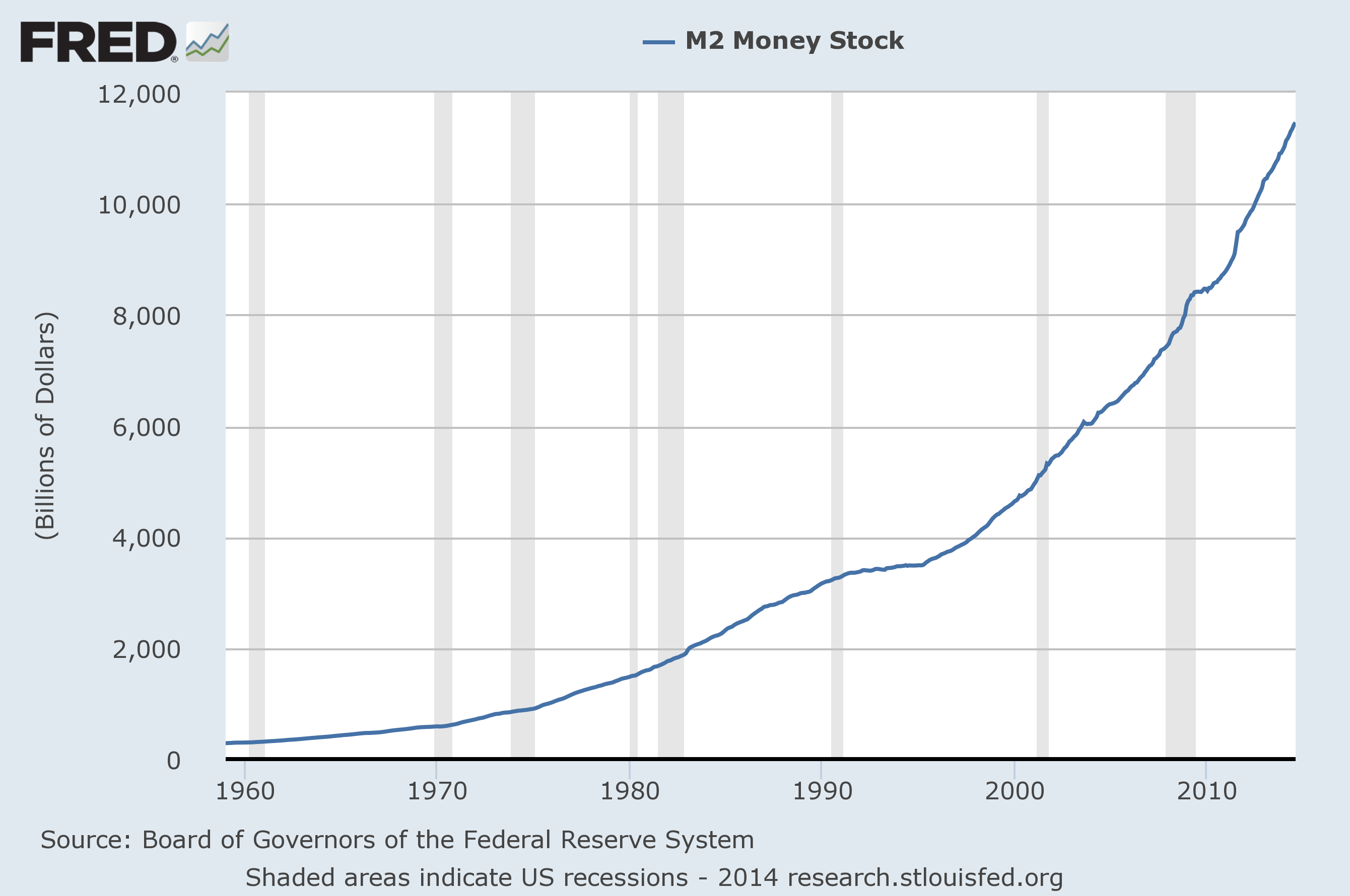
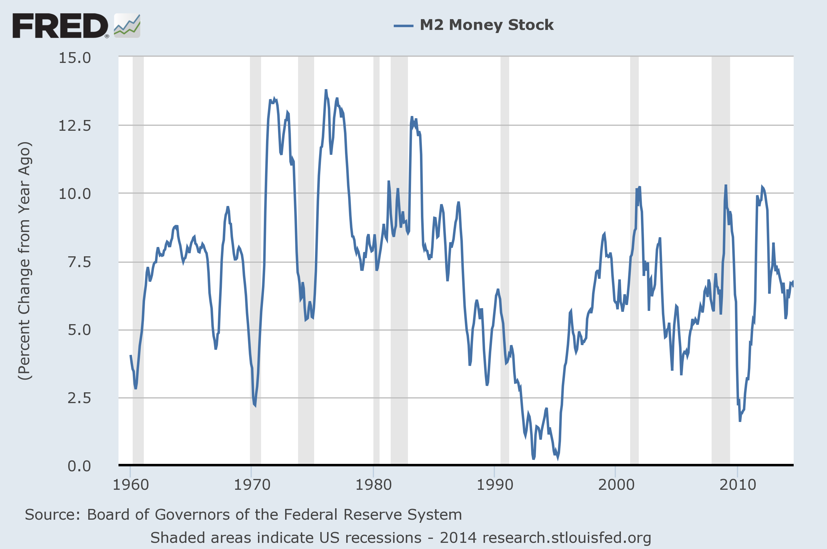
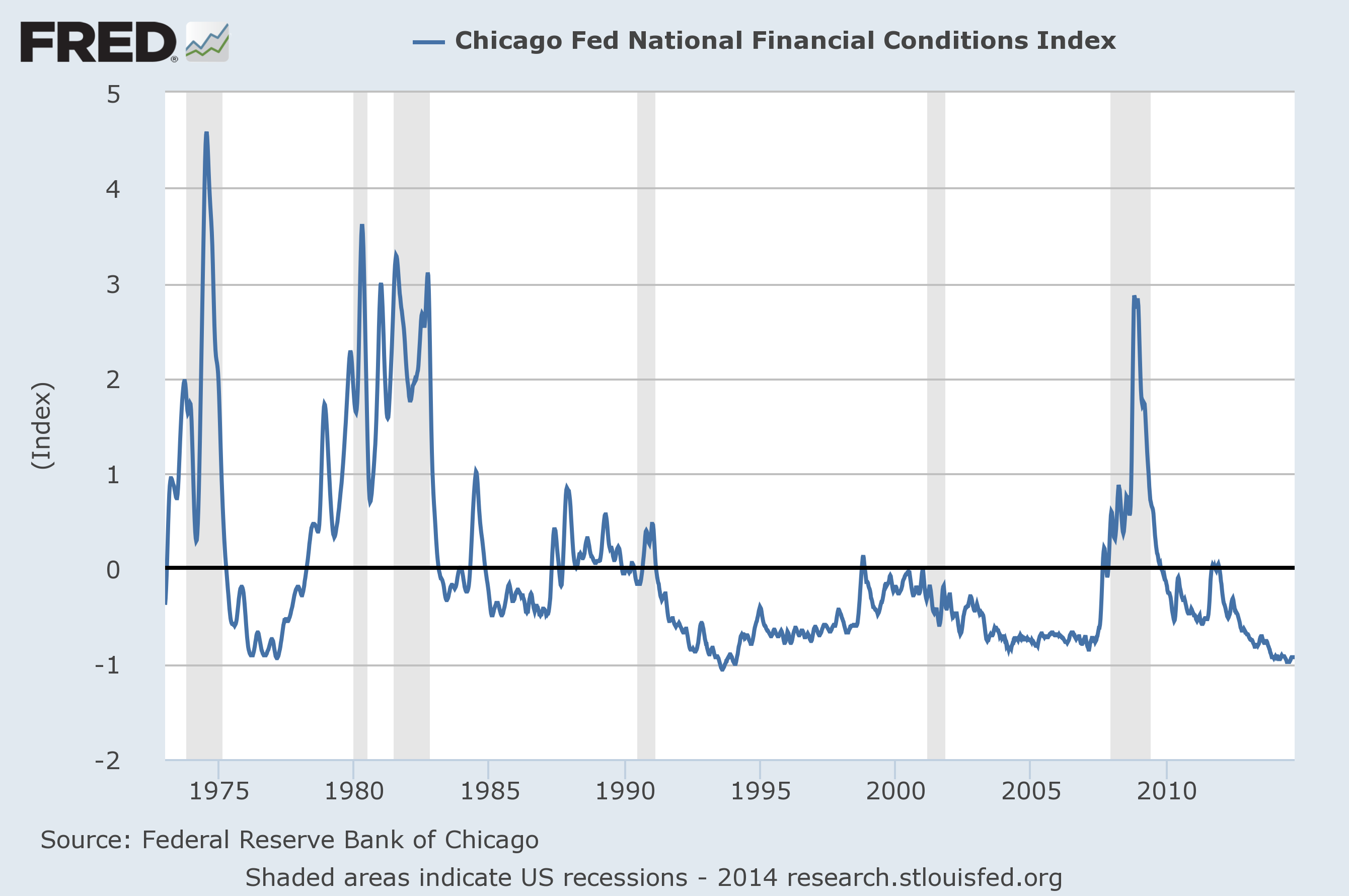
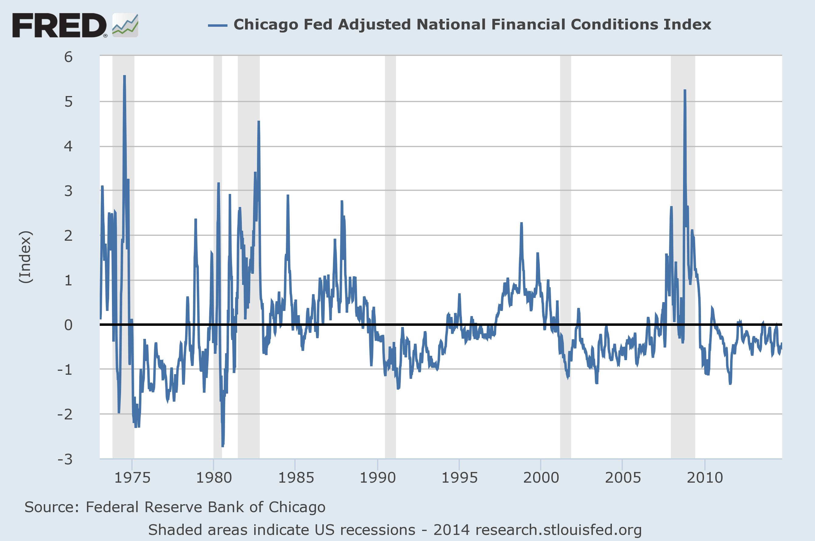
deflationary pressures," of which I have discussed previously. I have been using the term "deflationary pressures" as a term to describe deflationary manifestations within an environment that is still overall inflationary but heading towards deflation. [note: to clarify, for purposes of this discussion, when I mention "deflation" I am referring to the CPI going below zero.] While such deflationary pressures seem to be most evident in other areas such as Europe, there are also many such deflationary pressures in the United States. These are seen in various areas, including various commodities and also some aspects of retail.
Among commodities' price movements that I find especially notable is the price of silver, which has fallen from roughly $50 in early 2011 to a current price of $17.67, and weakness in iron ore prices, as discussed in the Bloomberg September 24
iron ore article as well as the September 5 Wall Street Journal article concerning
iron ore .
The
unemployment situation is another area with many indications of deep-seated problems. While some choose to focus on the most popular measure - the
unemployment rate (U-3) - this measure is suboptimal in many ways, and does not present a true depiction of the unemployment situation. As well, other unemployment measures depicting recent improvement are not necessarily clear depictions of underlying economic strength due to the methodology of the measures and/or various underlying dynamics. Two unemployment measures that do depict problematical conditions are that of the labor force participation rate and the "
not in the labor force" statistic.
Regardless of current true levels of unemployment, the main focus should be on future employment and the quality of such, which is exceedingly worrisome given the overall economic dynamics.
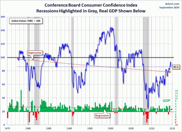
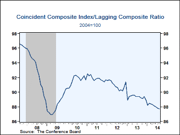
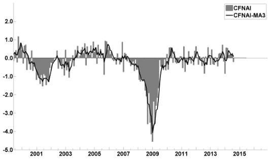
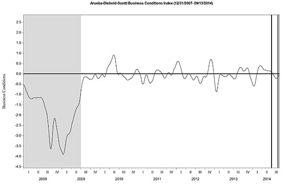
Another indicator that I find notable is that seen in the ratio of two measures from the Conference Board. As seen below, as depicted in Haver's post of September 19 ("
U.S. Leading Economic Indicators Index Continues to Improve") the ratio of the Coincident Composite Index to the Lagging Composite Index has been sinking for a while now, and is not far from the level seen in 2009:
While some prefer that "evidence" of forthcoming (severe) economic weakness be plainly evident and predicted in a widely available indicator or model, such has not been the case in prior economic recessions and depressions in post-1900 America, and certainly was not the case in 2008. My analyses indicate that, in part due to the complexity of today's (global) economic and financial system, almost all will again suffer from such lack of warning.
As I stated in the aforementioned "Additional Thoughts Concerning The Economic Situation" post:
Cumulatively, the growing level of financial danger will lead to the next crash. Key attributes of this next crash is its outsized magnitude (when viewed from an ultra-long term historical perspective) and the resulting economic impact. This next financial crash is of tremendous concern, as my analyses indicate it will lead to a Super Depression – i.e. an economy characterized by deeply embedded, highly complex, and difficult-to-solve problems.
_____
The
Special Note summarizes my overall thoughts about our economic situation
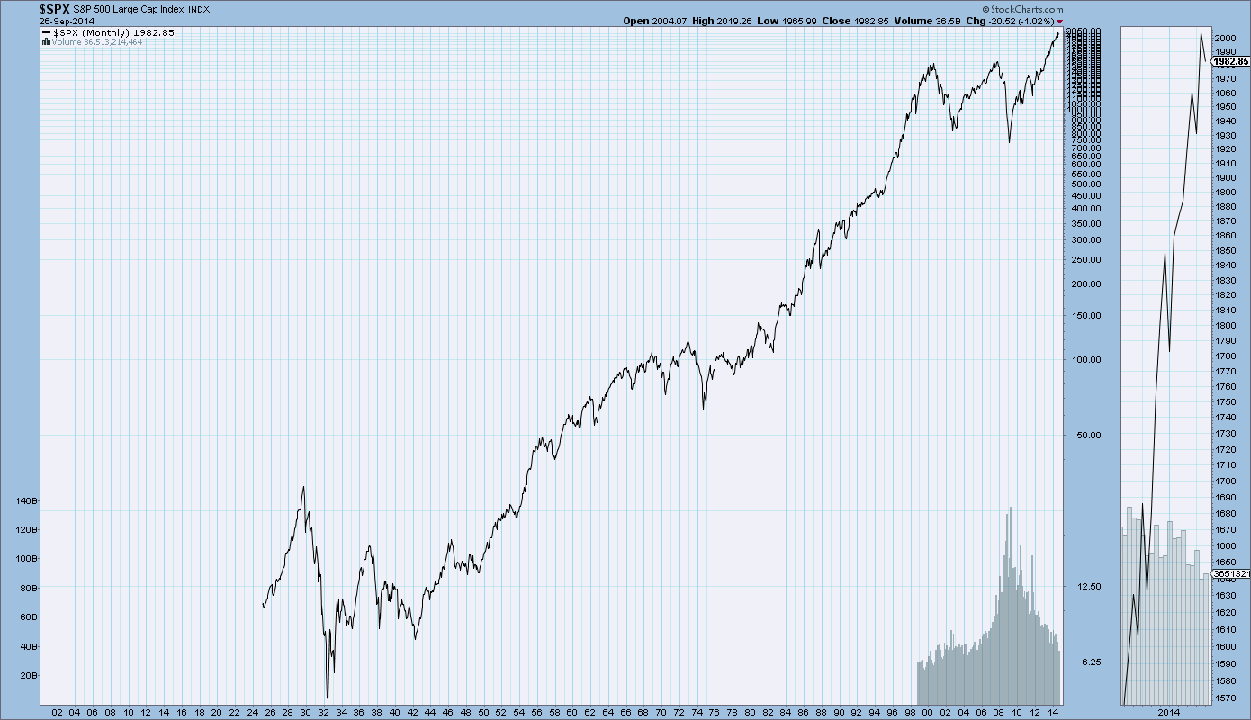
SPX at 1998.30 as this post is written