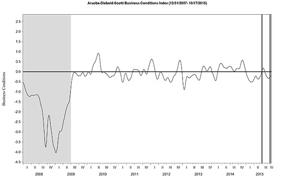
The
St. Louis Fed’s Financial Stress Index (STLFSI) is one index that is supposed to measure stress in the financial system. Its reading as of the October 22, 2015 update (reflecting data through October 16) is -.781.
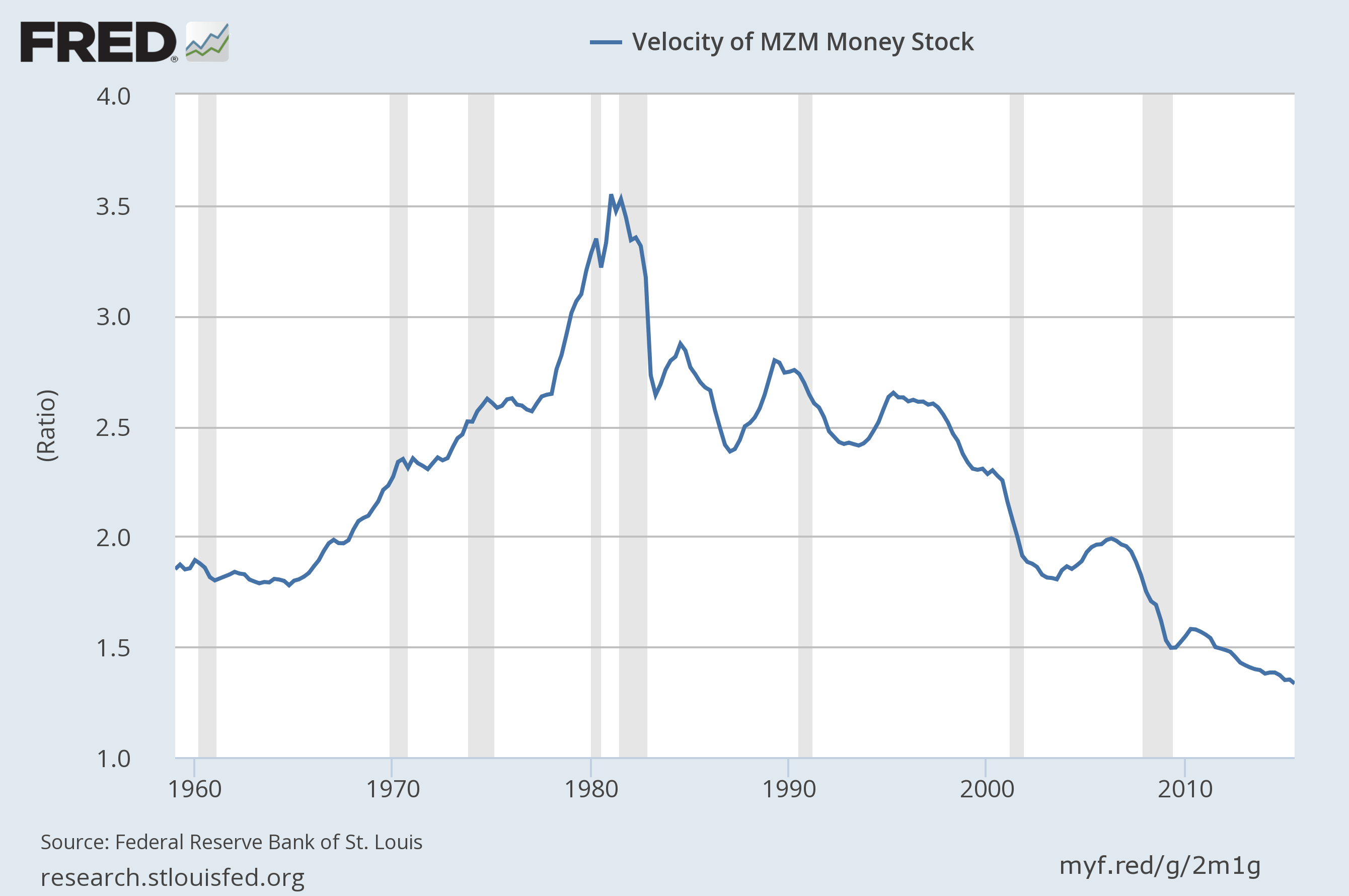
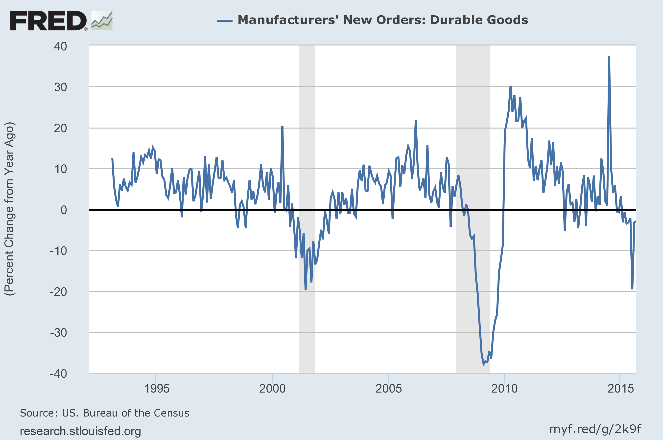
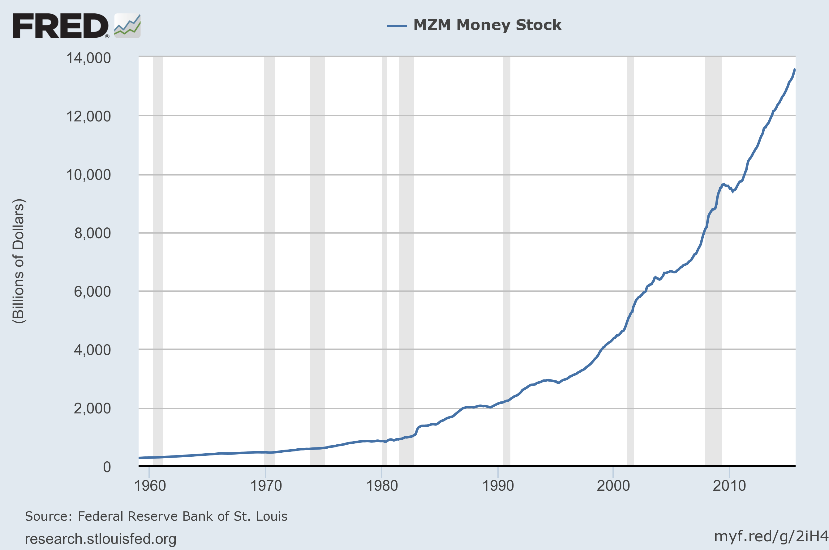
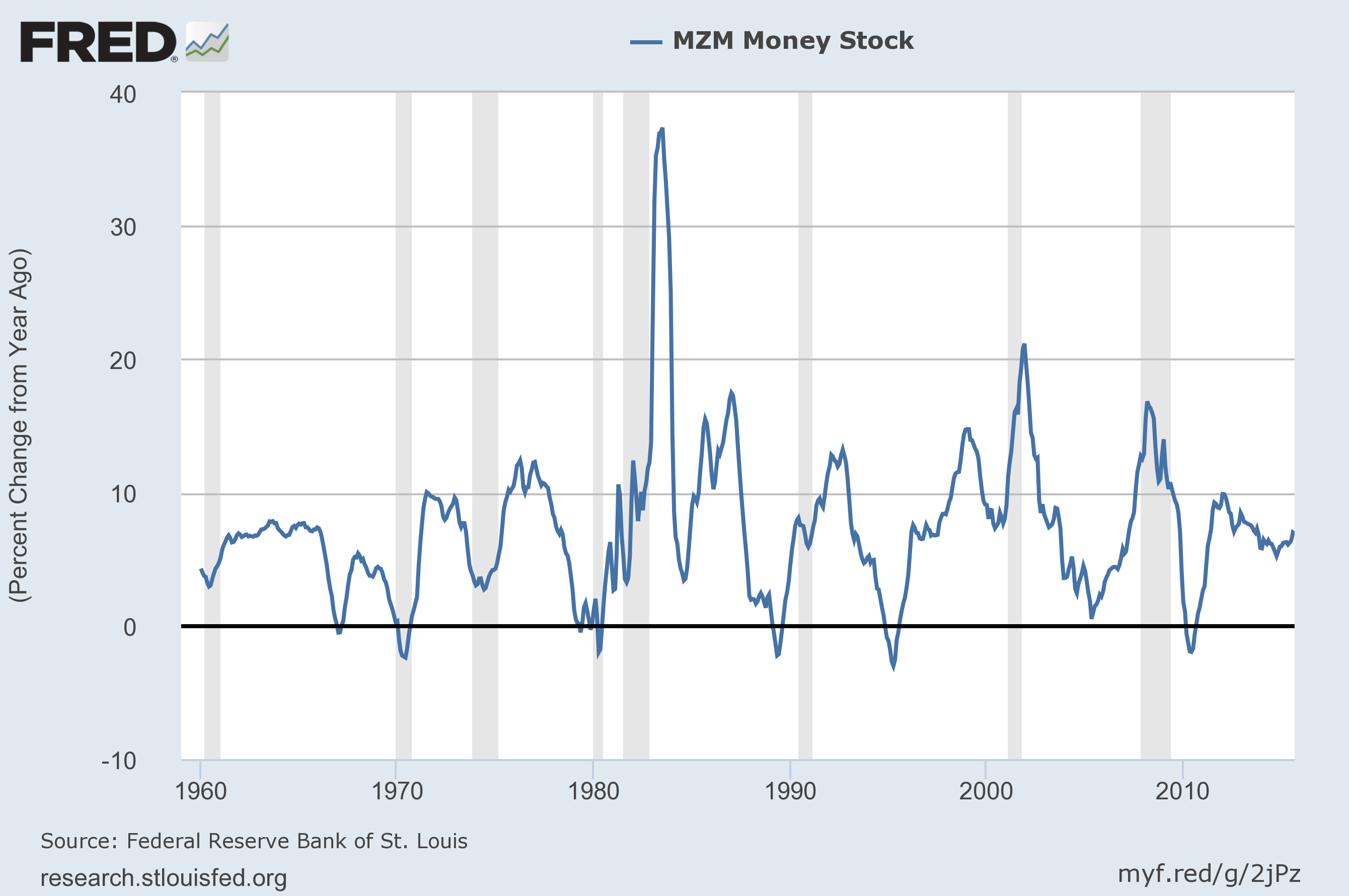
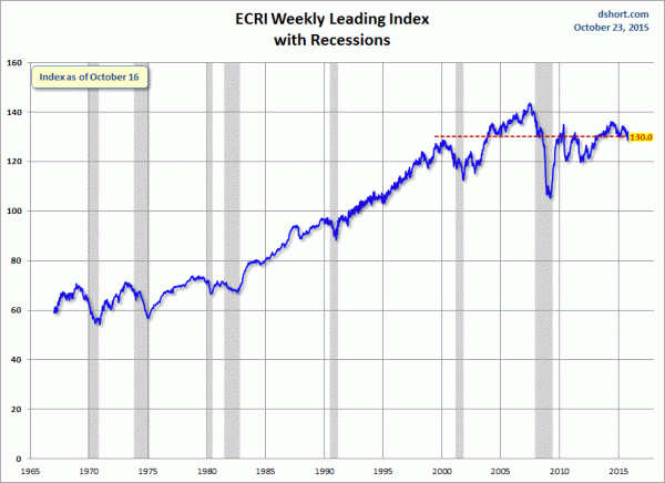
Of course, there are a variety of other measures and indices that are supposed to measure financial stress and other related issues, both from the Federal Reserve as well as from private sources.
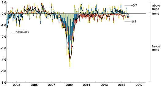
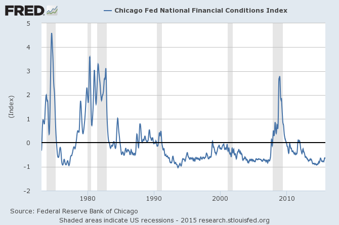
Two other indices that I regularly monitor include the Chicago Fed National Financial Conditions Index (NFCI) as well as the Chicago Fed Adjusted National Financial Conditions Index (ANFCI).
Here are summary descriptions of each, as seen in FRED:
The National Financial Conditions Index (NFCI) measures risk, liquidity and leverage in money markets and debt and equity markets as well as in the traditional and “shadow” banking systems. Positive values of the NFCI indicate financial conditions that are tighter than average, while negative values indicate financial conditions that are looser than average.
The adjusted NFCI (ANFCI). This index isolates a component of financial conditions uncorrelated with economic conditions to provide an update on how financial conditions compare with current economic conditions.
For further information, please visit the Federal Reserve Bank of Chicago’s web site:
Below are the most recently updated charts of the NFCI and ANFCI, respectively.
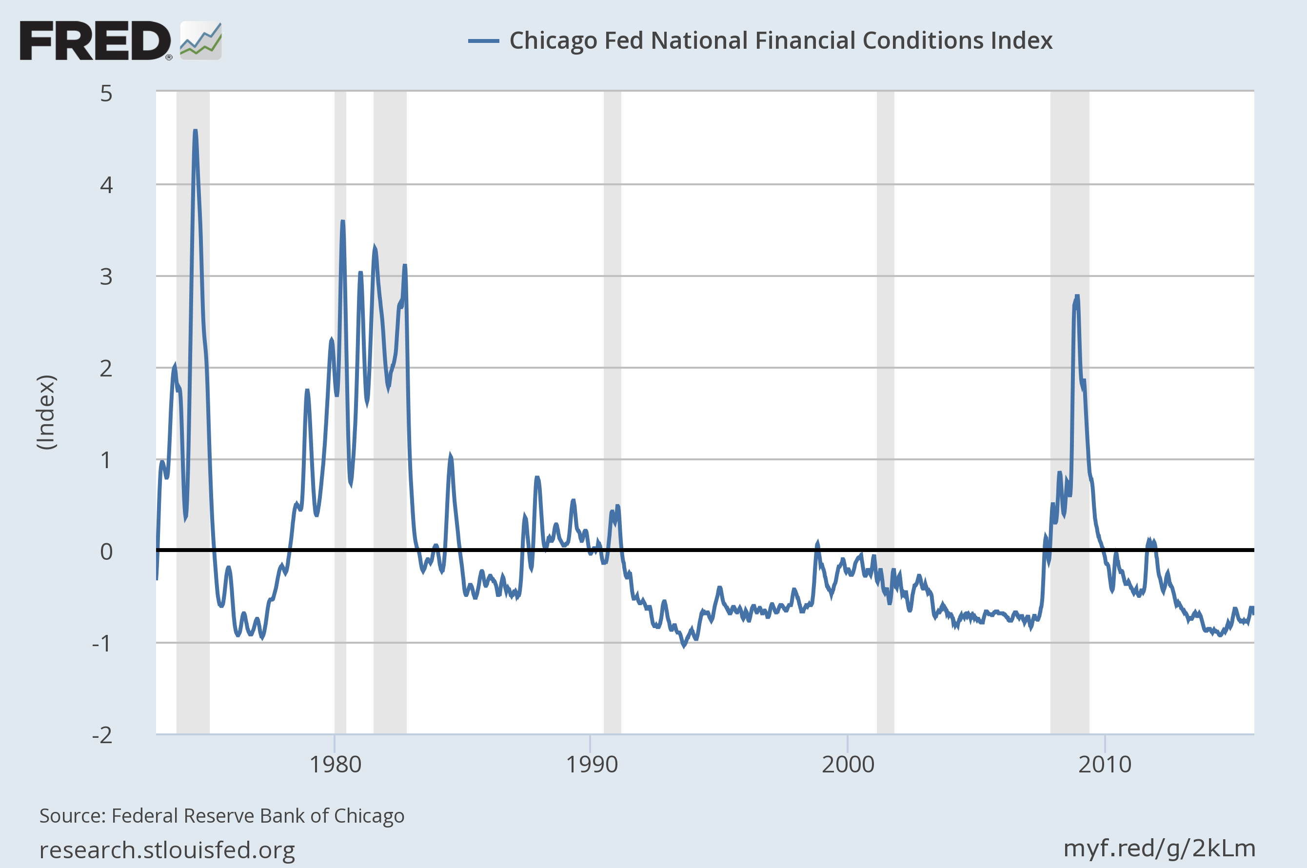
The NFCI chart below was last updated on October 28, 2015 incorporating data from January 5,1973 to October 23, 2015, on a weekly basis. The October 23, 2015 value is -.71:
Data Source: FRED, Federal Reserve Economic Data, Federal Reserve Bank of St. Louis; accessed October 28, 2015:
–
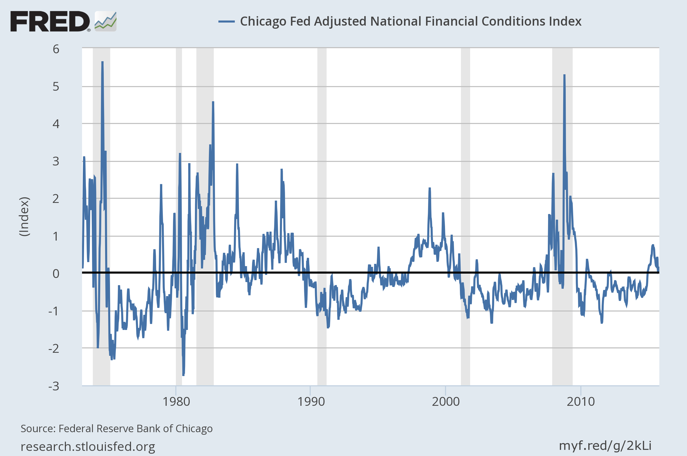
The ANFCI chart below was last updated on October 28, 2015 incorporating data from January 5,1973 to October 23, 2015, on a weekly basis. The October 23 value is .14:
Data Source: FRED, Federal Reserve Economic Data, Federal Reserve Bank of St. Louis; accessed October 28, 2015:
_________
I post various indicators and indices because I believe they should be carefully monitored. However, as those familiar with this blog are aware, I do not necessarily agree with what they depict or imply.
_____
The Special Note summarizes my overall thoughts about our economic situation
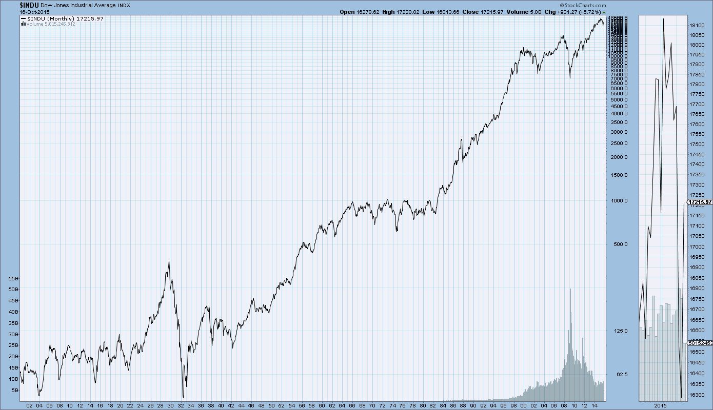
SPX at 2080.71 as this post is written