Friday, August 29, 2014

Consumer Confidence Surveys – As Of August 29, 2014

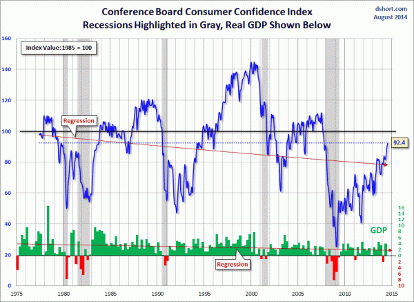
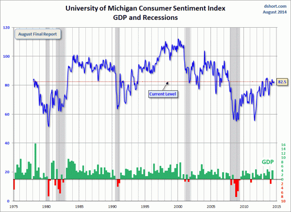
Doug Short had a blog post of August 29, 2014 (“August Michigan Consumer Sentiment Bounced Back“) in which he presents the latest Conference Board Consumer Confidence and Thomson/Reuters University of Michigan Consumer Sentiment Index charts.  They are presented below:
(click on charts to enlarge images)
Conference Board Consumer Confidence
-
University of Michigan Consumer Sentiment
-
There are a few aspects of the above charts that I find highly noteworthy.  Of course, the continuing subdued absolute levels of these two surveys is disconcerting.
Also, I find the “behavior” of these readings to be quite disparate as compared to the other post-recession periods, as shown in the charts between the gray shaded areas (the gray areas denote recessions as defined by the NBER.)
While I don’t believe that confidence surveys should be overemphasized, I find these readings to be very problematical, especially in light of a variety of other highly disconcerting measures highlighted throughout this blog.
_____
The Special Note summarizes my overall thoughts about our economic situation
SPX at 1999.98 as this post is written

Thursday, August 28, 2014

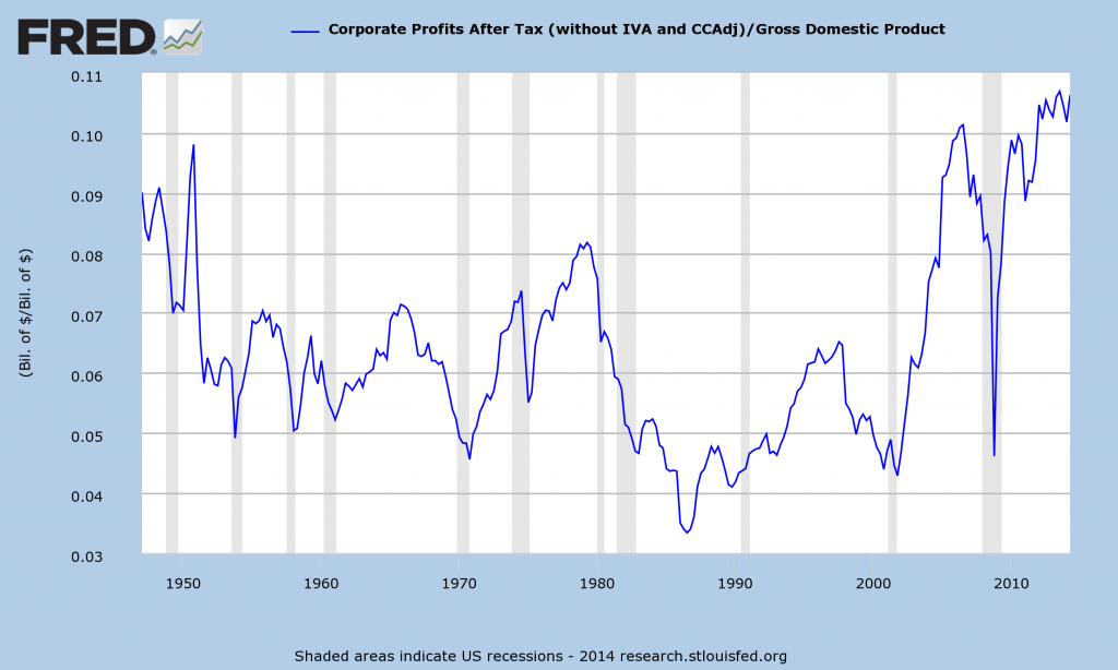
Corporate Profits As A Percentage Of GDP

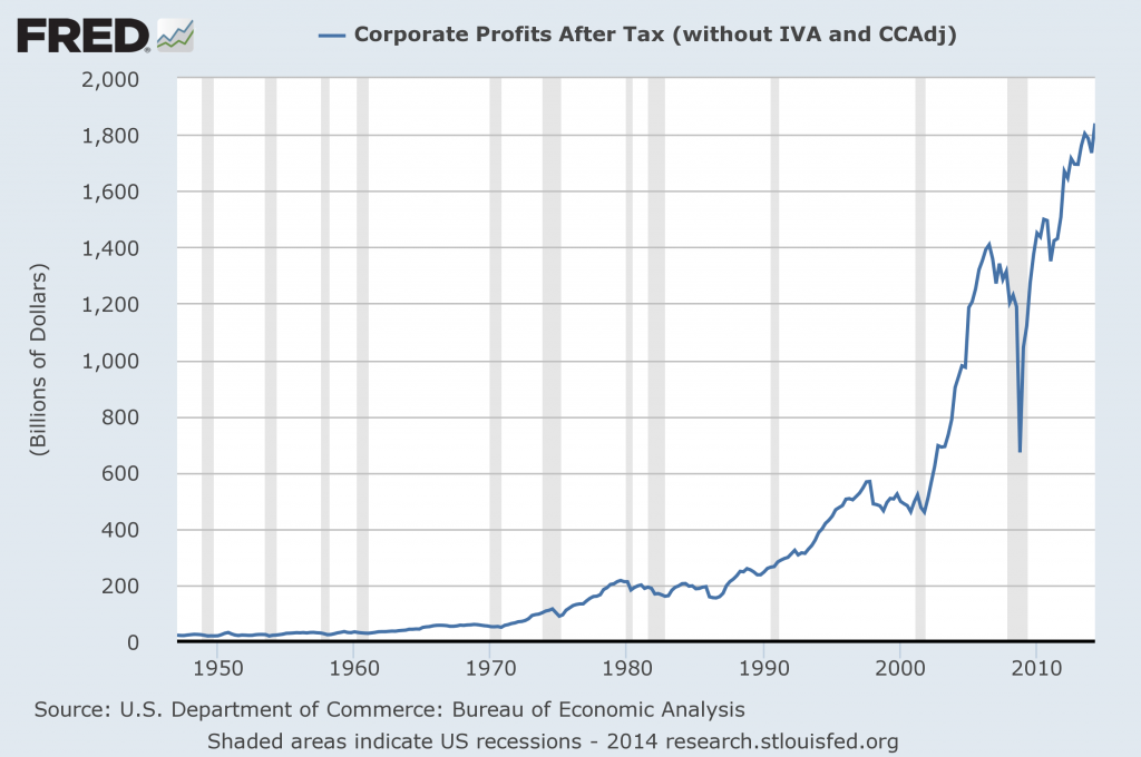
In the last post (“2nd Quarter 2014 Corporate Profits“) I displayed, for reference purposes, a long-term chart depicting Corporate Profits After Tax.
There are many ways to view this measure, both on an absolute as well as relative basis.
One relative measure is viewing Corporate Profits as a Percentage of GDP.  I feel that this metric is important for a variety of reasons.  As well, the measure is important to a variety of parties, including investors, businesses, and government policy makers.
As one can see from the long-term chart below (updated through the second quarter), (After Tax) Corporate Profits as a Percentage of GDP is at levels that can be seen as historically (very) high.  While there are many reasons as to why this is so, from a going-forward standpoint I think it is important to recognize both that such a notable condition exists, as well as contemplate and/or plan for such factors and conditions that would come about if (and in my opinion “when”) a more historically “normal” ratio of Corporate Profits as a Percentage of GDP occurs.  This topic can be very complex in nature, and depends upon myriad factors.  In my opinion it deserves far greater recognition.
(click on chart to enlarge image)
Corporate Profits As A Percentage Of GDP
Data Source: FRED, Federal Reserve Economic Data, Federal Reserve Bank of St. Louis; accessed August 28, 2014
_____
The Special Note summarizes my overall thoughts about our economic situation
SPX at 1997.91 as this post is written

2nd Quarter 2014 Corporate Profits

Today’s GDP release (Q2, 2nd Estimate)(pdf) was accompanied by the BLS Corporate Profits report for the 2nd Quarter.
Of course, there are many ways to adjust and depict overall Corporate Profits.  For reference purposes, here is a chart from the St. Louis Federal Reserve (FRED) showing the Corporate Profits After Tax (last updated August 28, 2014, with a value of $1839.8 Billion) :
Corporate Profits
-
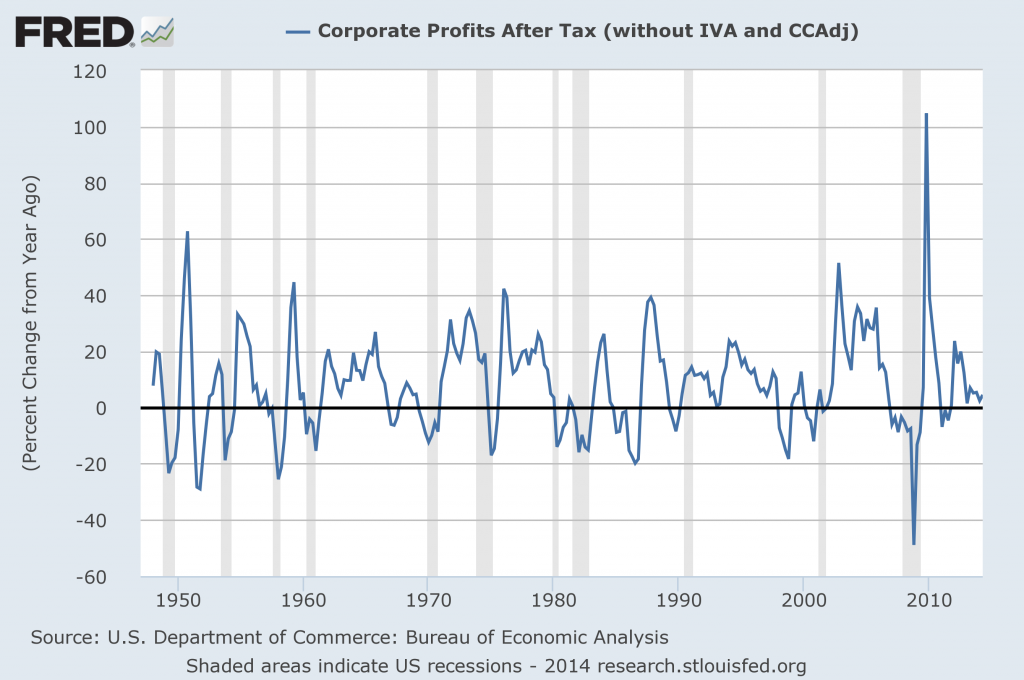
Here is the Corporate Profits After Tax measure shown on a Percentage Change from a Year Ago perspective:
Corporate Profits Percent Change From Year Ago
Data Source: FRED, Federal Reserve Economic Data, Federal Reserve Bank of St. Louis: Corporate Profits After Tax [CP]; U.S. Department of Commerce: Bureau of Economic Analysis; accessed August 28, 2014; https://research.stlouisfed.org/fred2/series/CP
_____
The Special Note summarizes my overall thoughts about our economic situation
SPX at 1997.61 as this post is written

Wednesday, August 27, 2014

Chicago Fed National Financial Conditions Index (NFCI)

The St. Louis Fed’s Financial Stress Index (STLFSI) is one index that is supposed to measure stress in the financial system.  Its reading as of the August 21, 2014 update (reflecting data through August 15) is -1.266.
Of course, there are a variety of other measures and indices that are supposed to measure financial stress and other related issues, both from the Federal Reserve as well as from private sources.
Two other indices that I regularly monitor include the Chicago Fed National Financial Conditions Index (NFCI) as well as the Chicago Fed Adjusted National Financial Conditions Index (ANFCI).
Here are summary descriptions of each, as seen in FRED:
The National Financial Conditions Index (NFCI) measures risk, liquidity and leverage in money markets and debt and equity markets as well as in the traditional and “shadow” banking systems. Positive values of the NFCI indicate financial conditions that are tighter than average, while negative values indicate financial conditions that are looser than average.
The adjusted NFCI (ANFCI). This index isolates a component of financial conditions uncorrelated with economic conditions to provide an update on how financial conditions compare with current economic conditions.
For further information, please visit the Federal Reserve Bank of Chicago’s web site:
Below are the most recently updated charts of the NFCI and ANFCI, respectively.
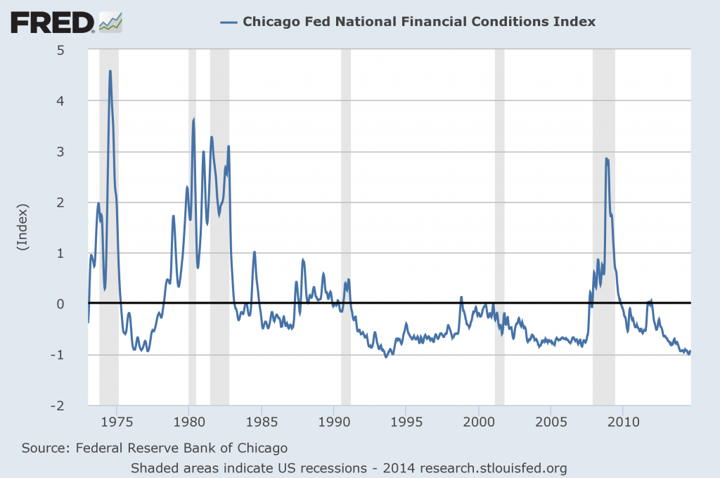
The NFCI chart below was last updated on August 27, incorporating data from January 5,1973 to August 22, 2014, on a weekly basis.  The August 22, 2014 value is -.94:
(click on chart to enlarge image)
NFCI
Data Source: FRED, Federal Reserve Economic Data, Federal Reserve Bank of St. Louis; accessed August 27, 2014:
-
The ANFCI chart below was last updated on August 27, incorporating data from January 5,1973 to August 22, 2014, on a weekly basis.  The August 22, 2014 value is -.48:
(click on chart to enlarge image)
Adjusted National Financial Conditions Index
Data Source: FRED, Federal Reserve Economic Data, Federal Reserve Bank of St. Louis; accessed August 27, 2014:
_________
I post various indicators and indices because I believe they should be carefully monitored.  However, as those familiar with this blog are aware, I do not necessarily agree with what they depict or imply.
_____
The Special Note summarizes my overall thoughts about our economic situation
SPX at 2000.03 as this post is written

Tuesday, August 26, 2014

Durable Goods New Orders – Long-Term Charts Through July 2014

Many people place emphasis on Durable Goods New Orders as a prominent economic indicator and/or leading economic indicator.
For reference, below are charts depicting this measure.
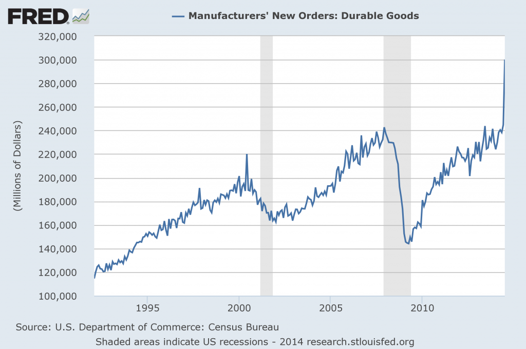
First, from the St. Louis Fed site (FRED), a chart through July, last updated on August 26, 2014.  This value is 300,123 ($ Millions) :
(click on charts to enlarge images)
Durable Goods New Orders July 2014
-
Here is the chart depicting this measure on a “Percentage Change from a Year Ago” basis:
DGORDER_8-26-14 300123 Percent Change From Year Ago
Data Source: FRED, Federal Reserve Economic Data, Federal Reserve Bank of St. Louis: Manufacturers’ New Orders:  Durable Goods [DGORDER]; U.S. Department of Commerce: Census Bureau; accessed August 26, 2014;
_________
I post various indicators and indices because I believe they should be carefully monitored.  However, as those familiar with this blog are aware, I do not necessarily agree with what they depict or imply.
_____
The Special Note summarizes my overall thoughts about our economic situation
SPX at 2003.44 as this post is written

Monday, August 25, 2014

Updates Of Economic Indicators August 2014

Here is an update of various indicators that are supposed to predict and/or depict economic activity. These indicators have been discussed in previous blog posts:
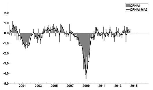
The August 2014 Chicago Fed National Activity Index (CFNAI)(pdf) updated as of August 25, 2014:
cfnai_monthly_MA3 8-25-14
-
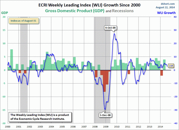
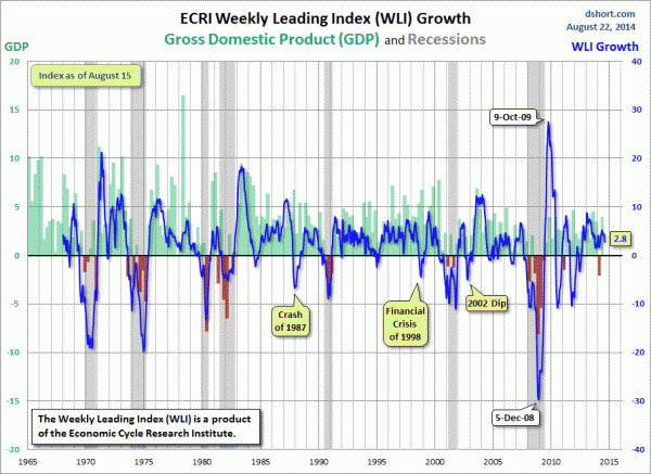
As of August 22, 2014 (incorporating data through August 15, 2014) the WLI was at 134.3 and the WLI, Gr. was at 2.8%.
Here is a chart of the ECRI WLI,Gr., from Doug Short’s August 22, 2014 post titled “ECRI Recession Watch:  Weekly Update” :
Dshort 8-22-14 - ECRI-WLI-growth-since-2000 2.8 percent
-
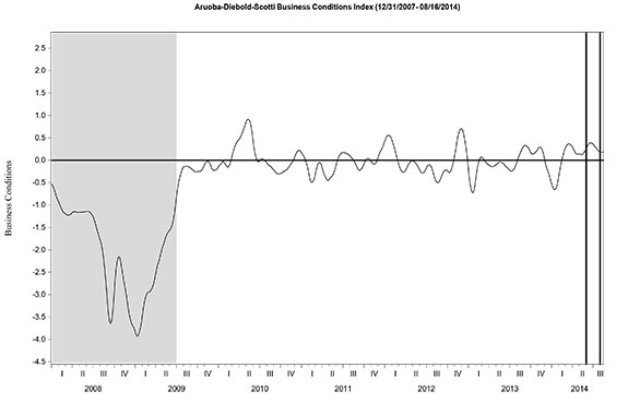
Here is the latest chart, depicting the ADS Index from December 31, 2007 through August 16, 2014:
ADS Index
-
As per the August 21, 2014 press release, the LEI was at 103.3 and the CEI was at 109.6 in July.
An excerpt from the August 21 release:
“The LEI improved sharply in July, suggesting that the economy is gaining traction and growth should continue at a strong pace for the remainder of the year,” said Ataman Ozyildirim, Economist at The Conference Board. “Although housing has been one of the weakest components this year, the sharp gain in building permits helped boost the LEI in July. Financial markets and labor market conditions have also supported recent gains, but business spending indicators remain soft and their contribution marginal.”
_________
I post various indicators and indices because I believe they should be carefully monitored.  However, as those familiar with this blog are aware, I do not necessarily agree with what they depict or imply.
_____
The Special Note summarizes my overall thoughts about our economic situation
SPX at 1998.60 as this post is written
Friday, August 22, 2014

Long-Term Charts Of The ECRI WLI & ECRI WLI, Gr. – August 22, 2014 Update

As I stated in my July 12, 2010 post (“ECRI WLI Growth History“):
For a variety of reasons, I am not as enamored with ECRI’s WLI and WLI Growth measures as many are.
However, I do think the measures are important and deserve close monitoring and scrutiny.
The movement of the ECRI WLI and WLI, Gr. is particularly notable at this time, as ECRI publicly announced on September 30, 2011 that the U.S. was “tipping into recession,” and ECRI has reiterated the view that the U.S. economy is currently in a recession, seen most recently in these twelve publicly available sources :
Other past notable year 2012 reaffirmations of the September 30, 2011 recession call by ECRI were seen (in chronological order) on March 15 (“Why Our Recession Call Stands”) as well as various interviews and statements the week of May 6, including:
Also, subsequent to May 2012:
__
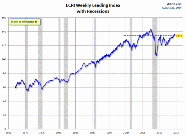
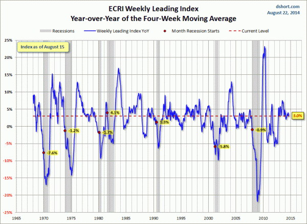
Below are three long-term charts, from Doug Short’s blog post of August 22, 2014 titled “ECRI Recession Watch:  Weekly Update.”  These charts are on a weekly basis through the August 22 release, indicating data through August 15, 2014.
Here is the ECRI WLI (defined at ECRI’s glossary):
ECRI WLI
-
This next chart depicts, on a long-term basis, the Year-over-Year change in the 4-week moving average of the WLI:
Dshort 8-22-14 - ECRI-WLI-YoY - 3.0 percent
-
This last chart depicts, on a long-term basis, the WLI, Gr.:
ECRI WLI,Gr.

_________
I post various economic indicators and indices because I believe they should be carefully monitored.  However, as those familiar with this blog are aware, I do not necessarily agree with what they depict or imply.
_____
The Special Note summarizes my overall thoughts about our economic situation
SPX at 1990.24 as this post is written
Current Economic Situation

With regard to our current economic situation, my thoughts can best be described/summarized by the posts found under the 39 “Building Financial Danger” posts.
My thoughts concerning our ongoing economic situation – with future implications – can be seen on the page titled “A Special Note On Our Economic Situation,” which has been found near the bottom of every blog post since August 15, 2010.
_____
The Special Note summarizes my overall thoughts about our economic situation
SPX at 1991.84 as this post is written
Thursday, August 21, 2014

Trends Of S&P500 Earnings Forecasts

S&P500 earnings trends and estimates are a notably important topic, for a variety of reasons, at this point in time.
FactSet publishes a report titled “Earnings Insight” that contains a variety of information including the trends and expectations of S&P500 earnings.
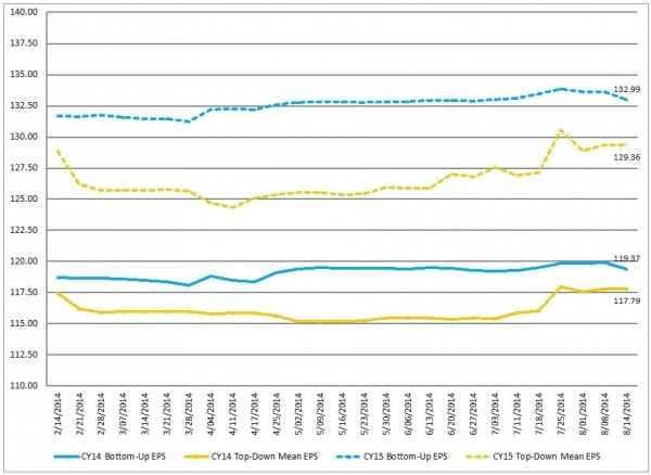
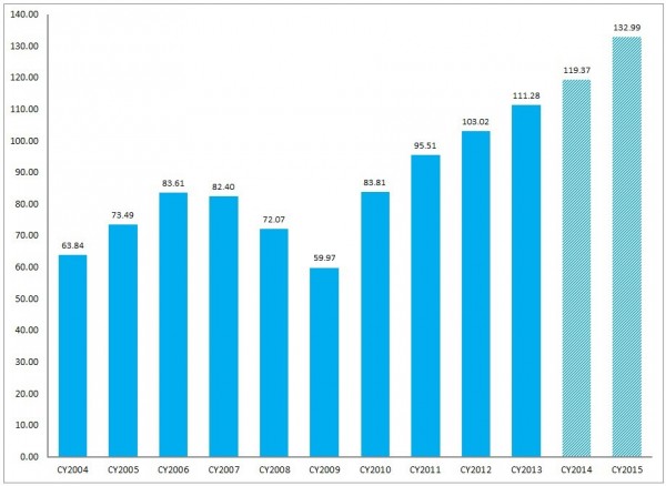
For reference purposes, here are two charts as seen in the “Earnings Insight” (pdf) report of August 15, 2014:
from page 12:
(click on charts to enlarge images)
CY Bottom-Up EPS vs. Top-Down Mean EPS (Trailing 26-Weeks) 
S&P500 earnings estimates trends
-
from page 13:
Calendar Year Bottom-Up EPS Actuals & Estimates
S&P500 annual earnings
_____
I post various economic forecasts because I believe they should be carefully monitored.  However, as those familiar with this blog are aware, I do not agree with many of the consensus estimates and much of the commentary in these forecast surveys.
_____
The Special Note summarizes my overall thoughts about our economic situation
SPX at 1989.72 as this post is written

Wednesday, August 20, 2014

S&P500 Earnings Estimates For Years 2014-2017

As many are aware, Thomson Reuters publishes earnings estimates for the S&P500.  (My other posts concerning S&P earnings estimates can be found under the S&P500 Earnings label)
The following estimates are from Exhibit 12 of “The Director’s Report” (pdf) of August 20, 2014, and represent an aggregation of individual S&P500 component “bottom up” analyst forecasts:
Year 2014 estimate:
$119.31/share
Year 2015 estimate:
$133.51/share
Year 2016 estimate:
$148.11/share
Year 2017 estimate:
$138.00/share
_____
I post various economic forecasts because I believe they should be carefully monitored.  However, as those familiar with this blog are aware, I do not agree with many of the consensus estimates and much of the commentary in these forecast surveys.
_____
The Special Note summarizes my overall thoughts about our economic situation
SPX at 1986.98 as this post is written

Standard & Poor’s S&P500 Earnings Estimates For 2014 & 2015 – As Of August 14, 2014

As many are aware, Standard & Poor’s publishes earnings estimates for the S&P500.  (My posts concerning their estimates can be found under the S&P500 Earnings label)
For reference purposes, the most current estimates are reflected below, and are as of August 14, 2014:
Year 2014 estimates add to the following:
-From a “bottom up” perspective, operating earnings of $119.25/share
-From a “top down” perspective, operating earnings of N/A
-From a “top down” perspective, “as reported” earnings of $110.24/share
Year 2015 estimates add to the following:
-From a “bottom up” perspective, operating earnings of $136.54/share
-From a “top down” perspective, operating earnings of $135.84/share
-From a “top down” perspective, “as reported” earnings of $132.30/share
_____
I post various economic forecasts because I believe they should be carefully monitored.  However, as those familiar with this blog are aware, I do not agree with many of the consensus estimates and much of the commentary in these forecast surveys.
_____
The Special Note summarizes my overall thoughts about our economic situation
SPX at 1982.96 as this post is written

Chicago Fed National Financial Conditions Index (NFCI)

The St. Louis Fed’s Financial Stress Index (STLFSI) is one index that is supposed to measure stress in the financial system.  Its reading as of the August 14, 2014 update (reflecting data through August 8) is -1.202.
Of course, there are a variety of other measures and indices that are supposed to measure financial stress and other related issues, both from the Federal Reserve as well as from private sources.
Two other indices that I regularly monitor include the Chicago Fed National Financial Conditions Index (NFCI) as well as the Chicago Fed Adjusted National Financial Conditions Index (ANFCI).
Here are summary descriptions of each, as seen in FRED:
The National Financial Conditions Index (NFCI) measures risk, liquidity and leverage in money markets and debt and equity markets as well as in the traditional and “shadow” banking systems. Positive values of the NFCI indicate financial conditions that are tighter than average, while negative values indicate financial conditions that are looser than average.
The adjusted NFCI (ANFCI). This index isolates a component of financial conditions uncorrelated with economic conditions to provide an update on how financial conditions compare with current economic conditions.
For further information, please visit the Federal Reserve Bank of Chicago’s web site:
Below are the most recently updated charts of the NFCI and ANFCI, respectively.
The NFCI chart below was last updated on August 20, incorporating data from January 5,1973 to August 15, 2014, on a weekly basis.  The August 15, 2014 value is -.91:
(click on chart to enlarge image)
NFCI
Data Source: FRED, Federal Reserve Economic Data, Federal Reserve Bank of St. Louis; accessed August 20, 2014:
-
The ANFCI chart below was last updated on August 20, incorporating data from January 5,1973 to August 15, 2014, on a weekly basis.  The August 15, 2014 value is -.52:
(click on chart to enlarge image)
ANFCI
Data Source: FRED, Federal Reserve Economic Data, Federal Reserve Bank of St. Louis; accessed August 20, 2014:
_________
I post various indicators and indices because I believe they should be carefully monitored.  However, as those familiar with this blog are aware, I do not necessarily agree with what they depict or imply.
_____
The Special Note summarizes my overall thoughts about our economic situation
SPX at 1983.31 as this post is written

Tuesday, August 19, 2014

"Hunger in America 2014" Report - Notable Excerpts

Yesterday (August 18, 2014) Feeding America released the "Hunger in America 2014" report.  As stated:
Hunger in America 2014 is the sixth and most comprehensive study undertaken. The 2014 study reveals that each year, the Feeding America network of food banks provides service to 46.5 million people in need across the United States, including 12 million children and 7 million seniors. Through a network of 58,000 pantries, meal service programs, and other charitable food programs, the Feeding America network reaches people in need in every community across the U.S.
Other excerpts I found notable, from the full "Hunger in America 2014" (pdf) report in the order they appear, include the following:
page 4:
The economy has experienced an unusually slow recovery since the deep recession in 2008 and 2009. The nation’s poverty rate reached 15.1 percent in 2010, the highest rate since 1993. The poverty rate remained at 15 percent in 2012 with 46.5 million people living in poverty. This is the largest number living in poverty since statistics were first published more than 50 years ago.  Sustained high poverty rates arise in part from high unemployment and falling household incomes. The U.S. unemployment rate exceeded 7.0 percent for five years between late 2008 and late 2013 (about 11 million people in any given month), the longest period of high unemployment in 70 years.  While the unemployment rate indicates that a large number of people cannot find jobs, many others are employed part time because they cannot find full-time work. The government’s measure of underemployment that includes all of these groups averaged 14 percent in fiscal year 2013, compared to a prerecession rate of 8.4 percent in 2007.  On average, about 24 million people were underemployed in 2013. Additionally, others may work full time but due to low wages their earnings do not lift them above the poverty line. Perhaps not surprisingly, real household income dropped 8.3 percent between 2007 and 2012.  Poverty, unemployment, and income, along with other demographic characteristics, are key drivers of individual and household food insecurity across the country.
These economic trends have contributed to rapid growth in the numbers of households seeking and receiving food assistance. The number of people participating in SNAP, the largest federal food assistance program, rose to a new high of 47.6 million in 2013, up from 33.5 million in 2009. While some of this growth can be attributed to changes in SNAP rules, recent studies conclude that the weak economy explains most of the increase. Other government programs that provided nutrition assistance in 2013 also saw high levels of enrollment. About 9 million people received WIC benefits in 2013. In the same year, 21.5 million children received free or reduced-price school lunches, and 11.2 million children received school breakfasts.
page 44:
Feeding America food banks and their partner agencies provide food and services to people in all 50 states, Washington, DC, and Puerto Rico. We estimate that the Feeding America network is currently serving 46.5 million unique individuals in 15.5 million households annually across the United States. The number of clients served and other findings from the Client Survey are further discussed in Chapters 4 and 5. Feeding America carries out this work through the coordinated efforts of its food banks, their partner agencies, and the food programs operated by those agencies. This chapter describes the structure of the network, characteristics of partner agencies in the network, the services the partner agencies provide, and the challenges they face in delivering charitable food assistance, as reported on the Agency Survey.
page 88:
Based solely on the unduplicated client counts, it appears that the Feeding America network has seen an increase over the past four years in the number of clients served annually. Estimates from the HIA 2010 study placed the annual unduplicated client count at that time at 37 million individuals. This apparent growth in unduplicated clients served by the network is likely the combination of changes in the scope and interpretation of the HIA study between 2010 and 2014, and actual growth in the network during that time. Some increase in the number of annual unduplicated clients is expected due to inclusion of additional programs not previously represented in the data.
page 131:
  • Across all client households, 84 percent are food insecure. In households with at least one child that number rises to 89 percent.
  • Client households report making spending tradeoffs between paying for food and paying for other necessities, such as medical care, housing, and utilities. Sixty-six percent of households report choosing between paying for food and medicine or medical care each year, and 31 percent do so every month. Fifty-seven percent of households choose between paying for food and housing annually, with 27 percent doing so on a monthly basis.
  • Sixty-three percent of households plan for charitable food assistance as a part of their monthly household budget.
  • More than half (55 percent) of client households receive monthly benefits from the federal Supplemental Nutrition Assistance Program (SNAP). Almost half of those not receiving SNAP benefits have never applied, most commonly because they did not think they were eligible. Seventy-two percent of households not receiving SNAP benefits may in fact be income eligible for SNAP.
  • Clients and their households often utilize multiple coping strategies to ensure they have enough food. More than 50 percent receive help from family or friends; 79 percent purchase inexpensive, unhealthy food; 40 percent water down food and drinks to make them last longer; and 23 percent grow food in a garden. Fifty-five percent of households report employing three or more coping strategies to get enough food each year.
Additional details and discussion can be found in the full "Hunger in America 2014" report mentioned above.
_____
The Special Note summarizes my overall thoughts about our economic situation
SPX at 1976.70 as this post is written