Wednesday, May 31, 2017

Zillow Q2 2017 Home Price Expectations Survey – Summary & Comments

On May 31, 2017, the Zillow Q2 2017 Home Price Expectations Survey results were released.  This survey is done on a quarterly basis.
Two excerpts from the Press Release:
Expectations for overall home price growth are stronger now than they were a year ago. A year ago, panelists predicted that home prices would rise 3.4 percent in 2017. Now, they expect to see a 4.8 percent increase. Their forecasts for home price growth in 2018 are also more optimistic now compared to last year.
also:
"On the heels of last year's nearly seven percent national home value appreciation rate, the prospect that prices will increase less than five percent overall this year might be dispiriting to some," said Pulsenomics founder Terry Loebs. "Yet, 4.8 percent is not only well above the historical average annual gain, it's the most optimistic projection for 2017 that we've seen from our expert panel over the past five years. Although most pessimistic experts still expect a sharp slowdown to commence in 2018, even this group anticipates home values to increase an average of nearly four percent this year. Given these projections, it's a pretty safe bet that U.S. home equity growth will exceed $1 trillion for the sixth consecutive year, and continue to buttress consumer confidence and household spending in 2017, especially if more of today's renters can afford the transition to homeownership."
Various Q2 2017 Zillow Home Price Expectations Survey charts are available, including that seen below:
U.S. Home Price Expectations chart
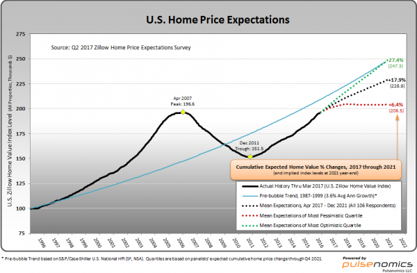
As one can see from the above chart, the average expectation is that the residential real estate market, as depicted by the U.S. Zillow Home Value Index, will continually climb.
The detail of the Q2 2017 Home Price Expectations Survey (pdf) is interesting.  Of the 100+ survey respondents, only six (of the displayed responses) forecasts a cumulative price decrease through 2021, and only one of those forecasts is for a double-digit percentage decline.  That forecast is from Mark Hanson, who foresees a 24.47% cumulative price decrease through 2021.
The Median Cumulative Home Price Appreciation for years 2017-2021 is seen as 5.00%, 9.22%, 12.49%, 15.69%, and 18.76%, respectively.
For a variety of reasons, I continue to believe that even the most “bearish” of these forecasts (as seen in Mark Hanson’s above-referenced forecast) will prove too optimistic in hindsight.  From a longer-term historical perspective, such a decline is very mild in light of the wild excesses that occurred over the “bubble” years.
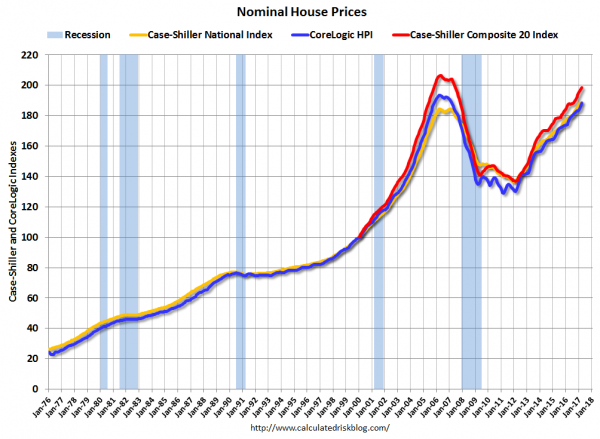
I have written extensively about the residential real estate situation.  For a variety of reasons, it is exceedingly complex.  While many people continue to have an optimistic view regarding future residential real estate prices, in my opinion such a view is unsupported on an “all things considered” basis.  Furthermore, from these price levels there exists outsized potential for a price decline of severe magnitude, unfortunately.  I discussed this downside, based upon historical price activity, in the October 24, 2010 post titled “What’s Ahead For The Housing Market – A Look At The Charts.”
_____
The Special Note summarizes my overall thoughts about our economic situation
SPX at 2408.37 as this post is written

House Prices Reference Chart

As a reference for long-term house price index trends, below is a chart, updated with the most current data (through March) from the CalculatedRisk blog post of May 30, 2017 titled “Real Prices and Price-to-Rent Ratio in March”:
(click on chart to enlarge image)
nominal house price chart
_________
I post various indicators and indices because I believe they should be carefully monitored.  However, as those familiar with this site are aware, I do not necessarily agree with what they depict or imply.
_____
The Special Note summarizes my overall thoughts about our economic situation
SPX at 2405.05 as this post is written

Tuesday, May 30, 2017

Consumer Confidence Surveys – As Of May 30, 2017

Doug Short had a blog post of May 30, 2017 (“Michigan Consumer Confidence Down, Remains Optimistic“) in which he presents the latest Conference Board Consumer Confidence and Thomson/Reuters University of Michigan Consumer Sentiment Index charts.  They are presented below:
(click on charts to enlarge images)
Conference Board Consumer Confidence Index
University of Michigan Consumer Sentiment Index
There are a few aspects of the above charts that I find highly noteworthy.  Of course, until the sudden upswing in 2014, the continued subdued absolute levels of these two surveys was disconcerting.
Also, I find the “behavior” of these readings to be quite disparate as compared to the other post-recession periods, as shown in the charts between the gray shaded areas (the gray areas denote recessions as defined by the NBER.)
While I don’t believe that confidence surveys should be overemphasized, I find these readings to be very problematical, especially in light of a variety of other highly disconcerting measures highlighted throughout this site.
_____
The Special Note summarizes my overall thoughts about our economic situation
SPX at 2412.91 as this post is written

Friday, May 26, 2017

Corporate Profits As A Percentage Of GDP

In the last post (“1st Quarter 2017 Corporate Profits“) I displayed, for reference purposes, a long-term chart depicting Corporate Profits After Tax.
There are many ways to view this measure, both on an absolute as well as relative basis.
One relative measure is viewing Corporate Profits as a Percentage of GDP.  I feel that this metric is important for a variety of reasons.  As well, the measure is important to a variety of parties, including investors, businesses, and government policy makers.
As one can see from the long-term chart below (updated through the first quarter), (After Tax) Corporate Profits as a Percentage of GDP is at levels that can be seen as historically (very) high.  While there are many reasons as to why this is so, from a going-forward standpoint I think it is important to recognize both that such a notable condition exists, as well as contemplate and/or plan for such factors and conditions that would come about if (and in my opinion “when”) a more historically “normal” ratio of Corporate Profits as a Percentage of GDP occurs.  This topic can be very complex in nature, and depends upon myriad factors.  In my opinion it deserves far greater recognition.
(click on chart to enlarge image)
CP:GDP
Data Source: FRED, Federal Reserve Economic Data, Federal Reserve Bank of St. Louis; accessed May 26, 2017
_____
The Special Note summarizes my overall thoughts about our economic situation
SPX at 2414.55 as this post is written

1st Quarter 2017 Corporate Profits

Today’s (May 26, 2017) GDP release (Q1, 2nd Estimate)(pdf) was accompanied by the BLS Corporate Profits report for the 1st Quarter.
Of course, there are many ways to adjust and depict overall Corporate Profits.  For reference purposes, here is a chart from the St. Louis Federal Reserve (FRED) showing the Corporate Profits After Tax (without IVA and CCAdj) (last updated May 26, 2017, with a value of $1735.8 Billion SAAR):
Corporate Profits After Tax
Here is the Corporate Profits After Tax measure shown on a Percentage Change from a Year Ago perspective:
Corporate Profits After Tax Percent Change From Year Ago
Data Source: FRED, Federal Reserve Economic Data, Federal Reserve Bank of St. Louis: Corporate Profits After Tax [CP]; U.S. Department of Commerce: Bureau of Economic Analysis; accessed May 26, 2017; https://research.stlouisfed.org/fred2/series/CP
_________
I post various indicators and indices because I believe they should be carefully monitored.  However, as those familiar with this blog are aware, I do not necessarily agree with what they depict or imply.
_____
The Special Note summarizes my overall thoughts about our economic situation
SPX at 2415.16 as this post is written

Durable Goods New Orders – Long-Term Charts Through April 2017

Many people place emphasis on Durable Goods New Orders as a prominent economic indicator and/or leading economic indicator.
For reference, below are two charts depicting this measure.
First, from the St. Louis Fed site (FRED), a chart through April 2017, updated on May 26, 2017. This value is $231,168 ($ Millions):
(click on charts to enlarge images)
DGORDER_5-26-17
Second, here is the chart depicting this measure on a “Percentage Change from a Year Ago” basis:
DGORDER Percent Change From Year Ago
Data Source: FRED, Federal Reserve Economic Data, Federal Reserve Bank of St. Louis: Manufacturers’ New Orders:  Durable Goods [DGORDER]; U.S. Department of Commerce: Census Bureau; accessed May 26, 2017;
_________
I post various indicators and indices because I believe they should be carefully monitored.  However, as those familiar with this site are aware, I do not necessarily agree with what they depict or imply.
_____
The Special Note summarizes my overall thoughts about our economic situation
SPX at 2415.58 as this post is written

Wednesday, May 24, 2017

Chicago Fed National Financial Conditions Index (NFCI)

The St. Louis Fed’s Financial Stress Index (STLFSI) is one index that is supposed to measure stress in the financial system.  Its reading as of the May 18, 2017 update (reflecting data through May 12, 2017) is -1.496.
Of course, there are a variety of other measures and indices that are supposed to measure financial stress and other related issues, both from the Federal Reserve as well as from private sources.
Two other indices that I regularly monitor include the Chicago Fed National Financial Conditions Index (NFCI) as well as the Chicago Fed Adjusted National Financial Conditions Index (ANFCI).
Here are summary descriptions of each, as seen in FRED:
The National Financial Conditions Index (NFCI) measures risk, liquidity and leverage in money markets and debt and equity markets as well as in the traditional and “shadow” banking systems. Positive values of the NFCI indicate financial conditions that are tighter than average, while negative values indicate financial conditions that are looser than average.
The adjusted NFCI (ANFCI). This index isolates a component of financial conditions uncorrelated with economic conditions to provide an update on how financial conditions compare with current economic conditions.
For further information, please visit the Federal Reserve Bank of Chicago’s web site:
Below are the most recently updated charts of the NFCI and ANFCI, respectively.
The NFCI chart below was last updated on May 24, 2017 incorporating data from January 5,1973 through May 19, 2017, on a weekly basis.  The May 19, 2017 value is -.82:
NFCI
Data Source: FRED, Federal Reserve Economic Data, Federal Reserve Bank of St. Louis; accessed May 24, 2017:
The ANFCI chart below was last updated on May 24, 2017 incorporating data from January 5,1973 through May 19, 2017, on a weekly basis.  The May 19 value is -.44:
ANFCI
Data Source: FRED, Federal Reserve Economic Data, Federal Reserve Bank of St. Louis; accessed May 24, 2017:
_________
I post various indicators and indices because I believe they should be carefully monitored.  However, as those familiar with this site are aware, I do not necessarily agree with what they depict or imply.
_____
The Special Note summarizes my overall thoughts about our economic situation
SPX at 2402.09 as this post is written

Tuesday, May 23, 2017

Median Household Income Chart

I have written many blog posts concerning the worrisome trends in income and earnings.
Doug Short, in his May 23, 2017 post titled “April Real Median Household Income Shows Encouraging Growth,” produced the chart below.  It is based upon data from Sentier Research, and it shows both nominal and real median household incomes since 2000, as depicted.  As one can see, post-recession real median household income (seen in the blue line since 2009) remains worrisome.
(click on chart to enlarge image)
Monthly Median Household Income chart
As Doug mentions in his aforementioned post, regarding the change in real median household incomes:
As the excellent data from Sentier Research makes clear, the mainstream U.S. household was struggling before the Great Recession. At this point, real household incomes are about where they were during the Great Recession.
Among other items seen in his post is a chart depicting each of the two (nominal and real household incomes) data series’ percent change over time since 2000.
_________
I post various indicators and indices because I believe they should be carefully monitored.  However, as those familiar with this site are aware, I do not necessarily agree with what they depict or imply.
_____
The Special Note summarizes my overall thoughts about our economic situation
SPX at 2398.42 as this post is written

Money Supply Charts Through April 2017

For reference purposes, below are two sets of charts depicting growth in the money supply.
The first shows the MZM (Money Zero Maturity), defined in FRED as the following:
M2 less small-denomination time deposits plus institutional money funds.
Money Zero Maturity is calculated by the Federal Reserve Bank of St. Louis.
Here is the “MZM Money Stock” (seasonally adjusted) chart, updated on May 19, 2017 depicting data through April 2017, with a value of $14,809.5 Billion:
MZMSL_5-19-17
Here is the “MZM Money Stock” chart on a “Percent Change From Year Ago” basis, with a current value of 5.2%:
MZMSL_5-19-17 5.2 Percent Change From Year Ago
Data Source: FRED, Federal Reserve Economic Data, Federal Reserve Bank of St. Louis; accessed May 23, 2017:
The second set shows M2, defined in FRED as the following:
M2 includes a broader set of financial assets held principally by households. M2 consists of M1 plus: (1) savings deposits (which include money market deposit accounts, or MMDAs); (2) small-denomination time deposits (time deposits in amounts of less than $100,000); and (3) balances in retail money market mutual funds (MMMFs). Seasonally adjusted M2 is computed by summing savings deposits, small-denomination time deposits, and retail MMMFs, each seasonally adjusted separately, and adding this result to seasonally adjusted M1.
Here is the “M2 Money Stock” (seasonally adjusted) chart, updated on May 18, 2017, depicting data through April 2017, with a value of $13,431.3 Billion:
M2SL_5-18-17
Here is the “M2 Money Stock” chart on a “Percent Change From Year Ago” basis, with a current value of 6.0%:
M2SL_5-18-17 Percent Change From Year Ago
Data Source: FRED, Federal Reserve Economic Data, Federal Reserve Bank of St. Louis; accessed May 23, 2017:
_____
The Special Note summarizes my overall thoughts about our economic situation
SPX at 2394.02 as this post is written

The U.S. Economic Situation – May 23, 2017 Update

Perhaps the main reason that I write of our economic situation is that I continue to believe, based upon various analyses, that our economic situation is in many ways misunderstood.  While no one likes to contemplate a future rife with economic adversity, current and future economic problems must be properly recognized and rectified if high-quality, sustainable long-term economic vitality is to be realized.
There are an array of indications and other “warning signs” – many readily apparent – that current economic activity and financial market performance is accompanied by exceedingly perilous dynamics.
I have written extensively about this peril, including in the following:
Building Financial Danger” (ongoing updates)
My analyses continues to indicate that the growing level of financial danger will lead to the next stock market crash that will also involve (as seen in 2008) various other markets as well.  Key attributes of this next crash is its outsized magnitude (when viewed from an ultra-long term historical perspective) and the resulting economic impact.  This next financial crash is of tremendous concern, as my analyses indicate it will lead to a Super Depression – i.e. an economy characterized by deeply embedded, highly complex, and difficult-to-solve problems.
For long-term reference purposes, here is a chart of the Dow Jones Industrial Average since 1900, depicted on a monthly basis using a LOG scale (updated through May 18, 2017, with a last value of 20,804.84):
(click on chart to enlarge image)(chart courtesy of StockCharts.com)
DJIA 1900-May 18, 2017
_____
The Special Note summarizes my overall thoughts about our economic situation
SPX at 2394.02 as this post is written

Monday, May 22, 2017

Updates Of Economic Indicators May 2017

Here is an update of various indicators that are supposed to predict and/or depict economic activity. These indicators have been discussed in previous blog posts:
The May 2017 Chicago Fed National Activity Index (CFNAI) updated as of May 22, 2017:
The CFNAI, with current reading of .49:
CFNAI_5-22-17 .49
Federal Reserve Bank of Chicago, Chicago Fed National Activity Index [CFNAI], retrieved from FRED, Federal Reserve Bank of St. Louis, May 22, 2017;
The CFNAI-MA3, with current reading of .23:
CFNAI-MA3_5-22-17 .23
Federal Reserve Bank of Chicago, Chicago Fed National Activity Index: Three Month Moving Average [CFNAIMA3], retrieved from FRED, Federal Reserve Bank of St. Louis, May 22, 2017;
As of May 19, 2017 (incorporating data through May 12, 2017) the WLI was at 144.5 and the WLI, Gr. was at 5.0%.
A chart of the WLI,Gr., from Doug Short’s ECRI update post of May 19, 2017:
ECRI WLI,Gr.
Here is the latest chart, depicting the ADS Index from December 31, 2007 through May 13, 2017:
ADS Index
The Conference Board Leading (LEI), Coincident (CEI) Economic Indexes, and Lagging Economic Indicator (LAG):
As per the May 18, 2017 press release, titled “The Conference Board Leading Economic Index (LEI) for the U.S. Increased in April” (pdf) the LEI was at 126.9, the CEI was at 115.2, and the LAG was 124.1 in April.
An excerpt from the  release:
“The recent trend in the U.S. LEI, led by the positive outlook of consumers and financial markets, continues to point to a growing economy, perhaps even a cyclical pickup,” said Ataman Ozyildirim, Director of Business Cycles and Growth Research at The Conference Board. “First quarter’s weak GDP growth is likely a temporary hiccup as the economy returns to its long-term trend of about 2 percent. While the majority of leading indicators have been contributing positively in recent months, housing permits followed by average workweek in manufacturing have been the sources of weakness among the U.S. LEI components.”
Here is a chart of the LEI from Doug Short’s Conference Board Leading Economic Index update of May 18, 2017:
Conference Board LEI
_________
I post various indicators and indices because I believe they should be carefully monitored.  However, as those familiar with this site are aware, I do not necessarily agree with what they depict or imply.
_____
The Special Note summarizes my overall thoughts about our economic situation
SPX at 2392.93 as this post is written

Friday, May 19, 2017

S&P500 And VIX Chart – Through May 18, 2017

For reference purposes, below is a 1-year chart of the S&P500 and VIX through Thursday's (May 18, 2017) close.  The closing price for the S&P500 was 2365.72 and the VIX had a closing value of 14.66.  Price labels as well as moving averages are also shown:
(click on chart to enlarge image)(chart courtesy of StockCharts.com; chart creation and annotation by the author)
S&P500 and VIX
_____
The Special Note summarizes my overall thoughts about our economic situation
SPX at 2365.72 as this post is written

Thursday, May 18, 2017

Walmart’s Q1 2018 Results – Comments

I found various notable items in Walmart’s Q1 2018 management call transcript (pdf) dated May 18, 2017.  (as well, there is Walmart’s press release of the Q1 results and related presentation materials)
I view Walmart’s results and comments as particularly noteworthy given their retail prominence and focus on low prices.  I have previously commented on their quarterly management call comments; these previous posts are found under the “paycheck to paycheck” label.
Here are various excerpts that I find most notable:
comments from Doug McMillon, President and CEO, page 3, wrt Walmart U.S.: :
Comp store sales grew 1.4 percent and comp store traffic improved 1.5 percent. We got off to a slower start than expected, due in part to delayed federal tax refund checks, but saw sales strengthen throughout the quarter. We also continued to manage the business well from an inventory and availability standpoint.
comments from Doug McMillon, President and CEO, page 4:
In U.S. eCommerce, we like the traction and we are working hard to make even more improvements. Walmart.com launched two new initiatives in the quarter. First, we made the change to shipping terms at the beginning of the quarter. Customers don’t have to pay a membership fee to get two-day shipping on millions of items. Second, we recently began offering customers pick-up discounts on non-store items. Our stores are located within 10 miles of nearly 90 percent of the U.S. population—so this is convenient for many of our customers, and also saves them money when they order online and pick it up during their visit to our stores.
comments from Brett Biggs, EVP & CFO, page 7:
Gross profit margin increased 1 basis point during the quarter. The rate for Walmart U.S. was flat, while Walmart International was up slightly.
comments from Brett Biggs, EVP & CFO, page 8, wrt Walmart U.S.:
You will recall in our fourth quarter comments that the first quarter started out slower than anticipated from a sales standpoint, due in part to the delayed issuance of federal income tax refund checks. As anticipated, our sales strengthened as the quarter progressed, delivering comp sales growth of 1.4 percent, led by an increase in customer traffic of 1.5 percent. This marks the 10th consecutive quarter of positive comp traffic. On a twoyear stacked basis, comp traffic is up 3 percent. Average ticket declined slightly primarily due to lower sales of higher ticket items at the beginning of the quarter, as well as continued price investment. Additionally, the grocery business continued to improve with food categories delivering the strongest quarterly comp sales performance in more than three years, due in part to a lack of market deflation in food, excluding price investments.
comments from Brett Biggs, EVP & CFO, page 9, wrt Walmart U.S.:
Gross margin rate was flat in the quarter. Savings from procuring merchandise and the acceleration of post-holiday markdowns taken in the fourth quarter benefited the margin rate, but this was offset by investments in price and the mix effects from our growing e-commerce business.
_____
The Special Note summarizes my overall thoughts about our economic situation
SPX at 2357.03 as this post is written

Wednesday, May 17, 2017

Chicago Fed National Financial Conditions Index (NFCI)

The St. Louis Fed’s Financial Stress Index (STLFSI) is one index that is supposed to measure stress in the financial system.  Its reading as of the May 11, 2017 update (reflecting data through May 5, 2017) is -1.451.
Of course, there are a variety of other measures and indices that are supposed to measure financial stress and other related issues, both from the Federal Reserve as well as from private sources.
Two other indices that I regularly monitor include the Chicago Fed National Financial Conditions Index (NFCI) as well as the Chicago Fed Adjusted National Financial Conditions Index (ANFCI).
Here are summary descriptions of each, as seen in FRED:
The National Financial Conditions Index (NFCI) measures risk, liquidity and leverage in money markets and debt and equity markets as well as in the traditional and “shadow” banking systems. Positive values of the NFCI indicate financial conditions that are tighter than average, while negative values indicate financial conditions that are looser than average.
The adjusted NFCI (ANFCI). This index isolates a component of financial conditions uncorrelated with economic conditions to provide an update on how financial conditions compare with current economic conditions.
For further information, please visit the Federal Reserve Bank of Chicago’s web site:
Below are the most recently updated charts of the NFCI and ANFCI, respectively.
The NFCI chart below was last updated on May 17, 2017 incorporating data from January 5,1973 through May 12, 2017, on a weekly basis.  The May 12, 2017 value is -.84:
NFCI
Data Source: FRED, Federal Reserve Economic Data, Federal Reserve Bank of St. Louis; accessed May 17, 2017:
The ANFCI chart below was last updated on May 17, 2017 incorporating data from January 5,1973 through May 12, 2017, on a weekly basis.  The May 12 value is -.47:
ANFCI
Data Source: FRED, Federal Reserve Economic Data, Federal Reserve Bank of St. Louis; accessed May 17, 2017:
_________
I post various indicators and indices because I believe they should be carefully monitored.  However, as those familiar with this site are aware, I do not necessarily agree with what they depict or imply.
_____
The Special Note summarizes my overall thoughts about our economic situation
SPX at 2363.03 as this post is written

Trends Of S&P500 Earnings Forecasts

S&P500 earnings trends and estimates are a notably important topic, for a variety of reasons, at this point in time.
FactSet publishes a report titled “Earnings Insight” that contains a variety of information including the trends and expectations of S&P500 earnings.
For reference purposes, here are two charts as seen in the “Earnings Insight” (pdf) report of May 12, 2017:
from page 19:
(click on charts to enlarge images)
S&P500 EPS estimates 2017 & 2018
from page 20:
annual S&P500 EPS
_____
I post various economic forecasts because I believe they should be carefully monitored.  However, as those familiar with this site are aware, I do not agree with many of the consensus estimates and much of the commentary in these forecast surveys.
_____
The Special Note summarizes my overall thoughts about our economic situation
SPX at 2400.67 as this post is written