Friday, March 30, 2012

Deloitte “CFO Signals” Report 1Q 2012 – Notable Aspects


Recently Deloitte released their “CFO Signals” report for 1st Quarter 2012.

As seen in page 2 of the full (pdf) report, “Ninety-four CFOs responded during the two weeks ended February 24. Over 71% are from public companies, and over 77% are from companies with more than $1B in annual revenue."

Here are some excerpts that I found notable:

from page 4:
Rising optimism is clearly reflected in CFOs’ earnings growth expectations.  After bottoming out at 9.3%* in the third quarter of last year, expected growth rose to 10.1%* last quarter and to 12.8%* this quarter. Rising variability of projections, however, indicates substantial difference of opinion.
But sales growth projections continued their downward trend. CFOs’ expected 5.9%* gains are a new low for this survey, and the U.S. expectation is just 5.2%*. This begs the question, “How long can companies expect earnings to outpace sales?” Eight consecutive quarters of this dynamic appear to suggest companies believe their cost-containment strategies can make up for slowing sales growth – perhaps through some combination of focusing on higher-margin businesses, exiting businesses outside core competencies, reaping benefits of efficiency improvement efforts, offshoring of resources, and expectations of declining input costs.
from page 4:
In contrast to the last two quarters, companies’ growth plans appear to be spurring hiring at home. CFOs’ expected domestic hiring gains of 2.1%* are more than double last quarter’s survey-low 1.0%*, and just over half of CFOs project gains. U.S. CFOs’ projections rose from 1.4%* last quarter to 1.8%* this quarter...
from page 4:
Similar to rising earnings projections, growing investment and hiring expectations raise questions about reasons for confidence as revenue appears to be leveling off. Perhaps companies are focused on anticipated growth that is more than a year away, or perhaps they are simply more optimistic than they should be.
from page 11, regarding "Top Industry Challenges" :
Pricing trends are again a top concern but declined from 52% last quarter to 37% this quarter. They are the top concern within Retail/Wholesale and Services and a top-two concern in Financial Services.
from page 15, regarding "Own-company optimism" :
Major (positive) reversal in optimism: After two quarters in negative territory, net optimism rebounded sharply to +48 percentage points this quarter. Nearly two thirds of CFO say they are more optimistic this quarter than they were last quarter, with just 15% more pessimistic (22% report no change).
_____


I post various business and economic surveys because I believe they should be carefully monitored.  However, as those familiar with this blog are aware, I do not necessarily agree with many of the consensus estimates and much of the commentary in these surveys.
_____

The Special Note summarizes my overall thoughts about our economic situation

SPX at 1403.28 as this post is written

Thursday, March 29, 2012

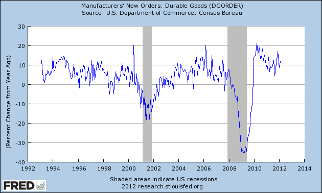
Durable Goods New Orders – Long-Term Charts Through February 2012


Many people place emphasis on Durable Goods New Orders as a prominent economic indicator and/or leading economic indicator.

For reference, here are a few charts depicting this measure.

First, from the St. Louis Fed site (FRED), a chart through February, last updated on March 28.  This February value is 211,765 ($ Millions) :

(click on charts to enlarge images)


-

Here is the chart depicting this measure on a Percentage Change from a Year Ago basis:


-

Lastly, a chart from Doug Short’s post of March 28 titled “Durable Goods Orders at 2.2%, Below Expectations” showing the Durable Goods New Orders vs. the S&P500's monthly average of daily closes:


_____

The Special Note summarizes my overall thoughts about our economic situation

SPX at 1393.26 as this post is written

Wednesday, March 28, 2012

The S&P500 Vs. The Shanghai Stock Exchange Composite Index – March 28, 2012


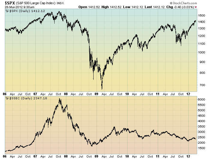
Starting on May 3, 2010 I have written posts concerning the notable divergence that has occurred between the S&P500 and Chinese (Shanghai Composite) stock markets.

The chart below illustrates this divergence; it shows the S&P500 vs. the Shanghai Composite on a daily basis, since 2006:

(click on chart to enlarge image)(chart courtesy of StockCharts.com; chart creation and annotation by the author)


-

It is notable that the Shanghai Composite led the SPX (S&P500) significantly in late ’08 – early ’09, yet it has been (gradually) declining since that time.

I continue to find this divergence between the S&P500 and  Shanghai Composite to be notable and disconcerting, on an “all things considered” basis.
_____

The Special Note summarizes my overall thoughts about our economic situation

SPX at 1409.82 as this post is written

Monday, March 26, 2012

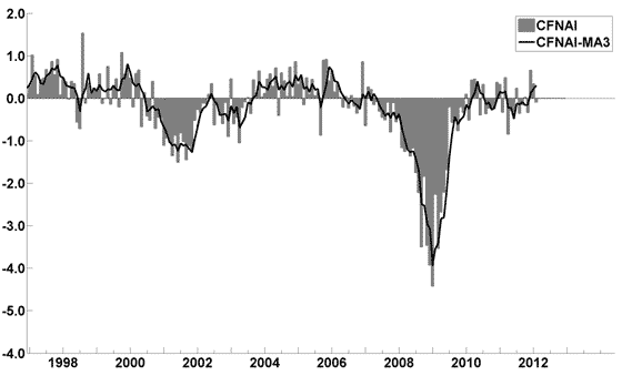
Updates On Economic Indicators March 2012


Here is an update on various indicators that are supposed to predict and/or depict economic activity.  These indicators have been discussed in previous blog posts:

The March Chicago Fed National Activity Index (CFNAI)(pdf) updated as of March 26, 2012:


-


An excerpt from the March 22 update titled “Index forecasts weaker growth” :
The February update of the USA TODAY/IHS Global Insight Economic Outlook Index shows real GDP growth, at a six-month annualized growth rate, increasing to 2.5% in March and April and then slowing to 2.1% in July. While employment, housing (mostly the multifamily sector) and consumer spending are slowly recovering, concerns about the Eurozone and world growth continue.
-


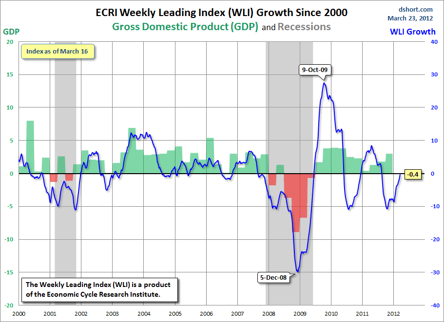
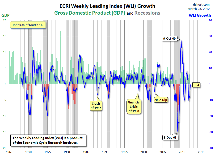
As of 3/23/12 the WLI was at 125.7 and the WLI, Gr. was at -.4%.

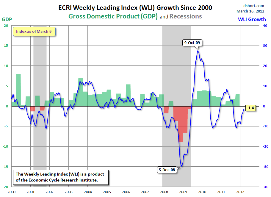
A chart of the WLI, Gr. since 2000, from Doug Short’s blog of March 23 titled "ECRI Indicators Improve, But Beware the 'Yo-Yo Years" :


-


no current value available

-


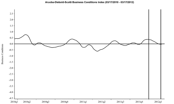
Here is the latest chart, depicting 3-17-10 to 3-17-12:


-


As per the March 22 release, the LEI was at 95.5 and the CEI was at 104.0 in February.

An excerpt from the March 22 release:
Added Ken Goldstein, economist at The Conference Board: “Recent data reflect an economy that improved this winter. To be sure, an unseasonably mild winter has contributed to many of the recent positive economic reports. But the consistent signal for the leading series suggests that progress on jobs, output, and incomes may continue through the summer months, if not beyond.”
_________

I post various indicators and indices because I believe they should be carefully monitored.  However, as those familiar with this blog are aware, I do not necessarily agree with what they depict or imply.
_____

The Special Note summarizes my overall thoughts about our economic situation

SPX at 1410.57 as this post is written

Sunday, March 25, 2012

Long-Term Charts Of The ECRI WLI & ECRI WLI, Gr. – March 23, 2012 Update


As I stated in my July 12, 2010 post ("ECRI WLI Growth History"):
For a variety of reasons, I am not as enamored with ECRI’s WLI and WLI Growth measures as many are.
However, I do think the measures are important and deserve close monitoring and scrutiny.
The movement of the ECRI WLI and WLI, Gr. is particularly notable at this time, as ECRI publicly announced on September 30, 2011 that the U.S. was “tipping into recession,” and ECRI has reaffirmed that view since, with the most recent statement on March 15 (“Why Our Recession Call Stands.”)

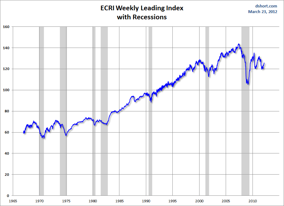
Below is a long-term chart, on a weekly basis through the March 23 release (data through March 16 with current value of 125.7), of the ECRI WLI (defined at ECRI’s glossary) from Doug Short’s blog post of March 23 titled "ECRI Indicators Improve, But Beware the 'Yo-Yo Years'" :

(click on charts to enlarge images)


-

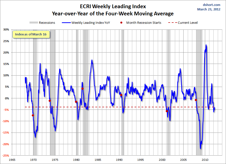
This next chart depicts, on a long-term basis, the year-over-year change in the 4-week moving average of the WLI through the March 23 release (data through March 16):


-

This last chart depicts, on a long-term basis, the WLI, Gr. through the March 23 release (data through March 16):


_________

I post various economic indicators and indices because I believe they should be carefully monitored.  However, as those familiar with this blog are aware, I do not necessarily agree with what they depict or imply.
_____

The Special Note summarizes my overall thoughts about our economic situation

SPX at 1397.11 as this post is written

Friday, March 23, 2012

Zillow March 2012 Home Price Expectations Survey – Summary & Comments


On March 20, the Zillow March 2012 Home Price Expectations Survey results were released.  This survey is done on a quarterly basis.

The accompanying image is seen below:


As one can see from the above chart, the average expectation is that the residential real estate market, as depicted by the Case-Shiller US National Home Price Index (NSA), will slowly climb from 2013 through 2016.

The detail of the March 2012 Home Price Expectations Survey (pdf) is interesting.  Of the 104 survey respondents, 8 (of the displayed responses) forecast a cumulative price decrease through 2016; and of those 8, only 1 (Gary Shilling) foresees a double-digit percentage cumulative price drop, at 16.98%.

The Median Cumulative Home Price Appreciation for years 2012-2016 is seen as -1.00%, .73%, 3.4%, 6.57%, and 10.46%, respectively.

For a variety of reasons, I continue to believe that even the most “bearish” of these forecasts (as seen in Gary Shilling's above-referenced forecast)  will prove too optimistic in hindsight.  Although a 16.98% decline is substantial, from a longer-term historical perspective such a decline is rather tame in light of the wild excesses that occurred over the “bubble” years.

I have written extensively about the residential real estate situation.  For a variety of reasons, it is exceedingly complex.  While many people continue to have an optimistic view regarding future residential real estate prices, in my opinion such a view is unsupported on an “all things considered” basis.  Furthermore, (even) from these price levels there exists outsized potential for a price decline of severe magnitude, unfortunately.  I discussed this downside, based upon historical price activity, in the October 24, 2010 post titled “What’s Ahead For The Housing Market – A Look At The Charts.”
_____

The Special Note summarizes my overall thoughts about our economic situation

SPX at 1391.76 as this post is written

St. Louis Financial Stress Index – March 22, 2012 Update


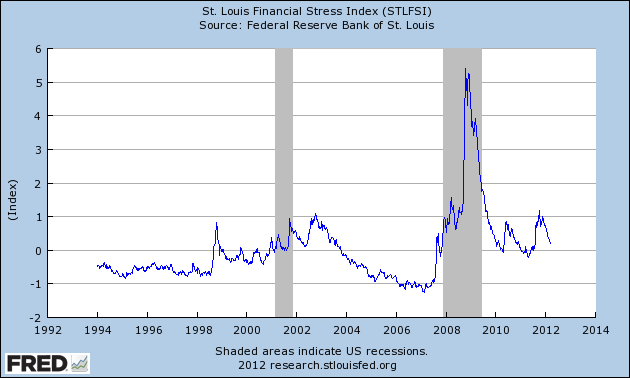
On March 28, 2011 I wrote a post ("The STLFSI") about the  STLFSI (St. Louis Fed’s Financial Stress Index) which is supposed to measure stress in the financial system.  For reference purposes, the most recent chart is seen below.  This chart was last updated on March 22, incorporating data from 12-31-93 to 3-16-12 on a weekly basis.  The present level is .189 :


_________

I post various indicators and indices because I believe they should be carefully monitored.  However, as those familiar with this blog are aware, I do not necessarily agree with what they depict or imply.
_____

The Special Note summarizes my overall thoughts about our economic situation

SPX at 1392.78 as this post is written

Thursday, March 22, 2012

March 2012 Duke/CFO Magazine Global Business Outlook Survey - Notable Excerpts


On March 7 the March Duke/CFO Magazine Global Business Outlook Survey (pdf) was released.  It contains a variety of statistics regarding how CFOs view business and economic conditions.
In this CFO Survey, I found the following to be notable excerpts:
Earnings and capital spending are both expected to rise more than 7 percent.
also:
The employment outlook has brightened, with U.S. finance executives expecting to increase their number of domestic full-time employees by 2.1 percent.
“The expected increase in employment is a welcome improvement over last quarter’s 1.5 percent forecast growth rate,” said Kate O’Sullivan, director of content development at CFO Magazine. “It indicates that national unemployment should fall below 8 percent in 2012.”
also:
The U.S. CFO Optimism Index, in which CFOs rate their confidence in the economy on a scale of 0 to 100, increased from 53 last quarter to 59 this quarter, equaling the index’s long-term average.
also:
CFOs cite weak consumer demand, intense pressure on profit margins, and the difficulty in attracting and retaining qualified employees among the top concerns for their companies.
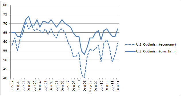
The CFO survey contains the Optimism Index chart, showing U.S. Optimism (with regard to the economy) at 59, as seen below:


-

It should be interesting to see how well the CFOs predict business and economic conditions going forward.   I discussed various aspects of this, and the importance of these predictions, in the July 9 2010 post titled “The Business Environment”.

(past posts on CEO and CFO Surveys can be found under the “CFO and CEO Confidence” tag)
_____

I post various economic forecasts because I believe they should be carefully monitored.  However, as those familiar with this blog are aware, I do not necessarily agree with many of the consensus estimates and much of the commentary in these forecast surveys.

_____

The Special Note summarizes my overall thoughts about our economic situation

SPX at 1402.89 as this post is written
Wednesday, March 21, 2012

Building Financial Danger – March 21, 2012 Update


On October 17, 2011 I wrote a post titled “Danger Signs In The Stock Market, Financial System And Economy.”  This post is a brief eighth update to that post.

My overall analysis indicates a continuing elevated and growing level of danger which contains  many worldwide and U.S.-specific “stresses” of a very complex nature.

I have written numerous posts of some of what I consider both ongoing and recent “negative developments.”  These developments, as well as other highly problematic conditions, have presented a highly perilous economic environment that endangers the overall financial system.

While many undoubtedly take comfort in the strong, remarkable performance of the stock market (as well as other asset classes), and recent various indications of increasing economic activity, my analysis continues to indicate that there are many reasons for tremendous concern, as seen in many fundamental economic, financial-market, and proprietary measures.  Many of these measures and disconcerting trends lack recognition and are not necessarily evident in "headline" statistics.

Since my January 11 post, I have been writing the following, which I continue to believe:
…my analyses indicate that the danger inherent in the financial system has reached a level at which a stock market crash – that would also involve (as seen in 2008) various other markets as well – has reached a level at which a near-term crash is (at least) a significant concern.
(note: the “next crash” has outsized significance and implications, as discussed in the post of January 6, "The Next Crash And Its Significance")

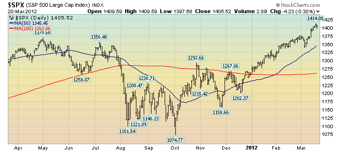
As reference, below is a one-year daily chart of the S&P500, indicating both the 50dma and 200dma as well as price labels.  The current price is 1405.52:

(click on chart to enlarge image)(chart courtesy of StockCharts.com; chart creation and annotation by the author)


_____

The Special Note summarizes my overall thoughts about our economic situation

SPX at 1405.52 as this post is written
Tuesday, March 20, 2012

The March 2012 Wall Street Journal Economic Forecast Survey


The March Wall Street Journal Economic Forecast Survey was published on March 19, 2012.  The headline is “So Far, Economy Hasn't Slipped On Oil Prices.”

The commentary largely focuses on the rising prices of oil and gasoline and the economists' views on how they will impact the economy.

Also, as seen in the Q&A section (in the spreadsheet), the economists put the probability of a U.S. recession in the next 12 months at 16%.


The current average forecasts among economists polled include the following:

GDP:
full-year 2012:  2.4%
full-year 2013:  2.7%
full-year 2014:  3.1%

Unemployment Rate:
December 2012: 8.0%
December 2013: 7.5%
December 2014:  6.8%

10-Year Treasury Yield:
December 2012: 2.55%
December 2013: 3.17%
December 2014:  3.83%

CPI:
December 2012:  2.4%
December 2013:  2.3%
December 2014:  2.6%

Crude Oil  ($ per bbl):
for 12/31/2012: $103.96

(note: I comment upon this WSJ Economic Forecast survey each month; commentary on past surveys can be found under the “Economic Forecasts” label)
_____

I post various economic forecasts because I believe they should be carefully monitored.  However, as those familiar with this blog are aware, I do not necessarily agree with many of the consensus estimates and much of the commentary in these forecast surveys.
_____

The Special Note summarizes my overall thoughts about our economic situation

SPX at 1409.75 as this post is written

Monday, March 19, 2012

Long-Term Charts Of The ECRI WLI & ECRI WLI, Gr. – March 16, 2012 Update


As I stated in my July 12, 2010 post ("ECRI WLI Growth History"):
For a variety of reasons, I am not as enamored with ECRI’s WLI and WLI Growth measures as many are.
However, I do think the measures are important and deserve close monitoring and scrutiny.
The movement of the ECRI WLI and WLI, Gr. is particularly notable at this time, as ECRI publicly announced on September 30 that the U.S. was “tipping into recession,” and ECRI has reaffirmed that view since, with the most recent statement on March 15 ("Why Our Recession Call Stands.")

Below is a long-term chart, on a weekly basis through the March 16 release (data through March 9 with current value of 125.1), of the ECRI WLI (defined at ECRI’s glossary) from Doug Short’s blog post of March 16 titled "ECRI Reaffirms Its Recession Call With New Analysis" :

(click on charts to enlarge images)

-

This next chart depicts, on a long-term basis, the WLI, Gr. through the March 16 release (data through March 9):


_________

I post various economic indicators and indices because I believe they should be carefully monitored.  However, as those familiar with this blog are aware, I do not necessarily agree with what they depict or imply.
_____

The Special Note summarizes my overall thoughts about our economic situation

SPX at 1404.17 as this post is written

Friday, March 16, 2012

ECRI's Recession Reaffirmation Of March 15, 2012 – Notable Excerpts


On September 30, 2011 ECRI released a statement titled “U.S. Economy Tipping Into Recession.”

Since that time, Lakshman Achuthan of ECRI has reaffirmed that view in various interviews, such as that on February 26, parts of which I highlighted in the February 28 post titled "The Velocity Of Money - Comments And Charts."

Yesterday, ECRI again reaffirmed their conclusion first made in the September 30 statement, that a U.S. recession is forthcoming.  The statement is titled "Why Our Recession Call Stands."  Here are a few excerpts that I find most notable:
Many have questioned why, in the face of improving economic data, ECRI has maintained its recession call. The straight answer is that the objective economic indicators we monitor, including those we make public, give us no other choice.
also: (note - USCI refers to ECRI's U.S. Coincident Index)
But the point remains that the USCI, which summarizes the definitive coincident economic indicators – including jobs – indicates declining growth in the U.S. economy.
also:
In spite of the efforts of monetary policy makers, actual U.S. economic growth has slowed, while WLI growth has barely budged from a two-and-a-half-year low.
The bigger question is, can unprecedented, concerted global monetary policy action repeal the business cycle? The objective coincident and leading indexes that we have always monitored are still telling us that it cannot.
_____

I post various economic forecasts because I believe they should be carefully monitored.  However, as those familiar with this blog are aware, I do not necessarily agree with the commentary in such forecasts.
_____

The Special Note summarizes my overall thoughts about our economic situation

SPX at 1402.60 as this post is written

Wednesday, March 14, 2012

Impact Of Interest Rates On The Federal Debt Interest Payments


On March 12, The Wall Street Journal published an editorial titled "Uncle Sam's Teaser Rate."  The subtitle is "Low interest rates disguise the federal debt bomb."

I find this editorial notable as it highlights a variety of important issues that lack recognition, including the refinancing schedule of U.S. Treasury debt, the sensitivity of debt interest payments to rising interest rates, and the Federal Reserve being among the largest buyers of U.S. debt.

A few notable excerpts from the editorial include:
First, a couple facts: the U.S. Treasury currently has $10.7 trillion in outstanding publicly-held debt, and more than $8 trillion of it must be repaid within the next seven years. More than $5 trillion falls due within the next 36 months.
This relatively short-term debt sheet is no accident. Like a subprime borrower opting for a low teaser rate, the government has structured its debt to keep current interest payments low. This is a political temptation for every Administration because it means lower budget deficits on its watch.
also:
As of January 2012, taking into account all the various notes and bonds issued by the federal government to the public, Uncle Sam is paying an average interest rate of 2.24%. The government expects to spend in the neighborhood of $225 billion this year making interest payments.
also:
If the government had to pay the 5% rate that it was offering before the financial crisis on today's debt, the annual interest payments would be $535 billion...
 _____

The Special Note summarizes my overall thoughts about our economic situation

SPX at 1392.92 as this post is written

March 13 Gallup Poll On Economic Confidence – Notable Excerpts


On March 13, Gallup released a poll titled “U.S. Economic Confidence Matches Best in Four Years.”

A few notable excerpts:
U.S. economic confidence improved sharply to -18 in the week ending March 11 from -25 the prior week -- the highest since the week ending Feb. 13, 2011, when it was also -18. The -18 readings this year and last are the highest weekly levels Gallup has recorded since it started tracking confidence daily in January 2008.
also:
The percentage of Americans saying the economy is "getting better" increased to 43% last week, while the percentage saying it is "getting worse" fell to 53%. Both of these measures are at their best levels since the 43% "getting better" and 52% "getting worse" of the week ending Feb. 13, 2011.
In a separate question, consumers' "poor" rating of the economy is now at 39%. This is the lowest "poor" rating for current economic conditions since the week ending March 9, 2008.
also:
This improvement in consumer perceptions is taking place despite sharply higher gas prices at the pump. In this regard, Gallup data find gas prices would need to climb to more than $5 per gallon before consumers would need to significantly alter their lifestyles.
_____

The Special Note summarizes my overall thoughts about our economic situation

SPX at 1397.52 as this post is written

Tuesday, March 13, 2012

The Level Of The VIX And The VIX Futures


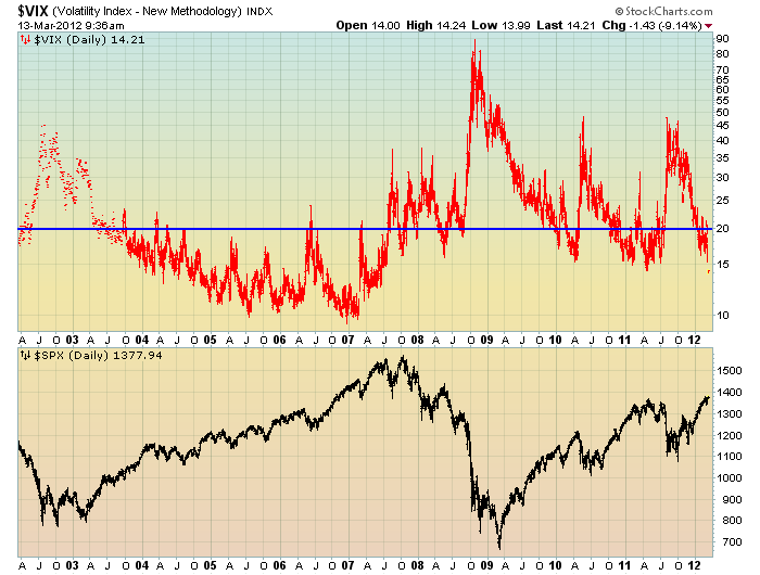
In the February 7 ("The VIX Level Of 20 And Its Continual Significance") as well as the February 6 ("Notable Technical And Sentiment Extremes In The Stock Market") posts I discussed various notable aspects of the stock market, ones that I viewed as problematic and worrisome.

In this post, I would like to provide an update on two of those aspects.  First, at yesterday's close, the VIX was at 15.64.  As I discussed in the aforementioned February 7 post:
In addition, when one views the VIX compared to the stock market (S&P500) over the last few years, one might conclude that a VIX level under 20 signifies investor overconfidence and/or complacency, as the stock market has often reacted in a sharply negative manner after sustained VIX advances above the 20 level.
Below is a chart displaying the VIX, in red, on a LOG scale, 10-year daily basis through this morning's current level of 14.21.  Below the VIX is the S&P500 :

(click on chart to enlarge image)(chart courtesy of StockCharts.com; chart creation and annotation by the author)


-

In addition, the price levels of the VIX vs. the VIX futures is highly notable.  I discussed this aspect in the aforementioned February 6 post.

At this moment, with the S&P500 at 1378.11, the VIX is at 14.32, while some VIX futures are at the following levels:

March VIX futures = 17.40
April VIX futures= 21.55
May VIX futures = 23.60
June VIX futures =24.85
August futures = 26.95
September futures =27.70

I view this spread as being highly outsized and is one of many “red flags” in the market.
_____

The Special Note summarizes my overall thoughts about our economic situation

SPX at 1378.11 as this post is written

Monday, March 12, 2012

Long-Term Charts Of The ECRI WLI & ECRI WLI, Gr. – March 9, 2012 Update


As I stated in my July 12, 2010 post ("ECRI WLI Growth History"):
For a variety of reasons, I am not as enamored with ECRI’s WLI and WLI Growth measures as many are.
However, I do think the measures are important and deserve close monitoring and scrutiny.
The movement of the ECRI WLI and WLI, Gr. is particularly notable at this time, as ECRI publicly announced on September 30 that the U.S. was “tipping into recession,” and have reaffirmed that view recently, such as on February 24.  I featured excerpts from their September 30 statement  in the October 3 post ("ECRI Recession Statement Of September 30 – Notable Excerpts")

Below is a long-term chart, on a weekly basis through March 9, of the ECRI WLI (defined at ECRI’s glossary) from Doug Short’s blog post of March 9 titled “ECRI's Weekly Leading Index Improves (Slightly) Yet Again” :

(click on charts to enlarge images)


-

This next chart depicts, on a long-term basis, the WLI, Gr. through March 9:


_________

I post various indicators and indices because I believe they should be carefully monitored.  However, as those familiar with this blog are aware, I do not necessarily agree with what they depict or imply.

_____

The Special Note summarizes my overall thoughts about our economic situation

SPX at 1370.87 as this post is written