Tuesday, July 31, 2018

Consumer Confidence Surveys – As Of July 31, 2018

The Doug Short site had a post of July 31, 2018 (“Consumer Confidence Increases Marginally in July“) that displays the latest Conference Board Consumer Confidence and Thomson/Reuters University of Michigan Consumer Sentiment Index charts.  They are presented below:
(click on charts to enlarge images)
Conference Board Consumer Confidence Index
University of Michigan Consumer Sentiment Index
There are a few aspects of the above charts that I find highly noteworthy.  Of course, until the sudden upswing in 2014, the continued subdued absolute levels of these two surveys was disconcerting.
Also, I find the “behavior” of these readings to be quite disparate as compared to the other post-recession periods, as shown in the charts between the gray shaded areas (the gray areas denote recessions as defined by the NBER.)
While I don’t believe that confidence surveys should be overemphasized, I find these readings to be very problematical, especially in light of a variety of other highly disconcerting measures highlighted throughout this site.
_____
The Special Note summarizes my overall thoughts about our economic situation
SPX at 2818.72 as this post is written

Employment Cost Index (ECI) – Second Quarter 2018

While the concept of Americans’ incomes can be defined in a number of ways, many prominent measures continue to show disconcerting trends.
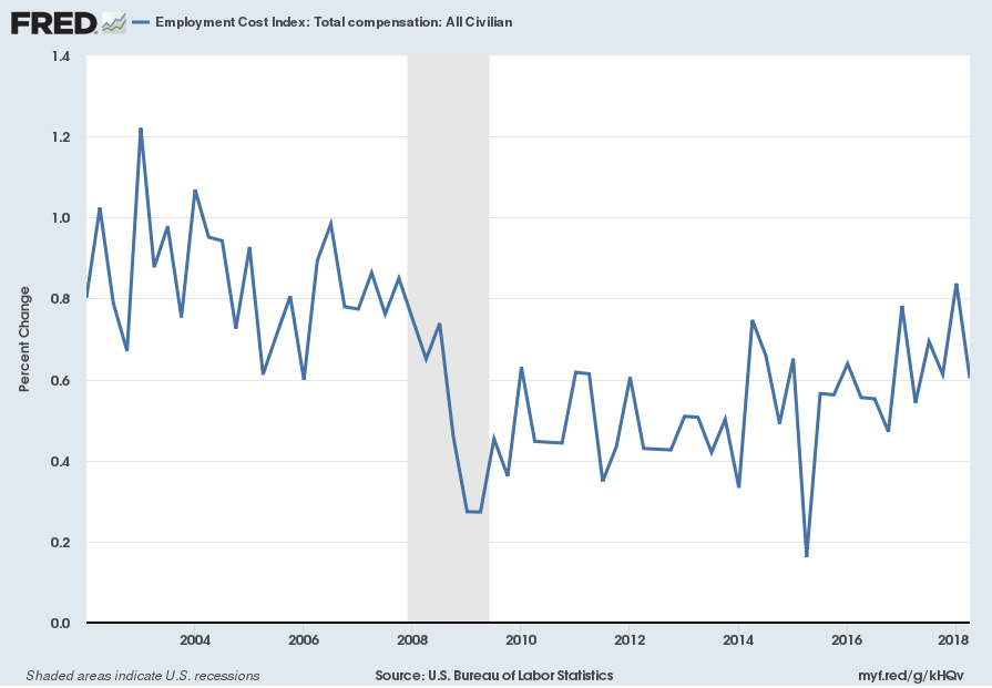
One prominent measure is the Employment Cost Index (ECI).
Here is a description from the BLS document titled “The Employment Cost Index:  what is it?“:
The Employment Cost Index (ECI) is a quarterly measure of the change in the price of labor, defined as compensation per employee hour worked. Closely watched by many economists, the ECI is an indicator of cost pressures within companies that could lead to price inflation for finished goods and services. The index measures changes in the cost of compensation not only for wages and salaries, but also for an extensive list of benefits. As a fixed-weight, or Laspeyres, index, the ECI controls for changes occurring over time in the industrial-occupational composition of employment.
On July 31, 2018, the ECI for the second quarter was released.  Here are two excerpts from the BLS release titled “Employment Cost Index – June 2018“:
Compensation costs for civilian workers increased 0.6 percent, seasonally adjusted, for the 3-month period ending in June 2018, the U.S. Bureau of Labor Statistics reported today. Wages and salaries (which make up about 70 percent of compensation costs) increased 0.5 percent and benefit costs (which make up the remaining 30 percent of compensation) increased 0.9 percent. (See tables A, 1, 2, and 3.)
also:
Compensation costs for civilian workers increased 2.8 percent for the 12-month period ending in June 2018 compared with a compensation costs increase of 2.4 percent in June 2017. Wages and salaries increased 2.8 percent for the 12-month period ending in June 2018 and increased 2.3 percent for the 12-month period ending in June 2017. Benefit costs increased 2.9 percent for the 12-month period ending in June 2018. In June 2017, the increase was 2.5 percent. (See tables A, 4, 8, and 12.)
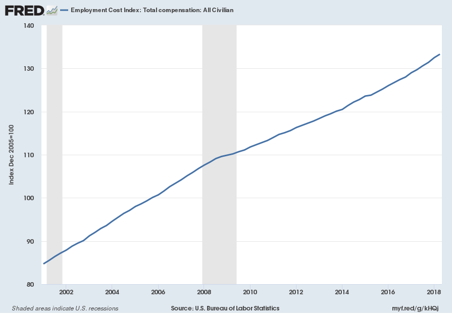
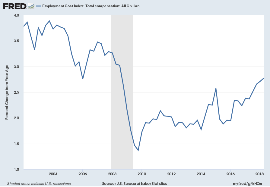
Below are three charts, updated on July 31, 2018 that depict various aspects of the ECI, which is seasonally adjusted (SA):
The first depicts the ECI, with a value of 133.3:
ECIALLCIV_7-31-18 133.3
source: US. Bureau of Labor Statistics, Employment Cost Index: Total compensation: All Civilian[ECIALLCIV], retrieved from FRED, Federal Reserve Bank of St. Louis, accessed July 31, 2018:
The second chart depicts the ECI on a “Percent Change from Year Ago” basis, with a value of 2.8%:
ECIALLCIV Percent Change From Year Ago
The third chart depicts the ECI on a “Percent Change” (from last quarter) basis, with a value of .6%:
ECIALLCIV_7-31-18 133.3 .6 Percent Change
_________
I post various indicators and indices because I believe they should be carefully monitored.  However, as those familiar with this site are aware, I do not necessarily agree with what they depict or imply.
_____
The Special Note summarizes my overall thoughts about our economic situation
SPX at 2821.28 as this post is written

Monday, July 30, 2018

Another Recession Probability Indicator – Updated Through Q1 2018

Each month I have been highlighting various estimates of U.S. recession probabilities.  The latest update was that of July 5, 2018, titled “Recession Probability Models – July 2018.”
While I don’t agree with the methodologies employed or the probabilities of impending economic weakness as depicted by these and other estimates, I do believe that the results of these models and estimates should be monitored.
Another probability of recession is provided by James Hamilton, and it is titled “GDP-Based Recession Indicator Index.”  A description of this index, as seen in FRED:
This index measures the probability that the U.S. economy was in a recession during the indicated quarter. It is based on a mathematical description of the way that recessions differ from expansions. The index corresponds to the probability (measured in percent) that the underlying true economic regime is one of recession based on the available data. Whereas the NBER business cycle dates are based on a subjective assessment of a variety of indicators that may not be released until several years after the event , this index is entirely mechanical, is based solely on currently available GDP data and is reported every quarter. Due to the possibility of data revisions and the challenges in accurately identifying the business cycle phase, the index is calculated for the quarter just preceding the most recently available GDP numbers. Once the index is calculated for that quarter, it is never subsequently revised. The value at every date was inferred using only data that were available one quarter after that date and as those data were reported at the time.
If the value of the index rises above 67% that is a historically reliable indicator that the economy has entered a recession. Once this threshold has been passed, if it falls below 33% that is a reliable indicator that the recession is over.
Additional reference sources for this index and its construction can be seen in the Econbrowser post of February 14, 2016 titled “Recession probabilities” as well as on the “The Econbrowser Recession Indicator Index” page.
Below is a chart depicting the most recent value of 2.7%, for the first quarter of 2018, last updated on July 27, 2018 (after the July 27, 2018 Gross Domestic Product Q2 2018 Advance Estimate (pdf)):
GDP-Based Recession Indicator Index
source:  Hamilton, James, GDP-Based Recession Indicator Index [JHGDPBRINDX], retrieved from FRED, Federal Reserve Bank of St. Louis on July 30, 2018:
_________
I post various indicators and indices because I believe they should be carefully monitored.  However, as those familiar with this site are aware, I do not necessarily agree with what they depict or imply.
_____
The Special Note summarizes my overall thoughts about our economic situation
SPX at 2807.33 as this post is written

Velocity Of Money – Charts Updated Through July 27, 2018

Here are three charts from the St. Louis Fed depicting the velocity of money in terms of the MZM, M1 and M2 money supply measures.
All charts reflect quarterly data through the 2nd quarter of 2018, and were last updated as of July 27, 2018.
Velocity of MZM Money Stock, current value = 1.321:
MZM money velocity chart
Data Source: FRED, Federal Reserve Economic Data, Federal Reserve Bank of St. Louis; accessed July 30, 2018:
Velocity of M1 Money Stock, current value = 5.578:
M1 money velocity chart
Data Source: FRED, Federal Reserve Economic Data, Federal Reserve Bank of St. Louis; accessed July 30, 2018:
Velocity of M2 Money Stock, current value = 1.454:
M2 money velocity chart
Data Source: FRED, Federal Reserve Economic Data, Federal Reserve Bank of St. Louis; accessed July 30, 2018:
_________
I post various indicators and indices because I believe they should be carefully monitored.  However, as those familiar with this site are aware, I do not necessarily agree with what they depict or imply.
_____
The Special Note summarizes my overall thoughts about our economic situation
SPX at 2818.82 as this post is written

Friday, July 27, 2018

Real GDP Chart Since 1947 With Trendline – 2nd Quarter 2018

For reference purposes, below is a chart from the Doug Short site post titled “Q2 GDP Advance Estimate: Real GDP at 4.1%” post of July 27, 2018, depicting Real GDP, with a trendline, as depicted.  This chart reflects the Gross Domestic Product Q2 2018 Advance Estimate (pdf) of July 27, 2018:
U.S. Real GDP and Its Historic Trend 18.51T
_________
I post various indicators and indices because I believe they should be carefully monitored.  However, as those familiar with this site are aware, I do not necessarily agree with what they depict or imply.
_____
The Special Note summarizes my overall thoughts about our economic situation
SPX at 2818.08 as this post is written

Long-Term Charts Of The ECRI WLI & ECRI WLI, Gr. – July 27, 2018 Update

As I stated in my July 12, 2010 post (“ECRI WLI Growth History“):
For a variety of reasons, I am not as enamored with ECRI’s WLI and WLI Growth measures as many are.
However, I do think the measures are important and deserve close monitoring and scrutiny.
Below are three long-term charts, from the Doug Short site’s ECRI update post of July 27, 2018 titled “ECRI Weekly Leading Index Update.”  These charts are on a weekly basis through the July 27, 2018 release, indicating data through July 20, 2018.
Here is the ECRI WLI (defined at ECRI’s glossary):
ECRI WLI 147.8
This next chart depicts, on a long-term basis, the Year-over-Year change in the 4-week moving average of the WLI:
ECRI WLI YoY of the Four-Week Moving Average 2.61 Percent
This last chart depicts, on a long-term basis, the WLI, Gr.:
ECRI WLI,Gr. .8 Percent
_________
I post various economic indicators and indices because I believe they should be carefully monitored.  However, as those familiar with this site are aware, I do not necessarily agree with what they depict or imply.
_____
The Special Note summarizes my overall thoughts about our economic situation
SPX at 2827.25 as this post is written

Thursday, July 26, 2018

Durable Goods New Orders – Long-Term Charts Through June 2018

Many people place emphasis on Durable Goods New Orders as a prominent economic indicator and/or leading economic indicator.
For reference, below are two charts depicting this measure.
First, from the St. Louis Fed site (FRED), a chart through June 2018, updated on July 26, 2018. This value is $251,884 ($ Millions):
(click on charts to enlarge images)
Durable Goods New Orders
Second, here is the chart depicting this measure on a “Percentage Change from a Year Ago” basis:
Durable Goods New Orders Percent Change From Year Ago
Data Source: FRED, Federal Reserve Economic Data, Federal Reserve Bank of St. Louis: Manufacturers’ New Orders:  Durable Goods [DGORDER]; U.S. Department of Commerce: Census Bureau; accessed July 26, 2018;
_________
I post various indicators and indices because I believe they should be carefully monitored.  However, as those familiar with this site are aware, I do not necessarily agree with what they depict or imply.
_____
The Special Note summarizes my overall thoughts about our economic situation
SPX at 2838.00 as this post is written

Wednesday, July 25, 2018

Chicago Fed National Financial Conditions Index (NFCI)

The St. Louis Fed’s Financial Stress Index (STLFSI) is one index that is supposed to measure stress in the financial system.  Its reading as of the July 19, 2018 update (reflecting data through July 13, 2018) is -1.181.
Of course, there are a variety of other measures and indices that are supposed to measure financial stress and other related issues, both from the Federal Reserve as well as from private sources.
Two other indices that I regularly monitor include the Chicago Fed National Financial Conditions Index (NFCI) as well as the Chicago Fed Adjusted National Financial Conditions Index (ANFCI).
Here are summary descriptions of each, as seen in FRED:
The National Financial Conditions Index (NFCI) measures risk, liquidity and leverage in money markets and debt and equity markets as well as in the traditional and “shadow” banking systems. Positive values of the NFCI indicate financial conditions that are tighter than average, while negative values indicate financial conditions that are looser than average.
The adjusted NFCI (ANFCI). This index isolates a component of financial conditions uncorrelated with economic conditions to provide an update on how financial conditions compare with current economic conditions.
For further information, please visit the Federal Reserve Bank of Chicago’s web site:
Below are the most recently updated charts of the NFCI and ANFCI, respectively.
The NFCI chart below was last updated on July 25, 2018 incorporating data from January 8, 1971 through July 20, 2018, on a weekly basis.  The July 20, 2018 value is -.83:
NFCI_7-25-18 -.83
Data Source: FRED, Federal Reserve Economic Data, Federal Reserve Bank of St. Louis; accessed July 25, 2018:
The ANFCI chart below was last updated on July 25, 2018 incorporating data from January 8,1971 through July 20, 2018, on a weekly basis.  The July 20 value is -.55:
ANFCI_7-25-18 -.52
Data Source: FRED, Federal Reserve Economic Data, Federal Reserve Bank of St. Louis; accessed July 25, 2018:
_________
I post various indicators and indices because I believe they should be carefully monitored.  However, as those familiar with this site are aware, I do not necessarily agree with what they depict or imply.
_____
The Special Note summarizes my overall thoughts about our economic situation
SPX at 2846.72 as this post is written

Tuesday, July 24, 2018

Money Supply Charts Through June 2018

For reference purposes, below are two sets of charts depicting growth in the money supply.
The first shows the MZM (Money Zero Maturity), defined in FRED as the following:
M2 less small-denomination time deposits plus institutional money funds.
Money Zero Maturity is calculated by the Federal Reserve Bank of St. Louis.
Here is the “MZM Money Stock” (seasonally adjusted) chart, updated on July 20, 2018 depicting data through June 2018, with a value of $15,524.8 Billion:
MZMSL
Here is the “MZM Money Stock” chart on a “Percent Change From Year Ago” basis, with a current value of 4.1%:
MZMSL_7-20-18 15524.8 4.1 Percent Change From Year Ago
Data Source: FRED, Federal Reserve Economic Data, Federal Reserve Bank of St. Louis; accessed July 24, 2018:
The second set shows M2, defined in FRED as the following:
M2 includes a broader set of financial assets held principally by households. M2 consists of M1 plus: (1) savings deposits (which include money market deposit accounts, or MMDAs); (2) small-denomination time deposits (time deposits in amounts of less than $100,000); and (3) balances in retail money market mutual funds (MMMFs). Seasonally adjusted M2 is computed by summing savings deposits, small-denomination time deposits, and retail MMMFs, each seasonally adjusted separately, and adding this result to seasonally adjusted M1.
Here is the “M2 Money Stock” (seasonally adjusted) chart, updated on July 19, 2018, depicting data through June 2018, with a value of $14,112.4 Billion:
M2SL_7-19-18 14112.4
Here is the “M2 Money Stock” chart on a “Percent Change From Year Ago” basis, with a current value of 4.2%:
M2SL_7-19-18 14112.4 4.2 Percent Change From Year Ago
Data Source: FRED, Federal Reserve Economic Data, Federal Reserve Bank of St. Louis; accessed July 24, 2018:
_____
The Special Note summarizes my overall thoughts about our economic situation
SPX at 2824.89 as this post is written

Monday, July 23, 2018

Updates Of Economic Indicators July 2018

Here is an update of various indicators that are supposed to predict and/or depict economic activity. These indicators have been discussed in previous blog posts:
The July 2018 Chicago Fed National Activity Index (CFNAI) updated as of July 23, 2018:
The CFNAI, with current reading of .43:
CFNAI_7-23-18 .43
source:  Federal Reserve Bank of Chicago, Chicago Fed National Activity Index [CFNAI], retrieved from FRED, Federal Reserve Bank of St. Louis, July 23, 2018;
The CFNAI-MA3, with current reading of .16:
CFNAIMA3_7-23-18 .16
source:  Federal Reserve Bank of Chicago, Chicago Fed National Activity Index: Three Month Moving Average [CFNAIMA3], retrieved from FRED, Federal Reserve Bank of St. Louis, July 23, 2018;
As of July 20, 2018 (incorporating data through July 13, 2018) the WLI was at 148.3 and the WLI, Gr. was at .9%.
Here is the latest chart, depicting the ADS Index from December 31, 2007 through July 14, 2018:
ADS Index
The Conference Board Leading (LEI), Coincident (CEI) Economic Indexes, and Lagging Economic Indicator (LAG):
As per the July 19, 2018 press release, titled “The Conference Board Leading Economic Index (LEI) for the U.S. Increased in June” (pdf) the LEI was at 109.8, the CEI was at 103.9, and the LAG was 105.4 in June.
An excerpt from the release:
“The U.S. LEI increased in June, pointing to continuing solid growth in the U.S. economy,” said Ataman Ozyildirim, Director of Business Cycles and Growth Research at The Conference Board. “The widespread growth in leading indicators, with the exception of housing permits which declined once again, does not suggest any considerable growth slowdown in the short-term.”
_________
I post various indicators and indices because I believe they should be carefully monitored.  However, as those familiar with this site are aware, I do not necessarily agree with what they depict or imply.
_____
The Special Note summarizes my overall thoughts about our economic situation
SPX at 2806.41 as this post is written

The U.S. Economic Situation – July 23, 2018 Update

Perhaps the main reason that I write of our economic situation is that I continue to believe, based upon various analyses, that our economic situation is in many ways misunderstood.  While no one likes to contemplate a future rife with economic adversity, current and future economic problems must be properly recognized and rectified if high-quality, sustainable long-term economic vitality is to be realized.
There are an array of indications and other “warning signs” – many readily apparent – that current economic activity and financial market performance is accompanied by exceedingly perilous dynamics.
I have written extensively about this peril, including in the following:
Building Financial Danger” (ongoing updates)
My analyses continues to indicate that the growing level of financial danger will lead to the next stock market crash that will also involve (as seen in 2008) various other markets as well.  Key attributes of this next crash is its outsized magnitude (when viewed from an ultra-long term historical perspective) and the resulting economic impact.  This next financial crash is of tremendous concern, as my analyses indicate it will lead to a Super Depression – i.e. an economy characterized by deeply embedded, highly complex, and difficult-to-solve problems.
For long-term reference purposes, here is a chart of the Dow Jones Industrial Average since 1900, depicted on a monthly basis using a LOG scale (updated through July 20, 2018, with a last value of 25058.12):
(click on chart to enlarge image)(chart courtesy of StockCharts.com)
DJIA 1900-July 20, 2018
_____
The Special Note summarizes my overall thoughts about our economic situation
SPX at 2806.21 as this post is written