Wednesday, August 30, 2017

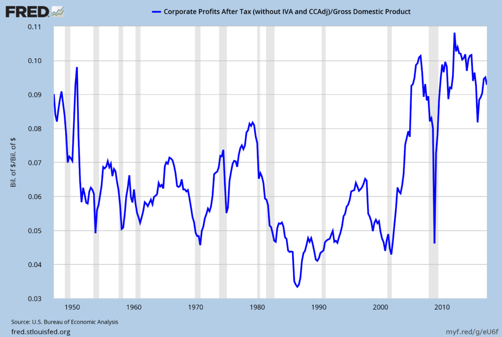
Corporate Profits As A Percentage Of GDP

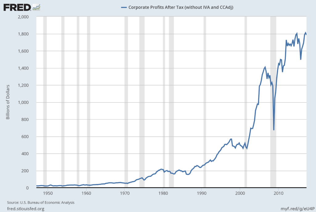
In the last post (“2nd Quarter 2017 Corporate Profits“) I displayed, for reference purposes, a long-term chart depicting Corporate Profits After Tax.
There are many ways to view this measure, both on an absolute as well as relative basis.
One relative measure is viewing Corporate Profits as a Percentage of GDP.  I feel that this metric is important for a variety of reasons.  As well, the measure is important to a variety of parties, including investors, businesses, and government policy makers.
As one can see from the long-term chart below (updated through the second quarter), (After Tax) Corporate Profits as a Percentage of GDP is at levels that can be seen as historically (very) high.  While there are many reasons as to why this is so, from a going-forward standpoint I think it is important to recognize both that such a notable condition exists, as well as contemplate and/or plan for such factors and conditions that would come about if (and in my opinion “when”) a more historically “normal” ratio of Corporate Profits as a Percentage of GDP occurs.  This topic can be very complex in nature, and depends upon myriad factors.  In my opinion it deserves far greater recognition.
(click on chart to enlarge image)
Corporate Profits As A Percentage Of GDP
Data Source: FRED, Federal Reserve Economic Data, Federal Reserve Bank of St. Louis; accessed August 30, 2017
_____
The Special Note summarizes my overall thoughts about our economic situation
SPX at 2458.59 as this post is written
2nd Quarter 2017 Corporate Profits

Today’s (August 30, 2017) GDP release (Q2, 2nd Estimate)(pdf) was accompanied by the BLS Corporate Profits report for the 2nd Quarter.
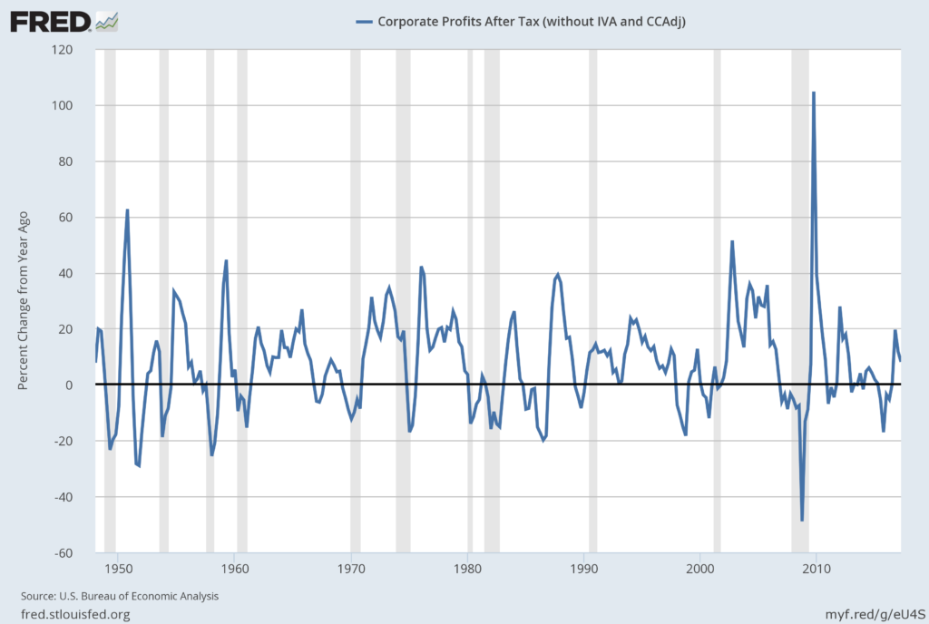
Of course, there are many ways to adjust and depict overall Corporate Profits.  For reference purposes, here is a chart from the St. Louis Federal Reserve (FRED) showing the Corporate Profits After Tax (without IVA and CCAdj) (last updated August 30, 2017, with a value of $1785.9 Billion SAAR):
Corporate Profits After Tax
Here is the Corporate Profits After Tax measure shown on a Percentage Change from a Year Ago perspective:
Corporate Profits After Tax Percent Change From Year Ago
Data Source: FRED, Federal Reserve Economic Data, Federal Reserve Bank of St. Louis: Corporate Profits After Tax [CP]; U.S. Department of Commerce: Bureau of Economic Analysis; accessed August 30, 2017; https://research.stlouisfed.org/fred2/series/CP
_________
I post various indicators and indices because I believe they should be carefully monitored.  However, as those familiar with this site are aware, I do not necessarily agree with what they depict or imply.
_____
The Special Note summarizes my overall thoughts about our economic situation
SPX at 2459.97 as this post is written
Chicago Fed National Financial Conditions Index (NFCI)

The St. Louis Fed’s Financial Stress Index (STLFSI) is one index that is supposed to measure stress in the financial system.  Its reading as of the August 24, 2017 update (reflecting data through August 18, 2017) is -1.48.
Of course, there are a variety of other measures and indices that are supposed to measure financial stress and other related issues, both from the Federal Reserve as well as from private sources.
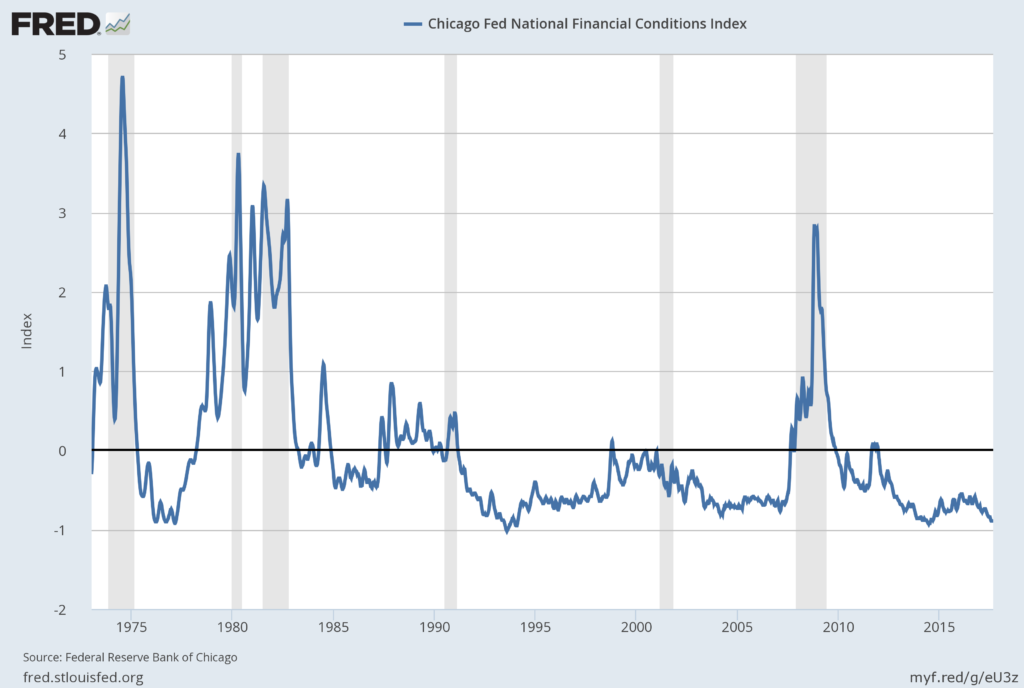
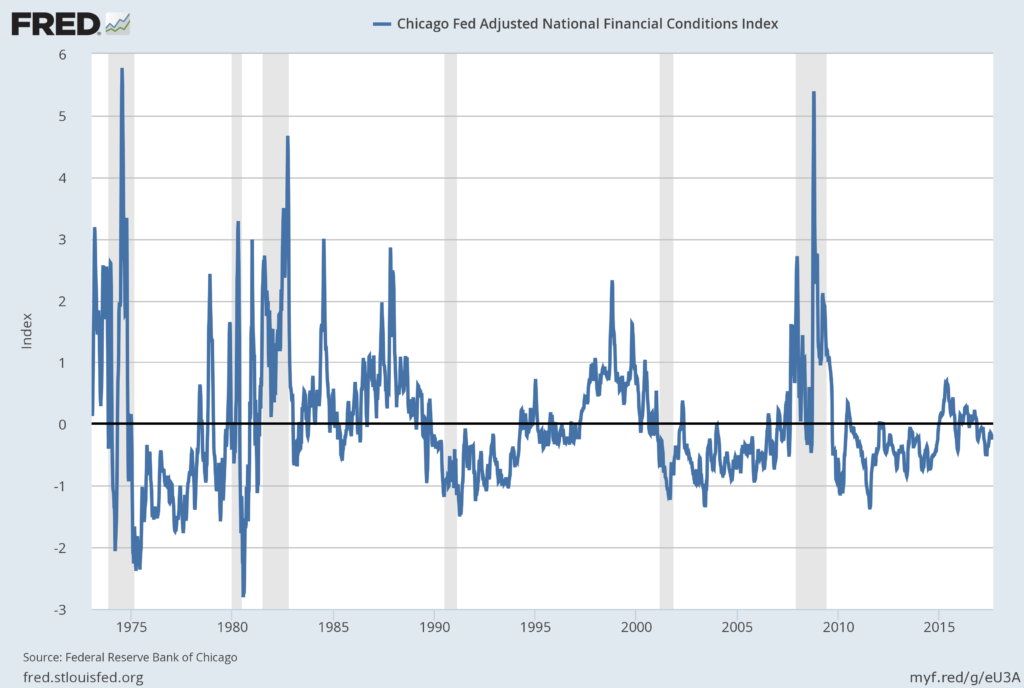
Two other indices that I regularly monitor include the Chicago Fed National Financial Conditions Index (NFCI) as well as the Chicago Fed Adjusted National Financial Conditions Index (ANFCI).
Here are summary descriptions of each, as seen in FRED:
The National Financial Conditions Index (NFCI) measures risk, liquidity and leverage in money markets and debt and equity markets as well as in the traditional and “shadow” banking systems. Positive values of the NFCI indicate financial conditions that are tighter than average, while negative values indicate financial conditions that are looser than average.
The adjusted NFCI (ANFCI). This index isolates a component of financial conditions uncorrelated with economic conditions to provide an update on how financial conditions compare with current economic conditions.
For further information, please visit the Federal Reserve Bank of Chicago’s web site:
Below are the most recently updated charts of the NFCI and ANFCI, respectively.
The NFCI chart below was last updated on August 30, 2017 incorporating data from January 5,1973 through August 25, 2017, on a weekly basis.  The August 25, 2017 value is -.87:
NFCI_8-30-17
Data Source: FRED, Federal Reserve Economic Data, Federal Reserve Bank of St. Louis; accessed August 30, 2017:
The ANFCI chart below was last updated on August 30, 2017 incorporating data from January 5,1973 through August 25, 2017, on a weekly basis.  The August 25 value is -.17:
ANFCI_8-30-17
Data Source: FRED, Federal Reserve Economic Data, Federal Reserve Bank of St. Louis; accessed August 30, 2017:
_________
I post various indicators and indices because I believe they should be carefully monitored.  However, as those familiar with this site are aware, I do not necessarily agree with what they depict or imply.
_____
The Special Note summarizes my overall thoughts about our economic situation
SPX at 2458.61 as this post is written
Tuesday, August 29, 2017

House Prices Reference Chart

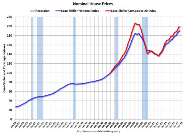
As a reference for long-term house price index trends, below is a chart, updated with the most current data (through June) from the CalculatedRisk blog post of August 29, 2017 titled “Real Prices and Price-to-Rent Ratio in June”:
(click on chart to enlarge image)
house price indexes
_________
I post various indicators and indices because I believe they should be carefully monitored.  However, as those familiar with this site are aware, I do not necessarily agree with what they depict or imply.
_____
The Special Note summarizes my overall thoughts about our economic situation
SPX at 2443.46 as this post is written
Monday, August 28, 2017

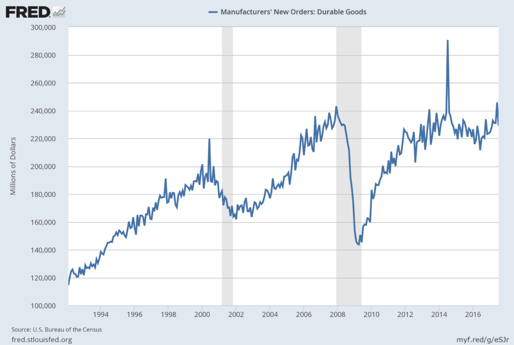
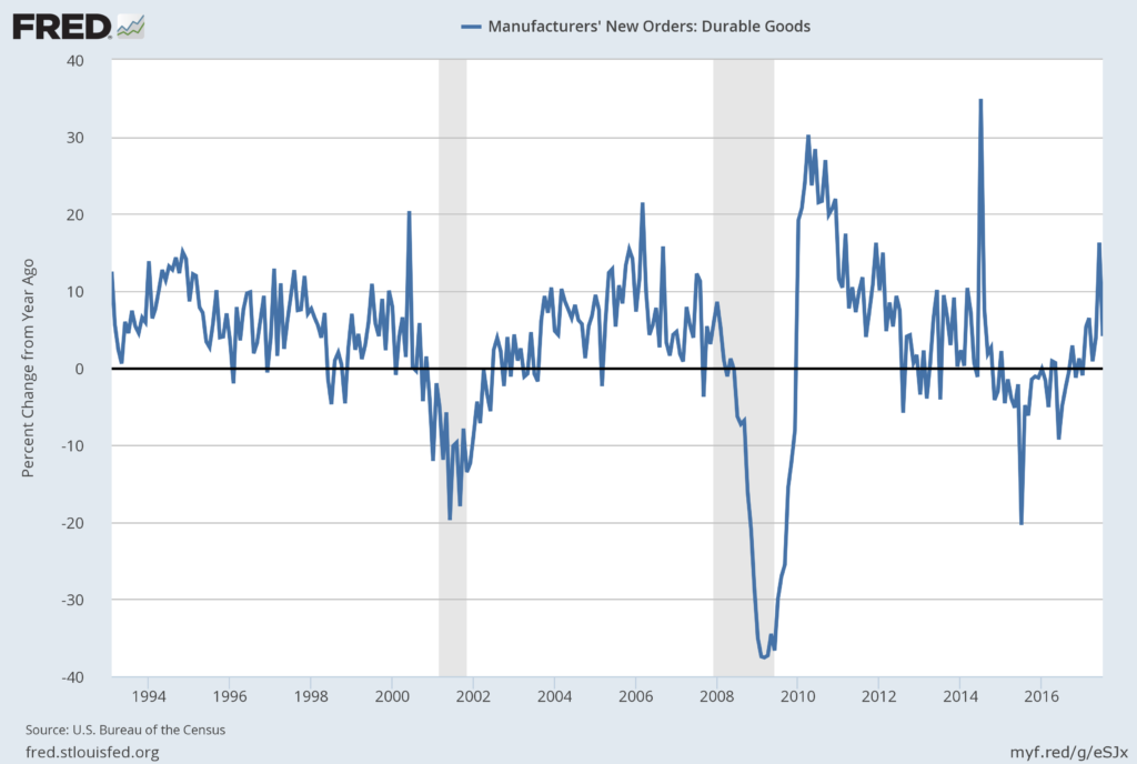
Durable Goods New Orders – Long-Term Charts Through July 2017

Many people place emphasis on Durable Goods New Orders as a prominent economic indicator and/or leading economic indicator.
For reference, below are two charts depicting this measure.
First, from the St. Louis Fed site (FRED), a chart through July 2017, updated on August 25, 2017. This value is $229,161 ($ Millions):
(click on charts to enlarge images)
Durable Goods New Orders
Second, here is the chart depicting this measure on a “Percentage Change from a Year Ago” basis:
Durable Goods New Orders percent change from year ago
Data Source: FRED, Federal Reserve Economic Data, Federal Reserve Bank of St. Louis: Manufacturers’ New Orders:  Durable Goods [DGORDER]; U.S. Department of Commerce: Census Bureau; accessed August 28, 2017;
_________
I post various indicators and indices because I believe they should be carefully monitored.  However, as those familiar with this site are aware, I do not necessarily agree with what they depict or imply.
_____
The Special Note summarizes my overall thoughts about our economic situation
SPX at 2444.35 as this post is written
Wednesday, August 23, 2017

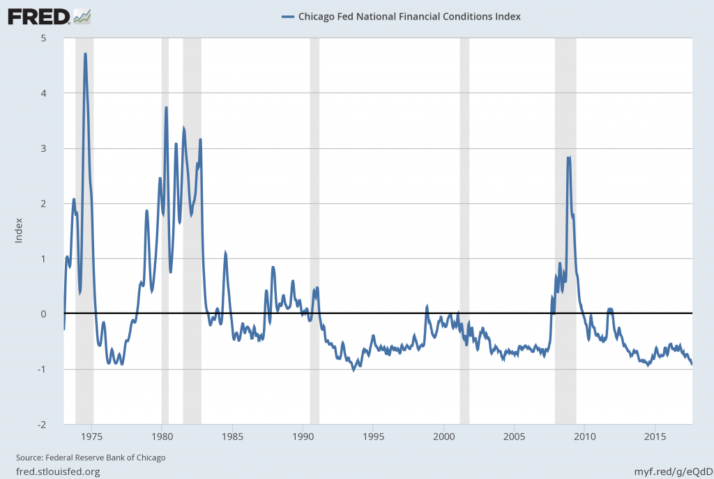
Chicago Fed National Financial Conditions Index (NFCI)

The St. Louis Fed’s Financial Stress Index (STLFSI) is one index that is supposed to measure stress in the financial system.  Its reading as of the August 17, 2017 update (reflecting data through August 11, 2017) is -1.507.

Of course, there are a variety of other measures and indices that are supposed to measure financial stress and other related issues, both from the Federal Reserve as well as from private sources.

Two other indices that I regularly monitor include the Chicago Fed National Financial Conditions Index (NFCI) as well as the Chicago Fed Adjusted National Financial Conditions Index (ANFCI).

Here are summary descriptions of each, as seen in FRED:
The National Financial Conditions Index (NFCI) measures risk, liquidity and leverage in money markets and debt and equity markets as well as in the traditional and “shadow” banking systems. Positive values of the NFCI indicate financial conditions that are tighter than average, while negative values indicate financial conditions that are looser than average. 
The adjusted NFCI (ANFCI). This index isolates a component of financial conditions uncorrelated with economic conditions to provide an update on how financial conditions compare with current economic conditions. 
For further information, please visit the Federal Reserve Bank of Chicago’s web site: 
http://www.chicagofed.org/webpages/publications/nfci/index.cfm
Below are the most recently updated charts of the NFCI and ANFCI, respectively.

The NFCI chart below was last updated on August 23, 2017 incorporating data from January 5,1973 through August 18, 2017, on a weekly basis.  The August 18, 2017 value is -.88:

NFCI 8-23-17

Data Source: FRED, Federal Reserve Economic Data, Federal Reserve Bank of St. Louis; accessed August 23, 2017:

http://research.stlouisfed.org/fred2/series/NFCI


The ANFCI chart below was last updated on August 23, 2017 incorporating data from January 5,1973 through August 18, 2017, on a weekly basis.  The August 18 value is -.18:

ANFCI 8-23-17

Data Source: FRED, Federal Reserve Economic Data, Federal Reserve Bank of St. Louis; accessed August 23, 2017:

http://research.stlouisfed.org/fred2/series/ANFCI

_________

I post various indicators and indices because I believe they should be carefully monitored.  However, as those familiar with this site are aware, I do not necessarily agree with what they depict or imply.
_____

The Special Note summarizes my overall thoughts about our economic situation

SPX at 2448.70 as this post is written
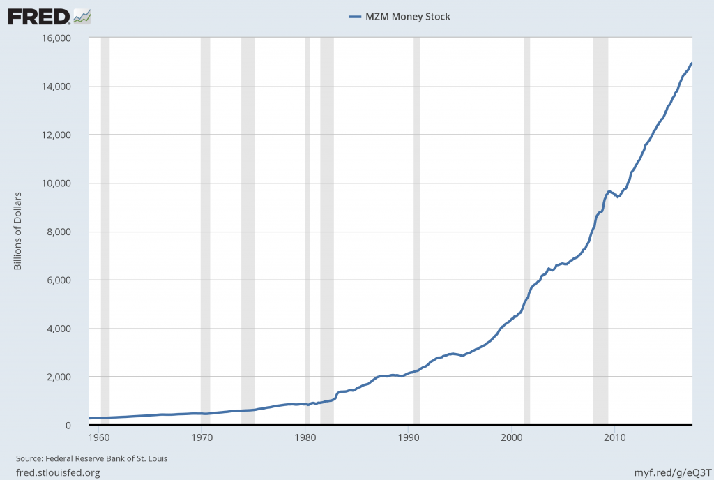
Money Supply Charts Through July 2017

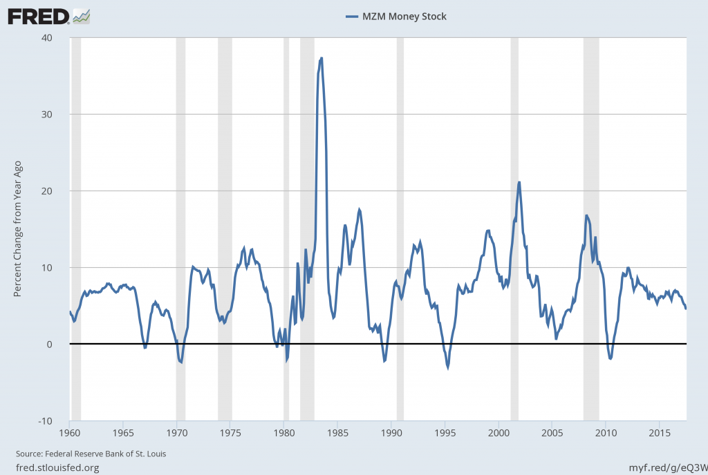
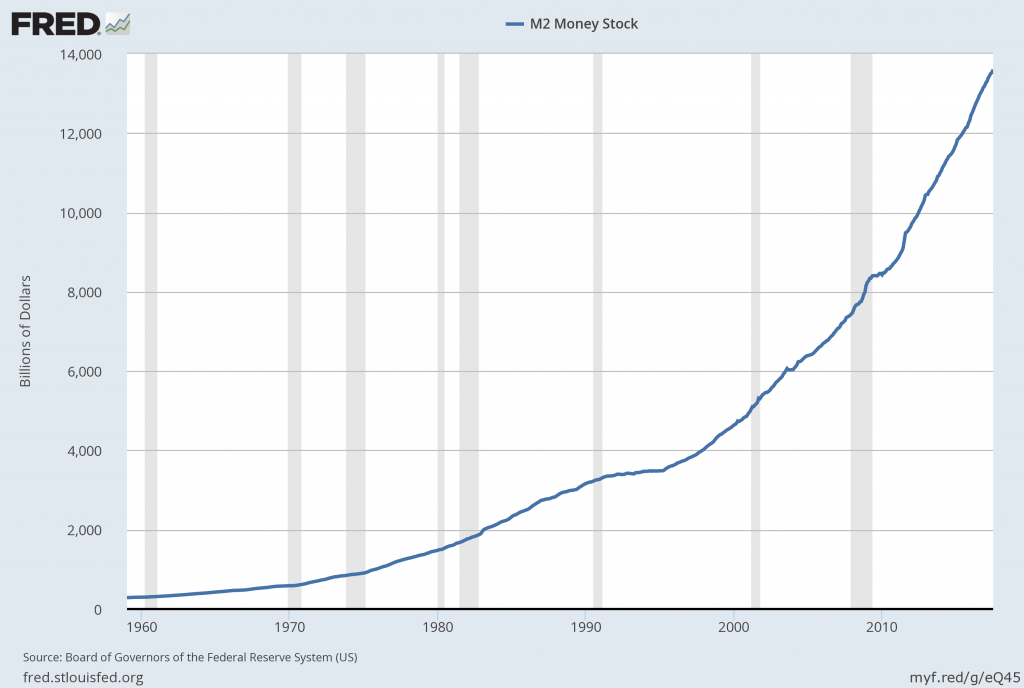
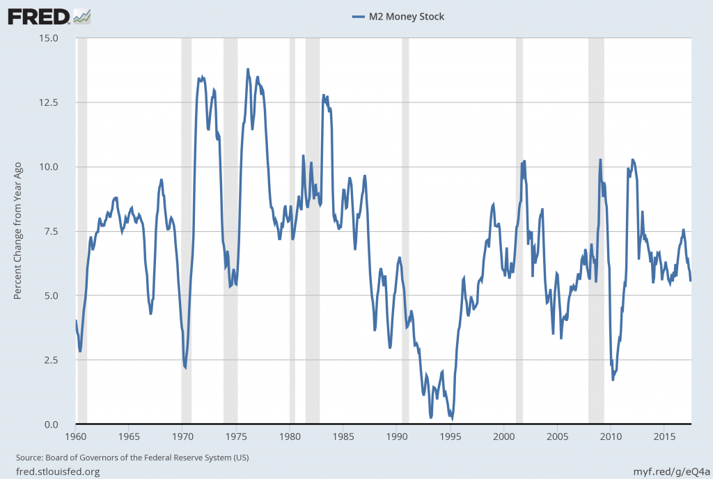
For reference purposes, below are two sets of charts depicting growth in the money supply.

The first shows the MZM (Money Zero Maturity), defined in FRED as the following:
M2 less small-denomination time deposits plus institutional money funds.
Money Zero Maturity is calculated by the Federal Reserve Bank of St. Louis.
Here is the “MZM Money Stock” (seasonally adjusted) chart, updated on August 18, 2017 depicting data through July 2017, with a value of $14,968.0 Billion:

MZMSL

Here is the “MZM Money Stock” chart on a “Percent Change From Year Ago” basis, with a current value of 4.5%:

MZMSL Percent Change From Year Ago

Data Source: FRED, Federal Reserve Economic Data, Federal Reserve Bank of St. Louis; accessed August 23, 2017:

https://research.stlouisfed.org/fred2/series/MZMSL

The second set shows M2, defined in FRED as the following:
M2 includes a broader set of financial assets held principally by households. M2 consists of M1 plus: (1) savings deposits (which include money market deposit accounts, or MMDAs); (2) small-denomination time deposits (time deposits in amounts of less than $100,000); and (3) balances in retail money market mutual funds (MMMFs). Seasonally adjusted M2 is computed by summing savings deposits, small-denomination time deposits, and retail MMMFs, each seasonally adjusted separately, and adding this result to seasonally adjusted M1.
Here is the “M2 Money Stock” (seasonally adjusted) chart, updated on August 17, 2017, depicting data through July 2017, with a value of $13,602.2 Billion:

M2SL

Here is the “M2 Money Stock” chart on a “Percent Change From Year Ago” basis, with a current value of 5.6%:

M2SL Percent Change From A Year Ago

Data Source: FRED, Federal Reserve Economic Data, Federal Reserve Bank of St. Louis; accessed August 23, 2017:

https://research.stlouisfed.org/fred2/series/M2SL

_____

The Special Note summarizes my overall thoughts about our economic situation

SPX at 2452.51 as this post is written
The U.S. Economic Situation – August 23, 2017 Update

Perhaps the main reason that I write of our economic situation is that I continue to believe, based upon various analyses, that our economic situation is in many ways misunderstood.  While no one likes to contemplate a future rife with economic adversity, current and future economic problems must be properly recognized and rectified if high-quality, sustainable long-term economic vitality is to be realized.

There are an array of indications and other “warning signs” – many readily apparent – that current economic activity and financial market performance is accompanied by exceedingly perilous dynamics.

I have written extensively about this peril, including in the following:

Building Financial Danger” (ongoing updates)

A Special Note On Our Economic Situation

Forewarning Pronounced Economic Weakness

Thoughts Concerning The Next Financial Crisis

Was A Depression Successfully Avoided?

Has the Financial System Strengthened Since the Financial Crisis?

The Next Crash And Its Significance

My analyses continues to indicate that the growing level of financial danger will lead to the next stock market crash that will also involve (as seen in 2008) various other markets as well.  Key attributes of this next crash is its outsized magnitude (when viewed from an ultra-long term historical perspective) and the resulting economic impact.  This next financial crash is of tremendous concern, as my analyses indicate it will lead to a Super Depression – i.e. an economy characterized by deeply embedded, highly complex, and difficult-to-solve problems.

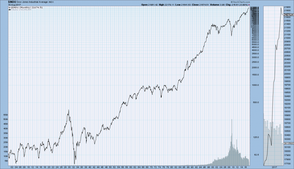
For long-term reference purposes, here is a chart of the Dow Jones Industrial Average since 1900, depicted on a monthly basis using a LOG scale (updated through August 18, 2017, with a last value of 21674.51):

(click on chart to enlarge image)(chart courtesy of StockCharts.com)

DJIA since 1900

_____

The Special Note summarizes my overall thoughts about our economic situation

SPX at 2452.51 as this post is written
Monday, August 21, 2017

Zillow Q3 2017 Home Price Expectations Survey – Summary & Comments

On August 21, 2017, the Zillow Q3 2017 Home Price Expectations Survey results were released.  This survey is done on a quarterly basis.

An excerpt from the press release:
The panelists expect a future recession to have a moderate impact on the U.S. housing market overall, but some markets are more at risk than others. More than 60 percent of experts say the next recession will have a major impact on the San Francisco and Miami housing markets, and at least half predict a major impact in Los Angeles and New York as well.


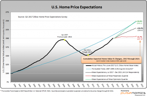
Various Q3 2017 Zillow Home Price Expectations Survey charts are available, including that seen below:

U.S. Home Price Expectations chart

As one can see from the above chart, the average expectation is that the residential real estate market, as depicted by the U.S. Zillow Home Value Index, will continually climb.

The detail of the Q3 2017 Home Price Expectations Survey (pdf) is interesting.  Of the 100+ survey respondents, only five (of the displayed responses) forecasts a cumulative price decrease through 2021, and only one of those forecasts is for a double-digit percentage decline.  That forecast is from Mark Hanson, who foresees a 24.47% cumulative price decrease through 2021.

The Median Cumulative Home Price Appreciation for years 2017-2021 is seen as 5.00%, 9.22%, 13.01%, 16.22%, and 19.33%, respectively.

For a variety of reasons, I continue to believe that even the most “bearish” of these forecasts (as seen in Mark Hanson’s above-referenced forecast) will prove too optimistic in hindsight.  From a longer-term historical perspective, such a decline is very mild in light of the wild excesses that occurred over the “bubble” years.

I have written extensively about the residential real estate situation.  For a variety of reasons, it is exceedingly complex.  While many people continue to have an optimistic view regarding future residential real estate prices, in my opinion such a view is unsupported on an “all things considered” basis.  Furthermore, from these price levels there exists outsized potential for a price decline of severe magnitude, unfortunately.  I discussed this downside, based upon historical price activity, in the October 24, 2010 post titled “What’s Ahead For The Housing Market – A Look At The Charts.”

_____

The Special Note summarizes my overall thoughts about our economic situation

SPX at 2425.73 as this post is written
Updates Of Economic Indicators August 2017

Here is an update of various indicators that are supposed to predict and/or depict economic activity. These indicators have been discussed in previous blog posts:

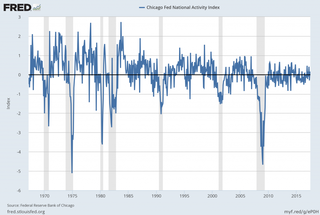
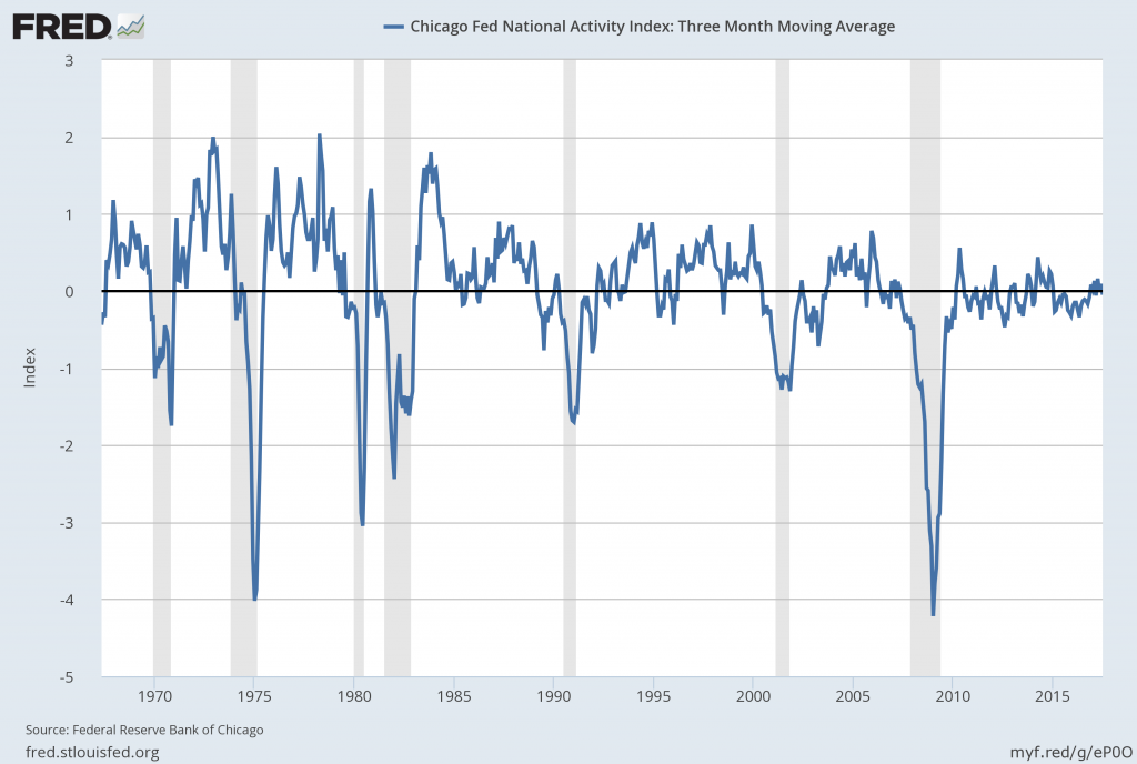
The August 2017 Chicago Fed National Activity Index (CFNAI) updated as of August 21, 2017:

The CFNAI, with current reading of -.01:

CFNAI 8-1-17

Federal Reserve Bank of Chicago, Chicago Fed National Activity Index [CFNAI], retrieved from FRED, Federal Reserve Bank of St. Louis, August 21, 2017;

https://fred.stlouisfed.org/series/CFNAI

The CFNAI-MA3, with current reading of -.05:

CFNAI-MA3_8-21-17 -.05

Federal Reserve Bank of Chicago, Chicago Fed National Activity Index: Three Month Moving Average [CFNAIMA3], retrieved from FRED, Federal Reserve Bank of St. Louis, August 21, 2017;

https://fred.stlouisfed.org/series/CFNAIMA3


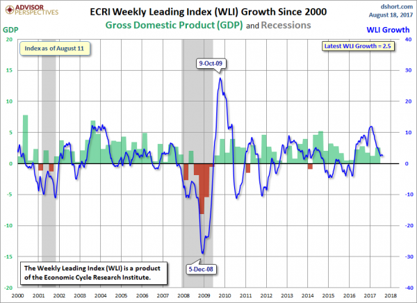
The ECRI WLI (Weekly Leading Index):

As of August 18, 2017 (incorporating data through August 11, 2017) the WLI was at 144.5 and the WLI, Gr. was at 2.5%.

A chart of the WLI,Gr., from Doug Short’s ECRI update post of August 18, 2017:

ECRI WLI,Gr.


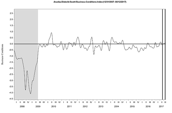
The Aruoba-Diebold-Scotti Business Conditions (ADS) Index:

Here is the latest chart, depicting the ADS Index from December 31, 2007 through August 12, 2017:

ADS Index


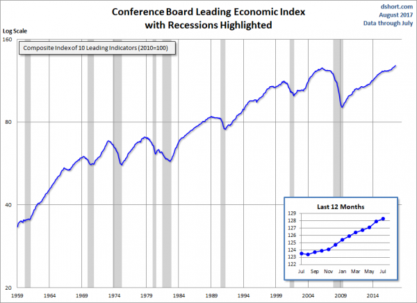
The Conference Board Leading (LEI), Coincident (CEI) Economic Indexes, and Lagging Economic Indicator (LAG):

As per the August 17, 2017 press release, titled “The Conference Board Leading Economic Index (LEI) for the U.S. Increased in July” (pdf) the LEI was at 128.3, the CEI was at 115.7, and the LAG was 124.8 in July.

An excerpt from the release:
“The U.S. LEI improved in July, suggesting the U.S. economy may experience further improvements in economic activity in the second half of the year,” said Ataman Ozyildirim, Director of Business Cycles and Growth Research at The Conference Board. “The large negative contribution from housing permits, a reversal from June, was more than offset by gains in the financial indicators, new orders and sentiment.”
Here is a chart of the LEI from Doug Short’s Conference Board Leading Economic Index update of August 17, 2017:

Conference Board LEI

_________

I post various indicators and indices because I believe they should be carefully monitored.  However, as those familiar with this site are aware, I do not necessarily agree with what they depict or imply.
_____

The Special Note summarizes my overall thoughts about our economic situation

SPX at 2426.01 as this post is written
Friday, August 18, 2017

"Taylor Rule" Chart - August 11, 2017 Update

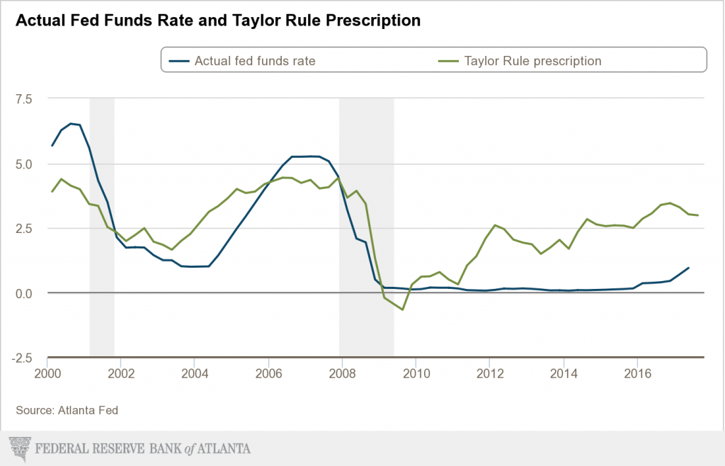
On January 9, 2017 I wrote a post ("Low Interest Rates And The Formation Of Asset Bubbles") that mentioned the "Taylor Rule."  As discussed in that post - and for other reasons - the level of the Fed Funds rate - and whether its level is appropriate - has vast importance and far-reaching consequences with regard to many aspects of the economy and financial system.

For reference, below is an updated chart depicting the "Taylor Rule" prescription and the actual Fed Funds rate, provided by the Federal Reserve Bank of Atlanta, updated as of August 11, 2017:

Taylor Rule prescription


_____

The Special Note summarizes my overall thoughts about our economic situation

SPX at 2435.14 as this post is written
Thursday, August 17, 2017

Broad-Based Indicators Of Economic Activity

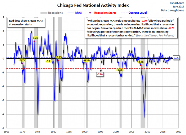
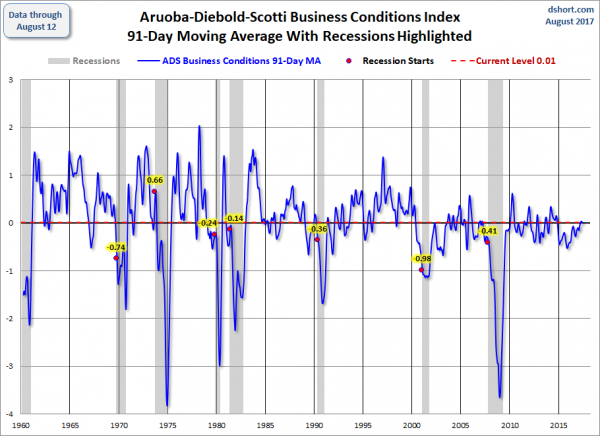
The Chicago Fed National Activity Index (CFNAI) and the Aruoba-Diebold-Scotti Business Conditions Index (ADS Index) are two broad-based economic indicators that I regularly feature in this site.

The short-term and long-term trends of each continue to be notable.

Doug Short, in his blog post of August 17, 2017, titled “The Philly Fed ADS Index Business Conditions Index Update” displays both the CFNAI MA-3 (3-month Moving Average) and ADS Index (91-Day Moving Average) from a variety of perspectives.

Of particular note, two of the charts, shown below, denote where the current levels of each reading is relative to the beginning of past recessionary periods, as depicted by the red dots.

The CFNAI MA-3:

(click on charts to enlarge images)

CFNAI-MA3


The ADS Index, 91-Day MA:

ADS Index 91-Day Moving Average


Also shown in the Doug Short’s aforementioned post is a chart of each with a long-term trendline (linear regression) as well as a chart depicting GDP for comparison purposes.

_________

I post various indicators and indices because I believe they should be carefully monitored.  However, as those familiar with this site are aware, I do not necessarily agree with what they depict or imply.
_____

The Special Note summarizes my overall thoughts about our economic situation

SPX at 2439.32 as this post is written
Trends Of S&P500 Earnings Forecasts

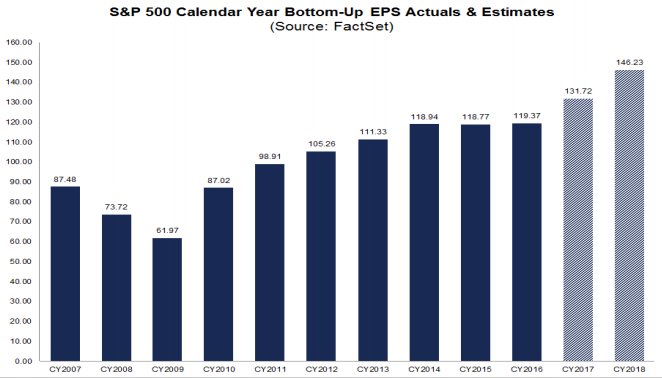
S&P500 earnings trends and estimates are a notably important topic, for a variety of reasons, at this point in time.

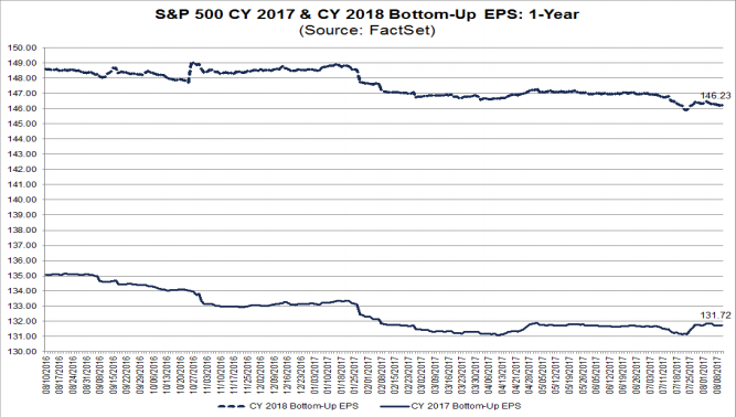
FactSet publishes a report titled “Earnings Insight” that contains a variety of information including the trends and expectations of S&P500 earnings.

For reference purposes, here are two charts as seen in the “Earnings Insight” (pdf) report of August 11, 2017:

from page 23:

(click on charts to enlarge images)

S&P500 EPS projections CY2017 and CY2018


from page 24:

S&P500 Annual EPS Actual And Forecast

_____

I post various economic forecasts because I believe they should be carefully monitored.  However, as those familiar with this site are aware, I do not agree with many of the consensus estimates and much of the commentary in these forecast surveys.
_____

The Special Note summarizes my overall thoughts about our economic situation

SPX at 2442.86 as this post is written

S&P500 EPS Forecasts 2017, 2018, 2019

As many are aware, Thomson Reuters publishes earnings estimates for the S&P500.  (My other posts concerning S&P earnings estimates can be found under the S&P500 Earnings label)

The following estimates are from Exhibit 20 of the “S&P500 Earnings Scorecard” (pdf) of August 17, 2017, and represent an aggregation of individual S&P500 component “bottom up” analyst forecasts.  For reference, the Year 2014 value is $118.78/share, the Year 2015 value is $117.46, and the Year 2016 value is $118.10/share:

Year 2017 estimate:

$131.66/share

Year 2018 estimate:

$146.12/share

Year 2019 estimate:

$159.35/share
_____

I post various economic forecasts because I believe they should be carefully monitored.  However, as those familiar with this site are aware, I do not agree with many of the consensus estimates and much of the commentary in these forecast surveys.
_____

The Special Note summarizes my overall thoughts about our economic situation

SPX at 2448.71 as this post is written

Standard & Poor’s S&P500 Earnings Estimates For 2017 And 2018 – As Of August 10, 2017

As many are aware, Standard & Poor’s publishes earnings estimates for the S&P500.  (My posts concerning their estimates can be found under the S&P500 Earnings label)

For reference purposes, the most current estimates are reflected below, and are as of August 10, 2017:

Year 2017 estimates add to the following:

-From a “bottom up” perspective, operating earnings of $127.14/share

-From a “top down” perspective, operating earnings of N/A

-From a “bottom up” perspective, “as reported” earnings of $115.74/share

Year 2018 estimates add to the following:

-From a “bottom up” perspective, operating earnings of $144.42/share

-From a “top down” perspective, operating earnings of N/A

-From a “bottom up” perspective, “as reported” earnings of $132.28/share
_____

I post various economic forecasts because I believe they should be carefully monitored.  However, as those familiar with this site are aware, I do not agree with many of the consensus estimates and much of the commentary in these forecast surveys.
_____

The Special Note summarizes my overall thoughts about our economic situation

SPX at 2464.35 as this post is written

Walmart’s Q2 2018 Results – Comments

I found various notable items in Walmart’s Q2 2018 management call transcript (pdf) dated August 17, 2017.  (as well, there is Walmart’s press release of the Q2 results and related presentation materials)

I view Walmart’s results and comments as particularly noteworthy given their retail prominence and focus on low prices.  I have previously commented on their quarterly management call comments; these previous posts are found under the “paycheck to paycheck” label.

Here are various excerpts that I find most notable:

comments from Doug McMillon, President and CEO, page 4, wrt Walmart U.S.: 
We had a strong quarter with comp-sales growth of 1.8 percent and
comp-traffic growth of 1.3 percent. It’s exciting that sales growth is coming
from across the business-- including stores, e-commerce and a
combination of both.
comments from Brett Biggs, EVP & CFO, page 8:
Walmart U.S. eCommerce again performed very well on the topline
as GMV grew 67 percent and sales increased 60 percent, including
acquisitions. The majority of this growth was organic through
Walmart.com, including Online Grocery, which is growing quickly. We’re
delivering growth through an improved customer value proposition that
includes free two-day shipping on millions of items and Easy Reorder, as
well as an expanded assortment, now with more than 67 million SKUs – an
increase of more than 30 percent from the first quarter. With Easy
Reorder, we’re integrating both in-store and online purchases to provide
customers with a single spot to view and repurchase the items they buy
most frequently. Initiatives like these, along with everyday low prices, are
the reasons why customers are choosing Walmart in greater numbers. As
a reminder, we’ll begin to lap the Jet.com acquisition in the third quarter.
comments from Brett Biggs, EVP & CFO, page 9, wrt Walmart U.S.: 
Gross margin rate declined 5 basis points in the quarter. Savings
from procuring merchandise benefited the margin rate but was more than
offset by the mix effects from our growing e-commerce business, as well as
continued investments in price.
_____

The Special Note summarizes my overall thoughts about our economic situation

SPX at 2468.11 as this post is written