Friday, December 30, 2011

Consumer Confidence Surveys – As Of 12-30-11


In yesterday’s post ("4 Confidence Charts – December 2011") I displayed four charts indicating various long-term consumer and small business confidence readings as compared to the S&P500.

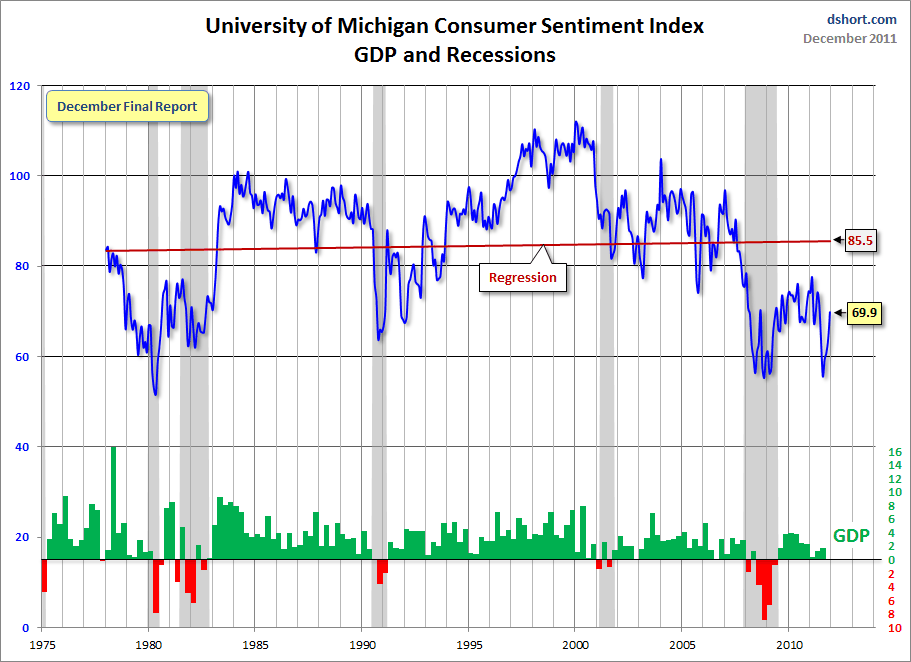
Doug Short had a blog post of December 27 (“Consumer Confidence at an Eight-Month High") in which he presents the Conference Board and University of Michigan charts in a different fashion.  They are presented below:

(click on charts to enlarge images)


-

There are a few aspects of the above charts that I find highly noteworthy.  Of course, the continuing very subdued absolute levels of these two surveys is disconcerting.

Also, I find the “behavior” of these readings to be quite disparate as compared to the other post-recession periods, as shown in the charts between the gray shaded areas (the gray areas denote recessions as defined by the NBER.)

While I don’t believe that confidence surveys should be overemphasized, I find these readings to be very problematical, especially in light of a variety of other highly disconcerting measures highlighted in this blog.
_____

The Special Note summarizes my overall thoughts about our economic situation

SPX at 1263.02 as this post is written

Thursday, December 29, 2011

4 Confidence Charts – December 2011


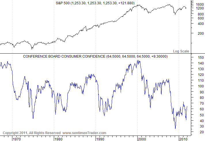
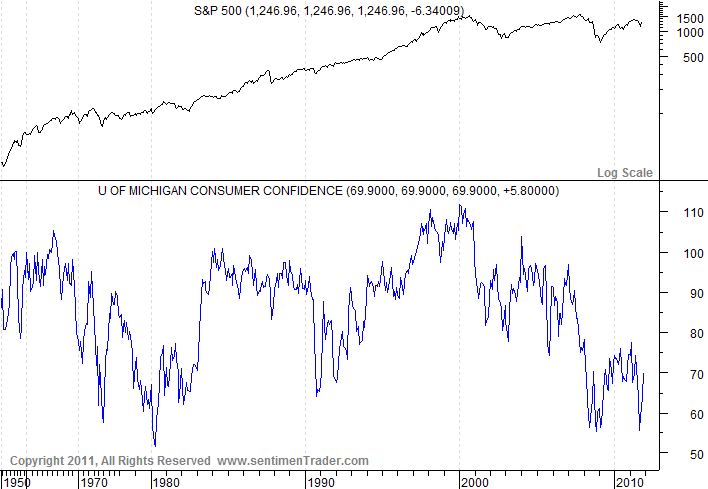
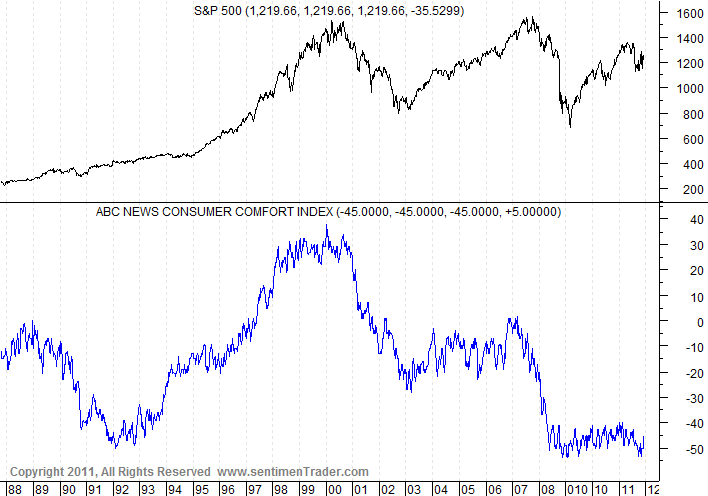
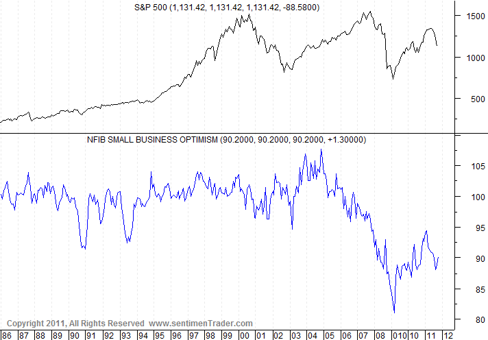
Here are four charts reflecting confidence survey readings.  These are from the SentimenTrader.com site.

I find these charts valuable as they provide a long-term history of each survey, which is rare.

Each survey chart is plotted in blue, below the S&P500:

(click on each chart to enlarge image)

Conference Board Consumer Confidence, last updated 12-27-11:


-

University of Michigan Consumer Confidence, last updated 12-22-11:


-

Bloomberg Consumer Comfort Index (formerly the ABC News Consumer Comfort Index) last updated 12-22-11:


-

NFIB Small Business Optimism, last updated 11-8-11:


-

As one can see, these charts continue to show subdued readings, especially when viewed from a long-term perspective.

These charts should be interesting to monitor going forward.  Although I don’t believe that confidence surveys should be overemphasized, they do help to delineate how the economic environment is being perceived.
_____

The Special Note summarizes my overall thoughts about our economic situation

SPX at 1256.14 as this post is written

Wednesday, December 28, 2011

The Current Gold Price And Its Broader Significance


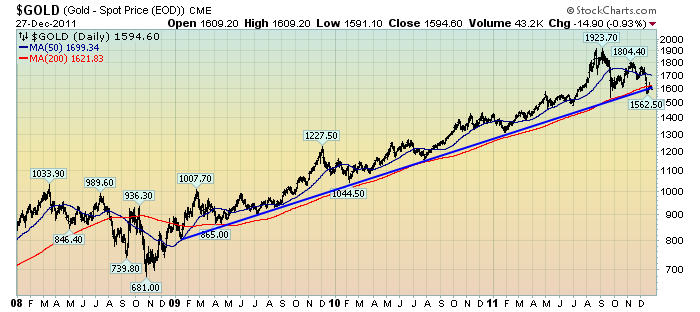
Gold has recently been in a correction (or consolidation) after a very steep rally.

It appears as if Gold is at a critical juncture at present.  As seen in the chart below (which depicts Gold on a daily basis, LOG scale, since 2008) Gold, at $1594.60/oz, is currently right below both the 200dma (depicted in red) as well as the rising trendline (recently broken to the downside) since early 2009:

(click on chart to enlarge image)(chart courtesy of StockCharts.com; chart creation and annotation by the author)


From an overall Technical Analysis standpoint, on both daily and weekly viewpoints, Gold appears vulnerable to a (significant) decline.

I have recently written of the broader implications of Gold's price movements.  In one post, that of August 25 ("Gold And Deflationary Pressures") I wrote the following, which I feel is still currently applicable:
I am very closely monitoring Gold as I believe a steep, abnormal correction could serve to (further) indicate deflationary pressures – which of course would have outsized impacts on financial markets, the economy, and economic policy (particularly QE3 or some other large intervention.)
_____

The Special Note summarizes my overall thoughts about our economic situation

SPX at 1265.43 as this post is written

Tuesday, December 27, 2011

Zillow December 2011 Home Price Expectations Survey - Summary & Comments


On December 20 Zillow released its December 2011 Home Price Expectations Survey results.  This survey (formerly called the MacroMarkets Home Price Expectation Survey) is done on a quarterly basis.

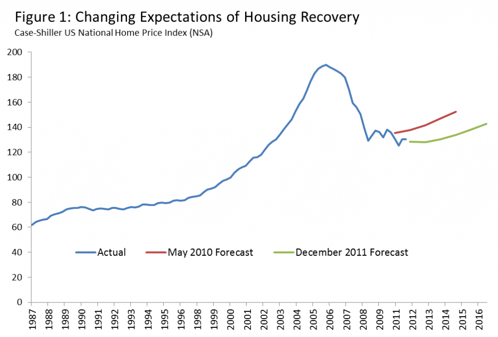
The accompanying chart is seen below:

(click on chart image to enlarge)

As one can see from the above chart, the average expectation is that the residential real estate market, as depicted by the Case-Shiller US National Home Price Index (NSA), will slowly climb (on a cumulative basis) through 2016.

The survey detail is interesting.  Of the 109 survey respondents, 9 (of the displayed responses) foresee a cumulative price decrease through 2016; and of those 9, only 3 foresee a double-digit percentage cumulative price drop.  Mark Hanson remains the most “bearish” of the survey participants with a forecast of a 25.17% cumulative price decline through 2016.

The Median Cumulative Home Price Appreciation for years 2011-2016 is seen as -2.00%, -1.99%, .29%, 3.01%, 6.96%, and 10.63% respectively.

For a variety of reasons, I continue to believe that even the most “bearish” of these forecasts (as seen in Mark Hanson’s above-referenced forecast)  will prove too optimistic in hindsight.  Although a 25.17% decline is substantial, from a longer-term historical perspective such a decline is rather tame in light of the wild excesses that occurred over the “bubble” years.

I have written extensively about the residential real estate situation.  For a variety of reasons, it is exceedingly complex.  While many people continue to have an optimistic view regarding future residential real estate prices, in my opinion such a view is unsupported on an “all things considered” basis.  Furthermore, (even) from these price levels there exists outsized potential for a price decline of severe magnitude, unfortunately.  I discussed this downside, based upon historical price activity, in the October 24, 2010 post titled "What's Ahead For The Housing Market - A Look At The Charts."
_____

The Special Note summarizes my overall thoughts about our economic situation

SPX at 1265.33 as this post is written

Friday, December 23, 2011

Updates On Economic Indicators December 2011


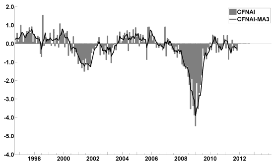
Here is an update on various indicators that are supposed to predict and/or depict economic activity.  These indicators have been discussed in previous blog posts:

The December Chicago Fed National Activity Index (CFNAI)(pdf) updated as of December 22, 2011:


-

An excerpt from the December 1 update titled “Index forecasts weaker growth” :
The November update of the USA TODAY/IHS Global Insight Economic Outlook Index shows real GDP growth, at a six-month annualized growth rate, increasing to 2.2% in November and December and then slowing to 1.6% in April. Persistent unemployment, elevated debt levels, high energy and food prices and low confidence have stalled consumer spending. Businesses are hesitant to expand amid uncertainty.
-


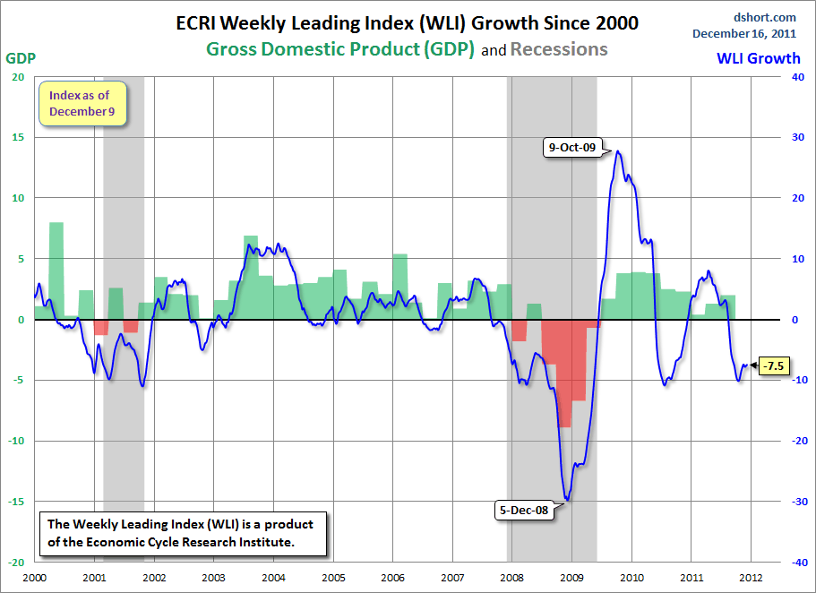
As of 12/9/11 the WLI was at 122.3 and the WLI, Gr. was at -7.5%.

A chart of the WLI Growth since 2000, from Doug Short’s blog of December 16 titled “ECRI Recession Call:  Growth Index Contraction Moderates Fractionally” :


-


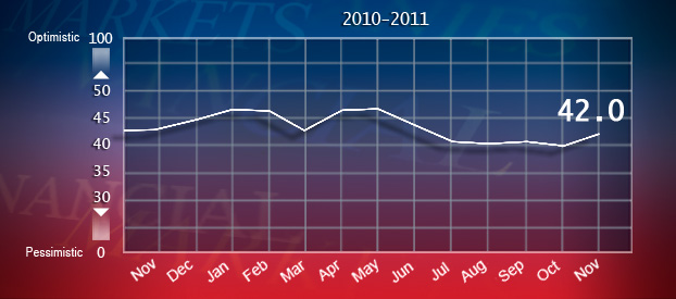
The Indicator as of December 13 was at 42.0, as seen below:


-


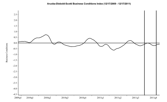
Here is the latest chart, depicting 12-17-09 to 12-17-11:


-


As per the December 22 release, the LEI was at 118 and the CEI was at 103.7 in November.

An excerpt from the December 22 release:
Says Ataman Ozyildirim, economist at The Conference Board: “November’s increase in the LEI for the U.S. was widespread among the leading indicators and continues to suggest that the risk of an economic downturn in the near term has receded. Interest rate spread and housing permits made the largest contributions to the LEI this month, overcoming a falling average workweek in manufacturing, which reversed its October gain. The CEI also rose on improving employment and personal income although industrial production fell in November.”
Says Ken Goldstein, economist at The Conference Board: “The LEI is pointing to continued growth this winter, possibly even gaining momentum by spring. For the second month in a row, building permits made a relatively strong contribution and there is a chance that the long decline in housing is finally slowing. However, this somewhat positive outlook for the domestic economy is at odds with a global economy that appears to be losing steam. In particular, a deeper-than-expected recession in Europe could easily derail the outlook for the U.S. economy.”
_________

I post various indicators and indices because I believe they should be carefully monitored.  However, as those familiar with this blog are aware, I do not necessarily agree with what they depict or imply.
_____

The Special Note summarizes my overall thoughts about our economic situation

SPX at 1254.00 as this post is written

Thursday, December 22, 2011

2012 Estimates For S&P500 Earnings & Price Levels


In the December 19 edition of Barron’s, the cover story is titled “Buckle Up!

Included in the story, 10 "stock-market strategists and investment managers” give various forecasts including 2012 S&P500 profits, 2012 S&P500 year-end price targets, 2012 & 2013 GDP growth, and 10-Year Treasury Note Yields.

As seen on page 27:
The mean prediction of the 10 stock-market strategists and investment managers surveyed by Barron's is that the Standard & Poor's 500 Index will end 2012 at about 1360, some 11.5% higher than Friday's close of 1220.
Also stated in the article:
The top-down call, or that of Wall Street's market strategists, is that earnings per share will rise about 7% in 2012, to $105, for companies in the S&P 500, from this year's estimated $98. The typically more optimistic bottom-up crowd of industry analysts calls for a 10% increase, to $108, although that forecast is down from an estimate of $113 in July.
_____

I post various economic forecasts because I believe they should be carefully monitored.  However, as those familiar with this blog are aware, I do not agree with many of the consensus estimates and much of the commentary in these forecast surveys.
_____

The Special Note summarizes my overall thoughts about our economic situation

SPX at 1243.72 as this post is written
Wednesday, December 21, 2011

The December 2011 Wall Street Journal Economic Forecast Survey


The December Wall Street Journal Economic Forecast Survey was published on December 9, 2011.  The headline is “Inflation Seen Outpacing Home Prices.”

The commentary largely focuses on the housing market and when the economists polled believed it might recover.

I found these excerpts regarding the housing market to be interesting, although I don't agree with them:
The economists' predictions reflect a market that is at or near a bottom and showing signs of stabilization. New construction in 2011 is forecast to be mostly steady with a year earlier at around 600,000 homes and climbing to around 720,000 in 2012. But recovery may still be some time away due to several factors.
also:
Goldman Sachs economists Hui Shan and Sven Jari Stehn last week said their model for home prices indicates a bottom some time in 2012. They note that affordability has improved in recent years, helping the market to stabilize but other factors are preventing the sector from taking off.
Also, as seen in the Q&A section (in the spreadsheet), the economists put the probability of a U.S. recession in the next 12 months at 23%.


The current average forecasts among economists polled include the following:

GDP:
full-year 2011 : 1.7%
full-year 2012:  2.3%
full-year 2013:  2.7%
full-year 2014:  3.1%

Unemployment Rate:
December 2011: 8.8%
December 2012: 8.5%
December 2013: 8.0%
December 2014: 7.2%

10-Year Treasury Yield:
December 2011: 2.08%
December 2012: 2.75%
December 2013: 3.35%
December 2014:  3.97%

CPI:
December 2011:  3.3%
December 2012:  2.2%
December 2013:  2.4%
December 2014:  2.5%

Crude Oil  ($ per bbl):
for 12/31/2011: $97.47
for 12/31/2012: $98.26

(note: I comment upon this WSJ Economic Forecast survey each month; commentary on past surveys can be found under the “Economic Forecasts” label)
_____

I post various economic forecasts because I believe they should be carefully monitored.  However, as those familiar with this blog are aware, I do not necessarily agree with many of the consensus estimates and much of the commentary in these forecast surveys.
_____

The Special Note summarizes my overall thoughts about our economic situation

SPX at 1241.30 as this post is written
Tuesday, December 20, 2011

Building Financial Danger – December 20, 2011 Update


On October 17 I wrote a post titled “Danger Signs In The Stock Market, Financial System And Economy.”  This post is a brief third update to that post.

My overall analysis indicates a continuing elevated and growing level of danger.

I have written numerous posts of some of what I consider both ongoing and recent “negative developments.”  These developments, as well as other highly problematic conditions, have presented a highly perilous economic environment that threatens the overall financial system.

The "downside" of potential price depreciation among many asset classes is substantial, as many asset classes are currently "asset bubbles," a topic that I have extensively written about.

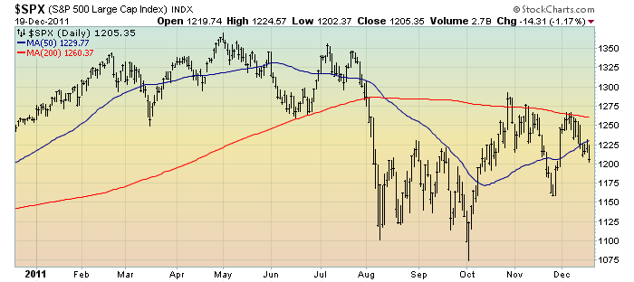
As far as the stock market is concerned, I don’t believe the October 4 1074.77 low on the S&P500 will prove to be a “lasting bottom”, and the dynamics as described in the October 20 post ("Thoughts On The Next Stock Market Decline") and other disturbing long-term “downside” considerations still apply.

As reference, below is a 1-year daily chart of the S&P500, indicating both the 50dma and 200dma:

(click on chart to enlarge image)(chart courtesy of StockCharts.com; chart creation and annotation by the author)


_____

The Special Note summarizes my overall thoughts about our economic situation

SPX at 1205.35 as this post is written
Monday, December 19, 2011

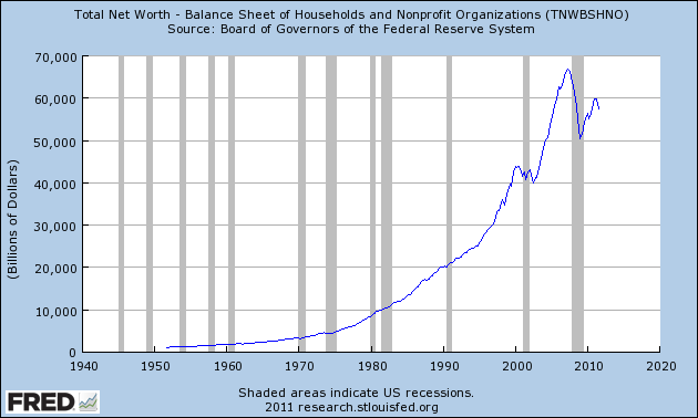
Total Household Net Worth As Of 3Q 2011 – A Long-Term Chart


In the December 13 post ("Total Household Net Worth As A Percent Of GDP 3Q 2011") I displayed a long-term chart depicting Total Household Net Worth as a percentage of GDP.

For reference purposes, here is Total Household Net Worth from a long-term perspective (from 1949:Q4 to 2011:Q3).  The last value (as of December 9, 2011) is $57.353 Trillion:


_____

The Special Note summarizes my overall thoughts about our economic situation

SPX at 1219.66 as this post is written

Thursday, December 15, 2011

S&P500 Price Projections – Livingston Survey December 2011


The December 8, 2011  Livingston Survey (pdf) contains, among its various forecasts, a S&P500 forecast.  It shows the following price forecast for the dates shown:

Dec. 30, 2011   1267.7
June 29, 2012   1322.5
Dec. 31, 2012    1395
Dec. 31, 2013    1480

These figures represent the median value across the 35 forecasters on the survey’s panel.
_____

I post various economic forecasts because I believe they should be carefully monitored.  However, as those familiar with this blog are aware, I do not agree with many of the consensus estimates and much of the commentary in these forecast surveys.
_____

The Special Note summarizes my overall thoughts about our economic situation

Tuesday, December 13, 2011

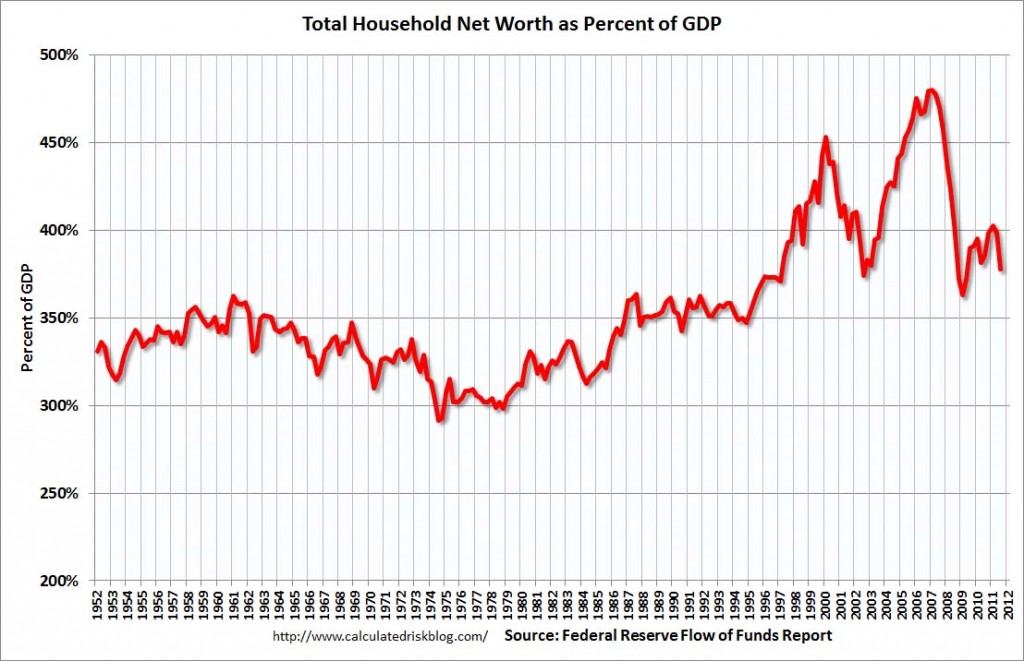
Total Household Net Worth As A Percent Of GDP 3Q 2011


The following chart is from the CalculatedRisk blog post of December 8, 2011 titled “Q3 Flow of Funds:  Household Net Worth declines $2.4 Trillion in Q3.” It depicts Total Household Net Worth as a Percent of GDP.  The underlying data is from The Federal Reserve Flow of Funds 3Q 2011 report:

(click on chart to enlarge image)


As seen in the above-referenced CalculatedRisk blog post:
The Fed estimated that household net worth declined $2.4 trillion in Q3. Household net worth peaked at $66.8 trillion in Q2 2007, and then net worth fell to $50.4 trillion in Q1 2009 (a loss of $16.4 trillion). Household net worth was at $57.4 trillion in Q3 2011 (up $7.0 trillion from the trough, but down $2.4 trillion in Q3).
The Fed estimated that the value of household real estate fell $98 billion to $16.1 trillion in Q3 2011. The value of household real estate has fallen $6.6 trillion from the peak - and is still falling in 2011.
My comments:

As I have written in previous posts on this Household Net Worth (as a percent of GDP) topic:
As one can see, the first outsized peak was in 2000, and attained after the stock market bull market / stock market bubbles and economic strength.  The second outsized peak was in 2007, right near the peak of the housing bubble as well as near the stock market peak.
As seen on the chart, the Total Household Net Worth is making an upturn, but is significantly below the prior 2007 peak.
I could extensively write about various interpretations that can be made from this chart.  One way this chart can be interpreted is a gauge of “what’s in it for me?” as far as the aggregated wealth citizens are gleaning from economic activity, as measured compared to GDP.
_____

The Special Note summarizes my overall thoughts about our economic situation

Thursday, December 8, 2011

Building Financial Danger - December 8, 2011 Update


On October 17 I wrote a post titled "Danger Signs In The Stock Market, Financial System And Economy."  This post is a brief second update (the first being on November 18 titled "Building Financial Danger - An Update") to that post.

My overall analysis indicates a continuing elevated and growing level of danger.  There are many worldwide and U.S.-specific "stresses" of a very  complex nature.

While many take comfort in a variety of recently improving economic indicators and historically positive stock market seasonality, in my opinion this type of extrapolation from historical norms is largely inappropriate given the unique and highly perilous situation the overall financial system is facing.  I have written numerous posts of some of what I consider both ongoing and recent "negative developments."

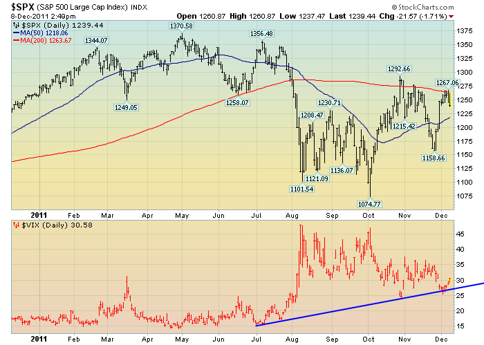
My analysis indicates that this continues to be an environment of rising risks and therefore is very dangerous in nature.  As far as the stock market is concerned, I don't believe the October 4 1074.77 low on the S&P500 will prove to be a "lasting bottom", and the dynamics as described in the October 20 post ("Thoughts On The Next Stock Market Decline") and other disturbing long-term "downside" factors still apply.

As reference, below is a 1-year daily chart of the S&P500 (plotted above, indicating both the 50dma and 200dma) and the VIX (plotted below in red, with a rising trendline displayed in dark blue):

(click on chart to enlarge image)(chart courtesy of StockCharts.com; chart creation and annotation by the author)


_____

The Special Note summarizes my overall thoughts about our economic situation

SPX at 1238.34 as this post is written
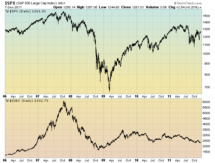
The S&P500 Vs. The Shanghai Stock Exchange Composite Index – December 2011


Starting on May 3, 2010 I have written posts concerning the notable divergence that has occurred between the S&P500 and Chinese (Shanghai Composite) stock markets.

The chart below illustrates this divergence; it shows the S&P500 vs. the Shanghai Composite on a daily basis, LOG scale, since 2006:

(click on chart to enlarge image)(chart courtesy of StockCharts.com)


-

It is notable that the Shanghai Composite led the SPX (S&P500) significantly in late ’08 – early ’09, yet it has been declining lately.

I continue to find this divergence between the S&P500 and  Shanghai Composite to be notable and disconcerting, on an “all things considered” basis.
_____

The Special Note summarizes my overall thoughts about our economic situation

SPX at 1261.01 as this post is written
Wednesday, December 7, 2011

U.S. Dollar Decline – December 7 2011 Update


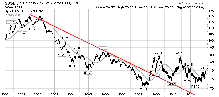
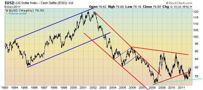
U.S. Dollar weakness is a foremost concern of mine.  As such, I have extensively written about it.  I am very concerned that the actions being taken to “improve” our economic situation will dramatically weaken the Dollar.  Should the Dollar substantially decline from here, as I expect, the negative consequences will far outweigh any benefits.  The negative impact of a substantial Dollar decline can’t be overstated, in my opinion.

The following three charts illustrate various technical analysis aspects of the U.S. Dollar, as depicted by the U.S. Dollar Index.

First, a look at the monthly U.S. Dollar from 1983.  This clearly shows a long-term weakness, with the blue line showing technical support (until 2007):

(charts courtesy of StockCharts.com; annotations by the author)

(click on charts to enlarge images)


-

Next, another chart, this one focused on the daily U.S. Dollar since 2000 on a LOG scale.  The red line represents both a trendline as well as a relatively good visual “best-fit” line.  The gray dotted line is the 200-day M.A. (moving average).  As seen on this chart, the U.S. Dollar looks vulnerable to continuing its downward trend that has been interrupted since early 2008:


-

Lastly, a chart of the Dollar on a weekly LOG scale.  There are some clearly marked  channels here, with a potential large, prominent triangle featured (shown with two potential lower trendlines, one red and one dashed blue line):


-

I will be providing updates on this U.S. Dollar situation regularly as it deserves very close monitoring…
_____

The Special Note summarizes my overall thoughts about our economic situation

SPX at 1255.69 as this post is written
Tuesday, December 6, 2011

A Chart Of Recent S&P500 Price Volatility – December 6 Update


This post is an update to recent posts that began on October 6 ("A Chart Of Recent S&P500 Price Volatility") on stock market volatility.

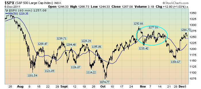
While I track many different measures of volatility, I find the following chart to be both simple and clear in depicting the recent outsized volatility in the stock market.

This chart depicts the S&P500 in 60 minute intervals from July 20 through yesterday’s (December 5) close.  As such, it encompasses the progression of the stock market since its July 25 daily high of 1344.32:

(click on chart to enlarge image)(chart courtesy of StockCharts.com)


The blue line is a 50-period moving average.  The light blue circle represents a period of reduced price fluctuations.

I continue to believe that this volatility is notable and has important implications.

As I wrote in the above-referenced October 6 post:
What I find notable is the frequency and extent of the price volatility.  As one can see, there have been several episodes of advances and declines of roughly 80-100+ points in rapid fashion – some even happening over the course of a few days.
While there are various ways to interpret such volatility, my overall belief is that such is (yet another) cautionary sign.
_____

The Special Note summarizes my overall thoughts about our economic situation

SPX at 1257.08 as this post is written

Monday, December 5, 2011

U-3 And U-6 Unemployment Rate Long-Term Reference Charts As Of December 2 2011


Shortly after each monthly employment report I have been posting a continual series titled “3 Critical Unemployment Charts.”

Of course, there are many other employment charts that can be displayed as well.

For reference purposes, below are the U-3 and U-6 Unemployment Rate charts from a long-term historical perspective.  Both charts are from the St. Louis Fed site.  The U-3 measure is what is commonly referred to as the official unemployment rate; whereas the U-6 rate is officially (per Bureau of Labor Statistics) defined as:
Total unemployed, plus all persons marginally attached to the labor force, plus total employed part time for economic reasons, as a percent of the civilian labor force plus all persons marginally attached to the labor force
Of note, many economic observers use the U-6 rate as a (closer) proxy of the actual unemployment rate rather than that depicted by the U-3 measure.

Here is the U-3 chart, currently showing a 8.6% unemployment rate:

(click on charts to enlarge images)(charts updated as of 12-2-11)


-

Here is the U-6 chart, currently showing a 15.6% unemployment rate:


_____

The Special Note summarizes my overall thoughts about our economic situation

SPX at 1244.28 as this post is written