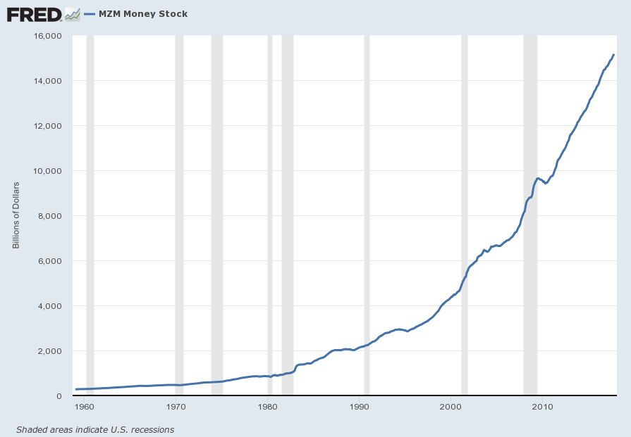
For reference purposes, below are two sets of charts depicting growth in the money supply.
The first shows the MZM (Money Zero Maturity), defined in FRED as the following:
M2 less small-denomination time deposits plus institutional money funds.
Money Zero Maturity is calculated by the Federal Reserve Bank of St. Louis.
Here is the “MZM Money Stock” (seasonally adjusted) chart, updated on November 27, 2017 depicting data through October 2017, with a value of $15,163.2 Billion:
Here is the “MZM Money Stock” chart on a “Percent Change From Year Ago” basis, with a current value of 4.7%:
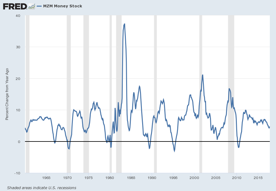
Data Source: FRED, Federal Reserve Economic Data, Federal Reserve Bank of St. Louis; accessed November 30, 2017:
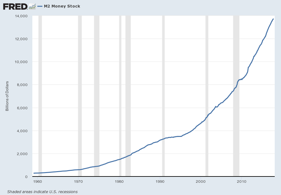
The second set shows M2, defined in FRED as the following:
M2 includes a broader set of financial assets held principally by households. M2 consists of M1 plus: (1) savings deposits (which include money market deposit accounts, or MMDAs); (2) small-denomination time deposits (time deposits in amounts of less than $100,000); and (3) balances in retail money market mutual funds (MMMFs). Seasonally adjusted M2 is computed by summing savings deposits, small-denomination time deposits, and retail MMMFs, each seasonally adjusted separately, and adding this result to seasonally adjusted M1.
Here is the “M2 Money Stock” (seasonally adjusted) chart, updated on November 24, 2017, depicting data through October 2017, with a value of $13,747.0 Billion:
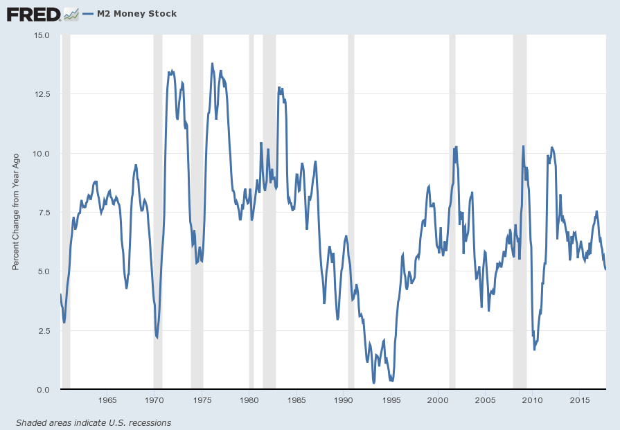
Here is the “M2 Money Stock” chart on a “Percent Change From Year Ago” basis, with a current value of 5.0%:
Data Source: FRED, Federal Reserve Economic Data, Federal Reserve Bank of St. Louis; accessed November 30, 2017:
_____
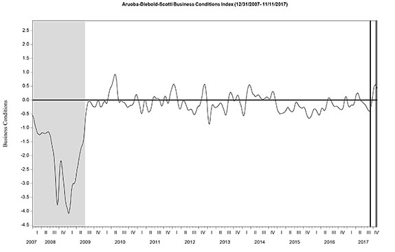
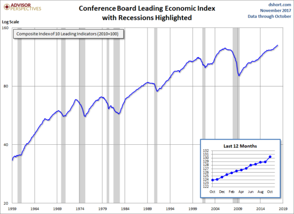
The Special Note summarizes my overall thoughts about our economic situation
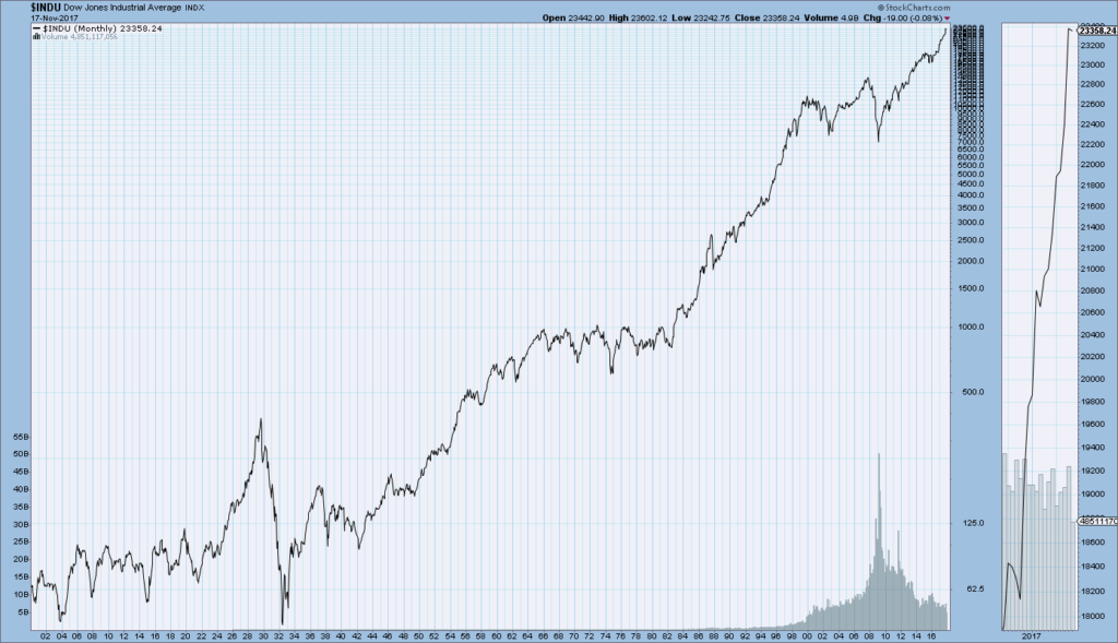
SPX at 2649.76 as this post is written