I found President Obama’s
State of the Union Address last night (January 20, 2015) to contain some noteworthy comments. While I could comment extensively on many parts of the speech, for now I will indicate excerpts that I found most relevant with regard to the economic situation, and may comment upon them at a future point. I am highlighting these excerpts for many reasons; it should be noted that I do not necessarily agree with any or all of them.
Here are the excerpts I found most relevant, in the order they occurred in the speech:
Tonight, after a breakthrough year for America, our economy is growing and creating jobs at the fastest pace since 1999. Our unemployment rate is now lower than it was before the financial crisis. More of our kids are graduating than ever before; more of our people are insured than ever before; we are as free from the grip of foreign oil as we’ve been in almost 30 years.
also:
The shadow of crisis has passed, and the State of the Union is strong.
At this moment – with a growing economy, shrinking deficits, bustling industry, and booming energy production – we have risen from recession freer to write our own future than any other nation on Earth. It’s now up to us to choose who we want to be over the next fifteen years, and for decades to come.
Will we accept an economy where only a few of us do spectacularly well? Or will we commit ourselves to an economy that generates rising incomes and chances for everyone who makes the effort?
also:
America, Rebekah and Ben’s story is our story. They represent the millions who have worked hard, and scrimped, and sacrificed, and retooled. You are the reason I ran for this office. You’re the people I was thinking of six years ago today, in the darkest months of the crisis, when I stood on the steps of this Capitol and promised we would rebuild our economy on a new foundation. And it’s been your effort and resilience that has made it possible for our country to emerge stronger.
We believed we could reverse the tide of outsourcing, and draw new jobs to our shores. And over the past five years, our businesses have created more than 11 million new jobs.
also:
We believed that sensible regulations could prevent another crisis, shield families from ruin, and encourage fair competition. Today, we have new tools to stop taxpayer-funded bailouts, and a new consumer watchdog to protect us from predatory lending and abusive credit card practices. And in the past year alone, about ten million uninsured Americans finally gained the security of health coverage.
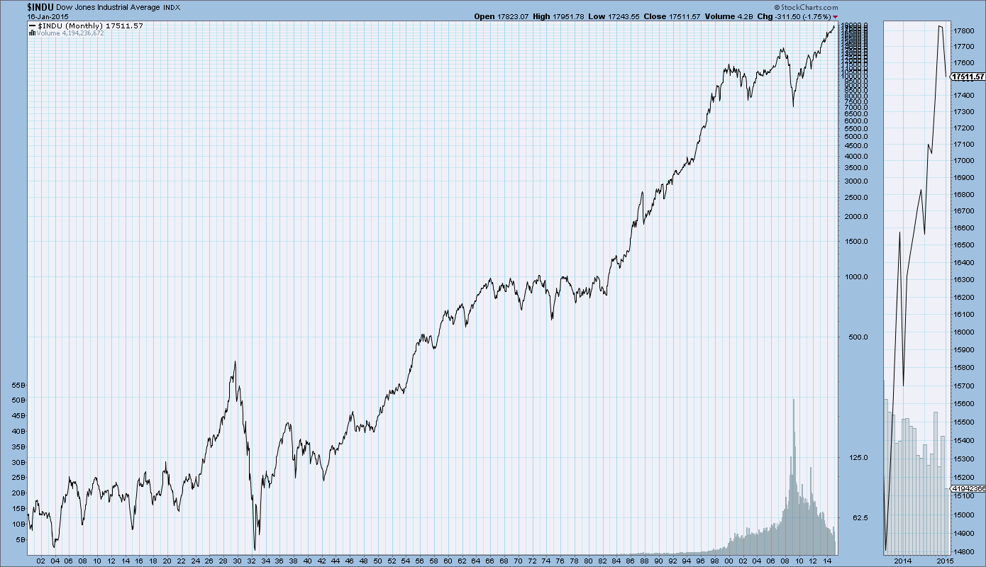
At every step, we were told our goals were misguided or too ambitious; that we would crush jobs and explode deficits. Instead, we’ve seen the fastest economic growth in over a decade, our deficits cut by two-thirds, a stock market that has doubled, and health care inflation at its lowest rate in fifty years.
So the verdict is clear. Middle-class economics works. Expanding opportunity works. And these policies will continue to work, as long as politics don’t get in the way. We can’t slow down businesses or put our economy at risk with government shutdowns or fiscal showdowns. We can’t put the security of families at risk by taking away their health insurance, or unraveling the new rules on Wall Street, or refighting past battles on immigration when we’ve got a system to fix. And if a bill comes to my desk that tries to do any of these things, it will earn my veto.
Today, thanks to a growing economy, the recovery is touching more and more lives. Wages are finally starting to rise again. We know that more small business owners plan to raise their employees’ pay than at any time since 2007. But here’s the thing – those of us here tonight, we need to set our sights higher than just making sure government doesn’t halt the progress we’re making. We need to do more than just do no harm. Tonight, together, let’s do more to restore the link between hard work and growing opportunity for every American.
also:
In fact, at every moment of economic change throughout our history, this country has taken bold action to adapt to new circumstances, and to make sure everyone gets a fair shot. We set up worker protections, Social Security, Medicare, and Medicaid to protect ourselves from the harshest adversity. We gave our citizens schools and colleges, infrastructure and the internet – tools they needed to go as far as their effort will take them.
also:
Of course, nothing helps families make ends meet like higher wages. That’s why this Congress still needs to pass a law that makes sure a woman is paid the same as a man for doing the same work. Really. It’s 2015. It’s time. We still need to make sure employees get the overtime they’ve earned. And to everyone in this Congress who still refuses to raise the minimum wage, I say this: If you truly believe you could work full-time and support a family on less than $15,000 a year, go try it. If not, vote to give millions of the hardest-working people in America a raise.
These ideas won’t make everybody rich, or relieve every hardship. That’s not the job of government. To give working families a fair shot, we’ll still need more employers to see beyond next quarter’s earnings and recognize that investing in their workforce is in their company’s long-term interest. We still need laws that strengthen rather than weaken unions, and give American workers a voice. But things like child care and sick leave and equal pay; things like lower mortgage premiums and a higher minimum wage – these ideas will make a meaningful difference in the lives of millions of families. That is a fact. And that’s what all of us – Republicans and Democrats alike – were sent here to do.
Second, to make sure folks keep earning higher wages down the road, we have to do more to help Americans upgrade their skills.
America thrived in the 20th century because we made high school free, sent a generation of GIs to college, and trained the best workforce in the world. But in a 21st century economy that rewards knowledge like never before, we need to do more.
By the end of this decade, two in three job openings will require some higher education. Two in three. And yet, we still live in a country where too many bright, striving Americans are priced out of the education they need. It’s not fair to them, and it’s not smart for our future.
That’s why I am sending this Congress a bold new plan to lower the cost of community college – to zero.
also:
Since 2010, America has put more people back to work than Europe, Japan, and all advanced economies combined. Our manufacturers have added almost 800,000 new jobs. Some of our bedrock sectors, like our auto industry, are booming. But there are also millions of Americans who work in jobs that didn’t even exist ten or twenty years ago – jobs at companies like Google, and eBay, and Tesla.
So no one knows for certain which industries will generate the jobs of the future. But we do know we want them here in America. That’s why the third part of middle-class economics is about building the most competitive economy anywhere, the place where businesses want to locate and hire.
_____
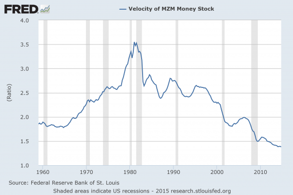
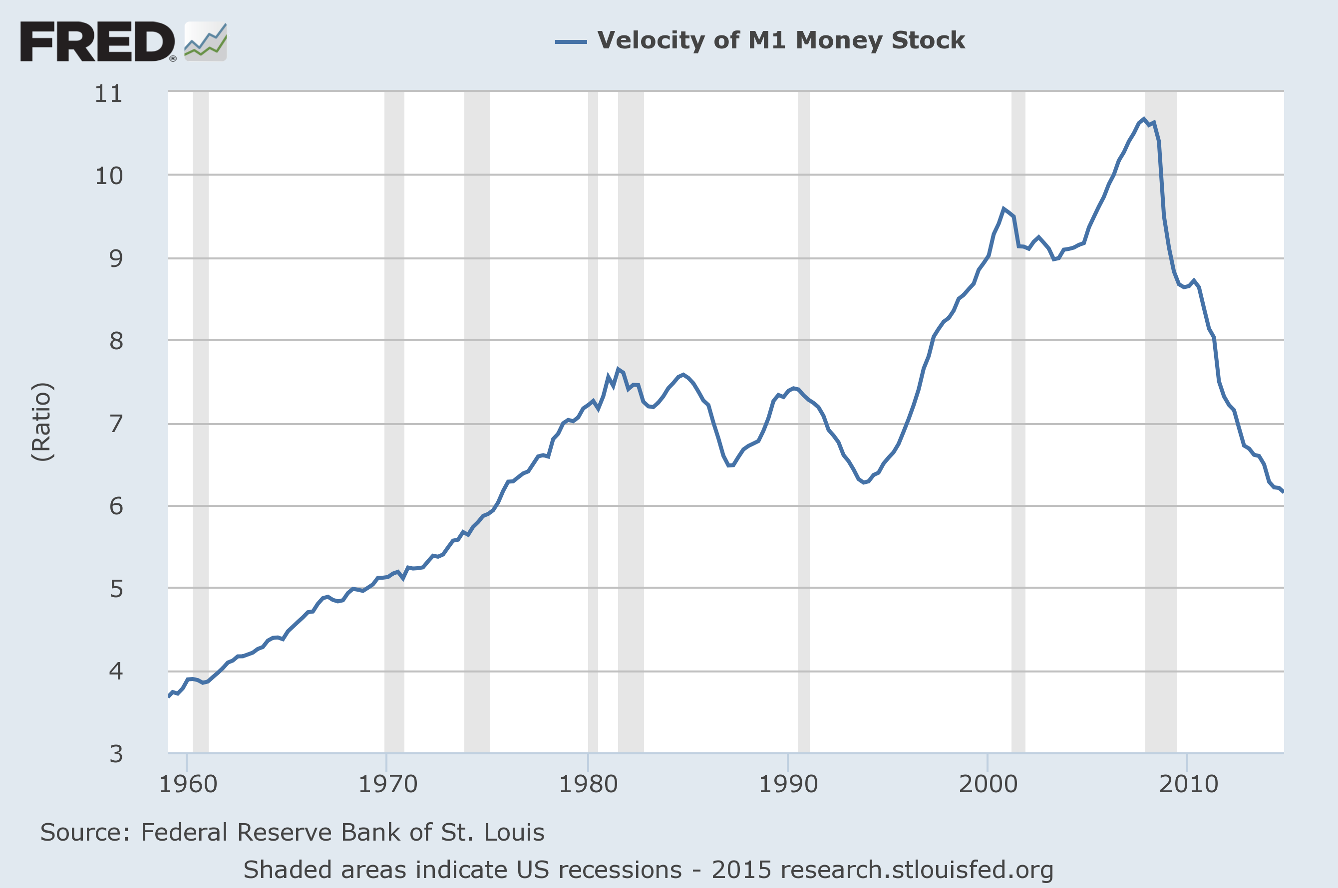
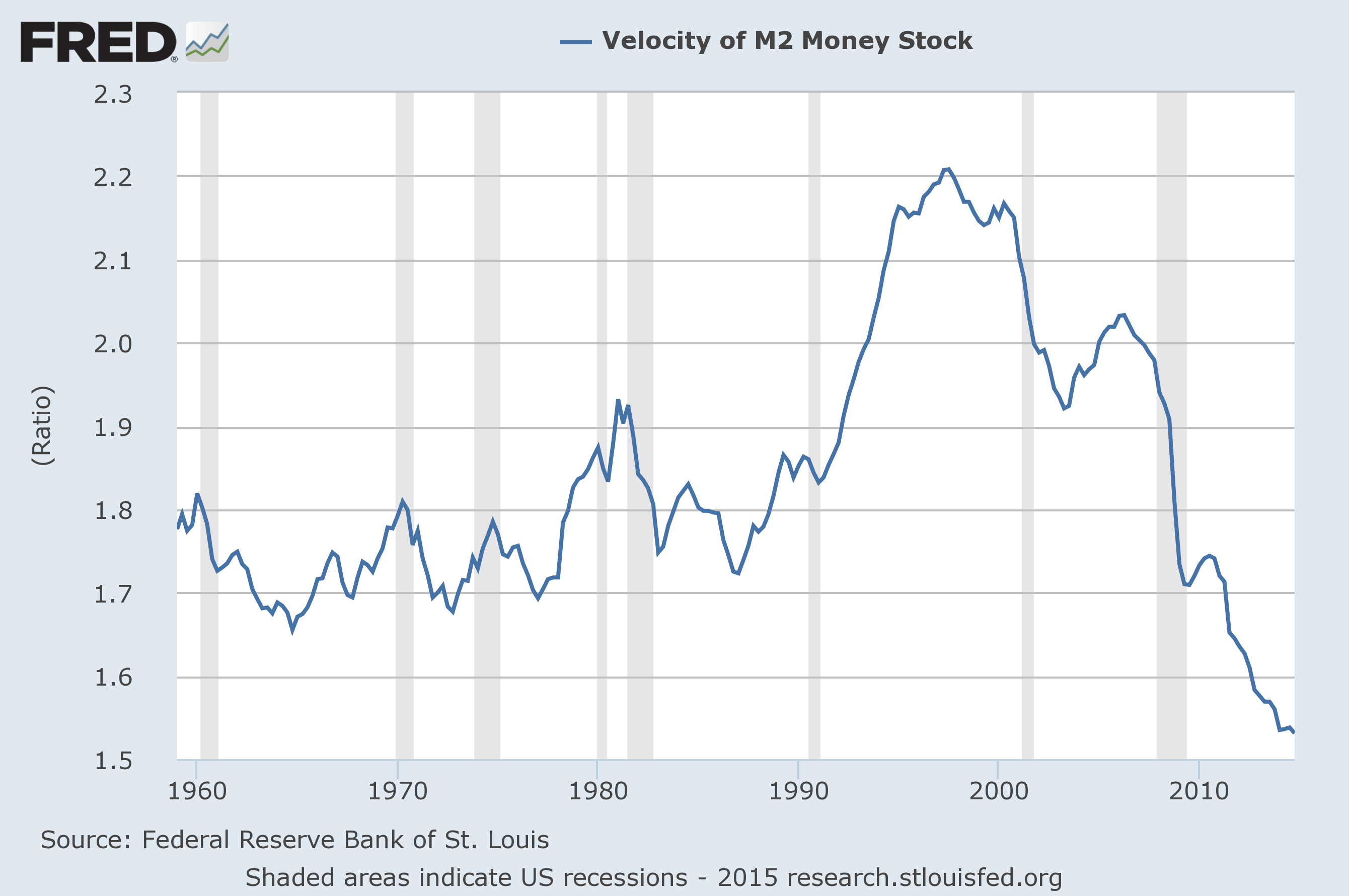
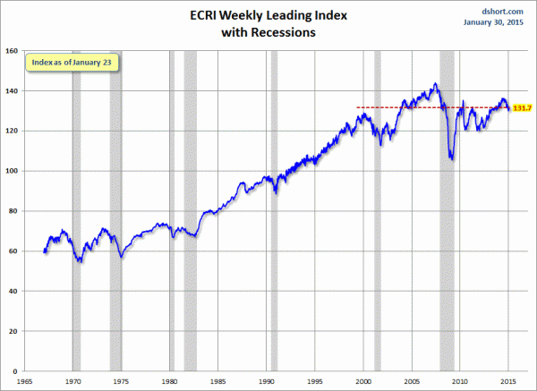
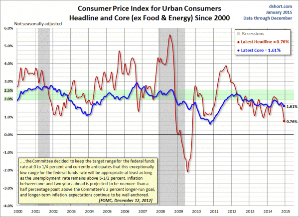
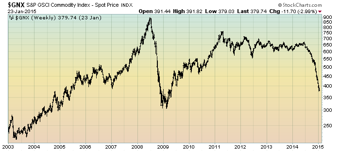
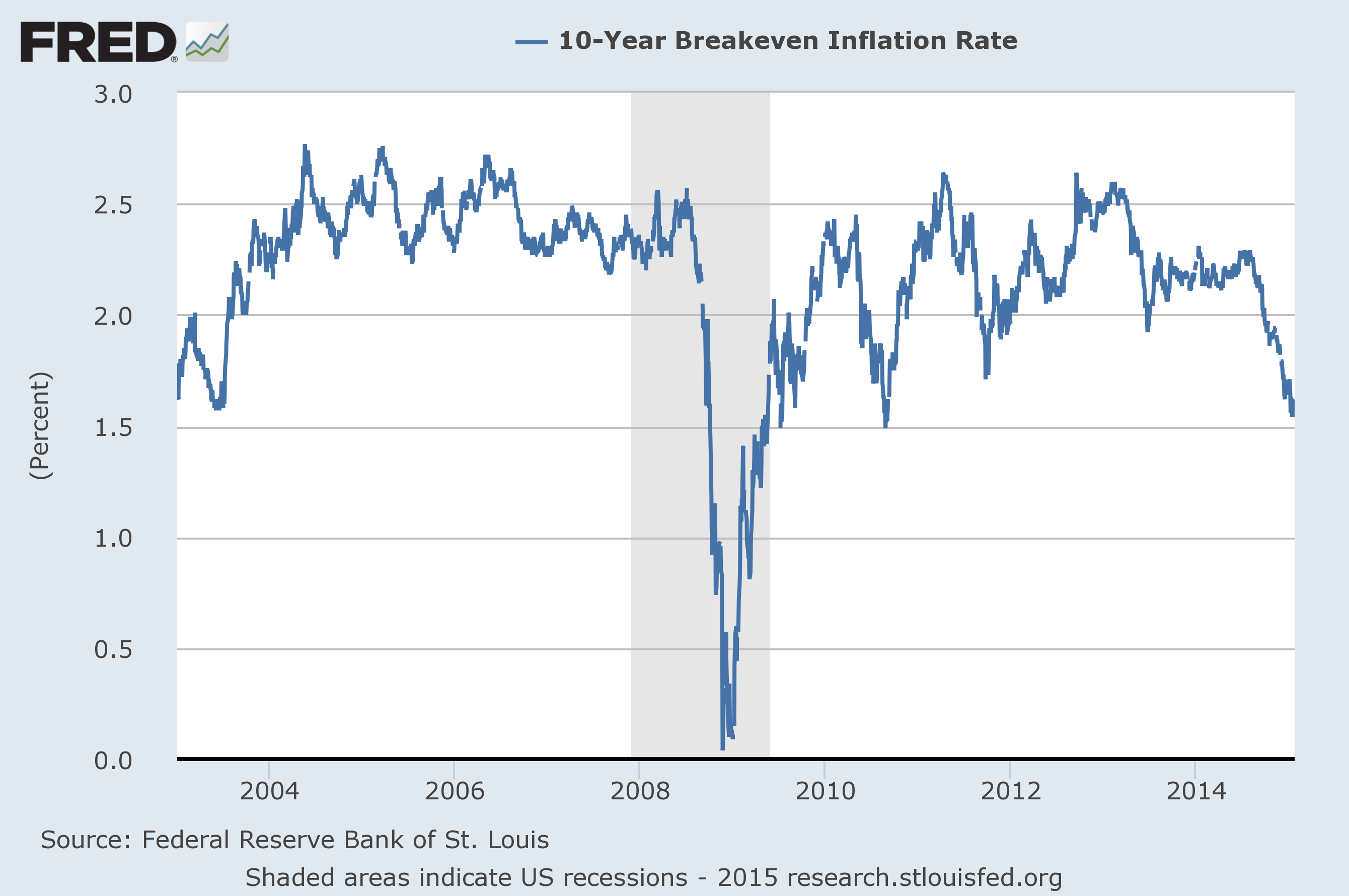
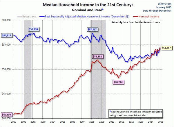
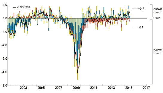
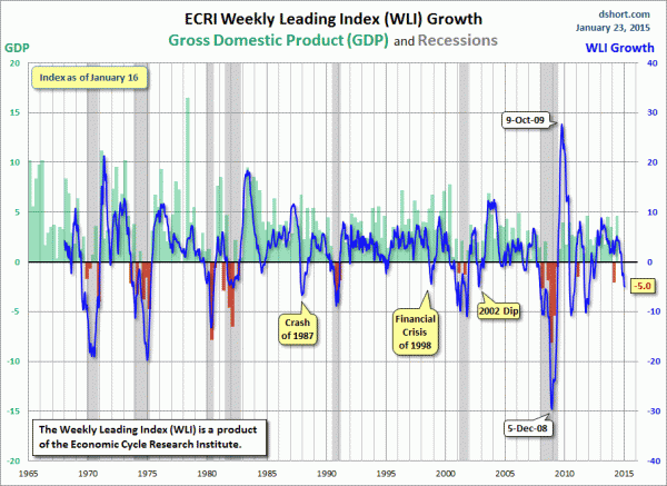
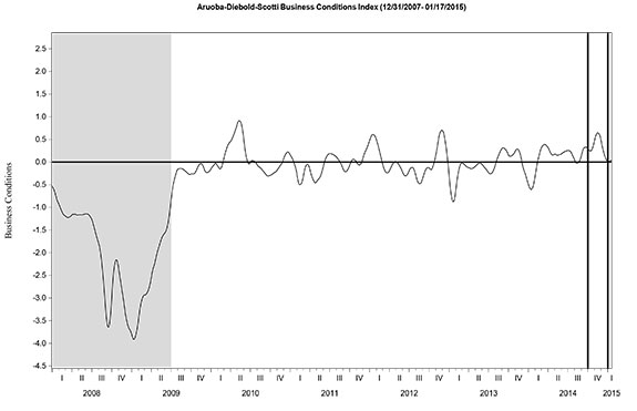
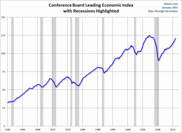
The Special Note summarizes my overall thoughts about our economic situation
SPX at 2034.50 as this post is written