For reference purposes, below is a chart from Doug Short depicting Real GDP, with a trendline, as depicted:

_____
The Special Note summarizes my overall thoughts about our economic situation
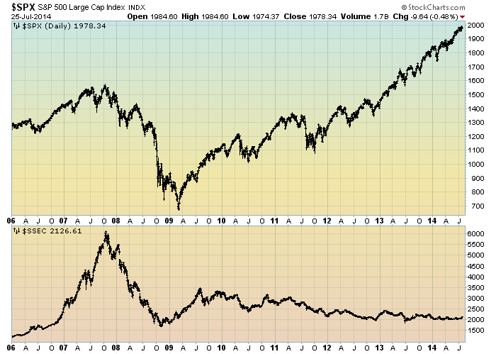
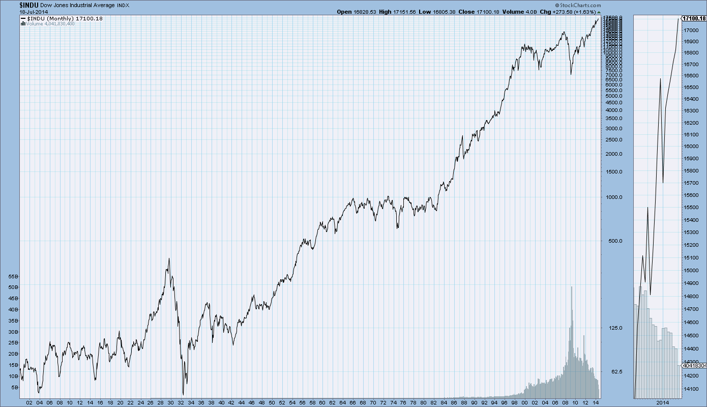
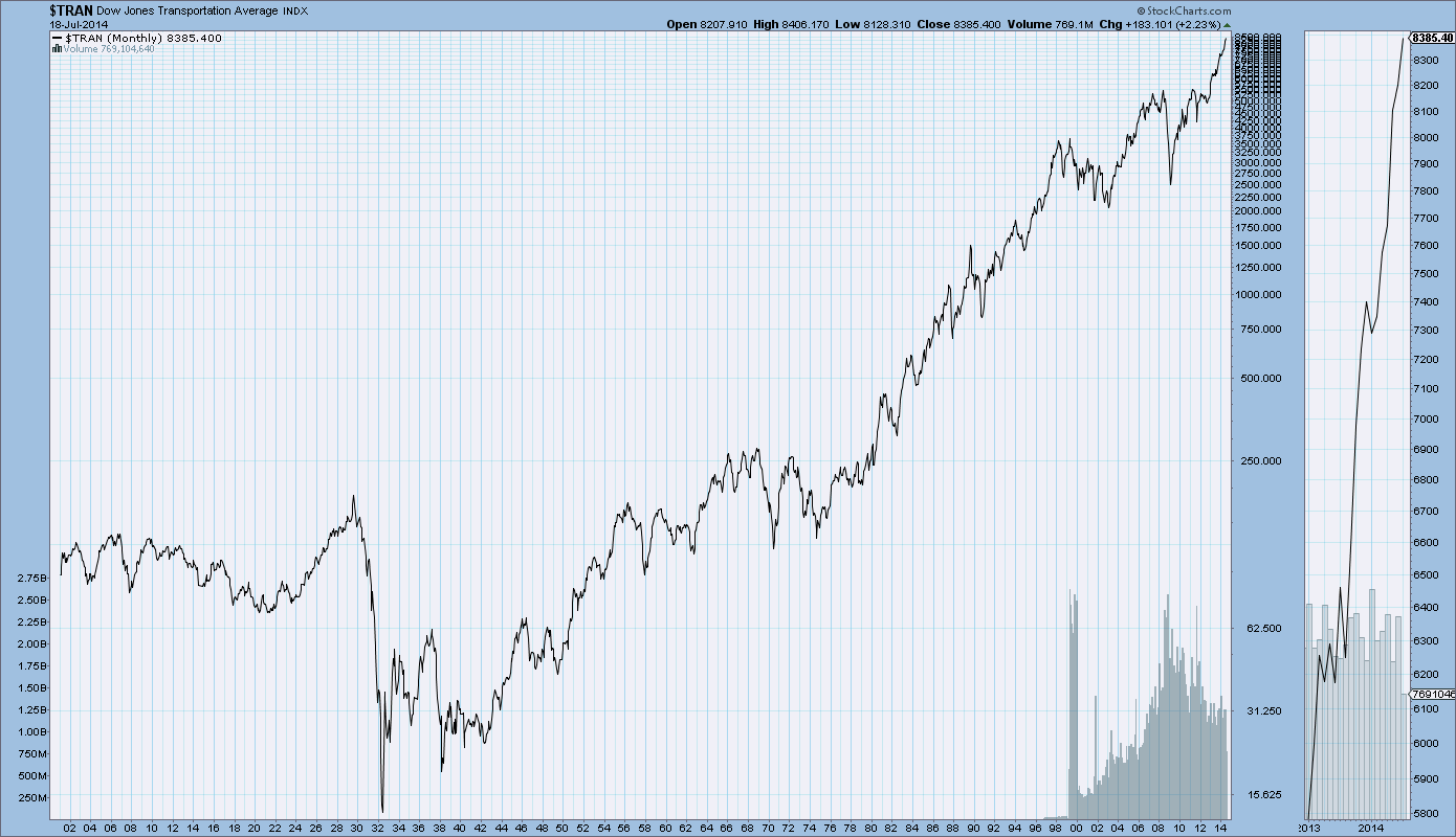
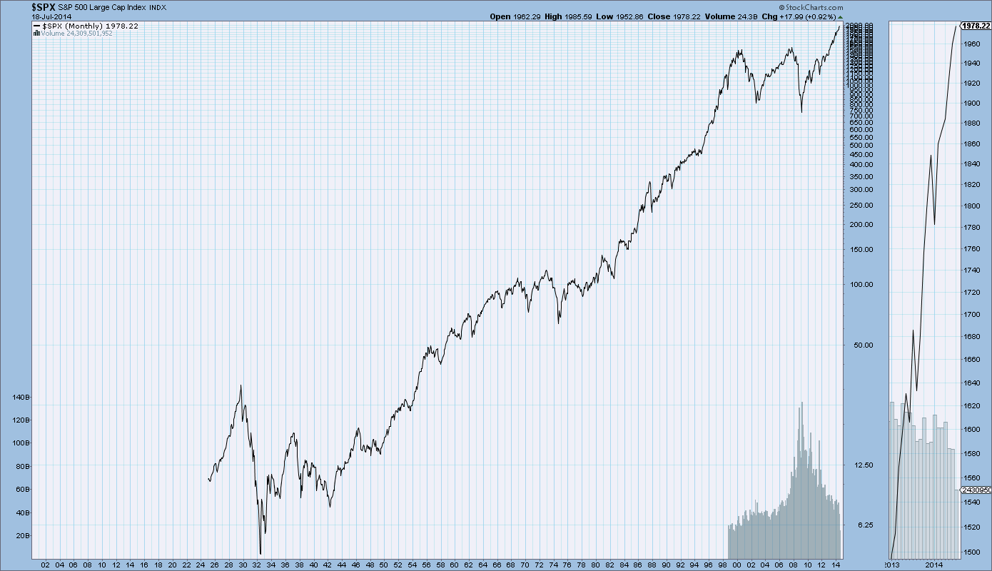
SPX at 1970.07 as this post is written
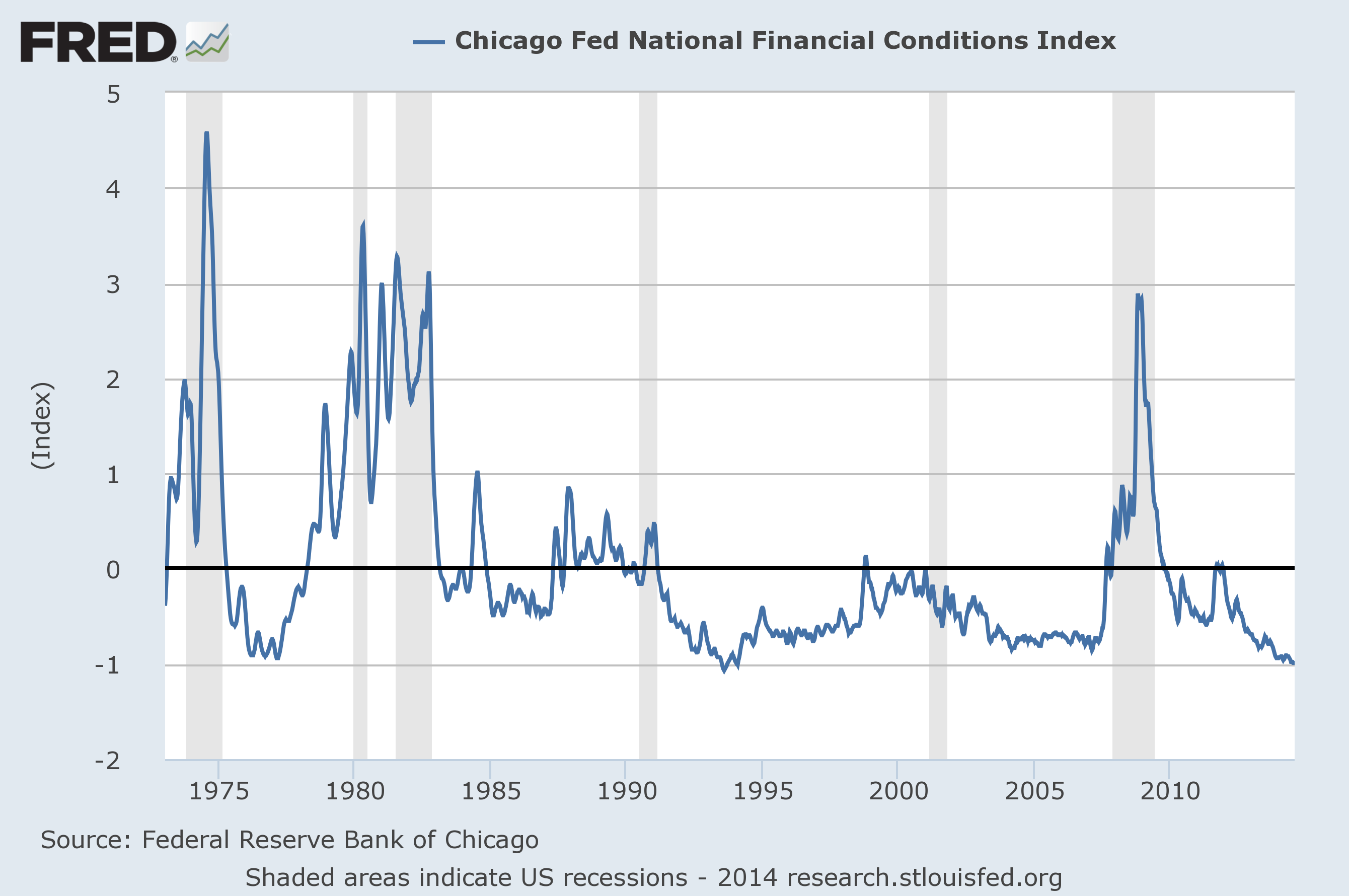
The National Financial Conditions Index (NFCI) measures risk, liquidity and leverage in money markets and debt and equity markets as well as in the traditional and “shadow” banking systems. Positive values of the NFCI indicate financial conditions that are tighter than average, while negative values indicate financial conditions that are looser than average.The adjusted NFCI (ANFCI). This index isolates a component of financial conditions uncorrelated with economic conditions to provide an update on how financial conditions compare with current economic conditions.For further information, please visit the Federal Reserve Bank of Chicago’s web site:
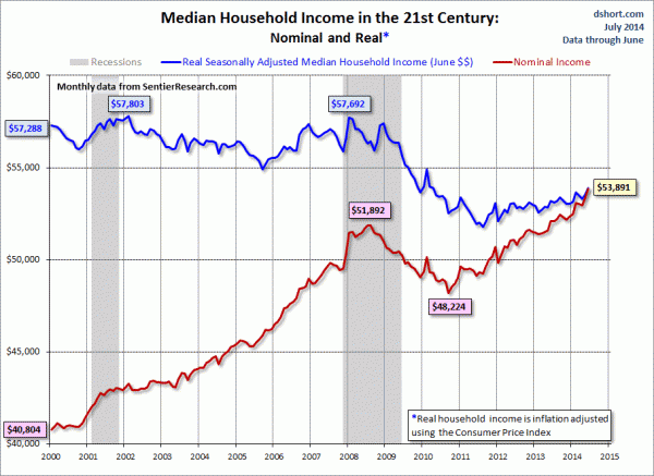
As the excellent data from Sentier Research makes clear, the mainstream U.S. household was struggling before the Great Recession. At this point, real household incomes are in worse shape than they were four years ago when the recession ended.
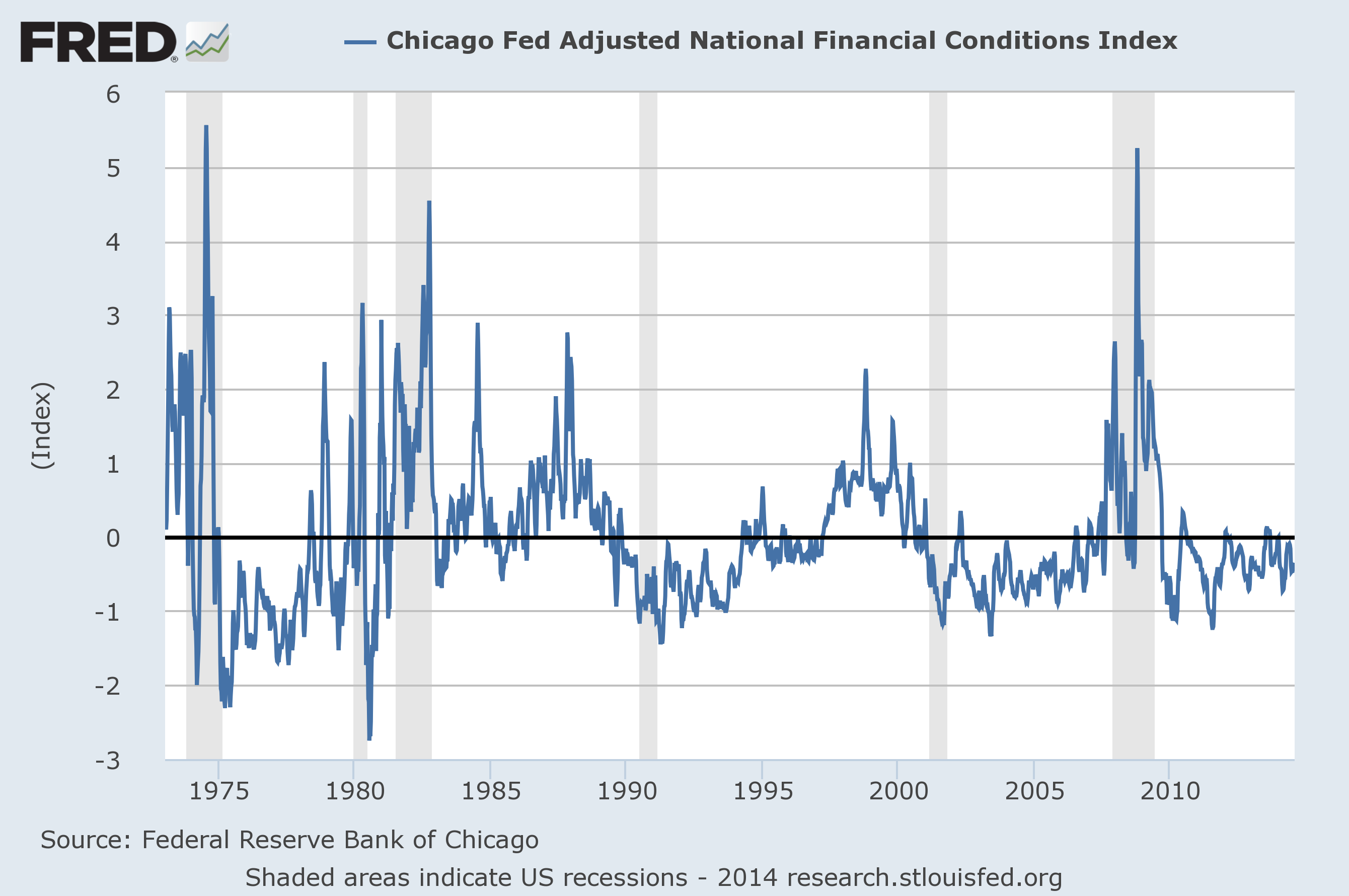
The National Financial Conditions Index (NFCI) measures risk, liquidity and leverage in money markets and debt and equity markets as well as in the traditional and “shadow” banking systems. Positive values of the NFCI indicate financial conditions that are tighter than average, while negative values indicate financial conditions that are looser than average.The adjusted NFCI (ANFCI). This index isolates a component of financial conditions uncorrelated with economic conditions to provide an update on how financial conditions compare with current economic conditions.For further information, please visit the Federal Reserve Bank of Chicago’s web site:


“The CEI shows the pace of economic activity continued to expand moderately through June,” said Ken Goldstein, Economist at The Conference Board. “Stronger consumer demand driven by sustained job gains and improving confidence remains the main source of improvement for the U.S. economy. In addition to a stronger housing market, more business investment could also provide an upside to the overall economy.”

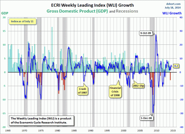
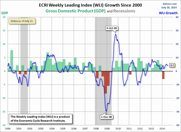
For a variety of reasons, I am not as enamored with ECRI’s WLI and WLI Growth measures as many are.However, I do think the measures are important and deserve close monitoring and scrutiny.