Thursday, March 30, 2017

Median Household Income Chart

I have written many blog posts concerning the worrisome trends in income and earnings.
Doug Short, in his March 30, 2017 post titled “February Real Median Household Income:  Higher in February” produced the chart below.  It is based upon data from Sentier Research, and it shows both nominal and real median household incomes since 2000, as depicted.  As one can see, post-recession real median household income (seen in the blue line since 2009) remains worrisome.
(click on chart to enlarge image)
U.S. Median Household Income
As Doug mentions in his aforementioned post, regarding the change in real median household incomes:
As the excellent data from Sentier Research makes clear, the mainstream U.S. household was struggling before the Great Recession. At this point, real household incomes are about where they were during the Great Recession.
Among other items seen in his blog post is a chart depicting each of the two (nominal and real household incomes) data series’ percent change over time since 2000.
_________
I post various indicators and indices because I believe they should be carefully monitored.  However, as those familiar with this site are aware, I do not necessarily agree with what they depict or imply.
_____
The Special Note summarizes my overall thoughts about our economic situation
SPX at 2364.27 as this post is written

Corporate Profits As A Percentage Of GDP

In the last post (“4th Quarter 2016 Corporate Profits“) I displayed, for reference purposes, a long-term chart depicting Corporate Profits After Tax.
There are many ways to view this measure, both on an absolute as well as relative basis.
One relative measure is viewing Corporate Profits as a Percentage of GDP.  I feel that this metric is important for a variety of reasons.  As well, the measure is important to a variety of parties, including investors, businesses, and government policy makers.
As one can see from the long-term chart below (updated through the fourth quarter), (After Tax) Corporate Profits as a Percentage of GDP is at levels that can be seen as historically (very) high.  While there are many reasons as to why this is so, from a going-forward standpoint I think it is important to recognize both that such a notable condition exists, as well as contemplate and/or plan for such factors and conditions that would come about if (and in my opinion “when”) a more historically “normal” ratio of Corporate Profits as a Percentage of GDP occurs.  This topic can be very complex in nature, and depends upon myriad factors.  In my opinion it deserves far greater recognition.
(click on chart to enlarge image)
Corporate Profits as a Percentage of GDP
Data Source: FRED, Federal Reserve Economic Data, Federal Reserve Bank of St. Louis; accessed March 30, 2017
_____
The Special Note summarizes my overall thoughts about our economic situation
SPX at 2369.94 as this post is written

4th Quarter 2016 Corporate Profits

Today’s (March 30, 2017) GDP release (Q4, 3rd Estimate)(pdf) was accompanied by the BLS Corporate Profits report for the 4th Quarter.
Of course, there are many ways to adjust and depict overall Corporate Profits.  For reference purposes, here is a chart from the St. Louis Federal Reserve (FRED) showing the Corporate Profits After Tax (without IVA and CCAdj) (last updated March 30, 2017, with a value of $1741.2 Billion):
CP_3-30-17
Here is the Corporate Profits After Tax measure shown on a Percentage Change from a Year Ago perspective:
CP percent change from year ago
Data Source: FRED, Federal Reserve Economic Data, Federal Reserve Bank of St. Louis: Corporate Profits After Tax [CP]; U.S. Department of Commerce: Bureau of Economic Analysis; accessed March 30, 2017; https://research.stlouisfed.org/fred2/series/CP
_________
I post various indicators and indices because I believe they should be carefully monitored.  However, as those familiar with this blog are aware, I do not necessarily agree with what they depict or imply.
_____
The Special Note summarizes my overall thoughts about our economic situation
SPX at 2364.90 as this post is written

Wednesday, March 29, 2017

Chicago Fed National Financial Conditions Index (NFCI)

The St. Louis Fed’s Financial Stress Index (STLFSI) is one index that is supposed to measure stress in the financial system.  Its reading as of the March 23, 2017 update (reflecting data through March 17, 2017) is -1.329.
Of course, there are a variety of other measures and indices that are supposed to measure financial stress and other related issues, both from the Federal Reserve as well as from private sources.
Two other indices that I regularly monitor include the Chicago Fed National Financial Conditions Index (NFCI) as well as the Chicago Fed Adjusted National Financial Conditions Index (ANFCI).
Here are summary descriptions of each, as seen in FRED:
The National Financial Conditions Index (NFCI) measures risk, liquidity and leverage in money markets and debt and equity markets as well as in the traditional and “shadow” banking systems. Positive values of the NFCI indicate financial conditions that are tighter than average, while negative values indicate financial conditions that are looser than average.
The adjusted NFCI (ANFCI). This index isolates a component of financial conditions uncorrelated with economic conditions to provide an update on how financial conditions compare with current economic conditions.
For further information, please visit the Federal Reserve Bank of Chicago’s web site:
Below are the most recently updated charts of the NFCI and ANFCI, respectively.
The NFCI chart below was last updated on March 29, 2017 incorporating data from January 5,1973 through March 24, 2017, on a weekly basis.  The March 24, 2017 value is -.78:
NFCI
Data Source: FRED, Federal Reserve Economic Data, Federal Reserve Bank of St. Louis; accessed March 29, 2017:
The ANFCI chart below was last updated on March 29, 2017 incorporating data from January 5,1973 through March 24, 2017, on a weekly basis.  The March 24 value is .01:
ANFCI
Data Source: FRED, Federal Reserve Economic Data, Federal Reserve Bank of St. Louis; accessed March 29, 2017:
_________
I post various indicators and indices because I believe they should be carefully monitored.  However, as those familiar with this blog are aware, I do not necessarily agree with what they depict or imply.
_____
The Special Note summarizes my overall thoughts about our economic situation
SPX at 2362.73 as this post is written

The Yield Curve – March 29, 2017

Many people believe that the Yield Curve is an important economic indicator.
On March 1, 2010, I wrote a post on the issue, titled “The Yield Curve As A Leading Economic Indicator.”
An excerpt from that post:
On the NY Fed link above, they have posted numerous studies that support the theory that the yield curve is a leading indicator.   My objections with using it as a leading indicator, especially now, are various.  These objections include: I don’t think such a narrow measure is one that can be relied upon;  both the yields at the short and long-end of the curve have been overtly and officially manipulated, thus distorting the curve; and, although the yield curve may have been an accurate leading indicator in the past, this period of economic weakness is inherently dissimilar in nature from past recessions and depressions in a multitude of ways – thus, historical yardsticks and metrics probably won’t (and have not) proven appropriate.
While I continue to have the above-stated reservations regarding the “yield curve” as an indicator, I do believe that it should be monitored.
As an indication of the yield curve, below is a weekly chart from January 1, 1990 through March 28, 2017.  The top two plots show the 10-Year Treasury and 2-Year Treasury yields.  The third plot shows the (yield) spread between the 10-Year Treasury and 2-Year Treasury, with the March 28, 2017 closing value of 1.12%.  The bottom plot shows the S&P500:
(click on chart to enlarge image)(chart courtesy of StockCharts.com; chart creation and annotation by the author)
Yield Curve since 1990
Additionally, below is a chart showing the same spread between the 10-Year Treasury and 2-Year Treasury, albeit with a slightly different measurement, using constant maturity securities.  This daily chart is from June 1, 1976 through March 27, 2017, with recessionary periods shown in gray. This chart shows a value of 1.11%:
T10Y2Y
source:  Federal Reserve Bank of St. Louis, 10-Year Treasury Constant Maturity Minus 2-Year Treasury Constant Maturity [T10Y2Y], retrieved from FRED, Federal Reserve Bank of St. Louis; accessed March 29, 2017:
_____
The Special Note summarizes my overall thoughts about our economic situation
SPX at 2358.57 as this post is written

Tuesday, March 28, 2017

Consumer Confidence Surveys – As Of March 28, 2017

Doug Short had a blog post of March 28, 2017 (“March Consumer Confidence Highest Since 2000“) in which he presents the latest Conference Board Consumer Confidence and Thomson/Reuters University of Michigan Consumer Sentiment Index charts.  They are presented below:
(click on charts to enlarge images)
Conference Board Consumer Confidence
University of Michigan Consumer Confidence
There are a few aspects of the above charts that I find highly noteworthy.  Of course, until the sudden upswing in 2014, the continued subdued absolute levels of these two surveys was disconcerting.
Also, I find the “behavior” of these readings to be quite disparate as compared to the other post-recession periods, as shown in the charts between the gray shaded areas (the gray areas denote recessions as defined by the NBER.)
While I don’t believe that confidence surveys should be overemphasized, I find these readings to be very problematical, especially in light of a variety of other highly disconcerting measures highlighted throughout this site.
_____
The Special Note summarizes my overall thoughts about our economic situation
SPX at 2360.96 as this post is written

Markets During Periods Of Federal Reserve Intervention – March 27, 2017 Update

In the August 9, 2011 post (“QE3 – Various Thoughts“) I posted a chart that depicted the movements of the S&P500, 10-Year Treasury Yield and the Fed Funds rate spanning the periods of various Federal Reserve interventions since 2007.
For reference purposes, here is an updated chart (through March 27, 2017) from Doug Short’s blog post of March 27 (“Treasury Snapshot:  10-Year Note at 2.38“):
Federal Reserve Intervention and U.S. markets
_____
The Special Note summarizes my overall thoughts about our economic situation
SPX at 2359.64 as this post is written

Friday, March 24, 2017

Durable Goods New Orders – Long-Term Charts Through February 2017

Many people place emphasis on Durable Goods New Orders as a prominent economic indicator and/or leading economic indicator.
For reference, below are two charts depicting this measure.
First, from the St. Louis Fed site (FRED), a chart through February 2017, updated on March 24, 2017. This value is $235,386 ($ Millions):
(click on charts to enlarge images)
Durable Goods New Orders
Second, here is the chart depicting this measure on a “Percentage Change from a Year Ago” basis:
DGORDER percent change from year ago
Data Source: FRED, Federal Reserve Economic Data, Federal Reserve Bank of St. Louis: Manufacturers’ New Orders:  Durable Goods [DGORDER]; U.S. Department of Commerce: Census Bureau; accessed March 24, 2017;
_________
I post various indicators and indices because I believe they should be carefully monitored.  However, as those familiar with this blog are aware, I do not necessarily agree with what they depict or imply.
_____
The Special Note summarizes my overall thoughts about our economic situation
SPX at 2353.87 as this post is written

Thursday, March 23, 2017

Deloitte “CFO Signals” Report Q1 2017 – Notable Aspects

Recently Deloitte released their “CFO Signals” “High-Level Summary” report for the 1st Quarter of 2017.
As seen in page 2 of the report, there were 132 survey respondents.  As stated:  “Each quarter (since 2Q10), CFO Signals has tracked the thinking and actions of CFOs representing many of North America’s largest and most influential companies. All respondents are CFOs from the US, Canada, and Mexico, and the vast majority are from companies with more than $1 billion in annual revenue. For a summary of this quarter’s response demographics, please see the sidebars and charts on this page. For other information about participation and methodology, please contact nacfosurvey@deloitte.com."
Here are some of the excerpts that I found notable:
from page 3:

Perceptions

How do you regard the current/future status of the North American, Chinese, and European economies? Perceptions of the North American economy improved again, with 66% of CFOs rating current conditions as good (a four-year high) and 62% expecting better conditions in a year. Perceptions of Europe improved to 12% and 28%, while China rose to 20% and 19%. Page 6.
What is your perception of the capital markets? Eighty-one percent of CFOs say debt financing is attractive (up slightly from 79% last quarter), while attractiveness of equity financing held steady for public company CFOs (at about 40%) and rose for private company CFOs (from 29% to 38%). Eighty percent of CFOs now say US equities are overvalued—a new survey high. Page 7.

Sentiment

Compared to three months ago, how do you feel about the financial prospects for your company? Net optimism rose sharply from last quarter’s +23.4 to +50.0 (a survey high). About 60% of CFOs express rising optimism (up from 43%), and those citing declining optimism fell from 20% to 10%. Page 8.

Expectations

What is your company’s business focus for the next year? CFOs indicate a strong bias toward revenue growth over cost reduction (60% vs. 18%), and investing cash over returning it (59% vs. 15%). They shifted to a bias toward new offerings over existing ones (42% vs. 38%), and markedly increased their bias toward current geographies over new ones (67% vs. 13%). Page 9.
Compared to the past 12 months, how do you expect your key operating metrics to change over the next 12 months? Revenue growth expectations rose from 3.7% to 4.3% and are slightly above their two-year average. Earnings growth rose to 7.3%, up from 6.4% and also above the two-year average. Capital spending growth skyrocketed from 3.6% to 10.5% (the highest level in almost five years). Domestic hiring growth rose from 1.3% to 2.1%. Page 10.
from page 8:

Sentiment

Net optimism—already fairly strong since 2Q16—rose sharply to a new survey high amid overwhelmingly positive sentiment among US CFOs.
This quarter’s net optimism spiked to a survey high +50. Nearly 60% of CFOs expressed rising optimism (up from 43% last quarter), and about 10% cited declining optimism (down from 20%).
Net optimism for the US rose sharply from last quarter’s already-strong +34 to +58 this quarter. Canada rose from +7 to +40, while optimism in Mexico slid from -64 to -71.
Healthcare/Pharma and Energy/Resources CFOs were among the most optimistic last quarter, but are among the least optimistic this quarter (joined by Retail/Wholesale). Financial Services CFOs were among the least optimistic last quarter, but are among the most optimistic this quarter, joined by Technology and Telecom/Media/Entertainment (T/M/E).
from page 10:

Expectations

All key growth metrics rose this quarter, with capital spending skyrocketing; the outlook for Healthcare/Pharma declined markedly, but the outlook for Manufacturing and Energy/Resources improved.
Revenue growth expectations rose to 4.3% and are slightly above their two-year average. US expectations rebounded from last quarter’s dismal level, while Mexico fell to a two-year low. Energy/Resources is near its two-year high, and Healthcare/Pharma fell to its survey low.
Earnings growth expectations of 7.3% are up significantly from last quarter and above their two-year average. The US improved, but Mexico declined again. Manufacturing is highest, hitting its highest level in two years; Healthcare/Pharma fell to its lowest level in more than three years.
Capital investment growth expectations of 10.5% are up drastically from last quarter and sit at their highest level in nearly five years. All countries improved significantly from last quarter. Manufacturing and Energy/Resources rose sharply, with both near their survey highs.
Domestic hiring growth rose from last quarter’s weak showing of 1.3% to 2.1% and is at its second-highest level in nearly two years. Canada is low, but up from last quarter. Manufacturing sits at a two-year high, but is lowest of the industries (despite strength in other metrics).
Among the various charts and graphics in the report are graphics depicting trends in “Own Company Optimism” on page 8 and “Economic Optimism” found on page 6.
_____
I post various business and economic surveys because I believe they should be carefully monitored.  However, as those familiar with this blog are aware, I do not necessarily agree with many of the consensus estimates and much of the commentary in these surveys.
_____
The Special Note summarizes my overall thoughts about our economic situation
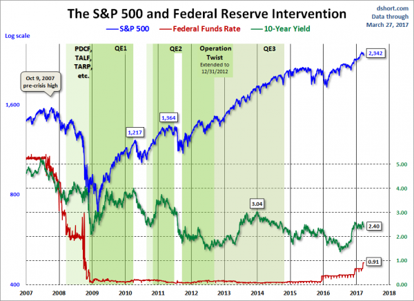
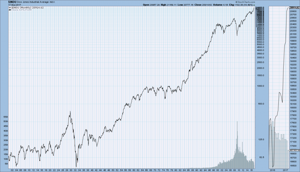
SPX at 2352.66. as this post is written

'Hidden' Weakness In Consumer Spending?

Throughout this site there are many charts of economic indicators.  At this time, the readings of various indicators regarding consumer spending are especially notable.  While many are still indicating significant growth, are these indicators accurately portraying the overall situation?
Below are a small sampling of consumer spending charts that depict significant or at least stable degrees of growth, and a brief comment for each:
Retail Sales
Retail sales levels appear to be growing.  An overall long-term view is shown below, with current value (as of March 15, 2017) of $473,991 Million:
Retail and Food Service Sales
source:  U.S. Bureau of the Census, Retail and Food Services Sales [RSAFS], retrieved from FRED, Federal Reserve Bank of St. Louis March 18, 2017;
The same information provided on a "percent change from year ago" basis, with a current value of 5.7%:
Retail and Food Service Sales Percent Change From Year Ago
Lastly, a long-term chart with trendlines, as seen in the Doug Short post of March 15, 2017, titled "Retail Sales:  February Growth Continues to Improve, As Expected":
Retail and Food Service Sales with trendlines
comment:  
As seen above, there doesn't appear to be recent discernible weakness in the retail spending trend as seen in this "Retail and Food Services Sales" [RSAFS] measure.
Consumer Spending
While there are many ways to judge consumer spending, the Gallup measure for consumer spending (on a "self-reported" basis) shows higher levels relative to the post-2008, as shown below:
Gallup consumer spending through February 2017
source:  Gallup "US Consumers' February Spending Highest Since 2008" March 6, 2017
GDP Estimates
While, of course, GDP encompasses more than consumer spending alone, current estimates of 2017 GDP remain at levels that would appear to be roughly consistent with the stable, significant spending depicted above.  For example, the Wall Street Journal Economic Forecast Survey of March 2017 (summarized in the March 16 post titled "The March 2017 Wall Street Journal Economic Forecast Survey") shows a 2017 GDP estimate of 2.4%.  This is close to the Federal Reserve's current (March 2017 FOMC Economic Projections (pdf)) median estimate of 2.1%.
As additional reference, the New York Federal Reserve's GDP Nowcasting Report of March 17, 2017 shows a Q1 estimate of 2.8% for Q1 and 2.5% for Q2.
comment:  
As seen above, U.S. GDP expectations don't appear to show discernible weakness in the trend.
Store Closings
Over the recent past there have been a substantial number of retail store closings.  While reliable statistics on the closings and announcements of such don't appear to be readily available, the numbers - as well as the results posted by various retailers - appear to indicate a (highly) problematical trend.  The incidence and timing of such closings - in the face of seemingly solid overall retail spending, as discussed above - seem to indicate that some significant factor(s) are contributing to a decline in "bricks and mortar" retail sales.  As one might expect, the weakness appears to be largely effecting marginal stores at this point.
While many would attribute such weakness in "bricks and mortar" stores to online sales - and especially Amazon - is online sales the primary factor?  While - because of many factors - it is difficult to say with certainty, online sales is undoubtedly a factor in the physical store closures.  However, I believe that a greater factor is retail spending that is not as strong as the aggregate trends shown above.
The closure of retail stores is of great significance to the U.S. economy.  Retail stores factor into many aspects of economic and financial activity, as discussed in previous posts, including the June 13, 2011 post titled "The Changing Nature Of Retail - Economic Implications."  The continued accelerating nature of online sales has many implications for the economy and businesses.
Along these lines, an excerpt with regard to the effect store closings have on small towns, as seen in The Wall Street Journal article of January 20, 2017, titled "Mall's Woes Ripple Across Small Town":
Malls in smaller U.S. cities are often linchpins of local economies and their struggles can have a ripple effect, from jobs and tax revenues to the fortunes of logistics and transportation companies that provide trucking and inventory support for stores. Creditors who invest in mortgage securities tied to troubled malls face the risk of default.
Lagging Retail Stocks
Another factor that seems to be indicating weakness in consumer spending is the ratio of retail stocks (XRT as a proxy) to the S&P500.  As seen in the 10-year chart below, XRT as a ratio to the S&P500 has been declining since roughly mid-2015:
(click on chart to enlarge image)(chart courtesy of StockCharts.com; chart creation and annotation by the author)
XRT:S&P500 ratio
GDP Estimates - GDP Now
The GDP estimate provided by the Federal Reserve Bank of Atlanta "GDP Now" is distinctly different than that mentioned above.  As of the March 16, 2017 update, the estimate for the 1st Quarter of 2017 is .9%.  While this estimate - which has been steadily declining - may or may not prove accurate, such a level would appear to be at least somewhat inconsistent with the stable, significant aggregate retail spending depicted in the "Retail And Food Services Sales" and other measures mentioned above.
As well, many other indicators - some mentioned on this site - indicate weakness in economic growth if not outright (substantially) problematical economic conditions.
_____
The Special Note summarizes my overall thoughts about our economic situation
SPX at 2348.45 as this post is written

The U.S. Economic Situation – March 23, 2017 Update

Perhaps the main reason that I write of our economic situation is that I continue to believe, based upon various analyses, that our economic situation is in many ways misunderstood.  While no one likes to contemplate a future rife with economic adversity, current and future economic problems must be properly recognized and rectified if high-quality, sustainable long-term economic vitality is to be realized.
There are an array of indications and other “warning signs” – many readily apparent – that current economic activity and financial market performance is accompanied by exceedingly perilous dynamics.
I have written extensively about this peril, including in the following:
Building Financial Danger” (ongoing updates)
My analyses continues to indicate that the growing level of financial danger will lead to the next stock market crash that will also involve (as seen in 2008) various other markets as well.  Key attributes of this next crash is its outsized magnitude (when viewed from an ultra-long term historical perspective) and the resulting economic impact.  This next financial crash is of tremendous concern, as my analyses indicate it will lead to a Super Depression – i.e. an economy characterized by deeply embedded, highly complex, and difficult-to-solve problems.
For long-term reference purposes, here is a chart of the Dow Jones Industrial Average since 1900, depicted on a monthly basis using a LOG scale (updated through March 17, 2017, with a last value of 20916.42):
(click on chart to enlarge image)(chart courtesy of StockCharts.com)
DJIA since 1900

_____
The Special Note summarizes my overall thoughts about our economic situation
SPX at 2348.45 as this post is written

Wednesday, March 22, 2017

Chicago Fed National Financial Conditions Index (NFCI)

The St. Louis Fed’s Financial Stress Index (STLFSI) is one index that is supposed to measure stress in the financial system.  Its reading as of the March 16, 2017 update (reflecting data through March 10, 2017) is -1.360.
Of course, there are a variety of other measures and indices that are supposed to measure financial stress and other related issues, both from the Federal Reserve as well as from private sources.
Two other indices that I regularly monitor include the Chicago Fed National Financial Conditions Index (NFCI) as well as the Chicago Fed Adjusted National Financial Conditions Index (ANFCI).
Here are summary descriptions of each, as seen in FRED:
The National Financial Conditions Index (NFCI) measures risk, liquidity and leverage in money markets and debt and equity markets as well as in the traditional and “shadow” banking systems. Positive values of the NFCI indicate financial conditions that are tighter than average, while negative values indicate financial conditions that are looser than average.
The adjusted NFCI (ANFCI). This index isolates a component of financial conditions uncorrelated with economic conditions to provide an update on how financial conditions compare with current economic conditions.
For further information, please visit the Federal Reserve Bank of Chicago’s web site:
Below are the most recently updated charts of the NFCI and ANFCI, respectively.
The NFCI chart below was last updated on March 22, 2017 incorporating data from January 5,1973 through March 17, 2017, on a weekly basis.  The March 17, 2017 value is -.78:
NFCI_3-22-17 -.78
Data Source: FRED, Federal Reserve Economic Data, Federal Reserve Bank of St. Louis; accessed March 22, 2017:
The ANFCI chart below was last updated on March 22, 2017 incorporating data from January 5,1973 through March 17, 2017, on a weekly basis.  The March 17 value is -.01:
ANFCI
Data Source: FRED, Federal Reserve Economic Data, Federal Reserve Bank of St. Louis; accessed March 22, 2017:
_________
I post various indicators and indices because I believe they should be carefully monitored.  However, as those familiar with this blog are aware, I do not necessarily agree with what they depict or imply.
_____
The Special Note summarizes my overall thoughts about our economic situation
SPX at 2340.21 as this post is written

Tuesday, March 21, 2017

Money Supply Charts Through February 2017

For reference purposes, below are two sets of charts depicting growth in the money supply.
The first shows the MZM (Money Zero Maturity), defined in FRED as the following:
M2 less small-denomination time deposits plus institutional money funds.
Money Zero Maturity is calculated by the Federal Reserve Bank of St. Louis.
Here is the “MZM Money Stock” (seasonally adjusted) chart, updated on March 17, 2017 depicting data through February 2017, with a value of $14,671.4 Billion:
MZMSL
Here is the “MZM Money Stock” chart on a “Percent Change From Year Ago” basis, with a current value of 5.8%:
MZMSL percent change from year ago
Data Source: FRED, Federal Reserve Economic Data, Federal Reserve Bank of St. Louis; accessed March 21, 2017:
The second set shows M2, defined in FRED as the following:
M2 includes a broader set of financial assets held principally by households. M2 consists of M1 plus: (1) savings deposits (which include money market deposit accounts, or MMDAs); (2) small-denomination time deposits (time deposits in amounts of less than $100,000); and (3) balances in retail money market mutual funds (MMMFs). Seasonally adjusted M2 is computed by summing savings deposits, small-denomination time deposits, and retail MMMFs, each seasonally adjusted separately, and adding this result to seasonally adjusted M1.
Here is the “M2 Money Stock” (seasonally adjusted) chart, updated on March 16, 2017, depicting data through February 2017, with a value of $13,313.1 Billion:
M2SL
Here is the “M2 Money Stock” chart on a “Percent Change From Year Ago” basis, with a current value of 6.4%:
M2SL percent change from year ago
Data Source: FRED, Federal Reserve Economic Data, Federal Reserve Bank of St. Louis; accessed March 21, 2017:
_____
The Special Note summarizes my overall thoughts about our economic situation
SPX at 2373.47 as this post is written