Sunday, April 30, 2017

Another Recession Probability Indicator – Updated Through Q4 2016

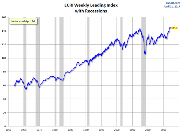
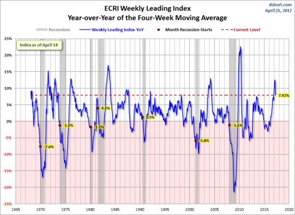
Each month I have been highlighting various estimates of U.S. recession probabilities.  The latest update was that of April 5, 2017, titled “Recession Probability Models – April 2017.”
While I don’t agree with the methodologies employed or the probabilities of impending economic weakness as depicted by these and other estimates, I do believe that the results of these models and estimates should be monitored.
Another probability of recession is provided by James Hamilton, and it is titled “GDP-Based Recession Indicator Index.”  A description of this index, as seen in FRED:
This index measures the probability that the U.S. economy was in a recession during the indicated quarter. It is based on a mathematical description of the way that recessions differ from expansions. The index corresponds to the probability (measured in percent) that the underlying true economic regime is one of recession based on the available data. Whereas the NBER business cycle dates are based on a subjective assessment of a variety of indicators that may not be released until several years after the event , this index is entirely mechanical, is based solely on currently available GDP data and is reported every quarter. Due to the possibility of data revisions and the challenges in accurately identifying the business cycle phase, the index is calculated for the quarter just preceding the most recently available GDP numbers. Once the index is calculated for that quarter, it is never subsequently revised. The value at every date was inferred using only data that were available one quarter after that date and as those data were reported at the time.
If the value of the index rises above 67% that is a historically reliable indicator that the economy has entered a recession. Once this threshold has been passed, if it falls below 33% that is a reliable indicator that the recession is over.
Additional reference sources for this index and its construction can be seen in the Econbrowser post of February 14, 2016 titled “Recession probabilities” as well as on the “The Econbrowser Recession Indicator Index” page.
Below is a chart depicting the most recent value of 8.4%, for the fourth quarter of 2016, last updated on April 28, 2017 (after the April 28, 2017 Gross Domestic Product Q1 2017 Advance Estimate (pdf)):
GDP-Based Recession Indicator Index
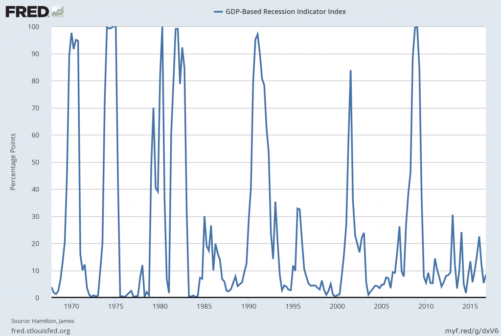
source:  Hamilton, James, GDP-Based Recession Indicator Index [JHGDPBRINDX], retrieved from FRED, Federal Reserve Bank of St. Louis on April 28, 2017:
_________
I post various indicators and indices because I believe they should be carefully monitored.  However, as those familiar with this site are aware, I do not necessarily agree with what they depict or imply.
_____
The Special Note summarizes my overall thoughts about our economic situation
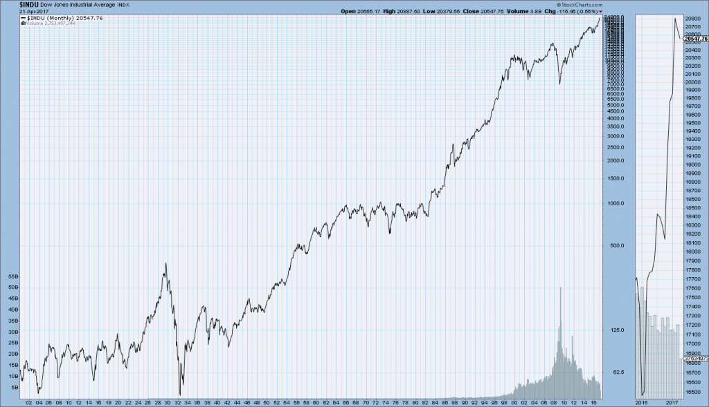
SPX at 2384.20 as this post is written

Friday, April 28, 2017

Velocity Of Money – Charts Updated Through April 28, 2017

Here are three charts from the St. Louis Fed depicting the velocity of money in terms of the MZM, M1 and M2 money supply measures.
All charts reflect quarterly data through the 1st quarter of 2017, and were last updated as of April 28, 2017.  As one can see, two of the three measures are at an all-time low for the periods depicted:
Velocity of MZM Money Stock, current value = 1.295:
MZMV 4-28-17
Data Source: FRED, Federal Reserve Economic Data, Federal Reserve Bank of St. Louis; accessed April 28, 2017:
Velocity of M1 Money Stock, current value = 5.592:
M1V_4-28-17 5.592
Data Source: FRED, Federal Reserve Economic Data, Federal Reserve Bank of St. Louis; accessed April 28, 2017:
Velocity of M2 Money Stock, current value = 1.428:
M2V_4-28-17 1.428
Data Source: FRED, Federal Reserve Economic Data, Federal Reserve Bank of St. Louis; accessed April 28, 2017:
_________
I post various indicators and indices because I believe they should be carefully monitored.  However, as those familiar with this site are aware, I do not necessarily agree with what they depict or imply.
_____
The Special Note summarizes my overall thoughts about our economic situation
SPX at 2384.22 as this post is written

Consumer Confidence Surveys – As Of April 28, 2017

Doug Short had a blog post of April 28, 2017 (“Michigan Consumer Sentiment:  April Final Continues Positive Trend“) in which he presents the latest Conference Board Consumer Confidence and Thomson/Reuters University of Michigan Consumer Sentiment Index charts.  They are presented below:
(click on charts to enlarge images)
Conference Board Consumer Confidence
University of Michigan Consumer Sentiment
There are a few aspects of the above charts that I find highly noteworthy.  Of course, until the sudden upswing in 2014, the continued subdued absolute levels of these two surveys was disconcerting.
Also, I find the “behavior” of these readings to be quite disparate as compared to the other post-recession periods, as shown in the charts between the gray shaded areas (the gray areas denote recessions as defined by the NBER.)
While I don’t believe that confidence surveys should be overemphasized, I find these readings to be very problematical, especially in light of a variety of other highly disconcerting measures highlighted throughout this site.
_____
The Special Note summarizes my overall thoughts about our economic situation
SPX at 2385.11 as this post is written

Employment Cost Index (ECI) – First Quarter 2017

While the concept of Americans’ incomes can be defined in a number of ways, many prominent measures continue to show disconcerting trends.
One prominent measure is the Employment Cost Index (ECI).
Here is a description from the BLS document titled “The Employment Cost Index:  what is it?“:
The Employment Cost Index (ECI) is a quarterly measure of the change in the price of labor, defined as compensation per employee hour worked. Closely watched by many economists, the ECI is an indicator of cost pressures within companies that could lead to price inflation for finished goods and services. The index measures changes in the cost of compensation not only for wages and salaries, but also for an extensive list of benefits. As a fixed-weight, or Laspeyres, index, the ECI controls for changes occurring over time in the industrial-occupational composition of employment.
On April 28, 2017, the ECI for the first quarter was released.  Here are two excerpts from the BLS release titled “Employment Cost Index – March 2017“:
Compensation costs for civilian workers increased 0.8 percent, seasonally adjusted, for the 3-month period ending in March 2017, the U.S. Bureau of Labor Statistics reported today. Wages and salaries (which make up about 70 percent of compensation costs) increased 0.8 percent, and benefits (which make up the remaining 30 percent of compensation) increased 0.7 percent. (See tables A, 1, 2, and 3.)
also:
Compensation costs for civilian workers increased 2.4 percent for the 12-month period ending in March 2017. In March 2016, compensation costs increased 1.9 percent. Wages and salaries increased 2.5 percent for the current 12-month period and increased 2.0 percent for the 12-month period ending in March 2016. Benefit costs increased 2.2 percent for the 12-month period ending in March 2017. In March 2016, the increase was 1.7 percent. (See tables A, 4, 8, and 12.)
Below are three charts, updated on April 28, 2017 that depict various aspects of the ECI, which is seasonally adjusted (SA):
The first depicts the ECI, with a value of 129.0:
ECIALLCIV
source: US. Bureau of Labor Statistics, Employment Cost Index: Total compensation: All Civilian[ECIALLCIV], retrieved from FRED, Federal Reserve Bank of St. Louis, accessed April 28, 2017:
The second chart depicts the ECI on a “Percent Change from Year Ago” basis:
ECIALLCIV percent change from year ago
The third chart depicts the ECI on a “Percent Change” (from last quarter) basis:
ECIALLCIV percent change from last quarter
_________
I post various indicators and indices because I believe they should be carefully monitored.  However, as those familiar with this site are aware, I do not necessarily agree with what they depict or imply.
_____
The Special Note summarizes my overall thoughts about our economic situation
SPX at 2386.38 as this post is written

Real GDP Chart Since 1947 With Trendline – 1st Quarter 2017

For reference purposes, below is a chart from Doug Short’s “Q1 GDP Advance Estimate: Real GDP Drops to .7 percent, Disappoints Forecast” post of April 28, 2017, depicting Real GDP, with a trendline, as depicted.  This chart reflects the Gross Domestic Product Q1 2017 Advance Estimate (pdf) of April 28, 2017:
U.S. Real GDP chart
_________
I post various indicators and indices because I believe they should be carefully monitored.  However, as those familiar with this site are aware, I do not necessarily agree with what they depict or imply.
_____
The Special Note summarizes my overall thoughts about our economic situation
SPX at 2387.90 as this post is written

Thursday, April 27, 2017

Durable Goods New Orders – Long-Term Charts Through March 2017

Many people place emphasis on Durable Goods New Orders as a prominent economic indicator and/or leading economic indicator.
For reference, below are two charts depicting this measure.
First, from the St. Louis Fed site (FRED), a chart through March 2017, updated on April 27, 2017. This value is $238,713 ($ Millions):
(click on charts to enlarge images)
Durable Goods New Orders
Second, here is the chart depicting this measure on a “Percentage Change from a Year Ago” basis:
DGORDER Percent Change From Year Ago
Data Source: FRED, Federal Reserve Economic Data, Federal Reserve Bank of St. Louis: Manufacturers’ New Orders:  Durable Goods [DGORDER]; U.S. Department of Commerce: Census Bureau; accessed April 27, 2017;
_________
I post various indicators and indices because I believe they should be carefully monitored.  However, as those familiar with this site are aware, I do not necessarily agree with what they depict or imply.
_____
The Special Note summarizes my overall thoughts about our economic situation
SPX at 2391.48 as this post is written

Wednesday, April 26, 2017

Chicago Fed National Financial Conditions Index (NFCI)

The St. Louis Fed’s Financial Stress Index (STLFSI) is one index that is supposed to measure stress in the financial system.  Its reading as of the April 20, 2017 update (reflecting data through April 14, 2017) is -1.309.
Of course, there are a variety of other measures and indices that are supposed to measure financial stress and other related issues, both from the Federal Reserve as well as from private sources.
Two other indices that I regularly monitor include the Chicago Fed National Financial Conditions Index (NFCI) as well as the Chicago Fed Adjusted National Financial Conditions Index (ANFCI).
Here are summary descriptions of each, as seen in FRED:
The National Financial Conditions Index (NFCI) measures risk, liquidity and leverage in money markets and debt and equity markets as well as in the traditional and “shadow” banking systems. Positive values of the NFCI indicate financial conditions that are tighter than average, while negative values indicate financial conditions that are looser than average.
The adjusted NFCI (ANFCI). This index isolates a component of financial conditions uncorrelated with economic conditions to provide an update on how financial conditions compare with current economic conditions.
For further information, please visit the Federal Reserve Bank of Chicago’s web site:
Below are the most recently updated charts of the NFCI and ANFCI, respectively.
The NFCI chart below was last updated on April 26, 2017 incorporating data from January 5,1973 through April 21, 2017, on a weekly basis.  The April 21, 2017 value is -.77:
NFCI
Data Source: FRED, Federal Reserve Economic Data, Federal Reserve Bank of St. Louis; accessed April 26, 2017:
The ANFCI chart below was last updated on April 26, 2017 incorporating data from January 5,1973 through April 21, 2017, on a weekly basis.  The April 21 value is -.20:
ANFCI
Data Source: FRED, Federal Reserve Economic Data, Federal Reserve Bank of St. Louis; accessed April 26, 2017:
_________
I post various indicators and indices because I believe they should be carefully monitored.  However, as those familiar with this site are aware, I do not necessarily agree with what they depict or imply.
_____
The Special Note summarizes my overall thoughts about our economic situation
SPX at 2393.47 as this post is written

Monday, April 24, 2017

Updates Of Economic Indicators April 2017

Here is an update of various indicators that are supposed to predict and/or depict economic activity. These indicators have been discussed in previous blog posts:
The April 2017 Chicago Fed National Activity Index (CFNAI) updated as of April 24, 2017:
The CFNAI, with current reading of .08:
CFNAI
Federal Reserve Bank of Chicago, Chicago Fed National Activity Index [CFNAI], retrieved from FRED, Federal Reserve Bank of St. Louis, April 24, 2017;
The CFNAI-MA3, with current reading of .03:
CFNAIMA3
Federal Reserve Bank of Chicago, Chicago Fed National Activity Index: Three Month Moving Average [CFNAIMA3], retrieved from FRED, Federal Reserve Bank of St. Louis, April 24, 2017;
As of April 21, 2017 (incorporating data through April 14, 2017) the WLI was at 144.1 and the WLI, Gr. was at 6.5%.
A chart of the WLI,Gr., from Doug Short’s ECRI update post of April 21, 2017:
ECRI WLI,Gr. since 2000
Here is the latest chart, depicting the ADS Index from December 31, 2007 through April 15, 2017:
ADS Index
The Conference Board Leading (LEI), Coincident (CEI) Economic Indexes, and Lagging Economic Indicator (LAG):
As per the April 20, 2017 press release, titled “The Conference Board Leading Economic Index (LEI) for the U.S. Increased in March” (pdf) the LEI was at 126.7, the CEI was at 114.9, and the LAG was 123.6 in March.
An excerpt from the  release:
“The March increase and upward trend in the U.S. LEI point to continued economic growth in 2017, with perhaps an acceleration later in the year if consumer spending and investment pick up,” said Ataman Ozyildirim, Director of Business Cycles and Growth Research at The Conference Board. “The gains among the leading indicators were very widespread, with new orders in manufacturing and the interest rate spread more than offsetting declines in the labor market components in March.”
Here is a chart of the LEI from Doug Short’s Conference Board Leading Economic Index update of April 20, 2017:
Conference Board LEI
_________
I post various indicators and indices because I believe they should be carefully monitored.  However, as those familiar with this site are aware, I do not necessarily agree with what they depict or imply.
_____
The Special Note summarizes my overall thoughts about our economic situation
SPX at 2374.76 as this post is written

The U.S. Economic Situation – April 24, 2017 Update

Perhaps the main reason that I write of our economic situation is that I continue to believe, based upon various analyses, that our economic situation is in many ways misunderstood.  While no one likes to contemplate a future rife with economic adversity, current and future economic problems must be properly recognized and rectified if high-quality, sustainable long-term economic vitality is to be realized.
There are an array of indications and other “warning signs” – many readily apparent – that current economic activity and financial market performance is accompanied by exceedingly perilous dynamics.
I have written extensively about this peril, including in the following:
Building Financial Danger” (ongoing updates)
My analyses continues to indicate that the growing level of financial danger will lead to the next stock market crash that will also involve (as seen in 2008) various other markets as well.  Key attributes of this next crash is its outsized magnitude (when viewed from an ultra-long term historical perspective) and the resulting economic impact.  This next financial crash is of tremendous concern, as my analyses indicate it will lead to a Super Depression – i.e. an economy characterized by deeply embedded, highly complex, and difficult-to-solve problems.
For long-term reference purposes, here is a chart of the Dow Jones Industrial Average since 1900, depicted on a monthly basis using a LOG scale (updated through April 21, 2017, with a last value of 20,768.77):
(click on chart to enlarge image)(chart courtesy of StockCharts.com)
DJIA since 1900
_____
The Special Note summarizes my overall thoughts about our economic situation
SPX at 2372.98 as this post is written

Friday, April 21, 2017

Long-Term Charts Of The ECRI WLI & ECRI WLI, Gr. – April 21, 2017 Update

As I stated in my July 12, 2010 post (“ECRI WLI Growth History“):
For a variety of reasons, I am not as enamored with ECRI’s WLI and WLI Growth measures as many are.
However, I do think the measures are important and deserve close monitoring and scrutiny.
Below are three long-term charts, from Doug Short’s ECRI update post of April 21, 2017 titled “ECRI Weekly Leading Index…”  These charts are on a weekly basis through the April 21, 2017 release, indicating data through April 14, 2017.
Here is the ECRI WLI (defined at ECRI’s glossary):
ECRI WLI
This next chart depicts, on a long-term basis, the Year-over-Year change in the 4-week moving average of the WLI:
This last chart depicts, on a long-term basis, the WLI, Gr.:
ECRI WLI,Gr.
_________
I post various economic indicators and indices because I believe they should be carefully monitored.  However, as those familiar with this site are aware, I do not necessarily agree with what they depict or imply.
_____
The Special Note summarizes my overall thoughts about our economic situation
SPX at 2350.64 as this post is written

Thursday, April 20, 2017

Trends Of S&P500 Earnings Forecasts

S&P500 earnings trends and estimates are a notably important topic, for a variety of reasons, at this point in time.
FactSet publishes a report titled “Earnings Insight” that contains a variety of information including the trends and expectations of S&P500 earnings.
For reference purposes, here are two charts as seen in the “Earnings Insight” (pdf) report of April 13, 2017:
from page 22:
(click on charts to enlarge images)
S&P500 EPS estimates
from page 23:
S&P500 annual EPS
_____
I post various economic forecasts because I believe they should be carefully monitored.  However, as those familiar with this site are aware, I do not agree with many of the consensus estimates and much of the commentary in these forecast surveys.
_____
The Special Note summarizes my overall thoughts about our economic situation
SPX at 2338.17 as this post is written

Wednesday, April 19, 2017

S&P500 EPS Estimates 2017 Through 2019

As many are aware, Thomson Reuters publishes earnings estimates for the S&P500.  (My other posts concerning S&P earnings estimates can be found under the S&P500 Earnings label)
The following estimates are from Exhibit 20 of the “S&P500 Earnings Scorecard” (pdf) of April 19, 2017, and represent an aggregation of individual S&P500 component “bottom up” analyst forecasts.  For reference, the Year 2014 value is $118.78/share, the Year 2015 value is $117.46, and the Year 2016 value is $118.10/share:
Year 2017 estimate:
$130.92/share
Year 2018 estimate:
$146.81/share
Year 2019 estimate:
$160.63/share
_____
I post various economic forecasts because I believe they should be carefully monitored.  However, as those familiar with this site are aware, I do not agree with many of the consensus estimates and much of the commentary in these forecast surveys.
_____
The Special Note summarizes my overall thoughts about our economic situation
SPX at 2338.17 as this post is written

Standard & Poor’s S&P500 Earnings Estimates For 2017 And 2018 – As Of April 13, 2017

As many are aware, Standard & Poor’s publishes earnings estimates for the S&P500.  (My posts concerning their estimates can be found under the S&P500 Earnings label)
For reference purposes, the most current estimates are reflected below, and are as of April 13, 2017:
Year 2017 estimates add to the following:
-From a “bottom up” perspective, operating earnings of $129.69/share
-From a “top down” perspective, operating earnings of N/A
-From a “bottom up” perspective, “as reported” earnings of $118.47/share
Year 2018 estimates add to the following:
-From a “bottom up” perspective, operating earnings of $146.15/share
-From a “top down” perspective, operating earnings of N/A
-From a “bottom up” perspective, “as reported” earnings of $132.45/share
_____
I post various economic forecasts because I believe they should be carefully monitored.  However, as those familiar with this site are aware, I do not agree with many of the consensus estimates and much of the commentary in these forecast surveys.
_____
The Special Note summarizes my overall thoughts about our economic situation
SPX at 2337.06 as this post is written

Chicago Fed National Financial Conditions Index (NFCI)

The St. Louis Fed’s Financial Stress Index (STLFSI) is one index that is supposed to measure stress in the financial system.  Its reading as of the April 13, 2017 update (reflecting data through April 7, 2017) is -1.369.
Of course, there are a variety of other measures and indices that are supposed to measure financial stress and other related issues, both from the Federal Reserve as well as from private sources.
Two other indices that I regularly monitor include the Chicago Fed National Financial Conditions Index (NFCI) as well as the Chicago Fed Adjusted National Financial Conditions Index (ANFCI).
Here are summary descriptions of each, as seen in FRED:
The National Financial Conditions Index (NFCI) measures risk, liquidity and leverage in money markets and debt and equity markets as well as in the traditional and “shadow” banking systems. Positive values of the NFCI indicate financial conditions that are tighter than average, while negative values indicate financial conditions that are looser than average.
The adjusted NFCI (ANFCI). This index isolates a component of financial conditions uncorrelated with economic conditions to provide an update on how financial conditions compare with current economic conditions.
For further information, please visit the Federal Reserve Bank of Chicago’s web site:
Below are the most recently updated charts of the NFCI and ANFCI, respectively.
The NFCI chart below was last updated on April 19, 2017 incorporating data from January 5,1973 through April 14, 2017, on a weekly basis.  The April 14, 2017 value is -.78:
NFCI
Data Source: FRED, Federal Reserve Economic Data, Federal Reserve Bank of St. Louis; accessed April 19, 2017:
The ANFCI chart below was last updated on April 19, 2017 incorporating data from January 5,1973 through April 14, 2017, on a weekly basis.  The April 14 value is -.15:
ANFCI
Data Source: FRED, Federal Reserve Economic Data, Federal Reserve Bank of St. Louis; accessed April 19, 2017:
_________
I post various indicators and indices because I believe they should be carefully monitored.  However, as those familiar with this site are aware, I do not necessarily agree with what they depict or imply.
_____
The Special Note summarizes my overall thoughts about our economic situation
SPX at 2343.58 as this post is written

Tuesday, April 18, 2017

April 2017 IMF Report – Probabilities Of Recession And Deflation

The International Monetary Fund (IMF) recently published the April 2017 “World Economic Outlook.” (pdf)  The subtitle is “Gaining Momentum?”
One area of the report is Figure 1.20 on page 29.  While I do not agree with the current readings of the two measures presented – Probability of Recession and the Probability of Deflation – I do find them to be notable, especially as one can compare these estimates across various global economies.
As one can see, the report states that the U.S. is estimated to have a roughly 22% probability of recession and roughly a 2% probability of deflation for the periods indicated.
_________
I post various economic indicators and indices because I believe they should be carefully monitored.  However, as those familiar with this blog are aware, I do not necessarily agree with what they depict or imply.
_____
The Special Note summarizes my overall thoughts about our economic situation
SPX at 2343.51 this post is written