Friday, December 30, 2016

Median Household Income Chart

I have written many blog posts concerning the worrisome trends in income and earnings.
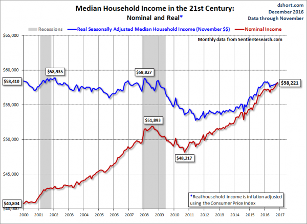
Doug Short, in his December 30, 2016 post titled “Real Median Household Income:  Slow Growth in 2016” produced the chart below.  It is based upon data from Sentier Research, and it shows both nominal and real median household incomes since 2000, as depicted.  As one can see, post-recession real median household income (seen in the blue line since 2009) remains worrisome.
(click on chart to enlarge image)
Median Household Income
As Doug mentions in his aforementioned post:
As the excellent data from Sentier Research makes clear, the mainstream U.S. household was struggling before the Great Recession. At this point, real household incomes are about where they were during the middle of the Great Recession.
Among other items seen in his blog post is a chart depicting each of the two (nominal and real household incomes) data series’ percent change over time since 2000.
_________
I post various indicators and indices because I believe they should be carefully monitored.  However, as those familiar with this site are aware, I do not necessarily agree with what they depict or imply.
_____
The Special Note summarizes my overall thoughts about our economic situation

SPX at 2243.62 as this post is written

Thursday, December 29, 2016

Chicago Fed National Financial Conditions Index (NFCI)

The St. Louis Fed’s Financial Stress Index (STLFSI) is one index that is supposed to measure stress in the financial system.  Its reading as of the December 29, 2016 update (reflecting data through December 23) is -1.134.
Of course, there are a variety of other measures and indices that are supposed to measure financial stress and other related issues, both from the Federal Reserve as well as from private sources.
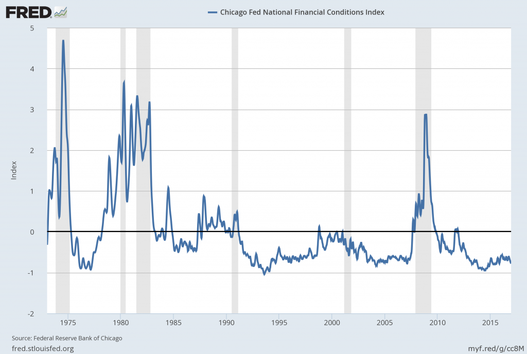
Two other indices that I regularly monitor include the Chicago Fed National Financial Conditions Index (NFCI) as well as the Chicago Fed Adjusted National Financial Conditions Index (ANFCI).
Here are summary descriptions of each, as seen in FRED:
The National Financial Conditions Index (NFCI) measures risk, liquidity and leverage in money markets and debt and equity markets as well as in the traditional and “shadow” banking systems. Positive values of the NFCI indicate financial conditions that are tighter than average, while negative values indicate financial conditions that are looser than average.
The adjusted NFCI (ANFCI). This index isolates a component of financial conditions uncorrelated with economic conditions to provide an update on how financial conditions compare with current economic conditions.
For further information, please visit the Federal Reserve Bank of Chicago’s web site:
Below are the most recently updated charts of the NFCI and ANFCI, respectively.
The NFCI chart below was last updated on December 29, 2016 incorporating data from January 5,1973 through December 23, 2016, on a weekly basis.  The December 23, 2016 value is -.77:
NFCI
Data Source: FRED, Federal Reserve Economic Data, Federal Reserve Bank of St. Louis; accessed December 29, 2016:
The ANFCI chart below was last updated on December 29, 2016 incorporating data from January 5,1973 through December 23, 2016, on a weekly basis.  The December 23 value is -.17:
ANFCI
Data Source: FRED, Federal Reserve Economic Data, Federal Reserve Bank of St. Louis; accessed December 29, 2016:
_________
I post various indicators and indices because I believe they should be carefully monitored.  However, as those familiar with this blog are aware, I do not necessarily agree with what they depict or imply.
_____
The Special Note summarizes my overall thoughts about our economic situation

SPX at 2247.89 as this post is written
misc. note – corrections of blog posts

In the July 2, 2010 post I explained my policy with regard to changing the content of posts after the day the posts have been published on the blog.

Tuesday, December 27, 2016

Consumer Confidence Surveys – As Of December 27, 2016

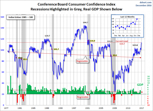
Doug Short had a blog post of December 27, 2016 (“Consumer Confidence Increases in December“) in which he presents the latest Conference Board Consumer Confidence and Thomson/Reuters University of Michigan Consumer Sentiment Index charts.  They are presented below:
(click on charts to enlarge images)
Conference Board Consumer Confidence
University of Michigan Consumer Sentiment
There are a few aspects of the above charts that I find highly noteworthy.  Of course, until the recent sudden upswing, the continued subdued absolute levels of these two surveys was disconcerting.
Also, I find the “behavior” of these readings to be quite disparate as compared to the other post-recession periods, as shown in the charts between the gray shaded areas (the gray areas denote recessions as defined by the NBER.)
While I don’t believe that confidence surveys should be overemphasized, I find these readings to be very problematical, especially in light of a variety of other highly disconcerting measures highlighted throughout this site.
_____
The Special Note summarizes my overall thoughts about our economic situation
SPX at 2271.05 as this post is written

Friday, December 23, 2016

Long-Term Charts Of The ECRI WLI & ECRI WLI, Gr. – December 23, 2016 Update

As I stated in my July 12, 2010 post (“ECRI WLI Growth History“):
For a variety of reasons, I am not as enamored with ECRI’s WLI and WLI Growth measures as many are.
However, I do think the measures are important and deserve close monitoring and scrutiny.
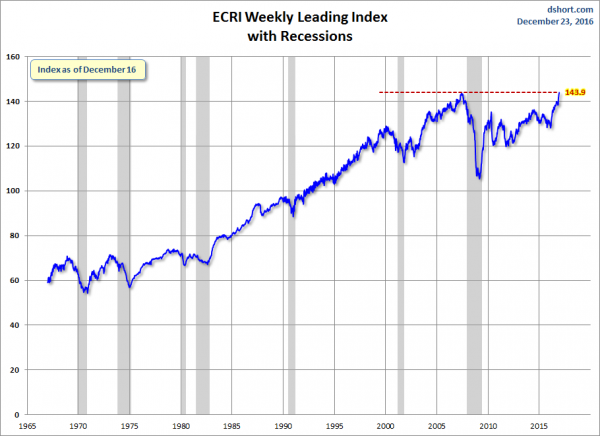
Below are three long-term charts, from Doug Short’s ECRI update post of December 23, 2016 titled “ECRI Weekly Leading Index: "Pinching Productivity.”  These charts are on a weekly basis through the December 23, 2016 release, indicating data through December 16, 2016.
Here is the ECRI WLI (defined at ECRI’s glossary):
ECRI WLI
This next chart depicts, on a long-term basis, the Year-over-Year change in the 4-week moving average of the WLI:
This last chart depicts, on a long-term basis, the WLI, Gr.:
ECRI WLI,Gr.
_________
I post various economic indicators and indices because I believe they should be carefully monitored.  However, as those familiar with this blog are aware, I do not necessarily agree with what they depict or imply.
_____
The Special Note summarizes my overall thoughts about our economic situation
SPX at 2260.97 as this post is written
The U.S. Economic Situation – December 23, 2016 Update

Perhaps the main reason that I write of our economic situation is that I continue to believe, based upon various analyses, that our economic situation is in many ways misunderstood.  While no one likes to contemplate a future rife with economic adversity, current and future economic problems must be properly recognized and rectified if high-quality, sustainable long-term economic vitality is to be realized.
There are an array of indications and other “warning signs” – many readily apparent – that current economic activity and financial market performance is accompanied by exceedingly perilous dynamics.
I have written extensively about this peril, including in the following:
Building Financial Danger” (ongoing updates)
My analyses continues to indicate that the growing level of financial danger will lead to the next stock market crash that will also involve (as seen in 2008) various other markets as well.  Key attributes of this next crash is its outsized magnitude (when viewed from an ultra-long term historical perspective) and the resulting economic impact.  This next financial crash is of tremendous concern, as my analyses indicate it will lead to a Super Depression – i.e. an economy characterized by deeply embedded, highly complex, and difficult-to-solve problems.
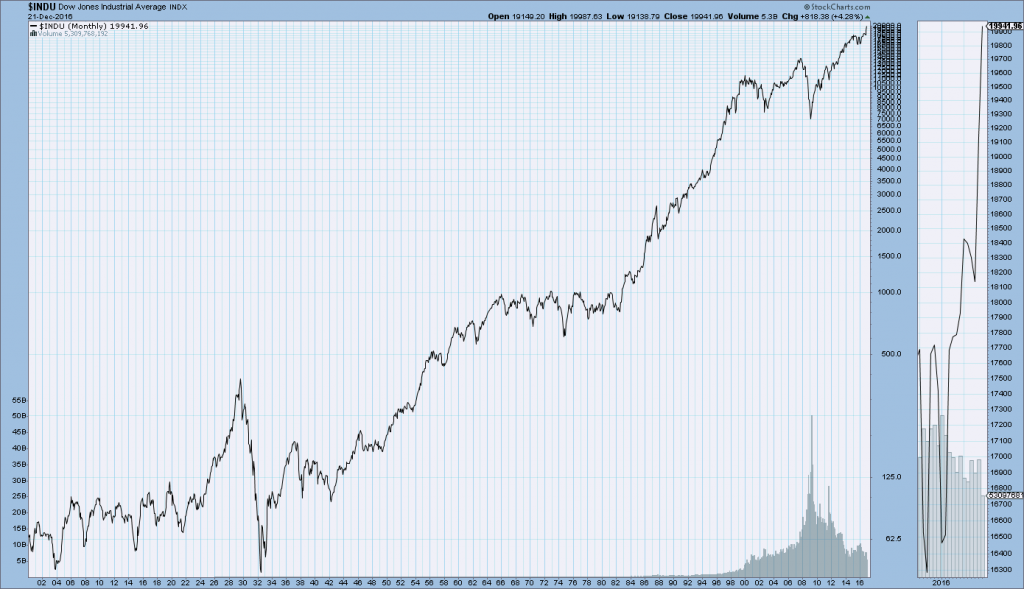
For long-term reference purposes, here is a chart of the Dow Jones Industrial Average since 1900, depicted on a monthly basis using a LOG scale (updated through December 16, 2016, with a last value of 19941.96):
(click on chart to enlarge image)(chart courtesy of StockCharts.com)
DJIA since 1900
_____
The Special Note summarizes my overall thoughts about our economic situation
SPX at 2260.60 as this post is written

Thursday, December 22, 2016

Updates Of Economic Indicators December 2016

Here is an update of various indicators that are supposed to predict and/or depict economic activity. These indicators have been discussed in previous blog posts:
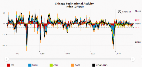
The December 2016 Chicago Fed National Activity Index (CFNAI) updated as of December 22, 2016: (current reading of CFNAI is -.27; current reading of CFNAI-MA3 is -.14):
CFNAI
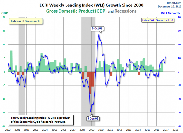
As of December 16, 2016 (incorporating data through December 9, 2016) the WLI was at 143.4 and the WLI, Gr. was at 11.0%.
A chart of the WLI,Gr., from Doug Short’s ECRI update post of December 16, 2016:
ECRI WLI, Gr.
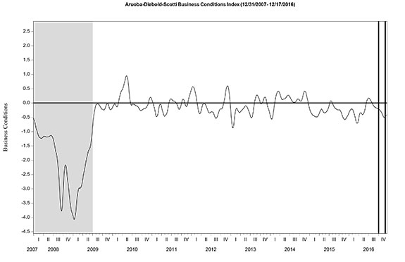
Here is the latest chart, depicting the ADS Index from December 31, 2007 through December 17, 2016:
ADS Index
The Conference Board Leading (LEI), Coincident (CEI) Economic Indexes, and Lagging Economic Indicator (LAG):
As per the December 16, 2016 press release, titled “The Conference Board Leading Economic Index (LEI) for the U.S. Increased Remains Flat in November,” (pdf) the LEI was at 124.6, the CEI was at 114.6, and the LAG was 123.2 in November.
An excerpt from the  release:
“The U.S. Leading Economic Index continued on an upward trend through 2016, although at a moderate pace of growth,” said Ataman Ozyildirim, Director of Business Cycles and Growth Research at The Conference Board. “The underlying trends in the LEI suggest that the economy will continue expanding into the first half of 2017, but it’s unlikely to considerably accelerate. Although the industrial and construction indicators held the U.S. LEI back in November, the weakness was offset by improvements in the interest rate spread, initial unemployment insurance claims, and stock prices.”
_________
I post various indicators and indices because I believe they should be carefully monitored.  However, as those familiar with this blog are aware, I do not necessarily agree with what they depict or imply.
_____
The Special Note summarizes my overall thoughts about our economic situation
SPX at 2260.97 as this post is written

Durable Goods New Orders – Long-Term Charts Through November 2016

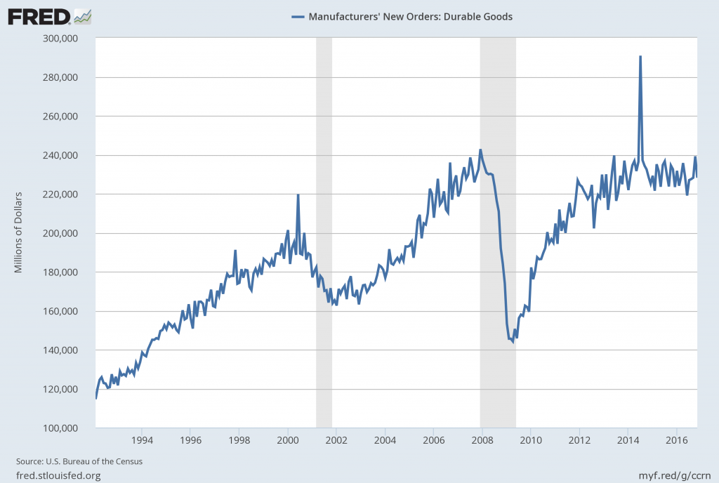
Many people place emphasis on Durable Goods New Orders as a prominent economic indicator and/or leading economic indicator.
For reference, below are two charts depicting this measure.
First, from the St. Louis Fed site (FRED), a chart through November 2016, updated on December 22, 2016. This value is $228,171 ($ Millions):
(click on charts to enlarge images)
Durable Goods New Orders
Second, here is the chart depicting this measure on a “Percentage Change from a Year Ago” basis:
Durable Goods New Orders percent change from year ago
Data Source: FRED, Federal Reserve Economic Data, Federal Reserve Bank of St. Louis: Manufacturers’ New Orders:  Durable Goods [DGORDER]; U.S. Department of Commerce: Census Bureau; accessed December 22, 2016;
_________
I post various indicators and indices because I believe they should be carefully monitored.  However, as those familiar with this blog are aware, I do not necessarily agree with what they depict or imply.
_____
The Special Note summarizes my overall thoughts about our economic situation
SPX at 2258.78 as this post is written

The Yield Curve – December 22, 2016

Many people believe that the Yield Curve is an important economic indicator.
On March 1, 2010, I wrote a post on the issue, titled “The Yield Curve As A Leading Economic Indicator.”
An excerpt from that post:
On the NY Fed link above, they have posted numerous studies that support the theory that the yield curve is a leading indicator.   My objections with using it as a leading indicator, especially now, are various.  These objections include: I don’t think such a narrow measure is one that can be relied upon;  both the yields at the short and long-end of the curve have been overtly and officially manipulated, thus distorting the curve; and, although the yield curve may have been an accurate leading indicator in the past, this period of economic weakness is inherently dissimilar in nature from past recessions and depressions in a multitude of ways – thus, historical yardsticks and metrics probably won’t (and have not) proven appropriate.
While I continue to have the above-stated reservations regarding the “yield curve” as an indicator, I do believe that it should be monitored.
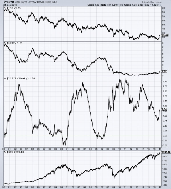
As an indication of the yield curve, below is a weekly chart from January 1, 1990 through December 21, 2016.  The top two plots show the 10-Year Treasury and 2-Year Treasury yields.  The third plot shows the (yield) spread between the 10-Year Treasury and 2-Year Treasury, with the December 21, 2016 closing value of 1.34%.  The bottom plot shows the S&P500:
(click on chart to enlarge image)(chart courtesy of StockCharts.com; chart creation and annotation by the author)
Yield Curve
Additionally, below is a chart showing the same spread between the 10-Year Treasury and 2-Year Treasury, albeit with a slightly different measurement, using constant maturity securities.  This daily chart is from June 1, 1976 through December 20, 2016, with recessionary periods shown in gray. This chart shows a value of 1.32%:
T10Y2Y
source:  Federal Reserve Bank of St. Louis, 10-Year Treasury Constant Maturity Minus 2-Year Treasury Constant Maturity [T10Y2Y], retrieved from FRED, Federal Reserve Bank of St. Louis; accessed December 22, 2016:
_____
The Special Note summarizes my overall thoughts about our economic situation
SPX at 2265.18 as this post is written
Wednesday, December 21, 2016

Chicago Fed National Financial Conditions Index (NFCI)

The St. Louis Fed’s Financial Stress Index (STLFSI) is one index that is supposed to measure stress in the financial system.  Its reading as of the December 15, 2016 update (reflecting data through December 9) is -1.18.
Of course, there are a variety of other measures and indices that are supposed to measure financial stress and other related issues, both from the Federal Reserve as well as from private sources.
Two other indices that I regularly monitor include the Chicago Fed National Financial Conditions Index (NFCI) as well as the Chicago Fed Adjusted National Financial Conditions Index (ANFCI).
Here are summary descriptions of each, as seen in FRED:
The National Financial Conditions Index (NFCI) measures risk, liquidity and leverage in money markets and debt and equity markets as well as in the traditional and “shadow” banking systems. Positive values of the NFCI indicate financial conditions that are tighter than average, while negative values indicate financial conditions that are looser than average.
The adjusted NFCI (ANFCI). This index isolates a component of financial conditions uncorrelated with economic conditions to provide an update on how financial conditions compare with current economic conditions.
For further information, please visit the Federal Reserve Bank of Chicago’s web site:
Below are the most recently updated charts of the NFCI and ANFCI, respectively.
The NFCI chart below was last updated on December 21, 2016 incorporating data from January 5,1973 through December 16, 2016, on a weekly basis.  The December 16, 2016 value is -.78:
NFCI
Data Source: FRED, Federal Reserve Economic Data, Federal Reserve Bank of St. Louis; accessed December 21, 2016:
The ANFCI chart below was last updated on December 21, 2016 incorporating data from January 5,1973 through December 16, 2016, on a weekly basis.  The December 16 value is -.10:
ANFCI
Data Source: FRED, Federal Reserve Economic Data, Federal Reserve Bank of St. Louis; accessed December 21, 2016:
_________
I post various indicators and indices because I believe they should be carefully monitored.  However, as those familiar with this blog are aware, I do not necessarily agree with what they depict or imply.
_____
The Special Note summarizes my overall thoughts about our economic situation
SPX at 2265.18 as this post is written

Money Supply Charts Through November 2016

For reference purposes, below are two sets of charts depicting growth in the money supply.
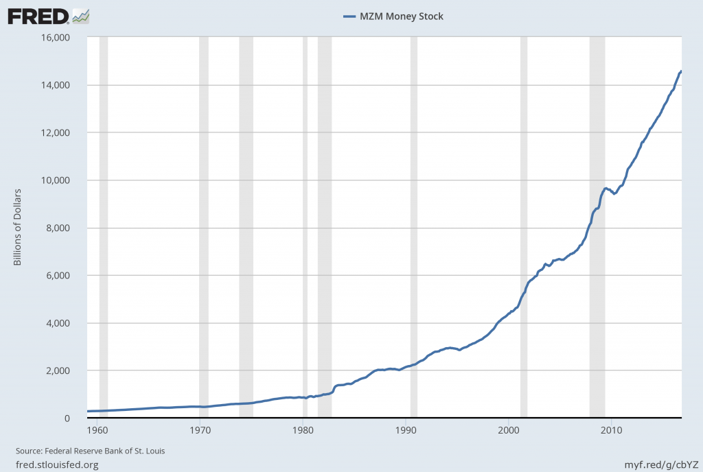
The first shows the MZM (Money Zero Maturity), defined in FRED as the following:
M2 less small-denomination time deposits plus institutional money funds.
Money Zero Maturity is calculated by the Federal Reserve Bank of St. Louis.
Here is the “MZM Money Stock” (seasonally adjusted) chart, updated on December 16, 2016 depicting data through November 2016, with a value of $14,598.2 Billion:
MZMSL
Here is the “MZM Money Stock” chart on a “Percent Change From Year Ago” basis:
MZMSL percent change from year ago
Data Source: FRED, Federal Reserve Economic Data, Federal Reserve Bank of St. Louis; accessed December 21, 2016:
The second set shows M2, defined in FRED as the following:
M2 includes a broader set of financial assets held principally by households. M2 consists of M1 plus: (1) savings deposits (which include money market deposit accounts, or MMDAs); (2) small-denomination time deposits (time deposits in amounts of less than $100,000); and (3) balances in retail money market mutual funds (MMMFs). Seasonally adjusted M2 is computed by summing savings deposits, small-denomination time deposits, and retail MMMFs, each seasonally adjusted separately, and adding this result to seasonally adjusted M1.
Here is the “M2 Money Stock” (seasonally adjusted) chart, updated on December 15, 2016, depicting data through November 2016, with a value of $13,222.9 Billion:
M2SL
Here is the “M2 Money Stock” chart on a “Percent Change From Year Ago” basis:
M2SL
Data Source: FRED, Federal Reserve Economic Data, Federal Reserve Bank of St. Louis; accessed December 21, 2016:
_____
The Special Note summarizes my overall thoughts about our economic situation
SPX at 2270.76 as this post is written

Tuesday, December 20, 2016

Trends Of S&P500 Earnings Forecasts

S&P500 earnings trends and estimates are a notably important topic, for a variety of reasons, at this point in time.
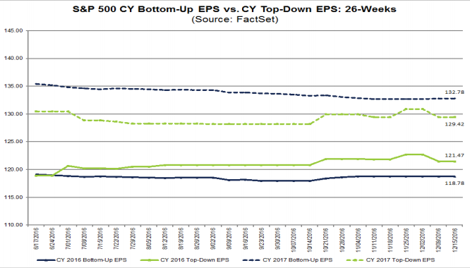
FactSet publishes a report titled “Earnings Insight” that contains a variety of information including the trends and expectations of S&P500 earnings.
For reference purposes, here are two charts as seen in the “Earnings Insight” (pdf) report of December 16, 2016:
from page 19:
(click on charts to enlarge images)
S&P500 EPS trends
from page 20:
S&P500 annual EPS
_____
I post various economic forecasts because I believe they should be carefully monitored.  However, as those familiar with this blog are aware, I do not agree with many of the consensus estimates and much of the commentary in these forecast surveys.
_____
The Special Note summarizes my overall thoughts about our economic situation
SPX at 2270.76 as this post is written

S&P500 EPS Annual Estimates Years 2016 Through 2018

As many are aware, Thomson Reuters publishes earnings estimates for the S&P500.  (My other posts concerning S&P earnings estimates can be found under the S&P500 Earnings label)
The following estimates are from Exhibit 20 of the “S&P500 Earnings Scorecard” (pdf) of December 20, 2016, and represent an aggregation of individual S&P500 component “bottom up” analyst forecasts.  For reference, the Year 2014 value is $118.78/share and the Year 2015 value is $117.46:
Year 2016 estimate:
$118.19/share
Year 2017 estimate:
$132.80/share
Year 2018 estimate:
$148.29/share
_____
I post various economic forecasts because I believe they should be carefully monitored.  However, as those familiar with this blog are aware, I do not agree with many of the consensus estimates and much of the commentary in these forecast surveys.
_____
The Special Note summarizes my overall thoughts about our economic situation
SPX at 2268.81 as this post is written

Monday, December 19, 2016

Standard & Poor’s S&P500 Earnings Estimates For 2016 & 2017 – As Of December 15, 2016

As many are aware, Standard & Poor’s publishes earnings estimates for the S&P500.  (My posts concerning their estimates can be found under the S&P500 Earnings label)
For reference purposes, the most current estimates are reflected below, and are as of December 15, 2016:
Year 2016 estimates add to the following:
-From a “bottom up” perspective, operating earnings of $108.95/share
-From a “top down” perspective, operating earnings of N/A
-From a “bottom up” perspective, “as reported” earnings of $99.36/share
Year 2017 estimates add to the following:
-From a “bottom up” perspective, operating earnings of $131.11/share
-From a “top down” perspective, operating earnings of N/A
-From a “bottom up” perspective, “as reported” earnings of $122.66/share
_____
I post various economic forecasts because I believe they should be carefully monitored.  However, as those familiar with this blog are aware, I do not agree with many of the consensus estimates and much of the commentary in these forecast surveys.
_____
The Special Note summarizes my overall thoughts about our economic situation
SPX at 2261.72 as this post is written

2017 Estimates For S&P500 Earnings & Price Levels

In the December 19, 2016 edition of Barron’s, the cover story is titled “Outlook 2017:  This Bull Has Legs.”
Included in the story, 10 investment strategists give various forecasts for 2017 including S&P500 profits, S&P500 year-end price targets, GDP growth, and 10-Year Treasury Note Yields.
A couple of excerpts:
Every September and December, Barron’s surveys a group of prominent strategists at major investment banks and money-management firms to gauge their outlook for stocks, bonds, and the economy in the months and year ahead. In our previous survey three months ago, this normally upbeat crew was bearish for the first time in many years (“Barron’s Survey: Strategists Say Beware the Bear,” Cover Story, Sept. 3). Now they have returned to optimistic form, noting that Corporate America will get a significant boost to profits from anticipated lower corporate taxes, infrastructure spending, and reduced regulations under a Republican-dominated federal government that takes office next year. They expect job growth to accelerate, too.
also:
Our prognosticators forecast aggregate growth in S&P 500 earnings of about 7% next year, to $127 from an expected $118.75 in 2016. In most cases, the 2017 number doesn’t include the majority of Trump’s proposed reforms. Instead, it reflects incremental earnings gains plus a sharp rebound in energy-company profits, now that oil prices have nearly doubled from their February low. The Trump agenda, in force, could add $5 to $10 to S&P earnings, the strategists say. Industry analysts are forecasting 2017 earnings of $132.69, a 12% increase over this year.
The average estimate for the S&P500 at the end of 2017 is 2380.
The article also mentions that among the investment strategists, average expected 2017 GDP growth is 2.4%.
_____
I post various economic forecasts because I believe they should be carefully monitored.  However, as those familiar with this blog are aware, I do not agree with many of the consensus estimates and much of the commentary in these forecast surveys.
_____
The Special Note summarizes my overall thoughts about our economic situation
SPX at 2258.07 as this post is written

The Strength And Stability Of The Financial System

Recently a number of prominent parties have stated that, in effect, the financial system is "stable" and "strong."  One such example is the comments made by Janet Yellen in the December 14, 2016 FOMC Press Conference ("Janet Yellen's December 14, 2016 Press Conference.")
Many attribute various financial regulations and reforms, enacted since the Financial Crisis, for this (purported) stability.
My beliefs on the subject of whether the overall financial system has strengthened - and whether it is now "strong" and/or "stable" - continue to be that discussed in a variety of past posts.   These beliefs are perhaps best summarized in the August 7, 2014 post titled "Thoughts Concerning The Next Financial Crisis" as well as the March 18, 2014 post titled "Was A Depression Successfully Avoided?"
_____
The Special Note summarizes my overall thoughts about our economic situation
SPX at 2258.07 as this post is written

Thursday, December 15, 2016

Janet Yellen’s December 14, 2016 Press Conference – Notable Aspects

On Wednesday, December 14, 2016 Janet Yellen gave her scheduled December 2016 FOMC Press Conference. (link of video and related materials)
Below are Janet Yellen’s comments I found most notable – although I don’t necessarily agree with them – in the order they appear in the transcript.  These comments are excerpted from the “Transcript of Chairman Yellen’s Press Conference“ (preliminary)(pdf) of December 14, 2016, with the accompanying “FOMC Statement” and “Economic Projections of Federal Reserve Board Members and Federal Reserve Bank Presidents, December 2016“ (pdf).
From Janet Yellen’s opening comments:
CHAIR YELLEN: Good afternoon. Today, the Federal Open Market Committee decided to raise the target range for the federal funds rate by 1/4 percentage point, bringing it to 1/2 to 3/4 percent. In doing so, my colleagues and I are recognizing the considerable progress the economy has made toward our dual objectives of maximum employment and price stability. Over the past year, 2-1/4 million net new jobs have been created, unemployment has fallen further, and inflation has moved closer to our longer-run goal of 2 percent. We expect the economy will continue to perform well, with the job market strengthening further and inflation rising to 2 percent over the next couple of years. I’ll have more to say about monetary policy shortly, but first I’ll review recent economic developments and the outlook.
Economic growth has picked up since the middle of the year. Household spending continues to rise at a moderate pace, supported by income gains and by relatively high levels of consumer sentiment and wealth. Business investment, however, remains soft, despite some stabilization in the energy sector. Overall, we expect the economy will expand at a moderate pace over the next few years.
Job gains averaged nearly 180,000 per month over the past three months, maintaining the solid pace that we’ve seen since the beginning of the year. Over the past seven years, since the depths of the Great Recession, more than 15 million jobs have been added to the U.S. economy. The unemployment rate fell to 4.6 percent in November, the lowest level since 2007, prior to the recession. Broader measures of labor market slack have also moved lower, and participation in the labor force has been little changed, on net, for about two years now, a further sign of improved conditions in the labor market given the underlying downward trend in participation Page 2 of 20 stemming largely from the aging of the U.S. population. Looking ahead, we expect that job conditions will strengthen somewhat further.
Janet Yellen’s responses as indicated to the various questions:
JAMES PUZZANGHERA. Hi. Jim Puzzanghera with the LA Times. For the average American, can you explain what the impact of this hike and three additional hikes will be next year? And should they feel more confident in the economy now that you are raising rates to a slightly faster pace?
CHAIR YELLEN. So, let me say that our decision to raise rates is-- should certainly be understood as a reflection of the confidence we have in the progress the economy has made and our judgment that that progress will continue and the economy is proven to be remarkably resilient. So it is a vote of confidence in the economy. As you know, this was a decision that was well anticipated in markets and I think it will have relatively small effect on market rates. It could boost very slightly some short-term interest rates that could have an effect on borrowing costs that are linked to them. But overall, I think that households and firms will see very modest changes from this decision. But certainly, it's important for households and businesses to understand that my colleagues and I have judged the course of the U.S. economy to be strong so that we're making progress toward our inflation and unemployment goals. We have a strong labor market and we have a resilient economy.
also:
BINYAMIN APPLEBAUM. About how the system should be improved?
CHAIR YELLEN. About how-- Financial rate. Yeah. So, OK on financial regulation, I feel that we lived through a devastating financial crisis that took a huge toll on our economy. And most members of Congress and the public came away from that experience feeling that it was important to take a set of steps that would result in a safer and stronger financial system. And I feel that we have done that. That has been our mission since the financial crisis for the last six or seven years. That's what Dodd-Frank was designed to do. I think it's very important that we have reduced the odds that a systemically important firm could fail by requiring higher capital, higher liquidity by performing stress tests that provide us another way of insuring that the firms we count on to supply credit to households and businesses would be able to go on doing that even in the face of a severely adverse shock. The firms, the largest firms have a great deal more capital than they did before the crisis. Those are important changes. We have placed the toughest regulations on those firms that are systemically important. I would advise that-- and we have been trying to do this, that it's important to look for ways to relieve regulatory burden on community banks and smaller institutions to tailor regulation so that it's appropriate for the systemic risk profile of the particular institutions. I think there was broad agreement also that we should end too big to fail and that means not only reducing the odds of the failure of a systemically important institution but also making sure that should such a firm fail that it could be resolved in an orderly way. And the living wills process has been about that and I think we've made considerable progress in making sure that the largest and most systemic firms conduct their businesses in a day-to-day way with some thought about-- with important thinking in place about whether or not the way they are conducting their business would aid resolution in the event that they encountered a severe negative shock. So, this is progress, I would say, is very important not to roll back. There may be some changes that could be made and we've suggested a few like eliminating the burden of compliance with the Volcker rule or incentive compensation, regulations for smaller banks or modestly raising the threshold for banks that are subject to enhanced prudential supervision. But I would urge that it's important to keep this in place.
also:
NANCY MARSHALL-GENZER. Hi, Nancy Marshall-Genzer with Marketplace. Wondering about slack, when do you think the slack in the labor market will have worked its way through so we're no longer talking about it at press conferences and it's not such a big issue?
CHAIR YELLEN. So, this is not something that it's possible to judge precisely. My colleagues write down their best estimates of a normal longer run unemployment rate. The median stands at 4.8 percent, so we're close possibly-- the unemployment rate right now is ever so slightly below but in the neighborhood. If we look at larger, broader measures of slack like the U6 measure that includes involuntary part-time employment and those who are marginally attached to the labor force. They're slightly higher than pre-recession levels, but they've come down considerably. We look at a broad array of indicators of the labor market, and if you look at job openings or the hires rate or the quick rate or difficulty of hiring workers as reported in business surveys, you know, I would say the labor market looks a lot like the way it did before the recession that it's-- We're roughly comparable to 2007 levels when we thought the, you know, there was a normal amount of slack in the labor market. The labor market was in the vicinity of maximum employment.
also:
PETER BARNES. On equity prices, you have talked about whether or not the valuations are still-- are within historical ranges of norms. Is this Dow 20,000 kind of within historical norms? Are you comfortable with that?
CHAIR YELLEN. Well, I think rates of return in the stock market relative to-- Remember that the level of interest rates is low and taking that into account, I believe it's fair to say that they remain within normal ranges.
also:
JUSTINE UNDERHILL. Justine Underhill, Yahoo Finance. So the Fed's balance sheet has grown to over $4 trillion dollars. And as the Fed begins removing policy accommodation, under what circumstances would you see the Fed removing or possibly winding down its balance sheet? And either letting mature-- securities mature or possibly outright selling bonds from the-- SOMA portfolio?
CHAIR YELLEN. So, we've indicated in our normalization principles that we expect to diminish the size of our portfolio over time largely by ceasing reinvestments of principal rather than by selling securities. We've indicated that once the process of normalization of the federal funds rate is well under way, we would probably begin to allow our portfolio to run off. We've not yet made any precise decisions about when that will occur. We want to feel that if the economy were to suffer an adverse shock, that we have some scope through traditional means of interest rate cuts to be able to respond to that. Now there's no mechanical rule about what level of the federal funds rate we might deem appropriate to begin that process. It's not something that only depends on the level of the federal funds rate, it also depends on our judgment of the amount of momentum in the economy and the possible concerns about downside risks of the economy. So, we've not yet made this decision, but it is something that we have long planned to begin to allow our balance sheet to run off. And then it would take several years. And we would end up if all goes well with the substantially smaller balance sheet than we have at present.
also:
MIKE DERBY. Mike Derby from Dow Jones Newswires. I'm wondering if the unexpected outcome of the election and the sense that a lot of people are really upset with how the economy is performing despite having, you know, aggregate economic statistics that look pretty good. Is that causing you in any way to think differently about how you evaluate the economy, like what sort of things you look for to get a sense of what's going on in the economy. Is, you know, basically, did-- how things turn on the election, is it making you think differently about how you evaluate the economy's performance and how it's dealing?
CHAIR YELLEN. Well, I mean, we've long been aware. And I've spoken about previously disturbing trends in the economy, particularly, rising wage inequality, income inequality, and the fact that a significant share of our population hasn't been enjoying significant real wage gains if any. And so, these are longstanding concerns. These are not new phenomenon, but the recession was very severe and probably exacerbated developments that had long been affecting many American workers and households. And I think they are quite disturbing. Now, they’re ones that the Fed is not well-positioned, I think our policies can affect the general level of economic activity and slack in the labor market, the level, the rate of inflation which we focus on. But I think it's important for policymakers more broadly to be attentive to these trends and to think about policies that could address them. We've been quite attentive with respect to particular demographic groups in the labor market, particularly minorities tend to be very badly affected by downturns. We've discussed that, we've been focused on it. It's not just since the election, and are pleased to see that they are enjoying gains. For example, the African-American unemployment rate at this point is now rough-- about back to 2007 levels as well. But these are important trends, and I think it's important for policy to address them.

_____
The Special Note summarizes my overall thoughts about our economic situation
SPX at 2262.03 as this post is written