In the July 2, 2010 post I explained my policy with regard to changing the content of posts after the day the posts have been published on the blog.
While I change bad links and incorrect formatting without notification, I believe that changing blog posts’ content warrants disclosure.
Over time I have made corrections to content on various blog posts. These corrections generally have been for reasons of (factual) accuracy and – for better readability – to correct typos and/or incorrect extraneous wording.
A list of these corrections is seen below. This list indicates the posts corrected and the reason for such corrections. The error as seen in the original posting is seen in bold:
Corrected On 11-21-11 (factual)
Re: 11-21-11 WSJ post that says “today, November 10, 2011”
Corrected On 3-12-12 (wording)
Re: 3-7-12 post Dynamics…desc: Highlight and discusses various dynamics and risks inherent in the Federal Reserve’s asset portfolio.
Re: 7-24-09 post Why…desc: The unemployment issue current facing
Corrected On 4-8-12 (factual)
Re: 3-9-12 post U-3 and U-6…(charts updated as of 2-3-12)
Corrected on 4-29-12 (factual)
Re: 4-27-12 post on Ben Bernanke…On Wednesday, January 25
Corrected on 5-25-12 (factual)
Re: 4-16-12 post on Durable Goods New Orders…This February value is 202,568 ($ Millions)
Corrected on 6-1-12
Re: Added post disclaimers on STLFSI posts of May 25, 2012 & May 18, 2012
Corrected on 6-10-12
Re: missing endquotes on 10-19-09 post: “ ”The remarkable thing about the stock market is “the absence of volume associated with it,” Hendry said.
Corrected on 6-11-12 (typo/additional word)
Re: disclaimer on June 14, 2010 & July 16, 2010 posts: …However, as those familiar with this blog are aware, I do not agree with the many of the consensus estimates and much of the commentary in these forecast surveys.
Corrected on 6-11-12 (incorrect word)
Re: on June 18, 2010; December 13, 2010; June 19, 2011; and December 15, 2011 Livingston Survey posts: an S&P500 forecast
Corrected on 6-19-12 (typo/additional word)
Re: WSJ Econ Forecast May 2012 on May 15, 2012: I found various the following excerpts to be notable
Corrected on 8-6-12 (typo)
RE: 3 Critical Unemployment Charts of July 7, June 2, and May 6 : On April 24 I wrote a five-part blog posts
Corrected on 9-13-12 (various)
RE: “Real Median Family Income & Poverty Measures For 2010” on 9-14-11 : change title to “Real Median Household Income & Poverty Measures For 2010” and change “Real Median Family Income was $49,445 in 2010” to“Real Median Household Income…” as well as “As seen on the chart on page 8, Real Median Family Income…” to “As seen on the chart on page 8, Real Median Household Income…”
Corrected on 10-7-12 (various)
RE: Milton Friedman “Free To Choose Videos” February 14, 2011: originally “For those unaware, Milton Friedman’s entire “Free to Choose” PBS television series of 1980 is available at the following links. These are the entire episodes, all of which (with the exception of Episode 6) are via Google Video:” ; change to “Milton Friedman’s entire “Free to Choose” PBS television series of 1980 is listed below:”
Corrected on 10-21-12 (factual)
RE: “Real Median Family Income & Poverty Measures” September 20, 2010: remove “Family” from title, first and second paragraphs; and replace with “Household”
Corrected on 10-21-12 (factual)
RE: “U.S. Real Household Income Growth Chart” September 6, 2011: remove “Family” from first and second paragraphs and replace with “Household”
Corrected on 10-21-12 (factual)
RE: “U.S. Real Mean Household Income Growth Chart 1967-2010” September 14, 2011: remove “family” from the first and second paragraphs and replace with “Household”
Corrected on 11-30-12 (factual)
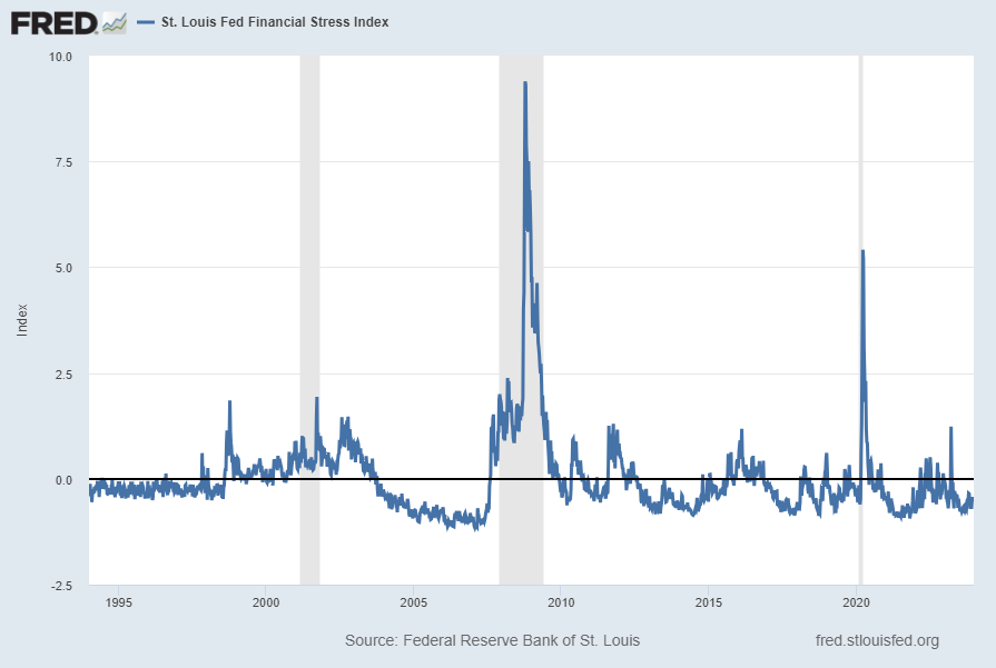
RE: “St. Louis Financial Stress Index – November 22, 2012 Update” November 23, 2012: re: “This chart was last updated on November 21, incorporating data from December 31,1993 to November 16, 2012 on a weekly basis. The November 21, 2012 value is -.184” – change November 21 to November 22
Corrected on 1-3-13 (punctuation – missing end quotation mark)
RE: “Deloitte ‘CFO Signals’ Report 3Q 2012 – Notable Aspects” – September 27, 2012: re: As seen in page 2 of the report, “Eighty-five CFOs responded during the two weeks ended August 24. More than 75% are from public companies, and 80% are from companies with more than $1B in annual revenue.”
Corrected on 1-7-13 (extra words)
RE: “Average Hourly Earnings Trends” of December 10, 2012 and November 5, 2012: Re: “This next chart depicts the same measure on a on a “Percentage Change From A Year Ago” basis.”
Corrected on 1-31-13 (incorrect date)
RE: “Velocity Of Money – Charts Updated Through October 26, 2012” of October 29, 2012: RE: “All charts reflect quarterly data through the second quarter of 2012, and were last updated as of October 26, 2012.”
Corrected on 2-11-13 (extra word)
RE: “Recession Probability Models” of January 22, 2013: RE: “For instance, as seen in the the January 14 post…”
Corrected on 3-8-13 (wrong date)
RE: “Long-Term Charts Of The ECRI WLI & ECRI WLI,Gr. – March 1, 2013 Update” of March 1, 2013: RE: “These charts are on a weekly basis through the March 1 release, indicating data through March 1, 2013.”
Corrected on 3-15-13 (missing end parenthesis)
RE: “Long-Term Charts Of The ECRI WLI & ECRI WLI,Gr. – March 8, 2013 Update” of March 8, 2013: RE: “ECRI, March 5, Recession in the Yo-Yo Years (provides a link to a 17-page ECRI report dated March 2013 titled “The U.S. Business Cycle in the Context of the Yo-Yo Years)”
Corrected on 4-11-13 (extra words)
RE: “Corporate Bond Yields And OASs” of March 14, 2013: RE: extra words in “A chart of the The BofA Merrill Lynch US Corporate Master Index Option-Adjusted Spread (OAS), with a value of 1.45%:” as well as “A chart of the The BofA Merrill Lynch US High Yield Master II Index, with an effective yield of 5.92%:”
Corrected on 4-24-13 (incorrect spelling of name)
RE: “S&P500 Earnings Estimates For 2013 & 2014” of March 26, 2013 & February 25, 2013: RE: “As many are aware, Thomsen Reuters…”
Corrected on 8-9-13 (incorrect date)
RE: “Recession Probability Models” of July 5, 2013: RE: “Data Source: FRED, Federal Reserve Economic Data, Federal Reserve Bank of St. Louis: Marcelle Chauvet and Jeremy Piger; U.S. Recession Probabilities [RECPROUSM156N]; accessed June 4, 2013:
Corrected on 8-12-13 (double negative)
RE: “Zillow Q2 2013 Home Price Expectations Survey – Summary & Comments” of May 9, 2013: RE: “The most “bearish” of these forecasts is that of Gary Shilling’s prediction of a –5.05% cumulative price decrease through 2017.”
Corrected on 8-29-13 (improper plural)
RE: “Corporate Profits As A Percentage Of GDP” of May 31, 2013; March 28, 2013; and January 30, 2013: RE: “While there are many reasons as to why this is so, from a going-forward standpoint I think it is important to recognize both that such a notable conditions exists…”
Corrected on 10-22-13 (lack of hyphens)
RE: “VIX Monthly And Weekly Charts Since 2000” of October 21, 2013; RE: “Here is the VIX Monthly chart, depicted on a LOG scale, with price labels as well as the 13– and 34–month moving averages, seen in the cyan and red lines, respectively:” and “Here is the VIX Weekly chart, depicted on a LOG scale, with price labels as well as the 13– and 34– week moving average, seen in the cyan and red lines, respectively:”
Corrected on 11-14-13 (wrong date)
RE: “The November 2013 Wall Street Journal Economic Forecast Survey” of November 12, 2013; RE: “The October Wall Street Journal Economic Forecast Survey was published on November 7, 2013.”
Corrected on 11-18-13 (misspelled name)
RE: “Janet Yellin’s Nomination” of October 14, 2013; RE: “The nomination of Janet Yellin to lead the Federal Reserve has generated much recent commentary.” Also: “While I may comment at length upon her nomination at a later time, for now I would like to highlight, for reference purposes, a few excerpts in the October 10, 2013 New York Times article titled “Yellin’s Path From Liberal Theorist to Fed Voice for Jobs.”
Corrected on 12-17-13 (misspelled name)
RE: “Janet Yellin’s Speech of June 2, 2011 – Notable Excerpts” of June 9, 2011; RE: “On June 2, Janet Yellin…”
Corrected on 12-17-13 (misspelled name)
RE: “Finance Reform Bill – A Few Comments” of July 19, 2010; RE: “I included the quote from Janet Yellin…”
Corrected on 12-17-13 (misspelled name)
RE: “President Obama’s Remarks on Ben Bernanke” of August 28, 2009; RE: “With regard to this ‘out of the box thinking’ and and ‘bold, persistent experimentation’ I would like to refer to a speech Janet Yellin…”
Corrected on 1-9-14 (incorrect date)
RE: “The January 2, 2014 value is -.927:”
Corrected on 4-1-14 (incorrect date)
RE: “Durable Goods New Orders – Long-Term Charts Through January 2014” of February 27, 2014; RE: First, from the St. Louis Fed site (FRED), a chart through December, last updated on February 27, 2014. This value is 224,975 ($ Millions) :
Corrected on 7-27-14 (omission of information)
RE: “Standard & Poor’s S&P500 Earnings Estimates For 2014 And 2015…” of May 21, 2014; RE:
-From a “top down” perspective, operating earnings of $148.18/share
-From a “top down” perspective, “as reported” earnings of $144.60/share
Corrected on 8-11-14 (wrong date on post)
RE: “Velocity of Money…” post of April 30, 2014: RE: wrong date under one chart; “Data Source: FRED, Federal Reserve Economic Data, Federal Reserve Bank of St. Louis; accessed January 30, 2014:”
Corrected on 9-2-14 (wrong date on post)
RE: “Updates Of Economic Indicators July 2014” post of July 21, 2014: RE: missing date; “Here is a chart of the ECRI WLI,Gr., from Doug Short’s July, 2014 post…”
Corrected on 9-4-14 (wrong date on post)
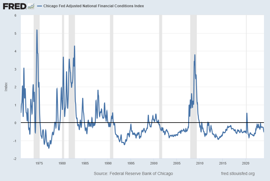
RE: “Chicago Fed National Financial Conditions Index (NFCI)” post of August 27, 2014: RE: wrong date; “The ANFCI chart below was last updated on August 27, incorporating data from January 5,1973 to August 22, 2014, on a weekly basis. The August 27, 2014 value is -.48:”
Corrected on 11-27-14 (clarification)
RE: “Long-Term Charts Of The ECRI WLI & ECRI WLI,Gr. – November 21, 2014 Update” post of November 21, 2014: RE: “… ECRI has reiterated the view that the U.S. economy is currently in a recession…” changed to “…ECRI had reiterated (but no longer believes per the November 19, 2014 interview) that the U.S. economy was in a recession…”
Corrected on 11-27-14 (missing parenthesis)
RE: “U.S. Dollar Decline – September 2, 2014 Update” post of September 2, 2014: RE: “…by the dashed light blue line):”
Corrected on 11-27-14 (missing parenthesis)
RE: “U.S. Dollar Decline – August 1, 2014 Update” post of August 1, 2014: RE: “…by the dashed light blue line):”
Corrected on 11-27-14 (missing parenthesis)
RE: “U.S. Dollar Decline – July 1, 2014 Update” post of July 1, 2014: RE: “…by the dashed light blue line):”
Corrected on 11-27-14 (phrase corrections)
RE: “Money Supply Charts Through September 2014” post of October 29, 2014: RE:” The second shows M2…” changed to “The two charts below show M2…”
Corrected on 11-27-14 (phrase corrections)
RE: “Money Supply Charts Through August 2014” post of September 29, 2014: RE:” The second shows M2…” changed to “The two charts below show M2…”
Corrected on 11-27-14 (phrase corrections)
RE: “Money Supply Charts Through May 2014” post of June 17, 2014: RE:” The second shows M2…” changed to “The two charts below show M2…”
Corrected on 2-11-15 (date correction)
RE: “Velocity Of Money – Charts Updated Through July 30, 2014” post of July 30, 2014: RE: “Data Source: FRED, Federal Reserve Economic Data, Federal Reserve Bank of St. Louis; accessed January 30, 2014:” changed to “Data Source: FRED, Federal Reserve Economic Data, Federal Reserve Bank of St. Louis; accessed July 30, 2014:”
Corrected on 3-25-15 (date correction)
RE: “Durable Goods New Orders – Long-Term Charts Through January 2015” post of February 26, 2015: RE: “First, from the St. Louis Fed site (FRED), a chart through December, updated on February 26, 2015. This value is 236,147 ($ Millions):”
Corrected on 3-27-15 (date correction)
Re: “Corporate Profits As A Percentage Of GDP” post of November 25, 2014: RE: “As one can see from the long-term chart below (updated through the first quarter)…”
Corrected on 3-27-15 (date correction)
Re: “Corporate Profits As A Percentage Of GDP” post of August 28, 2014: RE: “As one can see from the long-term chart below (updated through the first quarter)…”
Corrected on 6-12-15 (date correction)
Re: “Total Household Net Worth As A Percent Of GDP 4Q 2014” post of March 12, 2015: RE: “The following chart is from the CalculatedRisk blog post of March 12, 2014…”
Corrected on 8-18-15 (incorrect link and accompanying comments)
Re: “The August 2015 Wall Street Journal Economic Forecast Survey” post of August 13, 2015: RE: “The headline is “WSJ Survey: Economists Expect Fed Rate Liftoff in September.” Link and excerpted comments changed.
Corrected on 8-31-15 (wrong date)
Re: “Corporate Profits As A Percentage Of GDP” post of May 29, 2015: RE: “As one can see from the long-term chart below (updated through the fourth quarter)…”
Corrected on 8-31-15 (missing parenthesis)
RE: “The U.S. Economic Situation – April 23, 2015 Update” post of April 23, 2015: RE: “For long-term reference purposes, here is a chart of the Dow Jones Industrial Average since 1900, depicted on a monthly basis using a LOG scale (updated through April 17, 2015, with a last value of 17826.30):”
Corrected on 8-31-15 (missing parenthesis)
RE: “The U.S. Economic Situation – May 22, 2015 Update” post of May 22, 2015: RE: For long-term reference purposes, here is a chart of the Dow Jones Industrial Average since 1900, depicted on a monthly basis using a LOG scale (updated through May 15, 2015, with a last value of 18272.56):”
Corrected on 8-31-15 (missing parenthesis)
RE: “The U.S. Economic Situation – June 22, 2015 Update” post of June 22, 2015: RE: “For long-term reference purposes, here is a chart of the Dow Jones Industrial Average since 1900, depicted on a monthly basis using a LOG scale (updated through June 19, 2015, with a last value of 18014.28):”
Corrected on 8-31-15 (missing parenthesis)
RE: “The U.S. Economic Situation – July 23, 2015 Update” post of July 23, 2015: RE: “For long-term reference purposes, here is a chart of the Dow Jones Industrial Average since 1900, depicted on a monthly basis using a LOG scale (updated through July 17, 2015, with a last value of 18086.45):”
Corrected on 12-11-15 (incorporate previously unavailable updated chart)
RE: “December 2015 Duke/CFO Global Business Outlook Survey” post of December 10, 2015: RE: put in December chart that was unavailable on 12/10/15
Corrected on 12-14-15 (wrong year referenced)
RE: “2015 Estimates For S&P500 Earnings & Price Levels” post of December 15, 2014: RE: “The article also mentions that among the investment strategists, average 2014 GDP growth is 3.0%.”
Corrected on 12-23-15 (wrong date referenced)
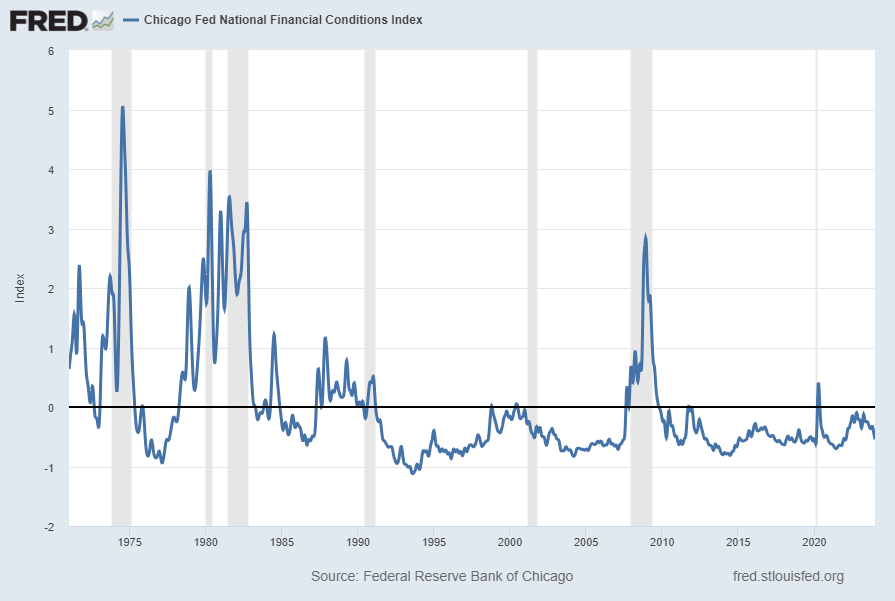
RE: “Chicago Fed National Financial Conditions Index” post of December 16, 2015: RE: “The NFCI chart below was last updated on December 16, 2015 incorporating data from January 5,1973 to December 11, 2015, on a weekly basis. The December 16, 2015 value is -.60:
Corrected on 2-11-16 (wrong date referenced)
RE: “The January 2016 Wall Street Journal Economic Forecast Survey” post of January 14, 2016: RE: full-year 2017: 2.3%
Corrected on 2-18-16 (missing word)
RE: “10-Year Treasury Yield – Long-Term Chart As Of January 7, 2015” of January 7, 2015: RE: “As a reference, here is a long-term chart of the 10-Year Treasury yield since 1980, depicted on a monthly basis, LOG scale, with price labels:”
Corrected on 5-17-16 (extra letter)
RE: “Monthly Changes In Total Nonfarm Payrolls” of February 9, 2016: RE: “The third charts shows a long-term chart…”
Corrected on 5-26-16 (wrong title of report)
RE: “S&P500 2015, 2016, 2017 & 2018 EPS Estimates” of April 19, 2016: RE: “The following estimates are from Exhibit 9C of ‘The Director’s Report’…”
Corrected on 5-26-16 (wrong date referenced)
RE: “Chicago Fed National Financial Conditions Index (NFCI)” of May 18, 2016: RE: The St. Louis Fed’s Financial Stress Index (STLFSI) is one index that is supposed to measure stress in the financial system. Its reading as of the May 12, 2016 update (reflecting data through May 5) is -.919.
Corrected on 5-31-16 (wrong date referenced)
RE: “Corporate Profits As A Percentage Of GDP” of March 28, 2016: RE: “As one can see from the long-term chart below (updated through the third quarter)…
Corrected on 8-22-16 (wrong date and quarter referenced)
RE: “Walmart’s Q1 2017 Results – Comments” of May 19, 2016: RE: “I found various notable items in Walmart’s Q1 2017 management call transcript (pdf) dated February 18, 2016. (as well, there is Walmart’s press release of the Q4 results (pdf) and related presentation materials)”
Corrected on 10-18-16 (wrong date referenced)
RE: “Disturbing Charts (Update 24)” of October 13, 2016: RE: “The Chicago Fed National Activity Index (CFNAI) 3-month moving average (CFNAI-MA3)(last updated 10-7-16):
Corrected on 11-16-16 (wrong date referenced)
RE: “Monthly Changes In Total Nonfarm Payrolls – August 8, 2016 Update” of August 8, 2016: RE: “The second chart shows a long-term chart of the same month-over-month change in total nonfarm payrolls (reports of January 1940 through the present report of July 2016):
Also:
RE: “Lastly, the fifth chart shows the total nonfarm payrolls number on a “percent change from year ago” basis from January 1940 – July 2016:”
Corrected on 11-16-16 (wrong date referenced)
RE: “Monthly Changes In Total Nonfarm Payrolls – May 9, 2016 Update” of May 9, 2016: RE: “The second chart shows a long-term chart of the same month-over-month change in total nonfarm payrolls (reports of January 1939 to the present report of April 2016):
Also:
RE: “Lastly, the fifth chart shows the total nonfarm payrolls number on a “percent change from year ago” basis from January 1939– July 2016:”
Corrected on 12-14-16 (wrong date referenced)
RE: “Chicago Fed National Financial Conditions Index (NFCI)” of December 7, 2016: RE: Data Source: FRED, Federal Reserve Economic Data, Federal Reserve Bank of St. Louis; accessed December 2, 2016:
Corrected on 2-6-17 (wrong number referenced)
RE: “Monthly Changes In Total Nonfarm Payrolls – November 7, 2016 Update” of November 7, 2016: RE: The third chart shows the aggregate number of total nonfarm payrolls, from January 1939 – October 2016 (October 2016 value of 161.000 million):
Corrected on 3-29-17 (wrong number referenced)
RE: “The Yield Curve – December 22, 2016” of December 22, 2016: RE: As an indication of the yield curve, below is a weekly chart from January 1, 1990 through December 21, 2016. The top two plots show the 10-Year Treasury and 2-Year Treasury yields. The third plot shows the (yield) spread between the 10-Year Treasury and 2-Year Treasury, with the October 20, 2016 closing value of 1.34%. The bottom plot shows the S&P500:
Corrected on 4-4-17 (wrong number referenced)
RE: “Recession Probability Models – March 2017” of March 6, 2017: RE: The two models featured above can be compared against measures seen in recent blog posts. For instance, as seen in the February 9 post titled “The February 2017 Wall Street Journal Economic Forecast Survey“ economists surveyed averaged a 16.49% probability of a U.S. recession within the next 12 months.
Corrected on 4-28-17 (wrong date referenced)
RE: “Velocity Of Money – Charts Updated As Through January 27, 2017” of January 27, 2017: RE: All charts reflect quarterly data through the 4th quarter of 2017, and were last updated as of January 27, 2017. As one can see, one of the three measures is at an all-time low for the periods depicted:
Corrected on 5-9-17 (wrong date referenced)
RE: “Markets During Periods Of Federal Reserve Intervention – March 27, 2017 Update” of March 27, 2017: RE: For reference purposes, here is an updated chart (through March 27, 2017) from Doug Short’s blog post of January 20…
Corrected on 9-25-17 (title of referenced post wrong)
RE: “Total Household Net Worth As A Percent Of GDP 1Q 2017” of June 8, 2017: RE: The following chart is from the CalculatedRisk post of June 8, 2017 titled “Fed’s Flow of Funds: Household Net Worth increased in Q4.”
Corrected on 10-18-17 (wrong date)
RE: “Standard & Poor’s S&P500 Earnings Estimates For 2017 And 2018 – As Of September 13, 2017” of September 18, 2017: RE: “For reference purposes, the most current estimates are reflected below, and are as of August 10, 2017:
Corrected on 10-23-17 (wrong chart displayed)
RE: “Chicago Fed National Financial Conditions Index (NFCI)” of October 18, 2017: RE: ANFCI chart was from 10-12-17
Corrected on 12-14-17 (wrong date)
RE: “2017 Estimates For S&P500 Earnings & Price Levels” of December 19, 2016: RE: The article also mentions that among the investment strategists, average expected 2016 GDP growth is 2.4%.
Corrected on 2-5-18 (wrong date)
RE: “Recession Probability Models – January 2018” of January 4, 2018: RE: For comparison purposes, it showed a 10.9539% probability through December…
Corrected on 2-15-18 (misspelled word)
RE: ““Taylor Rule” Chart – August 11, 2017 Update” of August 18, 2017: RE: As discussed in that post – and for other reasons – the level of the Fed Funds rate – and whether its level is appropriate – has vast importantance…
Corrected on 4-16-18 (missing word – “not”)
RE: “Charts Indicating Economic Weakness – September 2017” of September 6, 2017: RE: As I have stated in past commentaries, my analyses indicate that surveys or “market-based” measures concerning deflation will provide adequate “advance warning” of this deflation.
Corrected on 6-1-18 (incorrect number)
RE: “U-3 And U-6 Unemployment Rate Long-Term Reference Charts As Of May 4, 2018” of May 4, 2018: RE: Here is the U-3 chart, currently showing a 3.8% unemployment rate:
Corrected on 6-18-18 (typo)
RE: “Charts Indicating Economic Weakness – May 2018” of May 14, 2018: RE: One recent development that appears to be problematical aspects in consumer spending is the performance of the consumer staples stocks.
Corrected on 6-18-18 (typo)
RE: “Charts Indicating Economic Weakness – March 2018” of March 15, 2018: RE: As seen in many measures, including that seen below, the problem chronic (i.e long-term) in nature.
Corrected on 7-10-18 (typo)
RE: “Charts Indicating Economic Weakness – May 2018” of May 14, 2018: RE: source: U.S. Bureau of Economic Analysis, Light Weight Vehicle Sales: Autos and Light Trucks [ALTSALES], retrieved from FRED, Federal Reserve Bank of St. Louis; accessed April 10, 2017:
Corrected on 8-28-18 (missing label)
RE: “Standard & Poor’s S&P500 EPS Estimates 2018 2019 – June 15, 2018″ of June 21, 2018: RE: -From a “bottom up” perspective, “as reported” earnings of $164.77
Corrected on 9-20-18 (missing transition phrase)
RE: “Deloitte “CFO Signals” Report Q2 2018 – Notable Aspects” of June 21, 2018 RE: All respondents are CFOs from the US, Canada, and Mexico, and the vast majority are from companies with more than $1 billion in annual revenue. For a summary of this quarter’s response demographics, please see the sidebars and charts on this page. For other information about participation and methodology, please contact nacfosurvey@deloitte.com.”
from page 3:
Corrected on 9-24-18 (wrong figure)
RE: “Updates Of Economic Indicators August 2018” of August 27, 2018: RE: As per the August 17, 2018 press release, titled “The Conference Board Leading Economic Index (LEI) for the U.S. Increased in July” (pdf) the LEI was at 1110.7, the CEI was at 104.2, and the LAG was 105.2 in July.
Corrected on 9-24-18 (typo)
RE: “Chicago Fed National Financial Conditions Index (NFCI)” of September 6, 2018: RE: The ANFCI chart below was last updated on Semtember 6, 2018 incorporating data from January 8,1971 through August 31, 2018, on a weekly basis. The August 31 value is -.69:
Corrected on 9-27-18 (wrong date)
RE: “Chicago Fed National Financial Conditions Index (NFCI)” of September 19, 2018: RE: The St. Louis Fed’s Financial Stress Index (STLFSI) is one index that is supposed to measure stress in the financial system. Its reading as of the September 13, 2018 update (reflecting data through August 7, 2018) is -1.267.
Corrected on 10-17-18 (wrong chart)
RE: “Disturbing Charts (Update 32)” of October 16, RE: chart for TOTLL was actually chart for TOTBKCR
Corrected on 10-17-18 (wrong chart)
RE: “Updates Of Economic Indicators October 2018” of October 22, RE: As per the October 18, 2018 press release, titled “The Conference Board Leading Economic Index (LEI) for the U.S. Increased in August” (pdf) the LEI was at 111.8, the CEI was at 104.4, and the LAG was 105.3 in September.
Corrected on 12-21-18 (wrong date)
RE: “The Wall Street Journal Economic Forecasting Survey” of November 15, RE: The November 2018 Wall Street Journal Economic Forecast Survey was published on October 11, 2018.
Corrected on 12-24-18 (missing word)
RE: “Standard & Poor’s S&P500 EPS Estimates 2018 2019 – November 15, 2018” of November 19, RE: “For reference purposes, the most current estimates are reflected below, and are as November 15, 2018:”
Corrected on 12-24-18 (wrong date)
RE: “2018 Estimates For S&P500 Earnings & Price Levels” of December 11, 2017: RE: “Included in the story, 10 investment strategists give various forecasts for 2017 including S&P500 profits, S&P500 year-end price targets, GDP growth, and 10-Year Treasury Note Yields.”
Corrected on 1-16-19 (wrong source attribution)
RE: “Disturbing Charts (Update 32)” of October 16, 2018: for “Total Loans and Leases…” Board of Governors of the Federal Reserve System (US), Bank Credit of All Commercial Banks [TOTBKCR], retrieved from FRED, Federal Reserve Bank of St. Louis https://research.stlouisfed.org/fred2/series/TOTBKCR/, October 15, 2018.
Corrected on 2-1-19 (wrong source attribution)
RE: “3 Critical Unemployment Charts – January 2019” of January 4, 2019: RE: “Data Source: FRED, Federal Reserve Economic Data, Federal Reserve Bank of St. Louis: All Employees: Total nonfarm [PAYEMS] ; U.S. Department of Labor: Bureau of Labor Statistics; accessed January 4, 2018:”
Corrected on 2-11-19 (wrong heading description)
RE: “Charts Indicating Economic Weakness – August 2018” of August 13, 2018: RE: “Total Private Construction Spending: Commercial” is a measure of construction exhibiting weak YoY growth.”
Corrected on 3-8-19 (missing source information)
RE: “Velocity Of Money – Charts Updated Through October 26, 2018” of October 28, 2018: added source information below last chart posted
Corrected on 3-13-19 (two excess words)
RE: “Zillow Q4 2018 Home Price Expectations Survey – Summary & Comments” of December 4, 2018: RE: “The detail of the Q4 2018 Home Price Expectations Survey (pdf) is interesting.” Also: “The Median Cumulative Home Price Appreciation for years 2018-2023 is seen as 5.80%, 10.05%, 13.15%, 16.27%, and 19.70%, and 23.20%, respectively.”
Corrected on 5-13-19 (excess word)
RE: “Charts Indicating Economic Weakness – December 2017” of December 12, 2017: RE: “The declining nature of the growth rate is notable and may in itself may deserve consideration as an economic indicator:”
Corrected on 5-21-19 (excess digits)
RE: “Standard & Poor’s S&P500 EPS Estimates 2019 & 2020 – April 18, 2019” of April 22, 2019: RE: “-From a “bottom up” perspective, “as reported” earnings of $149.61.08/share”
Corrected on 11-11-19 (wrong date reference)
RE: “Employment Cost Index (ECI) – Second Quarter 2019” of July 31, 2019: RE: “On July 31, 2019, the ECI for the first quarter was released.”
Corrected on 11-11-19 (wrong date reference)
RE: “Charts Indicating Economic Weakness – June 2019” of June 13, 2019: RE: “source: U.S. Bureau of Labor Statistics, Civilian Labor Force Participation Rate: Bachelor’s Degree and Higher, 25 years and over [LNS11327662], retrieved from FRED, Federal Reserve Bank of St. Louis; accessed November 12, 2018: …”
Corrected on 11-18-19 (wrong date reference)
RE: “Charts Indicating Economic Weakness – September 2019” of September 12, 2019: RE: “Below is a chart of the index from September 7, 2017 through September 7, 2019…”
Corrected on 11-26-19 (wrong figure)
RE: “Updates Of Economic Indicators October 2019” of October 28, 2019: RE: “The CFNAI, with current reading of .45:”
Corrected on 12-27-19 (wrong date)
RE: “Zillow Q3 2019 Home Price Expectations Survey – Summary & Comments” of September 10, 2019: RE: “The detail of the Q2 2019 Home Price Expectations Survey is interesting:”
Corrected on 1-29-20 (wrong date)
RE: “Jerome Powell’s December 11, 2019 Press Conference – Notable Aspects” of December 12, 2019: RE: “On Wednesday, December 11, 2019 FOMC Chairman Jerome Powell gave his scheduled September 2019 FOMC Press Conference.”
Corrected on 2-10-20 (wrong figure)
RE: “3 Critical Unemployment Charts – January 2020” of January 10, 2020: RE: “Here is the chart for Unemployed 27 Weeks and Over (current value = 1.1186 million)
Corrected on 3-24-20 (wrong date)
RE: “Updates Of Economic Indicators February 2020” of February 24, 2020: RE: “As per the February 20, 2019 Conference Board press release.”
Corrected on 8-6-20 (wrong date)
RE: “Another Recession Probability Indicator – Updated Through Q4 2019” of April 30, 2020: RE: “Each month I have been highlighting various estimates of U.S. recession probabilities. The latest update was that of February 1, 2020…”
Corrected on 8-21-20 (misspelling)
RE: “Stock Market Capitalization To GDP – Through Q4 2019” of April 3, 2020: RE: “On the Advisor Perspective site…”
Corrected on 8-21-20 (missing phrase)
RE: “St. Louis Fed Price Pressures Measures Through June 2020” of June 30, 2020: RE: “For reference, below is a chart of the St. Louis Fed Price Pressures Measures [FRED STLPPMDEF] through June 2020.”
Corrected on 11-17-20 (incorrect date)
RE: “Charts Indicating Economic Weakness – January 2020” of January 13, 2020: “RE: source: U.S. Bureau of Labor Statistics, Average Weekly Overtime Hours of Production and Nonsupervisory Employees: Manufacturing [AWOTMAN], retrieved from FRED, Federal Reserve Bank of St. Louis; accessed January 13, 2019: https://fred.stlouisfed.org/series/AWOTMAN”
Corrected on 11-17-20 (incorrect date)
RE: “CEO Confidence Surveys 2Q 2020 – Notable Excerpts” of July 9, 2020: RE: “On July 2, 2020, The Conference Board released the 2nd Quarter Measure Of CEO Confidence. The overall measure of CEO Confidence was at 44, up from 34 in the fourth quarter.”
Corrected on 11-17-20 (incorrect date)
RE: “Another Recession Probability Indicator – Updated Through Q1 2020” of July 31, 2020: RE: “source: Hamilton, James, GDP-Based Recession Indicator Index [JHGDPBRINDX], retrieved from FRED, Federal Reserve Bank of St. Louis on April 30, 2020:
https://research.stlouisfed.org/fred2/series/JHGDPBRINDX
Corrected on 2-9-21 (incorrect date)
RE: “Chicago Fed National Financial Conditions Index (NFCI)” of January 21, 2021: RE: “Its reading as of the January 21, 2021 update (reflecting data through January 21, 2021) is -.7384:”
Corrected on 2-26-21 (missing decimal point)
RE: “Updates Of Economic Indicators January 2021” of January 25, 2021: RE: “The CFNAI-MA3, with a current reading of 61:”
Corrected on 4-7-21 (incorrect date)
RE: “Updates Of Economic Indicators February 2021” of February 22, 2021: RE: “As per the February 22, 2020 Conference Board press release…”
Corrected on 6-22-21 (incorrect date)
RE: “Zillow Q4 2020 Home Price Expectations Survey – Summary & Comments
” of December 12, 2020: RE: “Of the 100+ survey respondents, only one (of the displayed responses) forecasts a cumulative price decrease through 2024…
Corrected on 12-27-21 (incorrect date)
RE: “Zillow Q2 2021 Home Price Expectations Survey – Summary & Comments” of June 11, 2021: RE: “The Median Cumulative Home Price Appreciation for years 2021-2024 is seen as 8.7%, 14.35%, 17.97%, 22.69%, and 27.05%, respectively.”
Corrected on 12-27-21 (incorrect date)
RE: “Durable Goods New Orders – Long-Term Charts Through October 2021
” of November 24, 2021: RE: “Data Source: FRED, Federal Reserve Economic Data, Federal Reserve Bank of St. Louis: Manufacturers’ New Orders: Durable Goods [DGORDER]; U.S. Department of Commerce: Census Bureau; accessed October 27, 2021;”
Corrected on 5-3-22 (incorrect date)
RE: “VIX Weekly And Monthly Charts From The Year 2000 – April 6, 2022 Update” of April 6, 2022: RE: “For reference purposes, below are two charts of the VIX from year 2000 through the March 1, 2022) close, which had a closing value of 21.03.”
Corrected on 8-31-22 (incorrect date)
RE: “Recession Probability Models – July 2022” of July 13, 2022: RE: “This model, last updated on July 1, 2022 currently shows a .48% probability using data through June 2022.”
Corrected on 12-28-22 (incorrect label)
RE: “Chicago Fed National Financial Conditions Index (NFCI)” of November 17, 2022: RE: “source: Federal Reserve Bank of St. Louis, St. Louis Fed Financial Stress Index [STLFSI3], retrieved from FRED, Federal Reserve Bank of St. Louis; accessed November 17, 2022: https://fred.stlouisfed.org/series/STLFSI4
Corrected on 1-19-23 (incorrect date)
RE: “Chicago Fed National Financial Conditions Index (NFCI)” of January 5, 2023: RE: “The NFCI chart below was last updated on January 5, 2022 incorporating data from January 8, 1971 through December 30, 2022 on a weekly basis. The December 30 value is -.21215:”
Corrected on 3-7-23 (repeated text)
RE: “Charts Indicating Economic Weakness – February 2023” of February 6, 2023: RE:
Other Indicators
As mentioned previously, many other indicators discussed on this site indicate weak economic growth or economic contraction, if not outright (gravely) problematical economic conditions.
__
Other Indicators
As mentioned previously, many other indicators discussed on this site indicate weak economic growth or economic contraction, if not outright (gravely) problematical economic conditions.
Corrected on 5-9-23 (incorrect reference)
RE: “Charts Indicating Economic Weakness – April 2023” of April 10, 2023: RE: (seen under “Job Openings” chart)
source: U.S. Federal Highway Administration, Moving 12-Month Total Vehicle Miles Traveled [M12MTVUSM227NFWA], retrieved from FRED, Federal Reserve Bank of St. Louis; accessed April 8, 2023: https://fred.stlouisfed.org/series/M12MTVUSM227NFWA
Corrected on 12-6-23 (incorrect statistic)
RE: “Charts Indicating Economic Weakness – November 2023” of November 6, 2023: RE: “This “Job Openings” measure had a value of 9.553 (Thousands)…”
–
Some of the above corrections have been made after I received reader comments alerting me of the issues. I appreciate such notifications, and ask that if one spots factual inaccuracies, typos and/or bad links, please notify me of such via email message to economicgreenfield@gmail.com