Friday, September 29, 2017

Long-Term Charts Of The ECRI WLI & ECRI WLI, Gr. – September 29, 2017 Update

As I stated in my July 12, 2010 post (“ECRI WLI Growth History“):
For a variety of reasons, I am not as enamored with ECRI’s WLI and WLI Growth measures as many are.
However, I do think the measures are important and deserve close monitoring and scrutiny.
Below are three long-term charts, from Doug Short’s ECRI update post of September 29, 2017 titled “ECRI Weekly Leading Index:  WLIg Negative, First Time Since March of 2016.”  These charts are on a weekly basis through the September 29, 2017 release, indicating data through September 22, 2017.
Here is the ECRI WLI (defined at ECRI’s glossary):
ECRI WLI 143.7
This next chart depicts, on a long-term basis, the Year-over-Year change in the 4-week moving average of the WLI:
This last chart depicts, on a long-term basis, the WLI, Gr.:
ECRI WLI,Gr. -.1 Percent
_________
I post various economic indicators and indices because I believe they should be carefully monitored.  However, as those familiar with this site are aware, I do not necessarily agree with what they depict or imply.
_____
The Special Note summarizes my overall thoughts about our economic situation
SPX at 2515.62 as this post is written

Consumer Confidence Surveys – As Of September 29, 2017

Doug Short had a blog post of September 29, 2017 (“Michigan Consumer Sentiment:  September Final Down from August“) in which he presents the latest Conference Board Consumer Confidence and Thomson/Reuters University of Michigan Consumer Sentiment Index charts.  They are presented below:
(click on charts to enlarge images)
Conference Board Consumer Confidence
Michigan Consumer Sentiment
There are a few aspects of the above charts that I find highly noteworthy.  Of course, until the sudden upswing in 2014, the continued subdued absolute levels of these two surveys was disconcerting.
Also, I find the “behavior” of these readings to be quite disparate as compared to the other post-recession periods, as shown in the charts between the gray shaded areas (the gray areas denote recessions as defined by the NBER.)
While I don’t believe that confidence surveys should be overemphasized, I find these readings to be very problematical, especially in light of a variety of other highly disconcerting measures highlighted throughout this site.
_____
The Special Note summarizes my overall thoughts about our economic situation
SPX at 2516.90 as this post is written

Problematical Aspects Of Today’s Financial System

Perhaps the key issue surrounding the U.S. and global financial system is whether the embedded risk in the system has decreased or increased, especially since the Financial Crisis.
There have been much regulation and many other financial reforms made since the Financial Crisis.  These reforms, as well as other factors such as the protracted period of (very) strong returns in many markets, as well as low risk premiums and other market characteristics seem to indicate that risk has been mitigated, perhaps to a great degree.
Many prominent officials and other prominent market participants have stated or implied that risk has been greatly reduced in the system since the Financial Crisis.  Janet Yellen has discussed the issue at various points, including “Yellen:  Banks ‘very much stronger’; another financial crisis not likely ‘in our lifetime’” (CNBC, June 27, 2017) as well as “Financial Stability a Decade after the Onset of the Crisis” (Federal Reserve, August 25, 2017).  Stanley Fischer has discussed the issue as well, including in the “An Assessment of Financial Stability in the United States.” (Federal Reserve, June 27, 2017)
However, there are many reasons to believe that these widely-held assessments are (substantially) incorrect.  The financial and economic activity that has occurred in this era has been accompanied by a wide range of risks and other problematical dynamics, many of which have been discussed on this site.  Cumulatively, the financial system is rife with vastly problematical dynamics that my analyses continues to indicate will lead to what I have previously referred to as a “Super Depression,” i.e. a severe economic depression characterized by difficult-to-solve problems.
Some of those problematical aspects I wrote of in the September 18, 2013 post titled “Has The Financial System Strengthened Since The Financial Crisis?”  Since then the issues discussed have grown in peril.
As I stated (in part) in the March 18, 2014 post titled “Was A Depression Successfully Avoided?” –
While no one likes to contemplate a future rife with economic adversity, I do believe that our current economy and financial system on an “all things considered” basis have vastly problematical working dynamics much more pernicious than those existent prior to and during The Great Depression.
_____
The Special Note summarizes my overall thoughts about our economic situation
SPX at 2516.78 as this post is written

Wednesday, September 27, 2017

Chicago Fed National Financial Conditions Index (NFCI)

The St. Louis Fed’s Financial Stress Index (STLFSI) is one index that is supposed to measure stress in the financial system.  Its reading as of the September 21, 2017 update (reflecting data through September 15, 2017) is -1.533.
Of course, there are a variety of other measures and indices that are supposed to measure financial stress and other related issues, both from the Federal Reserve as well as from private sources.
Two other indices that I regularly monitor include the Chicago Fed National Financial Conditions Index (NFCI) as well as the Chicago Fed Adjusted National Financial Conditions Index (ANFCI).
Here are summary descriptions of each, as seen in FRED:
The National Financial Conditions Index (NFCI) measures risk, liquidity and leverage in money markets and debt and equity markets as well as in the traditional and “shadow” banking systems. Positive values of the NFCI indicate financial conditions that are tighter than average, while negative values indicate financial conditions that are looser than average.
The adjusted NFCI (ANFCI). This index isolates a component of financial conditions uncorrelated with economic conditions to provide an update on how financial conditions compare with current economic conditions.
For further information, please visit the Federal Reserve Bank of Chicago’s web site:
Below are the most recently updated charts of the NFCI and ANFCI, respectively.
The NFCI chart below was last updated on September 27, 2017 incorporating data from January 5,1973 through September 22, 2017, on a weekly basis.  The September 22, 2017 value is -.89:
NFCI
Data Source: FRED, Federal Reserve Economic Data, Federal Reserve Bank of St. Louis; accessed September 27, 2017:
The ANFCI chart below was last updated on September 27, 2017 incorporating data from January 5,1973 through September 22, 2017, on a weekly basis.  The September 22 value is -.62:
ANFCI_9-27-17 -.62
Data Source: FRED, Federal Reserve Economic Data, Federal Reserve Bank of St. Louis; accessed September 27, 2017:
_________
I post various indicators and indices because I believe they should be carefully monitored.  However, as those familiar with this site are aware, I do not necessarily agree with what they depict or imply.
_____
The Special Note summarizes my overall thoughts about our economic situation
SPX at 2510.06 as this post is written

Durable Goods New Orders – Long-Term Charts Through August 2017

Many people place emphasis on Durable Goods New Orders as a prominent economic indicator and/or leading economic indicator.
For reference, below are two charts depicting this measure.
First, from the St. Louis Fed site (FRED), a chart through August 2017, updated on September 27, 2017. This value is $232,798 ($ Millions):
(click on charts to enlarge images)
Durable Goods New Orders
Second, here is the chart depicting this measure on a “Percentage Change from a Year Ago” basis:
DGORDER Percent Change From Year Ago
Data Source: FRED, Federal Reserve Economic Data, Federal Reserve Bank of St. Louis: Manufacturers’ New Orders:  Durable Goods [DGORDER]; U.S. Department of Commerce: Census Bureau; accessed August 28, 2017;
_________
I post various indicators and indices because I believe they should be carefully monitored.  However, as those familiar with this site are aware, I do not necessarily agree with what they depict or imply.
_____
The Special Note summarizes my overall thoughts about our economic situation
SPX at 2508.75 as this post is written

Monday, September 25, 2017

Updates Of Economic Indicators September 2017

Here is an update of various indicators that are supposed to predict and/or depict economic activity. These indicators have been discussed in previous blog posts:
The September 2017 Chicago Fed National Activity Index (CFNAI) updated as of September 25, 2017:
The CFNAI, with current reading of -.31:
CFNAI_9-25-17 -.31
Federal Reserve Bank of Chicago, Chicago Fed National Activity Index [CFNAI], retrieved from FRED, Federal Reserve Bank of St. Louis, September 25, 2017;
The CFNAI-MA3, with current reading of -.04:
CFNAIMA3_9-25-17 -.04
As of September 22, 2017 (incorporating data through September 15, 2017) the WLI was at 143.4 and the WLI, Gr. was at 0%.
A chart of the WLI,Gr., from Doug Short’s ECRI update post of September 22, 2017:
ECRI WLI,Gr.
Here is the latest chart, depicting the ADS Index from December 31, 2007 through September 16, 2017:
ADS Index
The Conference Board Leading (LEI), Coincident (CEI) Economic Indexes, and Lagging Economic Indicator (LAG):
As per the September 21, 2017 press release, titled “The Conference Board Leading Economic Index (LEI) for the U.S. Increased in August” (pdf) the LEI was at 128.8, the CEI was at 115.8, and the LAG was 125.2 in August.
An excerpt from the release:
“The August gain is consistent with continuing growth in the U.S. economy for the second half of the year, which may even see a moderate pick up,” said Ataman Ozyildirim, Director of Business Cycles and Growth Research at The Conference Board. “While the economic impact of recent hurricanes is not fully reflected in the leading indicators yet, the underlying trends suggest that the current solid pace of growth should continue in the near term.”
Here is a chart of the LEI from Doug Short’s Conference Board Leading Economic Index update of September 21, 2017:
Conference Board LEI
_________
I post various indicators and indices because I believe they should be carefully monitored.  However, as those familiar with this site are aware, I do not necessarily agree with what they depict or imply.
_____
The Special Note summarizes my overall thoughts about our economic situation
SPX at 2492.49 as this post is written

Money Supply Charts Through August 2017

For reference purposes, below are two sets of charts depicting growth in the money supply.
The first shows the MZM (Money Zero Maturity), defined in FRED as the following:
M2 less small-denomination time deposits plus institutional money funds.
Money Zero Maturity is calculated by the Federal Reserve Bank of St. Louis.
Here is the “MZM Money Stock” (seasonally adjusted) chart, updated on September 22, 2017 depicting data through August 2017, with a value of $15,056.6 Billion:
MZMSL_9-22-17 15056.5
Here is the “MZM Money Stock” chart on a “Percent Change From Year Ago” basis, with a current value of 4.4%:
MZMSL_9-22-17 15056.5 4.4 Percent Change From Year Ago
Data Source: FRED, Federal Reserve Economic Data, Federal Reserve Bank of St. Louis; accessed September 25, 2017:
The second set shows M2, defined in FRED as the following:
M2 includes a broader set of financial assets held principally by households. M2 consists of M1 plus: (1) savings deposits (which include money market deposit accounts, or MMDAs); (2) small-denomination time deposits (time deposits in amounts of less than $100,000); and (3) balances in retail money market mutual funds (MMMFs). Seasonally adjusted M2 is computed by summing savings deposits, small-denomination time deposits, and retail MMMFs, each seasonally adjusted separately, and adding this result to seasonally adjusted M1.
Here is the “M2 Money Stock” (seasonally adjusted) chart, updated on September 21, 2017, depicting data through August 2017, with a value of $13,649.7 Billion:
M2SL_9-21-17 13649.7
Here is the “M2 Money Stock” chart on a “Percent Change From Year Ago” basis, with a current value of 5.3%:
M2SL_9-21-17 13649.7 5.3 Percent Change From Year Ago
Data Source: FRED, Federal Reserve Economic Data, Federal Reserve Bank of St. Louis; accessed September 25, 2017:
_____
The Special Note summarizes my overall thoughts about our economic situation
SPX at 2502.22 as this post is written

The Yield Curve – September 25, 2017

Many people believe that the Yield Curve is an important economic indicator.
On March 1, 2010, I wrote a post on the issue, titled “The Yield Curve As A Leading Economic Indicator.”
An excerpt from that post:
On the NY Fed link above, they have posted numerous studies that support the theory that the yield curve is a leading indicator.   My objections with using it as a leading indicator, especially now, are various.  These objections include: I don’t think such a narrow measure is one that can be relied upon;  both the yields at the short and long-end of the curve have been overtly and officially manipulated, thus distorting the curve; and, although the yield curve may have been an accurate leading indicator in the past, this period of economic weakness is inherently dissimilar in nature from past recessions and depressions in a multitude of ways – thus, historical yardsticks and metrics probably won’t (and have not) proven appropriate.
While I continue to have the above-stated reservations regarding the “yield curve” as an indicator, I do believe that it should be monitored.
As an indication of the yield curve, below is a weekly chart from January 1, 1990 through September 22, 2017.  The top two plots show the 10-Year Treasury and 2-Year Treasury yields.  The third plot shows the (yield) spread between the 10-Year Treasury and 2-Year Treasury, with the September 22, 2017 closing value of .80%.  The bottom plot shows the S&P500:
(click on chart to enlarge image)(chart courtesy of StockCharts.com; chart creation and annotation by the author)
Yield Curve Proxy
Additionally, below is a chart showing the same spread between the 10-Year Treasury and 2-Year Treasury, albeit with a slightly different measurement, using constant maturity securities.  This daily chart is from June 1, 1976 through September 21, 2017, with recessionary periods shown in gray. This chart shows a value of .82%:
T10Y2Y_9-22-17 .82
source:  Federal Reserve Bank of St. Louis, 10-Year Treasury Constant Maturity Minus 2-Year Treasury Constant Maturity [T10Y2Y], retrieved from FRED, Federal Reserve Bank of St. Louis; accessed September 25, 2017:
_____
The Special Note summarizes my overall thoughts about our economic situation
SPX at 2502.22 as this post is written

Friday, September 22, 2017

September 2017 Duke/CFO Global Business Outlook Survey – Notable Excerpts

On September 8, 2017 the September 2017 Duke/CFO Global Business Outlook was released.  It contains a variety of statistics regarding how CFOs view business and economic conditions.
In this CFO survey, I found the following to be the most notable excerpts – although I don’t necessarily agree with them:
The survey has been conducted for 86 consecutive quarters and spans the globe, making it the world’s longest-running and most comprehensive research on senior finance executives. This quarter, nearly 850 CFOs responded to the survey, which ended Sept. 8. Results are for the U.S. unless stated otherwise.
For the second quarter in a row, and for only the second time in the history of the survey, difficulty attracting and retaining qualified employees is the top concern of U.S. CFOs. This same concern ranks highly in many places around the world.
also:
Due in part to the tight labor market, U.S. companies expect to pay higher wages, with median wage growth of about 3 percent over the next 12 months. Wage growth should be strongest in the tech, health care, and construction industries.
also:
The Optimism Index fell slightly this quarter to 66 on a 100-point scale. That’s one point lower than last quarter but still far above the long-run average of 60.
“CFOs remain optimistic not only about the overall economy but about their own firms, too,” said Chris Schmidt, senior editor at CFO Research. “Our analysis of past results shows the CFO Optimism Index is an accurate predictor of hiring plans and overall GDP growth.”
The CFO survey contains two Optimism Index charts, with the bottom chart showing U.S. Optimism (with regard to the economy) at 66, as seen below:
Duke CFO Optimism
It should be interesting to see how well the CFOs predict business and economic conditions going forward.   I discussed past various aspects of this, and the importance of these predictions, in the July 9, 2010 post titled “The Business Environment”.
(past posts on CEO and CFO surveys can be found under the “CFO and CEO Confidence” label)
_____
I post various economic forecasts because I believe they should be carefully monitored.  However, as those familiar with this site are aware, I do not necessarily agree with many of the consensus estimates and much of the commentary in these forecast surveys.
_____
The Special Note summarizes my overall thoughts about our economic situation
SPX at 2499.53 as this post is written

Deloitte “CFO Signals” Report Q3 2017 – Notable Aspects

Recently Deloitte released their “CFO Signals” “High-Level Summary” report for the 3rd Quarter of 2017.
As seen in page 2 of the report, there were 160 survey respondents.  As stated:  “Each quarter (since 2Q10), CFO Signals has tracked the thinking and actions of CFOs representing many of North America’s largest and most influential companies.
All respondents are CFOs from the US, Canada, and Mexico, and the vast majority are from companies with more than $1 billion in annual revenue. For a summary of this quarter’s response demographics, please see the sidebars and charts on this page. For other information about participation and methodology, please contact nacfosurvey@deloitte.com.”
Here are some of the excerpts that I found notable:
from page 3:

Perceptions

How do you regard the current/future status of the North American, Chinese, and European economies? Perceptions of North America declined, with 64% of CFOs rating current conditions as good (still high), and 45% expecting better conditions in a year (down from 58% last quarter). Perceptions of Europe rose to 29% and 32%; China was flat at 32% and 30%. Page 6.
What is your perception of the capital markets? Eighty-three percent of CFOs say debt financing is attractive (down slightly from 85%). Attractiveness of equity financing rose for public company CFOs (from 42% to 48%) and decreased for private company CFOs (from 46% to 35%). Eighty-three percent of CFOs now say US equities are overvalued—a new survey high. Page 7.

Sentiment

Overall, what risks worry you the most? CFOs voice growing concerns about US political turmoil and geopolitical conflict; talent challenges again top CFOs’ internal worries, and technological change is a rising concern. Page 8.
Compared to three months ago, how do you feel about the financial prospects for your company? The net optimism index declined from last quarter’s +44 to +29 this quarter. About 45% of CFOs express rising optimism (down from 55%), and 16% express declining optimism (up from 11%). Page 9.

Expectations

What is your company’s business focus for the next year? CFOs indicate a strong bias toward revenue growth over cost reduction (60% vs. 20%) and investing cash over returning it (56% vs. 14%). They shifted back to a bias toward new offerings over existing ones (42% vs. 34%), and indicated a bias toward current geographies over new ones (62% vs. 19%). Page 10.
Compared to the past 12 months, how do you expect your key operating metrics to change over the next 12 months? Revenue growth expectations remain above the two-year average at 5.7% (up from 5.6% last quarter). Earnings growth slid from 8.7% to 7.9%, but remains above the two-year average. Capital spending growth fell from 9.0% to 7.3%, while domestic hiring growth rose from 2.1% to 2.6%. US CFOs trailed in almost all metrics. Page 11.
from page 9:

Sentiment

Coming off a survey high two quarters ago, optimism continued to decline— largely on growing pessimism in the US; Healthcare/Pharma and Technology improved, but Manufacturing and
(Please note that all responses were collected prior to Hurricane Harvey.)
This quarter’s net optimism declined significantly from last quarter’s +44 to a stillstrong +29. About 45% of CFOs expressed rising optimism (down from 55%), and 16% cited declining optimism (up from 11%).
Net optimism for the US declined sharply from last quarter’s +47 to +28 this quarter. Canada rose from +20 to +31, while optimism in Mexico declined from +50 to +39.
Healthcare/Pharma optimism rose sharply from +33 to +57, and Technology rose from +27 to +46. On the other hand, Manufacturing optimism fell sharply from +52 to +22, and Energy/Resources fell from +47 to just +19.
Please see the appendix for charts specific to individual industries and countries.
from page 11:

Expectations

Growth in key metrics, year-over-year

Bolstered by Canada and Mexico, domestic hiring surged and other metrics remain strong.
Earnings growth declined to 7.9% from last quarter’s 8.7%. The US declined but remained above its two-year average. Canada declined but remains strong. Mexico sits at its highest level in a year. Energy/Resources and Technology lead; Healthcare/Pharma and T/M/E trail.
Capital investment growth fell to 7.3% from 9.0%, still among its five-year highs. The US declined but remains above its two-year average. Canada declined but remains strong.  Mexico fell below its two-year average.  Energy/Resources, Healthcare/Pharma, and Financial Services are highest; Services, Technology, and Manufacturing are lowest.
Domestic hiring growth spiked to 2.6% from 2.1%. Canada hit its second-highest level in three years. Mexico rose to its highest level in a year. The US trails but hit its highest level in two years. Technology and Retail/Wholesale lead, while Healthcare/Pharma and Manufacturing trail. Wage pressures are evident in Mexico.
Please see the appendix for charts specific to individual industries and countries.
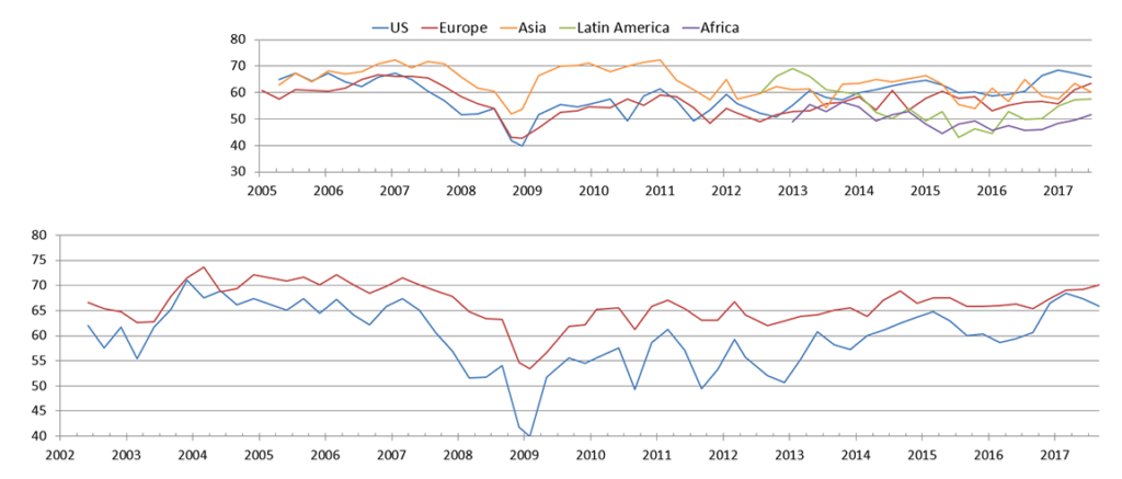
Among the various charts and graphics in the report are graphics depicting trends in “Own Company Optimism” on page 9 and “Economic Optimism” found on page 6.
_____
I post various business and economic surveys because I believe they should be carefully monitored.  However, as those familiar with this site are aware, I do not necessarily agree with many of the consensus estimates and much of the commentary in these surveys.
_____
The Special Note summarizes my overall thoughts about our economic situation
SPX at 2500.60 as this post is written