Wednesday, December 10, 2014

Chicago Fed National Financial Conditions Index (NFCI)

The St. Louis Fed’s Financial Stress Index (STLFSI) is one index that is supposed to measure stress in the financial system.  Its reading as of the December 4, 2014 update (reflecting data through November 28) is -1.137.
Of course, there are a variety of other measures and indices that are supposed to measure financial stress and other related issues, both from the Federal Reserve as well as from private sources.
Two other indices that I regularly monitor include the Chicago Fed National Financial Conditions Index (NFCI) as well as the Chicago Fed Adjusted National Financial Conditions Index (ANFCI).
Here are summary descriptions of each, as seen in FRED:
The National Financial Conditions Index (NFCI) measures risk, liquidity and leverage in money markets and debt and equity markets as well as in the traditional and “shadow” banking systems. Positive values of the NFCI indicate financial conditions that are tighter than average, while negative values indicate financial conditions that are looser than average.
The adjusted NFCI (ANFCI). This index isolates a component of financial conditions uncorrelated with economic conditions to provide an update on how financial conditions compare with current economic conditions.
For further information, please visit the Federal Reserve Bank of Chicago’s web site:
Below are the most recently updated charts of the NFCI and ANFCI, respectively.
The NFCI chart below was last updated on December 10, incorporating data from January 5,1973 to December 5, 2014, on a weekly basis.  The December 5, 2014 value is -.85:
(click on chart to enlarge image)
NFCI
Data Source: FRED, Federal Reserve Economic Data, Federal Reserve Bank of St. Louis; accessed December 10, 2014:
–
The ANFCI chart below was last updated on December 10, incorporating data from January 5,1973 to December 5, 2014, on a weekly basis.  The December 5, 2014 value is -.37:
ANFCI 12-10-14
Data Source: FRED, Federal Reserve Economic Data, Federal Reserve Bank of St. Louis; accessed December 10, 2014:
_________
I post various indicators and indices because I believe they should be carefully monitored.  However, as those familiar with this blog are aware, I do not necessarily agree with what they depict or imply.
_____
The Special Note summarizes my overall thoughts about our economic situation
SPX at 2032.99 as this post is written

Tuesday, December 9, 2014

NFIB Small Business Optimism – December 2014

The December NFIB Small Business Optimism report was released today, December 9, 2014. The headline of the Small Business Economic Trends report is “NFIB:  Small Business Optimism Perks Up In December. ”
The Index of Small Business Optimism increased 2.0 points in November to 98.1.
Here are some excerpts from that I find particularly notable (but don’t necessarily agree with) :
The Small Business Optimism Index gained 2.0 points, taking the Index to its highest level since February 2007. The average of the Index from 1974Q4 to 2014 to date is 98, which includes all the Great Recession readings. What didn’t improve were the four “hard” Index components: job creation plans, plans for capital outlays, job openings and inventory investment plans, together adding a negative 1 percentage point to the Index. The entire gain in the Index was accounted for by two components: Expectations for Business Conditions in Six Months and Expectations for Real Sales Volumes, adding a combined 21 percentage points to net favorable responses, perhaps a response to the November election results.
also:
The net percent of all owners (seasonally adjusted) reporting higher nominal sales in the past 3 months compared to the prior 3 months fell 1 point to a net negative 4 percent, a rather poor picture and inconsistent with the rise in optimism – bottom line, it is customers that bring joy and improve optimism. Twelve percent cited weak sales as their top business problem, one of the lowest readings since December, 2007, unchanged from October. Expected real sales volumes posted a 5 point gain, rising to a net 14 percent of owners expecting gains.
also:
Four percent of the owners reported that all their credit needs were not met, holding at the historic low. Twenty-nine percent reported all credit needs met, and 54 percent explicitly said they did not want a loan. Only 3 percent reported that financing was their top business problem. Thirty-three percent of all owners reported borrowing on a regular basis, up 5 points and high compared to recent experience. The average rate paid on short maturity loans increased 10 basis points to 5.6 percent. The net percent of owners expecting credit conditions to ease in the coming months was a seasonally adjusted negative 6 percent; 1 point worse than October.
Here is a chart of the NFIB Small Business Optimism chart, as seen in the December 9 Doug Short post titled “Small Business Optimism - A Seven-Year High“ :
NFIB Small Business Optimism
–
Further details regarding small business conditions can be seen in the full December 2014 NFIB Small Business Economic Trends report (pdf).
_____
The Special Note summarizes my overall thoughts about our economic situation
SPX at 2039.20 as this post is written

Charts Of Equities’ Performance Since March 9, 2009 And January 1, 1980 – December 9, 2014 Update

In the March 9, 2012 post (“Charts of Equities’ Performance Since March 9, 2009 And January 1, 1980“) I highlighted two charts for reference purposes.
Below are those two charts, updated through the latest daily closing price.
The first is a daily chart of the S&P500 (shown in green), as well as five prominent (AAPL, IBM, WFM, SBUX, CAT) individual stocks, since 2005.  There is a blue vertical line that is very close to the March 6, 2009 low.  As one can see, both the S&P500 performance, as well as many stocks including the five shown, have performed strongly since the March 6, 2009 low:
(click on chart to enlarge image)(chart courtesy of StockCharts.com; chart creation and annotation by the author)
prominent stocks vs. the S&P500
–
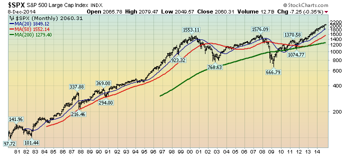
This next chart shows, on a monthly LOG basis, the S&P500 since 1980.  I find this chart notable as it provides an interesting long-term perspective on the S&P500′s performance.  The 20, 50, and 200-month moving averages are shown in blue, red, and green lines, respectively:
(click on chart to enlarge image)(chart courtesy of StockCharts.com; chart creation and annotation by the author)
S&P500 monthly since 1980
_____
The Special Note summarizes my overall thoughts about our economic situation
SPX at 2060.31 as this post is written

Monday, December 8, 2014

Building Financial Danger – December 8, 2014 Update

On October 17, 2011 I wrote a post titled “Danger Signs In The Stock Market, Financial System And Economy.”  This post is a brief 43nd update to that post.
My overall analysis indicates a continuing elevated and growing level of financial danger which contains many worldwide and U.S.-specific “stresses” of a very complex nature. I have written numerous posts in this blog of some of what I consider both ongoing and recent “negative developments.”  These developments, as well as other exceedingly problematic conditions, have presented a highly perilous economic environment that endangers the overall financial system.
Also of ongoing immense importance is the existence of various immensely large asset bubbles, a subject of which I have extensively written.  While all of these asset bubbles are wildly pernicious and will have profound adverse future implications, hazards presented by the bond market bubble are especially notable.
Predicting the specific timing and extent of a stock market crash is always difficult, and the immense complexity of today’s economic situation makes such a prediction even more challenging. With that being said, my analyses indicate that the danger inherent in the financial system has surpassed the level at which a near-term outsized (from an ultra-long term perspective) stock market crash – that would also involve (as seen in 2008) various other markets as well – is of tremendous concern.
(note: the “next crash” has great significance and implications, as discussed in the post of January 6, 2012 titled “The Next Crash And Its Significance“ and subsequent posts in the “Economic Depression” category)
As reference, below is a daily chart since 2008 of the S&P500 (with a last price of 2075.37), depicted on a LOG scale, indicating both the 50dma and 200dma as well as price labels:
(click on chart to enlarge image)(chart courtesy of StockCharts.com; chart creation and annotation by the author)
S&P500 since 2008
_____
The Special Note summarizes my overall thoughts about our economic situation
SPX at 2075.37 as this post is written

Median Household Income Chart

I have written many blog posts concerning the worrisome trends in income and earnings.
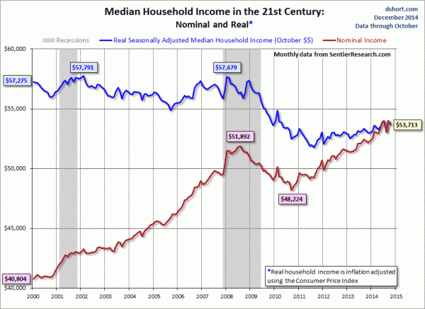
Doug Short, in his December 5, 2014 post titled “Real Median Household Income Declined .59% in October” produced the chart below.  It is based upon data from Sentier Research, and it shows both nominal and real median household incomes since 2000, as depicted.  As one can see, post-recession real median household income (seen in the blue line since 2009) is especially worrisome.
(click on chart to enlarge image)
median household income
–
As Doug mentions in his aforementioned blog post:
As the excellent data from Sentier Research makes clear, the mainstream U.S. household was struggling before the Great Recession. At this point, real household incomes are in worse shape than they were four years ago when the recession ended.
Among other items seen in his blog post is a chart depicting each of the two (nominal and real household incomes) data series’ percent change over time since 2000.
_____
The Special Note summarizes my overall thoughts about our economic situation
SPX at 2075.37 as this post is written

Saturday, December 6, 2014

“Not In Labor Force” Statistic – As Of December 2014

In the November 13, 2013 post (“Not In Labor Force Statistic“) I featured editorial commentary from the Wall Street Journal, as well as an accompanying long-term chart, with regard to the number of people not working.
Below is an updated chart regarding this statistic.  The current figure, last updated on December 5, 2014 depicting data through November 2014, is 92.547 million people (Not Seasonally Adjusted) :
Not In Labor Force
Data Source: FRED, Federal Reserve Economic Data, Federal Reserve Bank of St. Louis: Not In Labor Force [LNU05000000] ; U.S. Department of Labor: Bureau of Labor Statistics; accessed December 6, 2014;
_____
The Special Note summarizes my overall thoughts about our economic situation
SPX at 2075.37 as this post is written

Average Hourly Earnings Trends

I have written many blog posts concerning the worrisome trends in income and earnings.
Along these lines, one of the measures showing disconcerting trends is that of hourly earnings.
While the concept of hourly earnings can be defined and measured in a variety of ways, below are a few charts that I believe broadly illustrate problematic trends.
The first chart depicts Average Hourly Earnings Of All Employees: Total Private  (FRED series CES0500000003)(current value = $24.66) :
(click on chart to enlarge image)(chart last updated 12-5-14)
CES0500000003
Data Source: FRED, Federal Reserve Economic Data, Federal Reserve Bank of St. Louis: Average Hourly Earnings of All Employees:  Total Private [CES0500000003] ; U.S. Department of Labor: Bureau of Labor Statistics; accessed December 5, 2014:
–
This next chart depicts this same measure on a “Percentage Change From A Year Ago” basis.  While not totally surprising, I find the decline from 2009 and subsequent trend to be disconcerting:
(click on chart to enlarge image)(chart last updated 12-5-14)
CES0500000003_12-5-14 Percent Change From Year Ago
–
There are slightly different measures available from a longer-term perspective. Pictured below is another measure, the Average Hourly Earnings of Production and Nonsupervisory Employees – Total Private (FRED series AHETPI)(current value = $20.74) :
(click on chart to enlarge image)(chart last updated 12-5-14)
AHETPI
Data Source: FRED, Federal Reserve Economic Data, Federal Reserve Bank of St. Louis: Average Hourly Earnings of Production and Nonsupervisory Employees:  Total Private [AHETPI] ; U.S. Department of Labor: Bureau of Labor Statistics;  accessed December 5, 2014:
–
Pictured below is this AHETPI measure on a “Percentage Change From A Year Ago” basis:
(click on chart to enlarge image)(chart last updated 12-5-14)
AHETPI Percent Change From Year Ago
–
I will continue to actively monitor these trends, especially given the post-2009 dynamics.
_____
The Special Note summarizes my overall thoughts about our economic situation
SPX at 2075.37 as this post is written

Friday, December 5, 2014

Deflation Probabilities – December 5, 2014 Update

While I do not agree with the current readings of the measure – I think the measure dramatically understates the probability of deflation, as measured by the CPI – the Federal Reserve Bank of Atlanta maintains an interesting data series titled “Deflation Probabilities.”
As stated on the site:
Using estimates derived from Treasury Inflation-Protected Securities (TIPS) markets, described in a technical appendix, this weekly report provides two measures of the probability of consumer price index (CPI) deflation through 2018.
A chart shows the trends of the probabilities.  As one can see in the chart, the readings are volatile.
As for the current weekly reading, the December 4, 2014 update states the following:
The 2013–18 deflation probability—based on the 5-year TIPS issued in April 2013 and the 10-year TIPS issued in July 2008—was 0 percent on December 3, where it has been since early September 2013. The 2014–19 deflation probability is also 0 percent as of December 3.
Prices of Treasury Inflation-Protected Securities (TIPS) with similar maturity dates can be used to measure probabilities of a net decline in the consumer price index over the five-year period starting in early 2013 or the five-year period starting in early 2014.
I plan on providing updates to this measure on a regular interval.
_________
I post various economic indicators and indices because I believe they should be carefully monitored.  However, as those familiar with this blog are aware, I do not necessarily agree with what they depict or imply.
_____
The Special Note summarizes my overall thoughts about our economic situation
SPX at 2079.09 this post is written