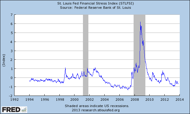
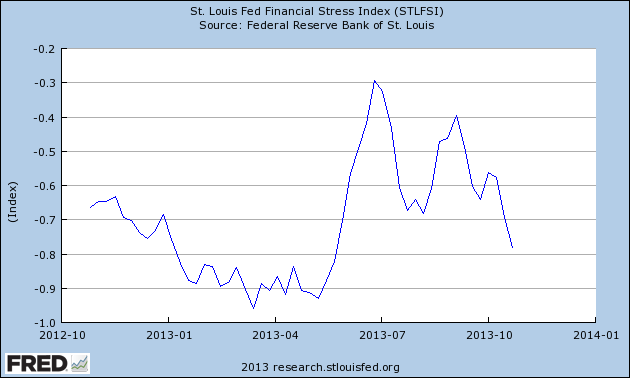
On March 28, 2011 I wrote a post ("The STLFSI") about the St. Louis Fed’s Financial Stress Index (STLFSI) which is supposed to measure stress in the financial system. For reference purposes, the most recent chart is seen below. This chart was last updated on October 31, incorporating data from December 31,1993 to October 25, 2013, on a weekly basis. The October 25, 2013 value is -.78:
(click on chart to enlarge image)

-
Here is the STLFSI chart from a 1-year perspective:
Data Source: FRED, Federal Reserve Economic Data, Federal Reserve Bank of St. Louis; accessed October 31, 2013:
_________
I post various indicators and indices because I believe they should be carefully monitored. However, as those familiar with this blog are aware, I do not necessarily agree with what they depict or imply.
_____
The Special Note summarizes my overall thoughts about our economic situation
SPX at 1764.71 as this post is written