Friday, May 31, 2013

Long-Term Charts Of The ECRI WLI & ECRI WLI, Gr. – May 31, 2013 Update

As I stated in my July 12, 2010 post ("ECRI WLI Growth History"):
For a variety of reasons, I am not as enamored with ECRI’s WLI and WLI Growth measures as many are.
However, I do think the measures are important and deserve close monitoring and scrutiny.
The movement of the ECRI WLI and WLI, Gr. is particularly notable at this time, as ECRI publicly announced on September 30, 2011 that the U.S. was “tipping into recession,” and ECRI has reiterated the view that the U.S. economy is currently in a recession, seen most recently in these five sources :
Other past notable 2012 reaffirmations of the September 30, 2011 recession call by ECRI were seen (in chronological order)  on March 15 (“Why Our Recession Call Stands”) as well as various interviews and statements the week of May 6, including:
Also, subsequent to May 2012:
-

Below are three long-term charts, from Doug Short’s blog post of May 31 titled “ECRI Recession Watch:  'What Wealth Effect?'”  These charts are on a weekly basis through the May 31 release, indicating data through May 24, 2013.

Here is the ECRI WLI (defined at ECRI’s glossary):

(click on charts to enlarge images)

Dshort 5-31-13 ECRI-WLI 130.7

-

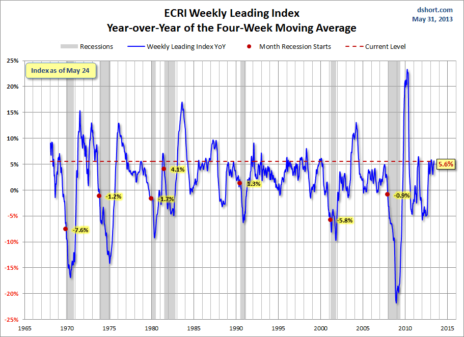
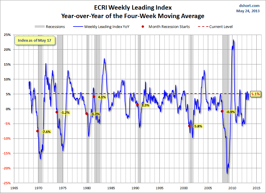
This next chart depicts, on a long-term basis, the Year-over-Year change in the 4-week moving average of the WLI:

Dshort 5-31-13 ECRI-WLI-YoY 5.6 percent

-

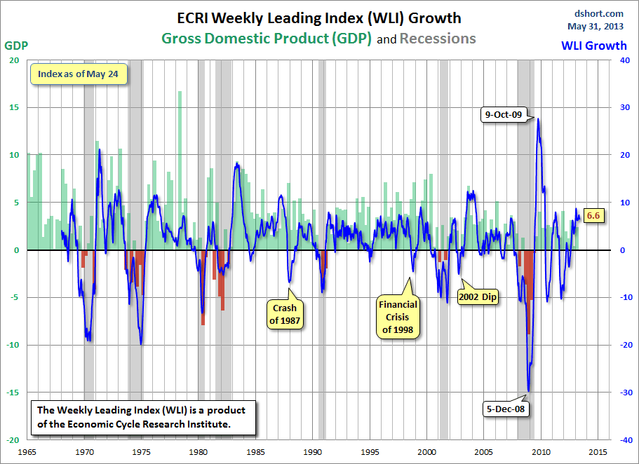
This last chart depicts, on a long-term basis, the WLI, Gr.:

Dshort 5-31-13 ECRI-WLI-growth-since-1965 6.6 percent

_________

I post various economic indicators and indices because I believe they should be carefully monitored.  However, as those familiar with this blog are aware, I do not necessarily agree with what they depict or imply.
_____

The Special Note summarizes my overall thoughts about our economic situation

SPX at 1643.55 as this post is written

St. Louis Financial Stress Index – May 30, 2013 Update

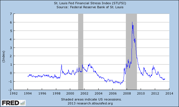
On March 28, 2011 I wrote a post ("The STLFSI") about the  St. Louis Fed’s Financial Stress Index (STLFSI) which is supposed to measure stress in the financial system.  For reference purposes, the most recent chart is seen below.  This chart was last updated on May 30, incorporating data from December 31,1993 to May 24, 2013, on a weekly basis.  The May 24, 2013 value is -.678 :

(click on chart to enlarge image)

STLFSI_5-30-13 -.678

-

Here is the STLFSI chart from a 1-year perspective:

STLFSI_5-30-13 -.678 1-year

Data Source: FRED, Federal Reserve Economic Data, Federal Reserve Bank of St. Louis; accessed May 31, 2013:
_________

I post various indicators and indices because I believe they should be carefully monitored.  However, as those familiar with this blog are aware, I do not necessarily agree with what they depict or imply.
_____

The Special Note summarizes my overall thoughts about our economic situation

SPX at 1653.83 as this post is written

Corporate Profits As A Percentage Of GDP

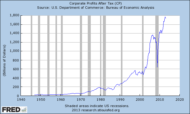
In the last post ("1st Quarter Corporate Profits") I displayed, for reference purposes, a long-term chart depicting Corporate Profits After Tax.

There are many ways to view this measure, both on an absolute as well as relative basis.

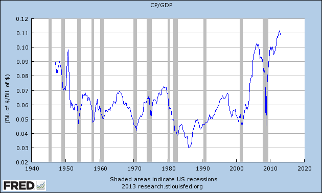
One relative measure is viewing Corporate Profits as a Percentage of GDP.  I feel that this metric is important for a variety of reasons.  As well, the measure is important to a variety of parties, including investors, businesses, and government policy makers.

As one can see from the  long-term chart below (updated through the first quarter), (After Tax) Corporate Profits as a Percentage of GDP is at levels that can be seen as historically (very) high.  While there are many reasons as to why this is so, from a going-forward standpoint I think it is important to recognize both that such a notable condition exists, as well as contemplate and/or plan for such factors and conditions that would come about if (and in my opinion “when”) a more historically “normal” ratio of Corporate Profits as a Percentage of GDP occurs.  This topic can be very complex in nature, and depends upon myriad factors.  In my opinion it deserves far greater recognition.

(click on chart to enlarge image)

CP-GDP 5-30-13
Data Source: FRED, Federal Reserve Economic Data, Federal Reserve Bank of St. Louis; accessed May 30, 2013
_____

The Special Note summarizes my overall thoughts about our economic situation

SPX at 1654.41 as this post is written

Thursday, May 30, 2013

1st Quarter Corporate Profits

Today’s GDP release (Q1, 2nd Estimate) was accompanied by the BLS Corporate Profits (preliminary estimate) report for the 1st Quarter.

Of course, there are many ways to adjust and depict overall Corporate Profits.  For reference purposes, here is a chart from the St. Louis Federal Reserve (FRED) showing the Corporate Profits After Tax (last updated May 30,2013, with a value of $1737.6 Billion) :

CP_5-30-13 1737.6

-

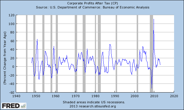
Here is the Corporate Profits After Tax measure shown on a Percentage Change from a Year Ago perspective:

CP_5-30-13 1737.6 Percent Change From Year Ago

Data Source: FRED, Federal Reserve Economic Data, Federal Reserve Bank of St. Louis: Corporate Profits After Tax [CP]; U.S. Department of Commerce: Bureau of Economic Analysis; accessed May 30, 2013; https://research.stlouisfed.org/fred2/series/CP

_____

The Special Note summarizes my overall thoughts about our economic situation

SPX at 1657.37 as this post is written

Median Household Income Chart


I have written many blog posts concerning the worrisome trends in income and earnings.

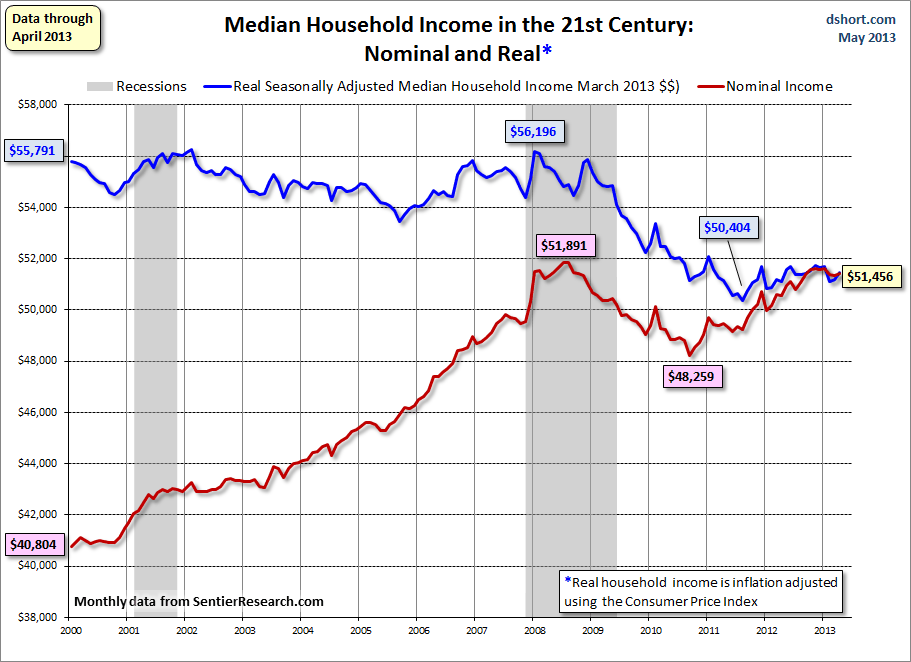
Doug Short, in his May 29 blog post, titled “Real Median Household Incomes:  Up .5% in April But Only a Fractional .6% Year-over-Year” produced the chart below.  It is based upon data from Sentier Research, and it shows both nominal and real median household incomes since 2000, as depicted.  As one can see, post-recession real median household income (seen in the blue line since 2009) is especially worrisome.

(click on chart to enlarge image)

Dshort 5-29-13 household-income-monthly-median-since-2000

-

As Doug mentions in his aforementioned blog post:
As the excellent data from Sentier Research makes clear, the mainstream U.S. household was struggling before the Great Recession. At this point, real household incomes are in significantly worse shape than they were over three years ago when the recession ended.
Among other items seen in his blog post is a chart depicting each of the two (nominal and real household incomes) data series’ percent change over time since 2000.
_____

The Special Note summarizes my overall thoughts about our economic situation

SPX at 1648.36 as this post is written

Wednesday, May 29, 2013

Durable Goods New Orders – Long-Term Charts Through April 2013


Many people place emphasis on Durable Goods New Orders as a prominent economic indicator and/or leading economic indicator.

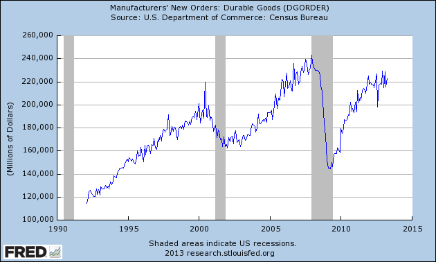
For reference, below are charts depicting this measure.

First, from the St. Louis Fed site (FRED), a chart through April, last updated on May 28.  This value is 222,557 ($ Millions) :

(click on charts to enlarge images)

DGORDER_5-28-13 222557

-

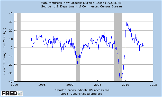
Here is the chart depicting this measure on a “Percentage Change from a Year Ago” basis:

DGORDER_5-28-13 222557 Percent Change From Year Ago

Data Source: FRED, Federal Reserve Economic Data, Federal Reserve Bank of St. Louis: Manufacturers’ New Orders:  Durable Goods [DGORDER] ; U.S. Department of Commerce: Census Bureau ;http://research.stlouisfed.org/fred2/series/DGORDER ; accessed May 28, 2013

_________

I post various indicators and indices because I believe they should be carefully monitored.  However, as those familiar with this blog are aware, I do not necessarily agree with what they depict or imply.
_____

The Special Note summarizes my overall thoughts about our economic situation

SPX at 1660.06 as this post is written

Tuesday, May 28, 2013

Consumer Confidence Surveys – As Of May 28, 2013


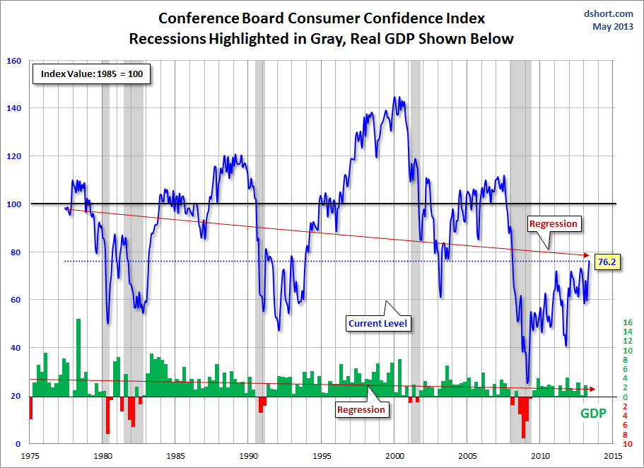
Doug Short had a blog post of May 28 ("Consumer Confidence Beats Expectations, Now at a 5-Year High") in which he presents the latest Conference Board Consumer Confidence and Thomson/Reuters University of Michigan Consumer Sentiment Index charts.  They are presented below:

(click on charts to enlarge images)

Dshort 5-28-13 - Conference-Board-consumer-confidence-index

-

Dshort 5-28-13 - Michigan-consumer-sentiment-index

-

There are a few aspects of the above charts that I find highly noteworthy.  Of course, the continuing subdued absolute levels of these two surveys is disconcerting.

Also, I find the “behavior” of these readings to be quite disparate as compared to the other post-recession periods, as shown in the charts between the gray shaded areas (the gray areas denote recessions as defined by the NBER.)

While I don’t believe that confidence surveys should be overemphasized, I find these readings to be very problematical, especially in light of a variety of other highly disconcerting measures highlighted throughout this blog.
_____

The Special Note summarizes my overall thoughts about our economic situation

SPX at 1660.06 as this post is written

Financial Stocks – May 28, 2013 Update Concerning Poor “Price Action”


On June 29, 2011 I wrote a blog post titled “Financial Stocks – Notable Price Action.”  This post is the latest update of that message.

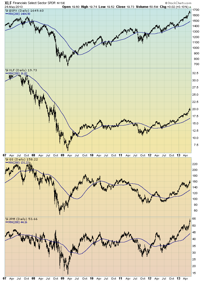
Although financial stocks have (in general) increased in price since 2012, I continue to believe that the longer-term “price action” of various financial stocks is disconcerting.  I view the poor performance of these financial and brokerage stocks to be one indicator among (very) many that serves as a “red flag” as to the financial markets and economy as a whole.

Here is an updated chart to that shown in the aforementioned June 29, 2011 post.  It shows the XLF (the financial ETF) on a daily basis since 2007.  As well, the S&P500 is plotted above it, with GS and JPM shown below it.  The blue line on each indicates the 200dma:

(click on chart image to enlarge)(chart courtesy of StockCharts.com; chart created by and annotated by author)

EconomicGreenfield 5-28-13 GS and JPM


_____

The Special Note summarizes my overall thoughts about our economic situation

SPX at 1649.60 as this post is written

Financial Stocks – Relative Price To Overall Stock Market – May 28, 2013 Update


In the June 29, 2011 post (“Financial Stocks – Notable Price Action”) I wrote the following:
I think that the relatively poor “price action” of various financial stocks is notable.  It is one of many current indications that overall stock market health is not as strong as a casual glance at the major indices would indicate.
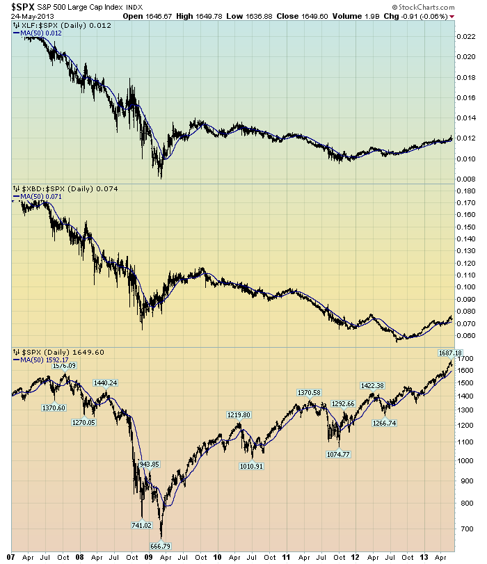
I continue to believe that the lagging / “sagging” price of various financial stocks is highly notable.  Here is a chart that I created a while ago that provides another view of the poor “price action” of the financial stocks vs. that of the entire stock market, as depicted by the S&P500:

(click on chart to enlarge image)(chart courtesy of StockCharts.com; chart created by and annotated by author)

EconomicGreenfield 5-28-13 XLF v SPX

-

The above chart is depicted on a daily basis, LOG scale, since 2007.   On each of the three plots, a blue line depicts the 50dma for perspective.

As one can see, there has been an interesting progression of the relative price of the XLF (Financial SPDR) vs. the S&P500, as seen in the top of the chart.  In the middle of the chart, the same can be seen in the $XBD (Broker/Dealer Index).  Generally, since mid-2009, the price of both the XLF and $XBD have been on a slow downward trajectory relative to the price of the S&P500.  The S&P500 is plotted on the bottom of the chart.

In my experience, any time the financials lag the general stock market for a considerable period, it is generally a “red flag” that should be closely monitored.
_____

The Special Note summarizes my overall thoughts about our economic situation

SPX at 1649.60 as this post is written

Friday, May 24, 2013

Long-Term Charts Of The ECRI WLI & ECRI WLI, Gr. – May 24, 2013 Update


As I stated in my July 12, 2010 post ("ECRI WLI Growth History"):
For a variety of reasons, I am not as enamored with ECRI’s WLI and WLI Growth measures as many are.
However, I do think the measures are important and deserve close monitoring and scrutiny.
The movement of the ECRI WLI and WLI, Gr. is particularly notable at this time, as ECRI publicly announced on September 30, 2011 that the U.S. was “tipping into recession,” and ECRI has reiterated the view that the U.S. economy is currently in a recession, seen most recently in these four sources :
Other past notable 2012 reaffirmations of the September 30, 2011 recession call by ECRI were seen (in chronological order)  on March 15 (“Why Our Recession Call Stands”) as well as various interviews and statements the week of May 6, including:
Also, subsequent to May 2012:
-

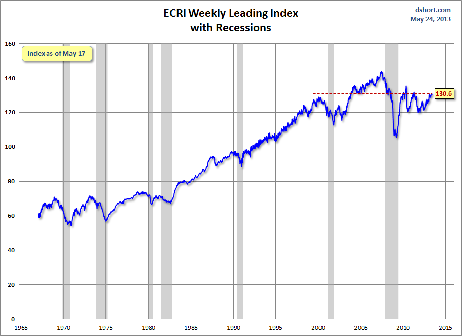
Below are three long-term charts, from Doug Short’s blog post of May 24 titled “Recession Watch:  ECRI’s Weekly Leading Indicator Up Slightly.”  These charts are on a weekly basis through the May 24 release, indicating data through May 17, 2013.

Here is the ECRI WLI (defined at ECRI’s glossary):

(click on charts to enlarge images)

Dshort 5-24-13 ECRI-WLI 130.6

-

This next chart depicts, on a long-term basis, the Year-over-Year change in the 4-week moving average of the WLI:

Dshort 5-24-13 ECRI-WLI-YoY 5.1

-

This last chart depicts, on a long-term basis, the WLI, Gr.:

Dshort 5-24-13 ECRI-WLI-growth-since-1965 6.8

_________

I post various economic indicators and indices because I believe they should be carefully monitored.  However, as those familiar with this blog are aware, I do not necessarily agree with what they depict or imply.
_____

The Special Note summarizes my overall thoughts about our economic situation

SPX at 1645.42 as this post is written

St. Louis Financial Stress Index – May 23, 2013 Update


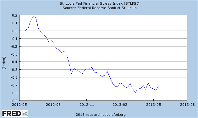
On March 28, 2011 I wrote a post ("The STLFSI") about the  St. Louis Fed’s Financial Stress Index (STLFSI) which is supposed to measure stress in the financial system.  For reference purposes, the most recent chart is seen below.  This chart was last updated on May 23, incorporating data from December 31,1993 to May 17, 2013, on a weekly basis.  The May 17, 2013 value is -.718 :

(click on chart to enlarge image)

STLFSI_5-23-13 -.718

-

Here is the STLFSI chart from a 1-year perspective:

STLFSI_5-23-13 -.718 1 year

Data Source: FRED, Federal Reserve Economic Data, Federal Reserve Bank of St. Louis; accessed May 24, 2013:

_________

I post various indicators and indices because I believe they should be carefully monitored.  However, as those familiar with this blog are aware, I do not necessarily agree with what they depict or imply.
_____

The Special Note summarizes my overall thoughts about our economic situation

SPX at 1650.51 as this post is written

Trends Of S&P500 Earnings Forecasts


S&P500 earnings trends and estimates are a notably important topic, for a variety of reasons, at this point in time.

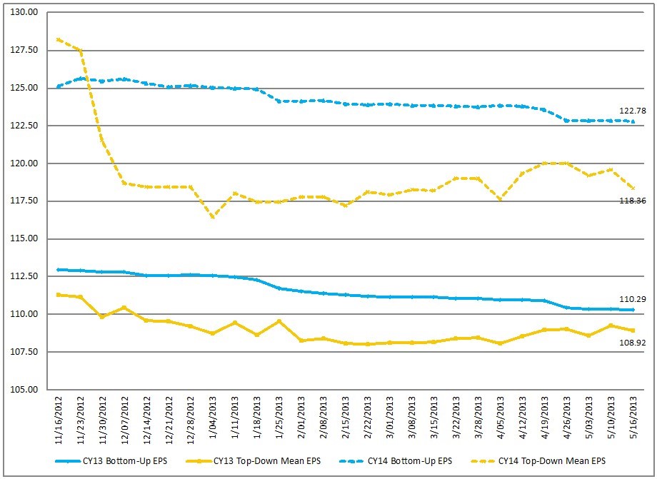
FactSet publishes a report titled “Earnings Insight” that contains a variety of information including the trends and expectations of S&P500 earnings.

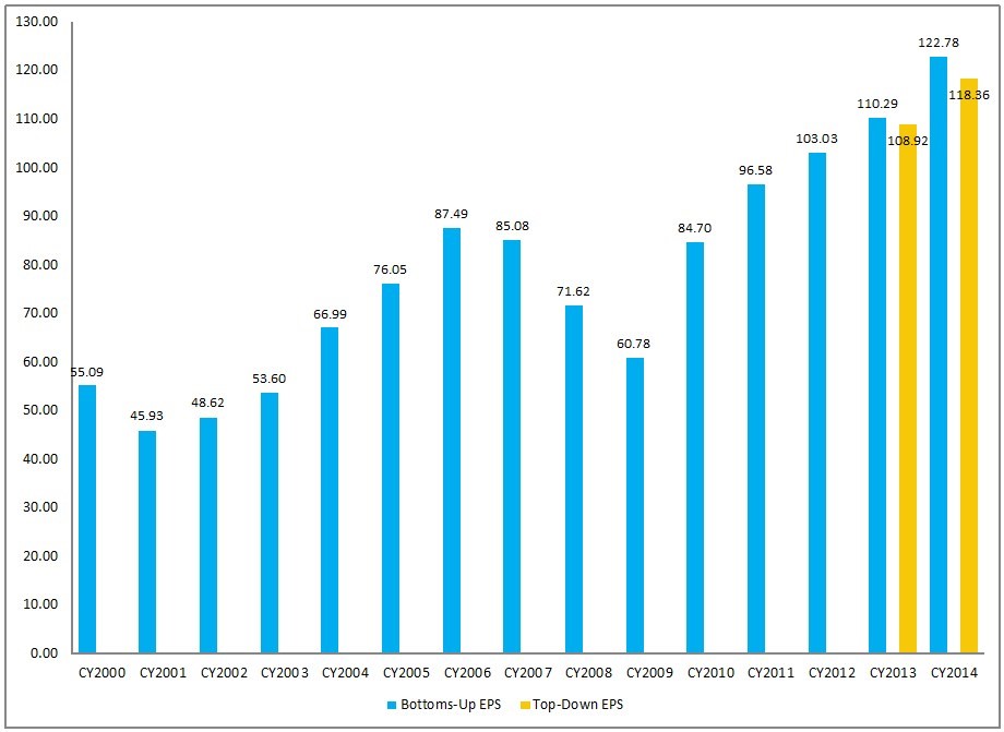
For reference purposes, here are two charts as seen in the “Earnings Insight” (pdf) report of May 17, 2013:

from page 17:

(click on charts to enlarge images)

CY Bottom-Up EPS vs. Top-Down Mean EPS (Trailing 26-Weeks) 

EconomicGreenfield 5-24-13 FactSet 5-17-13 EPS Forecasts

-

from page 18:

Calendar Year Bottom-Up EPS Actuals & Estimates

EconomicGreenfield 5-24-13 FactSet 5-17-13 EPS Forecasts CY Actual and Estimates

_____

I post various economic forecasts because I believe they should be carefully monitored.  However, as those familiar with this blog are aware, I do not agree with many of the consensus estimates and much of the commentary in these forecast surveys.
_____

The Special Note summarizes my overall thoughts about our economic situation

SPX at 1650.51 as this post is written

Thursday, May 23, 2013

S&P500 Earnings Estimates For Years 2013, 2014, And 2015


As many are aware, Thomson Reuters publishes earnings estimates for the S&P500.  (My other posts concerning S&P earnings estimates can be found under the S&P500 Earnings label)

The following estimates are from Exhibit 12 of “The Director’s Report” of May 23, 2013, and represent an aggregation of individual S&P500 component “bottom up” analyst forecasts:

Year 2013 estimate:
$110.89/share

Year 2014 estimate:
$123.46/share

Year 2015 estimate:
$135.99/share

_____

I post various economic forecasts because I believe they should be carefully monitored.  However, as those familiar with this blog are aware, I do not agree with many of the consensus estimates and much of the commentary in these forecast surveys.
_____

The Special Note summarizes my overall thoughts about our economic situation

SPX at 1646.93 as this post is written

Standard & Poor’s S&P500 Earnings Estimates For 2013 & 2014 – As Of May 18, 2013


As many are aware, Standard & Poor’s publishes earnings estimates for the S&P500.  (My posts concerning their estimates can be found under the S&P500 Earnings tag)

For reference purposes, the most current estimates are reflected below, and are as of May 18, 2013:

Year 2013 estimates add to the following:
-From a “bottom up” perspective, operating earnings of $109.69/share
-From a “top down” perspective, operating earnings of $113.07/share
-From a “top down” perspective, “as reported” earnings of $107.18/share

Year 2014 estimates add to the following:
-From a “bottom up” perspective, operating earnings of $123.38/share
-From a “top down” perspective, operating earnings of $121.80/share
-From a “top down” perspective, “as reported” earnings of $117.53/share

_____

I post various economic forecasts because I believe they should be carefully monitored.  However, as those familiar with this blog are aware, I do not agree with many of the consensus estimates and much of the commentary in these forecast surveys.
_____

The Special Note summarizes my overall thoughts about our economic situation

SPX at 1655.35 as this post is written
Wednesday, May 22, 2013

Broad-Based Indicators Of Economic Activity


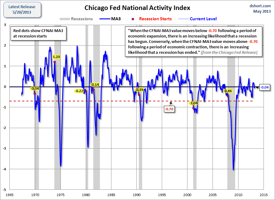
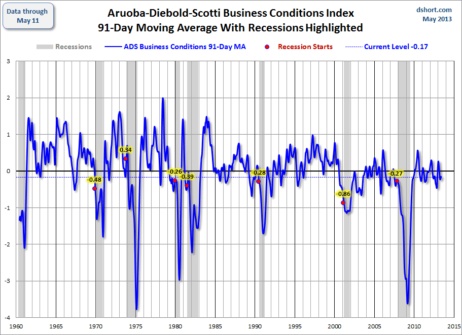
The Chicago Fed National Activity Index (CFNAI) and the Aruoba-Diebold-Scotti Business Conditions Index (ADS Index) are two broad-based economic indicators that I regularly feature in this site.

The current levels of each are notable, as they are vacillating from a short-term perspective and their long-term trends continue to sink.

Doug Short, in his blog post of May 21, titled “The Philly Fed Business Conditions Index” displays both the CFNAI MA-3 (3-month Moving Average) and ADS Index (91-Day Moving Average) from a couple of perspectives.

Of particular note, two of the charts, shown below, denote where the current levels of each reading is relative to the beginning of past recessionary periods, as depicted by the red dots.

The CFNAI MA-3:

(click on charts to enlarge images)

Dshort 5-21-13 Chicago-Fed-CFNAI-recession-indicator

-

The ADS Index, 91-Day MA:

Dshort 5-21-13 ADS-index-91-day-MA

-

Also shown in the Doug Short’s aforementioned post is a chart of each with a long-term trendline (linear regression) as well as a chart depicting GDP for comparison purposes.
_________

I post various indicators and indices because I believe they should be carefully monitored.  However, as those familiar with this blog are aware, I do not necessarily agree with what they depict or imply.
_____

The Special Note summarizes my overall thoughts about our economic situation

SPX at 1669.16 as this post is written