U.S. Economic Indicators
Throughout this site there are many discussions of economic indicators. At this time, the readings of various indicators are especially notable. This post is the latest in a series of posts indicating U.S. economic weakness or a notably low growth rate.
While many U.S. economic indicators – including GDP – are indicating economic growth, others depict (or imply) various degrees of weak growth or economic contraction. As seen in the September 2018 Wall Street Journal Economic Forecast Survey the consensus (average estimate) among various economists is for 3.1% GDP growth in 2018 and 2.4% GDP growth in 2019. However, there are other broad-based economic indicators that seem to imply a weaker growth rate.
As well, it should be remembered that GDP figures can be (substantially) revised.
Among the broad-based economic indicators that have been implying weaker growth or mild contraction is the Chicago Fed National Activity Index (CFNAI).
The August 2018 Chicago Fed National Activity Index (CFNAI) updated as of August 27, 2018:
The CFNAI, with current reading of .13:
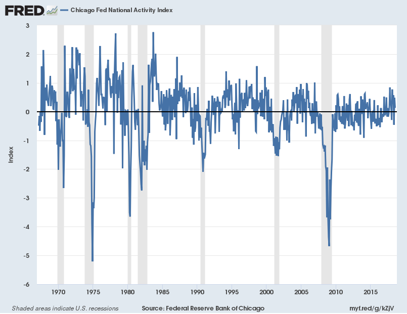
source: Federal Reserve Bank of Chicago, Chicago Fed National Activity Index [CFNAI], retrieved from FRED, Federal Reserve Bank of St. Louis, August 27, 2018;
The CFNAI-MA3, with current reading of .05:
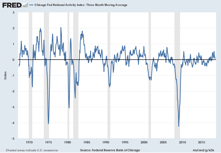
source: Federal Reserve Bank of Chicago, Chicago Fed National Activity Index: Three Month Moving Average [CFNAIMA3], retrieved from FRED, Federal Reserve Bank of St. Louis, August 27, 2018;
Another broad-based economic indicator that implies a weaker growth is that of the Aruoba-Diebold-Scotti Business Conditions Index (ADS Index.) Below is a two-year chart of the index through September 8, 2018, with a value of .1034, as of the September 13 update:
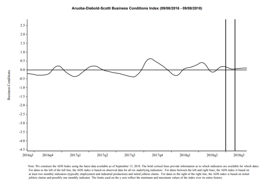
source: Federal Reserve Bank of Philadelphia, Aruoba-Diebold-Scotti Business Conditions Index (ADS Index)
__
Other Charts Indicating U.S. Economic Weakness
Below are a small sampling of other charts that depict weak growth or contraction, and a brief comment for each:
Total Federal Receipts
“Total Federal Receipts” growth continues to be intermittent in nature since 2015. As well, the level of growth does not seem congruent to the (recent) levels of economic growth as seen in aggregate measures such as Real GDP.
“Total Federal Receipts” through August had a last value of $219,115 Million. Shown below is the measure displayed on a “Percent Change From Year Ago” basis with value -3.2%, last updated September 13, 2018:
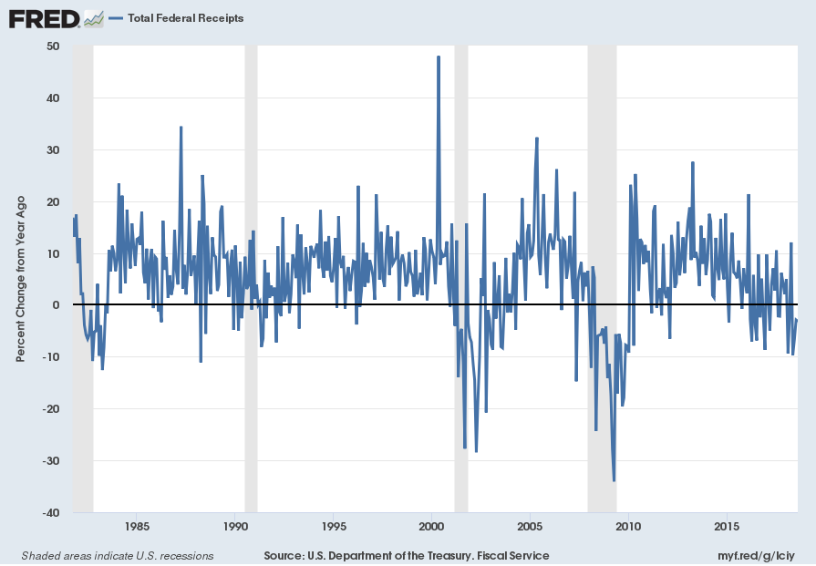
source: U.S. Department of the Treasury. Fiscal Service, Total Federal Receipts [MTSR133FMS], retrieved from FRED, Federal Reserve Bank of St. Louis, accessed August 11, 2018:
__
Federal Government Current Tax Receipts: Personal Current Taxes
Another measure that depicts weakness is that of “Federal government current tax receipts: Personal Current Taxes.” Through the second quarter the value is $1605.803 Billion Seasonally Adjusted Annual Rate (SAAR). Shown below is the chart, displayed on a “Percent Change From Year Ago” basis with value of 0%, last updated August 29, 2018:
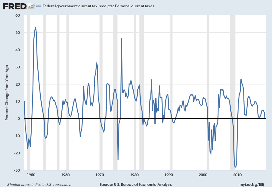
source: U.S. Bureau of Economic Analysis, Federal government current tax receipts: Personal current taxes [A074RC1Q027SBEA], retrieved from FRED, Federal Reserve Bank of St. Louis; accessed September 10, 2018:
__
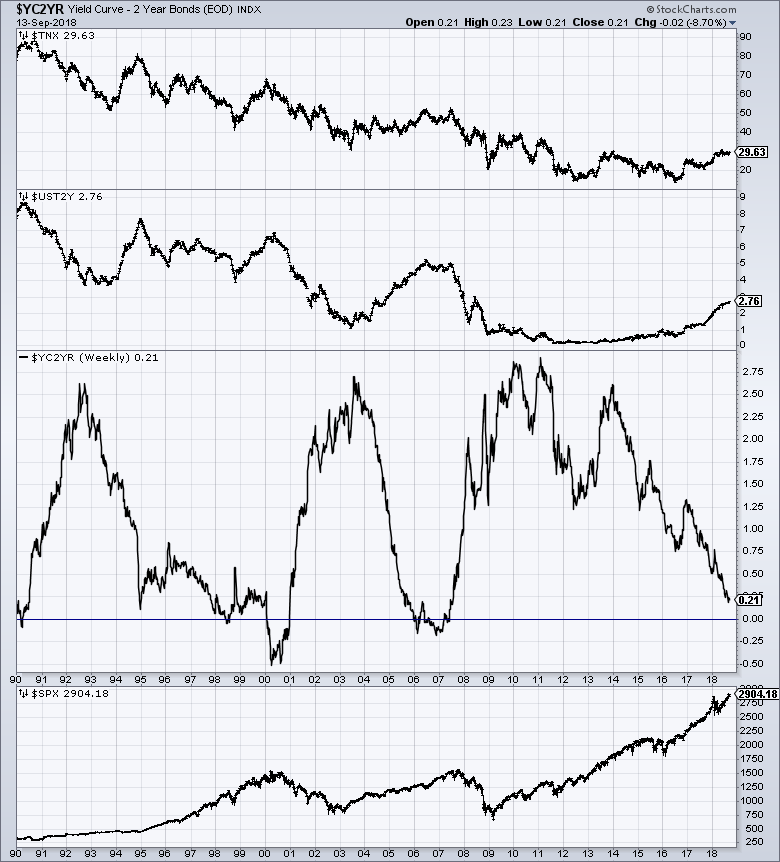
The Yield Curve
Many people believe that the Yield Curve is a leading economic indicator for the United States economy.
On March 1, 2010, I wrote a post on the issue, titled “The Yield Curve As A Leading Economic Indicator.”
While I continue to have the stated reservations regarding the “yield curve” as an indicator, I do believe that it should be monitored.
As an indication of the yield curve (i.e. a yield curve proxy), below is a weekly chart from January 1, 1990 through September 13, 2018. The top two plots show the 10-Year Treasury and 2-Year Treasury yields. The third plot shows the (yield) spread between the 10-Year Treasury and 2-Year Treasury, with the September 13, 2018 closing value of .21%. The bottom plot shows the S&P500:
(click on chart to enlarge image)(chart courtesy of StockCharts.com; chart creation and annotation by the author)
__
Auto Sales
Auto sales have experienced significant growth over the post-2009 period. The current reading (through August, updated on September 7) is 16.596 million vehicles SAAR:
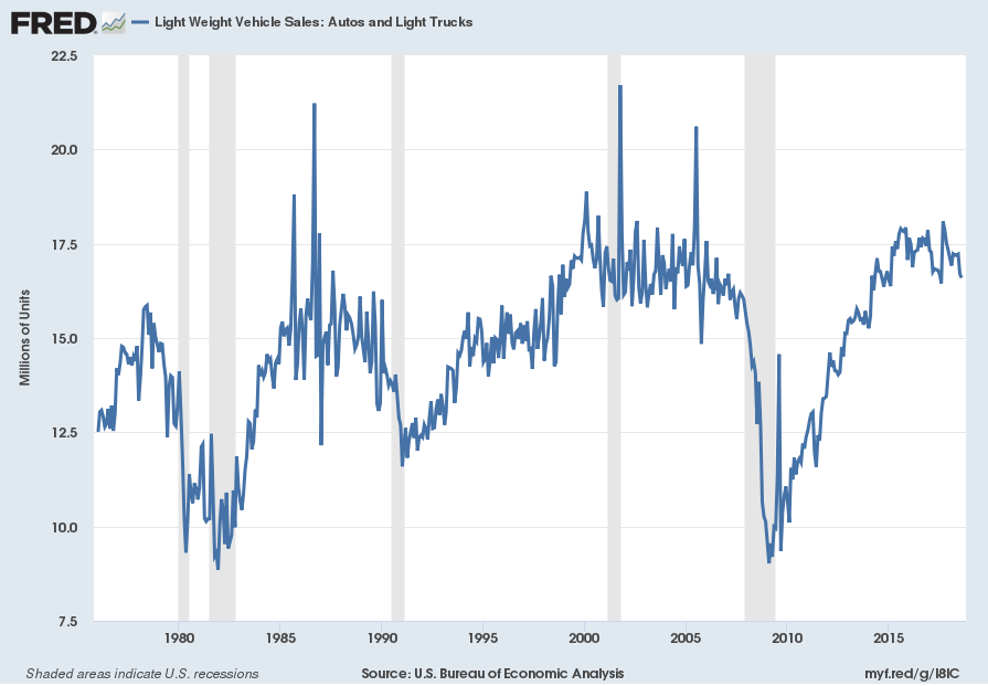
source: U.S. Bureau of Economic Analysis, Light Weight Vehicle Sales: Autos and Light Trucks [ALTSALES], retrieved from FRED, Federal Reserve Bank of St. Louis; accessed September 10, 2018:
Here is the same measure on a “Percent Change From Year Ago” basis, with value .9%:
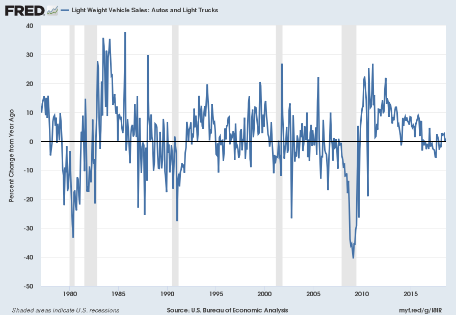
I believe that many factors indicate that auto sales have peaked. While this peaking will have vast economic implications, there are many other factors concerning auto sales that are worrisome. While an exhaustive discussion of the topic would be exceedingly lengthy, various notable factors include the degree to which (ultra-) cheap financing and relaxed financing terms are aiding sales, as well as various aspects of pricing and discounting.
__
Other Indicators
As mentioned previously, many other indicators discussed on this site indicate economic weakness or economic contraction, if not outright (gravely) problematical economic conditions.
_____
The Special Note summarizes my overall thoughts about our economic situation
SPX at 2904.18 as this post is written
No comments:
Post a Comment