Showing posts with label economic recovery. Show all posts

Tuesday, January 21, 2014

Recession Measures – Updated

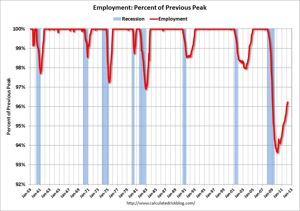
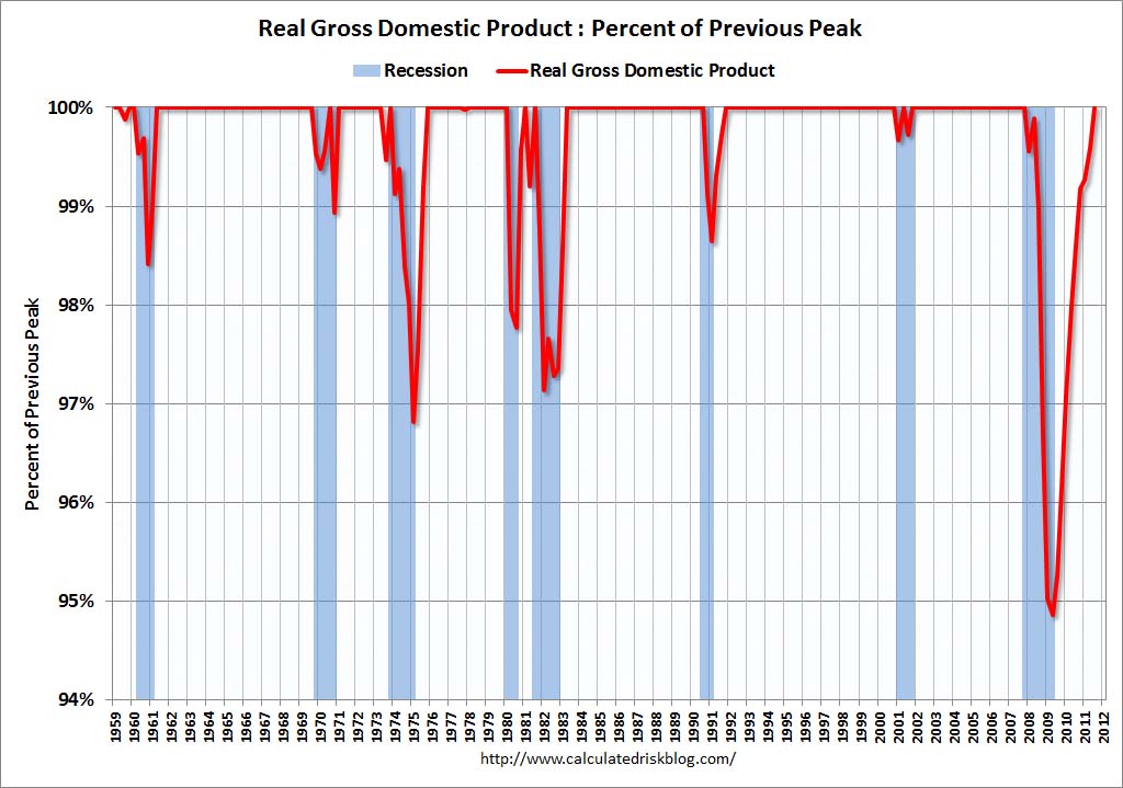
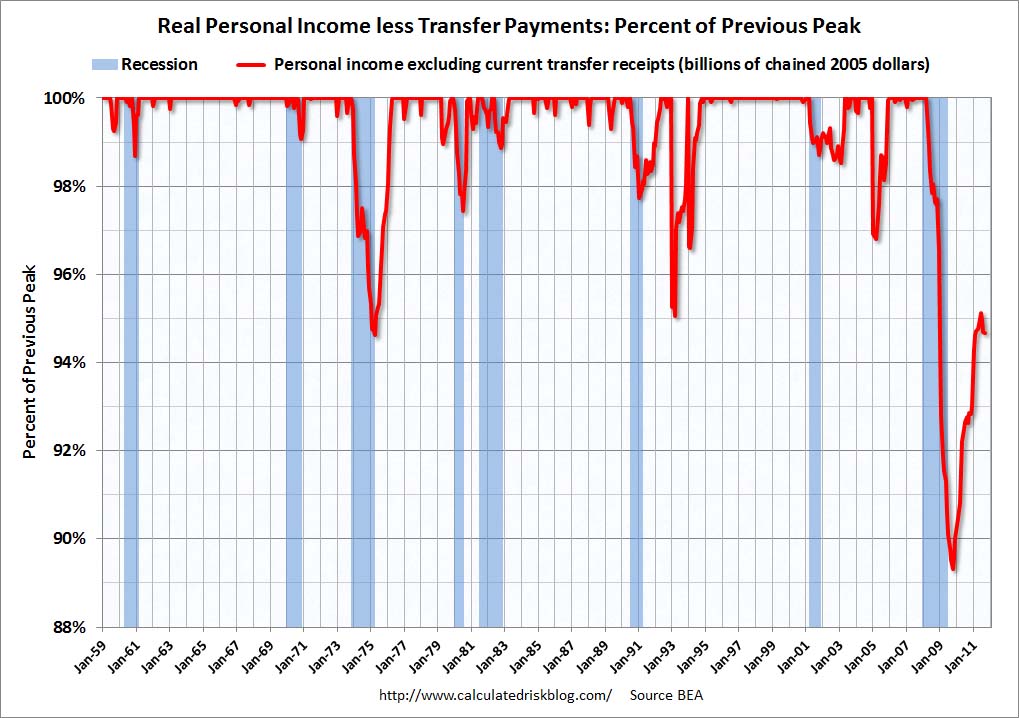
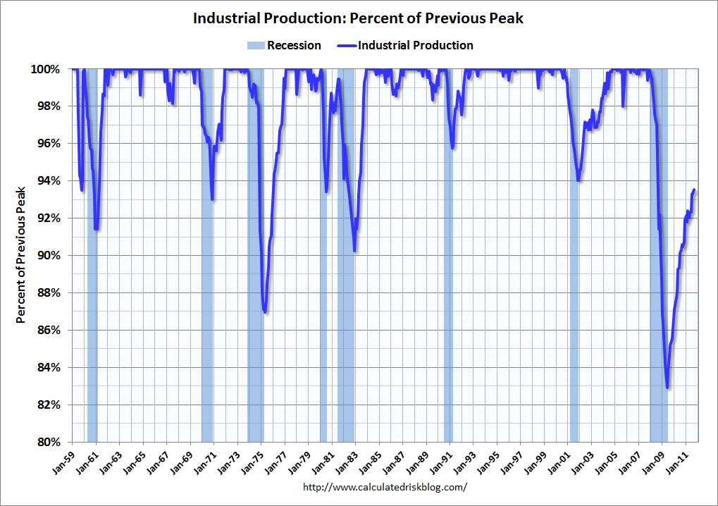
This post is the latest update to a series of blog posts seen on the CalculatedRisk.com blog.  The original blog post of April 12, 2010, is titled “Recession Measures.” In it, Bill McBride discussed key measures that the NBER uses to determine recoveries, and posted four charts.
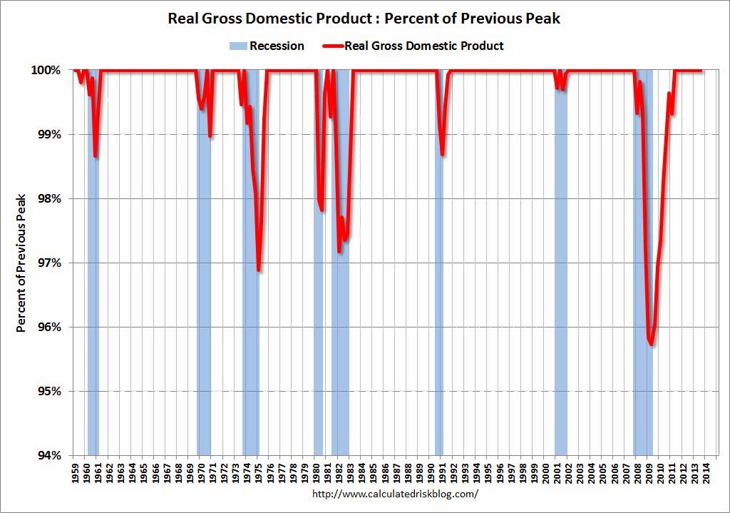
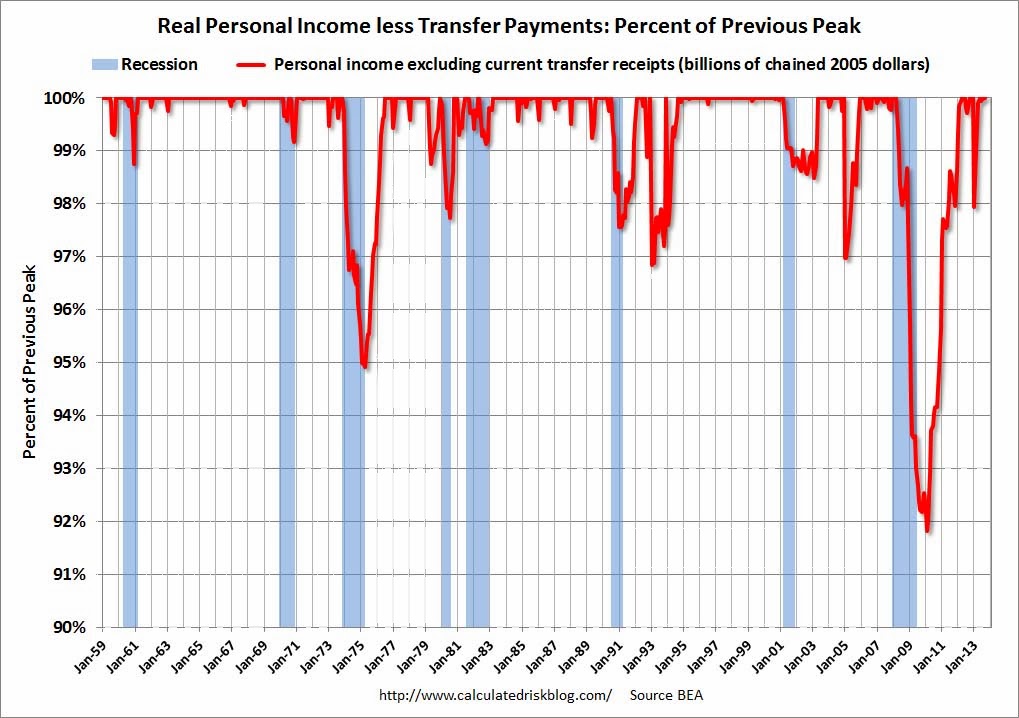
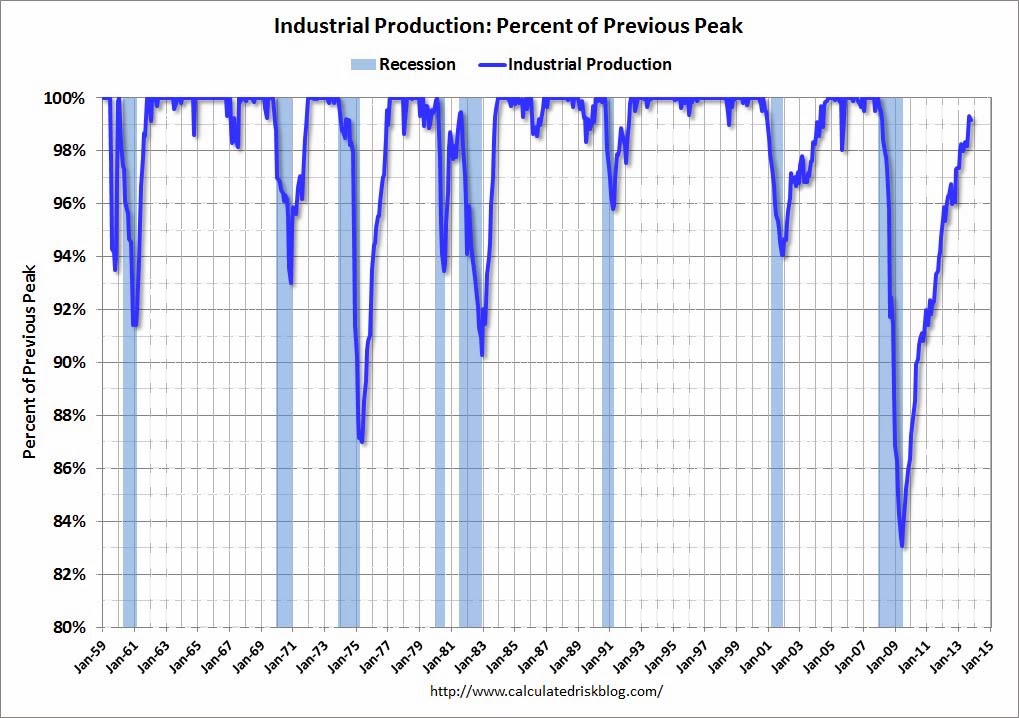
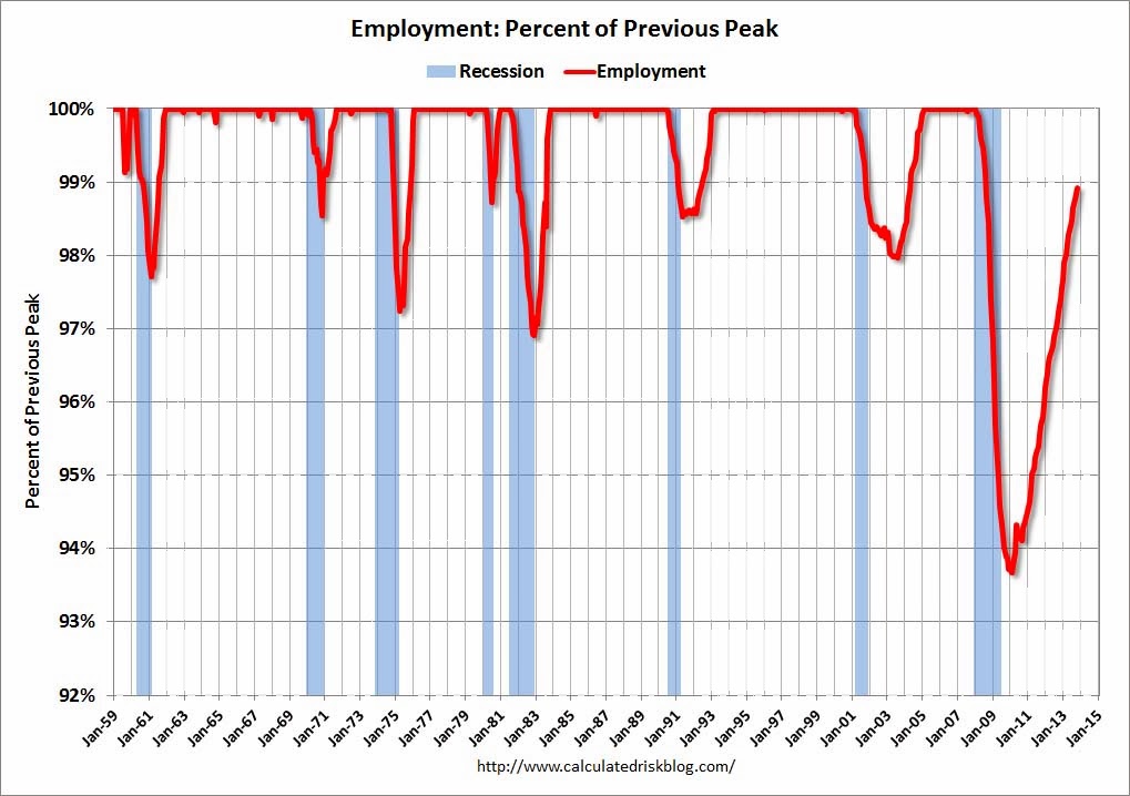
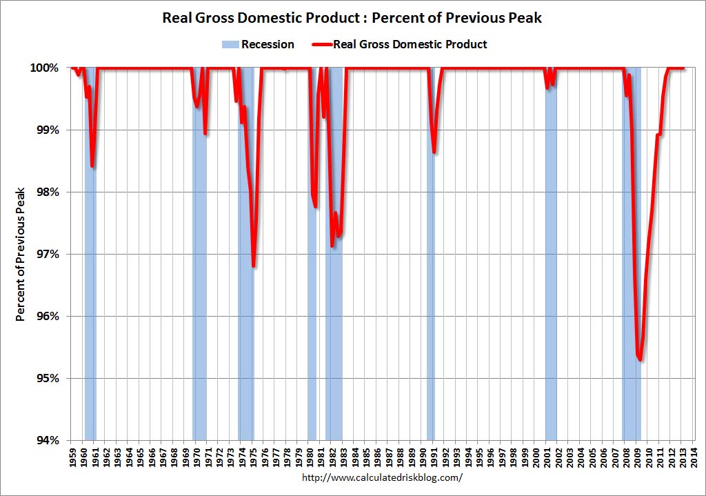
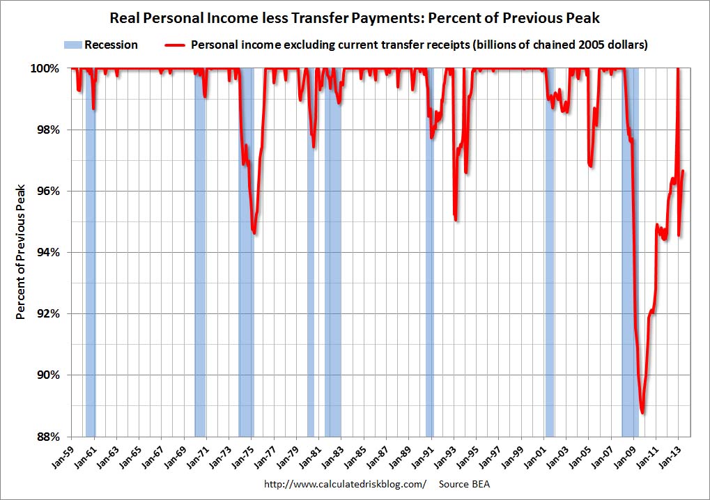
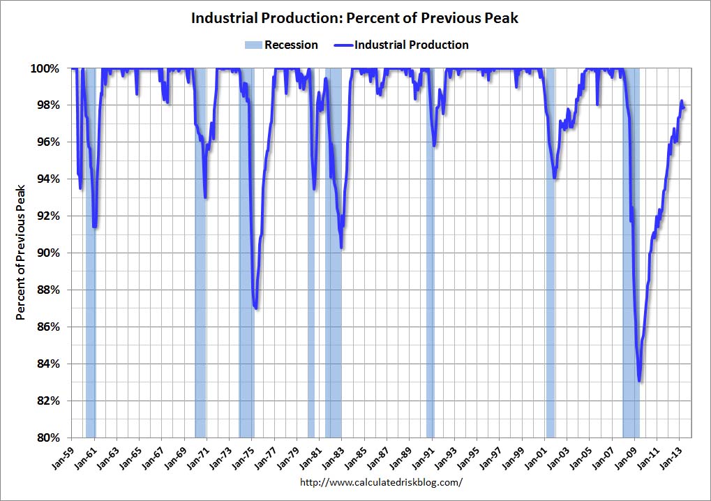
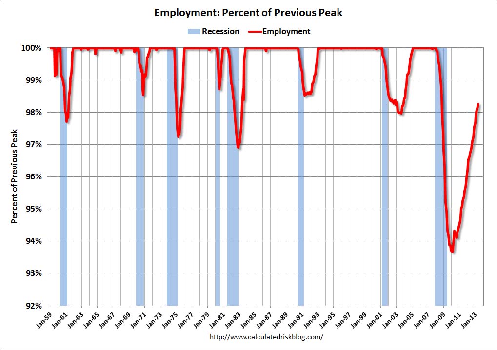
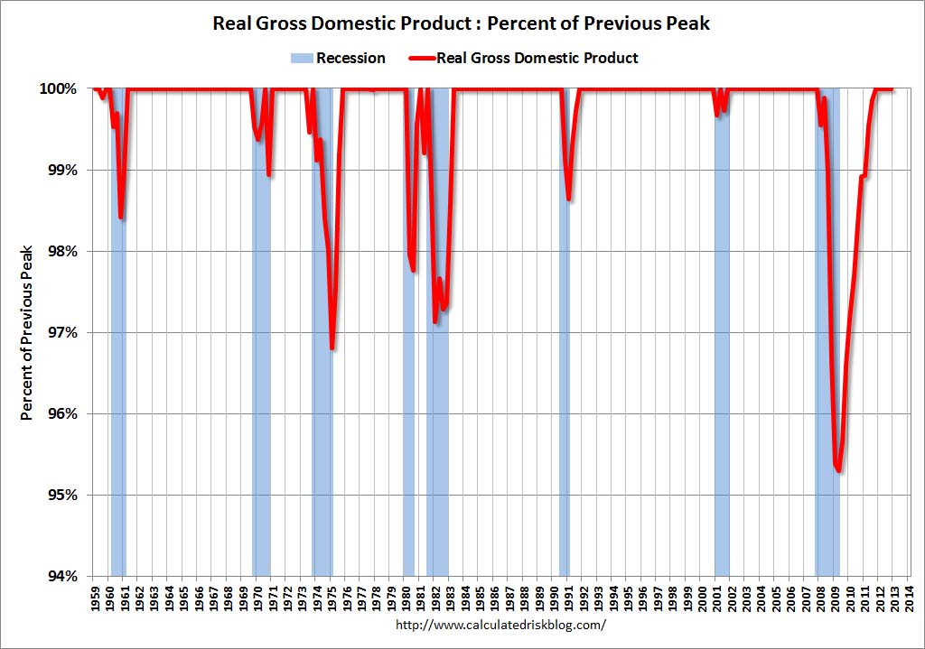
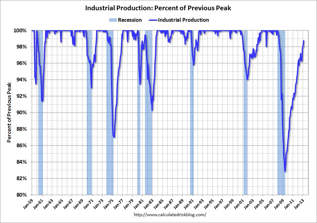
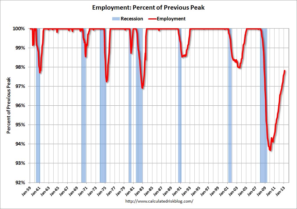
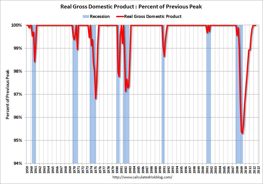
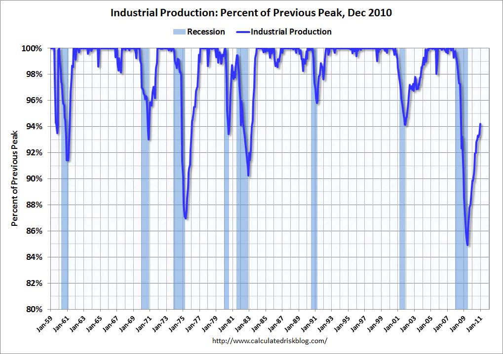
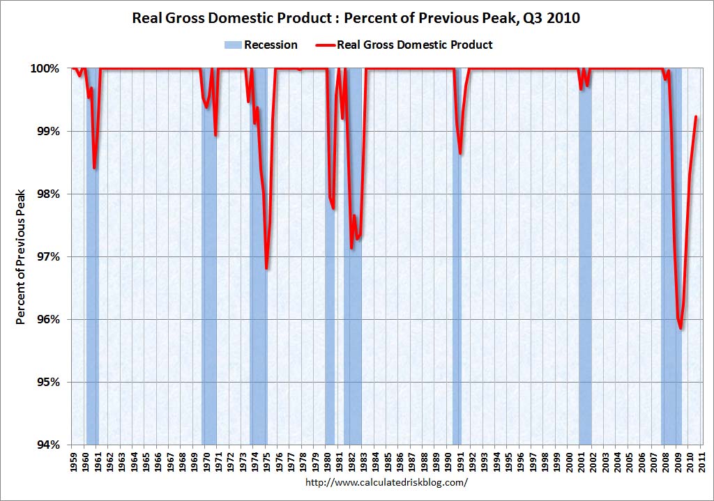
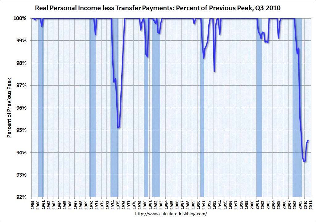
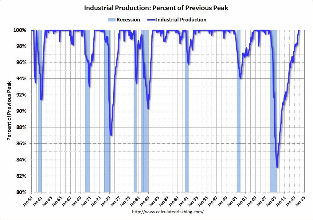
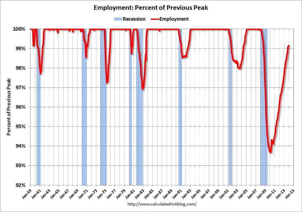
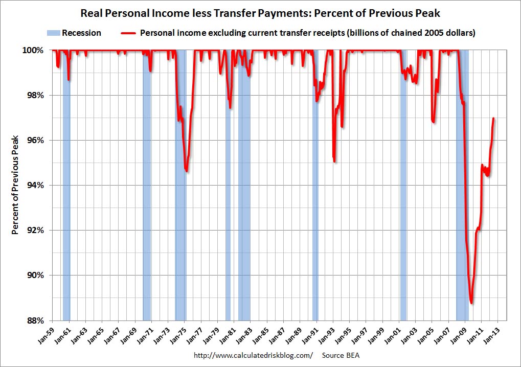
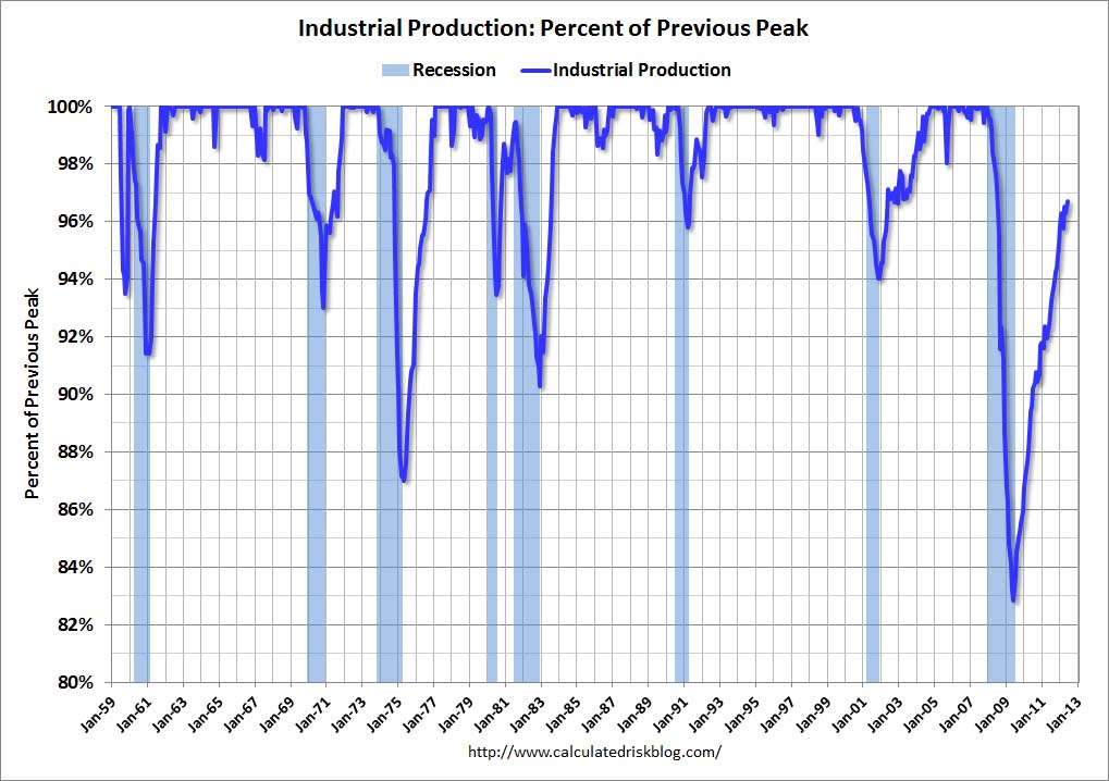
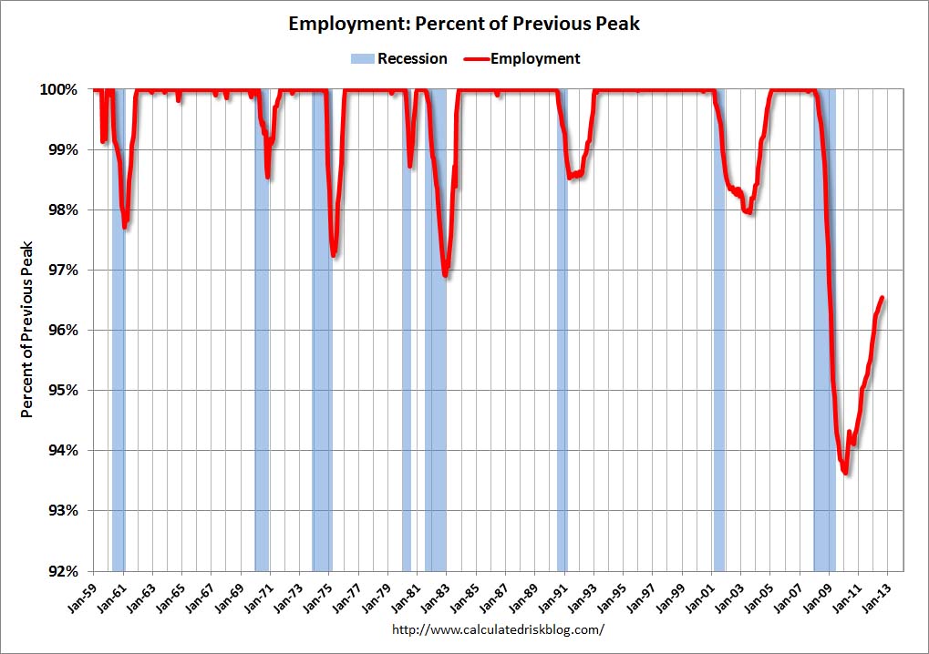
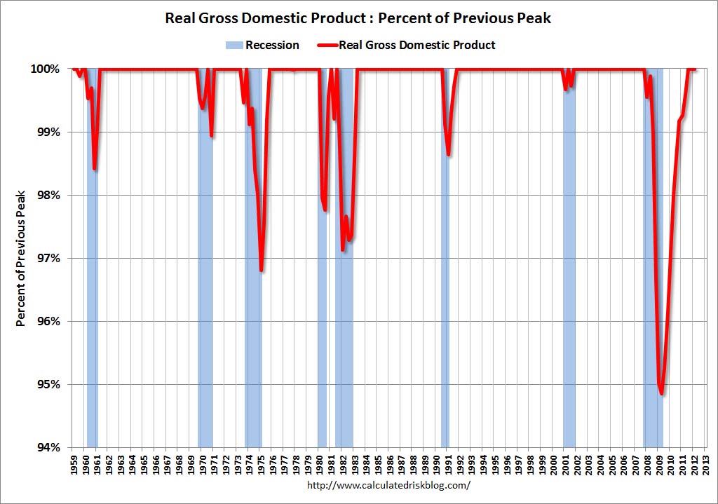
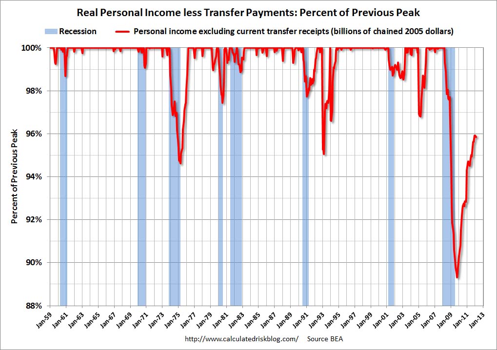
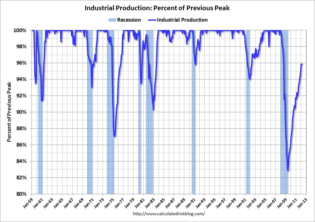
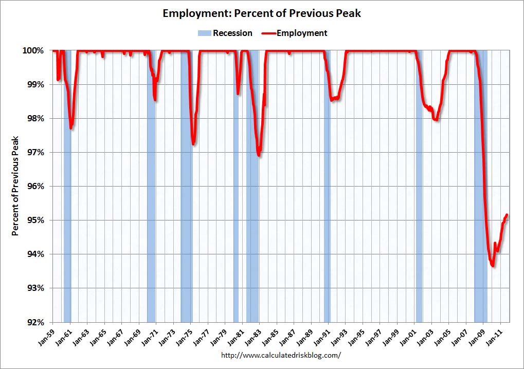
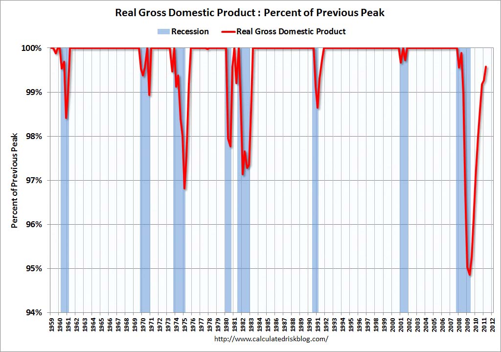
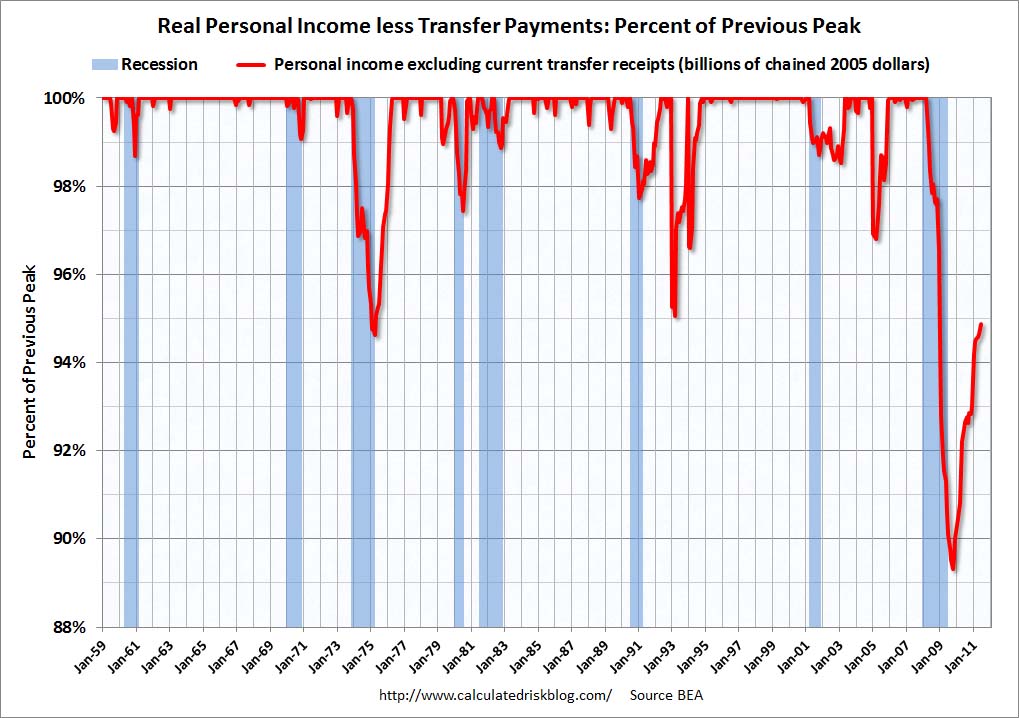
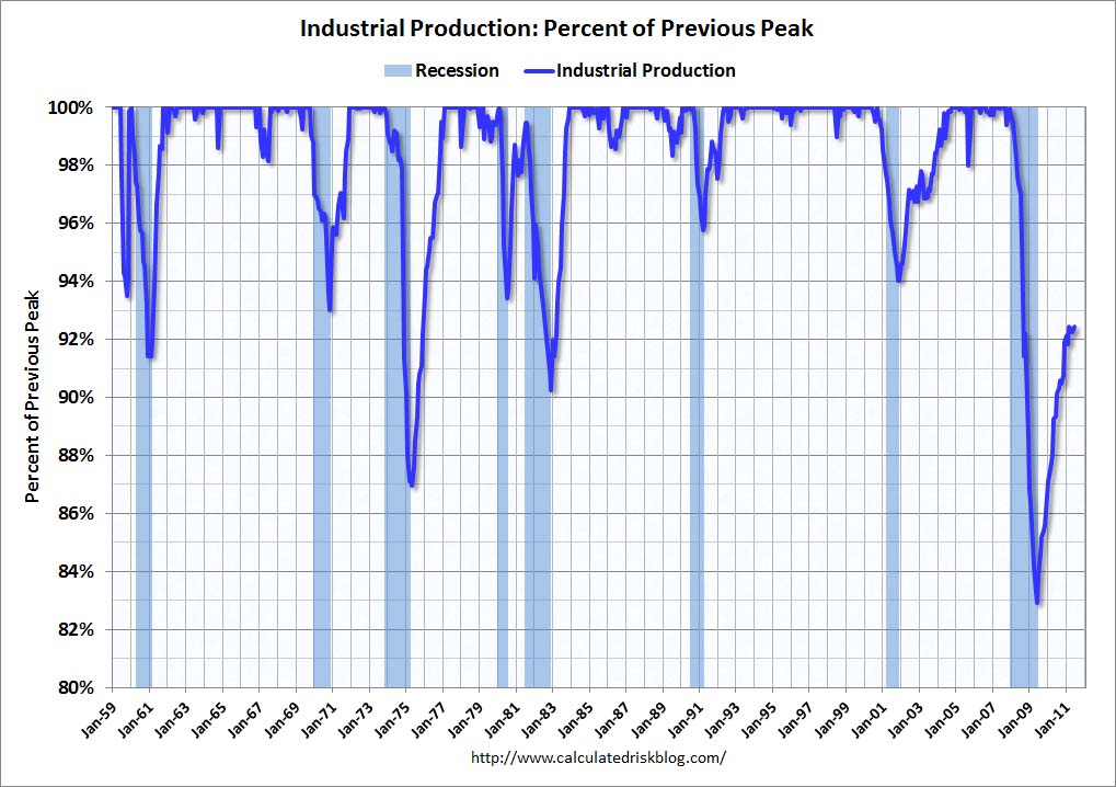
Here are those charts, updated in his January 18, 2014 post titled “Recovery Measures - Three out of Four Ain't Bad.”  The charts are constructed in a fashion different than most – in a “percent of peak” fashion.  As defined, “The following graphs are all constructed as a percent of the peak in each indicator.  This shows when the indicator has bottomed – and when the indicator has returned to the level of the previous peak.  If the indicator is at a new peak, the value is 100%.”  Periods of recession, as defined by the NBER, are shown as blue bars.
Here are the four charts, updated through the dates shown:
(click on images to enlarge)
Real Gross Domestic Product, above its pre-recession peak:
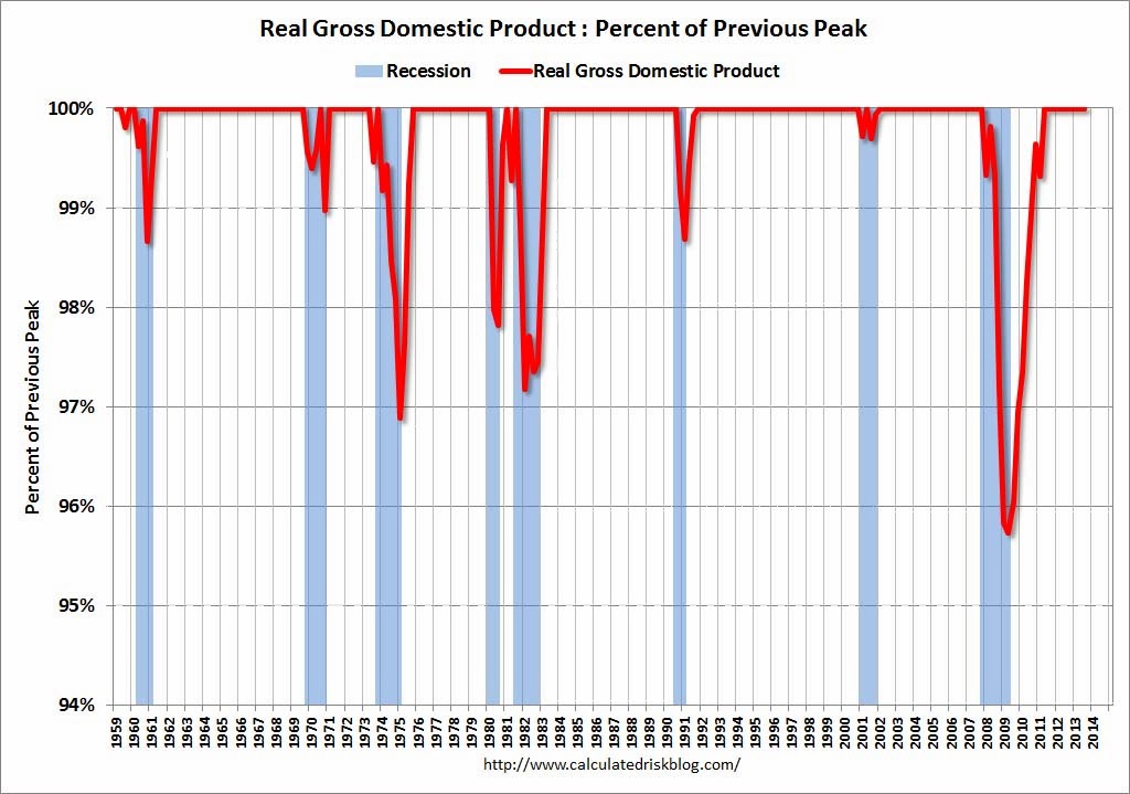
CR 1-18-14 - RMGDPQ32013
-
Real Personal Income Less Transfer Payments, above its pre-recession peak :
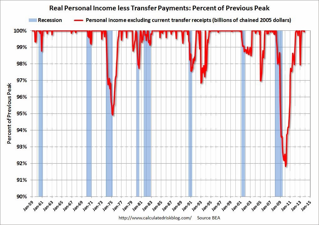
CR 1-18-14 - RMPersonalIncomeNov2013
-
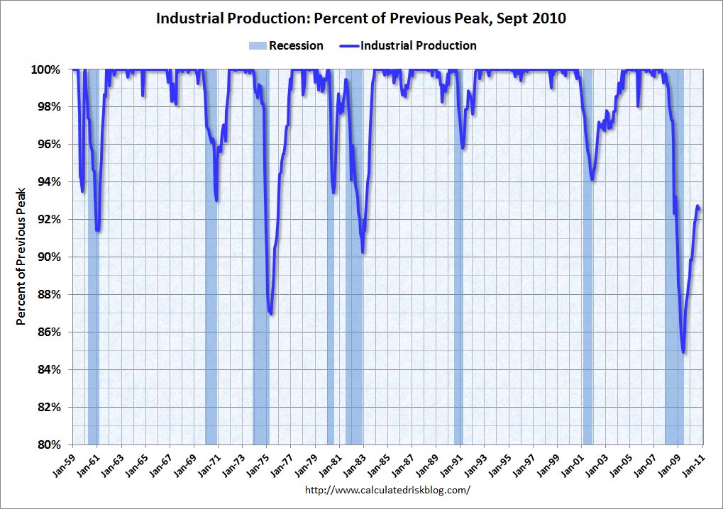
Industrial Production, above its pre-recession peak :
CR 1-18-14 - RMIPDec2013
-
Payroll Employment, still .9% below the pre-recession peak:
CR 1-18-14 - RMEmployDec2013
_____
The Special Note summarizes my overall thoughts about our economic situation
SPX at 1846.91 as this post is written

Tuesday, November 19, 2013

Recession Measures – Updated

This post is the latest update to a series of blog posts seen on the CalculatedRisk.com blog.  The original blog post of April 12, 2010, is titled “Recession Measures.” In it, Bill McBride discussed key measures that the NBER uses to determine recoveries, and posted four charts.
Here are those charts, updated in his November 17, 2013 post titled “Update:  Recovery Measures.”  The charts are constructed in a fashion different than most – in a “percent of peak” fashion.  As defined, “The following graphs are all constructed as a percent of the peak in each indicator.  This shows when the indicator has bottomed – and when the indicator has returned to the level of the previous peak.  If the indicator is at a new peak, the value is 100%.”  Periods of recession, as defined by the NBER, are shown as blue bars.
Here are the four charts, updated through the dates shown:
(click on images to enlarge)
Real Gross Domestic Product, above its pre-recession peak:
CR 11-17-13 - RMGDPQ32013
-
Real Personal Income Less Transfer Payments, above its pre-recession peak :
CR 11-17-13 - RMPersonalIncomeLessTransferQ32013
-
Industrial Production, still .8% below the pre-recession peak:
CR 11-17-13 - RMIPNov2013
-
Payroll Employment, still 1.1% below the pre-recession peak:
CR 11-17-13 - RMEmployOct2013

_____
The Special Note summarizes my overall thoughts about our economic situation
SPX at 1791.53 as this post is written
Wednesday, July 3, 2013

Recession Measures – Updated

This post is the latest update to a series of blog posts seen on the CalculatedRisk.com blog.  The original blog post of April 12, 2010, is titled “Recession Measures.” In it, Bill discussed key measures that the NBER uses to determine recoveries, and posted four charts.

Here are those charts, updated in his July 1, 2013 post titled “Update:  Recovery Measures.”  The charts are constructed in a fashion different than most – in a “percent of peak” fashion.  As defined, “The following graphs are all constructed as a percent of the peak in each indicator.  This shows when the indicator has bottomed – and when the indicator has returned to the level of the previous peak.  If the indicator is at a new peak, the value is 100%.”  Periods of recession, as defined by the NBER, are shown as blue bars.

Here are the four charts, updated through the dates shown:

(click on images to enlarge)

Real Gross Domestic Product, above its pre-recession peak:

CR 7-1-13 RMGDPJuly2013

-

Real Personal Income Less Transfer Payments, now 3.3% below the peak in December:

CR 7-1-13 RMPIlessTransferJuly2013

-

Industrial Production, still 2.1% below the pre-recession peak:

CR 7-1-13 RMIPJuly2013

-

Payroll Employment, still 1.8% below the pre-recession peak:

CR 7-1-13 RMEmployJuly2013

_____

The Special Note summarizes my overall thoughts about our economic situation

SPX at 1609.94 as this post is written
Wednesday, April 3, 2013

Recession Measures – Updated


This post is the latest update to a series of blog posts seen on the CalculatedRisk.com blog.  The original blog post of April 12, 2010, is titled “Recession Measures.” In it, Bill discussed key measures that the NBER uses to determine recoveries, and posted four charts.

Here are those charts, updated in his April 1, 2013 post titled “Update:  Recovery Measures.”  The charts are constructed in a fashion different than most – in a “percent of peak” fashion.  As defined, “The following graphs are all constructed as a percent of the peak in each indicator.  This shows when the indicator has bottomed – and when the indicator has returned to the level of the previous peak.  If the indicator is at a new peak, the value is 100%.”  Periods of recession, as defined by the NBER, are shown as blue bars.

Here are the four charts, updated through the dates shown:

(click on images to enlarge)

Real Gross Domestic Product, above its pre-recession peak:

CR 4-1-13 RMGDPQ42012

-

Real Personal Income Less Transfer Payments, now 3.7% below the peak in December:

CR 4-1-13 - RMPIFeb2013

-

Industrial Production, still 1.2% below the pre-recession peak:

CR 4-1-13 - RMIPFeb2013

-

Payroll Employment, still 2.2% below the pre-recession peak:

CR 4-1-13 - RMEmployFeb2013

_____

The Special Note summarizes my overall thoughts about our economic situation

SPX at 1566.56 as this post is written
Monday, August 6, 2012

Recession Measures – Updated


This post is the latest update to a series of blog posts seen on the CalculatedRisk.com blog.  The original blog post of April 12, 2010, is titled “Recession Measures.” In it, Bill discussed key measures that the NBER uses to determine recoveries, and posted four charts.

Here are those charts, updated in his August 5, 2012 post titled “Update:  Recovery Measures.”  The charts are constructed in a fashion different than most – in a “percent of peak” fashion.  As defined, “The following graphs are all constructed as a percent of the peak in each indicator.  This shows when the indicator has bottomed – and when the indicator has returned to the level of the previous peak.  If the indicator is at a new peak, the value is 100%.”  Periods of recession, as defined by the NBER, are shown as blue bars.

Here are the four charts, updated through the dates shown:

(click on images to enlarge)

Real Gross Domestic Product, above its pre-recession peak:


-

Real Personal Income Less Transfer Payments, still 3.0% below the pre-recession peak:


-

Industrial Production, still 3.3% below the pre-recession peak:


-

Payroll Employment, still 3.5% below the pre-recession peak:


_____

The Special Note summarizes my overall thoughts about our economic situation

SPX at 1390.99 as this post is written
Monday, April 30, 2012

Recession Measures – Updated


This post is the latest update to a series of blog posts seen on the CalculatedRisk.com blog.  The original blog post of April 12, 2010, is titled “Recession Measures.” In it, Bill discussed key measures that the NBER uses to determine recoveries, and posted four charts.

Here are those charts, updated in his April 29, 2012 post titled “Recovery Measures.”  The charts are constructed in a fashion different than most – in a “percent of peak” fashion.  As defined, “The following graphs are all constructed as a percent of the peak in each indicator.  This shows when the indicator has bottomed – and when the indicator has returned to the level of the previous peak.  If the indicator is at a new peak, the value is 100%.”  Periods of recession, as defined by the NBER, are shown as blue bars.

Here are the four charts, updated through the dates shown:

(click on images to enlarge)

Real Gross Domestic Product, above its pre-recession peak:


-

Real Personal Income Less Transfer Payments, still 4.2% below the pre-recession peak:


-

Industrial Production, still 4.1% below the pre-recession peak:


-

Payroll Employment, still 3.8% below the pre-recession peak:


_____

The Special Note summarizes my overall thoughts about our economic situation

SPX at 1403.36 as this post is written
Monday, October 31, 2011

Recession Measures – Updated


This post is the latest update to a series of blog posts seen on the CalculatedRisk.com blog.  The original blog post of April 12, 2010, is titled “Recession Measures.” In it, Bill discussed key measures that the NBER uses to determine recoveries, and posted four charts.

Here are those charts, updated in his October 30, 2011 post titled "Recovery Measures."  The charts are constructed in a fashion different than most – in a “percent of peak” fashion.  As defined, “The following graphs are all constructed as a percent of the peak in each indicator.  This shows when the indicator has bottomed – and when the indicator has returned to the level of the previous peak.  If the indicator is at a new peak, the value is 100%.”  Periods of recession, as defined by the NBER, are shown as blue bars.

Here are the four charts, updated through the dates shown: (click on images to enlarge)

Real Gross Domestic Product, now back to the pre-recession peak:


-

Real Personal Income Less Transfer Payments, still 5.3% below the pre-recession peak:


-

Industrial Production, still 6.5% below the pre-recession peak:


-

Payroll Employment, still 4.8% below the pre-recession peak:


_____

The Special Note summarizes my overall thoughts about our economic situation

SPX at 1285.08 as this post is written
Thursday, August 4, 2011

Recession Measures - Updated


This post is the latest update to a series of blog posts seen on the CalculatedRisk.com blog.  The original blog post of April 12, 2010, is titled “Recession Measures.” In it, Bill discussed key measures that the NBER uses to determine recoveries, and posted four charts.

Here are those charts, updated in his August 2, 2011 post.  The charts are constructed in a fashion different than most – in a “percent of peak” fashion.  As defined, “The following graphs are all constructed as a percent of the peak in each indicator.  This shows when the indicator has bottomed – and when the indicator has returned to the level of the previous peak.  If the indicator is at a new peak, the value is 100%.”  Periods of recession, as defined by the NBER, are shown as blue bars.

Here are the four charts, updated through the dates shown: (click on images to enlarge)

Real Gross Domestic Product, now 0.4% below the pre-recession peak:


-

Real Personal Income Less Transfer Payments, still 5.1% below the pre-recession peak:


-

Industrial Production, still 7.6% below the pre-recession peak:


-

Payroll Employment, still below the pre-recession peak:


_____

The Special Note summarizes my overall thoughts about our economic situation

SPX at 1260.34 as this post is written
Monday, February 7, 2011

Recession Measures - Updated

This post is the latest update to a series of blog posts seen on the CalculatedRisk.com blog. The original blog post of April 12, 2010, is titled “Recession Measures.” In it, Bill discussed key measures that the NBER uses to determine recoveries, and posted four charts.

Here are those charts, updated in his February 6, 2011 post. The charts are constructed in a fashion different than most – in a “percent of peak” fashion. As defined, “The following graphs are all constructed as a percent of the peak in each indicator. This shows when the indicator has bottomed – and when the indicator has returned to the level of the previous peak. If the indicator is at a new peak, the value is 100%.” Periods of recession, as defined by the NBER, are shown as blue bars.

Here are the four charts, updated through the dates shown: (click on images to enlarge)

Real Gross Domestic Product, now 0.14% above the pre-recession peak:


-

Real Personal Income Less Transfer Payments, still 4.3% below the pre-recession peak:


-

Industrial Production, still 5.8% below the pre-recession peak:


-

Payroll Employment, still 5.6% below the pre-recession peak:


-

A Special Note concerning our economic situation is found here

SPX at 1317.29 as this post is written
Tuesday, December 28, 2010

Retail Sales Per Capita Adjusted For Inflation

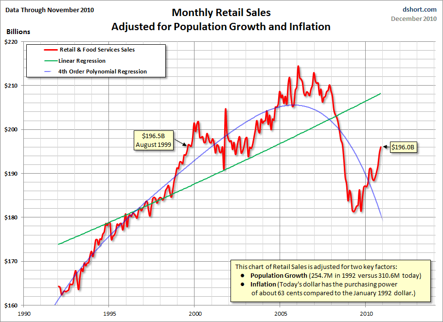
On December 14, Doug Short posted to his blog a chart showing retail sales per capita, adjusted for inflation (CPI).  The data is through November, as noted on the chart:

(click on chart to enlarge image)


Of course, this view of total retail sales, on a per-capita (factoring in population growth) basis - as well as adjusted for inflation - is not one that is often seen.  I've posted it as I believe that this view is an important one, for many reasons.
_____

A Special Note concerning our economic situation is found here
SPX at 1257.54 as this post is written
Monday, November 1, 2010

Recession Measures - Updated

On April 21 I wrote a post titled "Recession Measures - Two Charts."

That post referenced an April 12  CalculatedRisk blog post titled “Recession Measures.” In it, Bill discussed key measures that the NBER uses to determine recoveries, and posted four charts.

Here are those charts, updated in his October 29 post.  The charts are constructed in a fashion different than most - in a "percent of peak" fashion.  As defined, "The following graphs are all constructed as a percent of the peak in each indicator. This shows when the indicator has bottomed - and when the indicator has returned to the level of the previous peak. If the indicator is at a new peak, the value is 100%."  Periods of recession, as defined by the NBER, are shown as blue bars.

Here are the four charts: (click on images to enlarge)

Real Gross Domestic Product, still 0.8% below the pre-recession peak:


-

Real Personal Income Less Transfer Payments, still 5.5% below the pre-recession peak:


-

Industrial Production, still 7.5% below the pre-recession peak:


-

Payroll Employment, still 5.6% below the pre-recession peak:


_____

A Special Note concerning our economic situation is found here
SPX at 1183.26 as this post is written
Monday, July 26, 2010

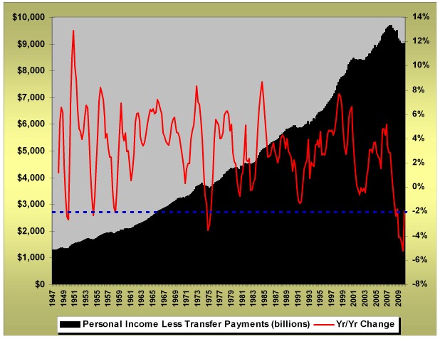
Personal Income Less Transfer Payments Chart

On July 1, 2010 ContraryInvestor.com posted the following chart:


(click on chart to enlarge image)

I find this chart interesting especially given its long-term perspective.

As seen by this measure, the post-2007 experience is (very) atypical...

back to home

SPX at 1102.66 as this post is written
Wednesday, April 21, 2010

Recession Measures - Two Charts

As an additional note to the last post, on April 12 the CalculatedRisk blog had an interesting post titled "Recession Measures." In it, he discussed key measures that the NBER uses to determine recoveries.

In the post he shows four charts, constructed in a "percent of peak" fashion. Here are the two that I find most notable (the other two not shown: employment and GDP/GDI):

Industrial Production, Percent of Previous Peak:


Real Personal Income Less Transfer Payments, Percent of Previous Peak:


SPX at 1207.17 as this post is written
Monday, April 19, 2010

NBER BCDC Member Robert J. Gordon Comments

On April 12 Robert J. Gordon, a member of the NBER Business Cycle Dating Committee, wrote of the reasons why he believes that "It is obvious that the recession is over."

There are many noteworthy items in his article, and I could extensively comment on his arguments. Needless to say I disagree, fully or partially, on many of his points.

I will highlight four items. First, I found this to be interesting, and it underscores the initial severity of the downturn:

"There was a powerful economic downdraft that started with the failure of Lehman in September 2008 and extended into the winter and spring of 2009. Everybody panicked. Firms laid off employees by the millions, and real gross private domestic investment declined between 2008:Q3 and 2009:Q2 at an unprecedented annual rate of -41.6 percent, even faster than at any time during the Great Depression."

Second, this is highly notable:

"Thus the American economy is enjoying strong upward momentum that is evident every day in the announcements of retail sales, service sector production, and almost everything else. There are no negatives in the actual data, but rather the negatives reside in doomsayer worries that consumers are too weak to spend or that the economy will collapse after the Obama stimulus dollars have been spent."

I strongly disagree with this above statement. While there have been signs of "strong upward momentum" - as he suggests - there are also many signs of pronounced weakness, broadly seen across many measures. Various posts on this blog discuss these measures and weaknesses.

Third, he states, "A double dip, i.e., two quarters with negative real GDP growth, is extremely implausible at any time over the next year."

Fourth, he states, "There are no plausible shocks that would suddenly push real GDP below its trough value of 2009:Q2 in the next year or two."

Those familiar with this blog know that I view this purported economic recovery as unsustainable, due to a variety of factors. Needless to say, I don't agree, for a variety of reasons, with his two above assertions concerning the durability of economic growth.

SPX at 1192.13 as this post is written
Monday, February 22, 2010

A Notable Poll On Economic Conditions

Here is poll (in PDF format) on economic conditions that I believe is highly notable. It is from CNN and was conducted February 12-15, 2010.

The question presented was "How would you rate the economic conditions in the country today -- as very good, somewhat good, somewhat poor, or very poor?"

A total of 83% replied economic conditions were "somewhat poor" or "very poor." 44% of respondents said conditions were "very poor."

Of further note, when one looks at the trend of the responses, there hasn't been much of an improvement from year-ago levels.

Although this is only one survey, I think it is notable in that it seems to belie many other economic statistics that have been used to support the widely-held theory that we are in an economic recovery.

This survey seems to support other statistics that indicate that many people believe current economic conditions to be poor - if not very much so. However, at the same time, some economic conditions surveys (and various economic indicators) show expectations for a strong economy in the future. One example of this was noted in my January 4 post.

In my opinion, this large dichotomy can not, and will not, last.

SPX at 1108 as this post is written
Monday, September 21, 2009

"The Greater The Economic Weakness, The Stronger The Recovery"

Recently there has been a thought circulating that the worse the recession (or economic weakness) the stronger the following economic rebound. This refrain has been heard from various quarters.

This belief does appear to be historically accurate, at least to some degree.

However, there are three aspects of this belief that I want to elaborate upon. The first is that even if one believes "the deeper the recession, the stronger the recovery" theory, there is a question of timing. If the period of economic weakness is long, mistaking the timing and making investments or other financial commitments too early in the cycle, before the recovery has begun, can be a costly and painful mistake.

Second, even if one has complete faith in this belief, this has to be viewed as a historical fact. Is this time "different?" It certainly appears to be, as I have extensively commented upon. Perhaps the operative phrase should be "Past performance is no guarantee of future results."

Third, this belief seems related to one that I commented on in a June 5 blog post - with the same implications.

SPX at 1061.05 as this post is written
Tuesday, June 30, 2009

More Questions Regarding Green Shoots

More Questions Regarding Green Shoots
Sunday, June 28th, 2009

In the last post, Warren Buffett commented what he was seeing with regard to signs of an upturn. This link contains what John Rice, Vice Chairman of GE recently (6/19) said:

“I am not particularly of the green shoots group yet,” Rice said today to the Atlanta Press Club, referring to a phrase used by Federal Reserve Chairman Ben S. Bernanke that described signs of a nascent recovery. “I have not seen it in our order patterns yet. At the macro level, there may be statistics suggesting the economy is starting to turn. I am not seeing it yet.”

http://www.bloomberg.com/apps/news?pid=newsarchive&sid=ayc5BDPO_GGs

Between Warren Buffett and John Rice, there is a tremendous size and breadth of businesses overseen. Their comments seem to support the question as to whether “green shoots” exist, i.e. is the economy showing signs of recovery?

This question is absolutely critical at this juncture, for a variety of reasons. Perhaps chief among them is the following: If there currently is no economic recovery, how sustainable is the stock market (as well as other markets’) rally since early March? If there is no economic recovery, is that some type of proof of the ineffectiveness, or failure, of the intervention efforts? Are we heading toward Sustainable Prosperity?

SPX at 918.90 as this post is written

Consumer-Led Recovery Story

Consumer-Led Recovery Story
Thursday, June 18th, 2009

This story, “On Borrowed Time : Consumer-Led Recovery” was in The Wall Street Journal on June 9. I found the chart and its implications to be interesting. One is led to wonder “how much gas is left in the tank” with regard to Household Debt as a Percentage of Disposable Income. This is especially an issue with ”Income” and asset values under pressure.
Also, there are various implications concerning Sustainable Prosperity…

http://online.wsj.com/article/SB124449816432295655.html

SPX at 911.96 as this post is written