Thursday, March 8, 2012

Total Household Net Worth As A Percent Of GDP 4Q 2011


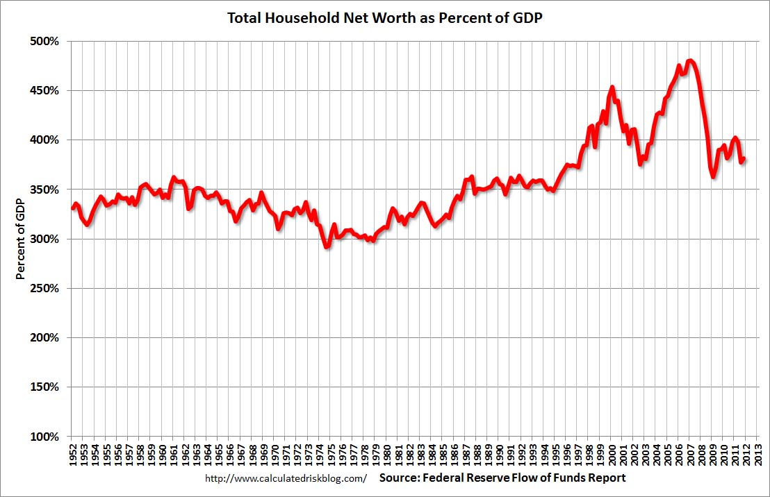
The following chart is from the CalculatedRisk blog post of March 8, 2012 titled “Fed's Flow of Funds:  Household Real Estate Value declined $213 billion in Q4.” It depicts Total Household Net Worth as a Percent of GDP.  The underlying data is from The Federal Reserve Flow of Funds 4Q 2011 report:

(click on chart to enlarge image)

As seen in the above-referenced CalculatedRisk blog post:
According to the Fed, household net worth peaked at $66.8 trillion in Q2 2007, and then net worth fell to $50.4 trillion in Q1 2009 (a loss of $16.4 trillion). Household net worth was at $58.5 trillion in Q4 2011 (up $8.0 trillion from the trough, but still down $8.4 trillion from the peak).
The Fed estimated that the value of household real estate fell $213 billion to $15.96 trillion in Q4 2011. The value of household real estate has fallen $6.75 trillion from the peak - and was still falling at the end of 2011.
My comments:


As I have written in previous posts on this Household Net Worth (as a percent of GDP) topic:
As one can see, the first outsized peak was in 2000, and attained after the stock market bull market / stock market bubbles and economic strength.  The second outsized peak was in 2007, right near the peak of the housing bubble as well as near the stock market peak.
As seen on the chart, the Total Household Net Worth is making an upturn, but is significantly below the prior 2007 peak.
I could extensively write about various interpretations that can be made from this chart.  One way this chart can be interpreted is a gauge of “what’s in it for me?” as far as the aggregated wealth citizens are gleaning from economic activity, as measured compared to GDP.
_____

The Special Note summarizes my overall thoughts about our economic situation

SPX at 1365.91 as this post is written

Standard & Poors S&P500 Earnings Estimates For 2012 & 2013


As many are aware, Standard & Poors publishes earnings estimates for the S&P500.  (My posts concerning their estimates can be found under the S&P500 Earnings label)

Currently (their latest estimates are as of  February 29), their estimates for 2012 add to the following:

-From a “bottom up” perspective, operating earnings of $104.89/share
-From a “top down” perspective, operating earnings of $104.82/share
-From a “top down” perspective, “as reported” earnings of $99.98/share

Currently, their estimates for 2013 add to the following:

-From a “bottom up” perspective, operating earnings of N.A.
-From a “top down” perspective, operating earnings of $111.73/share
-From a “top down” perspective, “as reported” earnings of $108.42/share

_____

I post various economic forecasts because I believe they should be carefully monitored.  However, as those familiar with this blog are aware, I do not agree with many of the consensus estimates and much of the commentary in these forecast surveys.
_____

The Special Note summarizes my overall thoughts about our economic situation

SPX at 1352.63 as this post is written

Wednesday, March 7, 2012

Dynamics And Risks Of The Federal Reserve's Portfolio


In previous posts I have written extensively of the intervention measures taken by the Federal Reserve, including the many risks involved with Quantitative Easing measures.   One of the risks is the resulting size of the Federal Reserve's portfolio and its inherent susceptibility to large (on a mark-to-market basis, as opposed to accounting basis) losses.

This risk greatly lacks recognition.  It appears that many people discount the risk of losses, as well as the potential for the Federal Reserve to exhaust its capital base, as they figure that the Treasury can always replenish the capital.  However, I believe that this reasoning is  shortsighted on many fronts.  Compounding the complexity of the potential for large losses in the Federal Reserve's portfolio is the fact that any action it may take with regard to acquiring or disposing of these assets has to be weighed against the risks or damage that such acquisition or disposition incurs in the economy and/or financial markets.  Given the complexity of the situation, the exceedingly large asset base and its leverage, and the uncertainties inherent in the markets - especially during times of financial stress or crises - asset acquisition, disposition, and willingness to take losses on the portfolio becomes a (very) complex matter.  While I am not aware of any recent Federal Reserve statements on this matter,  a FRBSF Paper of April 11, 2011 titled "The Fed's Interest Rate Risk" (pdf) contains the following excerpts:
The Fed, of course, strives to be a cost-efficient steward of the public purse. But its statutory mandate for conducting monetary policy is to promote maximum employment and price stability. These macroeconomic goals are the key metrics for judging monetary policy. Financial considerations—even potentially large capital losses—are secondary.
also (under "Conclusion") :
In its policy actions, the Fed’s primary focus has been on restoring the economy to health and maintaining low inflation. The Fed’s recent securities purchases appear likely to register financial gains, though these are at risk if interest rates rise. However, as then-professor Ben Bernanke (2000) wrote: For a central bank “to allow consideration of possible capital losses to block needed policy actions is misguided.” That is, interest rate risk should be a secondary consideration, subordinate to the macroeconomic goals of monetary policy.
There is also the possibility of exit from QE under exigent circumstances, which represents an adverse scenario fraught with peril.

Accentuating the dangers of the situation are the fact that interest rates are (depending upon the specific instrument) very near - or at - very-long term lows and my assessment (also held by many) that the bond market is an asset bubble.

Cumberland Advisors has published a notable document explaining its CUMB-E Index (pdf) that illustrates some of the main dynamics of the Federal Reserve's portfolio and their trends, including its capital base / leverage and its sensitivity to increases in interest rates.  As of February 29, the CUMB-E Index is at .438.

One interpretation that could be made is that if this were the portfolio of a commercial bank or hedge fund, with leverage of 50+:1  and with the aforementioned sensitivities and market dynamics - it would represent an exceedingly high risk situation.

As well, there are a variety of other notable risk aspects and dangers inherent in the situation that lack recognition, which I may discuss in future writings.
_____

The Special Note summarizes my overall thoughts about our economic situation

SPX at 1343.36 as this post is written

Monday, March 5, 2012

Building Financial Danger – March 5, 2012 Update


On October 17, 2011 I wrote a post titled “Danger Signs In The Stock Market, Financial System And Economy.”  This post is a brief seventh update to that post.

The current forecasting consensus among economists and investment professionals is one of slow (U.S.) economic growth, steady if not rising financial markets, and low probabilities (in two recent surveys 9.5% to 16% chance over the next four quarters) of the economy entering a recession.

While I understand how those forecasters have come to their conclusions, my overall analysis continues to indicate a distinctly different situation, one of a continuing elevated and growing level of danger - which contains  many worldwide and U.S.-specific “stresses” of a very  complex nature.  Many of these "stresses" lack recognition, some completely so.

My views of this danger, and its implications regarding the financial markets and economy as a whole, were last discussed in the post of February 21, 2012, titled “Building Financial Danger – February 21, 2012 Update.”

In that post, I reiterated a point I first made on January 11 :
…my analyses indicate that the danger inherent in the financial system has reached a level at which a stock market crash – that would also involve (as seen in 2008) various other markets as well – has reached a level at which a near-term crash is (at least) a significant concern.
(note: the “next crash” has outsized significance and implications, as discussed in the post of January 6, "The Next Crash And Its Significance")

Since that February 21 post, there have been additional causes for concern, seen in many fundamental economic, financial-market, and proprietary measures.  Many of these measures have been discussed in this blog.

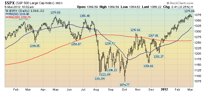
As reference, below is a 14-month daily chart of the S&P500, indicating both the 50dma and 200dma and price labels.  The current price is 1366.22:

(click on chart to enlarge image)(chart courtesy of StockCharts.com; chart creation and annotation by the author)

_____

The Special Note summarizes my overall thoughts about our economic situation

SPX at 1366.22 as this post is written

Corporate Profit Margins - Current Levels And Sustainability


In the Wall Street Journal of March 3-4, there was a notable article titled "Playing the Profit Wave."  The article discusses various aspects of corporate profitability, foremost among them whether profit margins are peaking.

I believe that this subject is of great importance currently, and many facets deserve greater recognition; especially, the lagging growth in sales growth, which is mentioned in the article (and excerpted below) and is subject that I have mentioned in numerous blog posts.

As seen in the article, corporate profit margins have, over recent quarters, been very high.  In fact, one source recently said that corporate profit margins are at 57-year highs.

Here are a few excerpts from the article that I find most important:
"We're already at or above previous highs in most sectors," says Ed Yardeni, president of Yardeni Research, an investment advisory firm in Brookville, N.Y. "There are plenty of signs that profit margins will flatten or go down this year and next year."
also:
So far, companies in the Standard & Poor's 500-stock index have reported operating profit margins—which show how much a company earns for each dollar of sales before interest and taxes—of 8.66% for 2011's fourth quarter, down 0.85 percentage point from the previous quarter.
also:
Widening margins have been a key driver of earnings growth since the market bottom in 2009. Though earnings in the S&P 500 have grown 71% since the second quarter of 2009, revenues have grown only 22%, according to S&P. Instead, companies have pried productivity out of employees and implemented cost-savings measures.
Even with last quarter's drop, today's 8.66% operating margins are still well above the 7.19% average since 1992.
_____

The Special Note summarizes my overall thoughts about our economic situation

SPX at 1369.63 as this post is written

Friday, March 2, 2012

Financial Stocks – March 2, 2012 Update Concerning Poor “Price Action”


On June 29, 2011 I wrote a blog post titled “Financial Stocks – Notable Price Action.”

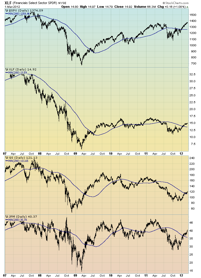
Although financial stocks have increased in price in 2012, I continue to believe that the longer-term “price action” of various financial stocks is disconcerting.  I view the poor performance of these financial and brokerage stocks to be one indicator among (very) many that serves as a “red flag” as to the financial markets and economy as a whole.

Here is an updated chart to that shown in the June 29 post.  It shows the XLF (the financial ETF) on a daily basis since 2007.  As well, the S&P500 is plotted above it, with GS and JPM shown below it.  The blue line on each indicates the 200dma:

(click on chart image to enlarge)(chart courtesy of StockCharts.com; chart created by and annotated by author)


_____

The Special Note summarizes my overall thoughts about our economic situation

SPX at 1371.51 as this post is written

Financial Stocks – Relative Price To Overall Stock Market – March 2, 2012 Update


In the June 29, 2011 post (“Financial Stocks – Notable Price Action”) I wrote the following:
I think that the relatively poor “price action” of various financial stocks is notable.  It is one of many current indications that overall stock market health is not as strong as a casual glance at the major indices would indicate.
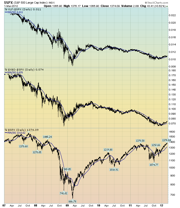
I continue to believe that the lagging / “sagging” price of various financial stocks is highly notable.  Here is another chart that I created a while ago that provides another view of the poor “price action” of the financial stocks vs. that of the entire stock market, as depicted by the S&P500:

(click on chart to enlarge image)(chart courtesy of StockCharts.com; chart created by and annotated by author)

-

The above chart is depicted on a daily basis, LOG scale, since 2007.   On each of the three plots, a blue line depicts the 50dma for perspective.

As one can see, there has been an interesting progression of the relative price of the XLF (Financial SPDR) vs. the S&P500, as seen in the top of the chart.  In the middle of the chart, the same can be seen in the $XBD (Broker/Dealer Index).  Generally, since mid-2009, the price of both the XLF and $XBD have been on a slow downward trajectory relative to the price of the S&P500.  The S&P500 is plotted on the bottom of the chart.

In my experience, any time the financials lag the general stock market for a considerable period, it is generally a “red flag” that should be closely monitored.
_____

The Special Note summarizes my overall thoughts about our economic situation


SPX at 1370.09 as this post is written

Thursday, March 1, 2012

U.S. Dollar Decline – March 1, 2012 Update


U.S. Dollar weakness is a foremost concern of mine.  As such, I have extensively written about it.  I am very concerned that the actions being taken to “improve” our economic situation will dramatically weaken the Dollar.  Should the Dollar substantially decline from here, as I expect, the negative consequences will far outweigh any benefits.  The negative impact of a substantial Dollar decline can’t be overstated, in my opinion.

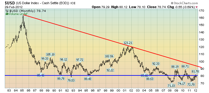
The following three charts illustrate various technical analysis aspects of the U.S. Dollar, as depicted by the U.S. Dollar Index.

First, a look at the monthly U.S. Dollar from 1983.  This clearly shows a long-term weakness, with the blue line showing technical support (until 2007):

(charts courtesy of StockCharts.com; annotations by the author)

(click on charts to enlarge images)


-

Next, another chart, this one focused on the daily U.S. Dollar since 2000 on a LOG scale.  The red line represents both a trendline as well as a relatively good visual “best-fit” line.  The gray dotted line is the 200-day M.A. (moving average).  As seen on this chart, the U.S. Dollar looks vulnerable to continuing its downward trend that has been interrupted since early 2008:


-

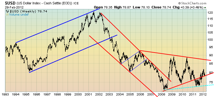
Lastly, a chart of the Dollar on a weekly LOG scale.  There are some clearly marked  channels here, with a potential large, prominent triangle featured (shown with two potential lower trendlines, one red and one dashed light blue line):


-

I will be providing updates on this U.S. Dollar situation regularly as it deserves very close monitoring…
_____

The Special Note summarizes my overall thoughts about our economic situation

SPX at 1371.57 as this post is written