Friday, December 6, 2019

3 Critical Unemployment Charts – December 2019

As I have commented previously, as in the October 6, 2009 post (“A Note About Unemployment Statistics”), in my opinion the official methodologies used to measure the various job loss and unemployment statistics do not provide an accurate depiction; they serve to understate the severity of unemployment.
However, even if one chooses to look at the official statistics, the following charts provide an interesting (and disconcerting) long-term perspective of certain aspects of the officially-stated unemployment (and, in the third chart, employment) situation.
The three charts below are from the St. Louis Fed site.  Here is the Median Duration of Unemployment (current value = 9.4 weeks):
(click on charts to enlarge images)(charts updated as of 12-6-19)
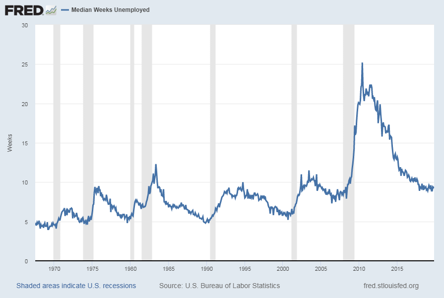
Median Duration Of Unemployment
Data Source: FRED, Federal Reserve Economic Data, Federal Reserve Bank of St. Louis: Median Duration of Unemployment [UEMPMED] ; U.S. Department of Labor: Bureau of Labor Statistics; accessed December 6, 2019: 
http://research.stlouisfed.org/fred2/series/UEMPMED
Here is the chart for Unemployed 27 Weeks and Over (current value = 1.224 million):
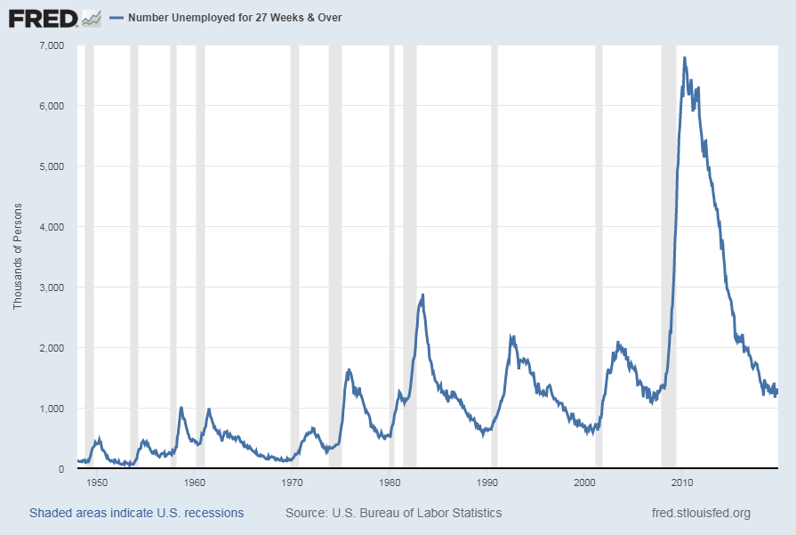
Unemployed 27 Weeks and Over
Data Source: FRED, Federal Reserve Economic Data, Federal Reserve Bank of St. Louis: Civilians Unemployed for 27 Weeks and Over [UEMP27OV] ; U.S. Department of Labor: Bureau of Labor Statistics; accessed December 6, 2019:
http://research.stlouisfed.org/fred2/series/UEMP27OV
Here is the chart for Total Nonfarm Payroll (current value = 152.252 million):
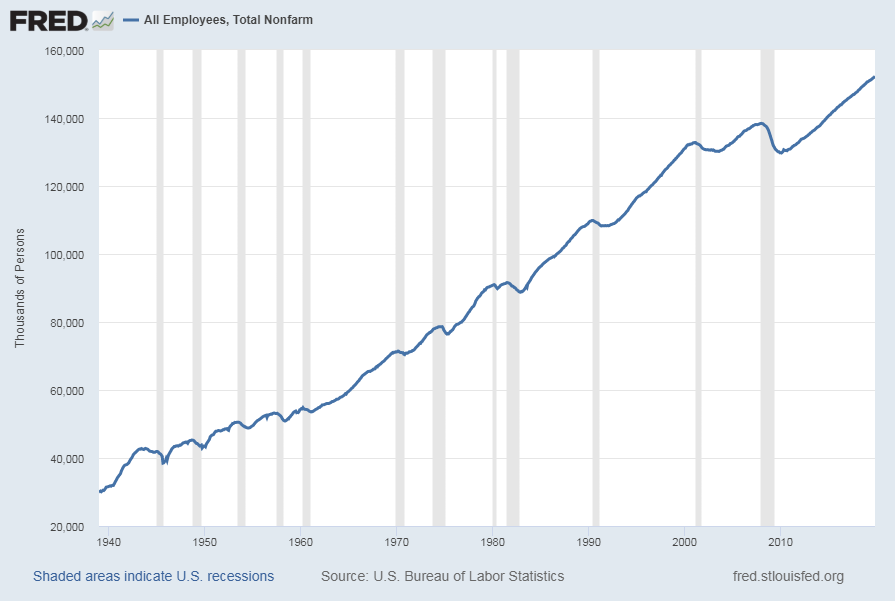
Total Nonfarm Payroll
Data Source: FRED, Federal Reserve Economic Data, Federal Reserve Bank of St. Louis: All Employees: Total Nonfarm [PAYEMS] ; U.S. Department of Labor: Bureau of Labor Statistics; accessed December 6, 2019: 
https://research.stlouisfed.org/fred2/series/PAYEMS
Our unemployment problem is severe.  The underlying dynamics of the current – and especially future – unemployment situation remain exceedingly worrisome.  These dynamics are numerous and complex, and greatly lack recognition and understanding.
My commentary regarding unemployment is generally found in the “Unemployment” label.  This commentary includes the page titled “U.S. Unemployment Trends,” which discusses various problematical issues concerning the present and future employment situation.
_____
The Special Note summarizes my overall thoughts about our economic situation
SPX at 3147.81 as this post is written

Thursday, December 5, 2019

Deflation Probabilities – December 5, 2019 Update

While I do not agree with the current readings of the measure – I think the measure dramatically understates the probability of deflation, as measured by the CPI – the Federal Reserve Bank of Atlanta maintains an interesting data series titled “Deflation Probabilities.”
As stated on the site:
Using estimates derived from Treasury Inflation-Protected Securities (TIPS) markets, described in a technical appendix, this weekly report provides two measures of the probability of consumer price index (CPI) deflation through 2024.
A chart shows the trends of the probabilities.  As one can see in the chart, the readings are volatile.
As for the current weekly reading, the December 5, 2019 update states the following:
The 2019–24 deflation probability was 1 percent on December 4, up from 0 percent on November 26. The 2018–23 deflation probability was 0 percent on December 4, where it has remained since July 8. These deflation probabilities, measuring the likelihoods of net declines in the Consumer Price Index over the five-year periods starting in early 2018 and early 2019, are estimated from prices of the five-year Treasury Inflation-Protected Securities (TIPS) issued in April 2018 and April 2019 and the 10-year TIPS issued in July 2013 and July 2014.
_________
I post various economic indicators and indices because I believe they should be carefully monitored.  However, as those familiar with this site are aware, I do not necessarily agree with what they depict or imply.
_____
The Special Note summarizes my overall thoughts about our economic situation
SPX at 3117.43 as this post is written

Wednesday, December 4, 2019

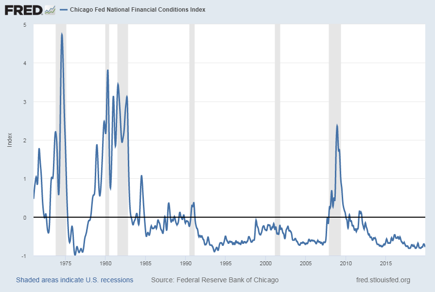
Chicago Fed National Financial Conditions Index (NFCI)

The St. Louis Fed’s Financial Stress Index (STLFSI) is one index that is supposed to measure stress in the financial system.  Its reading as of the November 29, 2019 update (reflecting data through November 22, 2019) is -1.325.
Of course, there are a variety of other measures and indices that are supposed to measure financial stress and other related issues, both from the Federal Reserve as well as from private sources.
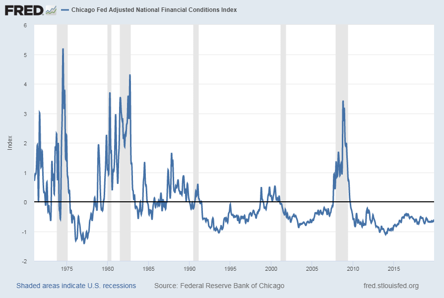
Two other indices that I regularly monitor include the Chicago Fed National Financial Conditions Index (NFCI) as well as the Chicago Fed Adjusted National Financial Conditions Index (ANFCI).
Here are summary descriptions of each, as seen in FRED:
The National Financial Conditions Index (NFCI) measures risk, liquidity and leverage in money markets and debt and equity markets as well as in the traditional and “shadow” banking systems. Positive values of the NFCI indicate financial conditions that are tighter than average, while negative values indicate financial conditions that are looser than average.
The adjusted NFCI (ANFCI). This index isolates a component of financial conditions uncorrelated with economic conditions to provide an update on how financial conditions compare with current economic conditions.
For further information, please visit the Federal Reserve Bank of Chicago’s web site:
Below are the most recently updated charts of the NFCI and ANFCI, respectively.
The NFCI chart below was last updated on December 4, 2019 incorporating data from January 8, 1971 through November 29, 2019, on a weekly basis.  The November 29 value is -.78:
NFCI
Data Source: FRED, Federal Reserve Economic Data, Federal Reserve Bank of St. Louis; accessed December 4, 2019: 
http://research.stlouisfed.org/fred2/series/NFCI
The ANFCI chart below was last updated on December 4, 2019 incorporating data from January 8, 1971 through November 29, 2019, on a weekly basis.  The November 29 value is -.62:
ANFCI
Data Source: FRED, Federal Reserve Economic Data, Federal Reserve Bank of St. Louis; accessed December 4, 2019: 
http://research.stlouisfed.org/fred2/series/ANFCI
_________
I post various indicators and indices because I believe they should be carefully monitored.  However, as those familiar with this site are aware, I do not necessarily agree with what they depict or imply.
_____
The Special Note summarizes my overall thoughts about our economic situation
SPX at 3112.76 as this post is written

Tuesday, December 3, 2019

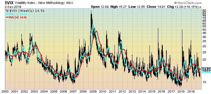
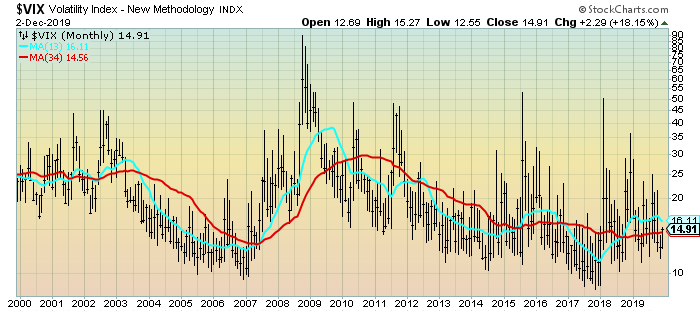
VIX Weekly And Monthly Charts Since The Year 2000 – December 3, 2019 Update

For reference purposes, below are two charts of the VIX from year 2000 through Monday’s (December 2, 2019) close, which had a closing value of 14.91.
Here is the VIX Weekly chart, depicted on a LOG scale, with the 13- and 34-week moving averages, seen in the cyan and red lines, respectively:
(click on chart to enlarge image)(chart courtesy of StockCharts.com; chart creation and annotation by the author)
VIX Weekly chart since 2000
Here is the VIX Monthly chart, depicted on a LOG scale, with the 13- and 34-month moving average, seen in the cyan and red lines, respectively:
(click on chart to enlarge image)(chart courtesy of StockCharts.com; chart creation and annotation by the author)
VIX Monthly chart since 2000
____
The Special Note summarizes my overall thoughts about our economic situation
SPX at 3080.95 as this post is written

Charts Of Equities’ Performance Since March 9, 2009 And January 1, 1980 – December 3, 2019 Update

In the March 9, 2012 post (“Charts of Equities’ Performance Since March 9, 2009 And January 1, 1980“) I highlighted two charts for reference purposes.
Below are those two charts, updated through the latest daily closing price.
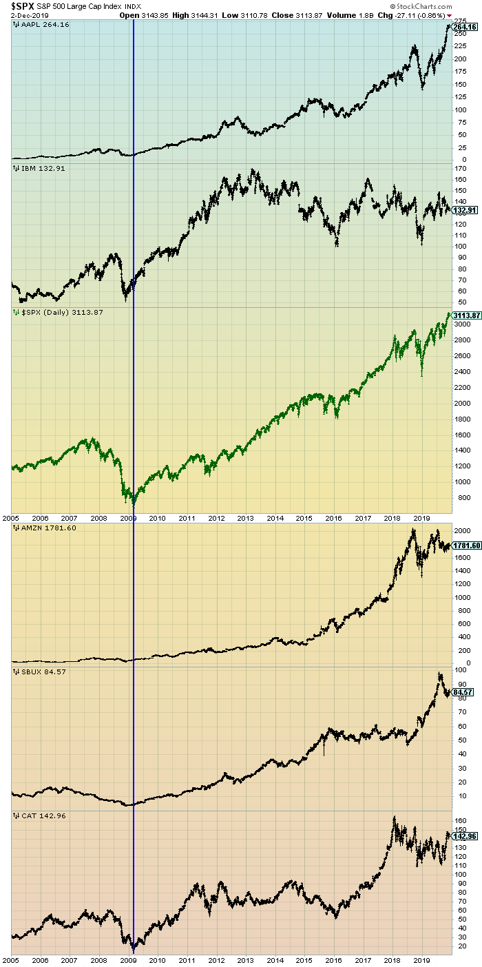
The first is a daily chart of the S&P500 (shown in green), as well as five prominent (AAPL, IBM, AMZN, SBUX, CAT) individual stocks, since 2005.  There is a blue vertical line that is very close to the March 6, 2009 low.  As one can see, both the S&P500 performance, as well as many stocks including the five shown, have performed strongly since the March 6, 2009 low:
(click on chart to enlarge image)(chart courtesy of StockCharts.com; chart creation and annotation by the author)
S&P500 and prominent stocks
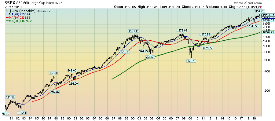
This next chart shows, on a monthly LOG basis, the S&P500 since 1980.  I find this chart notable as it provides an interesting long-term perspective on the S&P500′s performance.  The 20, 50, and 200-month moving averages are shown in blue, red, and green lines, respectively:
(click on chart to enlarge image)(chart courtesy of StockCharts.com; chart creation and annotation by the author)
S&P500 since 1980 chart
_____
The Special Note summarizes my overall thoughts about our economic situation
SPX at 3113.87 as this post is written

Monday, December 2, 2019

Four Ultra Long-Term Monthly U.S. Stock Index Charts

StockCharts.com maintains long-term historical charts of various major stock market indices, interest rates, currencies, commodities, and economic indicators.
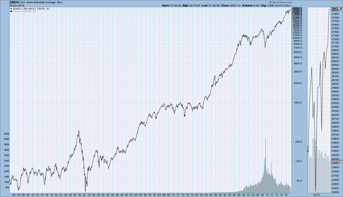
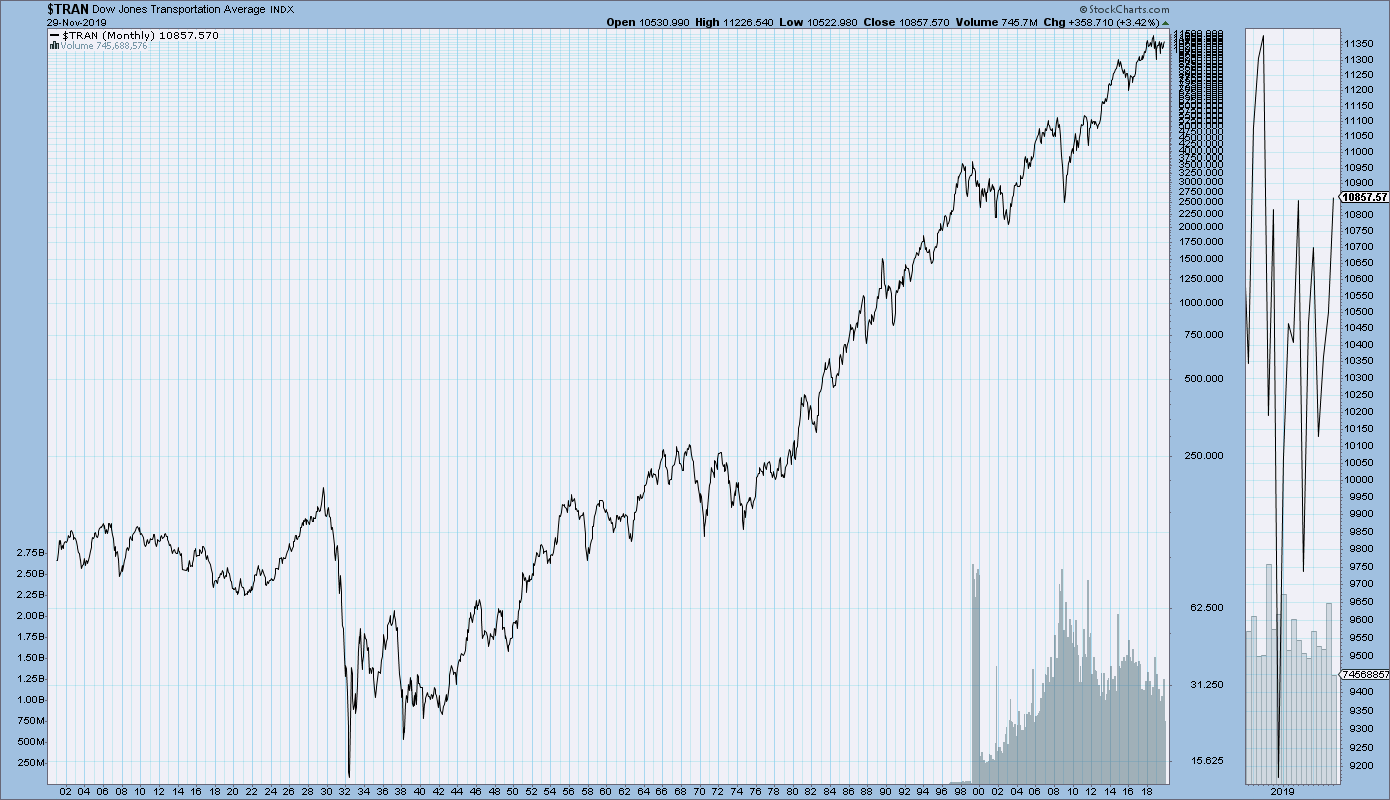
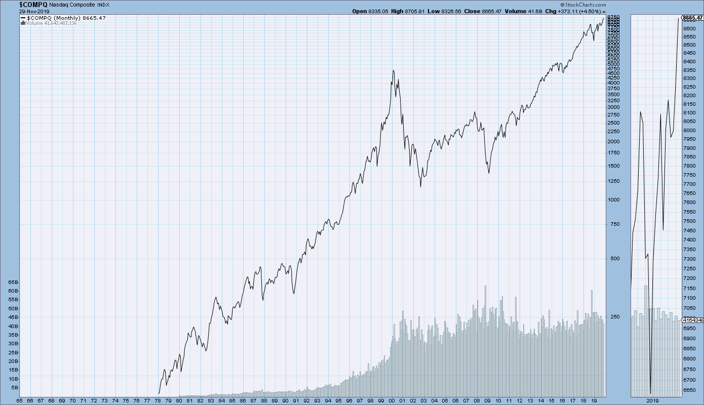
As a long-term reference, below are charts depicting various stock market indices for the dates shown.  All charts are depicted on a monthly basis using a LOG scale.
(click on charts to enlarge images)(charts courtesy of StockCharts.com)
The Dow Jones Industrial Average, from 1900 – November 29, 2019:
DJIA chart since 1900
The Dow Jones Transportation Average, from 1900 – November 29, 2019:
DJTA Since 1900 chart
The S&P500, from 1925 – November 29, 2019:
S&P500 Since 1925 chart
The Nasdaq Composite, from 1978 – November 29, 2019:
Nasdaq Composite Long-Term chart
_____
The Special Note summarizes my overall thoughts about our economic situation
SPX at 3140.98 as this post is written

The Current U.S. Economic Strength And Resilience

Various surveys, economic growth projections, and market risk indicators continue to indicate U.S. economic growth and financial system stability for the foreseeable future.
However, there are various indications – many of which have been discussed on this site – that this very widely-held consensus is in many ways incorrect.  There are many exceedingly problematical financial conditions that continue to exist, some of which have grown in severity.  As well, numerous economic dynamics continue to be worrisome and many economic indicators portray facets of weak growth or outright decline.
Of paramount importance is the resulting level of risk and the future economic implications.
From an “all things considered” standpoint, I continue to believe the overall level of risk is at a fantastic level, one that is far greater than that experienced at any time in the history of the United States.
Cumulatively, these highly problematical conditions will lead to future upheaval.  The extent of the resolution of these problematical conditions will determine the ongoing viability of the financial system and economy as well as the resultant quality of living.
As I have previously written in “The U.S. Economic Situation” updates:
My analyses continues to indicate that the growing level of financial danger will lead to the next stock market crash that will also involve (as seen in 2008) various other markets as well.  Key attributes of this next crash is its outsized magnitude (when viewed from an ultra-long term historical perspective) and the resulting economic impact.  This next financial crash is of tremendous concern, as my analyses indicate it will lead to a Super Depression – i.e. an economy characterized by deeply embedded, highly complex, and difficult-to-solve problems.
_____
The Special Note summarizes my overall thoughts about our economic situation
SPX at 3140.98 as this post is written

U.S. Dollar Decline – December 2, 2019 Update

U.S. Dollar weakness is a foremost concern of mine.  As such, I have extensively written about it.  I am very concerned that the actions being taken to “improve” our economic situation will dramatically weaken the Dollar.  Should the Dollar substantially decline from here, as I expect, the negative consequences will far outweigh any benefits.  The negative impact of a substantial Dollar decline can’t, in my opinion, be overstated.
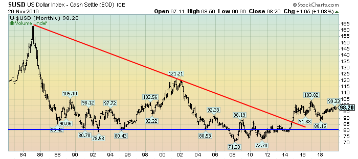
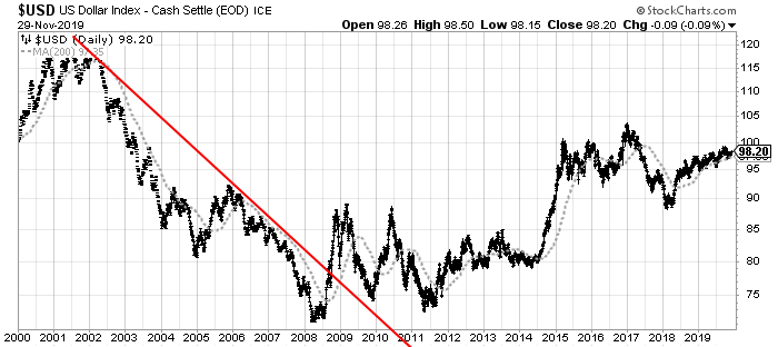
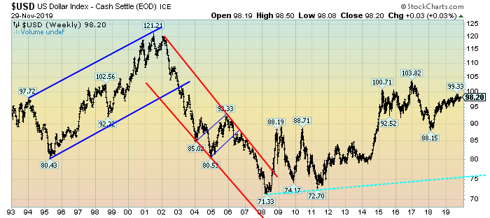
The following three charts illustrate various technical analysis aspects of the U.S. Dollar, as depicted by the U.S. Dollar Index.
First, a look at the monthly U.S. Dollar from 1983.  This clearly shows a long-term weakness, with the blue line showing technical support until 2007, and the red line representing a (past) trendline:
(charts courtesy of StockCharts.com; annotations by the author)
(click on charts to enlarge images)
U.S. Dollar Monthly chart
Next, another chart, this one focused on the daily U.S. Dollar since 2000 on a LOG scale.  The red line represents a (past) trendline.  The gray dotted line is the 200-day M.A. (moving average):
U.S. Dollar chart Daily
Lastly, a chart of the Dollar on a weekly LOG scale.  There are two clearly marked past channels, with possible technical support depicted by the dashed light blue line:
U.S. Dollar Weekly chart
I will continue providing updates on this U.S. Dollar situation regularly as it deserves very close monitoring…
_____
The Special Note summarizes my overall thoughts about our economic situation
SPX at 3140.98 as this post is written