Thursday, May 11, 2023

Chicago Fed National Financial Conditions Index (NFCI)

The St. Louis Fed’s Financial Stress Index (STLFSI4) is one index that is supposed to measure stress in the financial system. Its reading as of the May 11, 2023 update (reflecting data through May 5, 2023) is -.3460:

STLFSI4 -.3460

source: Federal Reserve Bank of St. Louis, St. Louis Fed Financial Stress Index [STLFSI4], retrieved from FRED, Federal Reserve Bank of St. Louis; accessed May 11, 2023: https://fred.stlouisfed.org/series/STLFSI4

Of course, there are a variety of other measures and indices that are supposed to measure financial stress and other related issues, both from the Federal Reserve as well as from private sources.

Two other indices that I regularly monitor include the Chicago Fed National Financial Conditions Index (NFCI) as well as the Chicago Fed Adjusted National Financial Conditions Index (ANFCI).

Here are summary descriptions of each, as seen in FRED:

The National Financial Conditions Index (NFCI) measures risk, liquidity and leverage in money markets and debt and equity markets as well as in the traditional and “shadow” banking systems. Positive values of the NFCI indicate financial conditions that are tighter than average, while negative values indicate financial conditions that are looser than average.

The adjusted NFCI (ANFCI). This index isolates a component of financial conditions uncorrelated with economic conditions to provide an update on how financial conditions compare with current economic conditions.

For further information, please visit the Federal Reserve Bank of Chicago’s web site:

http://www.chicagofed.org/webpages/publications/nfci/index.cfm

Below are the most recently updated charts of the NFCI and ANFCI, respectively.

The NFCI chart below was last updated on May 10, 2023 incorporating data from January 8, 1971 through May 5, 2023 on a weekly basis.  The May 5 value is -.28289:

NFCI -.28289

Data Source: FRED, Federal Reserve Economic Data, Federal Reserve Bank of St. Louis; accessed May 11, 2023:  
http://research.stlouisfed.org/fred2/series/NFCI

–

The ANFCI chart below was last updated on May 10, 2023 incorporating data from January 8, 1971 through May 5, 2023, on a weekly basis.  The May 5, 2023 value is -.25862:

ANFCI -.25862

Data Source: FRED, Federal Reserve Economic Data, Federal Reserve Bank of St. Louis; accessed May 11, 2023:  
http://research.stlouisfed.org/fred2/series/ANFCI

_________

I post various indicators and indices because I believe they should be carefully monitored.  However, as those familiar with this site are aware, I do not necessarily agree with what they depict or imply.

_____

The Special Note summarizes my overall thoughts about our economic situation

SPX at 4120.18 as this post is written

Tuesday, May 9, 2023

Charts Indicating Economic Weakness – May 2023

Throughout this site there are many discussions of economic indicators.  This post is the latest in a series of posts indicating facets of U.S. economic weakness or a notably low growth rate.

The level and trend of economic growth is especially notable at this time. As seen in various estimates, the probability of recession has grown significantly.

As seen in the April 2023 Wall Street Journal Economic Forecast Survey the consensus (average estimate) among various economists is for .45% GDP in 2023, 1.61% GDP in 2024, and 2.20% GDP in 2025.

Charts Indicating U.S. Economic Weakness

Below is a small sampling of charts that depict weak growth or contraction, and a brief comment for each:

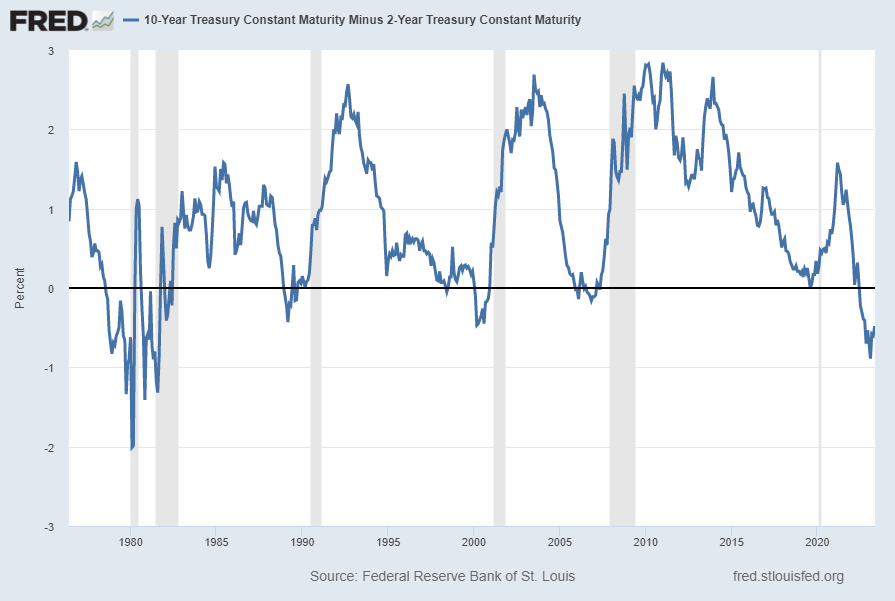
The Yield Curve (T10Y2Y)

Many people believe that the Yield Curve is a leading economic indicator for the United States economy.

On March 1, 2010, I wrote a post on the issue, titled “The Yield Curve As A Leading Economic Indicator.”

While I continue to have the stated reservations regarding the “Yield Curve” as an indicator, I do believe that it should be monitored.

The U.S. Yield Curve (one proxy seen below) is negative and is (all things considered) notably very low when viewed from a long-term perspective. Below is the spread between the 10-Year Treasury Constant Maturity and the 2-Year Treasury Constant Maturity from June 1976 through the May 8, 2023 update, showing a value of -.48% [10-Year Treasury Yield (FRED DGS10) of 3.44% as of the May 5 update, 2-Year Treasury Yield (FRED DGS2) of 3.92% as of the May 5 update]:

T10Y2Y -.48%

source: Federal Reserve Bank of St. Louis, 10-Year Treasury Constant Maturity Minus 2-Year Treasury Constant Maturity [T10Y2Y], retrieved from FRED, Federal Reserve Bank of St. Louis; accessed May 8, 2023: https://fred.stlouisfed.org/series/T10Y2Y

__

Job Openings (JTSJOL)

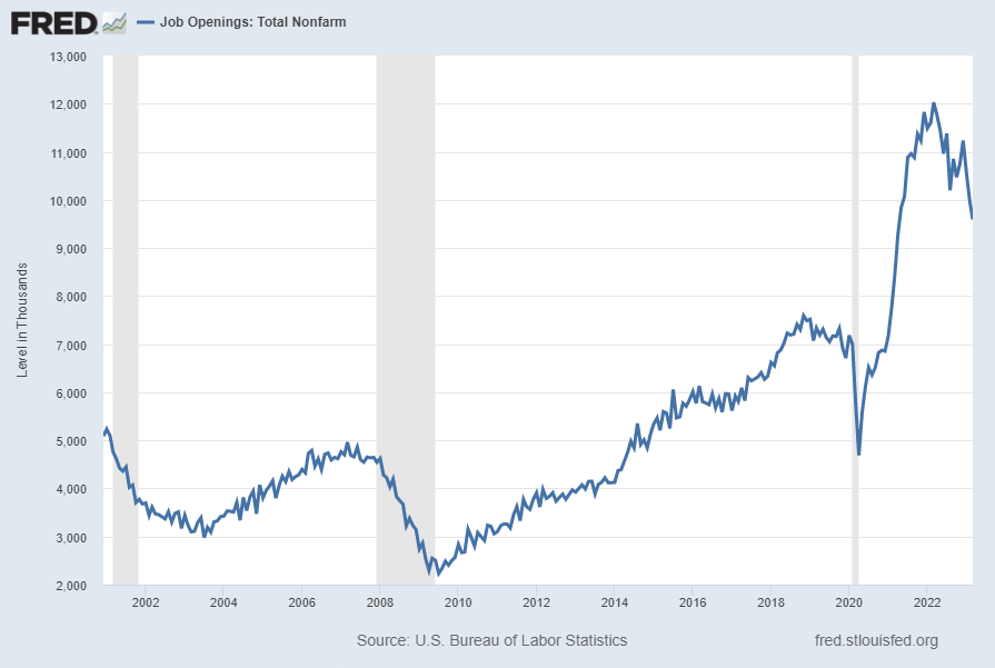
Job openings (Job Openings: Total Nonfarm [JTSJOL]), although still at a (very) high level, have recently declined significantly. This “Job Openings” measure had a value of 9,590 (Thousands) through March 2023, as of the May 2, 2023 update, as shown below:

JTSJOL 9590

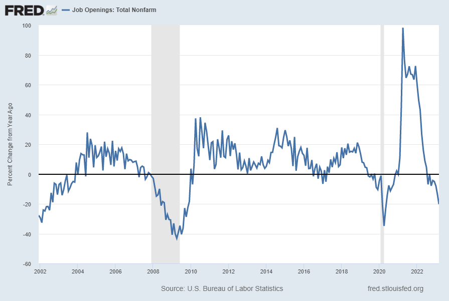
Below is this measure displayed on a “Percent Change From Year Ago” basis with value -20.3%:

JTSJOL -20.3% Change From Year Ago

source: U.S. Bureau of Labor Statistics, Job Openings: Total Nonfarm [JTSJOL], retrieved from FRED, Federal Reserve Bank of St. Louis; accessed May 8, 2023: https://fred.stlouisfed.org/series/JTSJOL

__

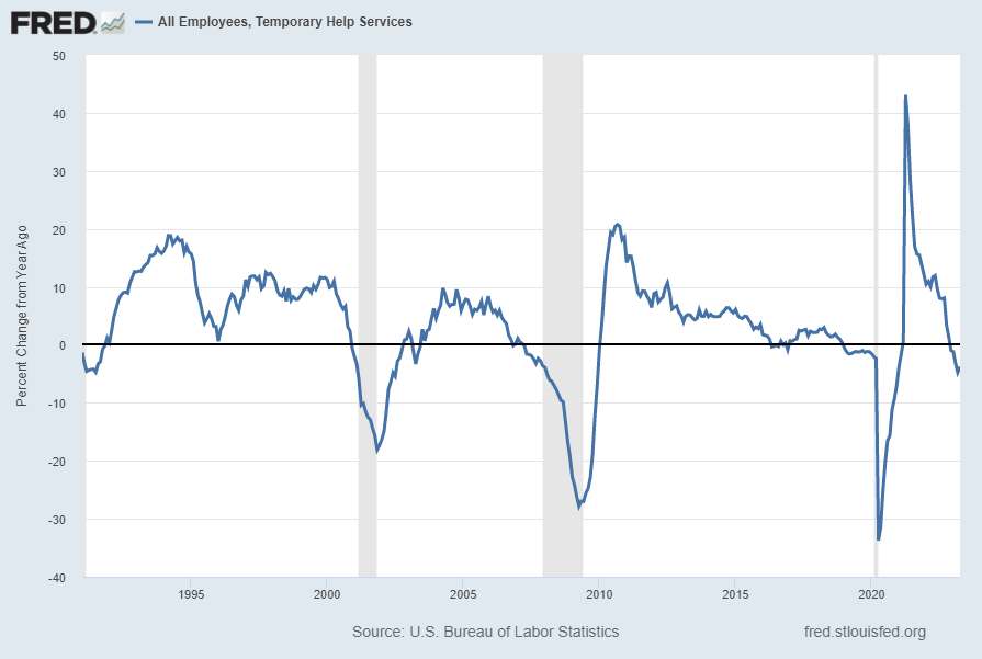
All Employees, Temporary Help Services (TEMPHELPS)

I have written extensively about many facets of employment and unemployment, as the current and future unemployment issue is of tremendous importance yet is in many ways misunderstood.

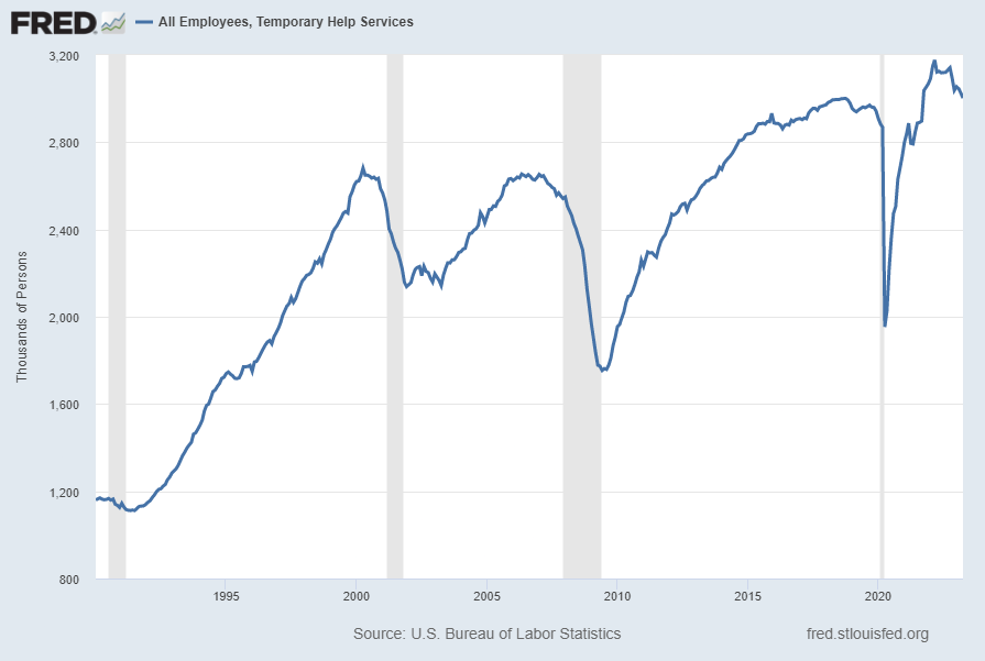
One theory regarding employment is that hiring cycles typically begin with an uptake in temporary employment. Conversely, due to various factors a reduction in temporary employees can be an (early) indicator of lessening labor demand.

Shown below is this measure with last value of 3,002.7 (Thousands) through April, last updated May 5, 2023:

TEMPHELPS 3002.7

Below is this measure displayed on a “Percent Change From Year Ago” basis with value -3.8%:

TEMPHELPS -3.8 Percent Change From Year Ago

source: U.S. Bureau of Labor Statistics, All Employees, Temporary Help Services [TEMPHELPS], retrieved from FRED, Federal Reserve Bank of St. Louis; accessed May 8, 2023: https://fred.stlouisfed.org/series/TEMPHELPS

__

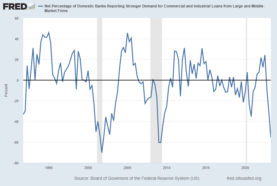
Net Percentage of Domestic Banks Reporting Stronger Demand for Commercial and Industrial Loans from Large and Middle-Market Firms (DRSDCILM)

“The Net Percentage of Domestic Banks Reporting Stronger Demand for Commercial and Industrial Loans from Large and Middle-Market Firms” measure has been notably declining.  The current value is -55.6% as of the May 8, 2023 quarterly update:

DRSDCILM -55.6 Percent

source: Board of Governors of the Federal Reserve System (US), Net Percentage of Domestic Banks Reporting Stronger Demand for Commercial and Industrial Loans from Large and Middle-Market Firms [DRSDCILM] , retrieved from FRED, Federal Reserve Bank of St. Louis; accessed May 8, 2023:
https://fred.stlouisfed.org/series/DRSDCILM

__

Other Indicators

As mentioned previously, many other indicators discussed on this site indicate weak economic growth or economic contraction, if not outright (gravely) problematical economic conditions.

_____

The Special Note summarizes my overall thoughts about our economic situation

SPX at 4138.12 as this post is written

Monday, May 8, 2023

Recession Probability Models – May 2023

There are a variety of economic models that are supposed to predict the probabilities of recession.

While I don’t agree with the methodologies employed or probabilities of impending economic weakness as depicted by the following two models, I think the results of these models should be monitored.

Please note that each of these models is updated regularly, and the results of these – as well as other recession models – can fluctuate significantly.

The first is the “Yield Curve as a Leading Indicator” from the New York Federal Reserve.  I wrote a post concerning this measure on March 1, 2010, titled “The Yield Curve as a Leading Indicator.”

Currently (last updated May 4, 2023 using data through April 2023) this “Yield Curve” model shows a 68.2214% probability of a recession in the United States twelve months ahead.  For comparison purposes, it showed a 57.7709% probability through March 2023, and a chart going back to 1960 is seen at the “Probability Of U.S. Recession Predicted by Treasury Spread.” (pdf)

The second model is from Marcelle Chauvet and Jeremy Piger.  This model is described on the St. Louis Federal Reserve site (FRED) as follows:

Smoothed recession probabilities for the United States are obtained from a dynamic-factor markov-switching model applied to four monthly coincident variables: non-farm payroll employment, the index of industrial production, real personal income excluding transfer payments, and real manufacturing and trade sales. This model was originally developed in Chauvet, M., “An Economic Characterization of Business Cycle Dynamics with Factor Structure and Regime Switching,” International Economic Review, 1998, 39, 969-996. (http://faculty.ucr.edu/~chauvet/ier.pdf)

Additional details and explanations can be seen on the “U.S. Recession Probabilities” page.

This model, last updated on May 1, 2023 currently shows a .66% probability using data through March 2023.

Here is the FRED chart (last updated May 1, 2023):

Smoothed U.S. Recession Probabilities

Data Source:  Piger, Jeremy Max and Chauvet, Marcelle, Smoothed U.S. Recession Probabilities [RECPROUSM156N], retrieved from FRED, Federal Reserve Bank of St. Louis, accessed May 8, 2023:  
http://research.stlouisfed.org/fred2/series/RECPROUSM156N

–

The two models featured above can be compared against measures seen in recent posts.  For instance, as seen in the April 17, 2023 post titled “The April 2023 Wall Street Journal Economic Forecast Survey“ economists surveyed averaged a 61% probability of a U.S. recession within the next 12 months.

_____

The Special Note summarizes my overall thoughts about our economic situation

SPX at 4138.17 as this post is written

Building Financial Danger – May 8, 2023 Update

My overall analysis indicates a continuing elevated and growing level of financial danger which contains many worldwide and U.S.-specific “stresses” of a very complex nature. I have written numerous posts on this site concerning both ongoing and recent “negative developments.”  These developments, as well as other exceedingly problematical conditions, have presented a highly perilous economic environment that endangers the overall financial system.

Also of ongoing immense importance is the existence of various immensely large asset bubbles, a subject of which I have extensively written.  While all of these asset bubbles are wildly pernicious and will have profound adverse future implications, hazards presented by the bond market bubble are especially notable.

Predicting the specific timing and extent of a stock market crash is always difficult, and the immense complexity of today’s economic situation makes such a prediction even more challenging. With that being said, my analyses continue to indicate that a near-term exceedingly large (from an ultra long-term perspective) stock market crash – that would also involve (as seen in 2008) various other markets – will occur. [note: the “next crash” and its aftermath has paramount significance and implications, as discussed in the post of January 6, 2012 titled “The Next Crash And Its Significance“ and various subsequent posts in the “Economic Depression” label]

As reference, below is a daily chart since 2008 of the S&P500 (through May 5, 2023 with a last price of 4136.25), depicted on a LOG scale, indicating both the 50dma and 200dma as well as price labels:

(click on chart to enlarge image)(chart courtesy of StockCharts.com; chart creation and annotation by the author)

S&P500 since 2008 4136.25

_____

The Special Note summarizes my overall thoughts about our economic situation

SPX at 4131.37 as this post is written

Friday, May 5, 2023

Monthly Changes In Total Nonfarm Payroll – May 5, 2023 Update

For reference purposes, below are five charts that display growth in payroll employment, as depicted by the Total Nonfarm Payroll measures (FRED data series PAYEMS).

PAYEMS, which is seasonally adjusted, is defined in Financial Reserve Economic Data [FRED] as:

All Employees: Total Nonfarm, commonly known as Total Nonfarm Payroll, is a measure of the number of U.S. workers in the economy that excludes proprietors, private household employees, unpaid volunteers, farm employees, and the unincorporated self-employed. This measure accounts for approximately 80 percent of the workers who contribute to Gross Domestic Product (GDP).

This measure provides useful insights into the current economic situation because it can represent the number of jobs added or lost in an economy. Increases in employment might indicate that businesses are hiring which might also suggest that businesses are growing. Additionally, those who are newly employed have increased their personal incomes, which means (all else constant) their disposable incomes have also increased, thus fostering further economic expansion.

Generally, the U.S. labor force and levels of employment and unemployment are subject to fluctuations due to seasonal changes in weather, major holidays, and the opening and closing of schools. The Bureau of Labor Statistics (BLS) adjusts the data to offset the seasonal effects to show non-seasonal changes: for example, women’s participation in the labor force; or a general decline in the number of employees, a possible indication of a downturn in the economy. To closely examine seasonal and non-seasonal changes, the BLS releases two monthly statistical measures: the seasonally adjusted All Employees: Total Nonfarm (PAYEMS) and All Employees: Total Nonfarm (PAYNSA), which is not seasonally adjusted.

The series comes from the ‘Current Employment Statistics (Establishment Survey).’

The source code is: CES0000000001

The first chart shows the monthly change in Total Nonfarm Payroll from the year 2000 through the current April 2023 report (April 2023 value of 253 (Thousands)):

(click on charts to enlarge images)

Total Nonfarm Payroll change

Data Source: FRED, Federal Reserve Economic Data, Federal Reserve Bank of St. Louis: All Employees: Total Nonfarm [PAYEMS] ; U.S. Department of Labor: Bureau of Labor Statistics; accessed May 5, 2023; https://fred.stlouisfed.org/series/PAYEMS

The second chart shows a longer-term chart of the same month-over-month change in Total Nonfarm Payroll (reports of February 1939 through the present report of April 2023):

Total Nonfarm Payroll Change

The third chart shows the aggregate number of Total Nonfarm Payroll, from the reports of January 1939 – April 2023 (April 2023 value of 155.673 million):

PAYEMS 155,673

The fourth chart shows this same measure of aggregate number of Total Nonfarm Payroll as seen above but presented on a LOG scale:

PAYEMS LOG scale

Lastly, the fifth chart shows the Total Nonfarm Payroll number on a “Percent Change from Year Ago” basis from January 1940 – April 2023: (April 2023 value of 2.6%)

PAYEMS 2.3 Percent Change From Year Ago

_________

I post various indicators and indices because I believe they should be carefully monitored.  However, as those familiar with this site are aware, I do not necessarily agree with what they depict or imply.

_____

The Special Note summarizes my overall thoughts about our economic situation

SPX at 4121.95 as this post is written

Average Hourly Earnings Trends

I have written many blog posts concerning the worrisome trends in income and earnings.

Along these lines, one of the measures showing disconcerting trends is that of hourly earnings.

While the concept of hourly earnings can be defined and measured in a variety of ways, below are a few charts that I believe broadly illustrate problematic trends.

The first chart depicts Average Hourly Earnings Of All Employees: Total Private (FRED series CES0500000003)(current value = $33.36):

(click on chart to enlarge image)(chart last updated 5-5-23)

Average Hourly Earnings Of All Employees: Total Private 33.36

Data Source: FRED, Federal Reserve Economic Data, Federal Reserve Bank of St. Louis: Average Hourly Earnings of All Employees:  Total Private [CES0500000003] ; U.S. Department of Labor: Bureau of Labor Statistics; accessed May 5, 2023: 
http://research.stlouisfed.org/fred2/series/CES0500000003

–

This next chart depicts this same measure on a “Percentage Change From A Year Ago” basis.   While not totally surprising, I find the decline from 2009 and subsequent trend to be disconcerting:

(click on chart to enlarge image)(chart last updated 5-5-23)

Average Hourly Earnings of All Employees, Total Private Percent Change From Year Ago

–

There are slightly different measures available from a longer-term perspective. Pictured below is another measure, the Average Hourly Earnings of Production and Nonsupervisory Employees – Total Private (FRED series AHETPI)(current value = $28.62):

(click on chart to enlarge image)(chart last updated 5-5-23)

AHETPI

Data Source: FRED, Federal Reserve Economic Data, Federal Reserve Bank of St. Louis: Average Hourly Earnings of Production and Nonsupervisory Employees:  Total Private [AHETPI] ; U.S. Department of Labor: Bureau of Labor Statistics;  accessed May 5, 2023: 
http://research.stlouisfed.org/fred2/series/AHETPI

–

Pictured below is this AHETPI measure on a “Percentage Change From A Year Ago” basis.   While not totally surprising, I find the decline from 2009 and subsequent trend to be disconcerting:

(click on chart to enlarge image)(chart last updated 5-5-23)

AHETPI Percent Change From Year Ago

–

I will continue to actively monitor these trends, especially given the post-2009 dynamics.

_________

I post various economic indicators and indices because I believe they should be carefully monitored.  However, as those familiar with this site are aware, I do not necessarily agree with what they depict or imply.

_____

The Special Note summarizes my overall thoughts about our economic situation

SPX at 4116.73 as this post is written

U-3 And U-6 Unemployment Rate Long-Term Charts As Of May 5, 2023

Shortly after each monthly employment report I have been posting a continual series titled “3 Critical Unemployment Charts.”

Of course, there are many other employment charts that can be displayed as well.

For reference purposes, below are the U-3 and U-6 Unemployment Rate charts from a long-term historical perspective.  Both charts are from the St. Louis Fed site.  The U-3 measure is what is commonly referred to as the official unemployment rate; whereas the U-6 rate is officially (per Bureau of Labor Statistics) defined as:

Total unemployed, plus all persons marginally attached to the labor force, plus total employed part time for economic reasons, as a percent of the civilian labor force plus all persons marginally attached to the labor force

Of note, many economic observers use the U-6 rate as a (closer) proxy of the actual unemployment rate rather than that depicted by the U-3 measure.

Here is the U-3 chart, currently showing a 3.4% unemployment rate:

Unemployment Rate

Data Source: FRED, Federal Reserve Economic Data, Federal Reserve Bank of St. Louis: Civilian Unemployment Rate [UNRATE] ; U.S. Department of Labor: Bureau of Labor Statistics; accessed May 5, 2023: 
http://research.stlouisfed.org/fred2/series/UNRATE

–

Here is the U-6 chart, currently showing a 6.6% unemployment rate:

U6RATE

Data Source: FRED, Federal Reserve Economic Data, Federal Reserve Bank of St. Louis: Total unemployed, plus all marginally attached workers plus total employed part time for economic reasons  [U6RATE] ; U.S. Department of Labor: Bureau of Labor Statistics; accessed May 5, 2023:  
http://research.stlouisfed.org/fred2/series/U6RATE

_____

The Special Note summarizes my overall thoughts about our economic situation

SPX at 4111.93 as this post is written