Wednesday, November 14, 2012

Standard & Poor’s S&P500 Earnings Estimates For 2012 & 2013 – As Of November 8, 2012


As many are aware, Standard & Poor’s publishes earnings estimates for the S&P500.  (My posts concerning their estimates can be found under the S&P500 Earnings label)

For reference purposes, the most current estimates are reflected below, and are as of November 8, 2012:

Year 2012 estimates add to the following:
-From a “bottom up” perspective, operating earnings of $100.03/share
-From a “top down” perspective, operating earnings of N/A
-From a “top down” perspective, “as reported” earnings of $89.30/share

Year 2013 estimates add to the following:
-From a “bottom up” perspective, operating earnings of $113.66/share
-From a “top down” perspective, operating earnings of $106.19/share
-From a “top down” perspective, “as reported” earnings of $99.74/share
_____

I post various economic forecasts because I believe they should be carefully monitored.  However, as those familiar with this blog are aware, I do not agree with many of the consensus estimates and much of the commentary in these forecast surveys.
_____

The Special Note summarizes my overall thoughts about our economic situation

SPX at 1369.71 as this post is written

Tuesday, November 13, 2012

The November 2012 Wall Street Journal Economic Forecast Survey


The November Wall Street Journal Economic Forecast Survey was published on November 9, 2012.  The headline is “Storm Expected to Trim Growth, not Spending.”

An excerpt:
On average, the economists see a small chance of recession over the next 12 months—at about 1-in-5, basically unchanged over the past five months. But most respondents still think that threats such as the fiscal cliff have the economy more likely to fall short of expectations than exceed them.

The current average forecasts among economists polled include the following:

GDP:
full-year 2012:  1.8%
full-year 2013:  2.4%
full-year 2014:  2.9%

Unemployment Rate:
December 2012: 7.9%
December 2013: 7.5%
December 2014:  7.0%

10-Year Treasury Yield:
December 2012: 1.78%
December 2013: 2.47%
December 2014:  3.06%

CPI:
December 2012:  2.1%
December 2013:  2.2%
December 2014:  2.3%

Crude Oil  ($ per bbl):
for 12/31/2012: $88.72
for 12/31/2013: $92.73

(note: I highlight this WSJ Economic Forecast survey each month; commentary on past surveys can be found under the “Economic Forecasts” category)
_____

I post various economic forecasts because I believe they should be carefully monitored.  However, as those familiar with this blog are aware, I do not necessarily agree with many of the consensus estimates and much of the commentary in these forecast surveys.
_____

The Special Note summarizes my overall thoughts about our economic situation

SPX at 1380.03 as this post is written

Sunday, November 11, 2012

Philadelphia Fed – 4th Quarter 2012 Survey Of Professional Forecasters


The Philadelphia Fed Fourth Quarter 2012 Survey of Professional Forecasters was released on November 9.  This survey is somewhat unique in various regards, such as it incorporates a longer time frame for various measures.

The survey shows, among many measures, the following expectations:

Real GDP: (annual average level)

full-year 2012 : 2.2%
full-year 2013 : 2.0%
full-year 2014 : 2.7%
full-year 2015:  2.9%

Unemployment Rate: (annual average level)

for 2012: 8.1%
for 2013: 7.8%
for 2014: 7.4%
for 2015: 6.9%

-

As for “the chance of a contraction in real GDP" in any of the next few quarters, estimates are 13.5%, 23.0%, 21.7%, 17.9%, and 16.4% for each of the quarters from Q4 2012 through Q4 2013, respectively.

As well, there are also a variety of time frames shown (present through the year 2021) with the expected inflation of each.  Inflation is measured in Headline and Core CPI and Headline and Core PCE.  Over all time frames expectations are shown to be in the 1.6%-2.35% range.
_____

I post various economic forecasts because I believe they should be carefully monitored.  However, as those familiar with this blog are aware, I do not agree with many of the consensus estimates and much of the commentary in these forecast surveys.
_____

The Special Note summarizes my overall thoughts about our economic situation

SPX at 1379.85 as this post is written

Consumer Confidence Surveys – As Of November 11, 2012


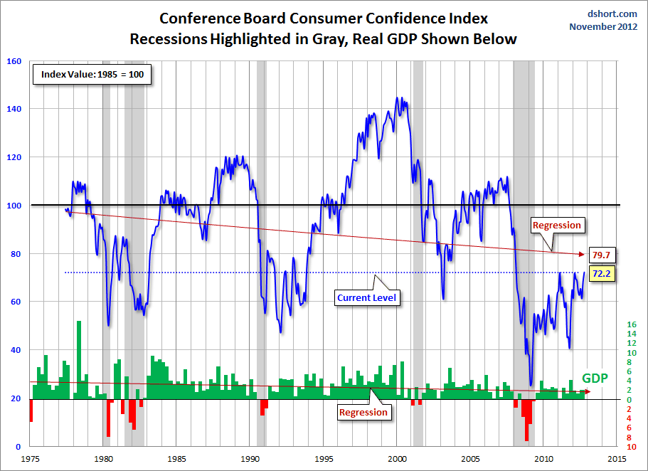
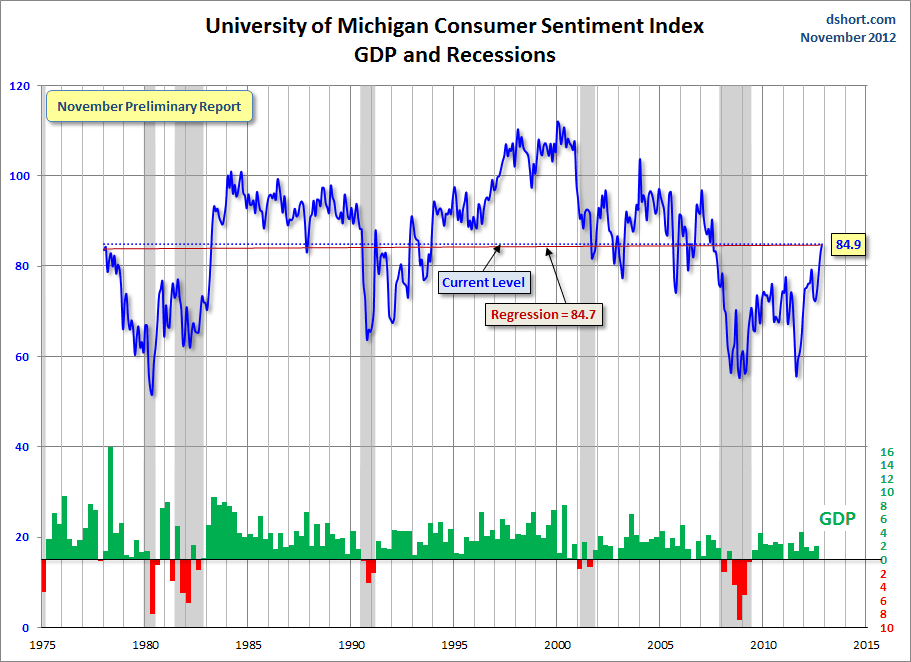
Doug Short had a blog post of November 9 ("Michigan Consumer Sentiment:  Highest Level Since July 2007") in which he presents the Conference Board Consumer Confidence and Thomson/Reuters University of Michigan Consumer Sentiment Index charts.  They are presented below:

(click on charts to enlarge images)


-


-

There are a few aspects of the above charts that I find highly noteworthy.  Of course, the continuing subdued absolute levels of these two surveys is disconcerting.

Also, I find the “behavior” of these readings to be quite disparate as compared to the other post-recession periods, as shown in the charts between the gray shaded areas (the gray areas denote recessions as defined by the NBER.)

While I don’t believe that confidence surveys should be overemphasized, I find these readings to be very problematical, especially in light of a variety of other highly disconcerting measures highlighted throughout this blog.
_____

The Special Note summarizes my overall thoughts about our economic situation

SPX at 1379.85 as this post is written

Friday, November 9, 2012

Long-Term Charts Of The ECRI WLI & ECRI WLI, Gr. – November 9, 2012 Update


As I stated in my July 12, 2010 post ("ECRI WLI Growth History"):
For a variety of reasons, I am not as enamored with ECRI’s WLI and WLI Growth measures as many are.
However, I do think the measures are important and deserve close monitoring and scrutiny.
The movement of the ECRI WLI and WLI, Gr. is particularly notable at this time, as ECRI publicly announced on September 30, 2011 that the U.S. was “tipping into recession,” and ECRI has reaffirmed that view since, most recently in a September 13 release titled “The 2012 Recession:  Are We There Yet?” and September 13 Bloomberg video titled “Recession Update.”

Other past notable 2012 reaffirmations of the September 30, 2011 recession call by ECRI were seen (in chronological order)  on March 15 (“Why Our Recession Call Stands”) as well as various interviews and statements the week of May 6, including:
Also, subsequent to May 2012:

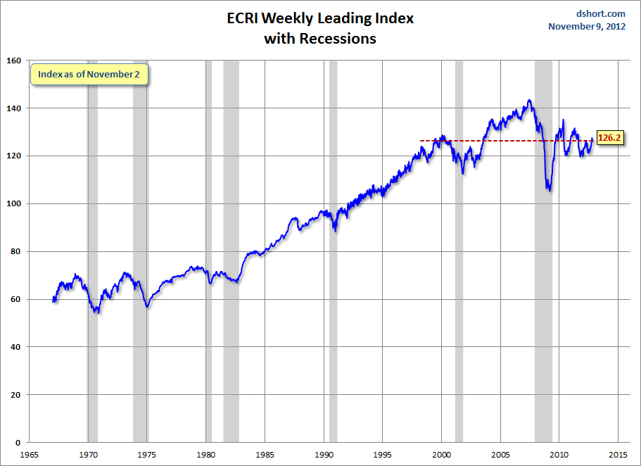
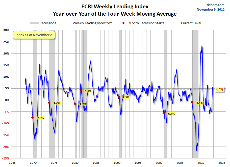
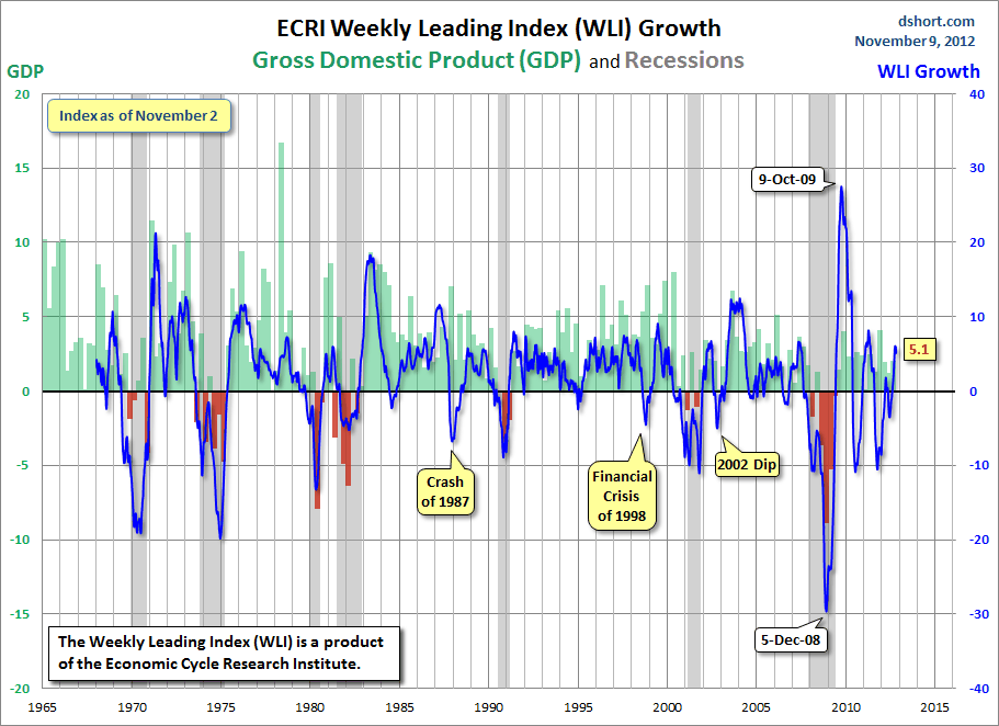
Below are three long-term charts, from Doug Short’s blog post of November 9 titled “ECRI Weekly Leading Index:  Off Its Interim High.”  These charts are on a weekly basis through the November 9 release, indicating data through November 2, 2012.

Here is the ECRI WLI (defined at ECRI’s glossary):


-

This next chart depicts, on a long-term basis, the Year-over-Year change in the 4-week moving average of the WLI:


-

This last chart depicts, on a long-term basis, the WLI, Gr.:


_________

I post various economic indicators and indices because I believe they should be carefully monitored.  However, as those familiar with this blog are aware, I do not necessarily agree with what they depict or imply.
_____

The Special Note summarizes my overall thoughts about our economic situation

SPX at 1379.85 as this post is written

St. Louis Financial Stress Index – November 8, 2012 Update


On March 28, 2011 I wrote a post ("The STLFSI") about the  STLFSI (St. Louis Fed’s Financial Stress Index) which is supposed to measure stress in the financial system.  For reference purposes, the most recent chart is seen below.  This chart was last updated on November 8, incorporating data from December 31,1993 to November 2, 2012 on a weekly basis.  The November 2, 2012 value is -.194 :

(click on chart to enlarge image)


_________

I post various indicators and indices because I believe they should be carefully monitored.  However, as those familiar with this blog are aware, I do not necessarily agree with what they depict or imply.
_____

The Special Note summarizes my overall thoughts about our economic situation

SPX at 1377.51 as this post is written

Thursday, November 8, 2012

Building Financial Danger – November 8, 2012 Update


On October 17, 2011 I wrote a post titled “Danger Signs In The Stock Market, Financial System And Economy.”  This post is a brief 18th update to that post.

My overall analysis indicates a continuing elevated and growing level of danger which contains  many worldwide and U.S.-specific “stresses” of a very complex nature. I have written numerous posts in this blog of some of what I consider both ongoing and recent “negative developments.”  These developments, as well as other highly problematic conditions, have presented a highly perilous economic environment that endangers the overall financial system.

My analysis continues to indicate that there are many reasons for tremendous concern, as seen in almost innumerable fundamental economic, financial-market, and proprietary measures.  While the vast majority would refute this view – as seen in a variety of recent economic and market forecasts that continue to indicate ongoing slow economic growth and low probabilities of any type of serious economic adversity – my analyses indicate this optimism is misplaced.

One aspect of concern is the existence of various immensely large asset bubbles, a subject of which I have extensively written.  While all of these asset bubbles are wildly pernicious and will have profound adverse future implications, hazards presented by the bond market bubble are especially notable.

Predicting the specific timing and extent of a stock market crash is always difficult, and the immense complexity of today’s economic situation makes such a prediction even more challenging. With that being said, my analyses indicate that the danger inherent in the financial system has reached a level at which a stock market crash – that would also involve (as seen in 2008) various other markets as well – continues to be at a level at which a near-term crash is of tremendous concern.

(note: the “next crash” has outsized significance and implications, as discussed in the post of January 6, "The Next Crash And Its Significance")

As reference, below is a one-year daily chart of the S&P500, indicating both the 50dma and 200dma as well as price labels.  The current price is 1394.53 :

(click on chart to enlarge image)(chart courtesy of StockCharts.com; chart creation and annotation by the author)


_____

The Special Note summarizes my overall thoughts about our economic situation

SPX at 1394.53 as this post is written

Wednesday, November 7, 2012

Charts Of Equities’ Performance Since March 9, 2009 And January 1, 1980 – November 7, 2012 Update


In the March 9, 2012 post ("Charts of Equities’ Performance Since March 9, 2009 And January 1, 1980") I highlighted two charts for reference purposes.

Below are those two charts, updated through yesterday’s close.

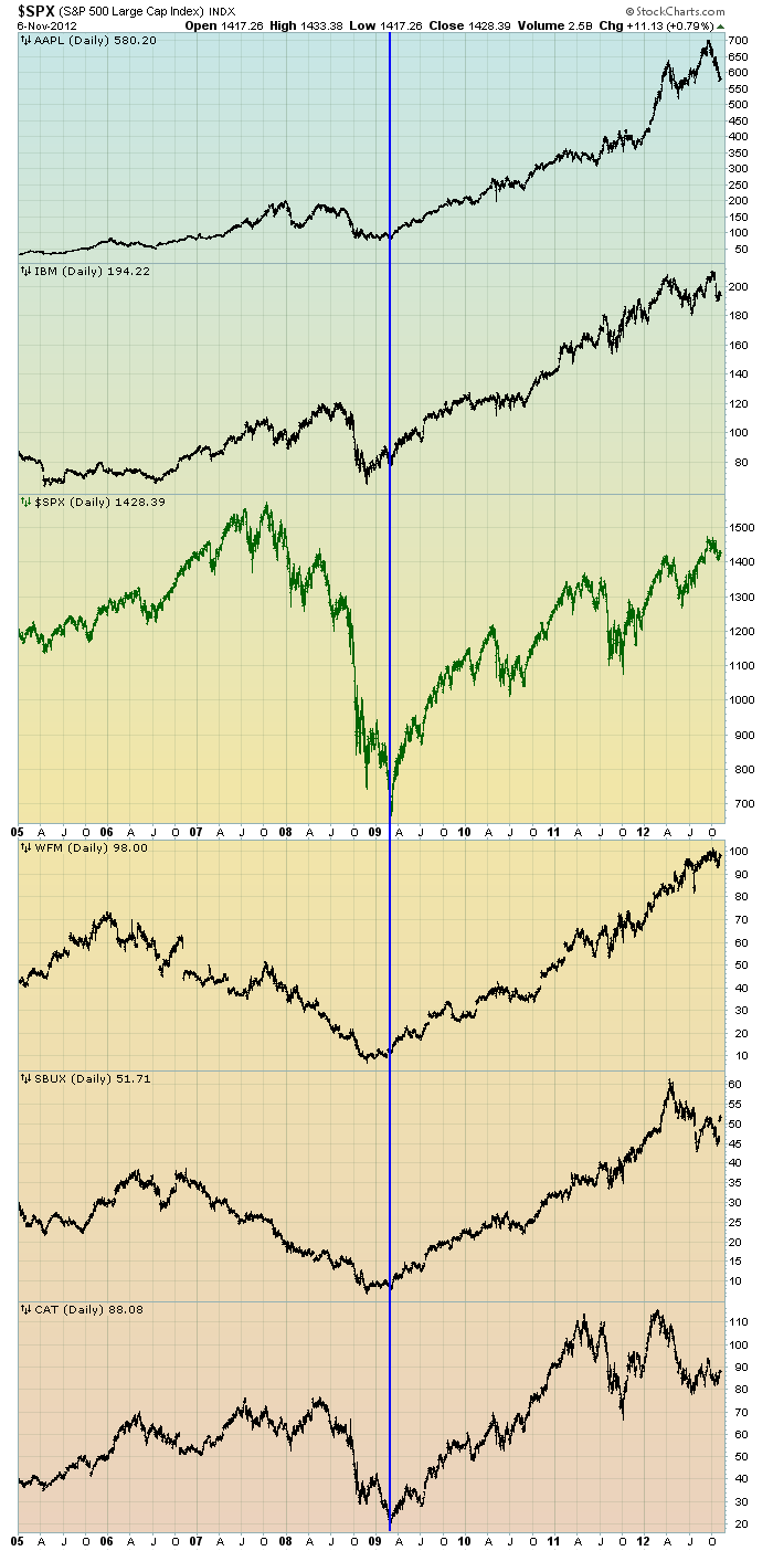
The first is a daily chart of the S&P500 (shown in green), as well as five (AAPL, IBM, WFM, SBUX, CAT) individual stocks, since 2005.  There is a blue vertical line that is very close to the March 6, 2009 low.  As one can see, both the S&P500 performance, as well as many stocks including the five shown, have performed strongly since the March 6, 2009 low:

(click on chart to enlarge image)(chart courtesy of StockCharts.com; chart creation and annotation by the author)


-

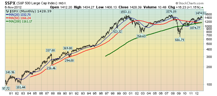
This next chart shows, on a monthly LOG basis, the S&P500 since 1980.  I find this chart notable as it provides an interesting long-term perspective on the S&P500′s performance.  The 20, 50, and 200-month moving averages are shown in blue, red, and green lines, respectively:

(click on chart to enlarge image)(chart courtesy of StockCharts.com; chart creation and annotation by the author)


_____

The Special Note summarizes my overall thoughts about our economic situation

SPX at 1406.65 as this post is written