Wednesday, December 17, 2014

Chicago Fed National Financial Conditions Index (NFCI)

The St. Louis Fed’s Financial Stress Index (STLFSI) is one index that is supposed to measure stress in the financial system.  Its reading as of the December 11, 2014 update (reflecting data through December 5) is -1.075.
Of course, there are a variety of other measures and indices that are supposed to measure financial stress and other related issues, both from the Federal Reserve as well as from private sources.
Two other indices that I regularly monitor include the Chicago Fed National Financial Conditions Index (NFCI) as well as the Chicago Fed Adjusted National Financial Conditions Index (ANFCI).
Here are summary descriptions of each, as seen in FRED:
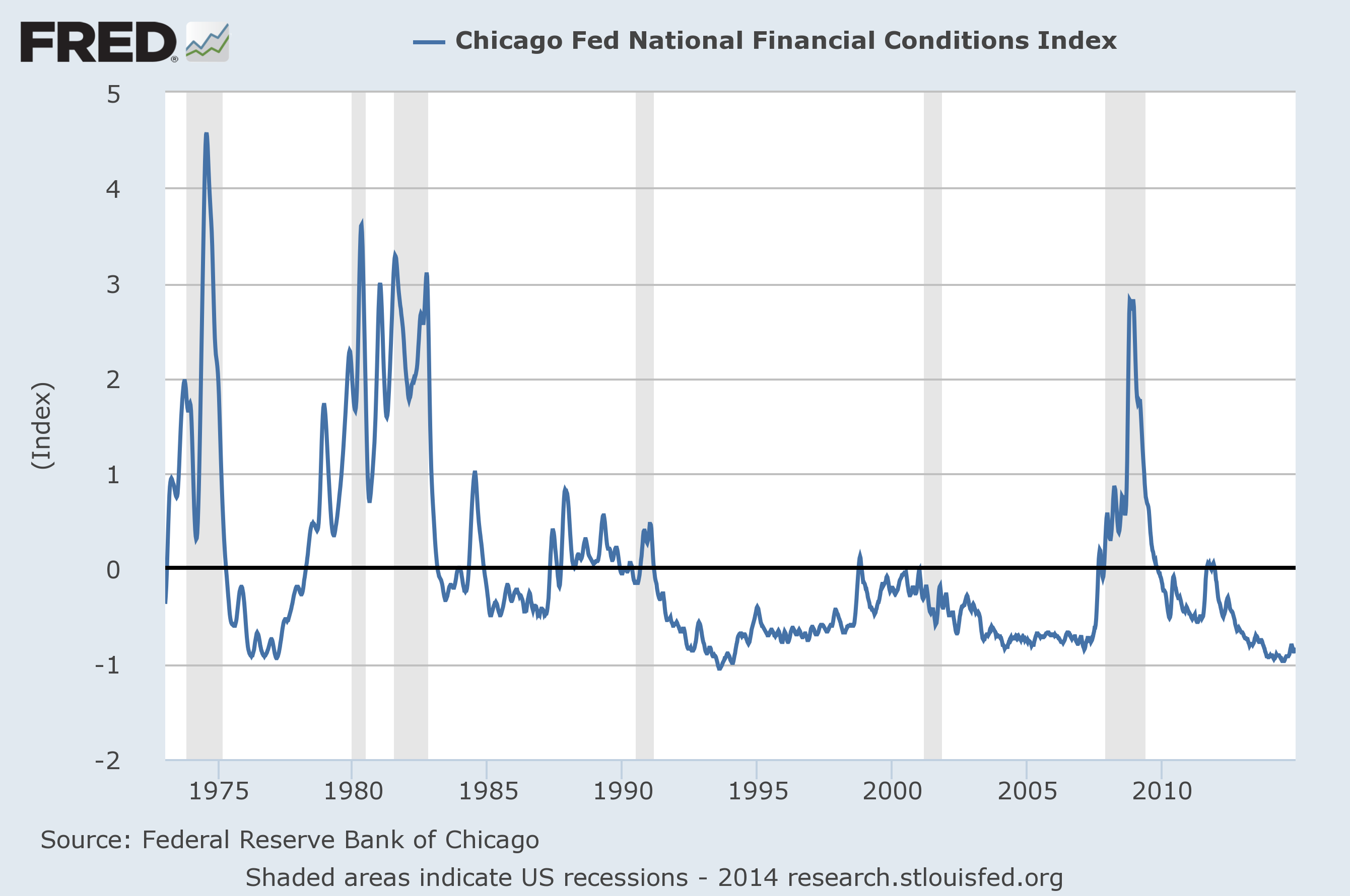
The National Financial Conditions Index (NFCI) measures risk, liquidity and leverage in money markets and debt and equity markets as well as in the traditional and “shadow” banking systems. Positive values of the NFCI indicate financial conditions that are tighter than average, while negative values indicate financial conditions that are looser than average.
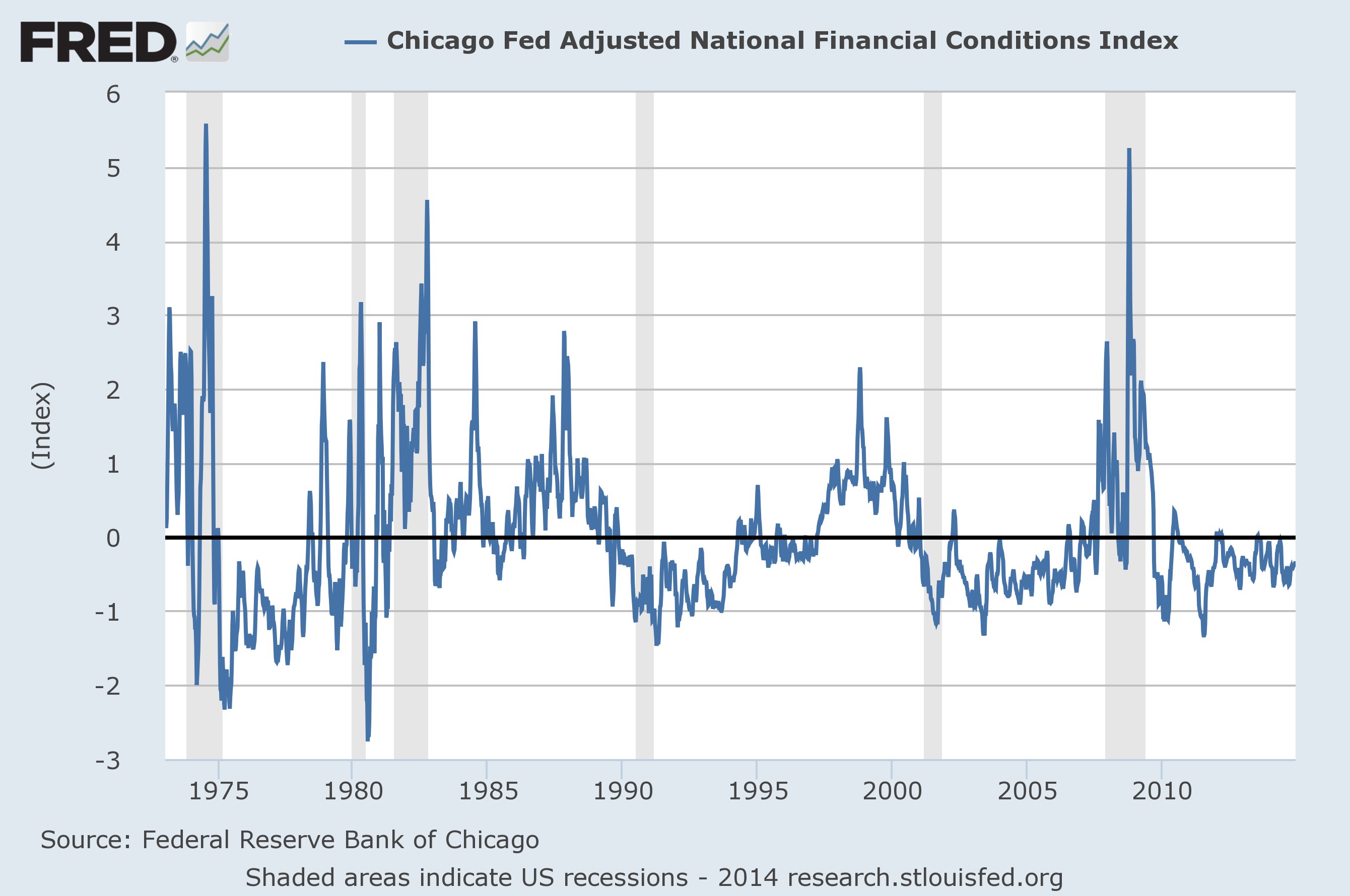
The adjusted NFCI (ANFCI). This index isolates a component of financial conditions uncorrelated with economic conditions to provide an update on how financial conditions compare with current economic conditions.
For further information, please visit the Federal Reserve Bank of Chicago’s web site:
Below are the most recently updated charts of the NFCI and ANFCI, respectively.
The NFCI chart below was last updated on December 17, incorporating data from January 5,1973 to December 12, 2014, on a weekly basis.  The December 12, 2014 value is -.83:
(click on chart to enlarge image)
NFCI
Data Source: FRED, Federal Reserve Economic Data, Federal Reserve Bank of St. Louis; accessed December 17, 2014:
The ANFCI chart below was last updated on December 17, incorporating data from January 5,1973 to December 12, 2014, on a weekly basis.  The December 12, 2014 value is -.33:
ANFCI
Data Source: FRED, Federal Reserve Economic Data, Federal Reserve Bank of St. Louis; accessed December 17, 2014:
_________
I post various indicators and indices because I believe they should be carefully monitored.  However, as those familiar with this blog are aware, I do not necessarily agree with what they depict or imply.
_____
The Special Note summarizes my overall thoughts about our economic situation
SPX at 1992.87 as this post is written

Stock Market Capitalization To GDP – Through Q3 2014

“Stock market capitalization to GDP” is a notable and important metric regarding stock market valuation.  In February of 2009 I wrote of it in “Does Warren Buffett’s Market Metric Still Apply?
Doug Short has recently published a post depicting this “stock market capitalization to GDP” metric.
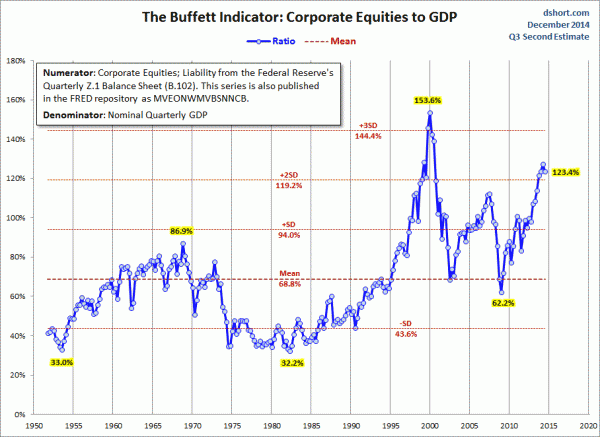
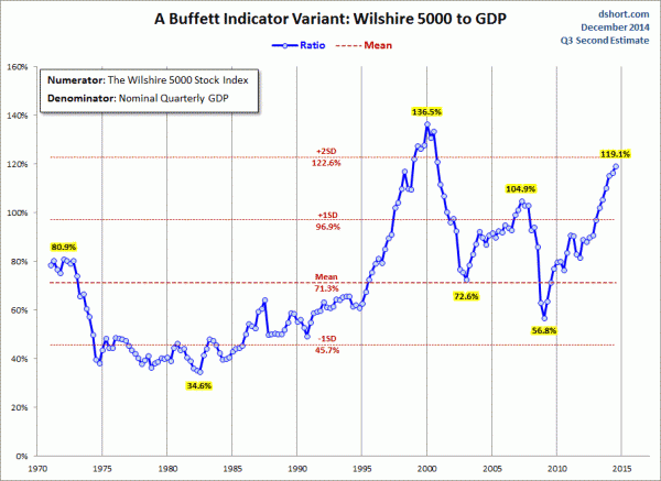
As seen in his December 11, 2014 post titled “Market Cap to GDP:  The Buffett Valuation Indicator Declines a Bit” he shows two different versions, varying by the definition of stock market capitalization. (note:  additional explanation is provided in his post.)
For reference purposes, here is the first chart, with the stock market capitalization as defined by the Federal Reserve:
(click on charts to enlarge images)
Dshort 12-11-14 - Buffett-Indicator
Here is the second chart, with the stock market capitalization as defined by the Wilshire 5000:
stock market capitalization to GDP
As one can see in both measures depicted above, “stock market capitalization to GDP” is at notably high levels from a long-term historical perspective.
_____
The Special Note summarizes my overall thoughts about our economic situation
SPX at 1987.04 as this post is written

Monday, December 15, 2014

S&P500 Price Projections – Livingston Survey December 2014

The December 2014 Livingston Survey (pdf) published on December 12, 2014 contains, among its various forecasts, a S&P500 forecast.  It shows the following price forecast for the dates shown:
Dec. 31, 2014   2065
June 30, 2015   2125
Dec. 31, 2015   2160.60
June 30, 2016   2300
These figures represent the median value across the 29 forecasters on the survey’s panel.
_____
I post various economic forecasts because I believe they should be carefully monitored.  However, as those familiar with this blog are aware, I do not agree with many of the consensus estimates and much of the commentary in these forecast surveys.
_____
The Special Note summarizes my overall thoughts about our economic situation
SPX at 1998.37 as this post is written

2015 Estimates For S&P500 Earnings & Price Levels

In the December 15, 2014 edition of Barron’s, the cover story is titled “Outlook 2015:  Stick With the Bull.”
Included in the story, 10 investment strategists give various forecasts for 2015 including S&P500 profits, S&P500 year-end price targets, GDP growth, and 10-Year Treasury Note Yields.
A couple of excerpts:
The strategists’ 2015 targets for the S&P 500 range from a low of 2100 to a high of 2350, with a mean of 2208, compared with Friday’s close of 2002. Subramanian’s 2015 target is 2200.
also:
BARRON’S SURVEYS a group of prominent market strategists every September and December, to gauge the outlook for stocks, bonds, and the economy in the final months of the current year and in the year ahead. Looking to 2015, the strategists see S&P 500 earnings per share rising a mean 7.5%, to $127, from an expected $118 this year. Most believe that higher earnings will be the market’s chief propellant in the new year.
Industry analysts tend toward more upbeat forecasts than the big-picture thinkers, although the current read on 2015 suggests there isn't much of a gap.  The analysts have penciled in earnings estimates of $128.80, according to Yardeni Research.
The article also mentions that among the investment strategists, average expected 2015 GDP growth is 3.0%.
_____
I post various economic forecasts because I believe they should be carefully monitored.  However, as those familiar with this blog are aware, I do not agree with many of the consensus estimates and much of the commentary in these forecast surveys.
_____
The Special Note summarizes my overall thoughts about our economic situation
SPX at 1993.56 as this post is written

Friday, December 12, 2014

The December 2014 Wall Street Journal Economic Forecast Survey

The December Wall Street Journal Economic Forecast Survey was published on December 11, 2014.  The headline is “Economists See Stronger Growth in 2015.”
I found numerous items to be notable – although I don’t necessarily agree with them – both within the article and in the “Economist Q&A” section.
Two excerpts:
According to the panel of 45 economists—not all of whom answered every question—the U.S. economy should grow an inflation-adjusted 2.9% across the four quarters of 2015. The forecast would make 2015 the second-strongest year of the economic expansion, which passed its five-year anniversary last summer.
also:
As has been the case through much of 2014, the panel sees a negative global event as the biggest downside risk to the U.S. outlook. Slower global growth was the biggest concern identified by forecasters worried about international drags. But some economists cited other risks, such as problems in the Chinese and Japanese financial systems and military action by Russia in Eastern Europe.
As seen in the “Recession Probability” section, the average response as to the odds of another recession starting within the next 12 months was 11.45%; November’s average response was 11.73%.
The current average forecasts among economists polled include the following:
GDP:
full-year 2014:  2.2%
full-year 2015:  2.9%
full-year 2016:  2.8%
Unemployment Rate:
December 2014: 5.8%
December 2015: 5.3%
December 2016: 5.0%
10-Year Treasury Yield:
December 2014: 2.36%
December 2015: 3.20%
December 2016: 3.75%
CPI:
December 2014:  1.4%
December 2015:  1.9%
December 2016:  2.3%
Crude Oil  ($ per bbl):
for 12/31/2014: $64.73
for 12/31/2015: $72.10
(note: I highlight this WSJ Economic Forecast survey each month; commentary on past surveys can be found under the “Economic Forecasts” label)
_____
I post various economic forecasts because I believe they should be carefully monitored.  However, as those familiar with this blog are aware, I do not necessarily agree with many of the consensus estimates and much of the commentary in these forecast surveys.
_____
The Special Note summarizes my overall thoughts about our economic situation
SPX at 2020.74 as this post is written

Long-Term Charts Of The ECRI WLI & ECRI WLI, Gr. – December 12, 2014 Update

As I stated in my July 12, 2010 post (“ECRI WLI Growth History“):
For a variety of reasons, I am not as enamored with ECRI’s WLI and WLI Growth measures as many are.
However, I do think the measures are important and deserve close monitoring and scrutiny.
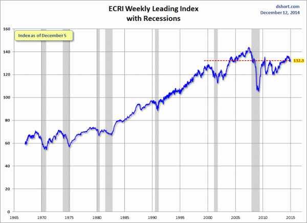
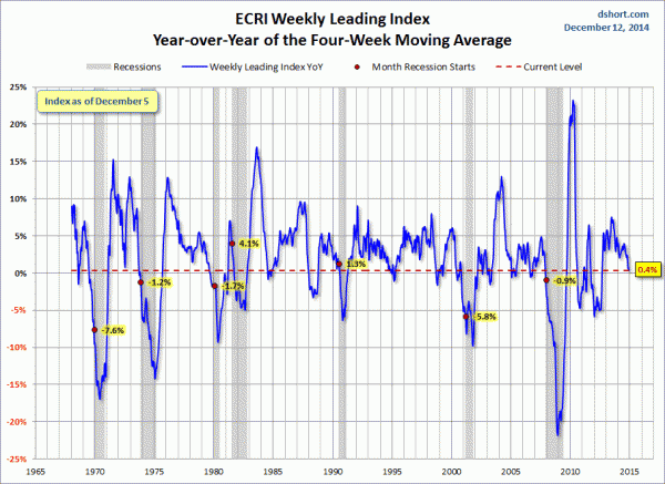
Below are three long-term charts, from Doug Short’s blog post of December 12, 2014 titled “ECRI Recession Watch:  Weekly Update.”  These charts are on a weekly basis through the December 12 release, indicating data through December 5, 2014.
Here is the ECRI WLI (defined at ECRI’s glossary):
ECRI WLI
This next chart depicts, on a long-term basis, the Year-over-Year change in the 4-week moving average of the WLI:
Dshort 12-12-14 - ECRI-WLI-YoY .4 percent
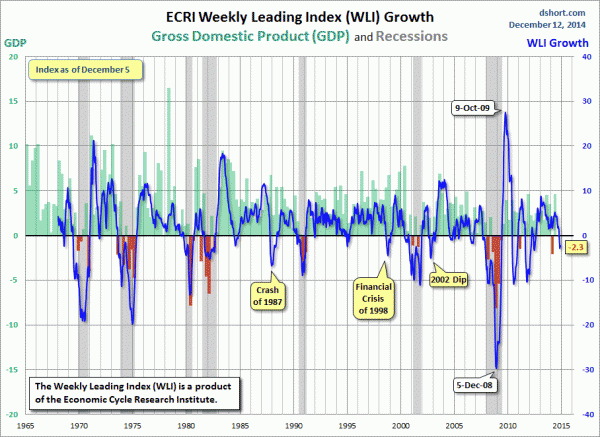
This last chart depicts, on a long-term basis, the WLI, Gr.:
ECRI WLI,Gr.
 
_________
I post various economic indicators and indices because I believe they should be carefully monitored.  However, as those familiar with this blog are aware, I do not necessarily agree with what they depict or imply.
_____
The Special Note summarizes my overall thoughts about our economic situation
SPX at 2019.27 as this post is written

Total Household Net Worth As Of 3Q 2014 – Two Long-Term Charts

In the last post (“Total Household Net Worth As A Percent Of GDP 3Q 2014“) I displayed a long-term chart depicting Total Household Net Worth as a percentage of GDP.
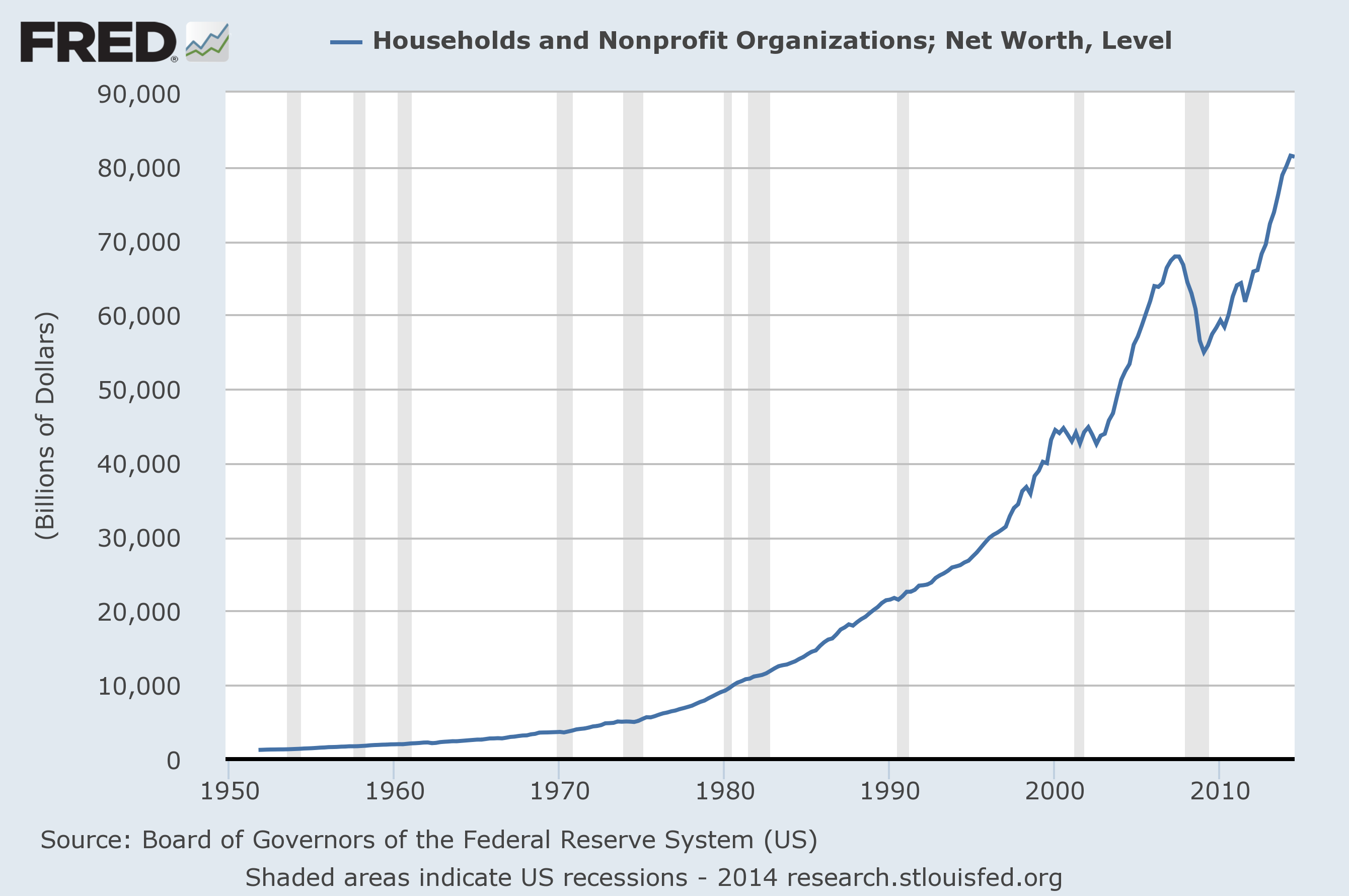
For reference purposes, here is Total Household Net Worth from a long-term perspective (from 1949:Q4 to 2014:Q3).  The last value (as of December 11, 2014) is $81.34881 Trillion:
(click on each chart to enlarge image)
total household net worth
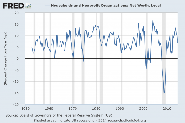
Also of interest is the same metric presented on a “Percent Change from a Year Ago” basis:
household net worth percent change from year ago
Data Source: FRED, Federal Reserve Economic Data, Board of Governors of the Federal Reserve System; accessed December 11, 2014:
_____
The Special Note summarizes my overall thoughts about our economic situation
SPX at 2035.33 as this post is written

Total Household Net Worth As A Percent Of GDP 3Q 2014

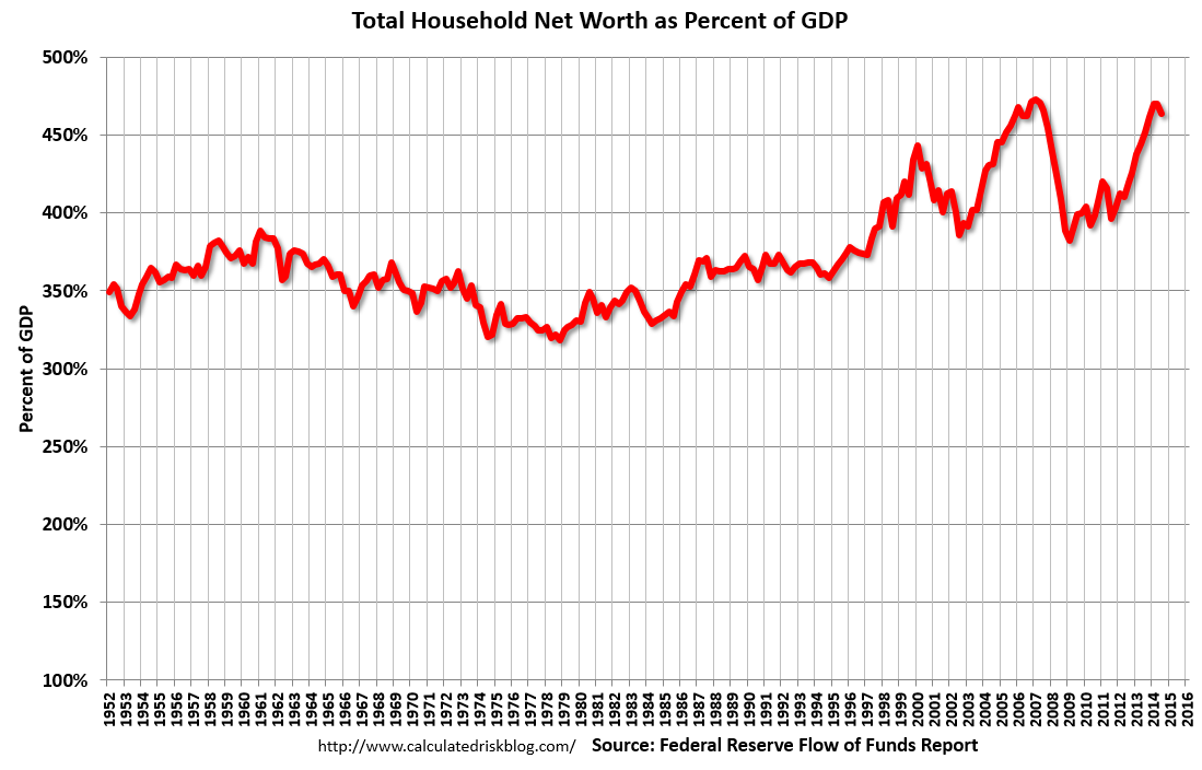
The following chart is from the CalculatedRisk blog post of December 11, 2014 titled “Fed’s Flow of Funds:  Household Net Worth 'dipped slightly' in Q3.” It depicts Total Household Net Worth as a Percent of GDP.  The underlying data is from the Federal Reserve’s Z.1 report, “Financial Accounts of the United States“:
(click on chart to enlarge image)
household net worth as a percent of gdp
As seen in the above-referenced CalculatedRisk blog post:
Prior to the recession, net worth peaked at $67.9 trillion in Q2 2007, and then net worth fell to $54.9 trillion in Q1 2009 (a loss of $13.0 trillion). Household net worth was at $81.3 trillion in Q3 2014 (up $26.4 trillion from the trough in Q1 2009).
The Fed estimated that the value of household real estate increased to $20.4 trillion in Q3 2014. The value of household real estate is still $2.2 trillion below the peak in early 2006.
As I have written in previous posts on this Household Net Worth (as a percent of GDP) topic:
As one can see, the first outsized peak was in 2000, and attained after the stock market bull market / stock market bubbles and economic strength.  The second outsized peak was in 2007, right near the peak of the housing bubble as well as near the stock market peak.
also:
I could extensively write about various interpretations that can be made from this chart.  One way this chart can be interpreted is a gauge of “what’s in it for me?” as far as the aggregated wealth citizens are gleaning from economic activity, as measured compared to GDP.
_____
The Special Note summarizes my overall thoughts about our economic situation
SPX at 2035.33 as this post is written