Thursday, March 31, 2016

Deloitte “CFO Signals” Report Q1 2016 – Notable Aspects

Recently Deloitte released their “CFO Signals” “High-Level Summary” report for the 1st Quarter of 2016.
As seen in page 2 of the report, “One hundred eighteen CFOs responded during the two-week period ending February 19. Seventy-two percent of respondents are from public companies, and 83% are from companies with more than $1B in annual revenue. For more information, please see the “About the survey” section of this report."
Here are some of the excerpts that I found notable:
from page 3:
How do you regard the current and future status of the North American, Chinese, and European economies? Forty-one percent of CFOs describe North American conditions as good (55% last quarter), and 36% expect better conditions in a year (47% last quarter). Nine percent regard China’s economy as good (down from 14% last quarter), and 11% expect improvement (down from 16%). Five percent describe Europe as good (down from 8%), and only 17% see it improving in a year (up from 15%). Page 8.
Compared to the past 12 months, how do you expect your key operating metrics to change over the next 12 months?* Revenue growth expectations fell from 5.9% to 3.3%, only slightly above the previous survey low from 2Q15. Earnings growth expectations fell from 8.3% to a new survey low of 6.0%. Capital spending expectations fell drastically from 4.9% to just 1.7%—eclipsing the previous survey low of 4.2% by a wide margin. Domestic hiring growth expectations declined sharply to just 0.6%, well off last quarter’s 1.2% and matching the survey low. Pages 11-13.
*Averages are means that have been adjusted to eliminate the effects of stark outliers.
from page 4:

Less confidence in North American economy

Behind these declining growth expectations are assessments of the North American economy that, having been a steadying influence for many quarters, now appear to be faltering. Assessments of current performance are still mostly positive, but confidence in the economy’s trajectory hit its lowest level in three years. Among their most worrisome risks, CFOs voiced growing concern about the toll economic and equity market volatility will take on liquidity and on consumers’ willingness to spend.
Meanwhile, CFOs’ confidence in Europe remains weak, and their assessment of China hit yet another low. Not surprisingly, CFOs this quarter indicated their highestever focus on current geographies over new ones (which, for most surveyed companies, means a continued focus on North American markets).
One potential bright spot in CFOs’ sentiment: for the first time since we began asking in 1Q15, and in sharp contrast to all prior quarters, more surveyed CFOs believe US equity markets are undervalued than overvalued. (Note that the S&P 500 index averaged 1865 while the survey was open, but has since rebounded to about 2010, or by almost 8%).
from page 11:

Revenue and earnings

What are CFOs’ expectations for their companies’ year-over-year revenue and earnings?
Revenue[1]
Expectations fell back toward their 2Q15’s record lows, driven by weakness across all regions and nearly all industries:
  • After rebounding from their 2Q15 survey-low 3.1% over the past two quarters, revenue growth expectations fell from 5.9% last quarter to just 3.3% this quarter. The median fell from 5.0% to 3.0%—a new survey low. Just 78% of CFOs expect year-over-year gains, matching the survey low. The distribution[2] of this quarter’s responses is narrow compared to last quarter and most recent quarters.
  • Country-specific expectations are 3.3% for the US (down from 6.3% last quarter), 2.2% for Canada (down from 2.8%), and 4.5% for Mexico (down from 7.4%).
  • Industry expectations are mostly very low, with Manufacturing lowest at just 0.7% and Services at just 1.4%. Energy/Resources rose slightly from 2.8% last quarter to 3.1% this quarter. All industries other than T/M/E were 4.4% or lower.
Earnings1
Expectations reversed recent gains and now sit at their survey low driven largely by weakness in Manufacturing and Financial Services:
  • After rebounding from their low of 6.5% in the second and third quarters of last year, earnings expectations fell sharply from 8.3% last quarter to just 6.0% this quarter—a new survey low. The median dropped to just 5.0%, down from 7.0% last quarter. The percentage of CFOs expecting year-over-year gains fell from 82% last quarter to 79% this quarter, and the distributionof responses was about average.
  • Country-specific expectations are 6.4% for the US (down from 9.2% last quarter), 4.2% for Canada (up from 3.3%), and 3.1% for Mexico (down from 6.5%).
  • All industries expect positive growth, with Retail/Wholesale at 8.7% and both Healthcare/Pharma and T/M/E above 10%. Manufacturing is low at 5.2%, with Technology, Financial Services, and Services even lower at below 4%.
[1] All averages have been adjusted to eliminate the effects of stark outliers.
[2] “Distribution” refers to the spread of the middle 90% of responses.
from page 13:

Employment

What are CFOs’ expectations for their companies’ year-over-year hiring?
Domestic hiring[1]
Expectations fell sharply to match their 3Q12 survey low:
  • Domestic hiring expectations fell to 0.6%, down substantially from last quarter’s 1.2% and matching the lowest level in this survey’s history. The median declined to 0.0%, well below the survey average of 0.7%. The proportion of CFOs expecting gains fell to 47%, also well below the average of 52%. The distribution[2] of responses is below average compared to recent quarters.
  • Country-specific expectations are 0.7% for the US (down from last quarter’s 1.3%, and now at the lowest level in three years), -0.9% for Canada (down from 0.6% last quarter), and 2.7% for Mexico (up from 0.5% last quarter).
  • Technology and Financial Services are highest at 1.6% and 1.4%, respectively (but still low by historical standards). Energy/Resources again indicated contraction at -0.3% (but that is up from -1.2% last quarter), with T/M/E lowest at -1.3%.
Offshore hiring1
Expectations declined sharply and are again well below their long-term survey average:
  • Offshore hiring growth fell to 1.9%, down from last quarter’s 2.8% and now at the lowest level since 2Q14. The median remains at 0.0%, and 45% of CFOs expect year-over-year gains (down from last quarter’s 49%).
  • Country-specific expectations are 1.8% for the US (down from 3.0%), 2.8% for Canada (up from 2.4%), and 0.4% for Mexico (down from 0.8%).
  • Technology indicates the highest expectation at 3.4%, with Energy/Resources and Manufacturing both the lowest at about 1.0%.
Domestic wage growth1
Expectations down slightly, but still indicative of substantial upward wage pressures: •             Domestic wage growth declined to 2.5%, down slightly from last quarter’s 2.7%. The median held at 3.0%, and 90% of CFOs expect year-over-year gains.
  • Country-specific expectations are 2.5% for the US, 2.1% for Canada, and 4.1% for Mexico.
  • All industry-specific expectations are between 2.2% and 3.1%, with Energy/Resources and Healthcare/Pharma on the low end and Services highest.
[1] All averages have been adjusted to eliminate the effects of stark outliers.
[2] “Distribution” refers to the spread of the middle 90% of responses.
Please see full report for industry-specific findings.
from page 15:

Most worrisome risks

Which external and internal risks do CFOs regard as most worrisome?
External concerns: Very strong concerns about the interplay of economic volatility, financial markets, and consumer confidence:
  • Rapidly escalating concerns about global economic volatility: Last quarter, CFOs’ concerns appeared to shift from a specific focus on Europe and China to a more generalized focus on global economic stagnation and volatility. This quarter’s findings show a strong acceleration of that trend.
  • Rising concerns about US economy and consumer spending: Worries rose about a US pullback, with sharply rising concerns about the toll economic and equity market volatility might take on consumers’ willingness to spend.
  • Drastically rising concerns about financial markets: With equity markets falling sharply between surveys, concerns about financial markets skyrocketed this quarter. Many CFOs voiced concerns that rising perceptions of global economic instability might affect the sentiment of financial institutions and investors, which might in turn depress equity valuations and, ultimately, reduce liquidity and consumer spending. FX concerns continued.
  • Rising commodity price worries: Worries about oil and other commodity prices continued to rise this quarter.
  • Continuing policy and regulation concerns: Regulatory concerns are again strong and industry dependent. The 2016 US presidential election emerged as a significant concern last quarter and continues to be a factor this quarter.
  • Declining concerns about competition: Concerns about industry dynamics and competitive behavior continued, but appeared to take a back seat to economic and financial markets concerns.
Internal concerns: Rising focus on adapting to tough conditions
  • Escalating execution concerns: CFOs voiced growing concerns about executing and adapting their operations and initiatives as business conditions shift.
  • Pricing and margin concerns: Concerns about managing prices and cost structures rose markedly this quarter.
  • Key talent retention challenges: Concerns around retention and leadership turnover rose this quarter.
Among the various charts and graphics in the report are graphics depicting trends in “Own Company Optimism” and “Economic Optimism” found on page 6.
_____
I post various business and economic surveys because I believe they should be carefully monitored.  However, as those familiar with this blog are aware, I do not necessarily agree with many of the consensus estimates and much of the commentary in these surveys.
_____
The Special Note summarizes my overall thoughts about our economic situation
SPX at 2064.50 as this post is written

Wednesday, March 30, 2016

Chicago Fed National Financial Conditions Index (NFCI)

The St. Louis Fed’s Financial Stress Index (STLFSI) is one index that is supposed to measure stress in the financial system.  Its reading as of the March 24, 2016 update (reflecting data through March 18) is -.77.
Of course, there are a variety of other measures and indices that are supposed to measure financial stress and other related issues, both from the Federal Reserve as well as from private sources.
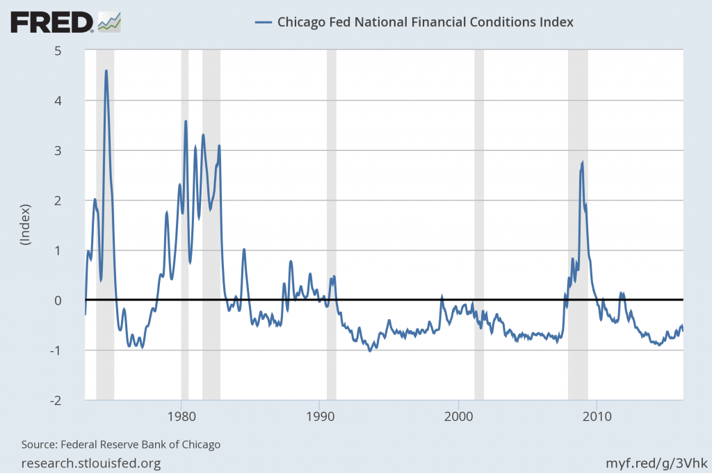
Two other indices that I regularly monitor include the Chicago Fed National Financial Conditions Index (NFCI) as well as the Chicago Fed Adjusted National Financial Conditions Index (ANFCI).
Here are summary descriptions of each, as seen in FRED:
The National Financial Conditions Index (NFCI) measures risk, liquidity and leverage in money markets and debt and equity markets as well as in the traditional and “shadow” banking systems. Positive values of the NFCI indicate financial conditions that are tighter than average, while negative values indicate financial conditions that are looser than average.
The adjusted NFCI (ANFCI). This index isolates a component of financial conditions uncorrelated with economic conditions to provide an update on how financial conditions compare with current economic conditions.
For further information, please visit the Federal Reserve Bank of Chicago’s web site:
Below are the most recently updated charts of the NFCI and ANFCI, respectively.
The NFCI chart below was last updated on March 30, 2016 incorporating data from January 5,1973 to March 25, 2016, on a weekly basis.  The March 25, 2016 value is -.66:
NFCI
Data Source: FRED, Federal Reserve Economic Data, Federal Reserve Bank of St. Louis; accessed March 30, 2016:
The ANFCI chart below was last updated on March 30, 2016 incorporating data from January 5,1973 to March 25, 2016, on a weekly basis.  The March 25 value is -.04:
ANFCI
Data Source: FRED, Federal Reserve Economic Data, Federal Reserve Bank of St. Louis; accessed March 30, 2016:
_________
I post various indicators and indices because I believe they should be carefully monitored.  However, as those familiar with this blog are aware, I do not necessarily agree with what they depict or imply.
_____
The Special Note summarizes my overall thoughts about our economic situation
SPX at 2061.38 as this post is written

Tuesday, March 29, 2016

Stock Market Capitalization To GDP – Through Q4 2015 – Update 2

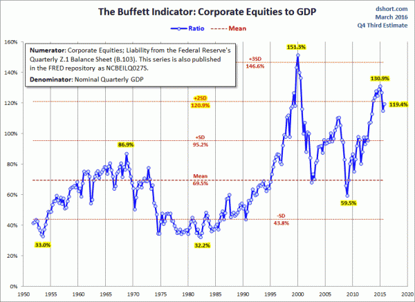
“Stock market capitalization to GDP” is a notable and important metric regarding stock market valuation.  In February of 2009 I wrote of it in “Does Warren Buffett’s Market Metric Still Apply?
Doug Short has recently published a post depicting this “stock market capitalization to GDP” metric.
As seen in his March 28, 2016 post titled “Market Cap to GDP:  An Increase in the Buffett Valuation Indicator” he shows two different versions, varying by the definition of stock market capitalization. (note:  additional explanation is provided in his post.)
For reference purposes, here is the first chart, with the stock market capitalization as defined by the Federal Reserve:
(click on charts to enlarge images)
market cap to GDP
Here is the second chart, with the stock market capitalization as defined by the Wilshire 5000:
stock market capitalization to GDP
As one can see in both measures depicted above, “stock market capitalization to GDP” is at notably high levels from a long-term historical perspective.
_____
The Special Note summarizes my overall thoughts about our economic situation
SPX at 2037.05 as this post is written
Monday, March 28, 2016

Corporate Profits As A Percentage Of GDP

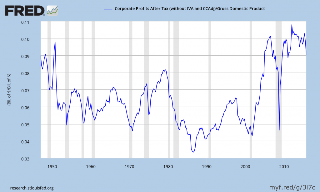
In the last post (“4th Quarter 2015 Corporate Profits“) I displayed, for reference purposes, a long-term chart depicting Corporate Profits After Tax.
There are many ways to view this measure, both on an absolute as well as relative basis.
One relative measure is viewing Corporate Profits as a Percentage of GDP.  I feel that this metric is important for a variety of reasons.  As well, the measure is important to a variety of parties, including investors, businesses, and government policy makers.
As one can see from the long-term chart below (updated through the fourth quarter), (After Tax) Corporate Profits as a Percentage of GDP is at levels that can be seen as historically (very) high.  While there are many reasons as to why this is so, from a going-forward standpoint I think it is important to recognize both that such a notable condition exists, as well as contemplate and/or plan for such factors and conditions that would come about if (and in my opinion “when”) a more historically “normal” ratio of Corporate Profits as a Percentage of GDP occurs.  This topic can be very complex in nature, and depends upon myriad factors.  In my opinion it deserves far greater recognition.
(click on chart to enlarge image)
Corporate Profits As A Percent Of GDP
Data Source: FRED, Federal Reserve Economic Data, Federal Reserve Bank of St. Louis; accessed March 28, 2016
_____
The Special Note summarizes my overall thoughts about our economic situation
SPX at 2035.94 as this post is written
4th Quarter 2015 Corporate Profits

Friday’s GDP release (Q4, 3rd Estimate)(pdf) was accompanied by the BLS Corporate Profits report for the 4th Quarter.
Of course, there are many ways to adjust and depict overall Corporate Profits.  For reference purposes, here is a chart from the St. Louis Federal Reserve (FRED) showing the Corporate Profits After Tax (last updated March 25, 2016, with a value of $1639.6 Billion):
Corporate Profits After Tax
Here is the Corporate Profits After Tax measure shown on a Percentage Change from a Year Ago perspective:
Corporate Profits Percent Change From Year Ago
Data Source: FRED, Federal Reserve Economic Data, Federal Reserve Bank of St. Louis: Corporate Profits After Tax [CP]; U.S. Department of Commerce: Bureau of Economic Analysis; accessed March 25, 2016; https://research.stlouisfed.org/fred2/series/CP
_____
The Special Note summarizes my overall thoughts about our economic situation
SPX at 2035.94 as this post is written
Thursday, March 24, 2016

Durable Goods New Orders – Long-Term Charts Through February 2016

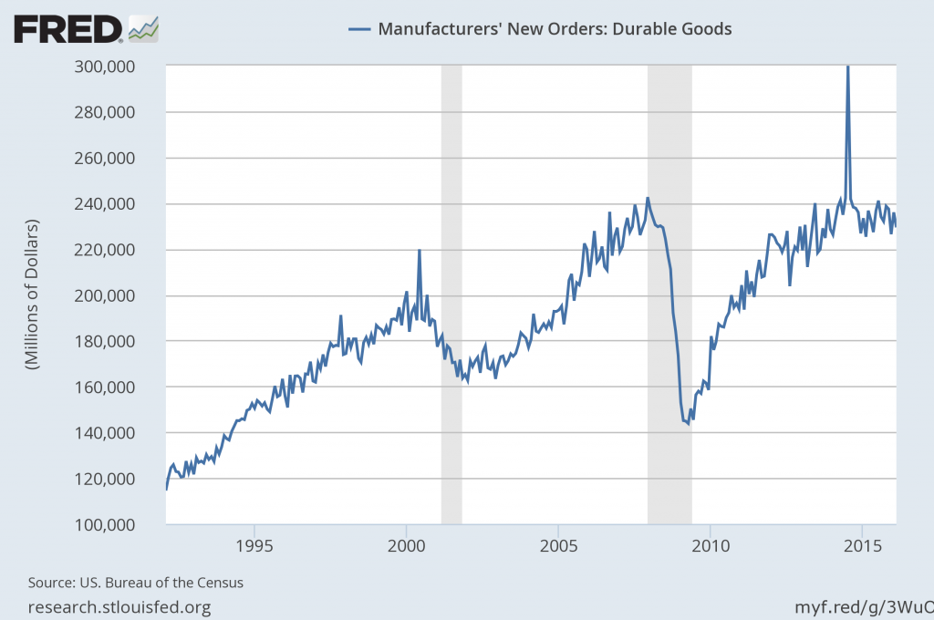
Many people place emphasis on Durable Goods New Orders as a prominent economic indicator and/or leading economic indicator.
For reference, below are two charts depicting this measure.
First, from the St. Louis Fed site (FRED), a chart through February 2016, updated on March 24, 2016. This value is $229,364 ($ Millions):
(click on charts to enlarge images)
durable goods new orders for February 2016
Second, here is the chart depicting this measure on a “Percentage Change from a Year Ago” basis:
durable goods new orders percent change from a year ago
Data Source: FRED, Federal Reserve Economic Data, Federal Reserve Bank of St. Louis: Manufacturers’ New Orders:  Durable Goods [DGORDER]; U.S. Department of Commerce: Census Bureau; accessed March 24, 2016;
_________
I post various indicators and indices because I believe they should be carefully monitored.  However, as those familiar with this blog are aware, I do not necessarily agree with what they depict or imply.
_____
The Special Note summarizes my overall thoughts about our economic situation
SPX at 2026.89 as this post is written
Wednesday, March 23, 2016

Chicago Fed National Financial Conditions Index (NFCI)

The St. Louis Fed’s Financial Stress Index (STLFSI) is one index that is supposed to measure stress in the financial system.  Its reading as of the March 17, 2016 update (reflecting data through March 11) is -.651.
Of course, there are a variety of other measures and indices that are supposed to measure financial stress and other related issues, both from the Federal Reserve as well as from private sources.
Two other indices that I regularly monitor include the Chicago Fed National Financial Conditions Index (NFCI) as well as the Chicago Fed Adjusted National Financial Conditions Index (ANFCI).
Here are summary descriptions of each, as seen in FRED:
The National Financial Conditions Index (NFCI) measures risk, liquidity and leverage in money markets and debt and equity markets as well as in the traditional and “shadow” banking systems. Positive values of the NFCI indicate financial conditions that are tighter than average, while negative values indicate financial conditions that are looser than average.
The adjusted NFCI (ANFCI). This index isolates a component of financial conditions uncorrelated with economic conditions to provide an update on how financial conditions compare with current economic conditions.
For further information, please visit the Federal Reserve Bank of Chicago’s web site:
Below are the most recently updated charts of the NFCI and ANFCI, respectively.
The NFCI chart below was last updated on March 23, 2016 incorporating data from January 5,1973 to March 18, 2016, on a weekly basis.  The March 18, 2016 value is -.64:
NFCI_3-23-16 -.64
Data Source: FRED, Federal Reserve Economic Data, Federal Reserve Bank of St. Louis; accessed March 23, 2016:
The ANFCI chart below was last updated on March 23, 2016 incorporating data from January 5,1973 to March 18, 2016, on a weekly basis.  The March 18 value is -.05:
ANFCI_3-23-16 -.05
Data Source: FRED, Federal Reserve Economic Data, Federal Reserve Bank of St. Louis; accessed March 23, 2016:
_________
I post various indicators and indices because I believe they should be carefully monitored.  However, as those familiar with this blog are aware, I do not necessarily agree with what they depict or imply.
_____
The Special Note summarizes my overall thoughts about our economic situation
SPX at 2043.54 as this post is written
The U.S. Economic Situation – March 23, 2016 Update

Perhaps the main reason that I write of our economic situation is that I continue to believe, based upon various analyses, that our economic situation is in many ways misunderstood.  While no one likes to contemplate a future rife with economic adversity, current and future economic problems must be properly recognized and rectified if high-quality, sustainable long-term economic vitality is to be realized.
There are an array of indications and other “warning signs” – many readily apparent – that current economic activity and financial market performance is accompanied by exceedingly perilous dynamics.
I have written extensively about this peril, including in the following:
Building Financial Danger” (ongoing updates)
My analyses continues to indicate that the growing level of financial danger will lead to the next stock market crash that will also involve (as seen in 2008) various other markets as well.  Key attributes of this next crash is its outsized magnitude (when viewed from an ultra-long term historical perspective) and the resulting economic impact.  This next financial crash is of tremendous concern, as my analyses indicate it will lead to a Super Depression – i.e. an economy characterized by deeply embedded, highly complex, and difficult-to-solve problems.
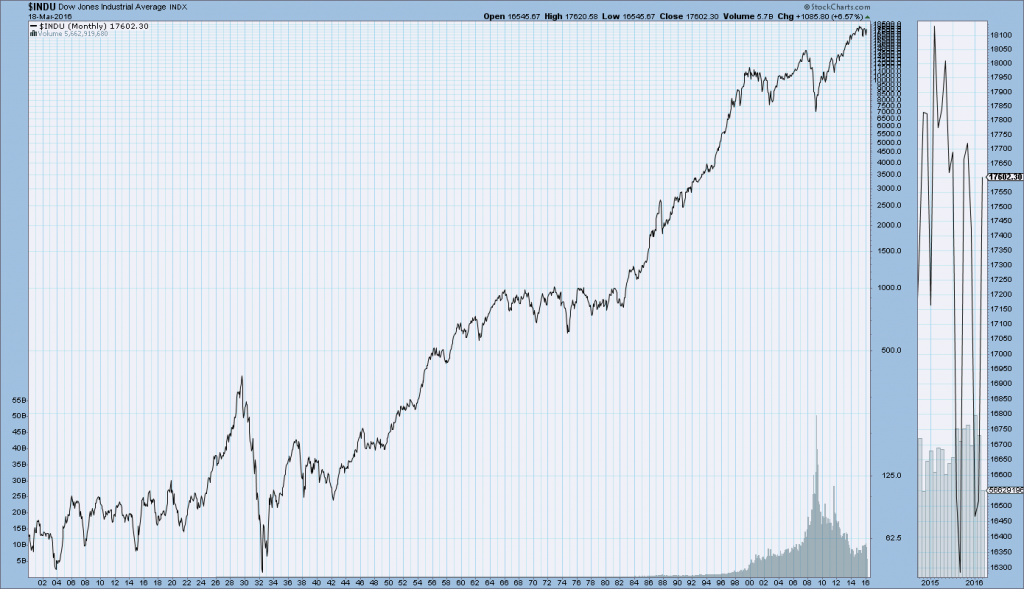
For long-term reference purposes, here is a chart of the Dow Jones Industrial Average since 1900, depicted on a monthly basis using a LOG scale (updated through March 18, 2016, with a last value of 17602.30):
(click on chart to enlarge image)(chart courtesy of StockCharts.com)
DJIA since 1900
_____
The Special Note summarizes my overall thoughts about our economic situation
SPX at 2043.38 as this post is written
Tuesday, March 22, 2016

Money Supply Charts Through February 2016

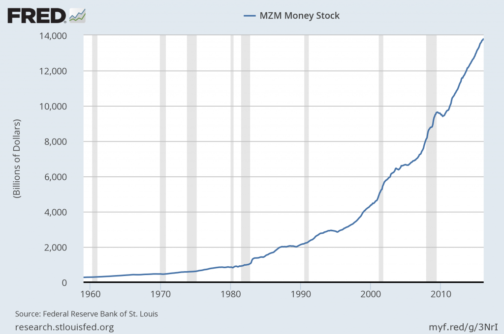
For reference purposes, below are two sets of charts depicting growth in the money supply.
The first shows the MZM (Money Zero Maturity), defined in FRED as the following:
M2 less small-denomination time deposits plus institutional money funds.
Money Zero Maturity is calculated by the Federal Reserve Bank of St. Louis.
Here is the “MZM Money Stock” (seasonally adjusted) chart, updated on March 11, 2016 depicting data through February 2016, with a value of $13,821.3 Billion:
MZM money supply
Here is the “MZM Money Stock” chart on a “Percent Change From Year Ago” basis:
MZM percent change from year ago
Data Source: FRED, Federal Reserve Economic Data, Federal Reserve Bank of St. Louis; accessed March 22, 2016:
The second set shows M2, defined in FRED as the following:
M2 includes a broader set of financial assets held principally by households. M2 consists of M1 plus: (1) savings deposits (which include money market deposit accounts, or MMDAs); (2) small-denomination time deposits (time deposits in amounts of less than $100,000); and (3) balances in retail money market mutual funds (MMMFs). Seasonally adjusted M2 is computed by summing savings deposits, small-denomination time deposits, and retail MMMFs, each seasonally adjusted separately, and adding this result to seasonally adjusted M1.
Here is the “M2 Money Stock” (seasonally adjusted) chart, updated on March 17, 2016, depicting data through February 2016, with a value of $12,472.8 Billion:
M2 money supply
Here is the “M2 Money Stock” chart on a “Percent Change From Year Ago” basis:
M2 Percent Change From Year Ago
Data Source: FRED, Federal Reserve Economic Data, Federal Reserve Bank of St. Louis; accessed March 22, 2016:
_____
The Special Note summarizes my overall thoughts about our economic situation
SPX at 2043.05 as this post is written

Monday, March 21, 2016

Updates Of Economic Indicators March 2016

Here is an update of various indicators that are supposed to predict and/or depict economic activity. These indicators have been discussed in previous blog posts:
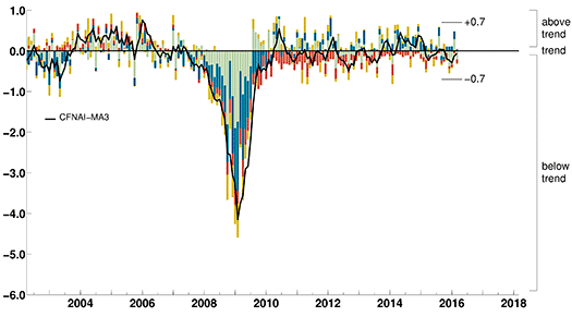
The March 2016 Chicago Fed National Activity Index (CFNAI) updated as of March 21, 2016: (current reading of -.29; current reading of CFNAI-MA3 is -.07):
CFNAI-MA3
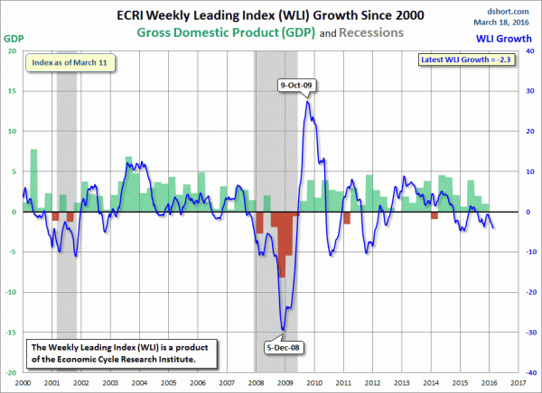
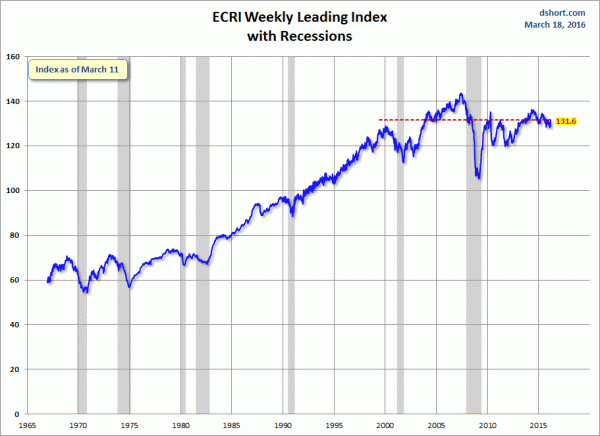
As of March 18, 2016 (incorporating data through March 11, 2016) the WLI was at 131.6 and the WLI, Gr. was at -2.3%.
A chart of the WLI,Gr., from Doug Short’s post of March 18, 2016, titled “ECRI Weekly Leading Index: WLI Up 1.0 From Last Week“:
ECRI WLI,Gr.
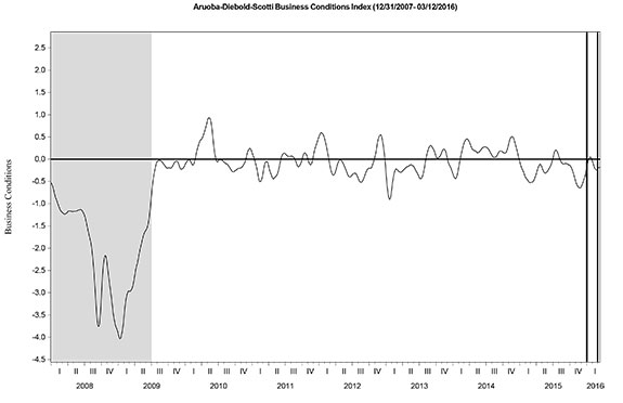
Here is the latest chart, depicting the ADS Index from December 31, 2007 through March 12, 2016:
ADS Index
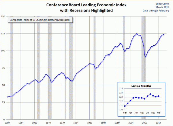
The Conference Board Leading (LEI), Coincident (CEI) Economic Indexes, and Lagging Economic Indicator (LAG):
As per the March 17, 2016 press release, titled “The Conference Board Leading Economic Index (LEI) for the U.S. Increased Slightly,” (pdf) the LEI was at 123.2, the CEI was at 113.3, and the LAG was 120.4 in February.
An excerpt from the March 17 release:
“The U.S. LEI increased slightly in February, after back-to-back monthly declines, but housing permits, stock prices, consumer expectations, and new orders remain sources of weakness,” said Ataman Ozyildirim, Director of Business Cycles and Growth Research at The Conference Board. “Although the LEI’s six-month growth rate has moderated considerably in recent months, the outlook remains positive with little chance of a downturn in the near-term.”
Here is a chart of the LEI from Doug Short’s blog post of March 17 titled “Conference Board Leading Economic Index: Slight Increase in February“:
Conference Board LEI
_________
I post various indicators and indices because I believe they should be carefully monitored.  However, as those familiar with this blog are aware, I do not necessarily agree with what they depict or imply.
_____
The Special Note summarizes my overall thoughts about our economic situation
SPX at 2045.41 as this post is written

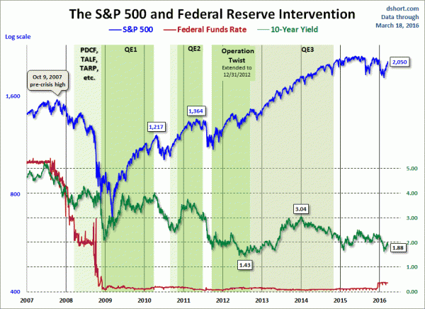
Markets During Periods Of Federal Reserve Intervention – March 21, 2016 Update

In the August 9, 2011 post (“QE3 – Various Thoughts“) I posted a chart that depicted the movements of the S&P500, 10-Year Treasury Yield and the Fed Funds rate spanning the periods of various Federal Reserve interventions since 2007.
For reference purposes, here is an updated chart (through March 18, 2016) from Doug Short’s blog post of March 18  (“Treasury Snapshot:  10-Year Note at 1.88%“):
financial markets during intervention
_____
The Special Note summarizes my overall thoughts about our economic situation
SPX at 2049.29 as this post is written
Friday, March 18, 2016

Long-Term Charts Of The ECRI WLI & ECRI WLI, Gr. – March 18, 2016 Update

As I stated in my July 12, 2010 post (“ECRI WLI Growth History“):
For a variety of reasons, I am not as enamored with ECRI’s WLI and WLI Growth measures as many are.
However, I do think the measures are important and deserve close monitoring and scrutiny.
Below are three long-term charts, from Doug Short’s blog post of March 18, 2016 titled “ECRI Weekly Leading Index:  Up 1.0 From Last Week.”  These charts are on a weekly basis through the March 18, 2016 release, indicating data through March 11, 2016.
Here is the ECRI WLI (defined at ECRI’s glossary):
ECRI WLI
This next chart depicts, on a long-term basis, the Year-over-Year change in the 4-week moving average of the WLI:
Dshort 3-18-16 - ECRI-WLI-YoY -.69 percent
This last chart depicts, on a long-term basis, the WLI, Gr.:
ECRI WLI, Gr.
_________
I post various economic indicators and indices because I believe they should be carefully monitored.  However, as those familiar with this blog are aware, I do not necessarily agree with what they depict or imply.
_____
The Special Note summarizes my overall thoughts about our economic situation
SPX at 2046.76 as this post is written

Trends Of S&P500 Earnings Forecasts

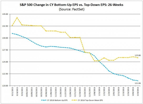
S&P500 earnings trends and estimates are a notably important topic, for a variety of reasons, at this point in time.
FactSet publishes a report titled “Earnings Insight” that contains a variety of information including the trends and expectations of S&P500 earnings.
For reference purposes, here are two charts as seen in the “Earnings Insight” (pdf) report of March 11, 2016:
from page 19:
(click on charts to enlarge images)
S&P500 earnings estimates 2016
from page 20:
S&P500 annual earnings 2006-2017
_____
I post various economic forecasts because I believe they should be carefully monitored.  However, as those familiar with this blog are aware, I do not agree with many of the consensus estimates and much of the commentary in these forecast surveys.
_____
The Special Note summarizes my overall thoughts about our economic situation
SPX at 2040.59 as this post is written