Thursday, June 30, 2016

10-Year Treasury Yields – Two Long-Term Charts As Of June 30, 2016

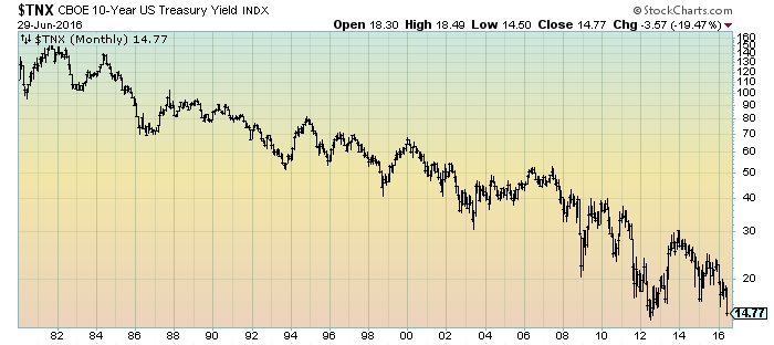
On Wednesday (June 29, 2016) the yield on the 10-Year Treasury closed at 1.477%.
As a reference, here is a long-term chart of the 10-Year Treasury yield since 1980, depicted on a monthly basis, LOG scale:
(click on charts to enlarge images)(charts courtesy of StockCharts.com; chart creation and annotation by the author)
10-Year Treasury Yield since 1980
Here is a long-term chart of the 10-Year Treasury yield since 2008, depicted on a daily basis, LOG scale:
10-Year Treasury Yield
_____
The Special Note summarizes my overall thoughts about our economic situation
SPX at 2070.77 as this post is written

Wednesday, June 29, 2016

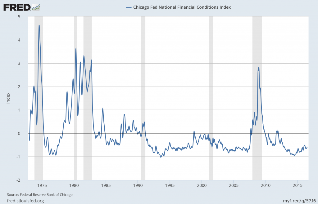
Chicago Fed National Financial Conditions Index (NFCI)

The St. Louis Fed’s Financial Stress Index (STLFSI) is one index that is supposed to measure stress in the financial system.  Its reading as of the June 23, 2016 update (reflecting data through June 17) is -.868.
Of course, there are a variety of other measures and indices that are supposed to measure financial stress and other related issues, both from the Federal Reserve as well as from private sources.
Two other indices that I regularly monitor include the Chicago Fed National Financial Conditions Index (NFCI) as well as the Chicago Fed Adjusted National Financial Conditions Index (ANFCI).
Here are summary descriptions of each, as seen in FRED:
The National Financial Conditions Index (NFCI) measures risk, liquidity and leverage in money markets and debt and equity markets as well as in the traditional and “shadow” banking systems. Positive values of the NFCI indicate financial conditions that are tighter than average, while negative values indicate financial conditions that are looser than average.
The adjusted NFCI (ANFCI). This index isolates a component of financial conditions uncorrelated with economic conditions to provide an update on how financial conditions compare with current economic conditions.
For further information, please visit the Federal Reserve Bank of Chicago’s web site:
Below are the most recently updated charts of the NFCI and ANFCI, respectively.
The NFCI chart below was last updated on June 29, 2016 incorporating data from January 5,1973 to June 24, 2016, on a weekly basis.  The June 24, 2016 value is -.58:
NFCI
Data Source: FRED, Federal Reserve Economic Data, Federal Reserve Bank of St. Louis; accessed June 29, 2016:
The ANFCI chart below was last updated on June 29, 2016 incorporating data from January 5,1973 to June 24, 2016, on a weekly basis.  The June 24 value is .07:
ANFCI
Data Source: FRED, Federal Reserve Economic Data, Federal Reserve Bank of St. Louis; accessed June 29, 2016:
_________
I post various indicators and indices because I believe they should be carefully monitored.  However, as those familiar with this blog are aware, I do not necessarily agree with what they depict or imply.
_____
The Special Note summarizes my overall thoughts about our economic situation
SPX at 2065.36 as this post is written

Four Charts Of Recent S&P500 Price Volatility – June 29, 2016

This post is an update to past posts regarding stock market volatility.
While I track many different measures of volatility, I find the following charts to be both simple and clear in depicting the recent volatility in the stock market.
Overall, my analyses indicates that there are many reasons for this volatility, and the volatility is highly significant.
For reference purposes, shown below are four charts with y-axis price labels.
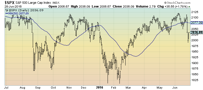
First, a one-year daily depiction of the S&P500 through yesterday’s (June 28, 2016) close, with a 50-day moving average (MA50) depicted by the blue line:
(click on chart to enlarge image)(charts courtesy of StockCharts.com)
S&P500 1-year daily
Second, a three-month daily depiction of the S&P500 through yesterday’s (June 28, 2016) close, with a 50-day moving average (MA50) depicted by the blue line:
(click on chart to enlarge image)(chart courtesy of StockCharts.com)
S&P500 daily
Third, a three-month depiction of the S&P500 in 60-minute intervals through yesterday’s (June 28, 2016) close, with a 50-hour moving average (MA50) depicted by the blue line:
S&P500 3-months 60-minutes
Fourth, a three-month depiction of the S&P500 in 10-minute intervals through yesterday’s (June 28, 2016) close, with a 50-period moving average (MA50) depicted by the blue line:
S&P500 3-month 10-minute intervals
_____
The Special Note summarizes my overall thoughts about our economic situation
SPX at 2036.09 as this post is written
Deloitte “CFO Signals” Report Q2 2016 – Notable Aspects

Recently Deloitte released their “CFO Signals” “High-Level Summary” report for the 2nd Quarter of 2016.
As seen in page 2 of the report, “One hundred forty CFOs responded during the two-week period ending May 20. Seventy-two percent of respondents are from public companies, and 78% are from companies with more than $1B in annual revenue. For more information, please see the “About the survey” section of this report."
Here are some of the excerpts that I found notable:
from page 3:
How do you regard the current and future status of the North American, Chinese, and European economies? Forty percent of CFOs describe the North American economy as good or very good (41% last quarter), and 39% expect better conditions in a year (up from 35% last quarter). Nine percent regard China’s economy as good (same as last quarter), and 10% expect improvement (down from 11%). Six percent describe Europe’s economy as good (up from 5%), and only 15% see it improving in a year (down from 17%). Page 8.
What is your perception of the capital markets? Fifty-six percent of CFOs say US equity markets are overvalued (up dramatically from 30% last quarter). Eighty percent say debt is currently an attractive financing option (up from 68%), and 30% of public company CFOs view equity financing favorably (up from 22% last quarter). Page 9.
Compared to the past 12 months, how do you expect your key operating metrics to change over the next 12 months?* Revenue growth expectations rose from 3.3% to 4.0%, but are still among their survey lows. Earnings growth expectations rose to 7.7% from last quarter’s survey-low 6.0%. Capital spending expectations rebounded strongly from last quarter’s survey-low 1.7% to 5.4%. Domestic hiring growth expectations rose to 1.1% from last quarter’s survey-low 0.6%. Pages 11-13.
*Averages are means that have been adjusted to eliminate the effects of stark outliers.
from page 4:
Better (but not good) expectations
This quarter’s net optimism¹ of +30.0 marks a sharp reversal from declining sentiment that left last quarter’s measure at +1.7—the lowest level in more than three years. Sentiment is net-positive across all industries, with both Manufacturing and Energy/Resources posting significantly more optimism than they did last quarter. Consistent with this reversal, CFOs’ expectations for revenue, earnings, capital spending, and domestic hiring all rebounded from last quarter’s mostly dismal levels. But the gains for some metrics were modest. Revenue growth expectations, for example, rose from last quarter’s 3.3%* to 4.0%,* but remain relatively low. Moreover, nearly all industries continue to show weakness, with Manufacturing again lowest. Similarly, earnings growth expectations rebounded from their survey-low 6.0%* last quarter to 7.7%*—better, but still well off the long-term average. All industries expect positive growth (with Energy/Resources and Healthcare/Pharma highest and Manufacturing improving), but most are still comparatively low. Domestic hiring growth expectations rose to 1.1%* from last quarter’s survey-low 0.6%,* but they are still relatively low as well. Energy/Resources, Manufacturing, and Services were all below 0.5%. Capital spending is the bright spot, rebounding strongly from last quarter’s survey-low 1.7%* to 5.4%*—the highest level since the second quarter of 2015. Expectations for Manufacturing improved, but Energy/Resources again lagged.
* Arithmetic means adjusted to eliminate the effects of stark outliers
from page 11:
Revenue and earnings
What are CFOs’ expectations for their companies’ year-over-year revenue and earnings?
Revenue¹
Expectations bounced back somewhat, but are still among their survey lows; weakness is again evident across nearly all industries:
• Last quarter’s revenue growth expectations were 3.3%, only slightly above the 2Q15 survey low of 3.1% and well below the prior quarter’s 5.9%. This quarter’s expectations improved to 4.0%, but are still among the lowest levels in the survey’s history. The median expectation rose from a survey-low 3.0% to 4.0%, and just 72% of CFOs expect yearover-year gains (a new survey low). The distribution² of this quarter’s responses is among the widest on record.
• Country-specific expectations are 3.7% for the US (up from 3.3% last quarter), 3.1% for Canada (up from 2.2%), and 8.6% for Mexico (up from 4.5%).
• Industry expectations are mostly low, with Manufacturing lowest at 2.1% (up from 0.7% last quarter) and Energy/Resources at 3.1% (even with last quarter). Technology and T/M/E are the only industries above 6%, at 6.7% and 6.9%, respectively.
Earnings¹
Expectations improved across all geographies and recorded a substantial rebound in Manufacturing:
• This quarter’s earnings growth expectations came in at 7.7%, significantly above last quarter’s survey-low 6.0%. The median rebounded from 5.0% to 7.0%, but the percentage of CFOs expecting year-over-year gains fell from 79% last quarter to just 76%—a new survey low. The distribution² of responses was well above the two-year average.
• Country-specific expectations are 7.3% for the US (up from 6.4% last quarter), 9.4% for Canada (up from 4.2%), and 9.7% for Mexico (up from 3.1%).
• All industries expect positive growth, with Healthcare/Pharma and Energy/Resources highest at 11% and 10%, respectively. Manufacturing improved from 5% to 8%. Technology and Services are again comparatively low at around 6%.
[1] All averages have been adjusted to eliminate the effects of stark outliers.
[2] “Distribution” refers to the spread of the middle 90% of responses.
from page 13:

Employment

What are CFOs’ expectations for their companies’ year-over-year hiring?
Domestic hiring¹
Expectations rebounded to levels consistent with a year ago:
• Domestic hiring expectations rose to 1.1%, up from last quarter’s survey-low 0.6% and consistent with 2015 levels. The median rose from 0.0% to 1.0%, a bit above the survey average of 0.7%. The proportion of CFOs expecting gains rose from 47% to 55% and is back near the survey average. The distribution² of responses is about average compared to recent quarters.
• Country-specific expectations are 0.9% for the US (above last quarter’s 0.7%, but still at the second-lowest level in three years), 0.9% for Canada (up from - 0.9% last quarter), and 3.9% for Mexico (up from 2.7% last quarter).
• Technology, T/M/E, and Retail/Wholesale are highest at 3.2%, 2.7%, and 2.0%, respectively. Energy/Resources again indicated a contraction (-0.5%, which is about even with last quarter). Manufacturing and Services were also low, both with estimates below 0.5%.
Offshore hiring¹
Expectations declined and are again well below their long-term average:
• Offshore hiring growth fell to 1.8%, down slightly from last quarter’s 1.9% and the lowest level in three years. The median remains at 0.0%, and just 39% of CFOs expect year-over-year gains (down from last quarter’s 45%).
• Country-specific expectations are 1.9% for the US (up slightly from 1.8%), 0.0% for Canada (down from 2.8%), and 1.6% for Mexico (up from 0.4%).
• Technology again indicates the highest expectation at 4.0% (up from 3.4%), with Energy/Resources and Healthcare/Pharma the lowest at 0.0% and 0.5%, respectively.
Domestic wage growth¹
Expectations up significantly, possibly indicative of upward wage pressures:
• Domestic wage growth rose to 3.1%, up from last quarter’s 2.5%. The median held at 3.0%, and 96% of CFOs expect year-over-year gains.
• Country-specific expectations are 3.1% for the US (up from 2.5%), 2.2% for Canada (up from 2.1%), and 4.6% for Mexico (up from 4.1%).
• All industry-specific expectations are between 2.6% and 3.9% (versus 2.2% and 3.1% last quarter), with Energy/Resources and Healthcare/Pharma on the low end and Technology highest.
[1] All averages have been adjusted to eliminate the effects of stark outliers.
[2] “Distribution” refers to the spread of the middle 90% of responses.
Please see full report for industry-specific findings.
from page 15:

Most worrisome risks

Which external and internal risks do CFOs regard as most worrisome?
External concerns: Rising concerns about oil prices, the US economy, and politics:
• Still-rising commodity price worries: After climbing significantly last quarter, worries about oil and other commodity prices continued to rise this quarter.
• Continuing concerns about broader global economic volatility: For the last two quarters, CFOs’ concerns appeared to shift from a specific focus on Europe and China to a more generalized focus on global economic stagnation and volatility. This trend largely continue this quarter, but was offset somewhat by rising concerns about the US economy.
• Sharply rising concerns about the US economy: Where last quarter’s rising concern was driven mostly by worries about the effects of struggling equity markets on consumer demand, this quarter’s rise appears driven by worries about US political and policy uncertainty as the 2016 elections approach.
• Sharply rising election and policy concerns: Regulatory concerns are again strong and industry dependent. US presidential election worries skyrocketed this quarter, with CFOs citing growing uncertainty around international trade, government spending, and tax policy.
• Declining concerns about financial markets: With equity markets having mostly recovered since last quarter’s survey, concerns about financial markets declined this quarter. Concerns about interest rates and a strong dollar continued, however, and worries about global debt levels (for both China and elsewhere) emerged as a growing concern.
Internal concerns: Rising concerns about growth
• Consistent talent challenges: Concerns around retention, an aging workforce, and leadership turnover continued this quarter.
• Escalating growth and execution concerns: CFOs voiced growing concerns about finding growth opportunities, executing their growth initiatives, innovating, and executing against their strategies and plans.
Among the various charts and graphics in the report are graphics depicting trends in “Own Company Optimism” and “Economic Optimism” found on page 6.
_____
I post various business and economic surveys because I believe they should be carefully monitored.  However, as those familiar with this blog are aware, I do not necessarily agree with many of the consensus estimates and much of the commentary in these surveys.
_____
The Special Note summarizes my overall thoughts about our economic situation
SPX at 2036.09 as this post is written
Tuesday, June 28, 2016

Consumer Confidence Surveys – As Of June 28, 2016

Doug Short had a blog post of June 28, 2016 (“Consumer Confidence Rebounds in June“) in which he presents the latest Conference Board Consumer Confidence and Thomson/Reuters University of Michigan Consumer Sentiment Index charts.  They are presented below:
(click on charts to enlarge images)
Conference Board Consumer Confidence
Michigan Consumer Sentiment
There are a few aspects of the above charts that I find highly noteworthy.  Of course, until the recent sudden upswing, the continued subdued absolute levels of these two surveys was disconcerting.
Also, I find the “behavior” of these readings to be quite disparate as compared to the other post-recession periods, as shown in the charts between the gray shaded areas (the gray areas denote recessions as defined by the NBER.)
While I don’t believe that confidence surveys should be overemphasized, I find these readings to be very problematical, especially in light of a variety of other highly disconcerting measures highlighted throughout this site.
_____
The Special Note summarizes my overall thoughts about our economic situation
SPX at 2019.34 as this post is written

U.S. Deflation – June 28, 2016 Update

This post provides an update to various past posts discussing deflation and “deflationary pressures,” including the most recent post, that of January 27, 2016 titled “U.S. Deflation – January 27, 2016 Update.”   I have extensively written of “deflationary pressures” and deflation as I continue to believe that prolonged and deep U.S. deflationary conditions are on the horizon, and that such deflationary conditions will cause, as well as accompany, inordinate economic hardship. [note: to clarify, for purposes of this discussion, when I mention “deflation” I am referring to the CPI going below zero. Also, I have been using the term “deflationary pressures” as a term to describe deflationary manifestations within an environment that is still overall inflationary but heading towards deflation.]
The subject of deflation contains many complex aspects, and accordingly no short discussion can even begin to be a comprehensive discussion of such.  However, in this post I would like to highlight some recent notable developments.
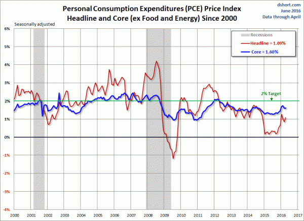
Of note, the shortfall between the Federal Reserve’s stated inflation target (2% on the PCE Price Index) and the actual inflation reading continues.  This 2% inflation target has been “missed” (inflation has been less than 2%) for well over three years.  For reference, here is a chart of the PCE Price Index from Doug Short’s post of June 1, 2016, titled “Minimal Change in the April PCE Price Index“:
PCE Price Index
These readings can be compared against the CPI figures.  As one can see, "core" CPI remains somewhat higher than the "core" PCE Price Index:
CPI
Janet Yellen briefly commented about inflation in the June 15, 2016 FOMC Press Conference:
Our inflation outlook also rests importantly on our judgment that longer-run inflation expectations remain reasonably well anchored. However, we can’t take the stability of longer-run inflation expectations for granted. While most survey measures of longer-run inflation expectations show little change, on balance, in recent months, financial market-based measures of inflation compensation have declined. Movements in these indicators reflect many factors and therefore may not provide an accurate reading on changes in the inflation expectations that are most relevant for wages and prices. Nonetheless, in considering future policy decisions, we will continue to carefully monitor actual and expected progress toward our inflation goal.
Trying to assess and/or predict the possibility of U.S. deflation is very challenging for many reasons.  Among these reasons is that there are many different measures that are supposed to predict and/or depict the possibility of deflation, and they can show apparently contradictory readings.  Among these measures are both survey-based as well as market-based measures.
Another challenge is that deflation in the U.S. has been relatively non-existent since the beginning of the 20th Century.  As such, knowledge and "practical experience" with deflation is lacking.  As seen in the below chart (from Doug Short's June 16, 2016 post titled "A Long-Term Look at Inflation") with the exception of The Great Depression prolonged periods of pronounced deflation have practically been nonexistent, especially after 1950:
Long-term inflation
However, there are many reasons that I believe that U.S. deflation of a pronounced and lasting nature will occur.  Among the reasons are the following:
  • As mentioned above, the continuing inability to "create" inflation to rise above the 2% goal.
  • Prolonged and pronounced economic low- and no-growth levels experienced globally.   While there is widespread consensus that U.S. economic growth will remain positive for the foreseeable future, my analyses indicates that the economy continues to have many highly problematical areas and that the widespread consensus concerning current and future economic growth is (substantially) incorrect.  Substantial economic weakness (i.e. contraction) and deflation often occur simultaneously.
  • A continued "flattening" of the Yield Curve, as discussed in the June 21, 2016 post "The Yield Curve - June 21, 2016."
  • Continual indications of "deflationary pressures."  I have written extensively concerning these persistent "deflationary pressures," which have manifested in a variety of areas.
  • Worrisome trends in various "market-based" (and to a lesser extent "survey-based") inflationary expectations.  While there are many of these measures, one is the “10-Year Breakeven Inflation Rate.”  It is described in FRED as:
    The breakeven inflation rate represents a measure of expected inflation derived from 10-Year Treasury Constant Maturity Securities (http://research.stlouisfed.org/fred2/series/DGS10 ) and 10-Year Treasury Inflation-Indexed Constant Maturity Securities (http://research.stlouisfed.org/fred2/series/DFII10 ). The latest value implies what market participants expect inflation to be in the next 10 years, on average.
    Here is the long-term chart, with a reading of 1.50 percent as of the June 23, 2016 reading:
    T10YIE
source:  Federal Reserve Bank of St. Louis, 10-Year Breakeven Inflation Rate [T10YIE], retrieved from FRED, Federal Reserve Bank of St. Louis, June 27, 2016:  https://research.stlouisfed.org/fred2/series/T10YIE/
  • Disconcerting readings and trends from the State Street PriceStats Inflation Series.
  • An additional concern is the seemingly (very) high levels of inventory, as seen in various measures, such as Total Business:  Inventories to Sales Ratio (currently seen at 1.40 as of the April 2016 reading, updated as of June 14, 2016.)  While, for many reasons, it is difficult to know how much of a future problem this seemingly elevated inventory level is, it definitely has the potential to be highly problematical and a substantial "driver" of future price deflation, especially during an economic contraction.
It should be noted that there are many other measures of current and future inflation that imply little or no worrisome trends.  However, as I have mentioned previously, the methods in which deflation "plays out" is not necessarily incongruent with various indicators seemingly indicating little chance of deflation prior to a deflationary period.
In conclusion, I continue to believe that significant (in extent and duration) U.S. deflation is on the horizon.  As discussed in the November 14, 2013 post (“Thoughts Concerning Deflation”) deflation often accompanies financial system distress.  My analyses continue to show an exceedingly complex and difficult future financial condition in which an immensely large “financial system crash” will occur, during and after which outright deflation will both accompany and exacerbate economic and financial conditions.
_____
The Special Note summarizes my overall thoughts about our economic situation
SPX at 2000.54 as this post is written
Friday, June 24, 2016

Durable Goods New Orders – Long-Term Charts Through May 2016

Many people place emphasis on Durable Goods New Orders as a prominent economic indicator and/or leading economic indicator.
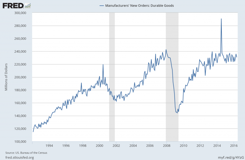
For reference, below are two charts depicting this measure.
First, from the St. Louis Fed site (FRED), a chart through May 2016, updated on June 24, 2016. This value is $230,701 ($ Millions):
(click on charts to enlarge images)
durable goods new orders
Second, here is the chart depicting this measure on a “Percentage Change from a Year Ago” basis:
Durable Goods New Orders percent change from year ago
Data Source: FRED, Federal Reserve Economic Data, Federal Reserve Bank of St. Louis: Manufacturers’ New Orders:  Durable Goods [DGORDER]; U.S. Department of Commerce: Census Bureau; accessed June 24, 2016;
_________
I post various indicators and indices because I believe they should be carefully monitored.  However, as those familiar with this blog are aware, I do not necessarily agree with what they depict or imply.
_____
The Special Note summarizes my overall thoughts about our economic situation
SPX at 2043.68 as this post is written
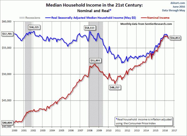
Median Household Income Chart

I have written many blog posts concerning the worrisome trends in income and earnings.
Doug Short, in his June 23, 2016 post titled “Real Median Household Income Declined Again in May” produced the chart below.  It is based upon data from Sentier Research, and it shows both nominal and real median household incomes since 2000, as depicted.  As one can see, post-recession real median household income (seen in the blue line since 2009) remains worrisome.
(click on chart to enlarge image)
median household income
As Doug mentions in his aforementioned post:
As the excellent data from Sentier Research makes clear, the mainstream U.S. household was struggling before the Great Recession. At this point, real household incomes are about where they were during the middle of the Great Recession.
Among other items seen in his blog post is a chart depicting each of the two (nominal and real household incomes) data series’ percent change over time since 2000.
_________
I post various indicators and indices because I believe they should be carefully monitored.  However, as those familiar with this site are aware, I do not necessarily agree with what they depict or imply.
_____
The Special Note summarizes my overall thoughts about our economic situation
SPX at 2113.32 as this post is written
Trends Of S&P500 Earnings Forecasts

S&P500 earnings trends and estimates are a notably important topic, for a variety of reasons, at this point in time.
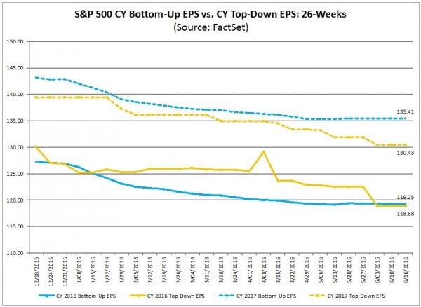
FactSet publishes a report titled “Earnings Insight” that contains a variety of information including the trends and expectations of S&P500 earnings.
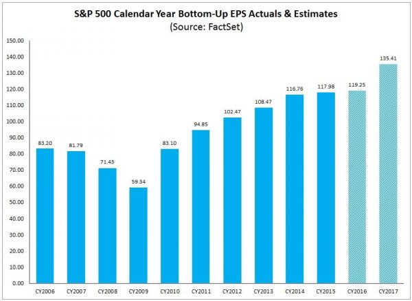
For reference purposes, here are two charts as seen in the “Earnings Insight” (pdf) report of June 17, 2016:
from page 19:
(click on charts to enlarge images)
S&P500 earnings 2016 and 2017
from page 20:
S&P500 annual EPS
_____
I post various economic forecasts because I believe they should be carefully monitored.  However, as those familiar with this blog are aware, I do not agree with many of the consensus estimates and much of the commentary in these forecast surveys.
_____
The Special Note summarizes my overall thoughts about our economic situation
SPX at 2113.42 as this post is written
Thursday, June 23, 2016

S&P500 2016, 2017 & 2018 EPS Forecasts

As many are aware, Thomson Reuters publishes earnings estimates for the S&P500.  (My other posts concerning S&P earnings estimates can be found under the S&P500 Earnings label)
The following estimates are from Exhibit 20 of the “S&P500 Earnings Scorecard” (pdf) of June 23, 2016, and represent an aggregation of individual S&P500 component “bottom up” analyst forecasts.  For reference, the Year 2014 value is $118.78/share and the Year 2015 value is $117.46:
Year 2016 estimate:
$118.38/share
Year 2017 estimate:
$135.42/share
Year 2018 estimate:
$149.24/share
_____
I post various economic forecasts because I believe they should be carefully monitored.  However, as those familiar with this blog are aware, I do not agree with many of the consensus estimates and much of the commentary in these forecast surveys.
_____
The Special Note summarizes my overall thoughts about our economic situation
SPX at 2113.32 as this post is written

Standard & Poor’s S&P500 Earnings Estimates For 2016 & 2017 – As Of June 16, 2016

As many are aware, Standard & Poor’s publishes earnings estimates for the S&P500.  (My posts concerning their estimates can be found under the S&P500 Earnings label)
For reference purposes, the most current estimates are reflected below, and are as of June 16, 2016:
Year 2016 estimates add to the following:
-From a “bottom up” perspective, operating earnings of $114.61/share
-From a “top down” perspective, operating earnings of N/A
-From a “bottom up” perspective, “as reported” earnings of $105.77/share
Year 2017 estimates add to the following:
-From a “bottom up” perspective, operating earnings of $134.38/share
-From a “top down” perspective, operating earnings of N/A
-From a “bottom up” perspective, “as reported” earnings of $124.94/share
_____
I post various economic forecasts because I believe they should be carefully monitored.  However, as those familiar with this blog are aware, I do not agree with many of the consensus estimates and much of the commentary in these forecast surveys.
_____
The Special Note summarizes my overall thoughts about our economic situation
SPX at 2113.32 as this post is written

Updates Of Economic Indicators June 2016

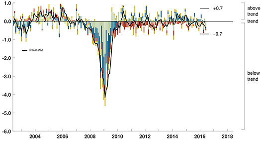
Here is an update of various indicators that are supposed to predict and/or depict economic activity. These indicators have been discussed in previous blog posts:
The June 2016 Chicago Fed National Activity Index (CFNAI) updated as of June 23, 2016: (current reading of CFNAI is -.51; current reading of CFNAI-MA3 is -.36):
CFNAI-MA3
As of June 17, 2016 (incorporating data through June 10, 2016) the WLI was at 136.5 and the WLI, Gr. was at 7.1%.
A chart of the WLI,Gr., from Doug Short’s post of June 17, 2016, titled “ECRI Weekly Leading Index:  WLI Down Slightly, But Growth Index Increases”:
ECRI WLI,Gr.
Here is the latest chart, depicting the ADS Index from December 31, 2007 through June 11, 2016:
ADS Index
The Conference Board Leading (LEI), Coincident (CEI) Economic Indexes, and Lagging Economic Indicator (LAG):
As per the June 23, 2016 press release, titled “The Conference Board Leading Economic Index (LEI) for the U.S. Declined,” (pdf) the LEI was at 123.7, the CEI was at 113.5, and the LAG was 121.9 in May.
An excerpt from the June 23 release:
“The US LEI declined in May, primarily due to a sharp increase in initial claims for unemployment insurance. The growth rate of the LEI has moderated over the past year,” said Ataman Ozyildirim, Director of Business Cycles and Growth Research at The Conference Board. “While the LEI suggests the economy will continue growing at a moderate pace in the near term, volatility in financial markets and a moderating outlook in labor markets could pose downside risks to growth.”
Here is a chart of the LEI from Doug Short’s blog post of June 23 titled “Conference Board Leading Economic Index: Decrease in May“:
Conference Board LEI
_________
I post various indicators and indices because I believe they should be carefully monitored.  However, as those familiar with this blog are aware, I do not necessarily agree with what they depict or imply.
_____
The Special Note summarizes my overall thoughts about our economic situation
SPX at 2101.54 as this post is written