As I have commented previously, as in the October 6, 2009 post (“A Note About Unemployment Statistics”), in my opinion the official methodologies used to measure the various job loss and unemployment statistics do not provide an accurate depiction; they serve to understate the severity of unemployment.
However, even if one chooses to look at the official statistics, the following charts provide an interesting (and disconcerting) long-term perspective of certain aspects of the officially-stated unemployment (and, in the third chart, employment) situation.
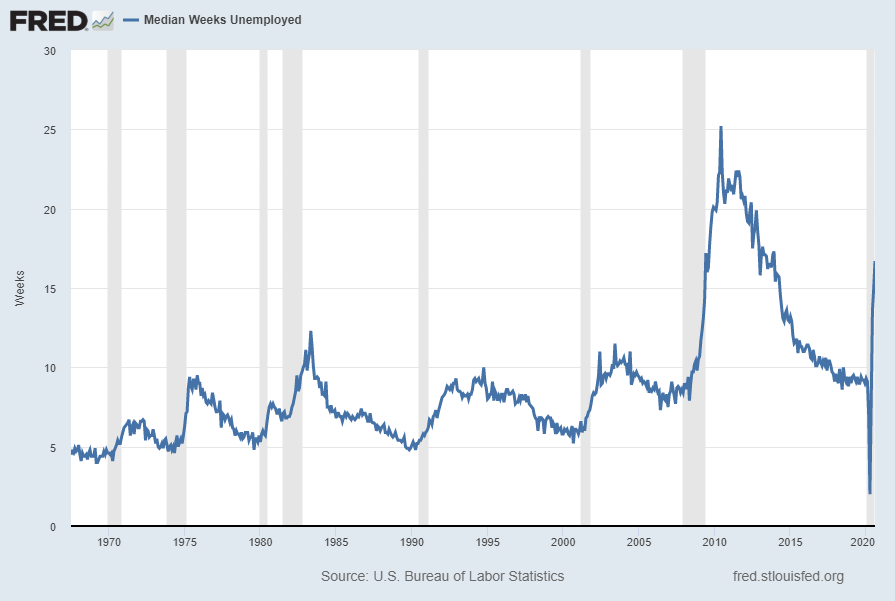
The three charts below are from the St. Louis Fed site. Here is the Median Duration of Unemployment (current value = 16.7 weeks):
(click on charts to enlarge images)(charts updated as of 9-4-20)

Data Source: FRED, Federal Reserve Economic Data, Federal Reserve Bank of St. Louis: Median Duration of Unemployment [UEMPMED] ; U.S. Department of Labor: Bureau of Labor Statistics; accessed September 4, 2020:
http://research.stlouisfed.org/fred2/series/UEMPMED
–
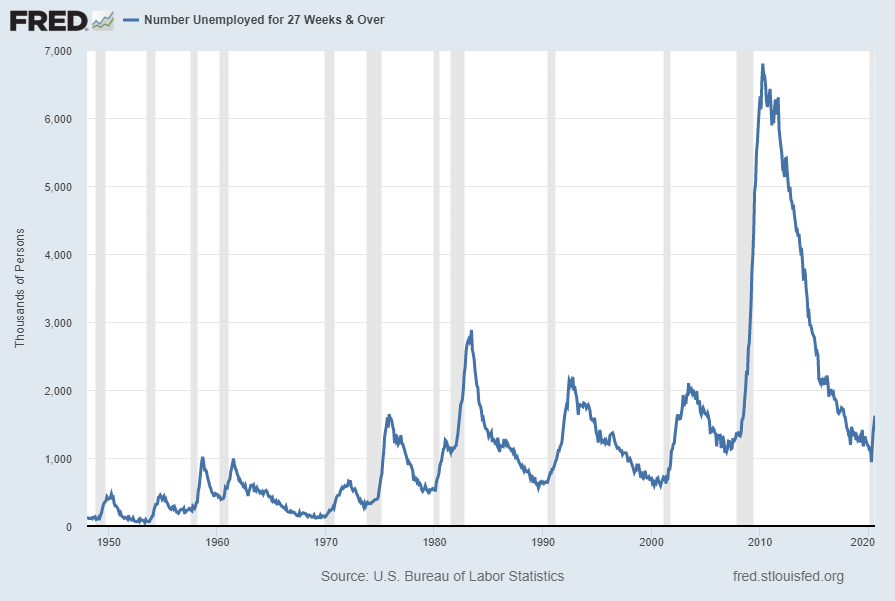
Here is the chart for Unemployed 27 Weeks and Over (current value = 1.624 million):

Data Source: FRED, Federal Reserve Economic Data, Federal Reserve Bank of St. Louis: Civilians Unemployed for 27 Weeks and Over [UEMP27OV] ; U.S. Department of Labor: Bureau of Labor Statistics; accessed September 4, 2020:
http://research.stlouisfed.org/fred2/series/UEMP27OV
–
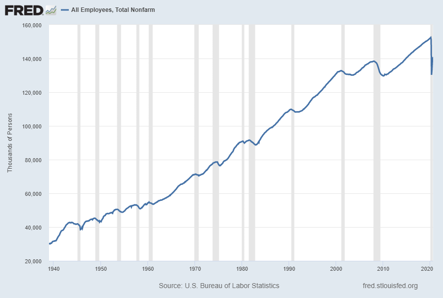
Here is the chart for Total Nonfarm Payroll (current value = 140.914 million):

Data Source: FRED, Federal Reserve Economic Data, Federal Reserve Bank of St. Louis: All Employees: Total Nonfarm [PAYEMS] ; U.S. Department of Labor: Bureau of Labor Statistics; accessed September 4, 2020:
https://research.stlouisfed.org/fred2/series/PAYEMS
–
Our unemployment problem is severe. The underlying dynamics of the current – and especially future – unemployment situation remain exceedingly worrisome. These dynamics are numerous and complex, and greatly lack recognition and understanding.
No comments:
Post a Comment