Friday, February 24, 2012

St. Louis Financial Stress Index – February 23, 2012 Update


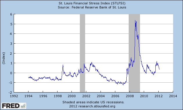
On March 28, 2011 I wrote a post ("The STLFSI") about the  STLFSI (St. Louis Fed’s Financial Stress Index) which is supposed to measure stress in the financial system.  For reference purposes, the most recent chart is seen below.  This chart was last updated on February 23, incorporating data from 12-31-93 to 2-17-12 on a weekly basis.  The present level is .363 :


_________

I post various indicators and indices because I believe they should be carefully monitored.  However, as those familiar with this blog are aware, I do not necessarily agree with what they depict or imply.
_____

The Special Note summarizes my overall thoughts about our economic situation

SPX at 1363.46 as this post is written

Thursday, February 23, 2012

Disturbing Charts (Update 6)


I find the following charts to be disturbing.   These charts would be disturbing at any point in the economic cycle; that they depict such a tenuous situation now – 33 months after the official (as per the 9-20-10 NBER announcement) June 2009 end of the recession – is especially notable.

These charts raise a lot of questions.  As well, they highlight the “atypical” nature of our economic situation from a long-term historical perspective.  I regularly discuss many troubling characteristics of our economy in this EconomicGreenfield blog.

All of these charts (except one, as noted) are from The Federal Reserve, and represent the most recently updated data.

The following 8 charts are from the St. Louis Federal Reserve:

(click on charts to enlarge images)

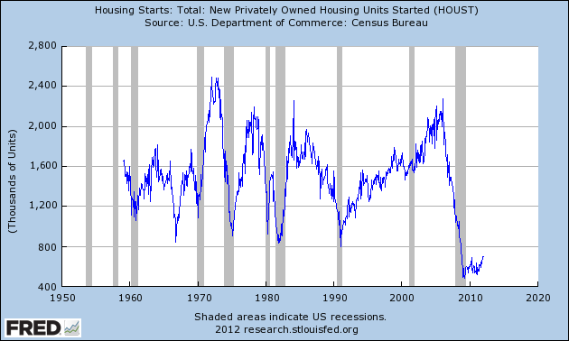
Housing starts (last updated 2-16-12):


-

The Federal Deficit (last updated 2-13-12):


-

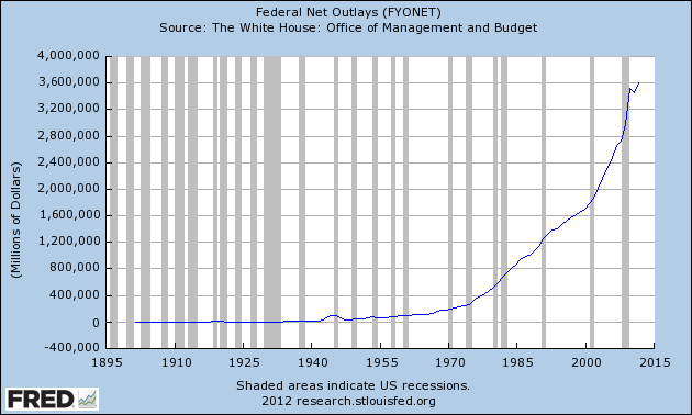
Federal Net Outlays (last updated 2-13-12):


-

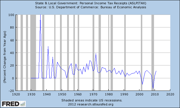
State & Local Personal Income Tax Receipts  (% Change from Year Ago)(last updated 1-27-12):


-

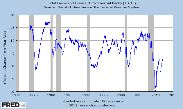
Total Loans and Leases of Commercial Banks (% Change from Year Ago)(last updated 2-21-12):


-

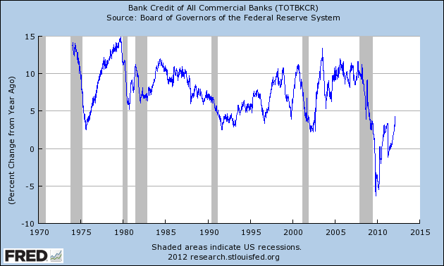
Bank Credit – All Commercial Banks (% Change from Year Ago)(last updated 2-21-12):


-

M1 Money Multiplier (last updated 2-16-12):


-

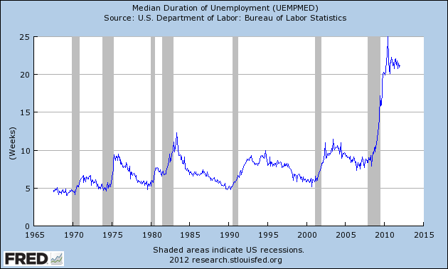
Median Duration of Unemployment (last updated 2-3-12):


-

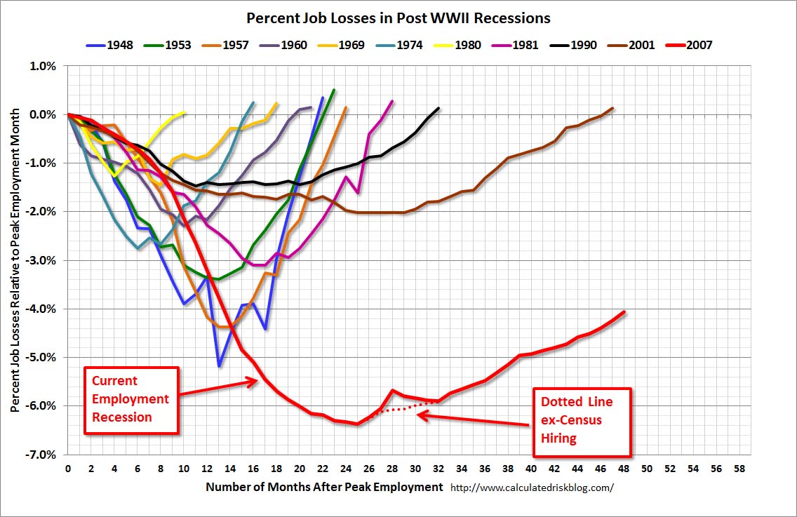
This next chart is from the CalculatedRisk.com blog post of 2-3-12, titled "Graphs:  Unemployment Rate, Participation Rate, Jobs Added" and it shows (in red) the relative length and depth of this downturn and subsequent recovery from an employment perspective:


-

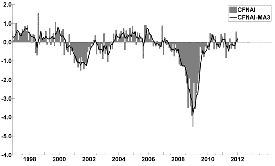
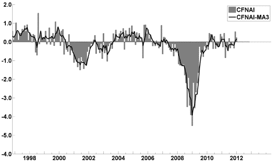
This last chart is of the Chicago Fed National Activity Index (CFNAI) and it depicts broad-based economic activity (last updated 2-21-12):


-

I will continue to update these charts on an intermittent basis as they deserve close monitoring…
_____

The Special Note summarizes my overall thoughts about our economic situation

SPX at 1362.34 as this post is written
Wednesday, February 22, 2012

Walmart’s Q4 2012 Results – Comments


I found various notable items in Walmart’s Q4 2012 conference call transcript (pdf) dated February 21, 2012.  I view Walmart’s results and comments as particularly noteworthy given their retail prominence and focus on low prices.  I have previously commented on their quarterly results; these previous posts are found under the “paycheck to paycheck” label.

Here are various excerpts that I find most notable:

comments from Mike Duke, page 7:
Our core customers remain cautious about their finances, and they turn to Walmart and our EDLP promise to help them manage through today’s economic challenges.
comments from Jeff Davis, page 10:
Gross profit as a percentage of net sales was 24.3 percent, a 40 basis point reduction compared to last year. All three segments contributed to the margin decline, and later you’ll hear more details from each segment.
comments from Bill Simon, page 16:
Despite moderating inflation in certain categories, grocery prices continue to be an issue for many of our customers. For the fourth quarter, total grocery inflation was approximately 4.0 percent. However, trade down and other initiatives reduced the net inflation impact on our customers to between 100 and 200 basis points.
comments from Bill Simon, page 20:
A challenging economy and rising gas prices will continue to drive customers to seek value. In the past, significant increases in gas prices over short periods of time have led to trip consolidation and higher ticket.  We’ll continue to help customers adapt to such trends.
_____

The Special Note summarizes my overall thoughts about our economic situation

SPX at 1362.21 as this post is written

Updates On Economic Indicators February 2012


Here is an update on various indicators that are supposed to predict and/or depict economic activity.  These indicators have been discussed in previous blog posts:

The February Chicago Fed National Activity Index (CFNAI)(pdf) updated as of February 21, 2012:


-


An excerpt from the February 6 update titled “Index forecasts weaker growth” :
The January update of the USA TODAY/IHS Global Insight Economic Outlook Index shows real GDP growth, at a six-month annualized growth rate, increasing to 2.5% in January and then slowing to 1.6% in June. While employment, housing (mostly the multifamily sector) and consumer spending are slowly recovering, concerns about the Eurozone and world growth continue.
-


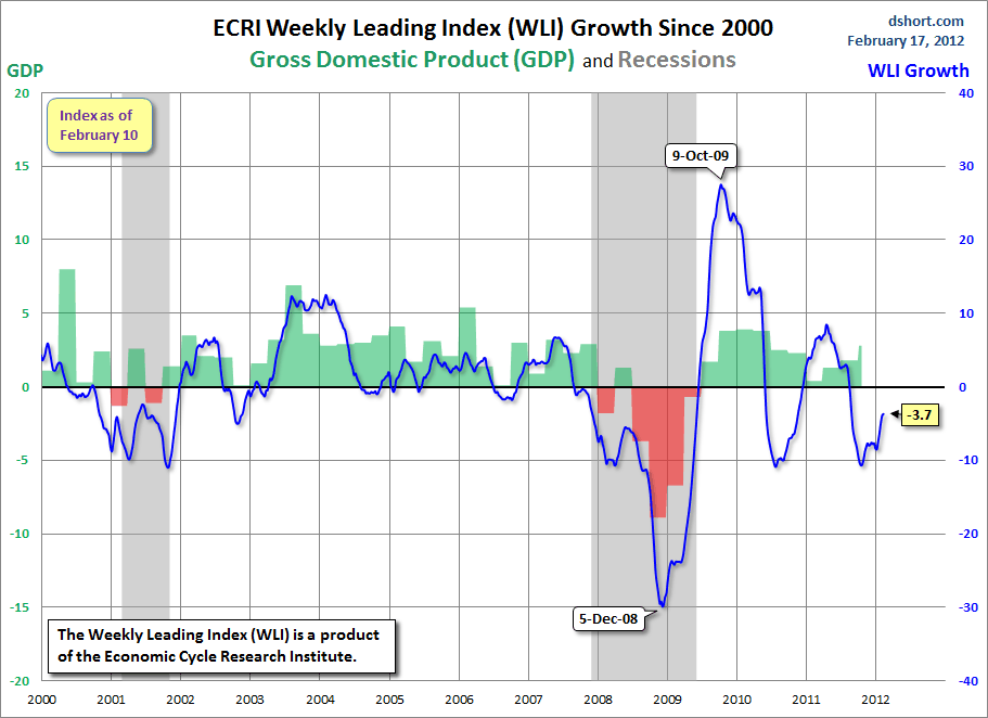
As of 2/17/12 the WLI was at 123.5 and the WLI, Gr. was at -3.7%.

A chart of the WLI, Gr. since 2000, from Doug Short’s blog of February 17 titled “ECRI Controversial Recession Call:  Fifth Consecutive Improvement in the Growth Index” :


-


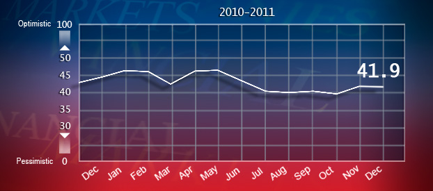
The Indicator as of January 9 was at 41.9, as seen below:


-

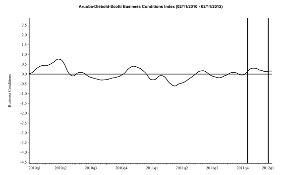
Here is the latest chart, depicting 2-11-10 to 2-11-12:


-


As per the February 17 release, the LEI was at 94.9 and the CEI was at 103.5 in January.

An excerpt from the February 17 release:
Added Ken Goldstein, economist at The Conference Board: “Recent data reflect an economy that started the year on a positive note.  The CEI shows some small signs of economic strengthening in the fourth quarter and continued to point in this direction in January. The LEI suggests these conditions will continue and could possibly even pick up this spring and summer.”
_________

I post various indicators and indices because I believe they should be carefully monitored.  However, as those familiar with this blog are aware, I do not necessarily agree with what they depict or imply.
_____

The Special Note summarizes my overall thoughts about our economic situation

SPX at 1362.12 as this post is written

Tuesday, February 21, 2012

Building Financial Danger – February 21, 2012 Update


On October 17, 2011 I wrote a post titled “Danger Signs In The Stock Market, Financial System And Economy.”  This post is a brief sixth update to that post.

My overall analysis indicates a continuing elevated and growing level of danger.  There are many worldwide and U.S.-specific “stresses” of a very  complex nature, and many lack recognition, some completely so.

My views of this danger, and its implications regarding the financial markets and economy as a whole, were last discussed in the post of February 2, 2012, titled “Building Financial Danger – February 2, 2012 Update.”

In that post, I reiterated a point I first made on January 11 :
…my analyses indicate that the danger inherent in the financial system has reached a level at which a stock market crash – that would also involve (as seen in 2008) various other markets as well – has reached a level at which a near-term crash is (at least) a significant concern.
(note: the "next crash" has outsized significance, as discussed in the post of January 6, "The Next Crash And Its Significance")

Since that February 2 post, there have been additional causes for concern, seen in many technical (analysis), sentiment and fundamental measures.  Various of these measures have been mentioned in this blog.

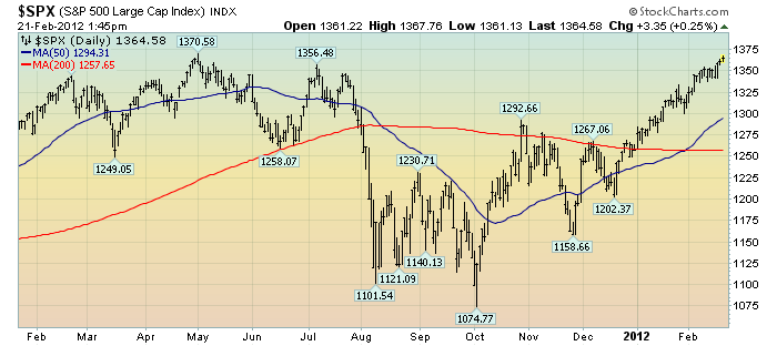
As reference, below is a 13-month daily chart of the S&P500, indicating both the 50dma and 200dma:

(click on chart to enlarge image)(chart courtesy of StockCharts.com; chart creation and annotation by the author)

_____

The Special Note summarizes my overall thoughts about our economic situation

SPX at 1364.58 as this post is written

The Bond Bubble – February 2012 Update


In previous posts I have discussed the Bond Bubble and its many facets.

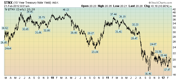
Since my last update on August 15, 2011 ("The Bond Bubble - Update"), the yield on the 10-Year Treasury has roughly been in the 1.7%-2.4% range.  This is seen in the 3-year daily chart, LOG-basis, as shown below:

(click on chart to enlarge image)(chart courtesy of StockCharts.com; chart creation and annotation by the author)


It should be noted that current rates on 10-Year Treasury Yields are, from a long-term historical view, extremely depressed.  This can be seen in a monthly chart of 10-Year Treasury Yields dating back to 1994, on a LOG-basis, with a red trendline :

(click on chart to enlarge image)(chart courtesy of StockCharts.com; chart creation and annotation by the author)


From an even longer-term perspective, looking at a 222-year chart of long-term interest rates, which uses the 30-year bond when available, one can also gain a perspective on today's abnormally low yields.  As seen on that chart, current yields on long-term interest rates have only been lower in one other time period in the 222-year history, with that other period being roughly 1940-1955.

Many investors, including those very prominent, currently believe that the biggest threat to the future value of bonds is inflation.  While I believe that the threat of inflation is a concern, there are various other factors that pose immense threats as well.

As I wrote in the aforementioned August 15, 2011 post:
While this Bond Bubble may have a little more “upside” left to it, I am of the belief that attempting to derive gains from bonds at this point is akin to “picking up pennies in front of a steamroller” – i.e. there is little to be gained, and much to be lost.
While the Bond Bubble continues, its risks to investors, financial markets and the economy in general has in no way diminished.
The perils of this bond bubble and its future "bursting" can hardly be overstated.  As I mentioned in the April 6, 2010 post ("The Threat Of Rising Interest Rates") :
Falling interest rates over the last 20 years have been an “enabler” of much of our current day economy.
_____

The Special Note summarizes my overall thoughts about our economic situation

SPX at 1361.23 as this post is written

Friday, February 17, 2012

Federal Reserve Philosophies - Then And Now


On Monday, February 13, John C. Williams, President and CEO, Federal Reserve Bank of San Francisco, gave a speech titled "The Federal Reserve's Mandate and Best Practice Monetary Policy."

Although I don't agree with many aspects of the speech, I found various aspects to be notable.  I would like to highlight one excerpt in particular, as I find it highly memorable and an iconic quote of the period:
With regard to both of the Fed’s mandates, it’s vital that we keep the monetary policy throttle wide open.
I think it is interesting to compare this excerpt to a famous quote by William McChesney Martin, who was Chairman of The Federal Reserve from 1951-1970; Martin declared that the Federal Reserve's role was "to take away the punch bowl just as the party gets going."
_____

Another notable excerpt from Williams' speech of Monday I would like to highlight as highly significant, especially the second paragraph, which concludes the speech :
We have pushed the federal funds rate close to zero because of the severe recession of 2007 through 2009, and the weak recovery since. We’ve said we expect to keep the federal funds rate extremely low at least through late 2014. Meanwhile, with the fed funds rate near zero, we’ve used some unconventional monetary policy tools to try to push down longer-term interest rates further. Our policy initiatives are a major reason why interest rates across the entire yield curve are at or near record low levels for the post-World War II period.
This is truly an extraordinary time for monetary policy. I’ve talked about some of the tradeoffs central bankers face. But I don’t see such tradeoffs today. Now is one of those moments when everything points in the same direction. The Fed is committed to achieving maximum employment and price stability. And we’re doing everything in our power to move towards those goals. Thank you very much.
_____

The Special Note summarizes my overall thoughts about our economic situation

SPX at 1358.04 as this post is written
Wednesday, February 15, 2012

NFIB Small Business Optimism – January 2012


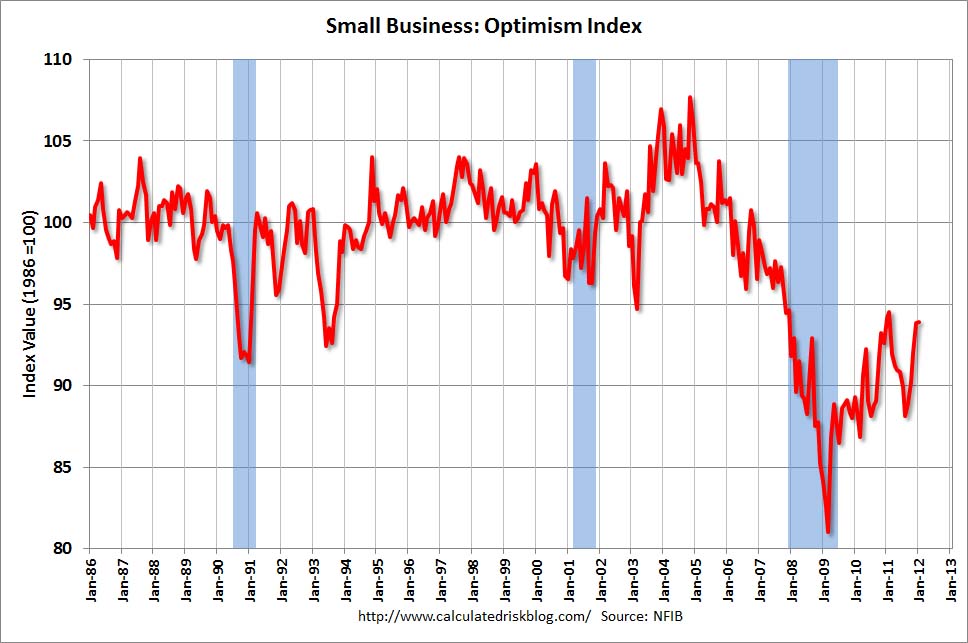
The January NFIB Small Business Optimism was released February 14.  The headline of the Press Release is “Small Business Confidence in a Lull."

The Index of Small Business Optimism increased .1 points in January, rising to 93.9.

Here are some excerpts from the report that I find particularly notable:
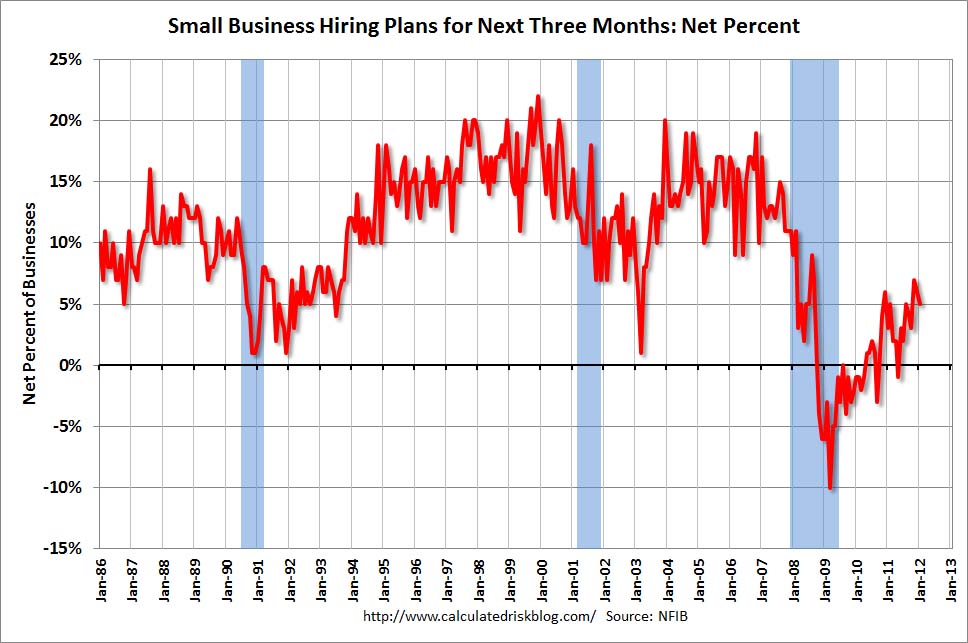
Historically, optimism remains at recession levels. While owners appeared less pessimistic about the outlook for business conditions and real sales growth, that optimism did not materialize in hiring or increased inventories plans.
also:
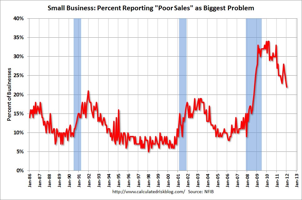
The net percent of owners expecting better business conditions in six months was a negative 3 percent, 5 points better than December but still 13 percentage points below last year’s reading. Not seasonally adjusted, 18 percent expect deterioration (down 4 points), and 22 percent expect improvement (up 7 points). A net 10 percent of all owners expect improved real sales volumes, up 1 point and the strongest reading since the beginning of the year. Twenty-two percent report “poor sales” as their top business problem, down 1 point, but still the top business problem reported.
In conjunction with this January NFIB Small Business Optimism Survey, the CalculatedRisk blog on February 14 (in a post titled "NFIB:  Small Business Optimism Index increases slightly in January") had three charts that depicted various facets (the Index itself; Hiring Plans and Poor Sales) of the Survey, as shown below:

(click on charts to enlarge images)
-
-

_____

The Special Note summarizes my overall thoughts about our economic situation

SPX at 1352.44 as this post is written