Monday, May 6, 2013

Average Hourly Earnings Trends


I have written many blog posts concerning the worrisome trends in income and earnings.

Along these lines, one of the measures showing disconcerting trends is that of hourly earnings.

While the concept of hourly earnings can be defined and measured in a variety of ways, below are a few charts that I believe broadly illustrate problematic trends.

The first chart depicts Average Hourly Earnings Of All Employees: Total Private  (FRED series CES0500000003)(current value = $23.87) :

(click on chart to enlarge image)(chart last updated 5-3-13)
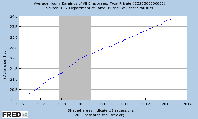
CES0500000003_5-3-13 23.87
Data Source: FRED, Federal Reserve Economic Data, Federal Reserve Bank of St. Louis: Average Hourly Earnings of All Employees:  Total Private [CES0500000003] ; U.S. Department of Labor: Bureau of Labor Statistics; accessed May 6, 2013:

-

This next chart depicts this same measure on a “Percentage Change From A Year Ago” basis.  While not totally surprising, I find the decline from 2009 and subsequent trend to be disconcerting:

(click on chart to enlarge image)(chart last updated 5-3-13)
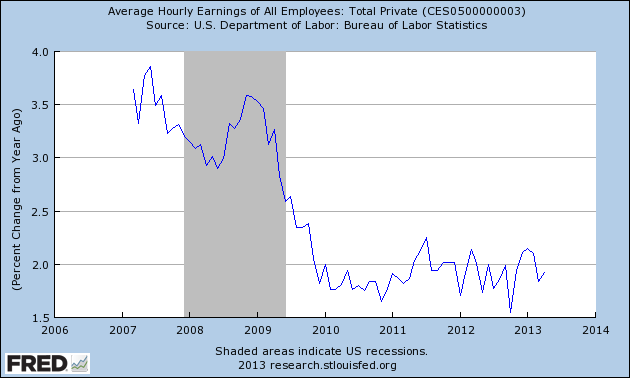
CES0500000003_5-3-13 23.87 Percent Change From Year Ago

-

There are slightly different measures available from a longer-term perspective.  Pictured below is another measure, the Average Hourly Earnings of Production and Nonsupervisory Employees – Total Private  (FRED series AHETPI)(current value = $20.06)  :

(click on chart to enlarge image)(chart last updated 5-3-13)
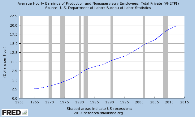
AHETPI_5-3-13 20.06
Data Source: FRED, Federal Reserve Economic Data, Federal Reserve Bank of St. Louis: Average Hourly Earnings of Production and Nonsupervisory Employees:  Total Private [AHETPI] ; U.S. Department of Labor: Bureau of Labor Statistics;  accessed May 6, 2013:

-

Pictured below is this AHETPI measure on a “Percentage Change From A Year Ago” basis:

(click on chart to enlarge image)(chart last updated 5-3-13)
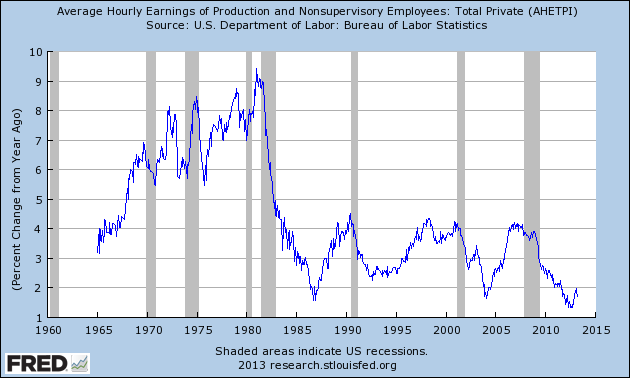
AHETPI_5-3-13 20.06 Percent Change From Year Ago

-

I will continue to actively monitor these trends, especially given the post-2009 dynamics.
_____

The Special Note summarizes my overall thoughts about our economic situation

SPX at 1614.42 as this post is written

Saturday, May 4, 2013

U-3 And U-6 Unemployment Rate Long-Term Reference Charts As Of May 3, 2013


Shortly after each monthly employment report I have been posting a continual series titled “3 Critical Unemployment Charts.”

Of course, there are many other employment charts that can be displayed as well.

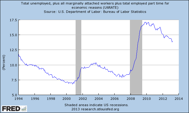
For reference purposes, below are the U-3 and U-6 Unemployment Rate charts from a long-term historical perspective.  Both charts are from the St. Louis Fed site.  The U-3 measure is what is commonly referred to as the official unemployment rate; whereas the U-6 rate is officially (per Bureau of Labor Statistics) defined as:
Total unemployed, plus all persons marginally attached to the labor force, plus total employed part time for economic reasons, as a percent of the civilian labor force plus all persons marginally attached to the labor force
Of note, many economic observers use the U-6 rate as a (closer) proxy of the actual unemployment rate rather than that depicted by the U-3 measure.

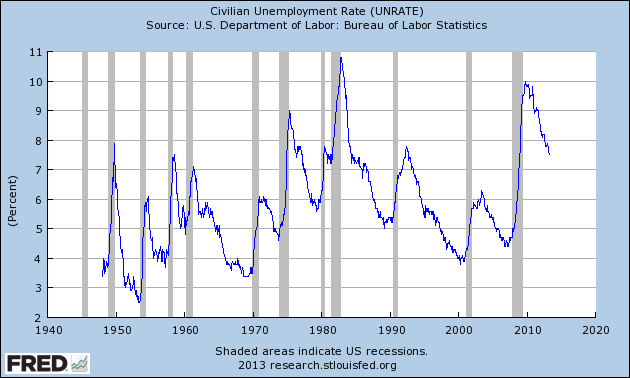
Here is the U-3 chart, currently showing a 7.5% unemployment rate:

(click on charts to enlarge images)(charts updated as of 5-3-13)

UNRATE_5-3-13 7.5 percent
Data Source: FRED, Federal Reserve Economic Data, Federal Reserve Bank of St. Louis: Civilian Unemployment Rate [UNRATE] ; U.S. Department of Labor: Bureau of Labor Statistics; http://research.stlouisfed.org/fred2/series/UNRATE, accessed May 4, 2013

-

Here is the U-6 chart, currently showing a 13.9% unemployment rate:

U6RATE_5-3-13 13.9 percent
Data Source: FRED, Federal Reserve Economic Data, Federal Reserve Bank of St. Louis: Total unemployed, plus all marginally attached workers plus total employed part time for economic reasons  [U6RATE] ; U.S. Department of Labor: Bureau of Labor Statistics; http://research.stlouisfed.org/fred2/series/U6RATE; accessed May 4, 2013

_____

The Special Note summarizes my overall thoughts about our economic situation

SPX at 1614.42 as this post is written

3 Critical Unemployment Charts – May 2013


As I have commented previously, as in the October 6, 2009 post (“A Note About Unemployment Statistics”), in my opinion the official methodologies used to measure the various job loss and unemployment statistics do not provide an accurate depiction; they serve to understate the severity of unemployment.

However, even if one chooses to look at the official statistics, the following charts provide an interesting (and disconcerting) long-term perspective of certain aspects of the officially-stated unemployment situation.

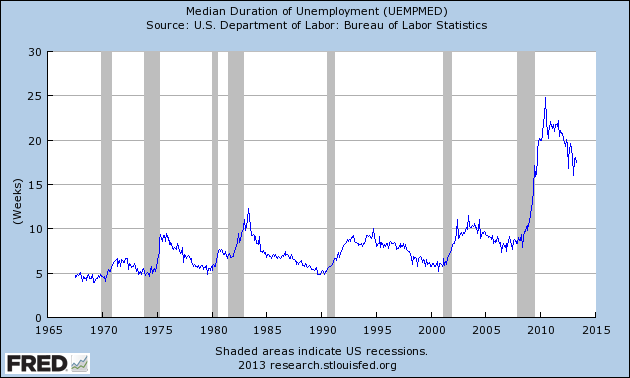
The first two charts are from the St. Louis Fed site.  Here is the Median Duration of Unemployment (current value = 17.5 weeks) :

(click on charts to enlarge images)(charts updated as of 5-3-13)

UEMPMED_5-3-13 17.5
Data Source: FRED, Federal Reserve Economic Data, Federal Reserve Bank of St. Louis: Median Duration of Unemployment [UEMPMED] ; U.S. Department of Labor: Bureau of Labor Statistics; http://research.stlouisfed.org/fred2/series/UEMPMED; accessed May 4, 2013

-

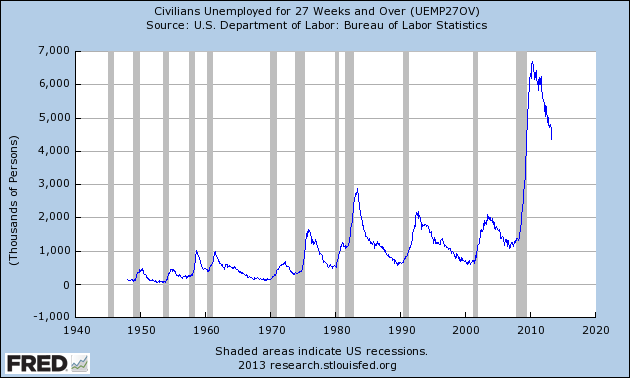
Here is the chart for Unemployed 27 Weeks and Over (current value =  4.353 million) :

UEMP27OV_5-3-13 4353
Data Source: FRED, Federal Reserve Economic Data, Federal Reserve Bank of St. Louis: Civilians Unemployed for 27 Weeks and Over [UEMP27OV] ; U.S. Department of Labor: Bureau of Labor Statistics; http://research.stlouisfed.org/fred2/series/UEMP27OV; accessed May 4, 2013

-

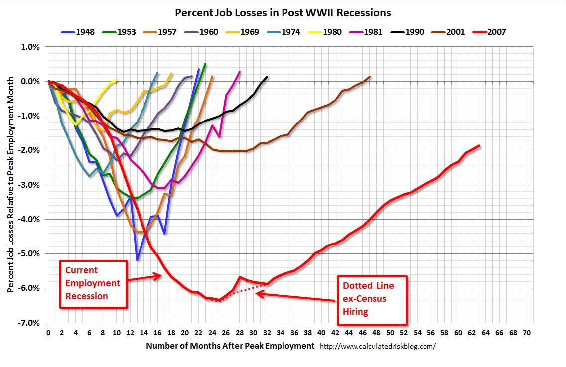
Lastly, a chart from the CalculatedRisk.com site, from the May 3 post titled “April Employment Report:  165,000 Jobs, 7.5% Unemployment Rate.”  This shows the employment situation vs. that of previous recessions, as shown:

CR 5-3-13 - EmployRecApril2013

-

As depicted by these charts, our unemployment problem is severe.  Unfortunately, there do not appear to be any “easy” solutions.

On April 24, 2012 I wrote a five-part blog post titled “The Unemployment Situation Facing The United States”, which discusses various problematical issues concerning the present and future employment situation.
_____

The Special Note summarizes my overall thoughts about our economic situation

SPX at 1614.42 as this post is written
Friday, May 3, 2013

Long-Term Charts Of The ECRI WLI & ECRI WLI, Gr. – May 3, 2013 Update


As I stated in my July 12, 2010 post ("ECRI WLI Growth History"):
For a variety of reasons, I am not as enamored with ECRI’s WLI and WLI Growth measures as many are.
However, I do think the measures are important and deserve close monitoring and scrutiny.
The movement of the ECRI WLI and WLI, Gr. is particularly notable at this time, as ECRI publicly announced on September 30, 2011 that the U.S. was “tipping into recession,” and ECRI has reiterated the view that the U.S. economy is currently in a recession, seen most recently in these four sources :
Other past notable 2012 reaffirmations of the September 30, 2011 recession call by ECRI were seen (in chronological order)  on March 15 (“Why Our Recession Call Stands”) as well as various interviews and statements the week of May 6, including:
Also, subsequent to May 2012:
-

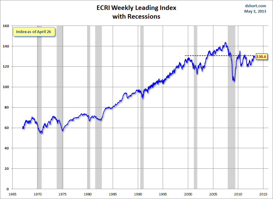
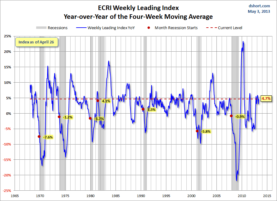
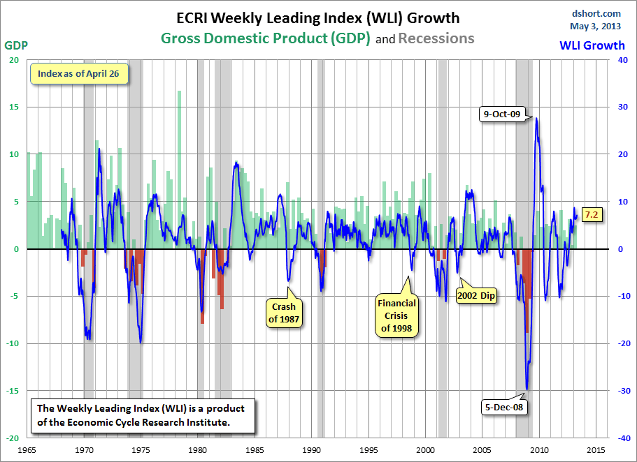
Below are three long-term charts, from Doug Short’s blog post of May 3 titled “Recession Watch:  ECRI’s Weekly Leading Indicator Is Unchanged, Growth Increases.”  These charts are on a weekly basis through the May 3 release, indicating data through April 26, 2013.

Here is the ECRI WLI (defined at ECRI’s glossary):

(click on charts to enlarge images)

Dshort 5-3-13 - ECRI-WLI 130.6

-

This next chart depicts, on a long-term basis, the Year-over-Year change in the 4-week moving average of the WLI:

Dshort 5-3-13 - ECRI-WLI-YoY 4.7 percent

-

This last chart depicts, on a long-term basis, the WLI, Gr.:

Dshort 5-3-13 - ECRI-WLI-growth-since-1965 7.2

_________

I post various economic indicators and indices because I believe they should be carefully monitored.  However, as those familiar with this blog are aware, I do not necessarily agree with what they depict or imply.
_____

The Special Note summarizes my overall thoughts about our economic situation

SPX at 1613.66 as this post is written

St. Louis Financial Stress Index – May 2, 2013 Update


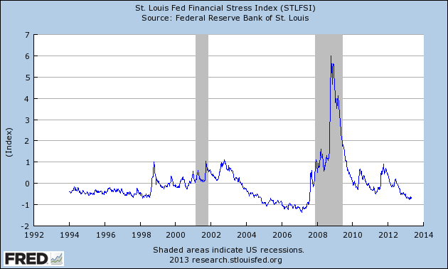
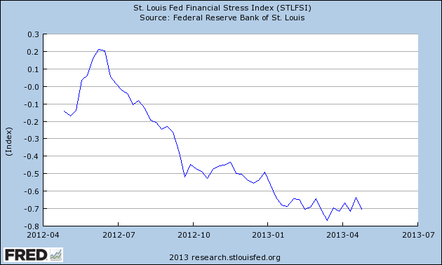
On March 28, 2011 I wrote a post ("The STLFSI") about the  St. Louis Fed’s Financial Stress Index (STLFSI) which is supposed to measure stress in the financial system.  For reference purposes, the most recent chart is seen below.  This chart was last updated on May 2, incorporating data from December 31,1993 to April 26, 2013 on a weekly basis.  The April 26, 2013 value is -.704 :

(click on chart to enlarge image)

STLFSI_5-2-13 -.704

-

Here is the STLFSI chart from a 1-year perspective:

STLFSI_5-2-13 -.704 1-year

Data Source: FRED, Federal Reserve Economic Data, Federal Reserve Bank of St. Louis; accessed May 3, 2013:
_________

I post various indicators and indices because I believe they should be carefully monitored.  However, as those familiar with this blog are aware, I do not necessarily agree with what they depict or imply.
_____

The Special Note summarizes my overall thoughts about our economic situation

SPX at 1617.52 as this post is written
Thursday, May 2, 2013

Notable Statement Concerning Continued Monetary Stimulus


While I don't necessarily agree with any or all parts of the following statement, released yesterday, from Financial Services Committee Chairman Jeb Hensarling (R-TX), I do think that it is notable, and as such should be recognized.

Here is the statement, which is in response to continued monetary stimulus as announced in yesterday's Federal Reserve FOMC Statement :
Like a patient who has been administered too many antibiotics, the economy is less and less responsive to the Fed’s continued monetary stimulus.  America is nearly five years into the Fed’s historically unprecedented interventionist policies and there is very little gain to show for it.  12 million Americans remain unemployed -- a number roughly equal to the entire population of Ohio.  Many others are so discouraged they have given up looking for work, and our so-called recovery is the weakest in modern times.
It’s time for the Fed to acknowledge the simple truth that the challenges facing our economy today cannot be solved by more monetary stimulus.  If the Fed wants to help the economy, it needs to adopt a more predictable, rules-based policy that aims for long-term price stability.  That is the policy that will promote long-term economic growth.
_____

The Special Note summarizes my overall thoughts about our economic situation

SPX at 1588.41 as this post is written
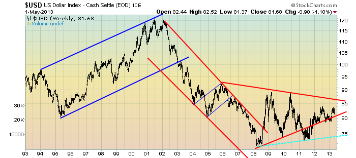
U.S. Dollar Decline – May 2, 2013 Update


U.S. Dollar weakness is a foremost concern of mine.  As such, I have extensively written about it.  I am very concerned that the actions being taken to “improve” our economic situation will dramatically weaken the Dollar.  Should the Dollar substantially decline from here, as I expect, the negative consequences will far outweigh any benefits.  The negative impact of a substantial Dollar decline can’t be overstated, in my opinion.

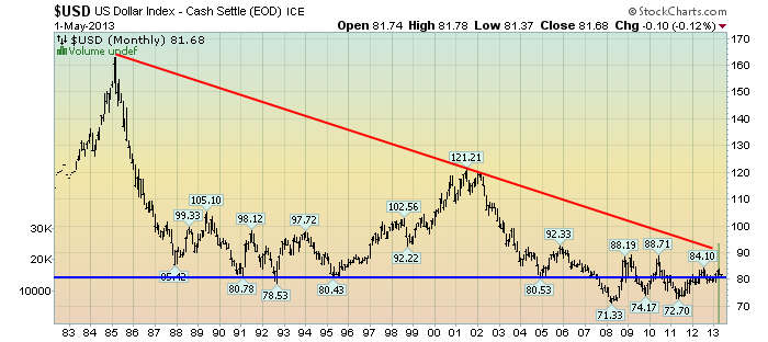
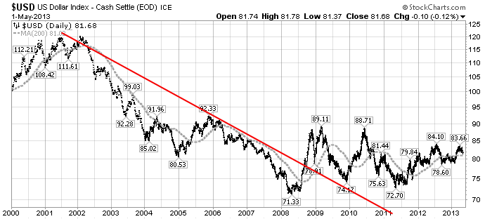
The following three charts illustrate various technical analysis aspects of the U.S. Dollar, as depicted by the U.S. Dollar Index.

First, a look at the monthly U.S. Dollar from 1983.  This clearly shows a long-term weakness, with the blue line showing technical support until 2007:

(charts courtesy of StockCharts.com; annotations by the author)

(click on charts to enlarge images)

EconomicGreenfield 5-2-13 USD Monthly

-

Next, another chart, this one focused on the daily U.S. Dollar since 2000 on a LOG scale.  The red line represents both a (past) trendline as well as a relatively good visual “best-fit” line.  The gray dotted line is the 200-day M.A. (moving average):

EconomicGreenfield 5-2-13 USD 200DMA

-

Lastly, a chart of the Dollar on a weekly LOG scale.  There are some clearly marked  channels, with a potential large, prominent triangle featured (shown with two potential lower trendlines, one red and one dashed light blue line):

EconomicGreenfield 5-2-13 USD Weekly LOG Triangle

-

I will continue providing updates on this U.S. Dollar situation regularly as it deserves very close monitoring…
_____

The Special Note summarizes my overall thoughts about our economic situation

SPX at 1582.70 as this post is written

Wednesday, May 1, 2013

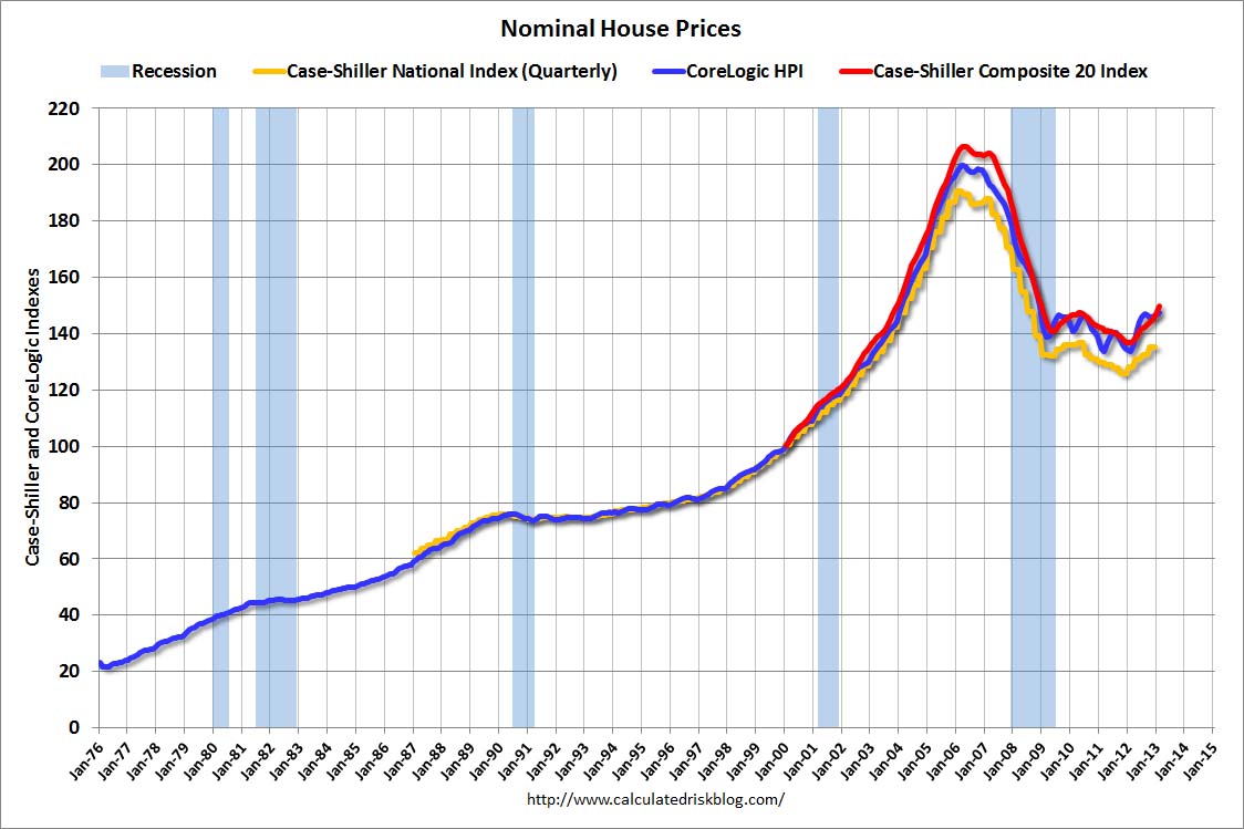
House Prices Reference Chart


As a reference for long-term house price index trends, below is a chart, updated with the most current data (through February, except for the Case-Shiller National Index, which is through December), from the CalculatedRisk blog post of April 30 titled “Real House Prices, Price-to-Rent Ratio, City Prices Relative to 2000” :

(click on chart to enlarge image)

CR 4-30-13 NominalHPIFeb2013

_____

The Special Note summarizes my overall thoughts about our economic situation

SPX at 1597.57 as this post is written