Wednesday, June 26, 2013

Durable Goods New Orders – Long-Term Charts Through May 2013

Many people place emphasis on Durable Goods New Orders as a prominent economic indicator and/or leading economic indicator.

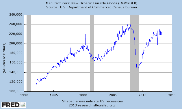
For reference, below are charts depicting this measure.

First, from the St. Louis Fed site (FRED), a chart through May, last updated on June 25.  This value is 231,030 ($ Millions) :

(click on charts to enlarge images)

DGORDER_6-25-13

-

Here is the chart depicting this measure on a “Percentage Change from a Year Ago” basis:

DGORDER_6-25-13 Percent Change From Year Ago
Data Source: FRED, Federal Reserve Economic Data, Federal Reserve Bank of St. Louis: Manufacturers’ New Orders:  Durable Goods [DGORDER] ; U.S. Department of Commerce: Census Bureau ; accessed June 26, 2013;

_________

I post various indicators and indices because I believe they should be carefully monitored.  However, as those familiar with this blog are aware, I do not necessarily agree with what they depict or imply.
_____

The Special Note summarizes my overall thoughts about our economic situation

SPX at 1599.73 as this post is written

Potential Losses In The Federal Reserve's Portfolio

I have written extensively on the issue of Quantitative Easing (QE) and Interventions as I believe many aspects of these practices lack recognition and understanding.   Quantitative Easing in general carries an array of risks, detrimental impacts, unintended consequences, and complex impacts on the economy and markets.

One such set of dynamics embedded within QE that I believe lacks recognition is the risk of losses that can occur in the Federal Reserve's portfolio.  I previously wrote of this in the post of March 7, 2012 titled "Dynamics And Risks Of The Federal Reserve's Portfolio."

While the subject of potential losses is complex - and quantification of such potential losses is made difficult due to the many factors involved - the sheer size of the numbers involved, as well as various adverse situations that may develop during the course of portfolio losses - make this an issue that deserves recognition.

It should be noted that various parties believe that numerous mitigating factors minimize the importance of the potential for losses from the Fed's portfolio.  For instance,  it appears that many people discount the risk of losses, as well as the potential for the Federal Reserve to exhaust its capital base, as they figure that the U.S. Treasury can always replenish the capital.  As well, there is the issue of "mark to market" losses vs. accounting losses, and how the markets view the difference.  (Note:  as seen in the FRBSF Economic Letter of April 11, 2011:  "...the Fed values its securities at acquisition cost and registers capital gains and losses only when securities are sold. Such historical-cost accounting is considered appropriate for a central bank that is motivated by macroeconomic policy objectives rather than financial profit and is consistent with the buy-and-hold securities strategy the Fed has traditionally followed.")  Other mitigating factors are cited as well, including reasoning cited by the Federal Reserve in the above-mentioned March 7, 2012 blog post.

However, if one believes that there is possible adverse impact(s) stemming from mark-to-market losses in the Federal Reserve's portfolio as well as the exhaustion of the Federal Reserve's capital, a disconcerting picture appears, especially in today's rising interest rate environment.

Subsequent to my March 7, 2012 blog post, there have been some published analyses that attempt to quantify the potential for losses in the Federal Reserve's portfolio.  Two of these include the January 2013 Federal Reserve paper titled "The Federal Reserve's Balance Sheet and Earnings:  A primer and projections," (discussed in the Wall Street Journal article of January 30, 2013 titled "Fed Risks Losses From Bonds") as well as the Bloomberg article of February 26, 2013 titled "Fed Faces Explaining Billion-Dollar Losses in QE Exit Stress."

While this Bloomberg article contains various interesting commentary, the following excerpts are especially notable:
MSCI’s data showed the greatest losses under the adverse scenario, as 10-year Treasury yields jump to 5.4 percent by the end of 2015 and three-month rates rise to 4 percent. The 10-year yield was 1.86 percent yesterday, and the three-month rate was 0.117 percent.
also:
Losses on the Fed’s portfolio rise steadily under the adverse scenario to $547 billion by the fourth quarter of 2015 in the MSCI analysis, which is purely a measure of interest-rate risk in the portfolio starting from bond prices at year end. It does not take account of purchases or sales the Fed may conduct in the future. The calculations are mark-to-market losses on the portfolio that take account of yield, amortization, accretion, and funding costs.
Also of critical importance is how sensitive the Federal Reserve's asset portfolio is to an increase in interest rates before the capital base is exhausted.  Cumberland Advisors publishes a CUMB-E Index (pdf) described as a measure of "Percentage  point parallel shift in yield curve needed to exhaust Federal Reserve capital account."  This CUMB-E Index value as of June 19 stood at .27.  (also of note is Cumberland's "Total Assets Of Major Central Banks" (pdf) which shows the size, trends, and composition of major Central Bank assets.)

In aggregate, my interpretation of this potential for losses in the Federal Reserve's portfolio is that the portfolio is highly susceptible (on an "all things considered" basis) to large (mark-to-market) losses.   While the amount of these losses depends upon many factors, the overall dynamics of interest rates and their potential for quick and substantial increases serves to further magnify the potential for large losses.

In addition to the direct (mark-to-market) losses, there are also an array of direct and indirect adverse impact(s) these losses can have on the Federal Reserve, U.S. financial standing, and financial markets.  While the extent of these various adverse impacts depends upon many factors, these impacts can cause many highly complex financial and policy problems.

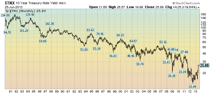
For reference, here is a chart of the 10-Year Treasury Note Yield since 1980, depicted on a monthly LOG basis since 1980 through June 25, 2013, with price labels:

(click on chart to enlarge image)(chart courtesy of StockCharts.com; chart creation and annotation by the author)

EconomicGreenfield 6-25-13 TNX Monthly LOG since 1980

_____

The Special Note summarizes my overall thoughts about our economic situation

SPX at 1588.03 as this post is written
Tuesday, June 25, 2013

Trends Of S&P500 Earnings Forecasts

S&P500 earnings trends and estimates are a notably important topic, for a variety of reasons, at this point in time.

FactSet publishes a report titled “Earnings Insight” that contains a variety of information including the trends and expectations of S&P500 earnings.

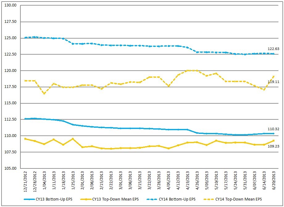
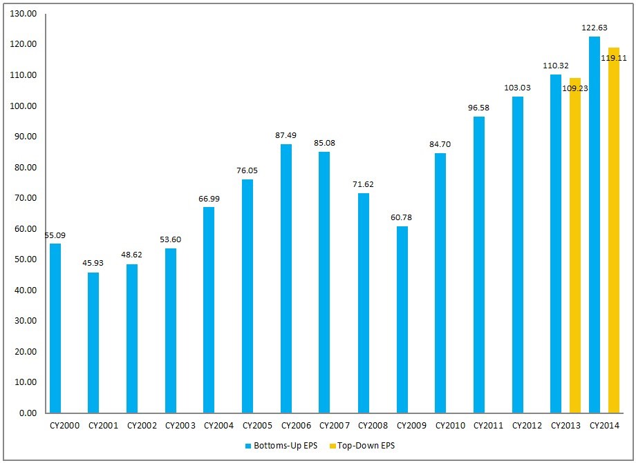
For reference purposes, here are two charts as seen in the “Earnings Insight” (pdf) report of June 21, 2013:

from page 17:

(click on charts to enlarge images)

CY Bottom-Up EPS vs. Top-Down Mean EPS (Trailing 26-Weeks)

EconomicGreenfield 6-25-13 FactSet EPS

-

from page 18:

Calendar Year Bottom-Up EPS Actuals & Estimates
EconomicGreenfield 6-25-13 FactSet 6-21-13 EPS Forecasts CY Actual and Estimates

_____

I post various economic forecasts because I believe they should be carefully monitored.  However, as those familiar with this blog are aware, I do not agree with many of the consensus estimates and much of the commentary in these forecast surveys.
_____

The Special Note summarizes my overall thoughts about our economic situation

SPX at 1586.21 as this post is written

S&P500 Earnings Estimates For Years 2013, 2014, And 2015

As many are aware, Thomson Reuters publishes earnings estimates for the S&P500.  (My other posts concerning S&P earnings estimates can be found under the S&P500 Earnings label)

The following estimates are from Exhibit 12 of “The Director’s Report” of June 24, 2013, and represent an aggregation of individual S&P500 component “bottom up” analyst forecasts:

Year 2013 estimate:
$111.01/share

Year 2014 estimate:
$123.65/share

Year 2015 estimate:
$135.92/share

_____

I post various economic forecasts because I believe they should be carefully monitored.  However, as those familiar with this blog are aware, I do not agree with many of the consensus estimates and much of the commentary in these forecast surveys.
_____

The Special Note summarizes my overall thoughts about our economic situation

SPX at 1573.09 as this post is written

Monday, June 24, 2013

Standard & Poor’s S&P500 Earnings Estimates For 2013 & 2014 – As Of June 21, 2013

As many are aware, Standard & Poor’s publishes earnings estimates for the S&P500.  (My posts concerning their estimates can be found under the S&P500 Earnings label)

For reference purposes, the most current estimates are reflected below, and are as of June 21, 2013:

Year 2013 estimates add to the following:
-From a “bottom up” perspective, operating earnings of $109.55/share
-From a “top down” perspective, operating earnings of $109.16/share
-From a “top down” perspective, “as reported” earnings of $102.80/share

Year 2014 estimates add to the following:
-From a “bottom up” perspective, operating earnings of $123.34/share
-From a “top down” perspective, operating earnings of $119.57/share
-From a “top down” perspective, “as reported” earnings of $116.90/share
_____

I post various economic forecasts because I believe they should be carefully monitored.  However, as those familiar with this blog are aware, I do not agree with many of the consensus estimates and much of the commentary in these forecast surveys.
_____

The Special Note summarizes my overall thoughts about our economic situation

SPX at 1580.63 as this post is written

Updates Of Economic Indicators June 2013

Here is an update on various indicators that are supposed to predict and/or depict economic activity.  These indicators have been discussed in previous blog posts:

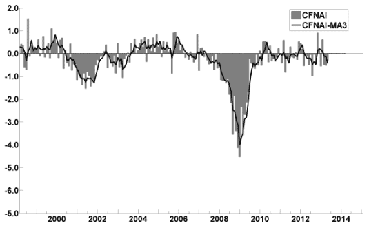
The June Chicago Fed National Activity Index (CFNAI)(pdf) updated as of June 24, 2013:

cfnai_monthly_MA3 6-24-13

-


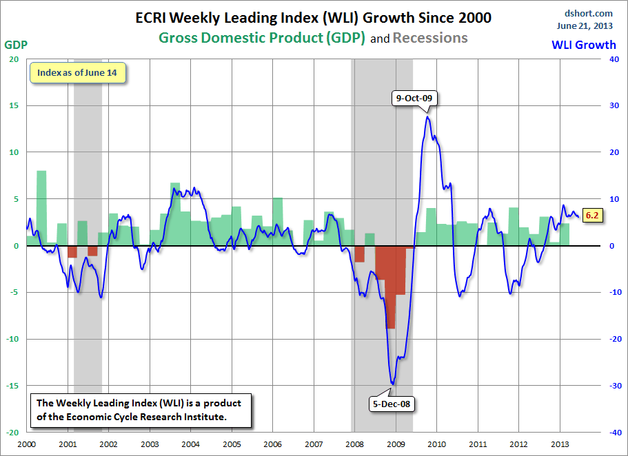
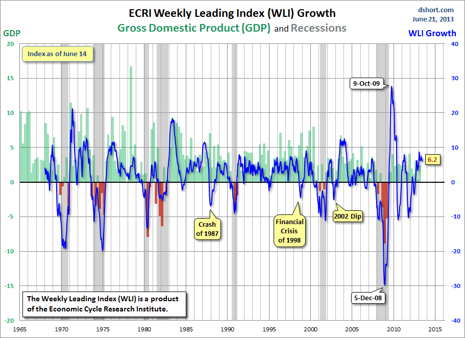
As of 6/21/13 (incorporating data through 6/14/13) the WLI was at 130.3 and the WLI, Gr. was at 6.2%.

A chart of the WLI, Gr. since 2000, from Doug Short’s blog of June 21 titled “ECRI Recession Watch:  Weekly Update” :

Dshort 6-21-13 - ECRI-WLI-growth-since-2000 6.2

-


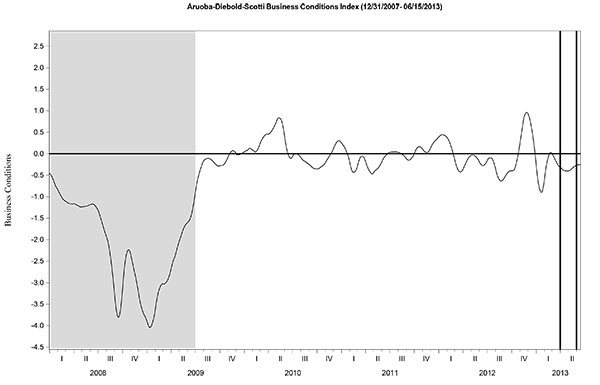
Here is the latest chart, depicting 12-31-07 through 6-15-13:

ads_12-31-07 - 6-15-13

-


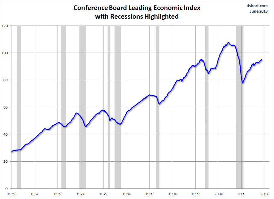
As per the June 20 press release, the LEI was at 95.2 and the CEI was at 105.6 in May.

An excerpt from the June 20 release:
Says Ataman Ozyildirim, economist at The Conference Board: “Despite month-to-month volatility, the LEI’s six-month growth rate remains steady, suggesting that conditions in the economy remain resilient. Widespread gains in the leading indicators over the last six months suggest there is some upside potential for economic activity in the second half of the year.”
Here is a chart of the LEI from Doug Short’s blog post of June 20 titled "Conference Board Leading Economic Index:  A Slight Rise in May" :

Dshort 6-20-13 - CB-LEI

_________

I post various indicators and indices because I believe they should be carefully monitored.  However, as those familiar with this blog are aware, I do not necessarily agree with what they depict or imply.
_____

The Special Note summarizes my overall thoughts about our economic situation

SPX at 1565.30 as this post is written

Current Economic Situation

With regard to our current economic situation,  my thoughts can best be described/summarized by the posts found under the 25 “Building Financial Danger” posts.

My thoughts concerning our ongoing economic situation – with future implications – can be seen on the page titled “A Special Note On Our Economic Situation,” which has been found near the bottom of every blog post since August 15, 2010.
_____

The Special Note summarizes my overall thoughts about our economic situation

SPX at 1592.43 as this post is written

Friday, June 21, 2013

Long-Term Charts Of The ECRI WLI & ECRI WLI, Gr. – June 21, 2013 Update

As I stated in my July 12, 2010 post ("ECRI WLI Growth History"):
For a variety of reasons, I am not as enamored with ECRI’s WLI and WLI Growth measures as many are.
However, I do think the measures are important and deserve close monitoring and scrutiny.
The movement of the ECRI WLI and WLI, Gr. is particularly notable at this time, as ECRI publicly announced on September 30, 2011 that the U.S. was “tipping into recession,” and ECRI has reiterated the view that the U.S. economy is currently in a recession, seen most recently in these five sources :
Other past notable 2012 reaffirmations of the September 30, 2011 recession call by ECRI were seen (in chronological order)  on March 15 (“Why Our Recession Call Stands”) as well as various interviews and statements the week of May 6, including:
Also, subsequent to May 2012:
-

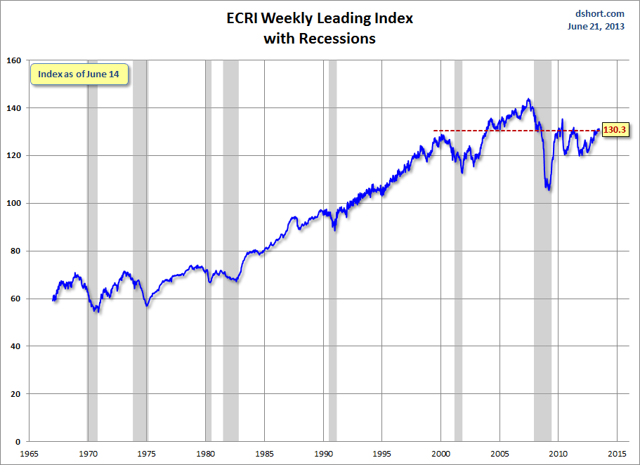
Below are three long-term charts, from Doug Short’s blog post of June 21 titled “ECRI Recession Watch:  Weekly Update”  These charts are on a weekly basis through the June 21 release, indicating data through June 14, 2013.

Here is the ECRI WLI (defined at ECRI’s glossary):

(click on charts to enlarge images)

Dshort 6-21-13 - ECRI-WLI 130.3

-

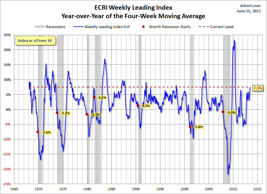
This next chart depicts, on a long-term basis, the Year-over-Year change in the 4-week moving average of the WLI:

Dshort 6-21-13 - ECRI-WLI-YoY 7.5 percent

-

This last chart depicts, on a long-term basis, the WLI, Gr.:

Dshort 6-21-13 - ECRI-WLI-growth-since-1965 6.2

_________

I post various economic indicators and indices because I believe they should be carefully monitored.  However, as those familiar with this blog are aware, I do not necessarily agree with what they depict or imply.
_____

The Special Note summarizes my overall thoughts about our economic situation

SPX at 1596.80 as this post is written