Thursday, February 13, 2014

St. Louis Financial Stress Index – February 13, 2014 Update

On March 28, 2011 I wrote a post (“The STLFSI“) about the St. Louis Fed’s Financial Stress Index (STLFSI) which is supposed to measure stress in the financial system.  For reference purposes, the most recent chart is seen below.  This chart was last updated on February 13, incorporating data from December 31,1993 to February 7, 2014, on a weekly basis.  The February 7, 2014 value is -.843:
(click on chart to enlarge image)
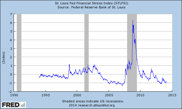
STLFSI_2-13-14 -.843
-
Here is the STLFSI chart from a 1-year perspective:
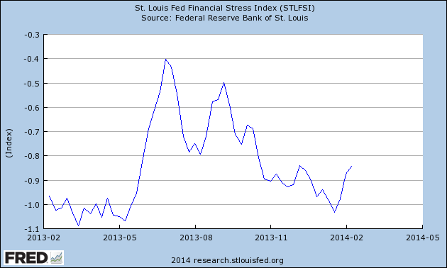
STLFSI_2-13-14 -.843 1-year
Data Source: FRED, Federal Reserve Economic Data, Federal Reserve Bank of St. Louis; accessed February 13, 2014:
_________
I post various indicators and indices because I believe they should be carefully monitored.  However, as those familiar with this blog are aware, I do not necessarily agree with what they depict or imply.
_____
The Special Note summarizes my overall thoughts about our economic situation
SPX at 1821.49 as this post is written

Zillow Q1 2014 Home Price Expectations Survey – Summary & Comments

On February 12, 2014, the Zillow Q1 2014 Home Price Expectations Survey results were released.  This survey is done on a quarterly basis.
Two excerpts from the Press Release:
The survey of 110 economists, real estate experts and investment and market strategists asked panelists to predict the path of the U.S. Zillow Home Value Indexi through 2018 and solicited opinions on investor activity and federal monetary policy. The survey was sponsored by leading real estate information marketplace Zillow, Inc. and is conducted quarterly by Pulsenomics LLC.
also:
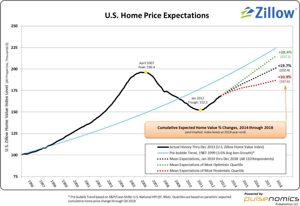
On average, panelists said they expect nationwide home value appreciation of 4.5 percent through the end of this year, a pace that exceeds historically normal annual appreciation rates of around 3 percent. This appreciation is expected to slow to roughly 3.8 percent in 2015 and 3.3 percent by 2018, rates much more in line with historic norms.
Based on current expectations for home value appreciation during the next five years, panelists predicted that overall U.S. home values could exceed their April 2007 peak by the first quarter of 2018, and may cross the$200,000 threshold by the third quarter of 2018.
Various Q1 2014 Zillow Home Price Expectations Survey charts are available, including that seen below:
Zillow 2-12-14 HPE Survey Chart Q1 2014 - large
As one can see from the above chart, the average expectation is that the residential real estate market, as depicted by the U.S. Zillow Home Value Index Level, will continually climb.
The detail of the Q1 2014 Home Price Expectations Survey (pdf) is interesting.  Of the 110 survey respondents, only two (of the displayed responses) forecast a cumulative price decrease through 2018; and of those two, neither foresee a double-digit percentage cumulative price drop.  The most “bearish” of these forecasts is that of Mark Hanson’s prediction of a 5.91% cumulative price decrease through 2018.
The Median Cumulative Home Price Appreciation for years 2014-2018 is seen as 4.50%, 8.51%, 12.48%, 15.86%, and 19.76%, respectively.
For a variety of reasons, I continue to believe that even the most “bearish” of these forecasts (as seen in Mark Hanson’s above-referenced forecast)  will prove too optimistic in hindsight.  From a longer-term historical perspective, such a decline is rather tame in light of the wild excesses that occurred over the “bubble” years.
I have written extensively about the residential real estate situation.  For a variety of reasons, it is exceedingly complex.  While many people continue to have an optimistic view regarding future residential real estate prices, in my opinion such a view is unsupported on an “all things considered” basis.  Furthermore, (even) from these price levels there exists outsized potential for a price decline of severe magnitude, unfortunately.  I discussed this downside, based upon historical price activity, in the October 24, 2010 post titled “What’s Ahead For The Housing Market – A Look At The Charts.”
_____
The Special Note summarizes my overall thoughts about our economic situation
SPX at 1819.26 as this post is written

Wednesday, February 12, 2014

America's Middle Class And Economic Inequality

Pew Research Center recently published two documents that I found notable.
The first is dated January 27, 2014 and is titled "Despite recovery, fewer Americans identify as middle class."  A couple of excerpts include:
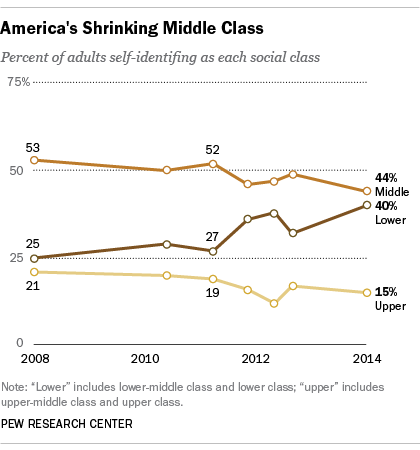
Despite a slowly recovering economy, the proportion of Americans who identify themselves as middle class has dropped sharply in recent years. Today, about as many Americans identify themselves as lower or lower-middle class (40%) as say they are in the middle class (44%), according to a recent Pew Research Center/USA TODAY survey.
also:
At the same time, the share of the public who says they are in the lower or lower-middle classes rose by 15 percentage points, from 25% in 2008 to 40% today.
Here is an accompanying chart:
Pew 1-27-14 - Factank - Despite recovery fewer Americans identify as middle class
-
Another Pew Research document that I found notable is that dated January 23, 2014, and is titled "Most See Inequality Growing, but Partisans Differ over Solutions." (pdf)  In this document, a variety of issues with regard to various facets of (economic) inequality are discussed.  Among the topics and poll findings discussed are:
  • the level of inequality
  • how best to reduce poverty
  • whether the minimum wage should be raised
  • "why are some people poor and others rich?"
  • "does hard work lead to success?"
  • the government's role in reducing poverty and inequality
  • fairness of the economic system
Additional information and graphical trends can be seen in the two Pew Research documents mentioned above.
_____
The Special Note summarizes my overall thoughts about our economic situation
SPX at 1820.44 as this post is written

Tuesday, February 11, 2014

NFIB Small Business Optimism – February 2014

The February NFIB Small Business Optimism report was released today, February 11.  The headline of the Press Release is “Small Business Confidence Edges Up, Ever So Slightly.”  The subtitle is “Main Street Still Cautious About The Future.”
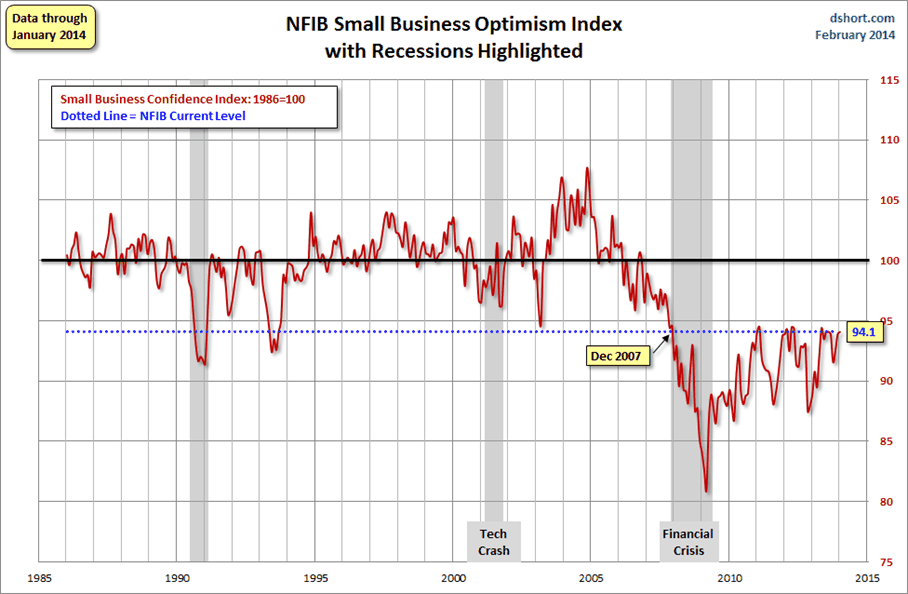
The Index of Small Business Optimism increased .2 points in January to 94.1.
Here are some excerpts from the Press Release that I find particularly notable (but don’t necessarily agree with) :
Small business optimism started the year slightly up from December at 94.1 but well below the pre-recession average of 100, according to the National Federation of Independent Business’ (NFIB’s) latest index. On the positive front, owners did find a reason to be more positive about their own sales (a huge 7 point jump in positive expectations) and plan more hiring, with the strongest job creation plans since 2007. However, owners continue to find inventories “too high” and sales and earnings trends continued to deteriorate for more owners. Overall, the Index is still just treading water.
also:
Capital Outlays. The percent of owners planning capital outlays in the next 3 to 6 months fell 2 points to 24 percent. Eight percent characterized the current period as a good time to expand facilities (down 2 points).  Of those who said it was a bad time to expand (59 percent), 27 percent still blamed the political environment, suggesting that at least for these owners, Washington is preventing their spending on expansion.  The net percent of owners expecting better business conditions in 6 months was a net negative 11 percent, unchanged from December.  Not seasonally adjusted, 19 percent expected an improvement in business conditions (up 2 points), and 23 percent expect deterioration (down 4 points).  A net 15 percent of all owners expect improved real sales volumes, up a huge 7 points, a favorable sign.  Overall, it looks like “maintenance mode”, no breakout in spending on the horizon based on these expectations with the exception of expected real sales.
Here is a chart of the NFIB Small Business Optimism chart, as seen in the February 11 Doug Short post titled “Small Business Sentiment:  A Fractional Improvement, but 'Losing Steam'“ :
Dshort 2-11-14 - NFIB-optimism-index
-
Further details regarding small business conditions can be seen in the Small Business Economic Trends document as well as the full February 2014 NFIB Small Business Economic Trends report (pdf).
_____
The Special Note summarizes my overall thoughts about our economic situation
SPX at 1799.84 as this post is written

Monday, February 10, 2014

Average Hourly Earnings Trends

I have written many blog posts concerning the worrisome trends in income and earnings.
Along these lines, one of the measures showing disconcerting trends is that of hourly earnings.
While the concept of hourly earnings can be defined and measured in a variety of ways, below are a few charts that I believe broadly illustrate problematic trends.
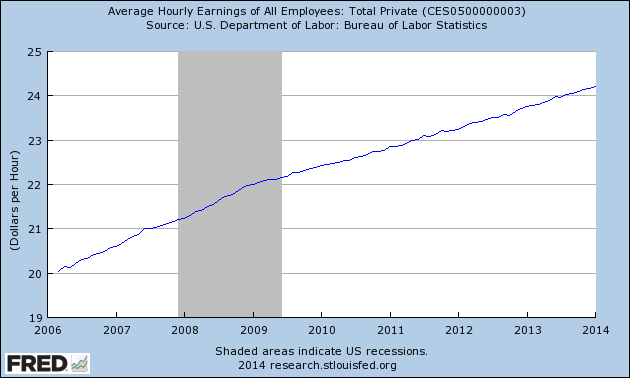
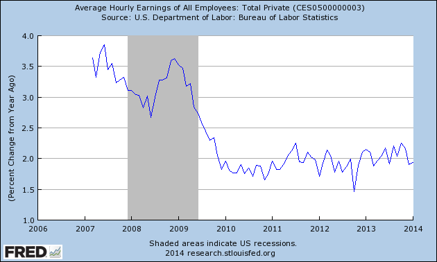
The first chart depicts Average Hourly Earnings Of All Employees: Total Private  (FRED series CES0500000003)(current value = $24.21) :
(click on chart to enlarge image)(chart last updated 2-7-14)
CES0500000003_2-7-14 24.21
Data Source: FRED, Federal Reserve Economic Data, Federal Reserve Bank of St. Louis: Average Hourly Earnings of All Employees:  Total Private [CES0500000003] ; U.S. Department of Labor: Bureau of Labor Statistics; accessed February 10, 2014:
-
This next chart depicts this same measure on a “Percentage Change From A Year Ago” basis.  While not totally surprising, I find the decline from 2009 and subsequent trend to be disconcerting:
(click on chart to enlarge image)(chart last updated 2-7-14)
CES0500000003_2-7-14 24.21 Percent Change From Year Ago
-
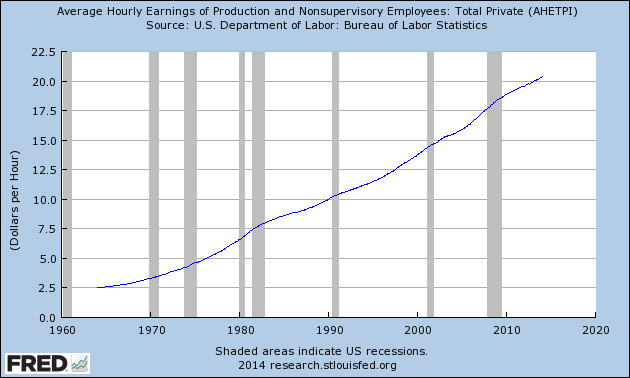
There are slightly different measures available from a longer-term perspective.  Pictured below is another measure, the Average Hourly Earnings of Production and Nonsupervisory Employees – Total Private  (FRED series AHETPI)(current value = $20.39)  :
(click on chart to enlarge image)(chart last updated 2-7-14)
AHETPI_2-7-14 20.39
Data Source: FRED, Federal Reserve Economic Data, Federal Reserve Bank of St. Louis: Average Hourly Earnings of Production and Nonsupervisory Employees:  Total Private [AHETPI] ; U.S. Department of Labor: Bureau of Labor Statistics;  accessed February 10, 2014:
-
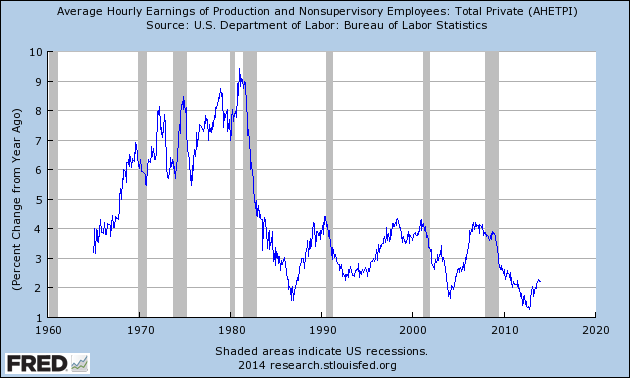
Pictured below is this AHETPI measure on a “Percentage Change From A Year Ago” basis:
(click on chart to enlarge image)(chart last updated 2-7-14)
AHETPI_2-7-14 20.39 Percent Change From Year Ago
-
I will continue to actively monitor these trends, especially given the post-2009 dynamics.
_____
The Special Note summarizes my overall thoughts about our economic situation
SPX at 1797.02 as this post is written

Friday, February 7, 2014

Long-Term Charts Of The ECRI WLI & ECRI WLI, Gr. – February 7, 2014 Update

As I stated in my July 12, 2010 post (“ECRI WLI Growth History“):
For a variety of reasons, I am not as enamored with ECRI’s WLI and WLI Growth measures as many are.
However, I do think the measures are important and deserve close monitoring and scrutiny.
The movement of the ECRI WLI and WLI, Gr. is particularly notable at this time, as ECRI publicly announced on September 30, 2011 that the U.S. was “tipping into recession,” and ECRI has reiterated the view that the U.S. economy is currently in a recession, seen most recently in these twelve sources :
Other past notable year 2012 reaffirmations of the September 30, 2011 recession call by ECRI were seen (in chronological order) on March 15 (“Why Our Recession Call Stands”) as well as various interviews and statements the week of May 6, including:
Also, subsequent to May 2012:
__
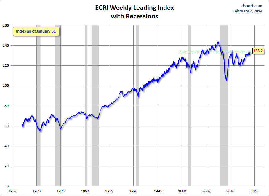
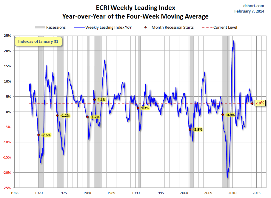
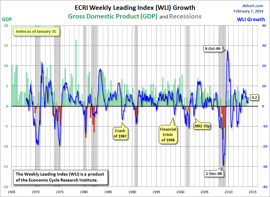
Below are three long-term charts, from Doug Short’s blog post of February 7, 2014 titled “ECRI Recession Watch:  Weekly Update.”  These charts are on a weekly basis through the February 7 release, indicating data through January 31, 2014.
Here is the ECRI WLI (defined at ECRI’s glossary):
Dshort 2-7-14 - ECRI-WLI 133.2
-
This next chart depicts, on a long-term basis, the Year-over-Year change in the 4-week moving average of the WLI:
Dshort 2-7-14 - ECRI-WLI-YoY 2.8 percent
-
This last chart depicts, on a long-term basis, the WLI, Gr.:
Dshort 2-7-14 - ECRI-WLI-growth-since-1965 4.2

_________
I post various economic indicators and indices because I believe they should be carefully monitored.  However, as those familiar with this blog are aware, I do not necessarily agree with what they depict or imply.
_____
The Special Note summarizes my overall thoughts about our economic situation
SPX at 1794.74 as this post is written

Building Financial Danger – February 7, 2014 Update

On October 17, 2011 I wrote a post titled “Danger Signs In The Stock Market, Financial System And Economy.”  This post is a brief 33rd update to that post.
My overall analysis indicates a continuing elevated and growing level of danger which contains many worldwide and U.S.-specific “stresses” of a very complex nature. I have written numerous posts in this blog of some of what I consider both ongoing and recent “negative developments.”  These developments, as well as other exceedingly problematic conditions, have presented a highly perilous economic environment that endangers the overall financial system.
Also of ongoing immense importance is the existence of various immensely large asset bubbles, a subject of which I have extensively written.  While all of these asset bubbles are wildly pernicious and will have profound adverse future implications, hazards presented by the bond market bubble are especially notable.
Predicting the specific timing and extent of a stock market crash is always difficult, and the immense complexity of today’s economic situation makes such a prediction even more challenging. With that being said, my analyses indicate that the danger inherent in the financial system has surpassed the level at which a near-term stock market crash – that would also involve (as seen in 2008) various other markets as well – is of tremendous concern.
(note: the “next crash” has outsized significance and implications, as discussed in the post of January 6, 2012 titled “The Next Crash And Its Significance“)
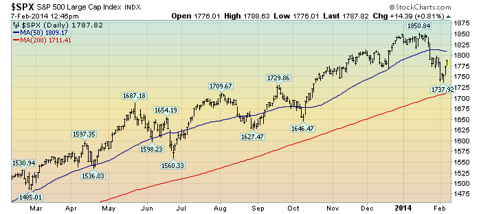
As reference, below is a one-year daily chart of the S&P500 (with a last price of 1787.82), indicating both the 50dma and 200dma as well as price labels:
(click on chart to enlarge image)(chart courtesy of StockCharts.com; chart creation and annotation by the author)
EconomicGreenfield 2-7-14 SPX Daily 1-year
_____
The Special Note summarizes my overall thoughts about our economic situation
SPX at 1787.82 as this post is written

U-3 And U-6 Unemployment Rate Long-Term Reference Charts As Of February 7, 2014

Shortly after each monthly employment report I have been posting a continual series titled “3 Critical Unemployment Charts.”
Of course, there are many other employment charts that can be displayed as well.
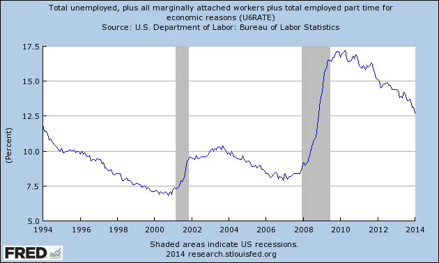
For reference purposes, below are the U-3 and U-6 Unemployment Rate charts from a long-term historical perspective.  Both charts are from the St. Louis Fed site.  The U-3 measure is what is commonly referred to as the official unemployment rate; whereas the U-6 rate is officially (per Bureau of Labor Statistics) defined as:
Total unemployed, plus all persons marginally attached to the labor force, plus total employed part time for economic reasons, as a percent of the civilian labor force plus all persons marginally attached to the labor force
Of note, many economic observers use the U-6 rate as a (closer) proxy of the actual unemployment rate rather than that depicted by the U-3 measure.
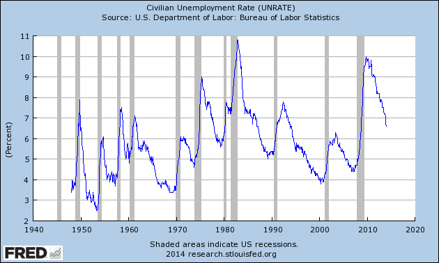
Here is the U-3 chart, currently showing a 6.6% unemployment rate:
(click on charts to enlarge images)(charts updated as of 2-7-14)
UNRATE_2-7-14 6.6 percent
Data Source: FRED, Federal Reserve Economic Data, Federal Reserve Bank of St. Louis: Civilian Unemployment Rate [UNRATE] ; U.S. Department of Labor: Bureau of Labor Statistics; accessed February 7, 2014;
-
Here is the U-6 chart, currently showing a 12.7% unemployment rate:
U6RATE_2-7-14 12.7 percent
Data Source: FRED, Federal Reserve Economic Data, Federal Reserve Bank of St. Louis: Total unemployed, plus all marginally attached workers plus total employed part time for economic reasons  [U6RATE] ; U.S. Department of Labor: Bureau of Labor Statistics; accessed February 7, 2014;
_____
The Special Note summarizes my overall thoughts about our economic situation
SPX at 1780.87 as this post is written