Friday, May 8, 2020

Building Financial Danger – May 8, 2020 Update

My overall analysis indicates a continuing elevated and growing level of financial danger which contains many worldwide and U.S.-specific “stresses” of a very complex nature. I have written numerous posts on this site concerning both ongoing and recent “negative developments.”  These developments, as well as other exceedingly problematical conditions, have presented a highly perilous economic environment that endangers the overall financial system.
Also of ongoing immense importance is the existence of various immensely large asset bubbles, a subject of which I have extensively written.  While all of these asset bubbles are wildly pernicious and will have profound adverse future implications, hazards presented by the bond market bubble are especially notable.
Predicting the specific timing and extent of a stock market crash is always difficult, and the immense complexity of today’s economic situation makes such a prediction even more challenging. With that being said, my analyses continue to indicate that a near-term exceedingly large (from an ultra long-term perspective) stock market crash – that would also involve (as seen in 2008) various other markets – will occur. [note: the “next crash” and its aftermath has paramount significance and implications, as discussed in the post of January 6, 2012 titled “The Next Crash And Its Significance“ and various subsequent posts in the “Economic Depression” label]
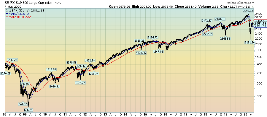
As reference, below is a daily chart since 2008 of the S&P500 (through May 7, 2020 with a last price of 2881.19), depicted on a LOG scale, indicating both the 50dma and 200dma as well as price labels:
(click on chart to enlarge image)(chart courtesy of StockCharts.com; chart creation and annotation by the author)
S&P500 chart
_____
The Special Note summarizes my overall thoughts about our economic situation
SPX at 2881.19 as this post is written

Wednesday, May 6, 2020

Chicago Fed National Financial Conditions Index (NFCI)

The St. Louis Fed’s Financial Stress Index (STLFSI2) is one index that is supposed to measure stress in the financial system.  Its reading as of the April 30, 2020 update (reflecting data through April 24, 2020) is 1.955.
Of course, there are a variety of other measures and indices that are supposed to measure financial stress and other related issues, both from the Federal Reserve as well as from private sources.
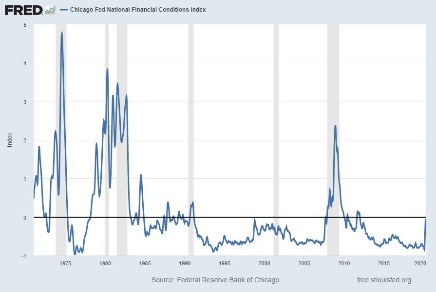
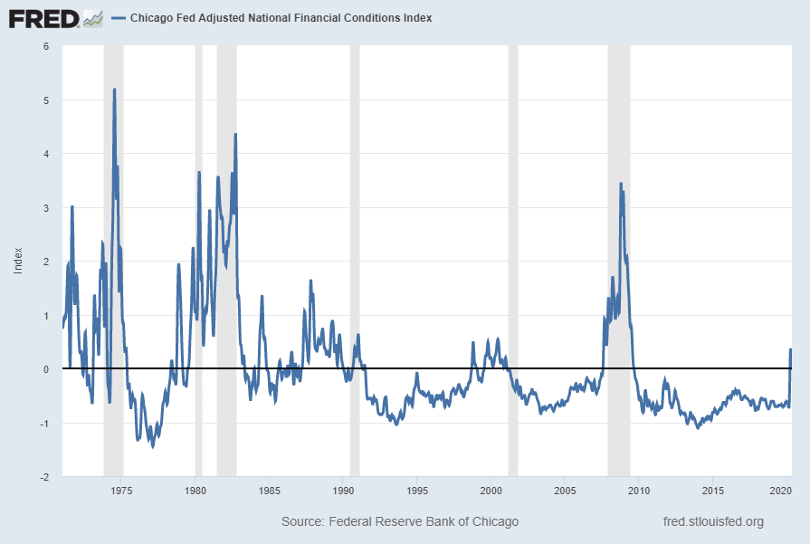
Two other indices that I regularly monitor include the Chicago Fed National Financial Conditions Index (NFCI) as well as the Chicago Fed Adjusted National Financial Conditions Index (ANFCI).
Here are summary descriptions of each, as seen in FRED:
The National Financial Conditions Index (NFCI) measures risk, liquidity and leverage in money markets and debt and equity markets as well as in the traditional and “shadow” banking systems. Positive values of the NFCI indicate financial conditions that are tighter than average, while negative values indicate financial conditions that are looser than average.
The adjusted NFCI (ANFCI). This index isolates a component of financial conditions uncorrelated with economic conditions to provide an update on how financial conditions compare with current economic conditions.
For further information, please visit the Federal Reserve Bank of Chicago’s web site:
Below are the most recently updated charts of the NFCI and ANFCI, respectively.
The NFCI chart below was last updated on May 6, 2020 incorporating data from January 8, 1971 through May 1, 2020, on a weekly basis.  The May 1 value is -.28:
NFCI
Data Source: FRED, Federal Reserve Economic Data, Federal Reserve Bank of St. Louis; accessed May 6, 2020: 
http://research.stlouisfed.org/fred2/series/NFCI
–
The ANFCI chart below was last updated on May 6, 2020 incorporating data from January 8, 1971 through May 1, 2020, on a weekly basis.  The May 1 value is -.03:
ANFCI chart
Data Source: FRED, Federal Reserve Economic Data, Federal Reserve Bank of St. Louis; accessed May 6, 2020: 
http://research.stlouisfed.org/fred2/series/ANFCI
_________
I post various indicators and indices because I believe they should be carefully monitored.  However, as those familiar with this site are aware, I do not necessarily agree with what they depict or imply.
_____
The Special Note summarizes my overall thoughts about our economic situation
SPX at 2868.44 as this post is written
Tuesday, May 5, 2020

VIX Weekly And Monthly Charts Since The Year 2000 – May 5, 2020 Update

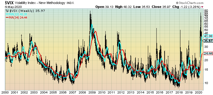
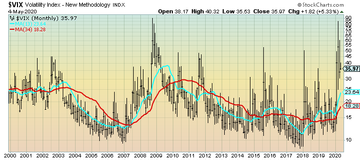
For reference purposes, below are two charts of the VIX from year 2000 through Monday’s (May 4, 2020) close, which had a closing value of 35.97.
Here is the VIX Weekly chart, depicted on a LOG scale, with the 13- and 34-week moving averages, seen in the cyan and red lines, respectively:
(click on chart to enlarge image)(chart courtesy of StockCharts.com; chart creation and annotation by the author)
VIX Weekly chart
–
Here is the VIX Monthly chart, depicted on a LOG scale, with the 13- and 34-month moving average, seen in the cyan and red lines, respectively:
(click on chart to enlarge image)(chart courtesy of StockCharts.com; chart creation and annotation by the author)
VIX Monthly
____
The Special Note summarizes my overall thoughts about our economic situation
SPX at 2892.34 as this post is written

Monday, May 4, 2020

Charts Of Equities’ Performance Since March 9, 2009 And January 1, 1980 – May 4, 2020 Update

In the March 9, 2012 post (“Charts of Equities’ Performance Since March 9, 2009 And January 1, 1980“) I highlighted two charts for reference purposes.
Below are those two charts, updated through the latest daily closing price.
The first is a daily chart of the S&P500 (shown in green), as well as five prominent (AAPL, IBM, AMZN, SBUX, CAT) individual stocks, since 2005.  There is a blue vertical line that is very close to the March 6, 2009 low.  As one can see, both the S&P500 performance, as well as many stocks including the five shown, have performed strongly since the March 6, 2009 low:
(click on chart to enlarge image)(chart courtesy of StockCharts.com; chart creation and annotation by the author)
S&P500 since 2005 and prominent stocks
–
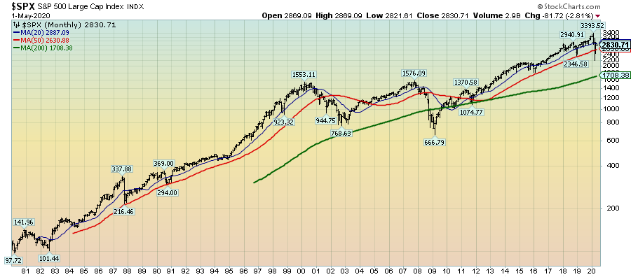
This next chart shows, on a monthly LOG basis, the S&P500 since 1980.  I find this chart notable as it provides an interesting long-term perspective on the S&P500′s performance.  The 20, 50, and 200-month moving averages are shown in blue, red, and green lines, respectively:
(click on chart to enlarge image)(chart courtesy of StockCharts.com; chart creation and annotation by the author)
S&P500 since 1980
_____
The Special Note summarizes my overall thoughts about our economic situation
SPX at 2811.61 as this post is written

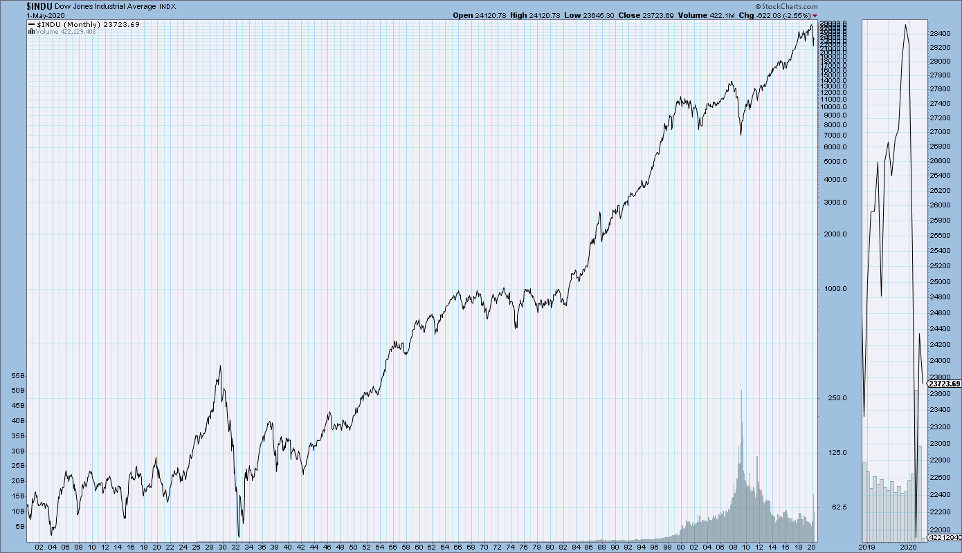
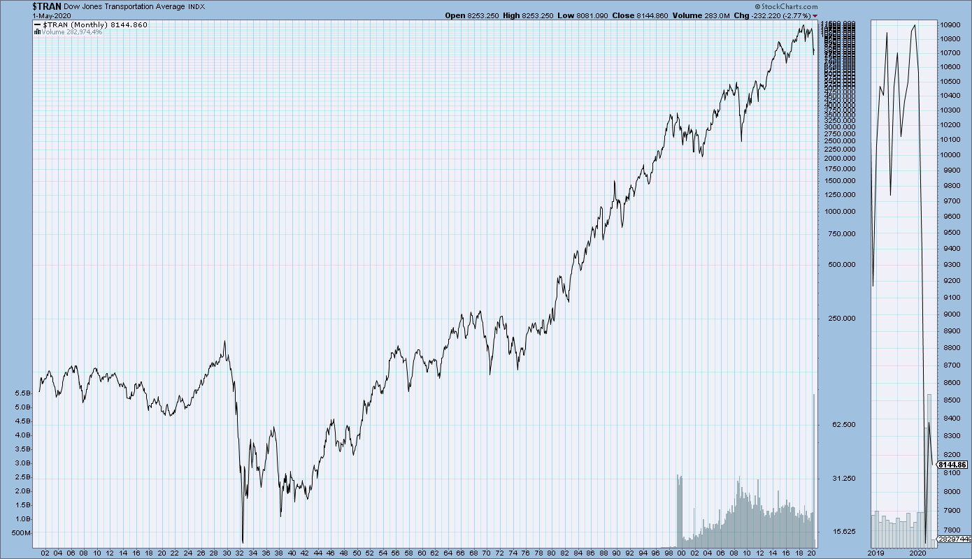
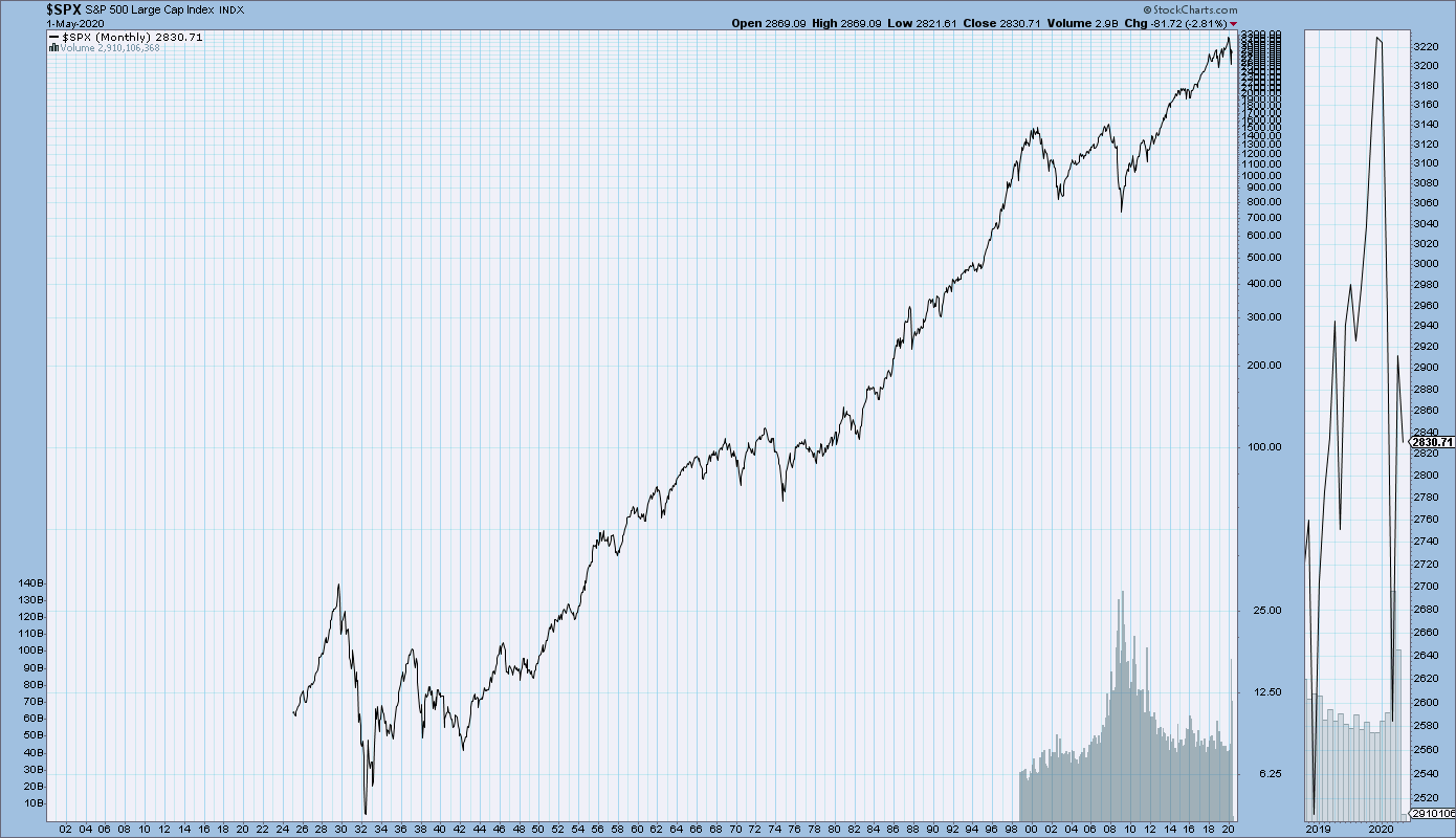
Main U.S. Stock Market Indexes – Four Ultra Long-Term Charts

StockCharts.com maintains long-term historical charts of various major stock market indices, interest rates, currencies, commodities, and economic indicators.
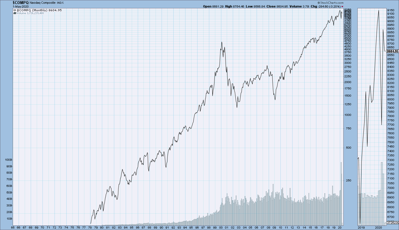
As a long-term reference, below are charts depicting various stock market indices for the dates shown.  All charts are depicted on a monthly basis using a LOG scale.
(click on charts to enlarge images)(charts courtesy of StockCharts.com)
The Dow Jones Industrial Average, from 1900 – May 1, 2020:
DJIA since 1900
–
The Dow Jones Transportation Average, from 1900 – May 1, 2020:
DJTA since 1900
–
The S&P500, from 1925 – May 1, 2020:
S&P500 chart
–
The Nasdaq Composite, from 1978 – May 1, 2020:
Nasdaq Composite since 1978
_____
The Special Note summarizes my overall thoughts about our economic situation
SPX at 2830.71 as this post is written

Friday, May 1, 2020

U.S. Dollar Decline – May 1, 2020 Update

U.S. Dollar weakness is a foremost concern of mine.  As such, I have extensively written about it.  I am very concerned that the actions being taken to “improve” our economic situation will dramatically weaken the Dollar.  Should the Dollar substantially decline from here, as I expect, the negative consequences will far outweigh any benefits.  The negative impact of a substantial Dollar decline can’t, in my opinion, be overstated.
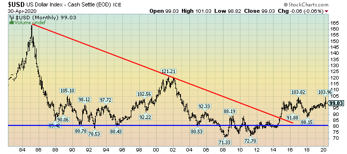
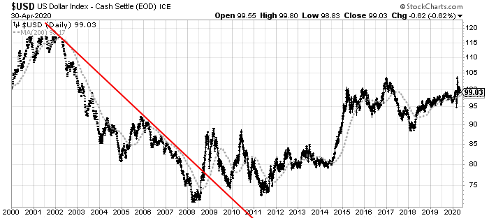
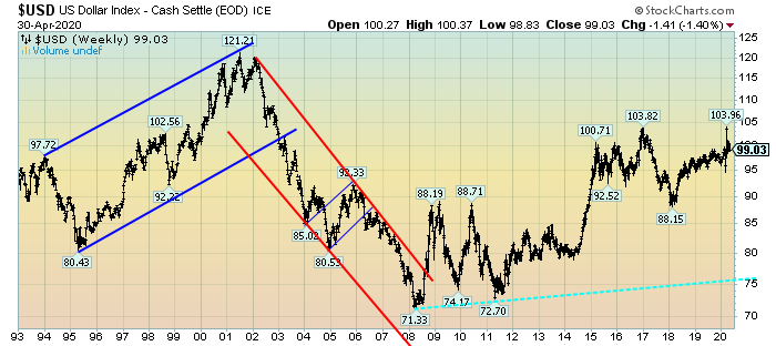
The following three charts illustrate various technical analysis aspects of the U.S. Dollar, as depicted by the U.S. Dollar Index.
First, a look at the monthly U.S. Dollar from 1983.  This clearly shows a long-term weakness, with the blue line showing technical support until 2007, and the red line representing a (past) trendline:
(charts courtesy of StockCharts.com; annotations by the author)
(click on charts to enlarge images)
U.S. Dollar monthly chart
–
Next, another chart, this one focused on the daily U.S. Dollar since 2000 on a LOG scale.  The red line represents a (past) trendline.  The gray dotted line is the 200-day M.A. (moving average):
U.S. Dollar Daily chart
–
Lastly, a chart of the Dollar on a weekly LOG scale.  There are two clearly marked past channels, with possible technical support depicted by the dashed light blue line:
U.S. Dollar Weekly chart
–
I will continue providing updates on this U.S. Dollar situation regularly as it deserves very close monitoring…
_____
The Special Note summarizes my overall thoughts about our economic situation
SPX at 2822.46 as this post is written

The High Degree Of Peril Inherent In The U.S. Economic Situation

Various surveys, economic growth projections, and market risk indicators portray a short period of substantial U.S. economic decline through mid-2020, followed by a significant economic rebound and then financial system stability for the foreseeable future.
However, there are various indications – many of which have been discussed on this site – that this very widely-held consensus is in many ways incorrect.  There are many exceedingly problematical financial conditions that have existed prior to 2020, and continue to exist.  As well, numerous economic dynamics continue to be exceedingly worrisome and many economic indicators have portrayed facets of weak growth or outright decline prior to 2020.
Of paramount importance is the resulting level of risk and the future economic implications.
From an “all things considered” standpoint, I continue to believe the overall level of risk remains at a fantastic level – one that is far greater than that experienced at any time in the history of the United States.
Cumulatively, these highly problematical conditions will lead to future upheaval.  The extent of the resolution of these problematical conditions will determine the ongoing viability of the financial system and economy as well as the resultant quality of living.
As I have previously written in “The U.S. Economic Situation” updates:
My analyses continues to indicate that the growing level of financial danger will lead to the next stock market crash that will also involve (as seen in 2008) various other markets as well.  Key attributes of this next crash is its outsized magnitude (when viewed from an ultra-long term historical perspective) and the resulting economic impact.  This next financial crash is of tremendous concern, as my analyses indicate it will lead to a Super Depression – i.e. an economy characterized by deeply embedded, highly complex, and difficult-to-solve problems.
_____
The Special Note summarizes my overall thoughts about our economic situation
SPX at 2833.10 as this post is written

Thursday, April 30, 2020

Another Recession Probability Indicator – Updated Through Q4 2019

Each month I have been highlighting various estimates of U.S. recession probabilities.  The latest update was that of April 7, 2020, titled “Recession Probability Models – April 2020.”
While I don’t agree with the methodologies employed or the probabilities of impending economic weakness as depicted by these and other estimates, I do believe that the results of these models and estimates should be monitored.
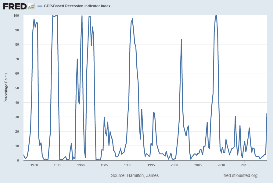
Another probability of recession is provided by James Hamilton, and it is titled “GDP-Based Recession Indicator Index.”  A description of this index, as seen in FRED:
This index measures the probability that the U.S. economy was in a recession during the indicated quarter. It is based on a mathematical description of the way that recessions differ from expansions. The index corresponds to the probability (measured in percent) that the underlying true economic regime is one of recession based on the available data. Whereas the NBER business cycle dates are based on a subjective assessment of a variety of indicators that may not be released until several years after the event , this index is entirely mechanical, is based solely on currently available GDP data and is reported every quarter. Due to the possibility of data revisions and the challenges in accurately identifying the business cycle phase, the index is calculated for the quarter just preceding the most recently available GDP numbers. Once the index is calculated for that quarter, it is never subsequently revised. The value at every date was inferred using only data that were available one quarter after that date and as those data were reported at the time.
If the value of the index rises above 67% that is a historically reliable indicator that the economy has entered a recession. Once this threshold has been passed, if it falls below 33% that is a reliable indicator that the recession is over.
Additional reference sources for this index and its construction can be seen in the Econbrowser post of February 14, 2016 titled “Recession probabilities” as well as on the “The Econbrowser Recession Indicator Index” page.
Below is a chart depicting the most recent value of 32.50%, for the fourth quarter of 2019, last updated on April 30, 2020 (after the April 29, 2020 Gross Domestic Product, First Quarter 2020 (Advance Estimate) (pdf)):
GDP-Based Recession Indicator Index
source:  Hamilton, James, GDP-Based Recession Indicator Index [JHGDPBRINDX], retrieved from FRED, Federal Reserve Bank of St. Louis on April 30, 2020:
https://research.stlouisfed.org/fred2/series/JHGDPBRINDX
_________
I post various indicators and indices because I believe they should be carefully monitored.  However, as those familiar with this site are aware, I do not necessarily agree with what they depict or imply.
_____
The Special Note summarizes my overall thoughts about our economic situation
SPX at 2912.43 as this post is written